Format and style elements in think-cell Charts
- Home
- Resources
- User manual
- think-cell Charts: Data visualization
- Format and style elements in think-cell Charts
This page explains the element formatting options that are specific to think-cell Suite. For general formatting options, see Format and style elements.
Match element formatting to the linked data range
Control the look of your presentations from their data sources by matching the formatting of elements and features (like chart segments, table cells, or text) to their linked data ranges. To learn more about linked data ranges, see Data entry in PowerPoint and Excel data links. To learn more about formatting Excel cells, see Microsoft Support.
To match an element's or feature's formatting to its linked data range, follow these steps:
- Select the element or feature to open the mini toolbar.
- Select the datasheet formatting option that you want (see Datasheet formatting options on the mini toolbar).
For example, to match a table cell's font color to the linked data range, select the cell to open the mini toolbar, select the Font Color dropdown menu, then select Use Datasheet Font Color (see Format and style text).
If an element is linked to an element datasheet or slide workbook, any formatting changes in the linked data range immediately appear in the element. If an element is linked to an external Excel range, formatting changes in the linked data range appear in your selection when you update the data link (see Manage the data in linked elements).
Matching an element's or feature's formatting to its linked data range has the following limitations:
- You can't apply gradient colors to think-cell elements or features.
- In think-cell charts, you can only match the following formatting options to the linked data range:
- Number format, font style, and font color of the chart labels
- Chart fills (see Match chart fills to the linked data range)
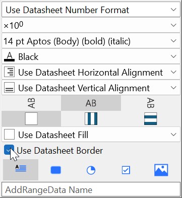
Datasheet formatting options on the mini toolbar
The formatting options on the mini toolbar are specific to the element or feature that you select and the formatting of the linked data range. For example, the Use Datasheet Date Format option is only available if the selected element can contain text and the linked data range has date formatting (see Microsoft Support).
The mini toolbar can have the following Use Datasheet formatting options:
- Format > Use Datasheet Number Format (see Number format)
- Format > Use Datasheet Date Format
- Font > Use Datasheet Bold/Italic
- Font Color > Use Datasheet Font Color
- Fill > Use Datasheet Fill
- Color Scheme > Use Datasheet Fill on Top (see Match chart fills to the linked data range)
- Horizontal Alignment > Use Datasheet Horizontal Alignment
- Vertical Alignment > Use Datasheet Vertical Alignment
- Use Datasheet Border
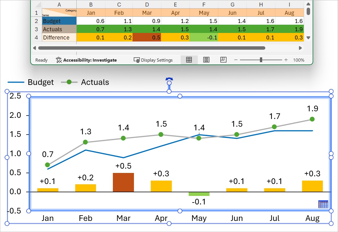
Match chart fills to the linked data range
To match a chart's fills to the linked data range, follow these steps:
- Select the chart to open the mini toolbar.
- Select the Color Scheme dropdown menu.
- Select Use Datasheet Fill on Top.
In most charts, selecting Use Datasheet Fill on Top matches a feature's fill to the fill of the linked data range cell, with the following exceptions:
- Lines and markers can only have solid fill colors.
- In scatter and bubble charts, a marker's color or a bubble's fill can match the linked cell that contains the series label, the X or Y axis value, or the size value (see Scatter and bubble charts).
- In area charts, an area's fill matches the linked cell that contains the series label (see Area charts).
- In line charts, a line's color matches the linked cell that contains the series label (see Line and profile charts).
If you select Use Datasheet Fill on Top and a feature in your chart is linked to a cell without a fill, that feature uses the chart's fill scheme instead (see Chart fill scheme).
To stop matching an individual chart feature's fill to its linked data range, follow these steps:
- Select the feature to open the mini toolbar.
- Select the Fill dropdown menu.
- Select a fill.
Match element formatting to Excel conditional formatting
In Excel, conditional formatting color-codes your data to help visualize trends. You can match the formatting of an element to the conditional formatting of its linked Excel range (see Excel data links). To do so, follow these steps:
- In Excel, select the cell range that you want to apply conditional formatting to, including one or more cells that are linked to your element.
- Select Home > Styles > Conditional Formatting.
- Select one of the preset formatting rules, or create custom formatting rules. To create custom formatting rules, select Home > Styles > Conditional Formatting > New Rule. In the New Formatting Rule dialog, enter your parameters, then select OK. To learn more about conditional formatting rules, see Microsoft Support.
- In PowerPoint, select the linked element to open the mini toolbar.
- Select the formatting option that you want (see Datasheet formatting options on the mini toolbar and Match chart fills to the linked data range).
Applying conditional formatting to linked elements has the following limitations:
- You can't apply Data Bars and Icon Sets conditional formatting presets to think-cell elements.
- You can't apply gradient colors to think-cell elements.
- When you create or change conditional formatting rules in a linked Excel range, think-cell can't automatically update element formatting. This is a known problem in Microsoft Office (see KB0174). To apply conditional formatting updates to your element, you must first change any data value in the linked range or restart Excel.
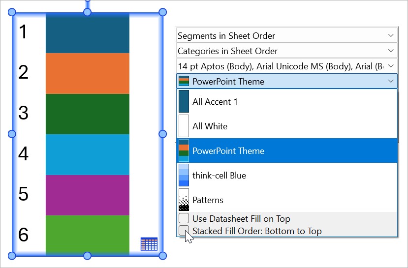
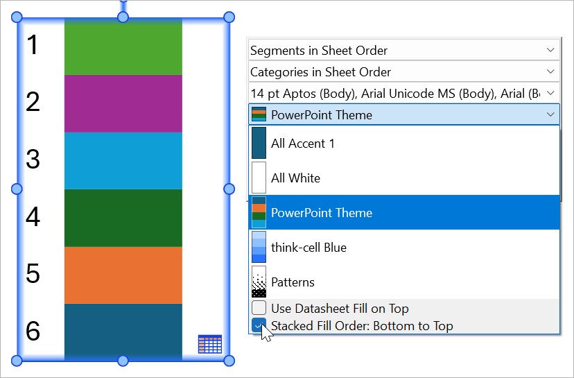
Chart fill scheme
Use fill schemes to apply a sequence of colors or patterns to a chart's series. By default, think-cell charts use the PowerPoint Theme fill scheme. To change the fill scheme of a chart, follow these steps:
- Select the chart to open the mini toolbar.
- Select the Color Scheme dropdown menu.
- Select a fill scheme.
The fills update automatically when you add or remove series.
A fill scheme applies fills to a chart in sequence and repeats the sequence after applying the last fill. For example, in a chart with seven series, the PowerPoint Theme fill scheme applies the first fill to the first series, the sixth fill to the sixth series, and the first fill again to the seventh series, as PowerPoint Theme has six fills.
You can reverse the fill scheme sequence so that the first fill applies to the last series in the chart. To reverse the fill scheme order, follow these steps:
- Select the chart to open the mini toolbar.
- Select the Color Scheme dropdown menu.
- Select Stacked Fill Order: Bottom to Top.
Note: In think-cell style files, you can customize fill schemes, change the default fill schemes of chart types, and specify what happens when a chart has more series than the number of fills in a fill scheme. To learn more, see Customize the list of fill schemes.
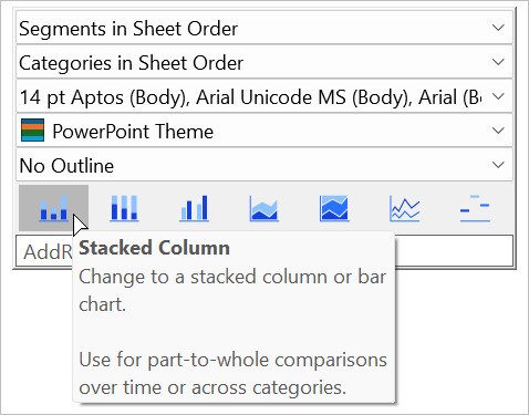
Change chart type
You can quickly change a think-cell chart to a different chart type that displays the same data. The chart type options on the mini toolbar depend on the orientation of the chart that you selected (see Rotate and flip elements). To change a chart to a different chart type, follow these steps:
- Select the chart to open the mini toolbar.
- At the bottom of the mini toolbar, choose from the following chart types:
- Stacked column or bar
- 100% stacked column or bar
- Clustered column or bar
- Stacked area
- 100% stacked area
- Line or profile
You can change a column, bar, line, or profile chart to a combination chart. To change a column or bar chart to a combination chart, follow these steps:
- Select a series column or bar segment to open the mini toolbar.
- Select Line
 or Profile
  .
.
To change a line or profile chart to a combination chart, follow these steps:
- Select a series line (or a marker in a series line) to open the mini toolbar.
- Select Stacked Column
 , Stacked Bar
  , Clustered Column
  , or Clustered Bar
  .
.
To change a column or bar chart to a 100% stacked column or bar chart, or a stacked area chart to a 100% stacked area chart, you can change the Y-axis type to % instead of using the mini toolbar (see Adjust the value axis type).
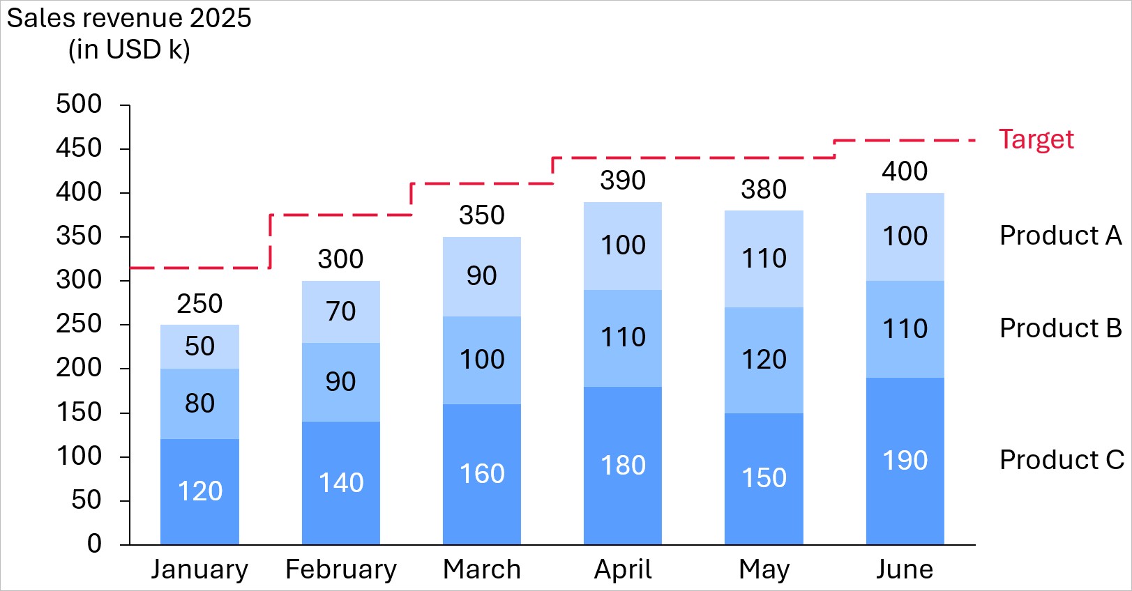
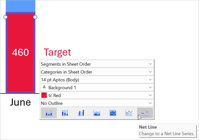
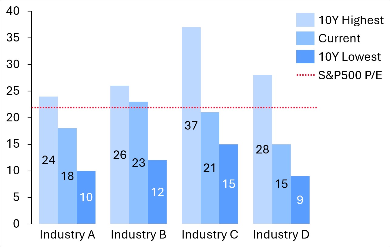
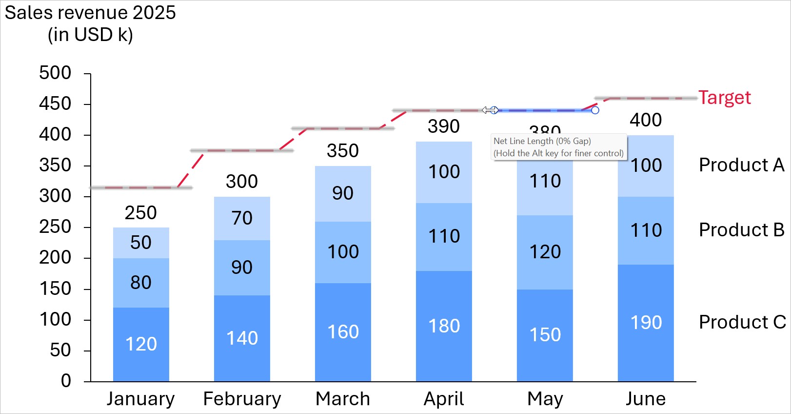
Display chart series as net lines
Net line series appear as parallel lines to the category axis. Use net lines to help compare expected and actual values, or highlight trends and deviations from the average. You can change any series to net lines in column, bar, waterfall, Mekko, line, and profile charts.
To display a series as net lines, follow these steps:
- Select a series label, segment, or line to open the mini toolbar.
- At the bottom of the mini toolbar, in the chart type options, select Net Line
 .
.
After you change a series to net lines, you can still change the data values that the net lines represent in the chart's linked data range (see Data entry in PowerPoint).
By default, the line color and style of net lines match that of value lines (see Value lines). To change the line color and style of net lines, follow these steps:
- Select a net line to open the mini toolbar.
- On the Line Color and Line Style dropdown menus, choose the line color and style that you want.
If a net line series has the same data value across all categories, you can form a single line by connecting the net lines. To connect net lines that represent the same value, select a net line and drag the handles until it connects with the other net lines.

Add connectors to net lines
If a net line series has different data values across its categories, you can form a single net line by adding connectors between the categories. The line style and color of net lines and their connectors always match.
To add connectors between net line categories, follow these steps:
- Right-click a net line to open the context menu.
- Select Add connectors
 .
.
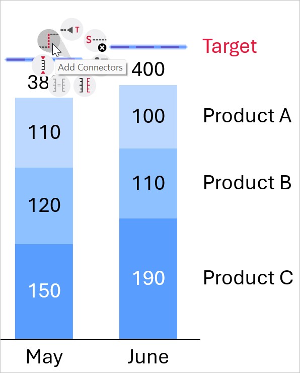
After adding connectors, you can form a step line. Step lines are net lines that look like a series of steps. To create step lines, extend the net lines by selecting a net line and dragging a handle until the net lines form right angles with the connectors.
Need to troubleshoot?
Check our knowledge base