Style files
This page provides detailed information about how you can customize the style of think-cell elements. You can create the default settings that you want and ensure that your presentations are visually consistent and on brand by customizing think-cell style files. Customizing a style file allows you to:
- Customize the fill, line, and marker options available for think-cell elements.
- Customize the default colors, styles, and color schemes for think-cell charts, shapes, text labels, and other features.
- Deploy custom PowerPoint presentation templates, or customize the default styles for your organization.
Set up think-cell style files
think-cell style files are XML files that specify the styles for think-cell elements and features. If you're new to XML, you may want to visit Microsoft Support to get a basic understanding of how XML files are structured.
Open and edit style files
You can open and edit think-cell style files using any text editor. We recommend using a dedicated code editor, such as Visual Studio Code with the Red Hat XML extension, as they can provide auto-completion suggestions and automatically validate the code using think-cell's XML schema.
The XML schemas specify the possible customization options and the correct syntax for each element and attribute. You can find the schemas that specify think-cell's style file syntax in your think-cell installation directory, in the xml-schemas folder. The schemas are also XML files, but there's no reason to view them: they simply allow your XML editor to do proper syntax checks, highlight errors, and provide auto-completion suggestions. In a think-cell style file, the URL of the style file's XML schema is specified in the the last value of the style element's xsi:schemaLocation attribute.
To edit a style file, follow these steps:
- Open your think-cell installation directory. To find your think-cell installation directory, in PowerPoint, go to Insert > think-cell > Tools

- Make a copy of the
stylesfolder and place the copy in your Documents folder. The copy allows you to make changes to the files in the folder without needing administrator rights and ensures that you keep the original files. - In your copy of the
stylesfolder, open the style file that you want to edit. - In the style file, edit the
styleelement's attributes.- Change the name in the
nameattribute. When think-cell is using a style file, the name of the style file appears in the Toolsnameattribute. - Your style file may reference a custom base style with a
basedOnattribute located after thenameattribute. In that case, do not delete or change the value of thebasedOnattribute in the copy of your style file.
- Change the name in the
- In the
styleelement, customize your styles as described in this chapter. - Before loading the style file into a presentation, review and fix any warnings or errors that your XML editor displays.
The sections and elements in this chapter are ordered based on the syntax of the think-cell style files. So, when you add an element to the style file, ensure that it is located after elements that appear earlier in the chapter and before elements that appear later in the chapter.
If you want to create your own style file, we recommend that you make a copy of the default style file and use it as a starting point for your customizations. To create a style file based on the default style file, follow the instructions above, and in the third step, open your copy of the default style file.
Note: To see which style file is the default for your think-cell version, in PowerPoint, go to Insert > think-cell > Tools
Your think-cell installation directory includes an example style file that showcases a variety of complex customizations, with annotations that guide you through the process. You can find the example style file in the styles folder, under Customization Possibilities Showcase/Customization Possibilities Showcase.xml.
The style file customizations described in this chapter assume that you are using think-cell 14. If your think-cell version is older than a style file's version, loading that style file will result in an error. However, older style files remain valid in newer versions of think-cell. If you want to add elements from this chapter to a style file created for an older think-cell version, do the following:
- In the
styleelement, change the values of thexmlnsandxsi:schemaLocationattributes to match the build number in the default style file of your think-cell version. - Update the style file with any missing required elements so that the style file syntax is valid in the newer think-cell version.
Load a style file into a presentation
The think-cell style file in a presentation depends on your organization's think-cell installation and the presentation's slide master. To see the name of the loaded style file, go to Insert > think-cell > Tools
- On the ribbon, go to Insert > think-cell > Tools
- In the Change Style menu, select the style file that you want. If the style file that you want doesn't appear in the menu, select Other to open the Load Style File dialog, then navigate to the location of the style file, select the style file, and select Open. You can load a style file that is located anywhere on your computer or network.
When you load a different style file, the new style applies to the think-cell elements you insert after changing the style file. To match the style of an existing element to the new style, change the element's style using the mini toolbar or reinsert the element.
To add a style file to a PowerPoint template, see Deploy a style file using a PowerPoint template.
Load, view, and remove style files using API functions
On Windows, you can use think-cell's API functions to programmatically load, view, and remove think-cell style files. LoadStyle loads a style file into a slide master or slide layout. LoadStyleForRegion loads a style file into a specific area of a slide layout. GetStyleName returns the name of the style file in a slide master or slide layout. RemoveStyles removes all style files from a slide layout.
Load a style file: LoadStyle
Signature
VBA
tcPpAddIn.LoadStyle( _
    CustomLayoutOrMaster As Object, _
    FileName As String
)C#
void tcPpAddIn.LoadStyle(
    object CustomLayoutOrMaster,
    string FileName
);Description
This function loads a style file into a slide layout or slide master. You can pass PowerPoint.CustomLayout or PowerPoint.Master as the CustomLayoutOrMaster parameter.
If you use the LoadStyle function to load a style file into a slide master, that style file will override other style files in the slide master or the slide layouts under that slide master. Similarly, if you use LoadStyle to load a style file into a slide layout, it will override other style files in that layout.
To avoid overriding style files, first load a style file that you want into the slide master, then load any other style files that you want into specific slide layouts. If you want to load a style file into an area of a slide layout using the LoadStyleForRegion function, use that function after you finish using LoadStyle (see Load a style file into an area of the layout: LoadStyleForRegion).
VBA
To use the LoadStyle function, add the following sample code to a module in PowerPoint (see Visual Basic for Applications). Replace the following:
<INSTALLATION_PATH>: think-cell installation directory<FILE_NAME>: The style file's name
Option Explicit

Sub LoadStyle_Sample()

    ' Get the think-cell add-in object
    Dim tcPpAddIn As Object
    Set tcPpAddIn = Application.COMAddIns("thinkcell.addin").Object

    Dim master As Master
    Set master = Application.ActivePresentation.Designs(1).SlideMaster

    Dim style As String
    style = "C:\<INSTALLATION_PATH>\styles\<FILE_NAME>.xml"

    Call tcPpAddIn.LoadStyle(master, style)
End SubLoad a style file into an area of the layout: LoadStyleForRegion
Signature
VBA
tcPpAddIn.LoadStyleForRegion( _
    CustomLayout As PowerPoint.CustomLayout, _
    FileName As String, _
    Left as Single, _
    Top as Single, _
    Width as Single, _
    Height as Single _
)C#
void tcPpAddIn.LoadStyleForRegion(
    PowerPoint.CustomLayout CustomLayout,
    string FileName,
    float Left,
    float Top,
    float Width,
    float Height
);Description
LoadStyleForRegion loads a style file into the slide layout CustomLayout and restricts it so that it applies only to an area on the layout. You can specify the restricted area using the Left, Top, Width, and Height parameters. On the rest of the slide, think-cell uses the style file that you loaded into the slide layout or the slide master with the LoadStyle function.
You can specify the parameters Left, Top, Width, and Height as fractions of the slide height and width. Left and Top specify the distance of the left and top edges of the restricted area from the left and top edges of the slide layout, respectively. We recommend specifying the parameters as fractions of the slide height and width. Alternatively, you can also specify the parameters in PowerPoint points, where 1 pt = 12700 EMU (see Style file terminology).
For example, to load a style file into an area that covers the right two-thirds of the layout, use the following code:
Left = CustomLayout.Width / 3
Top = 0
Width = CustomLayout.Width * 2 / 3
Height = CustomLayout.HeightAdd images or shapes to a specific area of the slide layout
With LoadStyleForRegion, you can add unique images or shapes to an area of a slide layout and load a style file that applies only to that area. To do this, add the image or shape to a slide or slide layout; query the image or shape's Left, Top, Width, and Height properties programmatically; and use the values with LoadStyleForRegion to restrict the style file to the same area that the image or shape covers.
think-cell supports a maximum of two style files per layout:
- A style file you load with
LoadStyleForRegion, which applies to a specific area on the layout - Another style file you load with
LoadStyle, which applies to the rest of the layout
VBA
To use the LoadStyleForRegion function, add the following sample code to a module in PowerPoint (see Visual Basic for Applications). Replace the following:
<INSTALLATION_PATH>: think-cell installation directory<FILE_NAME>: The style file's name
Option Explicit

Sub LoadStyleForRegion_Sample()

    ' Get the think-cell add-in object
    Dim tcPpAddIn As Object
    Set tcPpAddIn = Application.COMAddIns("thinkcell.addin").Object

    Dim layout As CustomLayout
    Set layout = Application.ActivePresentation.Designs(1).SlideMaster.CustomLayouts(2)

    ' Define a region covering the left half of the layout
    Dim left, top, width, height As Single
    left = 0
    top = 0
    width = layout.Width / 2
    height = layout.Height

    Dim style As String
    style = "C:\<INSTALLATION_PATH>\styles\<FILE_NAME>.xml"

    Call tcPpAddIn.LoadStyleForRegion(layout, style, left, top, width, height)
End SubView the name of the style file: GetStyleName
Signature
VBA
tcPpAddIn.GetStyleName( _
    CustomLayoutOrMaster As Object _
) As StringC#
string tcPpAddIn.GetStyleName(
    object CustomLayoutOrMaster
);Description
GetStyleName returns the name of the style file in the slide master or slide layout. You can specify the slide master or slide layout by passing PowerPoint.Master or PowerPoint.CustomLayout as the CustomLayoutOrMaster parameter. The function returns the name that is specified in the name attribute of the style element of the style file (see Open and edit style files).
Note that think-cell requires a style file in all slide masters and automatically loads the default style file into any slide master that doesn't already have one.
If you loaded a style file into a slide layout using the LoadStyleForRegion function, GetStyleName function does not return the name of that style file.
VBA
To use the GetStyleName function, add the following sample code to a module in PowerPoint. To learn more, see Visual Basic for Applications.
Option Explicit

Sub GetStyleName_Sample()

    ' Get the think-cell add-in object
    Dim tcPpAddIn As Object
    Set tcPpAddIn = Application.COMAddIns("thinkcell.addin").Object

    ' Get the Master of the first slide of the current presentation
    Dim master As Master
    Set master = Application.ActivePresentation.Slides(1).Master

    ' Print the name of the style loaded to the debug console
    Dim name As String
    name = tcPpAddIn.GetStyleName(master)
    Debug.Print name
End SubRemove all style files in a layout: RemoveStyles
Signature
VBA
tcPpAddIn.RemoveStyles( _
    CustomLayout As PowerPoint.CustomLayout _
)C#
void tcPpAddIn.RemoveStyles(
    PowerPoint.CustomLayout CustomLayout
);Description
RemoveStyles removes the style file in the slide layout CustomLayout. If the slide layout has two style files that you loaded using the LoadStyle and LoadStyleForRegion functions, RemoveStyles removes both style files. Afterwards, the style file that is in the slide master will apply to the slide layout. You can't remove style files loaded into a slide master, because think-cell requires that all slide masters have a style file.
VBA
To use the RemoveStyles function, add the following sample code to a module in PowerPoint. To learn more, see Visual Basic for Applications.
Option Explicit

Sub RemoveStyles_Sample()

    ' Get the think-cell add-in object
    Dim tcPpAddIn As Object
    Set tcPpAddIn = Application.COMAddIns("thinkcell.addin").Object

    Dim layout As CustomLayout
    Set layout = Application.ActivePresentation.Designs(1).SlideMaster.CustomLayouts(2)

    Call tcPpAddIn.RemoveStyles(layout)
End SubStyle file terminology
This section explains terms related to think-cell charts and XML structure that appear in this chapter. The following are an overview of XML terms with examples and descriptions and a glossary of chart terms.
Overview of XML terms
To customize think-cell styles, in a style file, you add or edit elements, child elements, attributes, and values. These are the main structural units that make up an XML file. To better understand the meaning and use of these four terms, consider the following XML example and table of definitions.
<solidFill name="Text 1">
  <schemeClr val="bg1"/>
</solidFill>|
Term |
Definition |
In the XML snippet |
|
Element |
The fundamental unit that specifies a style in the style file. Elements have opening and closing tags. |
|
|
Child element |
An element located between another element's opening and closing tags. Child elements specify properties of their parent elements. |
|
|
Attribute |
A string that is located in an element's opening tag to specify properties for that element. An attribute is followed by an equal sign. |
|
|
Value |
A string or number that specifies properties of an attribute. Values are placed in quotation marks. |
|
Chart creation glossary
English Metric Unit (EMU): English Metric Unit. A unit of measurement used primarily in Microsoft Office applications. A millimeter is 36,000 EMUs. A font point is 12,700 EMUs, so an 8 pt font is 101,600 EMUs.
fill: A solid color, pattern, texture, color gradient, or transparent area that applies to the interior of a shape.
label: Text that identifies or describes segments or other chart features.
legend: A table that displays the fills, markers, or line styles that identify chart series and the corresponding series labels.
marker: A shape, such as a circle, triangle, or diamond, that represents data in line and scatter charts. A marker's position denotes value and its shape denotes a data series.
scheme: A predefined set of fills, markers, or line styles used to identify data series in a chart.
segment: A rectangular part of a column or bar chart, Mekko chart, or waterfall chart that represents the value of a cell in the datasheet.
Customize available style options
This section describes how to customize the available style options: the line and font styles that think-cell uses by default and the reference lists of available fills, line styles, markers, and shapes.
The reference lists are inventories of the styles—that is, fills, line styles, markers, and shapes—that you specify later in the style file. To specify a style for a think-cell element in the style file, you need to first add this style to its corresponding reference list.
The available style options that you specify also determine the options that appear on the mini toolbar.
Caution: To avoid errors when loading a style file in PowerPoint, if you remove an element from a list, make sure there are no references to that element anywhere else in the style file.
Customize the list of fills
Customize the list of fills that think-cell uses. Elements that specify default colors, create fill schemes for charts, and set the colors of various lines and shapes will reference the list of fills. The fills appear on the mini toolbar on the Fill menu (see Fills). To customize the list of fills, follow these steps:
- In the style file, find the
fillLstelement. - In the
fillLstelement, specify the fills by adding or editingnoFill,solidFill, andpattFillchild elements. To learn more about each child element, see the following element reference. - To add divider lines that separate sets of fills on the Fill menu, in the
fillLstelement, add theseparatorchild element.
Create the fill list: fillLst
Create the list of fills that other elements in the style file can reference. The list appears on the mini toolbar on the Fill menu.
- In the
fillLstelement, specify colors by addingsolidFillchild elements and specify patterns by addingpattFillchild elements. - In the
fillLstelement, specify a transparent fill option by adding thenoFillchild element. - In the
fillLstelement, add divider lines that separate sets of fills in the Fill menu by adding theseparatorchild element. - In each child element, set a unique name in the
nameattribute. Other elements reference fills using the fill'snamevalue.
|
Child element |
Description |
Attributes |
|---|---|---|
|
|
|
Required. Specifies a unique name for the fill. |
|
|
Required. Specifies a unique name for the fill. |
|
|
|
|
Required. Specifies a unique name for the fill. Optional. References a preset pattern. If not present, Possible values: A value described in the Office Open XML's preset pattern values attribute list. |
|
|
|
Specify a color: solidFill
Specify the fill colors in the fill list. Set PowerPoint theme colors or specific RGB colors.
- In the
solidFillelement, specify the color by adding one of the following child elements.
|
Child element |
Description |
Attributes |
|---|---|---|
|
|
|
Required. Specifies the built-in theme color Possible values:
|
|
|
Required. Specifies the intensity of red, green, and blue using hexadecimal values. Possible values: Any six-digit hexadecimal color value between |
|
|
|
Required. Specify the intensity of red, green, and blue, respectively. Possible values: Any number between |
|
|
|
Required. Specify the intensity of red, green, and blue, respectively as a percentage. Possible values: Any percentage between |
|
|
|
Required. Specifies a fill color based on XML presets. Possible values: A value described in the Office Open XML's preset fill color values list. |
Lighten or darken a color: lumMod and lumOff
To customize the luminance, or brightness, of any solid fill color, in a schemeClr, srgbClr, sdrgbClr, scrgbClr, or prstClr child element, add the lumMod and lumOff child elements.
- To make a fill color darker, add the
lumModchild element. - To make a fill color lighter, we recommend using
lumOfftogether withlumMod. When used together, we recommend that the combinedvalvalues oflumModandlumOffattributes add up to 100%. - For example, to darken a color by 10%, add
lumModand set itsvalattribute to90%. To lighten a color by 10%, add both elements, then set thevalattribute oflumModto90%and thevalattribute oflumOffto10%. - Here are some examples showing how PowerPoint creates lighter and darker variations of the same base color in its Theme Colors menu:
- Lighter 80%:
<lumMod val="20%"/><lumOff val="80%/> - Lighter 60%:
<lumMod val="40%"/><lumOff val="60%/> - Lighter 40%:
<lumMod val="60%"/><lumOff val="40%/> - Darker 25%:
<lumMod val="75%"/> - Darker 50%:
<lumMod val="50%"/>
- Lighter 80%:
To see how lumMod and lumOff customizations appear in a list of fills, see the example screenshots in the Fill list example.
Note: These element descriptions and examples account for the most common uses for lumMod and lumOff. For more ways to customize luminance, see Microsoft Learn.
|
Child element |
Description |
Attributes |
|---|---|---|
|
|
|
Required. Specifies a color's luminance modulation as a percentage. Possible values: Any percentage between |
|
|
|
Required. Specifies a color's luminance offset as a percentage. Possible values: Any percentage between |
Specify a pattern: pattFill
Specify the fill patterns in the fill list.
- In each
pattFillelement, specify the foreground and background fill by adding one or both of thefgClrandbgClrchild elements, respectively. - If a
pattFillelement has missing child elements, it uses black as the foreground fill color and white as the background fill color. - In each
fgClrandbgClrchild element, specify the fill color by adding one ofschemeClr,srgbClr,sdrgbClr,scrgbClr, orprstClr.
|
Child element |
Description |
Attributes |
|---|---|---|
|
|
|
None |
|
|
|
The following example shows an XML code snippet displaying the fillLst child elements and how the specified fill list appears on the mini toolbar.
<fillLst>
 <noFill name="No Fill"/>
 <solidFill name="tx1">
   <schemeClr val="tx1"/>
 </solidFill>
 <solidFill name="bg1">
  <schemeClr val="bg1"/>
 </solidFill>
 <solidFill name="accent1">
  <schemeClr val="accent1"/>
 </solidFill>
 <solidFill name="accent2">
  <schemeClr val="accent2"/>
 </solidFill>
 <solidFill name="accent3">
  <schemeClr val="accent3"/>
 </solidFill>
 <solidFill name="Green">
  <sdrgbClr r="0" g="255" b="0"/>
 </solidFill>
 <solidFill name="Yellow">
  <scrgbClr r="100%" g="100%" b="0%"/>
 </solidFill>
 <solidFill name="Blue">
	<prstClr val="blue"/>
 </solidFill>
 <solidFill name="Red">
  <srgbClr val="CC0000"/>
 </solidFill>
 <separator/>
 <solidFill name="Accent 1, Lighter 20%">
  <schemeClr val="accent1">
   <lumMod val="80%"/>
   <lumOff val="20%"/>
  </schemeClr>
 </solidFill>
 <solidFill name="Accent 1, Darker 20%">
  <schemeClr val="accent1">
   <lumMod val="80%"/>
   </schemeClr>
 </solidFill>
 <separator/>
 <solidFill name="Gray">
  <prstClr val="silver"/>
 </solidFill>
 <solidFill name="Purple">
  <prstClr val="purple"/>
 </solidFill>
 <separator/>
 <pattFill name="10%" prst="pct10">
  <fgClr>
   <schemeClr val="tx1"/>
  </fgClr>
  <bgClr>
   <schemeClr val="bg1"/>
  </bgClr>
 </pattFill>
 <pattFill name="25%" prst="pct25">
  <fgClr>
   <schemeClr val="tx1"/>
  </fgClr>
  <bgClr>
   <schemeClr val="bg1"/>
  </bgClr>
  </pattFill>
 <pattFill name="50%" prst="pct50">
  <fgClr>
   <schemeClr val="tx1"/>
  </fgClr>
  <bgClr>
   <schemeClr val="bg1"/>
	</bgClr>
 </pattFill>
 <pattFill name="Light downward diagonal" prst="ltDnDiag">
  <fgClr>
   <schemeClr val="tx1"/>
  </fgClr>
  <bgClr>
   <schemeClr val="bg1"/>
  </bgClr>
 </pattFill>
 <pattFill name="Wide upward diagonal" prst="wdUpDiag">
  <fgClr>
   <schemeClr val="tx1"/>
  </fgClr>
  <bgClr>
   <schemeClr val="bg1"/>
  </bgClr>
 </pattFill>
</fillLst>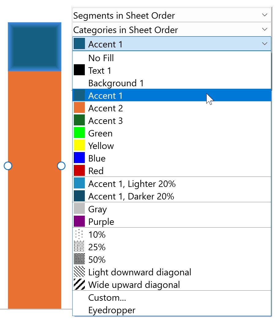
Customize the list of line styles
Customize the list of line styles that think-cell uses. Elements that specify custom lines, create line schemes, and specify line styles for various chart features will reference the list of lines (see Change the line style and weight). The line styles appear on the mini toolbar on the Line Style menu. To customize the list of lines, follow these steps:
- In the style file, find the
lnLstelement. - In the
lnLstelement, specify the lines by adding or editinglnchild elements. To learn more about thelnchild element, see the following element reference.
Create the line list: lnLst
Create the list of lines that other elements in the style file can reference. The list appears on the mini toolbar on the Line Style menu.
- In the
lnLstelement, specify line styles by adding at least onelnchild element. - In each
lnelement, specify the line weight in thewattribute and set a unique name in thenameattribute. Other elements reference lines using the line'snamevalue.
|
Child element |
Description |
Attributes |
|---|---|---|
|
|
|
Required. Specifies a unique name for the line. Required. Specifies the line weight in EMUs ( Maximum possible value: |
Specify a line style: ln
Specify the line types in the line list.
- In each
lnelement, add aprstDashchild element. - In each
prstDashchild element, specify a solid or dashed line type based on preset XML values.
|
Child element |
Description |
Attributes |
|---|---|---|
|
|
|
Required. Specifies the line type based on Office Open XML's preset line type values. Possible values:
|
The following example shows an XML code snippet displaying the lnLst child elements and how the specified line list appears on the mini toolbar.
<lnLst>
 <ln name="Solid 0.5 pt" w="6350">
  <prstDash val="solid"/>
 </ln>
 <ln name="Solid 1 pt" w="12700">
  <prstDash val="solid"/>
 </ln>
 <ln name="Solid 1.5 pt" w="19050">
  <prstDash val="solid"/>
 </ln>
 <ln name="Long Dash 0.5 pt" w="6350">
  <prstDash val="lgDash"/>
 </ln>
 <ln name="Long Dash 1 pt" w="12700">
  <prstDash val="lgDash"/>
 </ln>
 <ln name="Long Dash 1.5 pt" w="19050">
  <prstDash val="lgDash"/>
 </ln>
 <ln name="Dash 0.5 pt" w="6350">
  <prstDash val="dash"/>
 </ln>
 <ln name="Dash 1 pt" w="12700">
  <prstDash val="dash"/>
 </ln>
 <ln name="Dash 1.5 pt" w="19050">
  <prstDash val="dash"/>
 </ln>
 <ln name="Dot 0.5 pt" w="6350">
  <prstDash val="sysDot"/>
 </ln>
 <ln name="Dot 1 pt" w="12700">
  <prstDash val="sysDot"/>
 </ln>
 <ln name="Dot 1.5 pt" w="19050">
  <prstDash val="sysDot"/>
 </ln>
 <ln name="Long Dash Dot 1 pt" w="12700">
  <prstDash val="lgDashDot"/>
 </ln>
 <ln name="Dash Dot 1 pt" w="12700">
  <prstDash val="dashDot"/>
 </ln>
 <ln name="Long Dash Dot Dot 1 pt" w="12700">
  <prstDash val="lgDashDotDot"/>
 </ln>
 <ln name="Dash Dot Dot 1 pt" w="12700">
  <prstDash val="sysDashDotDot"/>
 </ln>
</lnLst>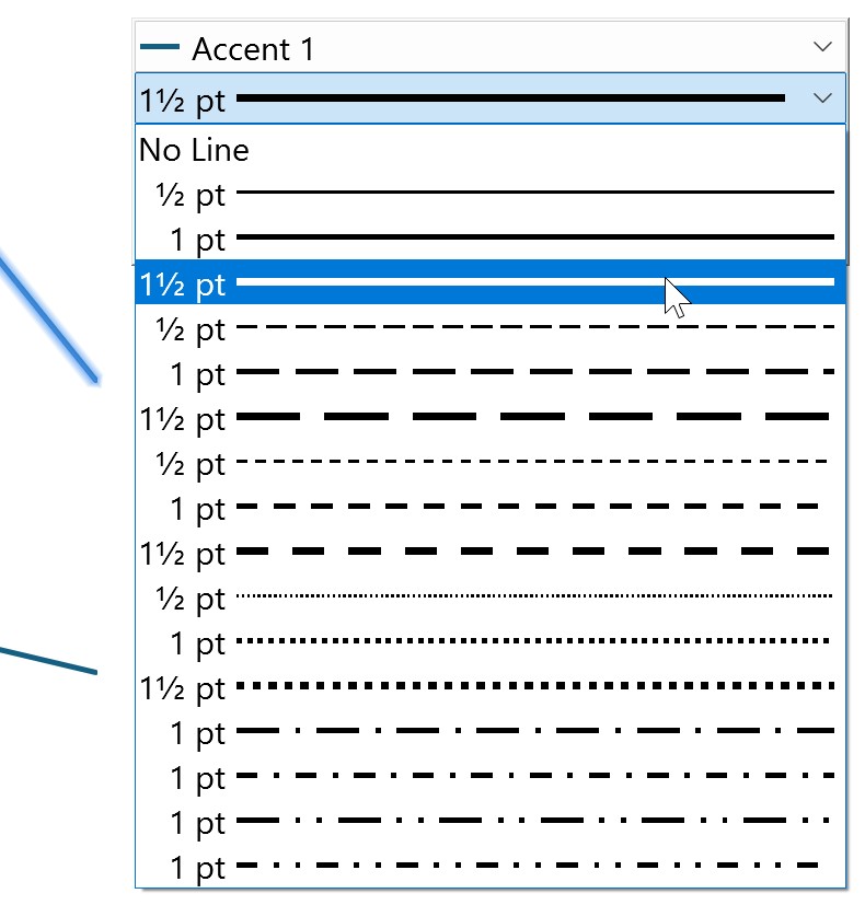
Customize the list of markers
Customize the list of markers that think-cell uses. Elements you use throughout the style file will reference the list of markers to specify default markers and create marker schemes for line, scatter, and Gantt charts (see Marker shape). The markers appear on the mini toolbar on the Marker Style menu. To customize the list of markers, follow these steps:
- In the style file, find the
markerLstelement. - In the
markerLstelement, specify the markers by adding or editingmarkerchild elements. To learn more about themarkerchild element, see the following element reference.
Create the marker list: markerLst
Create the list of markers that other elements in the style file can reference. The list appears on the mini toolbar on the Marker Style menu.
- In the
markerLstelement, specify markers by adding at least onemarkerchild element. - In each child element, set a unique name in the
nameattribute. Other elements reference markers using the marker'snamevalue.
|
Child element |
Description |
Attributes |
|---|---|---|
|
|
|
Required. Specifies a unique name for the marker. |
Specify a marker style: marker
Specify the marker styles in the marker list.
- In each
markerelement, add asymbolchild element. - In each
symbolchild element, specify a marker shape based on preset XML values.
|
Child element |
Description |
Attributes |
|---|---|---|
|
|
|
Required. Specifies the marker shape based on the Office Open XML's preset marker shape values list. Possible values:
|
The following example shows an XML code snippet displaying the markerLst child elements and how the specified marker list appears on the mini toolbar.
<markerLst>
 <marker name="Marker1">
  <symbol val="circle"/>
 </marker>
 <marker name="Marker2">
  <symbol val="triangle"/>
 </marker>
 <marker name="Marker3">
  <symbol val="diamond"/>
 </marker>
 <marker name="Marker4">
  <symbol val="square"/>
 </marker>
 <marker name="HollowMarker1">
  <symbol val="hollowCircle"/>
 </marker>
 <marker name="HollowMarker2">
  <symbol val="hollowTriangle"/>
 </marker>
 <marker name="HollowMarker3">
  <symbol val="hollowDiamond"/>
 </marker>
 <marker name="HollowMarker4">
  <symbol val="hollowSquare"/>
 </marker>
 <marker name="Marker5">
  <symbol val="star"/>
 </marker>
 <marker name="Xmark">
  <symbol val="x"/>
 </marker>
 <marker name="Dash">
  <symbol val="dash"/>
 </marker>
 <marker name="PlusSign">
  <symbol val="plus"/>
 </marker>
</markerLst>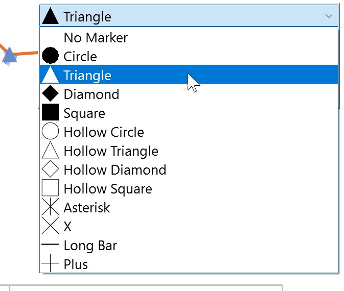
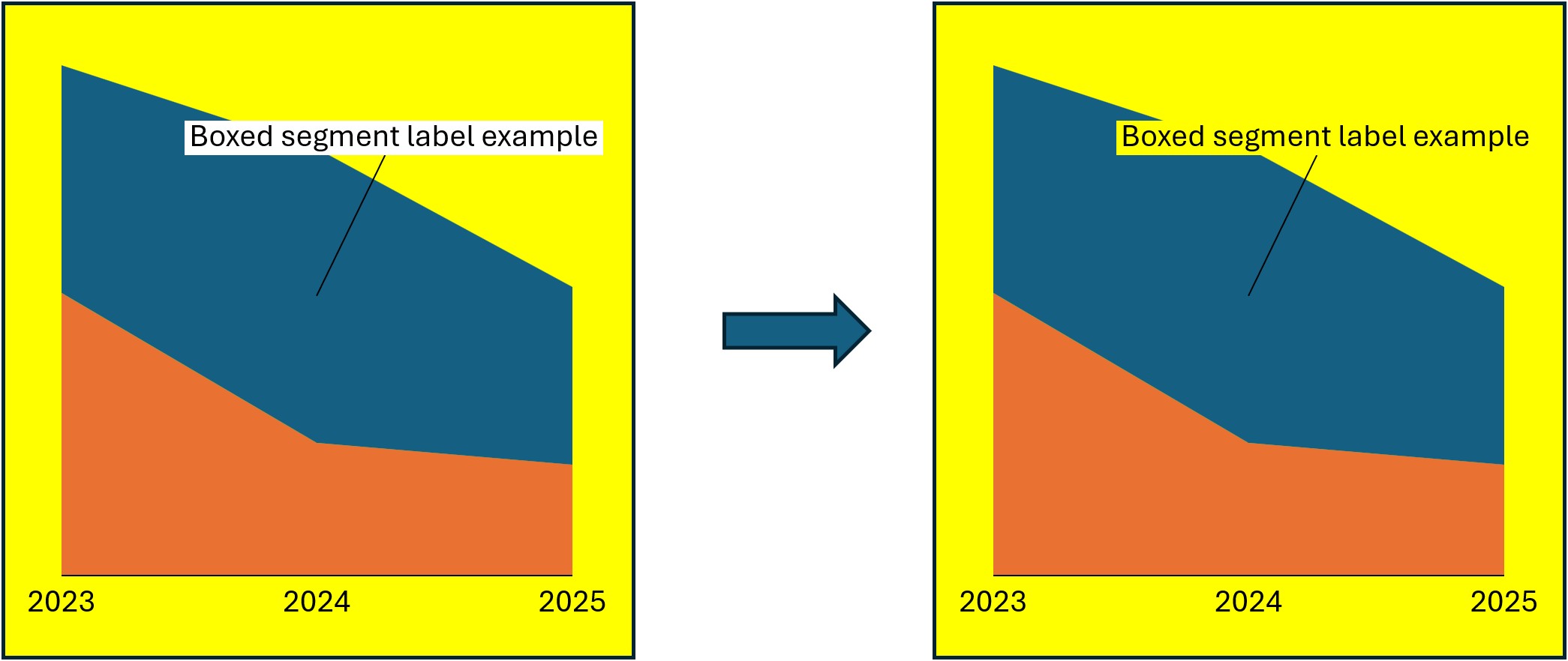
Troubleshoot background fills for axis breaks and boxed segment labels
Optional
By default, think-cell automatically adjusts the background fill of axis breaks and some boxed segment labels to match the slide's background fill. If chart features don't match the slide's background, we recommend editing the PowerPoint slide master to change the slide background fill. To change the slide background fill using the slide master, select Slide Master > Background > Background Styles > Format Background, then select the fill you want and select Apply to All. To learn more about changing the slide background fill using the slide master, see KB0129.
If you don't want to change the slide master, you can override think-cell's automatic background detection and manually specify the slide's background fill. This is typically useful in the following cases:
- The slide background fill isn't configured with the slide master's Format Background option and/or can't be changed using the slide master. As a result, the background fills of axis breaks and some boxed segment labels don't match the rest of the slide.
- Your design uses different backgrounds in different areas of the same slide. In this case, you can assign each area its own style file using the think-cell API (see Load a style file into an area of the layout: LoadStyleForRegion).
When you manually specify a custom slide background fill, we recommend that you also specify think-cell font colors using the defRPr element to ensure that the chart feature's text is legible against the custom background (see Customize the default text style by overriding slide master text style levels). To manually specify the slide background fill that think-cell will match the background fills of axis breaks and certain boxed segment labels to, follow these steps:
- In the style file, find or add the
solidfillRefBackgroundelement. - In the
solidfillRefBackgroundelement, specify the fill color that you want using thenameattribute. To learn more about thesolidfillRefBackgroundelement, see the following element reference.
Specify the background fill for axis breaks and boxed segment labels: solidfillRefBackground
Specify the fill color that think-cell will match the background fills of axis breaks and certain boxed segment labels to.
- In the style file, find or add the
solidfillRefBackgroundelement. - In the
solidfillRefBackgroundelement, specify the fill color using thenameattribute.
|
Elements |
Description |
Attributes |
|---|---|---|
|
|
|
Required. Specifies a fill color name from the list of fills in |
The following example shows an XML code snippet displaying the solidfillRefBackground element and how the specified background fill affects the appearance of axis breaks and segment labels.
<solidfillRefBackground name="Yellow" />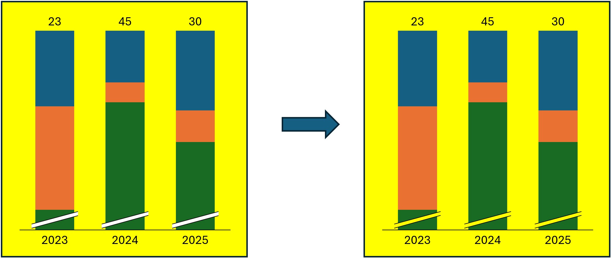
Customize the global default line style
Specify a line type and color that think-cell uses as the global default. If you don't specify a custom line style for a chart feature, think-cell will use the global default line style. If you only add an element to specify a custom line type or color, think-cell uses the value set in the global default line style for the missing element. To specify the global default line style, follow these steps:
- In the style file, find the
lnfillDefaultelement. - In the
lnfillDefaultelement, specify the default line type and color by adding or editing thelnRefandsolidfillRefchild elements. To learn more about each child element, see the following element reference.
Specify the global default line style: lnfillDefault
Specify the default line style that think-cell uses.
- In the
lnfillDefaultelement, specify the line type by adding thelnRefchild element and line color by adding thesolidfillRefchild element in the order that they appear in the table. - Throughout the style file, if an optional element specifying a custom line type or color is not present, think-cell specifies that line type or color using the
lnReforsolidfillRefspecified inlnfillDefault, respectively.
|
Child element |
Description |
Attributes |
|---|---|---|
|
|
|
Required. Specifies a name from the list of lines in |
|
|
|
Required. Specifies a name from the list of fills in |
The following example shows an XML code snippet displaying the lnfillDefault element. Using this example, if you don't specify a custom line style for an element or only specify a custom line type or color, think-cell will use the default Solid 1 pt type and Text 1 color.
<lnfillDefault>
 <lnRef name="Solid 1 pt"/>
 <solidfillRef name="tx1"/>
</lnfillDefault>Specify a custom line style
Throughout the style file, many optional elements allow you to specify a custom line style for a chart feature. These elements give you the option to customize specific line styles, using the child elements lnRef and solidfillRef to specify line type and line color, respectively. In some cases, you can also specify a chart feature with no lines at all. In such cases, specify chart elements without lines using the noLine child element, which replaces the lnRef and solidfillRef child elements. Each optional element that specifies a line style overrides the line style specified one level above that element, which is the global default line style specified in lnfillDefault, unless otherwise noted (see Customize the global default line style).
As a general rule, think-cell follows this logic of custom line styles overriding another line style with all optional elements. If line type (lnRef) or color (solidfillRef) isn't present in an optional element, think-cell uses the line type or color specified one level above that element, usually in lnfillDefault. If you omit a line style element altogether, think-cell uses the style specified one level above that element, usually in lnfillDefault. Thus, you only need to add elements that specify a custom line style if you want line type or color that is different from the respective default line style.
For example, the optional lnfillArrowCAGR element specifies a custom line style for CAGR arrows. If lnfillArrowCAGR is not present, think-cell specifies the CAGR arrow lines using the optional lnfillArrow element, which specifies the default line style for all arrows. In turn, if lnfillArrow is not present, think-cell uses the global default line style specified in lnfillDefault.
Specify a custom line style for a chart feature: lnRef, solidfillRef, and noLine
To specify a custom line style for a chart feature, in the style file, add the optional element for that chart feature. When specifying a custom line style with an optional element, note the following:
- To specify a custom line type and color, in the element, add the
lnRefchild element followed by thesolidfillRefchild element. To specify only the line type or color, add just one of the child elements. - You can specify some chart features without lines. To specify no lines for such chart features, in the element, add the
noLinechild element instead oflnRefandsolidfillRef.
|
Child element |
Description |
Attributes |
|---|---|---|
|
|
|
|
|
|
|
|
|
|
|
None |
The following examples show XML code snippets displaying line style customizations at different levels in the style file and how each customization affects the appearance of CAGR arrows.
Without a custom line style, the CAGR arrow uses the global default line style:
<lnfillDefault>
 <lnRef name="Solid 0.75 pt" />
 <solidfillRef name="tx1" />
</lnfillDefault>
If you specify a custom line style for arrows, CAGR arrows will use that line style:
<lnfillDefault>
 <lnRef name="Solid 0.75 pt" />
 <solidfillRef name="tx1" />
</lnfillDefault>
...
<lnfillArrow>
 <lnRef name="Solid 2.25 pt" />
 <solidfillRef name="Blue" />
</lnfillArrow>
If you specify a custom line color for CAGR arrows, that color will override the line color specified one level above it in lnfillArrow but think-cell will use the line type specified in lnfillArrow for CAGR arrows:
<lnfillDefault>
 <lnRef name="Solid 0.75 pt" />
 <solidfillRef name="tx1" />
</lnfillDefault>
...
<lnfillArrow>
 <lnRef name="Solid 2.25 pt" />
 <solidfillRef name="Blue" />
</lnfillArrow>
<lnfillArrowCAGR>
 <solidfillRef name="Orange" />
</lnfillArrowCAGR>
Customize the default gridline style
Optional
Specify a default line style for gridlines. To customize a default gridline style, follow these steps:
- In the style file, find or add the
lnfillGridlineelement. ThelnfillGridlineelement must be located immediately after thelnfillDefaultelement. - In the
lnfillGridlineelement, specify the line type by adding thelnRefchild element and/or line color by adding thesolidfillRefchild element. To learn more about each child element, see the following element reference.
Specify a default gridline style: lnfillGridline
Specify a custom line style for gridlines. Set a default gridline type, color, or both.
- In the
lnfillGridlineelement, specify the line type by adding thelnRefchild element and/or line color by adding thesolidfillRefchild element in the order that they appear in the table (see Specify a custom line style). - If
lnReforsolidfillRefis not present, think-cell uses the value inlnfillDefaultfor the missing element.
|
Child element |
Description |
Attributes |
|---|---|---|
|
|
|
Required. Specifies a name from the list of lines in |
|
|
|
Required. Specifies a name from the list of fills in |
The following example shows an XML code snippet displaying the lnfillGridline element and how it customizes the default appearance of axis gridlines in a chart.
<lnfillGridline>
 <lnRef name="Solid 0.5 pt" />
 <solidfillRef name="Red"/>
</lnfillGridline>
Customize the list of arrow label and Gantt timeline shapes
Customize the list of arrow label and Gantt timeline shapes that think-cell uses. Elements you use throughout the style file will reference the list of shapes to specify default styles for difference and CAGR arrow labels and the list of Gantt chart timeline shapes (see Chart annotations and Timeline items). The markers appear on the Gantt chart mini toolbar on the Shape Style menu. To customize the list of shape styles, follow these steps:
- In the style file, find the
shapestyleLstelement. - In the
shapestyleLstelement, specify the shapes by adding or editingshapestylechild elements. To learn more about theshapestylechild element, see the following element reference.
Create the shape list: shapestyleLst
Create the list of shapes that other elements in the style file can reference. The list appears on the mini toolbar on the Shape Style menu.
- In the
shapestyleLstelement, specify shapes by adding one or moreshapestylechild elements. - In each child element, set a unique name in the
nameattribute. Other elements reference shapes using the shape'snamevalue.
|
Child element |
Description |
Attributes |
|---|---|---|
|
|
|
Required. Specifies a unique name for the shape style. |
Specify a shape style: shapestyle
Specify the shape styles in the shape list.
- In each
shapestyleelement, add afillRefchild element and an optionallnfillchild element. - In each
fillRefchild element, specify a shape's background fill in thenameattribute. - In each
lnfillchild element, specify a shape's outline by adding the child elements described in the table.
|
Child element |
Description |
Attributes |
|---|---|---|
|
|
|
Required. Specifies a name from the list of fills in |
|
|
|
None |
The following example shows an XML code snippet displaying the shapestyleLst child elements and how the specified shape list appears on the mini toolbar.
<shapestyleLst>
 <shapestyle name="Completed">
  <fillRef name="Green" />
 </shapestyle>
 <shapestyle name="In Progress">
  <fillRef name="Blue" />
  <lnfill>
   <lnRef name="Dash 0.5 pt" />
  </lnfill>
 </shapestyle>
 <shapestyle name="Backlog">
  <fillRef name="Gray" />
  <lnfill>
   <lnRef name="Dash 0.5 pt" />
  </lnfill>
 </shapestyle>
</shapestyleLst>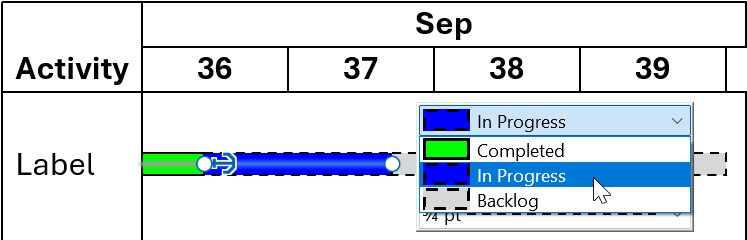
Customize charts
Contents
- Customize the lists of fill, line, and marker schemes
- Customize the default chart schemes
- Customize the default text style
- Create preset layouts for chart placement
- Customize the default label styles
- Customize the default line and label styles for chart annotations
- Customize the default legend styles
Customize the lists of fill, line, and marker schemes
Create schemes of fills, lines, and markers that think-cell uses for charts. You can create any number of schemes. You can only reference the fills, lines, and markers listed in fillLst, lnLst, and markerLst elements in the schemes (see Customize available style options).
Customize the list of fill schemes
Customize the list of fill schemes that think-cell uses (see Chart fill scheme). Elements throughout the style file reference this list to specify default schemes for think-cell charts. The schemes appear on the mini toolbar on the Fill Scheme menu. To learn how to specify the default fill scheme for each applicable chart type, see Customize the default chart schemes. To customize the list of fill schemes, follow these steps:
- In the style file, find or add the
fillSchemeLstelement. - In the
fillSchemeLstelement, create fill schemes by addingfillSchemechild elements. - In each
fillSchemeelement, add child elements as needed. To learn more about each child element, see the following element reference. - To add divider lines that separate sets of schemes on the Fill Scheme menu, in the
fillSchemeLstelement, add theseparatorchild element.
Create the fill scheme list: fillSchemeLst
Create the list of fill schemes that other elements in the style file can reference. The list appears on the mini toolbar on the Fill Scheme menu.
- In the
fillSchemeLstelement, specify schemes by addingfillSchemechild elements. - In the
fillSchemeLstelement, add divider lines that separate sets of schemes in the Fill Scheme menu by adding theseparatorchild element. - In each
fillSchemechild element, set a unique name in thenameattribute. Other elements reference fill schemes using the scheme'snamevalue.
|
Child element |
Description |
Attributes |
|---|---|---|
|
|
|
Required. Specifies a unique name for the fill scheme. Required. Specifies the fill scheme used for Other Series. To learn more, see Other series. Optional. Specifies what happens when there are more series in the chart than there are fills in the fill scheme. If not present, the sequence of fills will repeat. Possible values:
|
|
|
|
Specify a fill scheme: fillScheme
Specify the fill schemes in the fill scheme list. Add child elements in the order that they appear in the table.
- If you want to specify outline styles for chart segments, in the
fillSchemeelement, add thelnfillSegmentandlnfillSegmentMekkochild elements. - In the
fillSchemeelement, specify the fills in the scheme by addingfillRefchild elements. - If you want to specify fill schemes for charts with a specific number of series, in the
fillSchemeelement, addseriesCountSpecificchild elements.
|
Child element |
Description |
Attributes |
|---|---|---|
|
|
|
None |
|
|
|
None |
|
|
|
Required. Specifies a name from the list of fills in |
|
|
|
Required. Specifies how many series a chart should have for Possible values: A number, such as Optional. Specifies what happens when there are more series in the chart than there are fills in the fill scheme. If not present, the sequence of fills will repeat. Possible values:
|
The following example shows an XML code snippet displaying the fillSchemeLst child elements and how the specified schemes appear on the mini toolbar.
<fillSchemeLst>
 <fillScheme name="PowerPoint Theme" fillRefOtherSeries="Gray">
  <lnfillSegment>
   <noLine />
  </lnfillSegment>
  <lnfillSegmentMekko>
   <lnRef name="Solid 1 pt" />
   <solidfillRef name="tx1" />
  </lnfillSegmentMekko>
   <fillRef name="accent1" />
   <fillRef name="accent2" />
   <fillRef name="accent3" />
 </fillScheme>
 <fillScheme name="Gray" fillRefOtherSeries="PowerPoint Theme">
   <fillRef name="Gray" />
 </fillScheme>
 <fillScheme name="Patterns" fillRefOtherSeries="50%">
  <lnfillSegmentMekko>
   <lnRef name="Solid 1.5 pt" />
  </lnfillSegmentMekko>
   <fillRef name="bg1" />
   <fillRef name="10%" />
   <fillRef name="Light downward diagonal" />
   <fillRef name="Wide upward diagonal" />
  <seriesCountSpecific seriesCount="1">
	 <fillRef name="25%" />
  </seriesCountSpecific>
 </fillScheme>
</fillSchemeLst>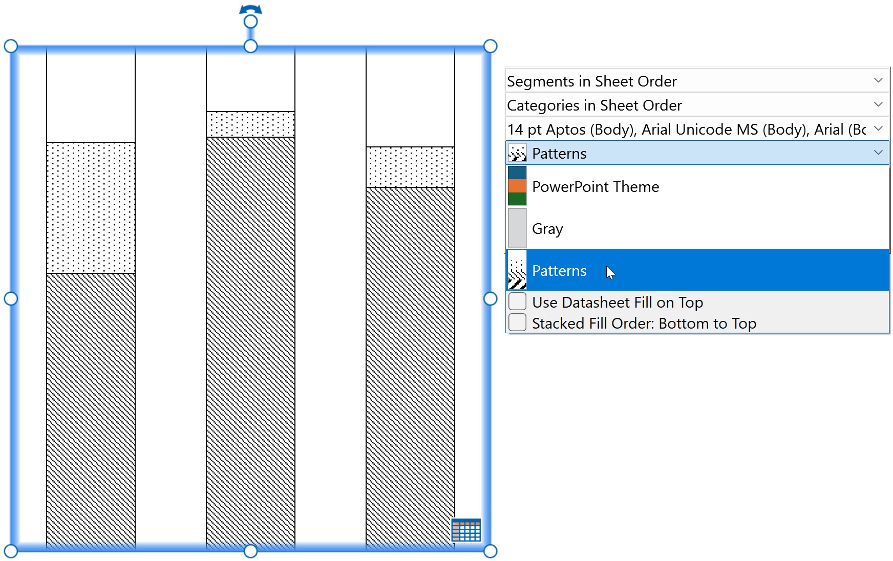
Customize the list of line schemes
Customize the list of line schemes that think-cell uses. Elements throughout the style file reference this list to specify default schemes for think-cell line charts. The schemes appear on the mini toolbar on the Line Scheme menu (see Line scheme). To learn how to specify default line schemes for line charts, see Customize the default chart schemes. To customize the list of line schemes, follow these steps:
- In the style file, find or add the
lnfillmarkerSchemeLstelement. - In the
lnfillmarkerSchemeLstelement, create line schemes by addinglnfillmarkerSchemechild elements. - In each
lnfillmarkerSchemeelement, add child elements as needed. To learn more about each child element, see the following element reference. - To add divider lines that separate sets of schemes on the Line Scheme menu, in the
lnfillmarkerSchemeLstelement, add theseparatorchild element.
Create the line scheme list: lnfillmarkerSchemeLst
Create the list of line schemes that other elements in the style file can reference. The list appears on the mini toolbar on the Line Scheme menu.
- In the
lnfillmarkerSchemeLstelement, specify schemes by addinglnfillmarkerSchemechild elements. - In the
fillSchemeLstelement, add divider lines that separate sets of schemes on the Line Scheme menu by adding theseparatorchild element. - In each
lnfillmarkerSchemechild element, set a unique name in thenameattribute. Other elements reference line schemes using the scheme'snamevalue.
|
Child element |
Description |
Attributes |
|---|---|---|
|
|
|
Required. Specifies a unique name for the line scheme. |
|
|
|
Specify a line scheme: lnfillmarkerScheme
Specify the line schemes in the line scheme list. Add child elements in the order that they appear in the table.
- In the
lnfillmarkerSchemeelement, specify the lines in the scheme by addinglnfillmarkerchild elements. - If you want to specify line schemes for charts with a specific number of series, in the
lnfillmarkerSchemeelement, addseriesCountSpecificchild elements.
|
Child element |
Description |
Attributes |
|---|---|---|
|
|
|
None |
|
|
|
Required. Specifies how many series a chart should have for Possible values: A number, such as Optional. Specifies what happens when there are more series in the chart than there are lines in the line scheme. If not present, the sequence of lines will repeat. Possible values:
|
Specify custom line and marker styles: lnfillmarker
Specify the line and marker styles in each line scheme.
- In each
lnfillmarkerelement, specify a custom line style by adding any of the following child elements in the order that they appear in the table. - If no child elements are present,
lnfillmarkeruses the global default line style specified inlnfillDefault. (see Specify a custom line style).
|
Child element |
Description |
Attributes |
|---|---|---|
|
|
|
Required. Specifies a name from the list of lines in |
|
|
|
Required. Specifies a fill color name from the list of fills in |
|
|
|
Required. Specifies a name from the list of markers in |
The following example shows an XML code snippet displaying the lnfillmarkerSchemeLst child elements and how the specified schemes appear on the mini toolbar.
<lnfillmarkerSchemeLst>
	<lnfillmarkerScheme name="Dash with Markers">
		<lnfillmarker>
			<lnRef name="Long Dash 1.5 pt"/>
			<solidfillRef name="tx1"/>
			<markerRef name="Square"/>
		</lnfillmarker>
		<lnfillmarker>
			<lnRef name="Dash 1.5 pt"/>
			<solidfillRef name="Blue"/>
			<markerRef name="Circle"/>
		</lnfillmarker>
		<lnfillmarker>
			<lnRef name="Long Dash 2.25 pt"/>
			<solidfillRef name="Red"/>
			<markerRef name="Triangle"/>
		</lnfillmarker>
	</lnfillmarkerScheme>
	<lnfillmarkerScheme name="Solid without Markers">
		<lnfillmarker>
			<lnRef name="Solid 1.5 pt" />
		</lnfillmarker>
		<lnfillmarker>
			<lnRef name="Solid 2.25 pt"/>
			<solidfillRef name="Gray"/>
		</lnfillmarker>
	</lnfillmarkerScheme>
</lnfillmarkerSchemeLst>
Customize the list of marker schemes
Customize the list of marker schemes that scatter charts use. The schemes appear on the mini toolbar on the Marker Scheme menu (see Marker scheme). To learn how to specify the default marker scheme for scatter charts, see Customize the default chart schemes. To customize the list of marker schemes, follow these steps:
- In the style file, find or add the
fillmarkerSchemeLstelement. - In the
fillmarkerSchemeLstelement, create marker schemes by addingfillmarkerSchemechild elements. - In each
fillmarkerSchemeelement, add child elements as needed. To learn more about each child element, see the following element reference. - To add divider lines that separate sets of schemes on the Marker Scheme menu, in the
fillmarkerSchemeLstelement, add theseparatorchild element.
Create the marker scheme list: fillmarkerSchemeLst
Create the list of marker schemes that scatter charts use. The list appears on the mini toolbar on the Marker Scheme menu.
- In the
fillmarkerSchemeLstelement, specify schemes by addingfillmarkerSchemechild elements. - In the
fillmarkerSchemeLstelement, add divider lines that separate sets of schemes on the Marker Scheme menu by adding theseparatorchild element. - In each
fillmarkerSchemechild element, set a unique name in thenameattribute. Other elements reference marker schemes using the scheme'snamevalue.
|
Child element |
Description |
Attributes |
|---|---|---|
|
|
|
Required. Specifies a unique name for the marker scheme. |
|
|
|
Specify a marker scheme: fillmarkerScheme
Specify the marker schemes in the marker scheme list. Add child elements in the order that they appear in the table.
- If you want a marker scheme to use the data label to indicate positions of values without a marker, in the
fillmarkerSchemeelement, add thenoMarkerchild element. - In the
fillmarkerSchemeelement, specify the markers in the scheme by addingfillmarkerchild elements. - If you want to specify marker schemes for charts with a specific number of series, in the
fillmarkerSchemeelement, addseriesCountSpecificchild elements.
|
Child element |
Description |
Attributes |
|---|---|---|
|
|
|
None |
|
|
|
None |
|
|
|
Required. Specifies how many series a chart should have for Possible values: A number, such as |
Specify marker styles: fillmarker
Specify the marker styles in each marker scheme.
- In each
fillmarkerelement, specify a custom marker style by adding the following child elements in the order that they appear in the table.
|
Child elements |
Description |
Attributes |
|---|---|---|
|
|
|
Required. Specifies a name from the list of markers in |
|
|
|
Required. Specifies a fill color name from the list of fills in |
The following example shows an XML code snippet displaying the fillmarkerSchemeLst child elements and how the specified schemes appear on the mini toolbar.
<fillmarkerSchemeLst>
 <fillmarkerScheme name="No Markers">
  <noMarker/>
 </fillmarkerScheme>
 <fillmarkerScheme name="Shapes">
  <fillmarker>
   <markerRef name="Square" />
   <solidfillRef name="Red" />
  </fillmarker>
  <fillmarker>
   <markerRef name="Circle" />
   <solidfillRef name="Green" />
  </fillmarker>
  <fillmarker>
   <markerRef name="Dash" />
   <solidfillRef name="Blue" />
  </fillmarker>
 </fillmarkerScheme>
</fillmarkerSchemeLst>
Customize the default chart schemes
Customize the default fill, line, and marker schemes that think-cell charts use (see Introduction to charts). To customize default chart schemes, follow these steps:
- In the style file, specify the default fill scheme for column and bar, combination, waterfall, Mekko, area, pie, doughnut, and bubble charts by adding the
fillSchemeRefDefaultelement. - If you want to specify a default fill scheme for a specific chart type individually, add the relevant element for that chart type after the
fillSchemeRefDefaultelement. To learn more about elements that specify default fill schemes for specific chart types, see the following element reference. - After specifying your default fill schemes, specify the default line and marker schemes by adding the
lnfillmarkerSchemeRefDefaultandfillmarkerSchemeRefDefaultelements.
Specify the default chart schemes: fillSchemeRefDefault, lnfillmarkerSchemeRefDefault, and fillmarkerSchemeRefDefault
Specify the default fill, line, and marker schemes that think-cell charts use. Add the elements in the order that they appear in the table.
- After the
fillmarkerSchemeLstelement, specify the default fill scheme for column and bar, combination, waterfall, Mekko, area, pie, doughnut, and bubble charts by adding thefillSchemeRefDefaultelement. - To specify the default fill scheme for a chart type individually, add the relevant element for that chart type after the
fillSchemeRefDefaultelement. See the following table for elements that specify a default fill scheme for a specific chart type.- If you specify a default fill scheme for each chart type individually, you can omit the
fillSchemeRefDefaultelement.
- If you specify a default fill scheme for each chart type individually, you can omit the
- After specifying default fill schemes, specify the default line and marker schemes by adding the
lnfillmarkerSchemeRefDefaultandfillmarkerSchemeRefDefaultelements.
|
Elements |
Description |
Attributes |
|---|---|---|
|
|
|
Required. Specifies a name from the list of fill schemes in |
|
|
|
|
|
|
|
|
|
|
|
|
|
|
|
|
|
|
|
|
|
|
|
|
|
|
|
|
|
|
|
Required. Specifies a name from the list of line schemes in |
|
|
|
|
|
|
|
Required. Specifies a name from the list of marker schemes in |
The following example shows an XML code snippet displaying various default scheme customizations.
<fillSchemeRefDefault name="PowerPoint Theme" />
<fillSchemeRefDefaultPie name="Gray" />
<lnfillmarkerSchemeRefDefault name="Dash with Markers" />
<lnfillmarkerSchemeRefDefaultCombination name="Solid without Markers" />
<fillmarkerSchemeRefDefault name="Shapes" />Customize the default text style
Optional
By default, think-cell selects one of the top three text style levels in your presentation's slide master as the default text style for think-cell elements. When selecting the text style this way, if the font size in the text style level is bigger than 14 pt, think-cell uses 14 pt font size. We recommend using the default think-cell font selection, as it provides more flexibility when there is a change in the master slide design. If think-cell's default font selection doesn't work for your brand identity, you can specify which slide master text style level think-cell uses by adding the defPPr element. If you specify the default text style level using the defPPr element, the font size has no restrictions.
For information on slide masters, see Microsoft Support. To specify the default text style level, follow these steps:
- In the style file, find or add the
defPPrelement. - In the
defPPrelement, specify the text style level you want using thelvlattribute. To learn more about thedefPPrelement and possiblelvlvalues, see the following element reference.
If you want to specify a custom default text style that overrides the slide master's text style levels, add the optional defRPr child element, then specify the custom text properties you want using the defRPr attributes and child elements. To learn more, see Customize the default text style by overriding slide master text style levels.
Specify the default text style level: defPPr
Specify which slide master text style level think-cell uses as the default text style for think-cell elements. If the defPPr element is not present, think-cell automatically selects one of the top three text style levels in your presentation's slide master as the default text style.
- In the
defPPrelement, specify the slide master text style level that think-cell uses in thelvlattribute.
|
Elements |
Description |
Attributes |
|---|---|---|
|
|
|
Required. Specifies the text style level. Possible values: Any number between |
The following example shows an XML code snippet displaying the defPPr element and how the specified text style appears in the slide master and charts.
<defPPr lvl="1" />

Customize the default text style by overriding slide master text style levels
Optional
If you don't want to use a presentation's slide master to determine the text style, you can manually specify text properties for think-cell by adding the defRPr child element to the defPPr element. To customize the default text properties by overriding the slide master, follow these steps:
- In the style file, find or add the
defPPrelement. - In the
defPPrelement, manually specify the default text properties by adding or editing thedefRPrchild element and its attributes. To learn more about thedefRPrelement, see the following element reference.
Specify the default text properties by overriding the slide master: defRPr
Manually customize your default text properties by overriding the slide master. If defRPr is not present, think-cell specifies the text style using the slide master text style level set in the lvl attribute of the defPPr element. If the defPPr element is not present, think-cell automatically chooses the text style based on the presentation's slide master.
- In the
defPPrelement, add thedefRPrchild element. - In the
defRPrchild element, specify the font size in the optionalszattribute and specify bold and italic font in the optionalbandiattributes, respectively. - If a
defRPrattribute is not present, think-cell uses the style of the slide master text style level set in thelvlattribute of thedefPPrelement in place of the missing attribute.
|
Child element |
Description |
Attributes |
|---|---|---|
|
|
|
Optional. Specifies the font size. Possible values: Any number between Optional. Enables or disables bold fonts. If not present, think-cell uses the Possible values:
Optional. Enables or disables italic font style. If not present, think-cell uses the Possible values:
|
Manually specify the text style: defRPr child elements
Specify a custom text color and alternative color for darker backgrounds. Set a default font for Latin, East Asian, and Complex Script texts.
- In the
defRPrelement, specify the text color, alternative color, and font styles by adding any of the following child elements in the order that they appear in the table. - If a
defRPrchild element is not present, think-cell uses the style of the slide master text style level set in thelvlattribute of thedefPPrelement in place of the missing child element.
|
Child element |
Description |
Attributes |
|---|---|---|
|
|
|
Required. Specifies a name from the list of fills in |
|
|
|
Required. Specifies a name from the list of fills in |
|
|
|
Required. Specifies a font. |
|
|
|
Required. Specifies a font. |
|
|
|
Required. Specifies a font. |
The following examples show XML code snippets displaying the defRPr child elements and how the specified text styles appear in the charts.
Slide master text style levels
Specifying a custom font
<defPPr lvl="1">
 <defRPr b="true" i="false">
  <latin typeface="Times New Roman" />
 </defRPr>
</defPPr>
Specifying custom font colors
<defPPr lvl="1">
 <defRPr b="true" i="false">
  <solidfillRef name="Red" />
  <solidfillRefAlt name="Gray" />
  <latin typeface="Times New Roman" />
 </defRPr>
</defPPr>
Create preset layouts for chart placement
Optional
Create preset layouts that specify chart positions on the slide (see Insert charts). With preset layouts, when you select a think-cell chart to insert into your presentation, the chart placement tool opens on the upper left of the slide pane. To create preset layouts, follow these steps:
- In your style file, find or add the
fixedLayoutLstelement. - In the
fixedLayoutLstelement, addfixedLayoutchild elements as needed. To learn more about both elements, see the following element reference.
Create the list of preset layouts for think-cell charts: fixedLayoutLst
Create preset layouts that specify chart positions on the slide.
- In the style file, find or add the
fixedLayoutLstelement.
- In the
fixedLayoutLstelement, specify layouts by adding one or morefixedLayoutchild elements. - In each
fixedLayoutchild element, specify which chart types the layout applies to using theforattribute.- In the
forattribute, to specify pie and doughnut charts, use thepievalue. To specify Gantt charts, use theganttvalue. To specify all other charts, use thechartvalue. - You can specify multiple values in the
forattribute, separated by an empty space. For example, to specify Gantt, pie, and doughnut charts, add<fixedLayout for="gantt pie">.
- In the
|
Child element |
Description |
Attributes |
|---|---|---|
|
|
|
Required. Specifies which chart type the layout applies to. You can specify multiple values in the Possible values:
|
Specify a layout position: rect
Specify positions on the slide for preset layouts.
- In each
fixedlayoutelement, add one or morerectchild elements. - In each
rectchild element, specify chart placement position for the layout using thel,t,r, andbattributes.- As the value of each attribute, you can specify a relative position as a percentage, or an absolute position in EMUs, or a combination of both.
- To specify a combination of relative and absolute positions as the value, add a percentage, followed by a plus sign (
+) or a minus sign (-), followed by an EMU value. For example,r="50%",t="2000000", andb="100%-1000000"are all valid options. - Each attribute value is calculated as a position relative to the upper-left corner of a slide.
|
Child element |
Description |
Attributes |
|---|---|---|
|
|
|
Required. Specifies the left, top, right, and bottom edges of the slide, respectively. Attribute values are calculated as a position relative to the upper-left corner of a slide. Possible values:
|
The following examples show XML code snippets displaying various fixedLayoutLst child elements and how they specify the chart placement tool and the preset layouts for pie and Gantt charts.
<fixedLayoutLst>
 <fixedLayout for="pie">
  <rect l="50%-2000000" t="66.67%-2000000" r="50%+2000000" b="66.67%+2000000"/>
</fixedLayoutLst>
<fixedLayoutLst>
 <fixedLayout for="pie">
  <rect l="50%-2000000" t="66.67%-2000000" r="50%+2000000" b="66.67%+2000000"/>
 </fixedLayout>
 <fixedLayout for="chart pie">
  <rect l="10%" t="30%" r="45%" b="90%"/>
  <rect l="55%" t="30%" r="90%" b="90%"/>
 </fixedLayout>
</fixedLayoutLst>
<fixedLayoutLst>
 <fixedLayout for="gantt">
	<rect l="1000000" t="2000000" r="100%-1000000" b="100%-1000000"/>
 </fixedLayout>
</fixedLayoutLst>
Customize the default label styles
Customize the default styles that think-cell labels use. You can customize label styles of various think-cell chart features, including leader lines, styles for CAGR labels, and the positions of labels in charts. To learn more about think-cell labels, see Chart labels. To customize label properties, follow these steps:
- In the style file, find or add the
labelelement. - In the
labelelement, add child elements as needed. To learn more about each child element, see the following element reference.
Specify label styles: label
Specify the label styles of various think-cell chart features, including leader lines, styles for CAGR labels, and the positions of labels in charts.
- In the
labelelement, add the following child elements in the order that they appear in the table.
|
Child element |
Description |
Attributes |
|---|---|---|
|
|
|
None |
|
|
|
Required. Specifies a name from the list of shape styles in |
|
|
|
Required. Specifies the position of total labels. Possible values:
|
|
|
|
Required. Specifies the segment label's position. Possible values:
|
The following examples show XML code snippets for each label child element and how they customize the default appearance of labels.
Leader lines
<label>
 ...
 <lnfillLeaderLine>
  <lnRef name="Solid 1 pt" />
  <solidfillRef name="Red" />
 </lnfillLeaderLine>
 ...
</label>
Chart decoration shapes
<label>
 ...
	<shapestyleRefBubble name="Red Bubble" />
 ...
</label>
Waterfall chart label position
<label>
 ...
  <sumLabelPosition val="awayFromBaseline" />
 ...
</label>
Segment label position
<label>
 ...
 <avoidSegmentLabelBoxing val="true" />
 ...
</label>
Customize the default line and label styles for chart annotations
Customize the default styles for various lines in think-cell chart annotations, such as chart axes and connector lines (see Chart features and Change the line style and weight). Specify which labels appear in think-cell charts. To customize styles for chart annotation lines and labels, follow these steps:
- In the style file, find or add the
chartelement.
- In the
chartelement, add child elements as needed. To learn more about each child element, see the following element reference.
Specify line styles for chart annotations: chart
Specify the line styles of various think-cell chart features, such as chart axes, connector lines, and CAGR arrows.
- In the
chartelement, add the following child elements in the order that they appear in the table.
|
Child element |
Description |
Attributes |
|---|---|---|
|
|
|
None |
|
|
|
|
|
|
|
|
|
|
|
|
|
|
|
|
|
|
|
|
|
|
|
|
|
|
|
|
|
|
|
|
|
|
|
|
|
|
|
|
|
|
|
|
|
|
|
|
|
|
|
|
|
|
|
Required. Specifies the fill scheme order. Possible values:
|
|
|
|
Required. Specifies the fill scheme order. Possible values:
|
|
|
|
None |
Specify the default chart labels: defaultLabels
Specify which labels appear in think-cell charts.
- In the
defaultLabelselement, add the following child elements in the order that they appear in the table. To learn more about think-cell chart labels, see Label types.
|
Child element |
Description |
Attributes |
|---|---|---|
|
|
|
Required. Specifies which labels appear in the chart. Possible values:
|
|
|
|
Required. Specifies where the labels appear in the chart. Possible values:
|
|
|
|
Required. Specifies where the labels appear in the chart. Possible values:
|
|
|
|
Required. Specifies where the labels appear in the chart. Possible values:
|
The following example shows an XML code snippet displaying various default line style and label customizations.
<chart>
 <lnfillAxis>
  <solidfillRef name="Gray" />
 </lnfillAxis>
 <lnfillArrow>
  <lnRef name="Solid 1.5 pt"/>
 </lnfillArrow>
 <lnfillArrowCAGR>
  <lnRef name="Solid 2.25 pt" />
  <solidfillRef name="Red" />
 </lnfillArrowCAGR>
 <lnfillArrowCategoryDifference>
  <lnRef name="Solid 1 pt"/>
  <solidfillRef name="Blue" />
 </lnfillArrowCategoryDifference>
 <lnfillExtensionLine>
  <lnRef name="Solid 0.5 pt"/>
  <solidfillRef name="Green" />
 </lnfillExtensionLine>
 <lnfillConnector>
  <lnRef name="Long Dash 0.25 pt"/>
 </lnfillConnector>
 <lnfillValueLine>
  <lnRef name="Long Dash 0.75 pt"/>
 </lnfillValueLine>
 <fillOrderStacked val="topToBottom"/>
 <defaultLabels>
  <segment val="totalAndSegment"/>
  <segmentWaterfallSummand val="totalAndSegmentSingleSegmentInside"/>
  <pieSlice val="outerAndInner"/>
 </defaultLabels>
</chart>
Customize the default legend styles
Optional
Customize the default text and outline style for think-cell chart legends. To learn more about think-cell chart legends, see Legends. To customize the default styles for legends, follow these steps:
- In the style file, find or add the
legendelement.
- In the
legendelement, add child elements as needed. To learn more about each child element, see the following element reference.
Specify the default legend styles: legend
Specify an outline style as the default for think-cell chart legends and customize the legend text style.
- In the
legendelement, add the following child elements in the order that they appear in the table.
|
Child element |
Description |
Attributes |
|---|---|---|
|
|
|
None |
|
|
|
Optional. Specifies the text style level. If not present, think-cell uses the Possible values: Any number between |
The following example shows an XML code snippet displaying legend child elements and how they customize the appearance of chart legends.
<legend>
 <lnfill>
  <lnRef name="Solid 1 pt" />
  <solidfillRef name="Red" />
 </lnfill>
 <pPr lvl="2">
  <defRPr b="false" i="true">
   <latin typeface="Times New Roman" />
  </defRPr>
 </pPr>
</legend>
Customize Harvey balls and checkboxes
Specify the default styles for think-cell Harvey balls and checkboxes (see Harvey balls and checkboxes).
Customize the default Harvey ball styles
To customize the default styles for Harvey balls, follow these steps:
- In the style file, find or add the
harveyballelement. - Specify the default checkbox size using the
szattribute of theharveyballelement. - In the
harveyballelement, add child elements as needed. To learn more about each child element, see the following element reference.
Customize Harvey balls: harveyball
Specify the default styles for Harvey balls.
- In the style file, find or add the
harveyballelement. - In the
harveyballelement, specify the default Harvey ball size using theszattribute.
|
Element |
Description |
Attributes |
|---|---|---|
|
|
|
Required. Specifies the default size of the Harvey ball to one hundredth of a point ( Possible values: Any number between |
Specify the default Harvey ball styles: fillRefCompleted, fillRefBackground, and lnfill
In the harveyball element, add the following child elements in the order that they appear in the table.
- To specify the fills for the filled and empty Harvey ball sections, add the
fillRefCompletedandfillRefBackgroundchild elements, respectively. - To specify an outline style for Harvey balls, add the optional
lnfillchild element.
|
Child element |
Description |
Attributes |
|---|---|---|
|
|
|
Required. Specifies a name from the list of fills in |
|
|
|
Required. Specifies a name from the list of fills in |
|
|
|
None |
The following example shows an XML code snippet displaying the harveyball child elements and how they customize the appearance of Harvey balls.
<harveyball sz="3400">
 <fillRefCompleted name="Blue" />
 <fillRefBackground name="Gray" />
 <lnfill>
  <lnRef name="Solid 0.75 pt" />
  <solidfillRef name="tx1" />
 </lnfill>
</harveyball>
Customize the default checkbox styles
Specify the default styles that apply to think-cell checkboxes. To set a default style for checkboxes, follow these steps:
- In the style file, find or add the
checkboxelement. - Specify the default checkbox size using the
szattribute of thecheckboxelement. - In the
checkboxelement, add child elements as needed. To learn more about each child element, see the following element reference.
Customize checkboxes: checkbox
Specify the default styles for Harvey balls.
- In the style file, find or add the
checkboxelement. - In the
checkboxelement, specify the default checkbox size using theszattribute.
|
Element |
Description |
Attributes |
|---|---|---|
|
|
|
Required. Specifies the default size of a checkbox to one hundredth of a point ( Possible values: Any number between |
Specify the default checkbox styles: fillRef, lnfill, and choices
In the checkbox element, add the following child elements in the order that they appear in the table.
- To specify the checkbox background fill, add the
fillRefchild element. - To specify an outline style for checkboxes, add the optional
lnfillchild element. - To specify groups of checkbox symbols, add at least one
choiceschild element.
|
Child element |
Description |
Attributes |
|---|---|---|
|
|
|
Required. Specifies a name from the list of fills in |
|
|
|
None |
|
|
|
None |
Specify a group of checkbox symbols: choices
Specify a group of symbols, characters, and pictures that can appear as checkbox symbols. You can have different groups of checkbox symbols that you can cycle through by specifying multiple choices elements (see Checkboxes).
- In each
choiceselement, specify symbols or characters as checkbox symbols by addingglyphchild elements and specify images as checkbox symbols by addingpicchild elements. - Each
choiceselement requires at least oneglyphorpicchild element.
|
Child element |
Description |
Attributes |
|---|---|---|
|
|
|
Optional. Specifies keyboard shortcuts that select a checkbox symbol. If not present, you can select checkbox symbols using the mini toolbar, in the Checkbox Symbol menu. Possible values: Required. Specifies the default size of the checkbox symbol to one hundredth of a point ( Possible values: Any number between |
|
|
|
Optional. Specifies keyboard shortcuts that select a checkbox symbol. If not present, you can select checkbox symbols using the mini toolbar, in the Checkbox Symbol menu. Possible values: |
Specify a symbol or character as a checkbox symbol: glyph
In each glyph element, add the following child elements in the order that they appear in the table.
- To specify a fill color for the symbol, add the optional
solidfillRefchild element. - To specify a font style for the symbol, add the optional
fontchild element. - To specify the symbol, add the
tchild element and specify the symbol between the opening and closing tags.- You can specify the symbol as a plain text character or a decimal or hexadecimal numeric reference to a Unicode character between the opening and closing tags (see Wikipedia). For example, to specify the ✗ symbol, add
<t>✗</t>or<t>✗</t>. To specify an empty checkbox, add<t> </t>. - Each
tchild element inside achoiceselement must have a unique character. Differentchoiceselements can have duplicateglyphandtchild elements.
- You can specify the symbol as a plain text character or a decimal or hexadecimal numeric reference to a Unicode character between the opening and closing tags (see Wikipedia). For example, to specify the ✗ symbol, add
|
Child element |
Description |
Attributes |
|---|---|---|
|
|
|
Required. Specifies a fill color name from the list of fills in |
|
|
|
Required. Specifies a font name. |
|
|
|
None |
Specify an image as a checkbox symbol: pic
In each pic element, specify an EMF file as a checkbox symbol by adding the Relationship child element.
- Specify the file path and name of the EMF file in the
Targetattribute of theRelationshipchild element. If the EMF file is located in the same folder as the style file, this means that you can just specify the file name in theTargetattribute. - Each
Relationshipchild element inside achoiceselement must have a uniqueTargetattribute value. Differentchoiceselements can have duplicateRelationshipchild elements. - To ensure that the style file loads without errors on both Windows and Mac, use forward slash (/) when specifying the file path. We recommend keeping the EMF files in the same folder as the style file and just specifying the file name.
|
Child element |
Description |
Attributes |
|---|---|---|
|
|
|
Required. Specifies the file path and name of the EMF file. Each |
The following example shows an XML code snippet displaying the checkbox child elements and how they customize the appearance of checkbox symbols.
<checkbox sz="3400">
<fillRef name="No Fill" />
<lnfill>
<lnRef name="Solid 1 pt" />
<solidfillRef name="tx1" />
</lnfill>
<choices>
<glyph hotkeys="Y1" sz="3200">
<solidfillRef name="Green"/>
<font typeface="Arial Unicode MS"/>
<t>✓</t>
</glyph>
<glyph hotkeys="X2" sz="3200">
<solidfillRef name="Red" />
<font typeface="Arial Unicode MS"/>
<t>✗</t>
</glyph>
<glyph hotkeys=" 3" sz="3200">
<t> </t>
</glyph>
</choices>
<choices>
<pic hotkeys="Q4">
<Relationship Target="traffic_light_green.emf"/>
</pic>
<pic hotkeys="Q5">
<Relationship Target="traffic_light_yellow.emf"/>
</pic>
<pic hotkeys="Q6">
<Relationship Target="traffic_light_red.emf"/>
</pic>
</choices>
</checkbox>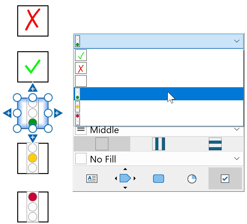
Customize Gantt charts
Customize the appearance and format of think-cell Gantt charts. Specify default styles, such as the line style of borders and separators, background fills, and the appearance of bars and markers. Add an option to match the timeline of Gantt charts to your organization's fiscal calendar. To learn more about Gantt charts, see Gantt charts (timelines).
Customize the default Gantt chart styles
To customize the default styles and formatting for Gantt charts, follow these steps:
- In the style file, find or add the
ganttelement. - In the
ganttelement, add child elements as needed. To learn more about each child element, see the element reference.
Specify the Gantt chart styles: gantt
Specify the default appearance and format of think-cell Gantt charts. To see how the customizations appear in a Gantt chart, see the example screenshots in the following section.
- In the
ganttelement, add the following child elements in the order that they appear in the table.
|
Child element |
Description |
Attributes |
|---|---|---|
|
|
|
None |
|
|
|
Optional. Specifies the text alignment for calendar scale labels. Possible values:
Possible values:
|
|
|
|
Optional. Specifies the text alignment for calendar scale labels. Possible values:
Optional. Enables or disables underline gaps between calendar scale labels. Possible values:
|
|
|
|
Optional. Specifies the text alignment for calendar scale labels. Possible values:
|
|
|
|
None |
|
|
|
None |
|
|
|
None |
|
|
|
None |
|
|
|
Required. Specifies a name from the list of fills in
|
|
|
|
Required. Specifies a name from the list of fills in
|
|
|
|
Required. Specifies a name from the list of fills in
|
|
|
|
None |
|
|
|
None |
|
|
|
None |
|
|
|
None |
|
|
|
Required. Specifies the bar weight in EMUs ( |
|
|
|
None |
|
|
|
Required. Specifies the bracket style.
|
|
|
|
Required. Specifies milestone size in EMUs ( |
The following examples show XML code snippets for each gantt child element and how they customize the appearance of a Gantt chart.
Calendar header styles
Specify the calendar scale header style using one of scaleFrame, scaleUnderline, or scaleExtendSeparators.
<scaleFrame algn="ctr" includeLabelColumnHeaders="false">
 <lnfill>
  <solidfillRef name="Red" />
 </lnfill>
</scaleFrame>
<scaleFrame algn="ctr" includeLabelColumnHeaders="true">
 <lnfill>
  <solidfillRef name="Red" />
 </lnfill>
</scaleFrame>
<scaleUnderline algn="l" gap="false">
 <lnfill>
  <solidfillRef name="Red" />
 </lnfill>
</scaleUnderline>
<scaleUnderline algn="l" gap="true">
 <lnfill>
  <solidfillRef name="Red" />
 </lnfill>
</scaleUnderline>
<scaleExtendSeparators algn="ctr"/>
Border line styles
Specify the line type and color for the borders using lnfillBodyLeftRight, lnfillBodyTop, lnfillBodyBottom, and lnfillFrameLeftRight.
<lnfillBodyLeftRight>
 <solidfillRef name="Blue" />
</lnfillBodyLeftRight>
<lnfillBodyTop>
 <solidfillRef name="Green" />
</lnfillBodyTop>
<lnfillBodyBottom>
 <solidfillRef name="Red" />
</lnfillBodyBottom>
<lnfillFrameLeftRight>
 <solidfillRef name="Orange" />
</lnfillFrameLeftRight>
Column background color
Specify the default background fill color using fillRefDefaultBody. We recommend setting the name attribute to No Fill or equivalent. The following example is for illustrative purposes only.
<fillRefDefaultBody name="Company Light Blue" />
Shade color
Specify the colors for vertical and horizontal shades using fillRefHorzShading and fillRefVertShading.
<fillRefHorzShading name="Company Light Blue" />
<fillRefVertShading name="Company Medium Blue" />
Separator styles
Specify the line type and color for calendar section separators using lnfillSeparatorVertPrimary and lnfillSeparatorVertSecondary.
<lnfillSeparatorVertPrimary>
 <lnRef name="Solid 1.5 pt" />
 <solidfillRef name="Blue" />
</lnfillSeparatorVertPrimary>
<lnfillSeparatorVertSecondary>
 <lnRef name="Dash 1 pt" />
 <solidfillRef name="Red" />
</lnfillSeparatorVertSecondary>
Shape styles
Specify the list of shapes for timeline items using shapestyleLstBar.
<shapestyleLstBar w="100000">
 <shapestyleRef name="Completed" />
 <shapestyleRef name="In Progress" />
 <shapestyleRef name="Backlog" />
</shapestyleLstBar>
To specify timeline items as lines instead of shapes, use lnfillLstBar instead.
<lnfillLstBar>
 <solidfillRef name="Blue" />
 <lnRef name="Solid 6 pt" />
 <lnRef name="Dash 6 pt" />
</lnfillLstBar>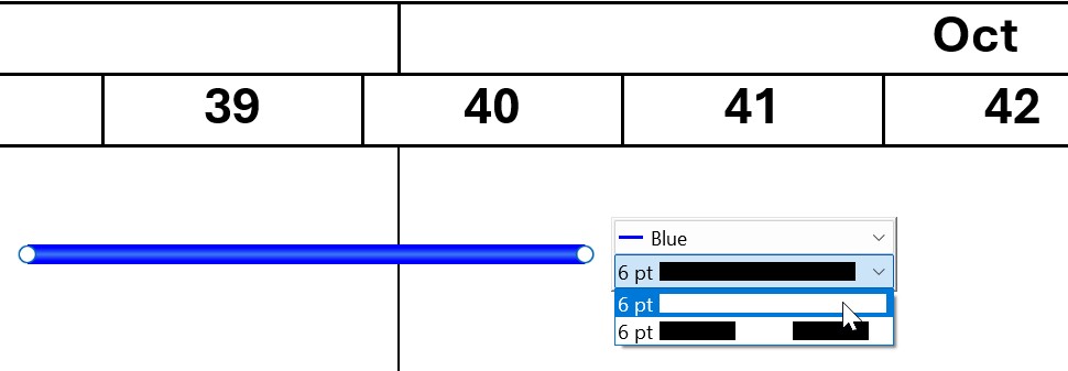
Add pentagons and chevrons to the list of timeline shape options using shapestyleLstPentagonAndChevron.
<shapestyleLstPentagonAndChevron>
 <shapestyleRef name="Solid Pentagon" />
 <shapestyleRef name="Dashed Pentagon" />
 <shapestyleRef name="Long Dashed Pentagon" />
</shapestyleLstPentagonAndChevron>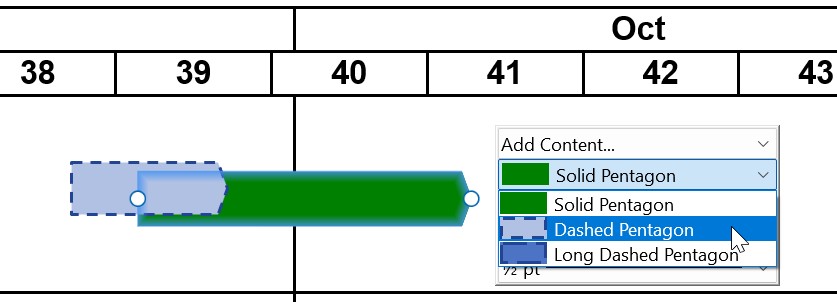
Bracket styles
Specify the bracket style for chart timeline items by setting the style attribute of bracket to one of curly, line, or triangle.
<bracket style="curly">
 <lnfill>
  <lnRef name="Solid 2 pt" />
  <solidfillRef name="Dark Blue" />
 </lnfill>
</bracket>
<bracket style="line">
 <lnfill>
  <lnRef name="Solid 2 pt" />
  <solidfillRef name="Dark Blue" />
 </lnfill>
</bracket>
<bracket style="triangle">
 <lnfill>
  <lnRef name="Solid 2 pt" />
  <solidfillRef name="Dark Blue" />
 </lnfill>
</bracket>
Milestone styles
Specify the default styles for milestone markers and milestone lines using milestone.
<milestone w="119063">
 <markerRef name="Diamond" />
 <solidfillRef name="Dark Blue" />
 <lnfill>
  <lnRef name="Dash 1 pt" />
 </lnfill>
</milestone>
Add fiscal calendar option to Gantt charts
Optional
Add an option to switch the Gantt chart timeline to a fiscal calendar format. The option appears as a checkbox on the Gantt chart's mini toolbar.
In fiscal calendar format, the chart's year, quarter, and week sections match your specifications in the fiscalYear element. Selecting the Fiscal Year option in a Gantt chart's mini toolbar adds the abbreviation "FY" to the year section header in the chart.
To add a fiscal calendar option to your Gantt chart, follow these steps:
- In the style file, after the
ganttelement, add afiscalYearelement. - In the
fiscalYearelement, add child elements as needed. To learn more about each child element, see the element reference.
If your organization's fiscal calendar follows the 52-53-week convention, where the fiscal year ends on a particular day of the week, consider adding the weekAlignment child element to the fiscalYear element and note the following:
- A fiscal year will end on the weekday specified in the
lastWeekdayattribute. - Quarters consist of 13 weeks. The fourth quarter of a leap year consists of 14 weeks.
- The
lastDayattribute sets the calendar date on which the specifiedlastWeekdayfalls. - If the
weeksPerMonthattribute is present, months end on the day specified in thelastWeekdayattribute. The leap week is always added to the last month of the fourth quarter.
Specify a fiscal calendar option for Gantt charts: fiscalYear
Add an option to switch the Gantt chart timeline to a fiscal calendar format. The option appears as a checkbox on the Gantt chart's mini toolbar. To see how the customizations appear in a Gantt chart's timeline, see the example in the following section.
- In the
fiscalYearelement, add the following child elements in the order that they appear in the table.
|
Child element |
Description |
Attributes |
|---|---|---|
|
|
|
Required. Specifies the fiscal year's start or end month.
|
|
|
|
|
|
|
|
Required. Specifies the end day of the fiscal week.
Required. Specifies when the fiscal year ends, based on the end day of the fiscal week set in the Possible values:
Optional. Specifies a calendar structure where the year is divided into four quarters of 13 weeks: two four-week months and one five-week month. Months will end on the day specified in Possible values:
|
The following example shows an XML code snippet of the fiscalYear child elements and the corresponding Gantt chart headers. The elements customize the appearance and behavior of a Gantt chart with the fiscal year option selected as follows:
- The first quarter begins in June, as specified in the
startelement. - Each week ends on a Friday, as specified in the
lastWeekdayattribute. - The fiscal year ends on the Friday closest to the last day of May, as specified in the
lastDayattribute: if May 31 is a Thursday, the fiscal year ends on June 1. To end the fiscal year on May 25 instead, set thelastDayattribute toinLastMonth. - Each quarter consists of 13 weeks that are divided into three months according to the 4-5-4 convention, as specified in the
weeksPerMonthattribute.
<fiscalYear>
 <start month="jun" />
 <weekAlignment lastWeekday="fri" lastDay="nearestToEndOfLastMonth" weeksPerMonth="454"/>
</fiscalYear>
Need to troubleshoot?
Check our knowledge base