Quantitative charts
- Home
- Resources
- User manual
- think-cell Charts: Data visualization
- Quantitative charts
think-cell has many types of charts to help you visualize and understand numerical data. Here, we provide an overview of our quantitative chart types.
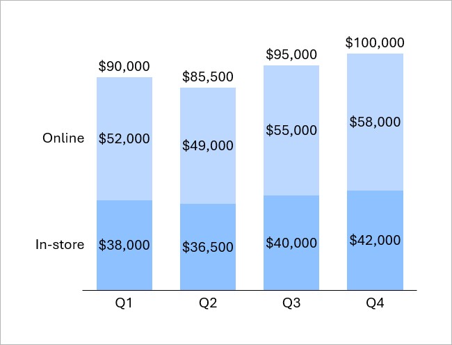
You can use column charts to compare categories or to show how values change over time. For example, you can compare how different business segments contribute to revenue in each quarter.
To learn more, see Column and bar charts.
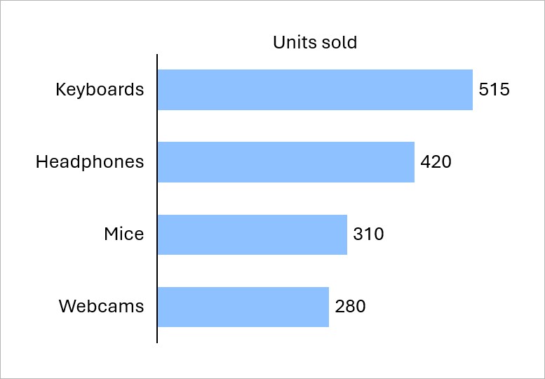
You can use bar charts to show differences in data across categories. For example, you can compare the number of units sold for each product in a catalog.
To learn more, see Column and bar charts.
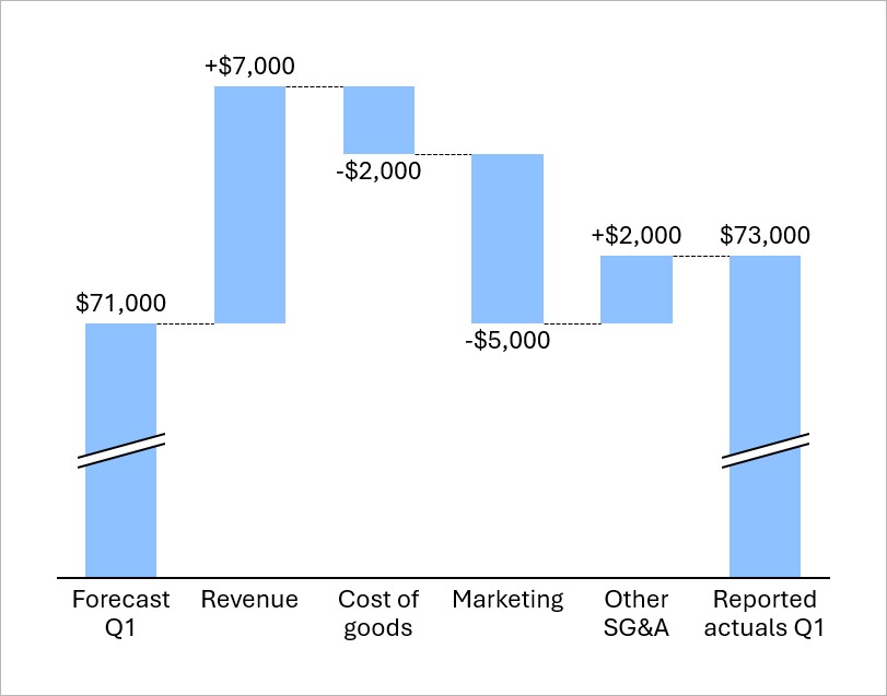
Waterfall charts show how an initial value changes as you add or subtract a series of values. For example, you can show how revenue, costs, and other financial components contribute to the difference between predicted and actual quarterly income.
To learn more, see Waterfall charts.
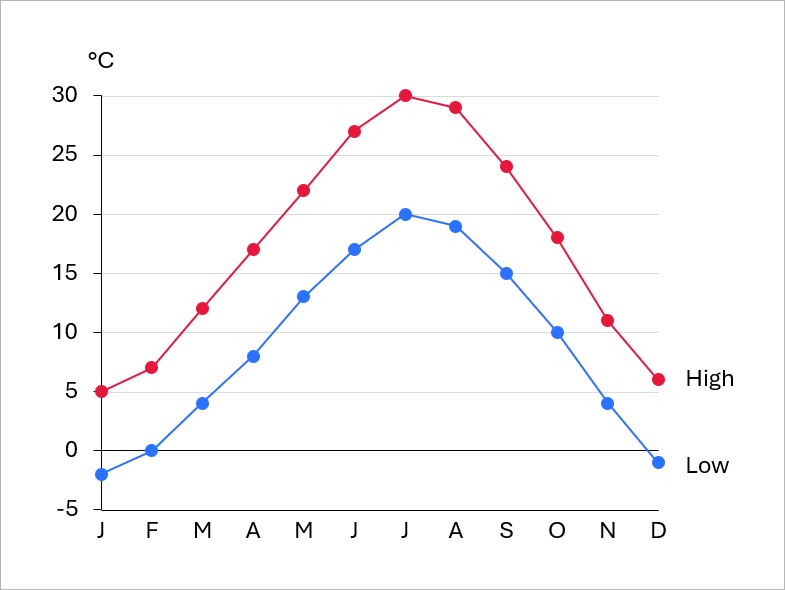
Use a line chart to examine trends or continuous data over time. For example, you can track temperature data over the course of a year.
A line chart that's rotated 90° is called a profile chart.
To learn more, see Line and profile charts.
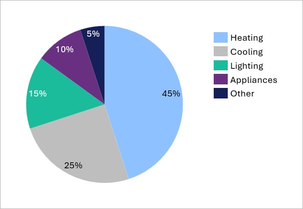
Use a pie chart or doughnut chart to show data as slices that represent proportions of a whole. For example, you can show the breakdown of household energy consumption.
To learn more, see Pie and doughnut charts.
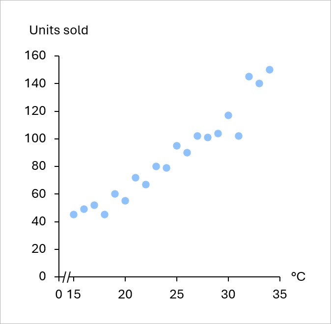
Use a scatter chart to compare data across two dimensions or to determine the extent to which one variable affects or relates to another. For example, you can show the relationship between temperature and ice cream sales.
To learn more, see Scatter charts.
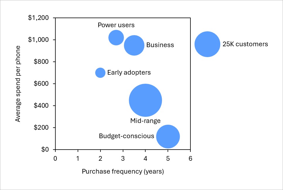
Use a bubble chart to show the size of different data segments across two dimensions. For example, you can show the size, purchase frequency, and average spend of different smartphone customer segments.
To learn more, see Bubble charts.
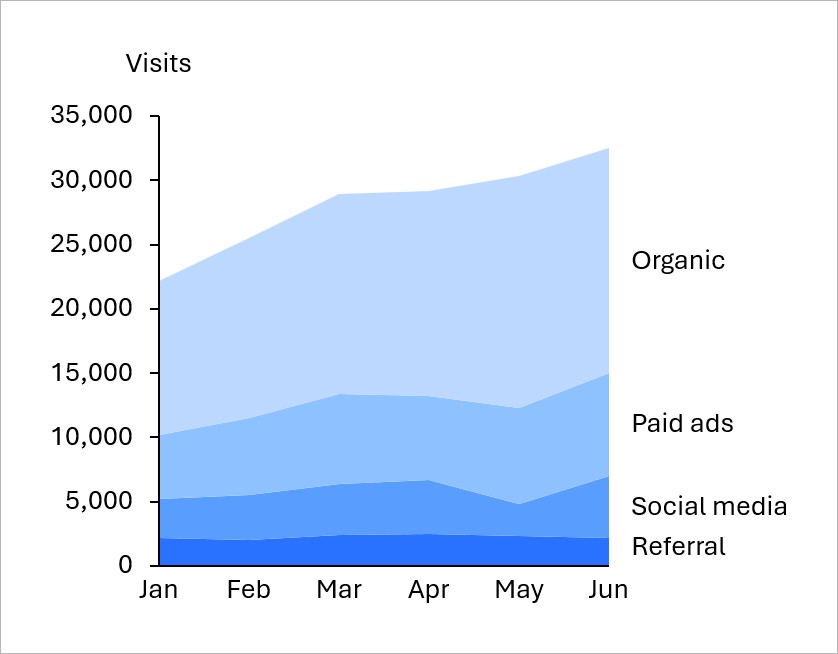
Use an area chart to track data series over time and show how series contribute to total values. For example, you can show website traffic by source over time.
To learn more, see Area charts.
Mekko charts are column charts in which column width represents the relative size of a category.
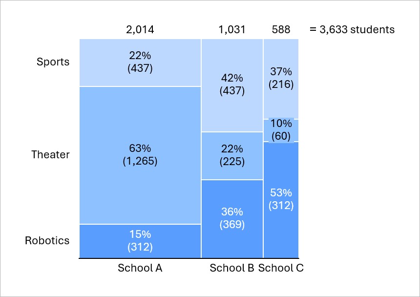
In Mekko charts with a percent axis, segment areas represent proportions of the total. For example, you can show the number of students who participate in different extracurricular activities in different schools as percentages of all the students. In this chart, a segment's area represents an absolute number of students.
To learn more, see Mekko charts with a percent axis.
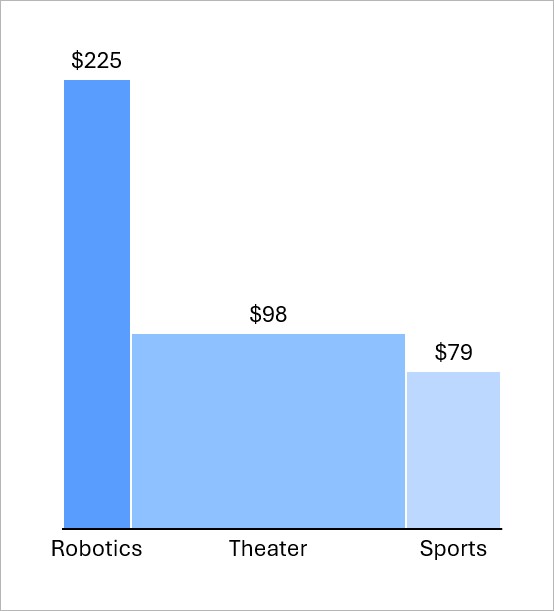
Mekko charts with units show absolute differences across categories. For example, you can compare a school's annual spend on each extracurricular activity per student. In this chart, a column area represents the total spend on an activity.
To learn more, see Mekko charts with units.
Need to troubleshoot?
Check our knowledge base