think-cell's subscription-based licensing model allows us to continuously improve our software, with two options available for users to choose how they receive updates.
think-cell Early Access users are the first to get frequent updates that contain the latest think-cell features, in addition to the usual improvements in stability and speed.
Users who do not choose think-cell Early Access will receive new features when they are included as part of a stable release version of the software. The latest such version is think-cell 14.
On this page, you can find information about what is currently available in think-cell Early Access, as well as descriptions of all features included in our stable release versions.
think-cell Early Access
Disclaimer: By their nature, think-cell Early Access features are still in development, frequently updated, and not yet included in our latest stable software release. Features included on this page may be changed or removed without prior notification, and the descriptions here are not necessarily a complete or accurate representation of what will be included in the next stable release version.
You can see which features are currently available to think-cell Early Access users for each think-cell product:
Get AI support for your best slides with think-cell Assist
With think-cell Assist, you can now draw on a range of powerful AI features from a fully integrated side pane in PowerPoint and Excel, giving you access to AI chat and new capabilities for data analysis, chart generation, translation, text, and more.
Maintain focus with in-app generative AI chat
think-cell Assist includes generative AI chat as part of the PowerPoint side pane. This reduces app-switching and keeps your conversations secure when you want to sense-check an idea, brainstorm a storyline for your presentation, or search the web from within PowerPoint. think-cell Assist's generative AI chat also lets you use natural language to edit texts or run other AI-powered actions across one or more slides.
Get the support you need while staying focused on your presentation. Learn more: Chat
Analyze your Excel data with AI
You can use think-cell Assist in Excel via the integrated side pane chat. With natural language prompts, you can ask the AI to read and analyze your datasets, generate new worksheets and data tables, and prepare charts. Because all outputs are formula-based, you can trace calculations and be sure you are generating insights you can own.
When working in Excel, you can use think-cell Assist to automatically generate charts, either from your existing data or from the results of an AI-powered analysis. It takes one click to generate and, because it's a think-cell chart, you can refine it how you like and add annotations to quickly create a best-in-class visualization for your presentation.
You can use think-cell Assist to turn draft texts into presentation-ready copy that lands. Text features include the ability to shorten or rephrase texts, or convert paragraphs into bullet points. Here, you can work with default prompts or save your own prompts to include your individual style specifications or other preferences.
Learn more about think-cell Assist’s text generation features in our user manual: Edit Text
Translate slide content while preserving layout
You can use think-cell Assist to translate individual text boxes, whole slides, or even your entire presentation at the click of a button. Translations are available in 70+ languages and they are applied in-place, updating the texts while preserving the layout and structure of your slides.
Learn more about translation in our user manual: Translate Slides
Turn trusted data into think-cell charts
You can access data from Statista from within PowerPoint and turn it into a fully functional think-cell chart. think-cell Assist pulls the numbers and generates the chart directly in your slide, ready for you to extend, edit or customize as you need for your presentation.
Learn more about data access in our user manual: Research Data
Generate slide summaries and action titles
You can ask think-cell Assist to analyze your slide content and generate a selection of action titles for you to choose from. One click and the chosen title is added to your slide. If you want more than just a title, you can summarize a single slide or even generate a slide with an executive summary of your whole presentation.
We are continuously listening to users’ feedback on our data and charting capabilities, and optimizing workflows within our existing feature set.
Here are some of the latest additions and improvements.
More flexibility with Gantt chart formatting
You can now edit your Gantt chart more easily without having to reformat labels when your calendar range changes. If a label goes outside the visible range, it won’t have lost its content and formatting when you bring it back.
Since think-cell 14, you’ve been able to use charts with data tables. We’ve now aligned these charts’ behavior more closely with that of other think-cell charts, making workflows more consistent and intuitive.
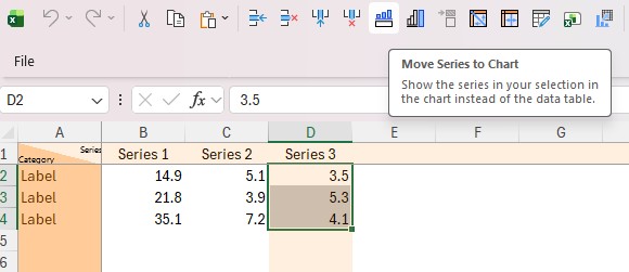
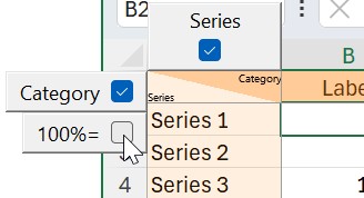
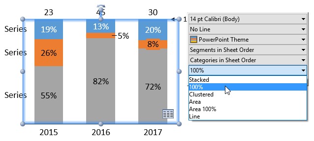
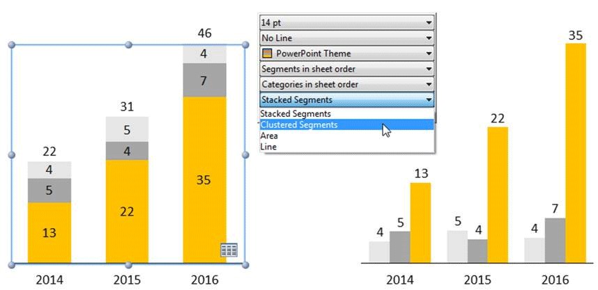
We’ve made some adjustments to chart datasheets to make it easier to see and choose how categories and series are displayed in your think-cell charts.
For charts with data tables, you can now see in the datasheet which categories or series are currently displayed in data tables. The corresponding rows or columns are now highlighted in orange, and you have two toggle buttons (one for series, one for categories) to make changes directly from within the chart datasheet.
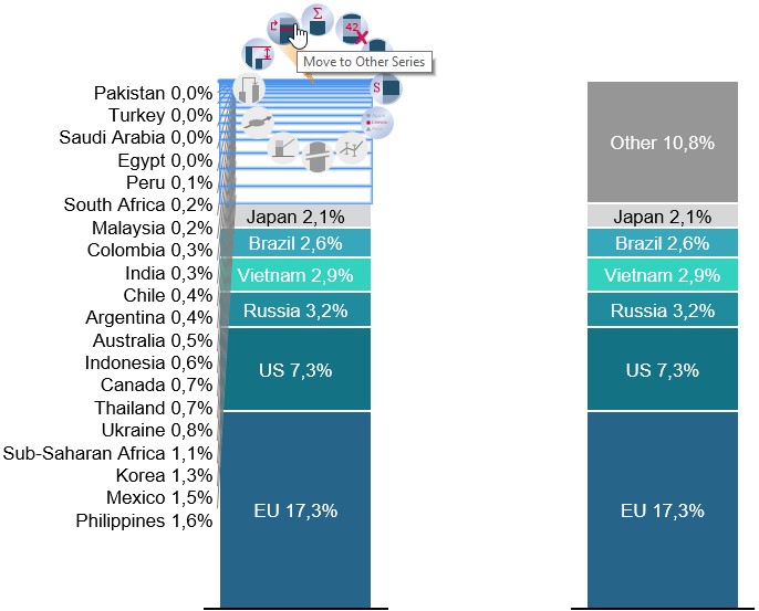
We've also built similar behavior for when you have an "Other" series in a chart like a stacked column chart. Now, a simple gray highlight on the row or column of the "Other" series helps you understand your datasheet more easily, and a toggle in the datasheet lets you quickly choose which series to include or exclude in the "Other" series.
think-cell Library was first released with think-cell 13. Here are the latest improvements.
Added support for some SMB-based file shares
We've now added support for indexing think-cell Library folders on some SMB-based network-attached storage systems, such as Synology.
Updates to think-cell Core
Here you can find information about the latest features within think-cell Core.
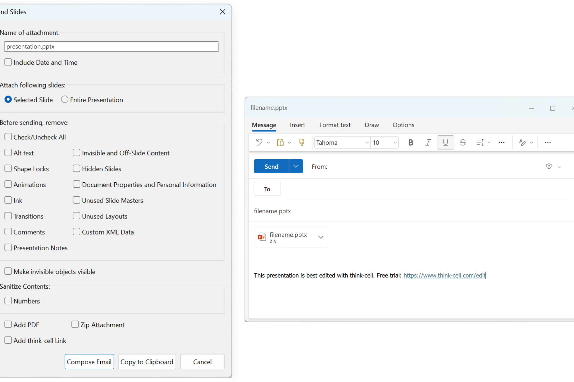
Send slides with new Outlook
think-cell now works with new Outlook for Windows. If you're using new Outlook, you can now send specific slides or entire presentations via email, just like with classic Outlook.
This applies to other features that create emails, too. If you're using new Outlook, you can generate an email from inside PowerPoint to request support or submit feedback to the think-cell team.
Learn more about using think-cell to send slides in our user manual: Send slides
think-cell 14
As well as adding new capabilities for efficient layout adjustment and flexible ways to reuse your content, think-cell 14 enhances how you can build Excel-driven reports in PowerPoint and gives you a wider variety of visualizations for your insights. These new features are all available within an optimized overall think-cell experience.
Check out the video for the most important highlights or read further down the page for a quick run-down of everything that’s new in think-cell 14.
think-cell’s aim has always been to save you clicks and help you create PowerPoint presentations more efficiently. The latest additions to think-cell focus on automating some of the more intricate, laborious steps of slide-building.
New capabilities include being able to intelligently swap the positions of shapes or rescale multiple objects with a single click, letting you quickly explore alternative layouts while maintaining the balance of your slide.
More efficiency means faster iterations, a heightened ability to adapt, and a final layout that perfectly supports your presentation’s story.
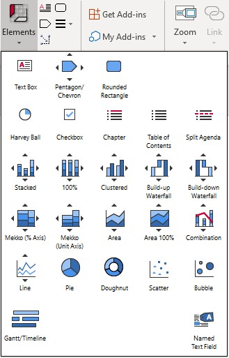
Get started with think-cell elements
Learn more about using think-cell elements in your slide layouts in our user manual: Shapes and elements
Swap objects
When you build a slide, you won’t always know your final layout before you start. With think-cell’s swap objects tool, you can switch the positions of two elements with a single click.
This lets you quickly experiment with different slide layouts and precisely reorder elements with ease.
Learn more about how to swap objects in our user manual: Swap objects
Scale
This new addition to think-cell Tools lets you scale shapes together. If you need to adjust a layout, you can now easily make multiple objects larger or smaller at once. Font sizes and shapes will stay in proportion, and your slides will stay balanced and visually consistent.
When you work with think-cell charts, you now have more control over their position on the slide.
You can choose between the outer chart area and the inner plot area when aligning your chart with other elements and guides. So, if you tweak your chart, adjusting the slide layout is quick and precise.
When building your slide, you can easily combine think-cell tables, charts and other elements with native PowerPoint shapes. You can group objects to move, resize, or swap them together, and quickly rearrange the layout of your slide.
Learn more about grouping in our user manual: Group objects
Flexible content reuse
Since its launch in early 2025, the think-cell Library has helped you jumpstart your presentation creation by giving you instant access to your PowerPoint repository. think-cell 14 builds on this, giving you more flexibility in how you reuse your content.
When you want to add a slide from your think-cell Library, you can now choose whether to use the original formatting, whether to adapt the colors to your current presentation, or whether to insert just the objects to a slide you’ve already started to build.
This added flexibility makes it easier to leverage your existing assets, and accelerates the journey from blank slide to meaningful content.
Insert slides with source formatting
Say you’re adding a success story from a major client. Choose to insert with source formatting and you keep all the original branding, colors and layout, respecting the customer’s brand identity and avoiding manual redesign.
Insert slides with destination formatting
Alternatively, if you’re working on a pitch for a new customer and have a presentation tailored to their brand identity, you can simply choose destination formatting and any templates or slides you add will automatically adapt to the master theme and brand guidelines.
Insert elements
If you don’t need an entire slide but you want to use a map, chart or other branded element from an old presentation, you’ve got this option too. You can insert just the elements from a slide and fit them seamlessly into your existing layout.
Read more about the different ways of inserting assets into your presentations in our user manual.
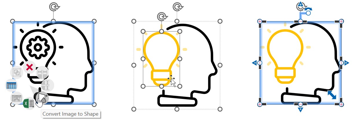
Edit icons and other SVG images
think-cell 14 also adds flexibility to how you reuse visuals. The think-cell Library already has millions of icons, but sometimes a little customization goes a long way. With one click, you can convert an SVG icon into shapes you can edit. Make any adjustments you like so your icon is a perfect fit for the needs of your presentation.
Not everyone works with PowerPoint the same way. That’s why several features introduced as part of think-cell 14 are designed to streamline how you manage and connect the data behind your charts and tables, whether it comes from an Excel spreadsheet or you prefer to work exclusively in PowerPoint.
This includes the ability to capture more cell formatting from Excel, more control over how you manage updates to linked files, and the option to use more powerful internal datasheets for all the data-driven elements on a PowerPoint slide.
Enhanced Excel-driven reporting in PowerPoint means you can work however suits you best, stop duplicating tables, and have a single source of truth that lets you present your data with maximum confidence.
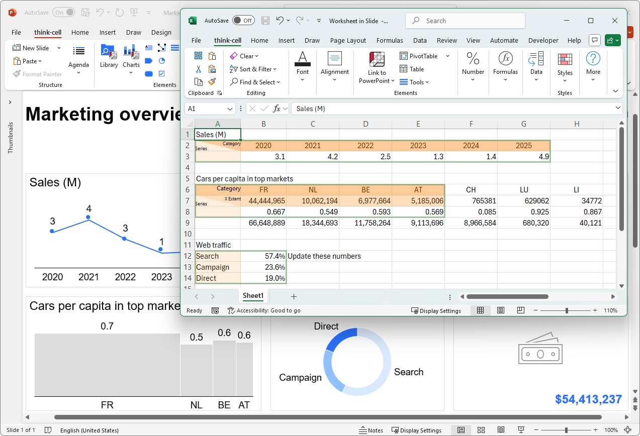
Slide workbooks
While you’ve always been able to link your think-cell charts to Excel files, what if you could manage all the data for an entire slide from a single location, without even having to leave PowerPoint?
Now you can.
Imagine you’re building a quarterly performance review. You might have a dashboard slide with several charts and tables that all draw from a master dataset. Instead of juggling different Excel files, you can have all the data for all your visualizations in a single slide workbook.
Essentially, this is like having a fully functional Excel spreadsheet within your PowerPoint slide. This means no more worrying about connecting huge Excel workbooks to your presentation and potentially exposing irrelevant or sensitive data.
Learn more about slide workbooks in our user manual: Slide workbooks
Table with formatting or as image
We know that for many of you, your data lives in Excel. And you already use formatting to highlight insights or provide context to people viewing the spreadsheet.
With think-cell 14, we’ve tightened the sync between your presentation and your data, adding a number of features that make it easy to replicate your Excel formatting in PowerPoint.
Firstly, we’ve given you more options when inserting tables from Excel into PowerPoint. You can now choose to keep the cell formatting or copy the table as a pixel-perfect image. Either way, you’re in control and the tables are linked to Excel so you don’t need to worry about updating your presentation if your data changes.
Learn more about your options when creating tables from Excel in our user manual: Create tables from Excel
More options for table formatting
We've also given more options for matching think-cell table formatting to the formatting of an Excel range. This includes font style, indents, alignment and fill color. You can now link any or all of these to your Excel sheet.
Also, when adding stripes to a think-cell table, you can now use an existing cell’s color as a reference to apply to the whole table.
For more about formatting think-cell tables, see our user manual: Format tables
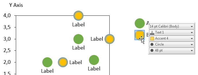
More conditional formatting support for charts and tables
We’ve also expanded support for Excel’s conditional formatting rules. think-cell 14 recognizes color scales for data ranges, rules that reference other cells, and even formatting based on text and dates. Forget about rebuilding heatmaps in PowerPoint and see all the colors from your Excel data automatically reflected in your think-cell charts and tables.
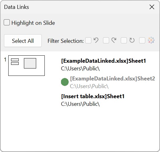
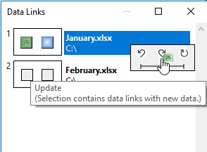
How you manage your Excel links has also improved. You’re now alerted and can easily update a data source when there’s a change to a linked file. We’ve also revamped the data links dialog to reflect these changes and give you full control over how you manage your Excel links.
Read more about configuring your Excel links in our user manual: Manage data links
Clean-up: Remove all slide workbooks and all data links
Data links are useful when building your slides, but you might not always want to expose them. When you’re ready to share your presentation, our popular clean-up tool now includes the option to remove all data links and slide workbooks, ensuring your deck is secure, sanitized, and ready for distribution.
Learn more about how to use the clean-up tool in our user manual: Clean up and sanitize
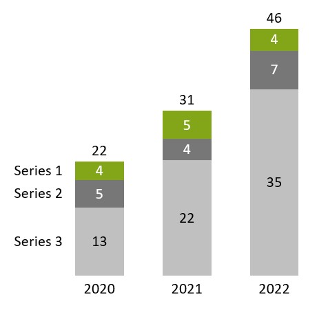
100%= row removed from default datasheet
One small change, but one with a big impact, is we’ve removed the 100%= row from the default datasheet layout for think-cell charts.
The majority of datasets don’t need this row so this will give you a cleaner workflow and cut the clicks needed to build your think-cell charts.
Of course, if you do need explicit totals for a percentage-based chart, it’s just a single click and the 100%= row is back again.
For more information on how to edit the data layout, see our user manual: Edit datasheet layout
Advanced insight visualization
think-cell’s automated chart annotations help reduce manual adjustments and aid both layout consistency and data accuracy. think-cell 14 gives you more ways to visualize your insights by expanding the annotation and chart options to cover a wider range of data scenarios.
For example, you can now add net lines to show category-specific benchmark values for column charts, or show complex relationships between variables by adding exponential or polynomial trendlines to your scatter charts.
That one slide per presentation you always had to screenshot from Excel? Now you can do it directly in think-cell.
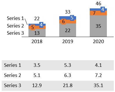
Data tables for charts
We all know charts are great for telling stories and highlighting trends, but sometimes you can’t beat a table for showing your data with maximum precision. A new option in think-cell 14 lets you pull out a series from your chart and show it perfectly aligned in an accompanying data table.
You can now convert a chart series to net lines. Use these to highlight trends and deviations, or to compare expected and actual values.
For example, a sales manager can quickly add a net line to show the quarterly targets on a sales performance chart. This helps the team easily understand where they exceeded expectations, or where they fell short.
You can read more about how to add net lines, including how to add connectors to net lines to form a step chart, in our user manual: Display chart series as net lines
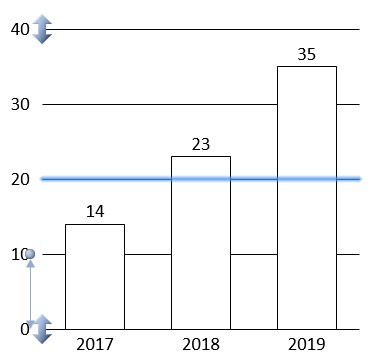
Value line median option
Our value lines have also been enhanced. You can now choose to show either the arithmetic mean or the median with your auto-calculated value line. For many datasets, the median is a more useful benchmark because it’s less impacted by outliers, like Black Friday sales or website traffic during a viral event.
Learn more about value lines in our user manual: Value lines
Ordinal axes
To make it possible to emphasize the ranking order of your categories to your audience, we’ve introduced ordinal axes.
For example, if you’re presenting data to show the importance of your hero products for total sales, you can order your chart from highest to lowest. With an ordinal axis, you can further underscore the contribution of the top-performing products in your portfolio.
For more information about different options for axes, see our user manual: Category axes
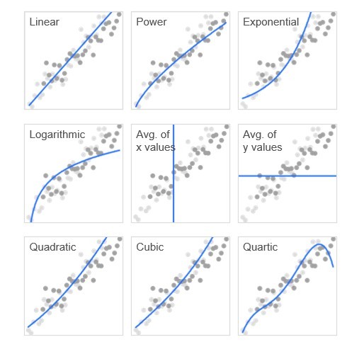
More trendlines for scatter charts
With think-cell 14, you can now add more trendlines for scatter charts, including quadratic, cubic, and quartic trendlines. More options mean you can accurately visualize the patterns in a wider variety of datasets, without the need for separate calculations or workarounds.
As well as these significant additions, we’ve made a few more minor improvements to help you visualize your insights more effectively.
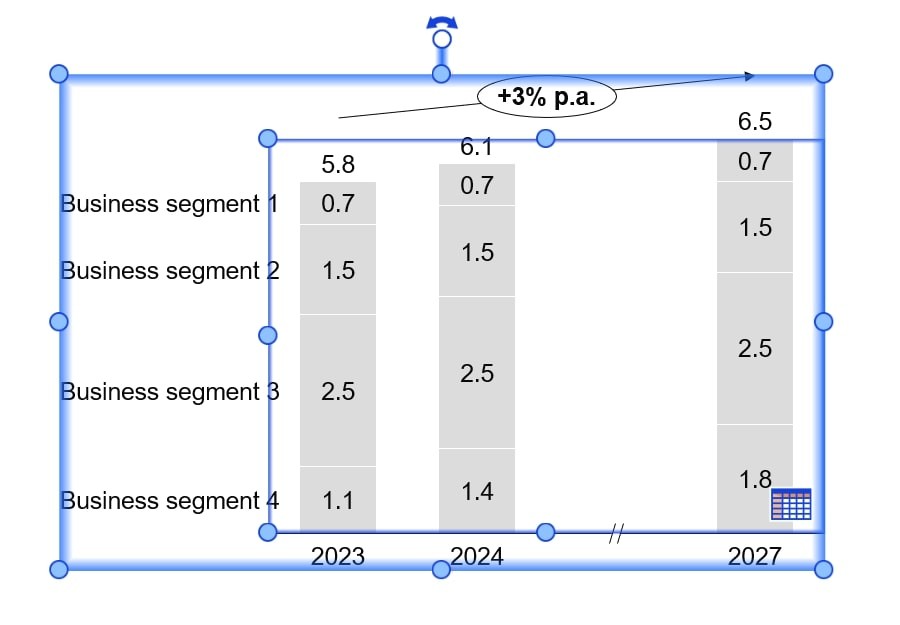
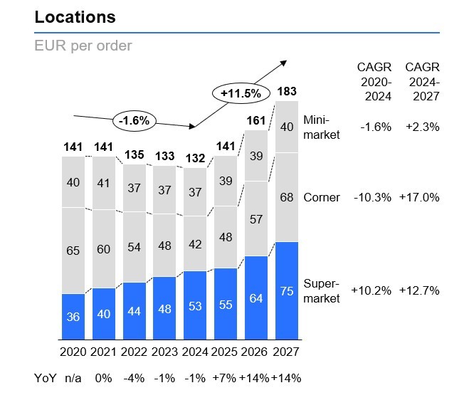
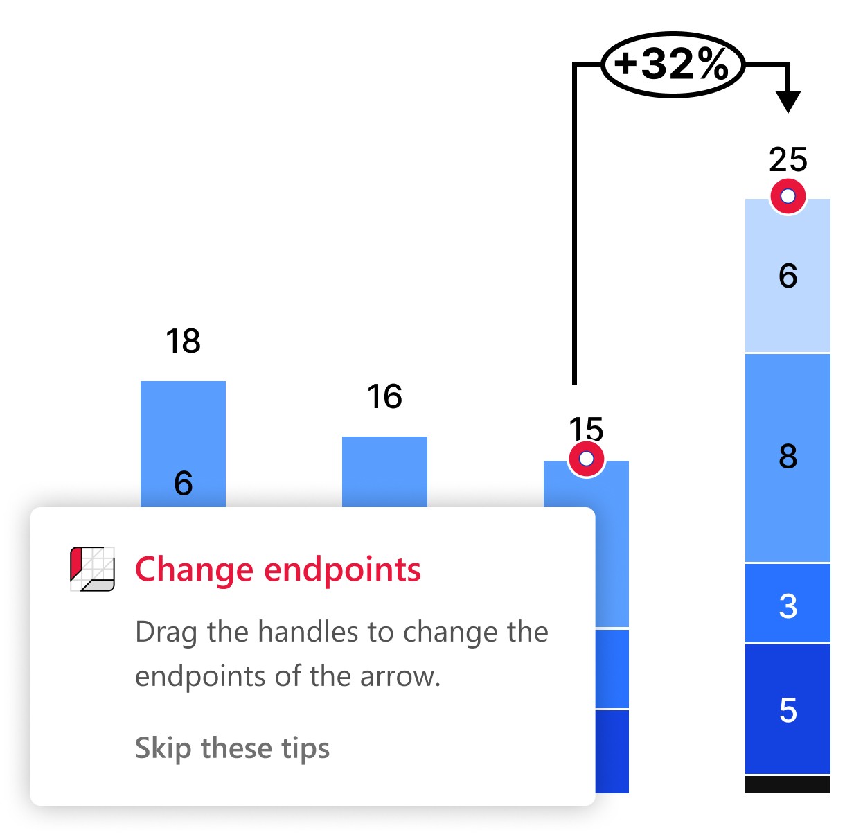
CAGR arrows with p.a. suffix
CAGR arrows now include the suffix p.a. (per annum) by default to show that they represent the compound annual growth rate. If you don’t want the suffix, you can simply edit the label.
Learn more about CAGR arrows in our user manual: CAGR arrows
Grand total labels in Mekko and column charts
We’ve added grand total labels to charts like stacked column charts and percentage axis Mekko charts that show the sum of category totals. The grand total label appears at the top right.
You can find an overview of the available chart label types in our user manual: Label types
Improved think-cell experience
To support the new capabilities, think-cell 14 also optimizes the foundations of the think-cell experience, providing more hands-on guidance and making default behaviors more intuitive and further streamlining common workflows.
Part of ensuring usability is integrating our new and existing features into one seamless product. This includes updating the think-cell tab and the mini toolbar to ensure everything is where you need it, and the most valuable actions remain easily accessible.
Besides reducing friction for experienced users, improvements to the think-cell experience will also ease the learning curve for new users and help them see the benefits of using think-cell more quickly.
In-product training
We’ve added in-product tips to help you use think-cell features you might not have seen before. These will appear based on what you’re currently doing, giving you a smoother experience as you get to know think-cell.
Mini toolbar
As the range of available formatting options has increased, we’ve updated the mini toolbar so it’s more structured and groups related commands together. For example, you’ll now find the styling options Use Datasheet Font Color and Use Datasheet Bold/Italic in their corresponding dropdown menus. For stacked bar and column charts, we've also added a checkbox that lets you reverse the order of your fill colors.
Learn more about the mini toolbar in our user manual: Mini toolbar
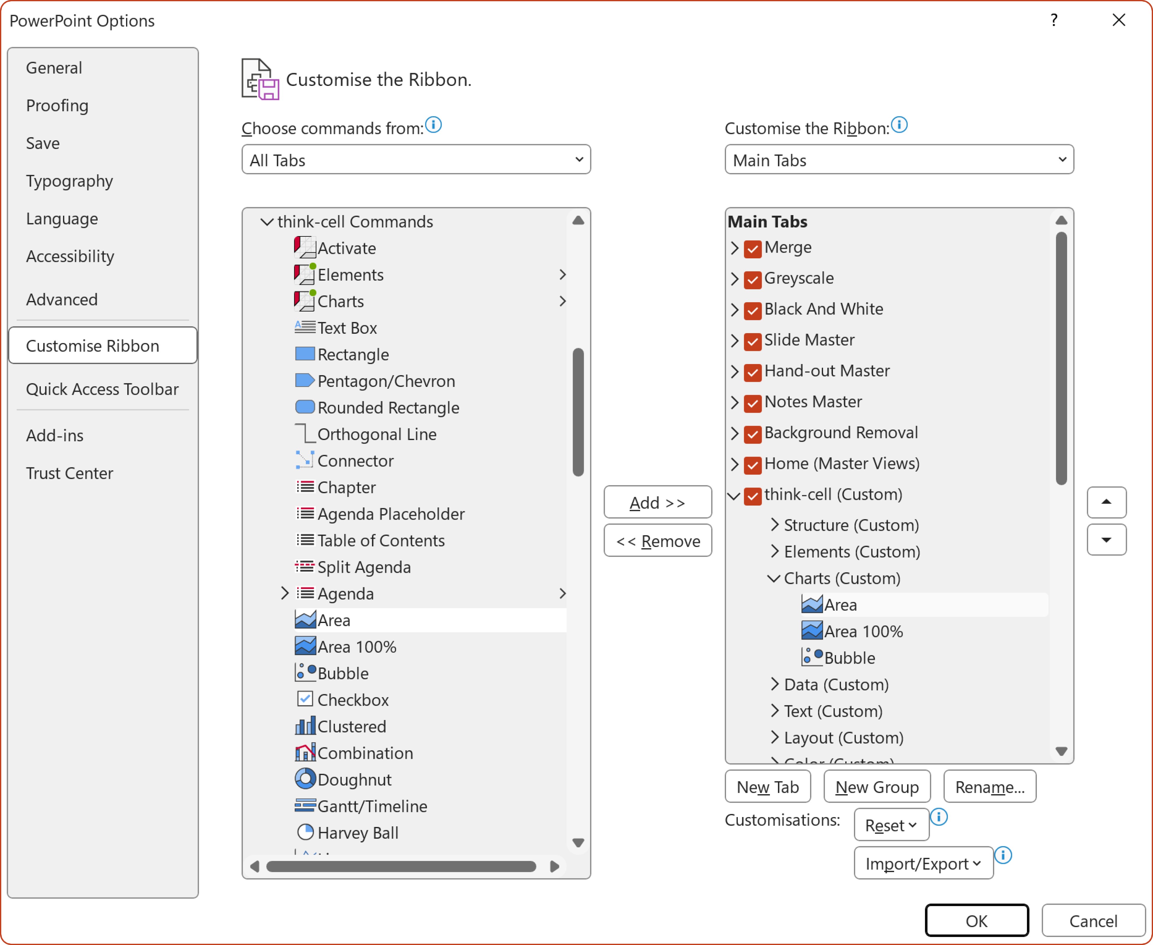
think-cell tab
To accommodate think-cell 14’s new features, we’ve updated the layout of the think-cell tab and its menus. By default, the most important commands are where you need them, but you can also customize the tab to suit your individual preferences.
We’ve also made it possible for administrators to add buttons and links to resources, and we’ve built a process that lets you easily deploy or update your own custom ribbon tab.
When searching for slides in your think-cell Library, you can now choose to filter out duplicate slides, giving you a clearer overview of the available assets.
It’s now easier to ensure brand consistency across presentations with more options available in think-cell style files. You can now set preferred font styles for legend labels and specify which data labels to display as standard in new charts. We’ve also added a new API function that lets you get the name of the style file.
Learn more about think-cell style files in our user manual: Style files
Shared datasheets for think-cell elements
Part of improving the think-cell experience is making workflows more flexible, which is why we’ve enhanced our datasheets. Now, when you group elements like think-cell tables, rounded rectangles or text boxes together, everything is added to a single shared datasheet.
The same is true of Harvey balls and checkboxes, which you can group with other elements or easily add to tables. think-cell will then create a shared datasheet for you to manage and update the contents.
Learn more about working with table datasheets in our user manual: Tables with datasheets
Fixed dimensions for images
think-cell 14 gives you more control when working with think-cell images, letting you set a fixed height or width. Once you’ve set a fixed height or width, you can resize the image and it will scale proportionally.
For more information about resizing think-cell images, see our user manual: Resize objects
Layout for think-cell elements
We've made working with think-cell elements like text boxes and tables more intuitive, so you can benefit from automations while staying in control as you build up your slide layouts.
Chart scanner improvements
We’ve made significant technical refinements to our chart scanner, reducing the likelihood of inaccuracies and increasing the ability to recognize segments, axes, and identify series correctly, even on low-contrast images.
Learn more about our chart scanner in our user manual: Chart scanner
Offline user manual
think-cell 14 comes with a copy of the user manual saved to your local machine, so you can now read how to use all features, even when you’re off the grid or in flight mode.
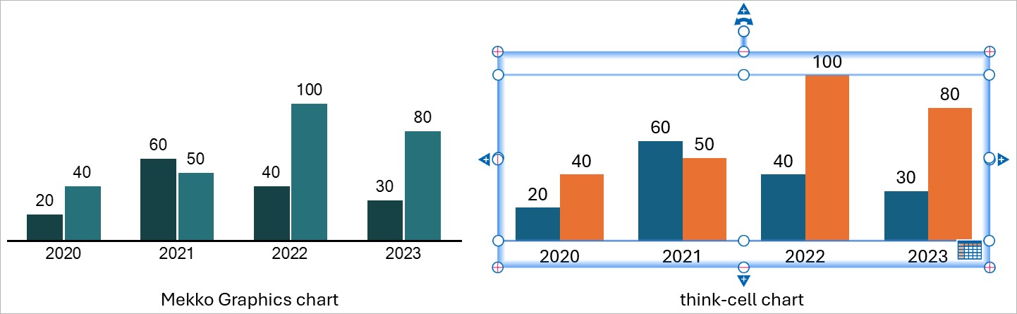
Import Mekko Graphics charts to think-cell
You can now convert Mekko Graphics charts to think-cell charts. No need to recreate what you’ve built or been sent by a colleague. You can even use our API to save more time when converting several charts at once.
For more information on importing charts from Mekko Graphics to think-cell, see our user manual: Import Mekko Graphics charts
Improved proxy server support
We now use WinHTTP services instead of WinINet for more seamless integration with your proxy server settings.
Introducing think-cell Suite: A new era for business presentations
What began as a powerful charting tool has evolved into a comprehensive solution to meet the growing needs of our users. With the release of think-cell 13, we're proud to unveil the think-cell Suite—your all-in-one solution designed to streamline and enhance every aspect of business presentation creation.
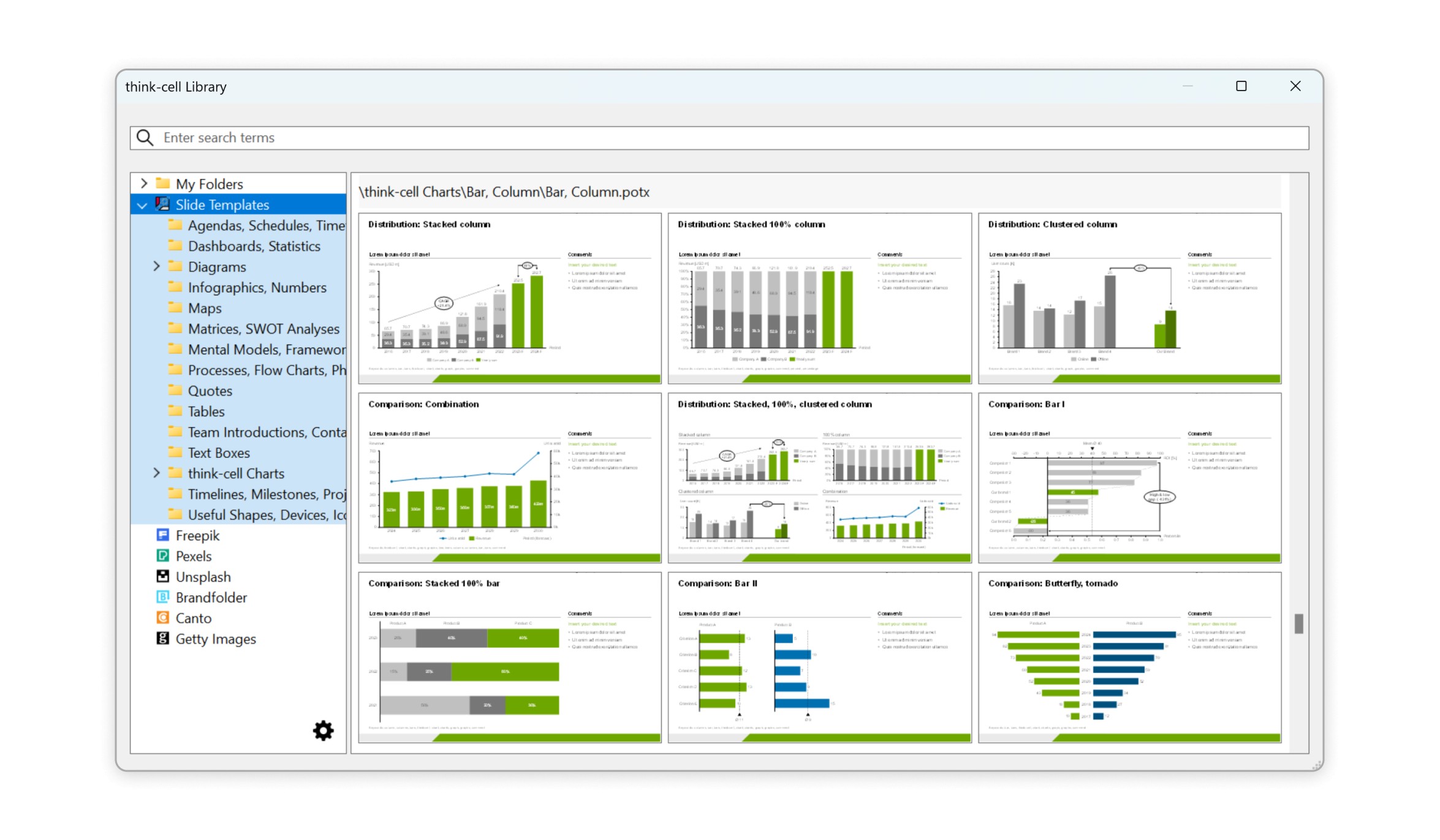
Build presentations faster with the think-cell Library
Deliver beautiful, on-brand presentations faster than ever with the library. Effortlessly manage slides, templates, and other presentation assets directly within PowerPoint.
Instantly locate slide and image assets on your computer, network, or OneDrive with powerful search features.
Choose from 250 free, professionally designed slide templates.
Access online icon and stock image providers.
Instantly find the assets you need
Search existing images and slides on your computer, network, or OneDrive, and insert the assets into your presentation—all directly within PowerPoint.
With the library, it's easy to find that perfect slide you created months ago.
Search for presentation file names and specific text on your slides.
Filter the results by date modified, aspect ratio, author, slide master, layout, and more.
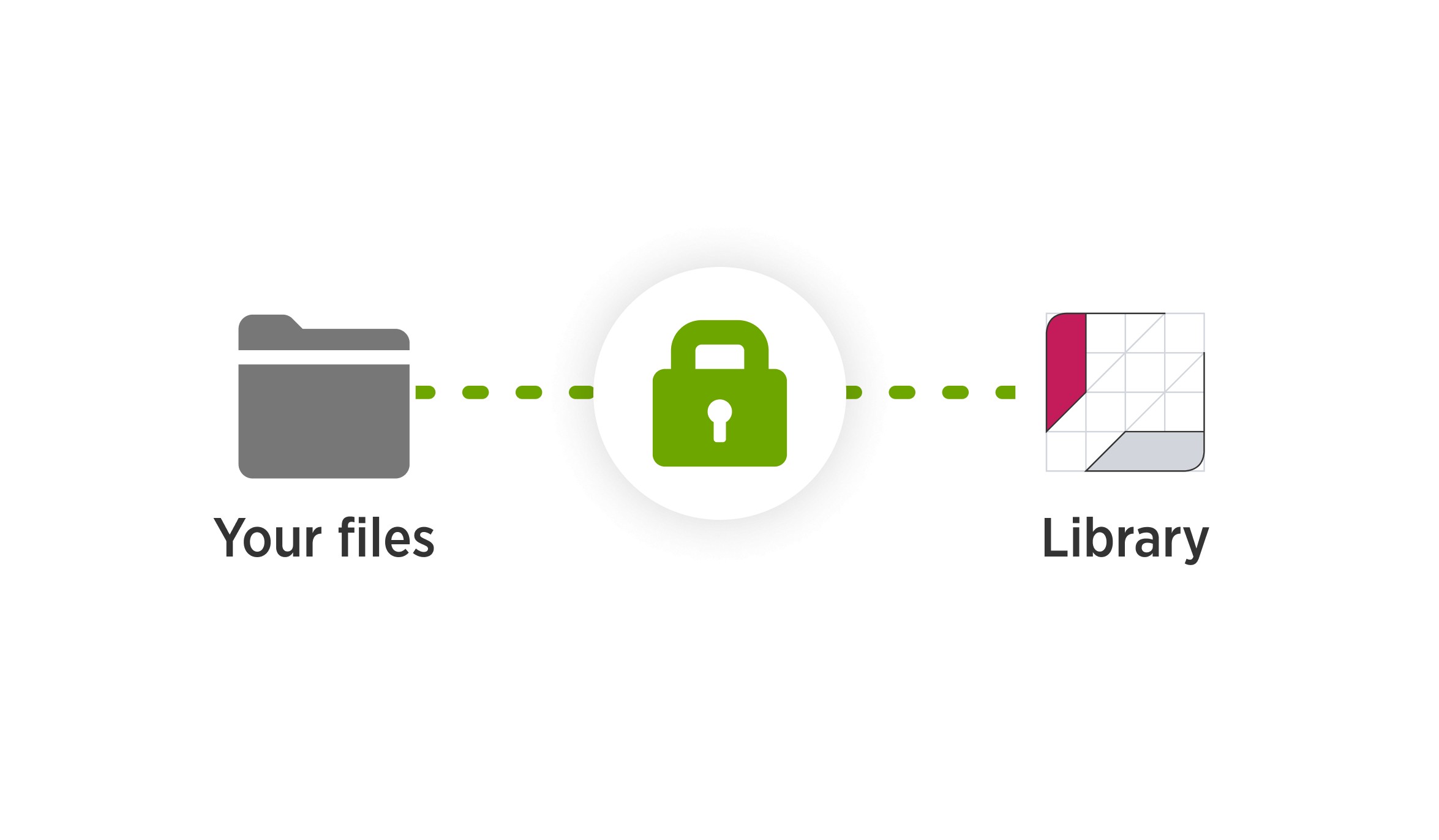
think-cell protects your data
When you add your slides and images to the library, your data stays where it is: think-cell neither uploads your files to a cloud service nor copies them to another location.
The library also preserves user permissions for files. Users who can't access a file in your company network can't see that file in the library either.
Browse professionally designed slide templates
Streamline presentation creation with beautiful, free slide templates from think-cell. The library contains 250 templates for process flows, SWOT analyses, infographics, and more. Templates automatically adjust to your color themes and slide masters, ensuring consistency across your presentations.
Add images and icons
Access millions of images and icons in the library. Icons from Magnific and stock images from Pexels and Unsplash are free to use with think-cell. If you have a subscription to Brandfolder, Canto, or Getty Images, you can use these sources in the library as well.
Boost your efficiency with think-cell Tools in PowerPoint
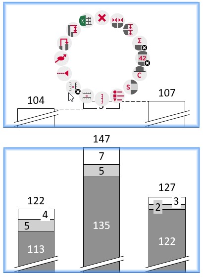
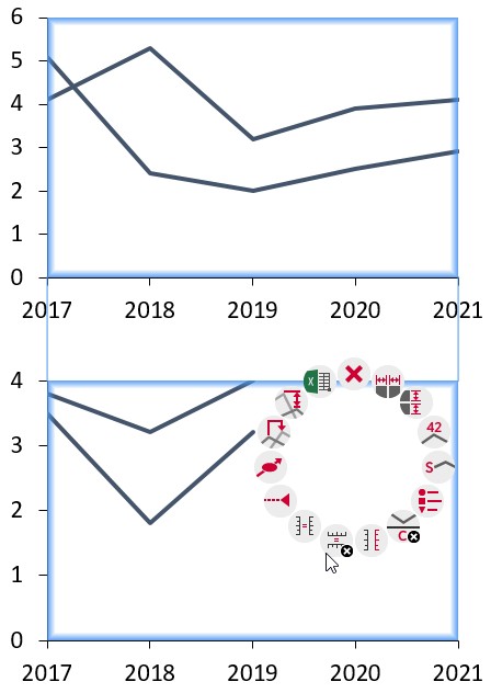
The think-cell Tools introduce smart and efficient ways to enhance your workflow in PowerPoint. Whether you need to adjust the layout, clean up your slides, or streamline the sharing process, we provide a suite of tools that make everything easier and faster. With a focus on precision and quality, you can effortlessly manage everything from aligning and resizing elements to sanitizing your slides for sensitive content. Take a look at how these tools can simplify your workflow:
Align and resize: Quickly and accurately adjust the alignment, position, and size of elements to ensure a polished presentation layout.
Save or send slides: Easily share or export selected slides or entire presentations, ensuring smooth collaboration and communication.
Clean up and sanitize: Remove sensitive information, comments, and other unwanted content to ensure your presentation is professional and secure.
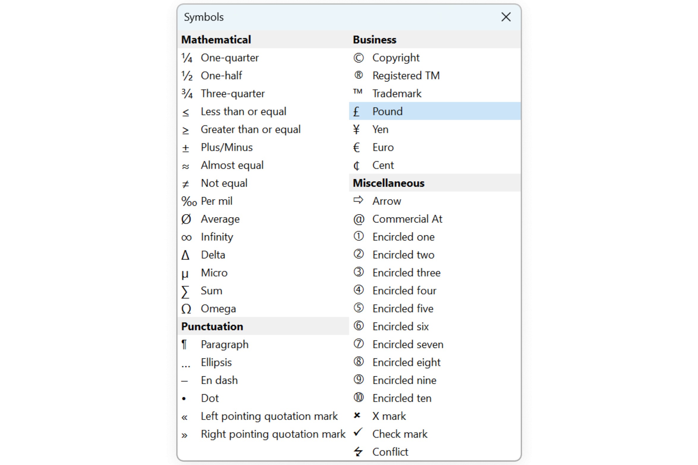
Insert symbols: Find the symbols and special characters you actually need with fewer clicks.
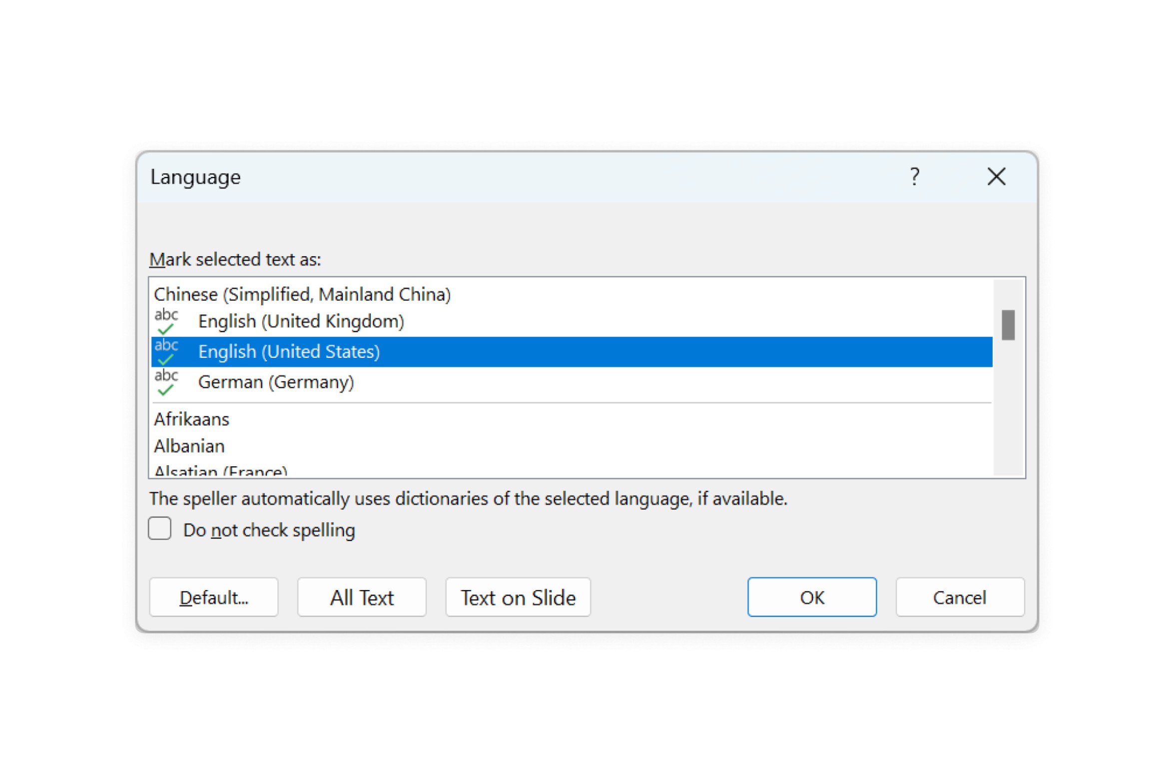
Change proofing language: Choose the proofing language for selected objects, slides, or the entire presentation. Ideal for international presentations.
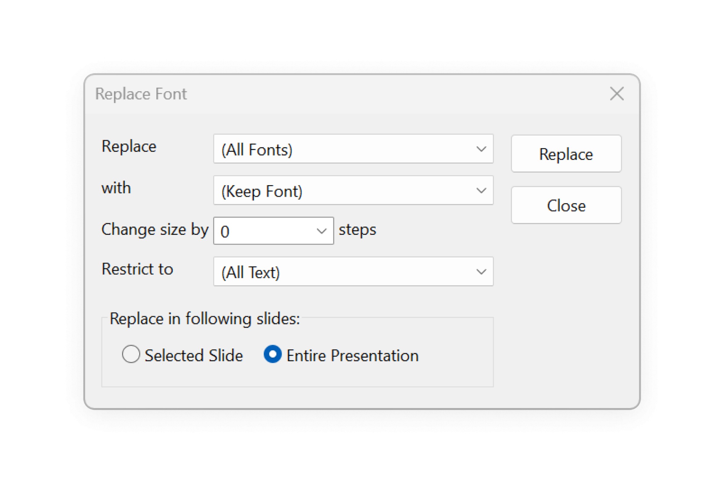
Replace and resize fonts: Replace or resize fonts for selected slides or entire presentations to maintain a cohesive and readable design.
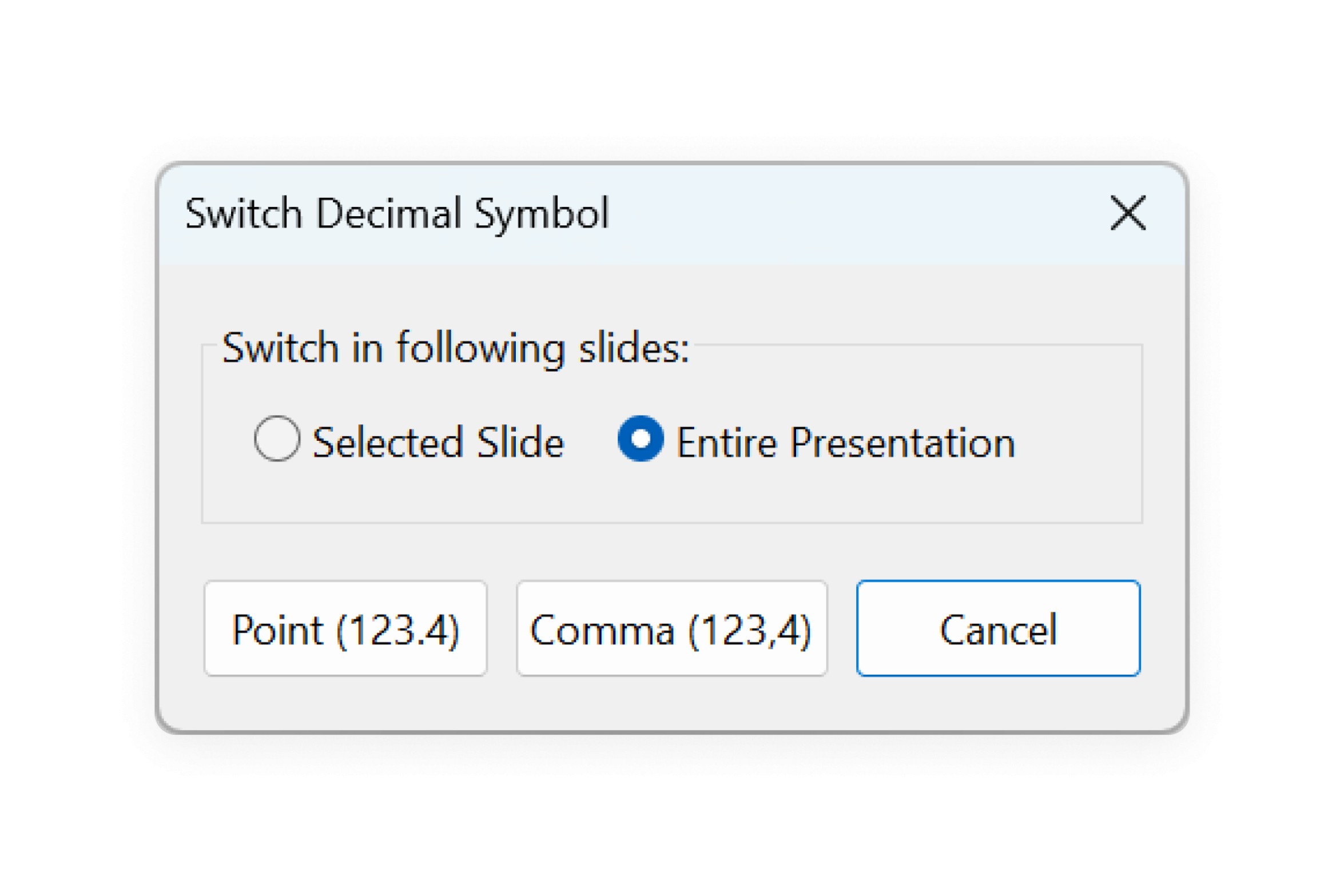
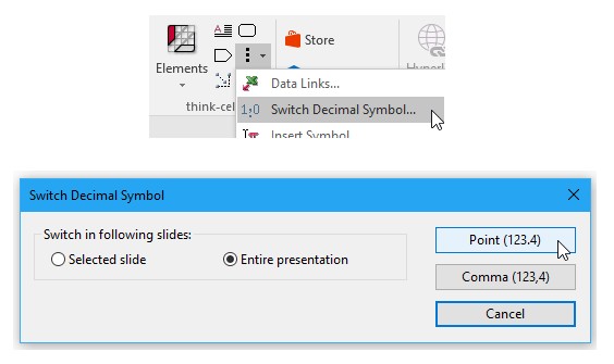
Switch decimal symbols: Switch between periods and commas as the decimal point to ensure accuracy and consistency in international presentations.
The think-celltab on the PowerPoint ribbon contains all of the think-cell Tools, so it's easier than ever to use these features without disrupting your workflow. To learn more, see think-cell Tools.
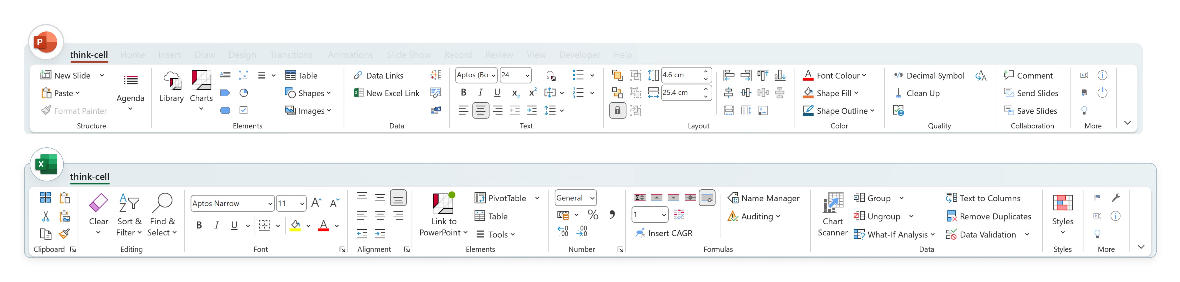
Access your essential tools from one think-cell tab
We've added a convenient think-cell tab to your ribbon in PowerPoint and Excel.
All the most popular commands in one place
The think-cell ribbon tabs combine popular PowerPoint and Excel commands with think-cell tools. In a single think-cell tab, you can access all the essential tools you need to manage your data and create presentations.
Streamline your workflow with the think-cell tab:
In PowerPoint, insert images and other objects from the same tab where you manage your presentation's structure and layout.
In Excel, manage your cell formulas from the same tab where you link data to think-cell charts.
Windows users can fully customize their ribbon tabs. Personalize your ribbon by rearranging it, adding custom groups and commands, or removing tools that you don't use. For example, add a custom group for your favorite think-cell charts.
Enhanced control of what you already love about think-cell
Making PowerPoint better goes even further with think-cell 12. While the addition of Profile charts bolsters our ever-expanding portfolio of charts and graphs, the enhancements included in this release increase your ability to easily control, connect and display more information. From applying color to multiple partitions (versus only one side) to linking Harvey balls, checkboxes, and even images to data in Excel, think-cell continues to shave hours off your day while making every presentation shine. It’s that simple.
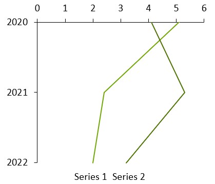
You can create rotated line charts, also known as profile charts, and rotated combo charts in the same way as rotated stacked or clustered charts.
Similarly, for a rotated stacked or clustered chart you can use the chart type control to change the chart type to line, keeping the rotation.
The think-cell profile chart is an easy way to visualize even the most complex trends with data that indicates the value area and points of control related to specific topic areas.
Common use cases include: Company or product comparisons across various categories, personality profiles, market profiles for financial and banking industries.
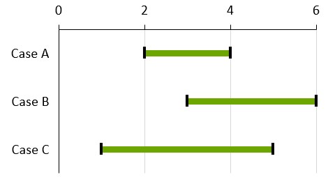
Using a rotated line chart and error bars, you can create football fields. They can be used to visualize the low and high values for an item and the spread between them.
To create a football field chart:
Create a rotated line chart
Enter the low and high values in the datasheet
Select both the lines for low and high values
Right-click and choose Add Error Bars from think-cell's context menu
Select one error bar and format both the bar and data points for low and high values as desired. You would typically switch to a thick error bar, e.g., 6pt in football field charts
Right-click the chart background and select Add Gridlines from the context menu. To style all of them, select any one of them and press Ctrl+A to select all. You can then choose formatting options from the floating toolbar, such as a lighter color.
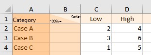
Scatter chart partition fills
You can directly select individual partitions in scatter and bubble charts. This makes it easy to give each partition a different fill color, if desired. Previously, you selected a partition line to choose the fill color to only one side of the line.
To create a chart with four partition fills:
Create a scatter chart as usual
Add two partition lines that intersect
Move the mouse pointer into one of the partitions, which will highlight in orange as a selection target
Select the partition and choose a fill color
Repeat for the other partitions.
This also works for areas bounded by non-linear trendlines!
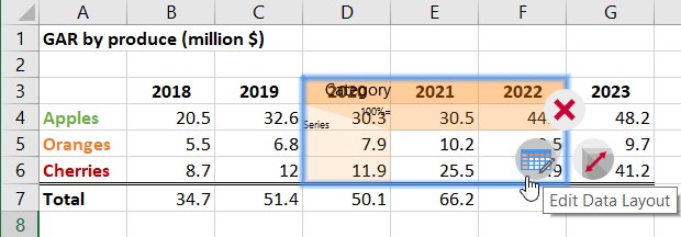
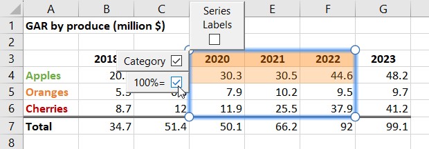
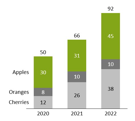
Editable Data Layout
You can now customize the layout of the internal datasheet as well as that of Excel links.
This is particularly useful when you want to link charts to an existing Excel sheet whose layout you do not want to modify. Let's say you have an Excel sheet laid out like this, and want to create a column chart out of the selected range:
Select the range and click Insert > think-cell > Link to PowerPoint > Stacked
Place the chart in the desired position on the slide.
In the resulting linked range, the first data row is misinterpreted as 100% values, and the first data column as series labels.
To get the correct interpretation of the data:
Right-click the green border of the linked range and select Edit Data Layout
Disable Series Labels and 100%=
Click the green update flag on the chart in PowerPoint.
The link will now correctly interpret all linked cells except the first row as data values, with data rows representing series.
To label the series, simply right-click the chart, select Add Series Labels and replace the placeholder in the labels accordingly. The final result will look something like this:
Note: When working with the internal datasheet of a chart, you can find the Edit Data Layout button in the Quick Access Toolbar at the top of the window.
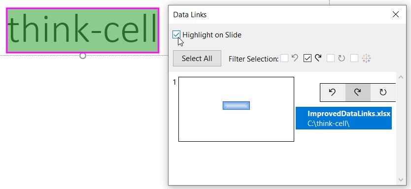
Highlighting linked elements in PowerPoint
You can click Highlight on Slide in the Data Links dialog to highlight all elements linked to external sources on the slide, to further facilitate easy management of your data links.
Text linked to Excel is now listed in the Data Links dialog.
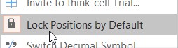
Option to lock positions by default for tables, text boxes and other elements
think-cell tables, text boxes and other elements are automatically resized and positioned. This advanced automation can be a great time-saver, but is also quite different from PowerPoint's standard mode. A new option allows you to have the best of both worlds, getting access to think-cell's new elements while controlling size and position yourself. You can find it in the Tools menu.
Lock Positions by Default is activated by default in think-cell 12.
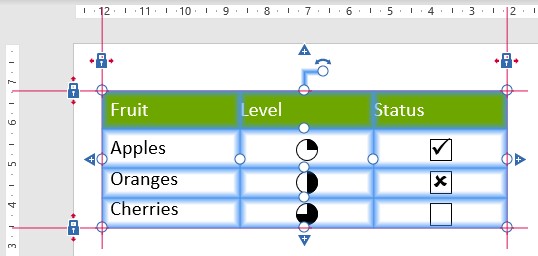
When Lock Positions by Default is active, think-cell elements that you add have all locks closed.
To move the element, select the whole table and drag it. It will keep its size and the locks will be moved to the new postions.
To resize, drag the respective lock or handle. For example, to make the element wider, drag the right lock or the handle on the right edge.
Option to align center/align middle for all think-cell layout elements
You can now align the horizontal (Align Objects Center) or vertical (Align Objects Middle) center of a think-cell layout element, or a group of think-cell layout elements with one another, or with the slide.
Just as with other alignments between think-cell's smart layout elements, this relationship will be maintained even when something causes the slide layout to change.
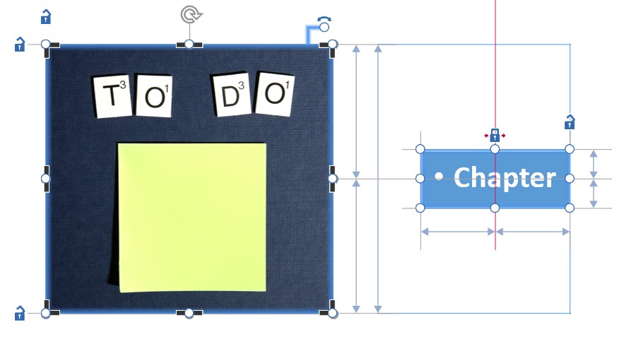
Let's say you want to have an image of a fixed size on your agenda slides that is always aligned vertically with the middle of the table of contents, which in turn is always in the center of the slide horizontally. You can now easily achieve this as follows:
Insert an agenda slide into your presentation by selecting Chapter from the think-cell Elements menu
Insert the desired stock image by selecting it in the Elements > Stock Image and clicking on the slide to the left of the agenda table of contents to insert it
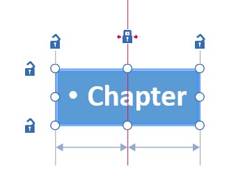
Select the table of contents by clicking its border, so that the locks are shown, and click Home > Drawing > Arrange > Align > Align Center. A red line with a closed lock will appear in the middle of the table of contents
Multi-select the image and the table of contents by holding Ctrl and clicking both. Click Home > Drawing > Arrange > Align > Align Middle. A grey line connecting the middle of both elements will appear, indicating that they are aligned with each other around that position
Select the image and, holding Ctrl drag one of its resize handles to fix its desired size.
Now you can add chapters, subchapters, etc. to your agenda as usual, and think-cell will automatically take care that the desired relation between slide, table of contents, and image is maintained.
Additional features
Customize appearance of Gantt charts
You can now customize the appearance of the Gantt chart using the new <gantt> element in the style file: From setting default background fills for different elements over fine-grained control over the properties of every single kind of line in the chart to new choices for the look of the date scale. For a detailed description, see gantt.
We have also added support to Gantt charts for fiscal years that always start or end on a particular weekday, and thus require leap weeks, as well as support for 4-4-5, 4-5-4, and 5-4-4 calendars. For example, including the following element in your style file will allow you to use fiscal years ending on the Friday closest to Janurary 31st, and with 13 week quarters following a 4-5-4 convention:
This means you can now use it on your Microsoft Surface Pro X, for example.
Remove the X-axis/baseline of charts
To place the chart on top of a picture or visual background, for example, simply right-click the axis and click the Delete button, or left-click the axis to select it and press the Del key. To add it back in, right-click a highlighted segment of the X-axis area, and select Add Axis Line.
Deleting Unused Links in Excel
You can now delete all disconnected data links in an open workbook. Simply click Delete Disconnected Links from think-cell's Tools menu in Excel, or right-click a linked range highlighted in red and select Delete All Disconnected Data Links from the contextual menu.
Cleaning and sanitization
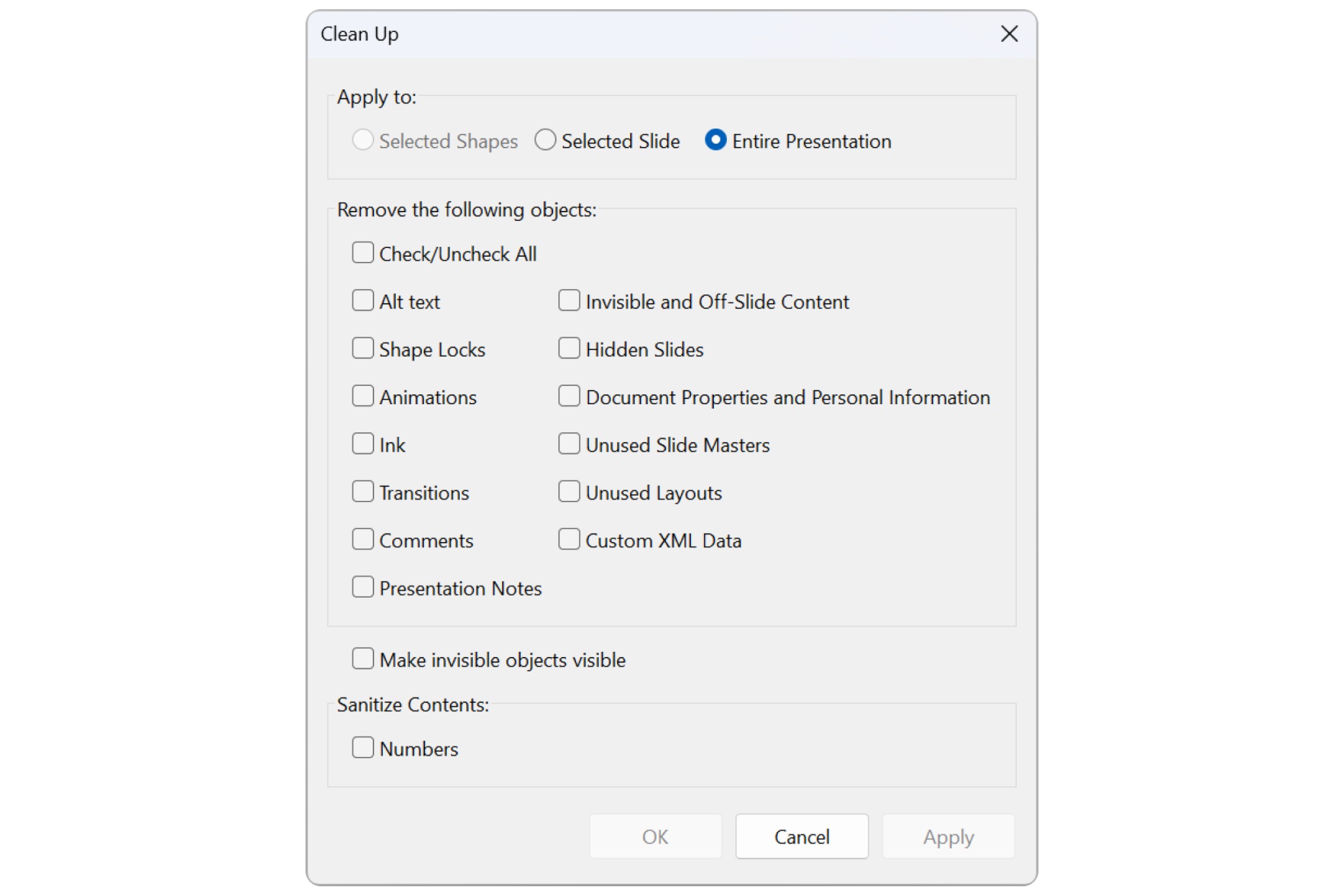
think-cell has expanded its cleaning and sanitization options, to help you prevent leakage of sensitive internal or client data, and has bundled them into a single Clean Up... dialog. For example, think-cell can remove all Comments and Presentation Notes, as well as any unused Slide Masters and Layouts embedded in the presentation. It can also automatically replace all numbers contained in the presentation with random ones. The same functionality is available when using think-cell's Send/Save Slides... dialog.
Predefined slide layouts
You can now predefine slide layouts in the style file which will be shown as thumbnails on inserting or moving a chart. Click one of the rectangular areas marked on the thumbnail to quickly and precisely insert the chart with that position and size. This is especially useful when combining it with slide templates to ensure consistent placement of charts on the slide in relation to other elements. Think of it as placeholders for think-cell charts, just more flexible. For detailed instructions on how to do this, see Create preset layouts for chart placement .
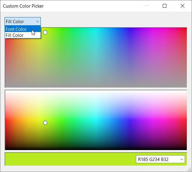
Improved color picker
think-cell now comes with an improved tool for picking colors, accessible by selecting Custom... from any color control. It gives you a useful preview by immediately applying the selected color on the slide. You can also easily switch between choosing colors for different features of the selected element, such as fill color and font color, and even switch to choosing the colors for a different element simply by selecting it on the slide. If you want to select a predefined RGB color in either hex (#82a617) or decimal (rgb(130, 166, 23) or R119 G119 B119) format, simply enter it into the box bottom right.
think-cell 11
Our CEO Markus Hannebauer walks you through the most important new features of think-cell 11 in the following short video. See below for further details.
Linked data tables
You can create linked data tables in PowerPoint from data ranges in Excel.
To create both a chart and a data table:
Create a linked chart as usual
In Excel, select just the series labels and numbers
Choose Table from think-cell's Elements button in Excel
Place the data table on the slide and restrict its position as desired with the locks, e.g., to be below and aligned with the chart.
Updating the linked table works exactly the same as updating the chart. You can even set it to update automatically whenever the data changes in Excel. See Tables to learn more.
Image element and inserting stock photos
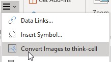
You can convert bitmap image shapes to think-cell elements by selecting the image and choosing Convert images to think-cell in the ≡ menu. think-cell will take the image into account when automatically positioning smart text boxes, process flows and tables.
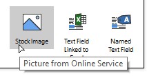
Using the Stock Image button in the Elements menu, you can directly insert a stock photo that will be part of the automatic slide layout. On first use you need to enter your Getty credentials, or you can use free images from Unsplash. See Images and icons to learn more.
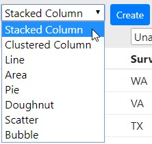
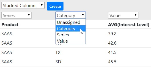
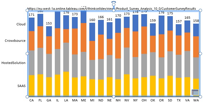
Data connector for Tableau
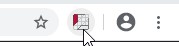
You can connect a view on a Tableau dashboard with a PowerPoint chart using think-cell. See Tableau data links to learn more.
Open a Tableau dashboard in Chrome.
Click the icon of the think-cell extension:
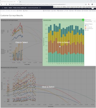
The different views on your dashboard are detected and shaded in green when the mouse pointer is over them. Click one.
A new tab is opened with the view's data. Pick the chart type you want to create.
Assign columns to the parts of the think-cell datasheet pertinent to the chosen chart type, i.e., for a stacked chart, categories, series and values.
Click Create to create a think-cell chart in PowerPoint.
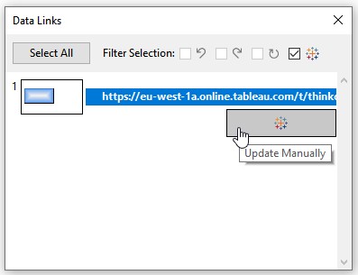
think-cell remembers the connection to the Tableau data! Clicking on the datasheet button of the chart in PowerPoint will open the tab with the view's data in Chrome. There, you can click on Update to transmit updated data to PowerPoint. You can also start the data update from think-cell's Data Links dialog:
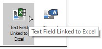
Text fields linked to Excel
You can insert a text field that is linked to a cell in Excel into any think-cell label or PowerPoint text box.
In Excel, select the cell with the content you wish to link to
In PowerPoint, place the cursor in a label or text box
Choose Text Linked to Excel from think-cell's Elements button in Excel
The contents of the linked text field always updates automatically when the cell contents in Excel changes.
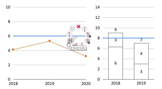
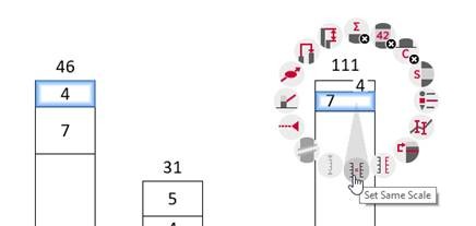
Changes to the user interface for Same Scale
The Same Scale functionality is improved and more flexible. It was necessary to move the button to access it. The Same Scale button is not shown anymore when two or more whole charts are selected. Instead, select the parts you want to scale the same in both charts:
two segments, one in each chart
two axes, one in each chart
two gridlines, one in each chart
two data points, one in each chart
You can also mix and match, i.e., for a line and a column chart, you would select a data point in the line chart and a segment in the column chart.
As before, you then right-click and choose Set Same Scale from the contextual menu. And also as before, you can set more than two charts to the same scale. Just select, e.g., one segment in each chart and apply Same Scale. See below for another example, this time using two segments, in two charts:
To revert to automatic scaling, select a segment, axis, gridline or data point and choose Reset to Independent Scale from the contextual menu.
Additional features
Ctrl+A is much more powerful now. Hit it repeatedly to automatically select ever larger sets: all labels of one series, then for all series, then all labels in the chart. Same for all segments of one series, then all segments in the chart, then even all segments across all charts on the same slide. As the next formatting change you make will be applied across the whole selection, this makes wide-ranging changes very fast.
You can move category labels to the top of the chart, without flipping the chart itself.
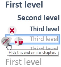
Do you have a multi-level agenda with too many sub-items to always show everything? You can now hide all chapters of a certain type. For example, select a third-level agenda item, right-click and choose Hide this and similar chapters. The currently active chapter can not be hidden, of course. To go back, select the whole agenda and choose Show all chapters and subchapters from its context menu. (learn more)
Chart scaling is adjustable even without a visible axis by selecting a segment, data point or gridline and using the usual axis handles.
Support for right-to-left charts for use with right-to-left languages such as Arabic and Hebrew. When you change the language, all existing charts are switched to right-to-left automatically and vice versa.
In the Gantt chart, you can set a fiscal year that is different from the calendar year. In a style file, include the following snippet for a fiscal year that ends in September. Q1 of the next year would start with October:
<fiscalYear>
    <end month="sep"/>
</fiscalYear>
think-cell 10
Now on macOS
After several years of development, we have achieved what no other company has done before – we have ported a complex Windows Office add-in to Office for Mac without sacrificing functionality! Your license for think-cell on Windows is also valid for macOS. think-cell 10 works with Microsoft Office 2016 for Mac version 16.9 or later, running on OS X Yosemite (10.10) or later.
With think-cell 10, you can now choose your favorite working environment and have the same great user experience. The interface is exactly the same and all features are available.
User Interface
With think-cell now branching across multiple platforms we took the opportunity to refresh the user interface. Icons in the Elements menu and context menu have a fresh new look.
With one click, you can change the chart type from this row of icons.
In the Data Links dialog you can now also easily select all charts linked to a specific Excel source file, and update them with one click (see Manage linked data with the Data Links dialog).
New buttons in the contextual toolbar help you easily update and revert, as well as switch to automatic updates for a chart.
Selecting a series in the legend of a scatter or bubble chart highlights all points or bubbles of the series.
Same scale and axes
Setting charts to the same scale is now persistent. If the scale changes in one chart, all charts with the same scale will be updated. You can set charts to the same scale even when their axes are not displayed (see Match the scales of different axes).
Using the same scale for multiple charts also works with axis breaks. Setting the same scale does not remove existing breaks, and adding an axis break to one chart will automatically add it to other charts using the same scale.
The X axes can also be set to same scale if they are value-based or date-based. For example, you can easily set two line charts to show the same years, even when the date range covered by the data is different (see Match the scales of different axes).
Scatter and bubble charts now support same scale. You independently choose whether the X- or Y-axis should use the same scale.
Value axes support a reversed axis. Scatter and bubble charts support a numerically reversed axis. Column, clustered and area charts simply flip the chart. In a line chart with two axes, you can set one to a reversed order to highlight negative correlations (see Reverse the value axis).
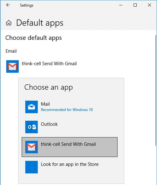
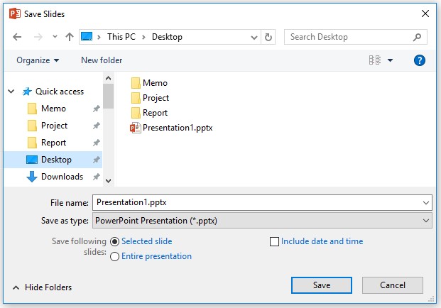
Save and send slides
On Windows, you can use Gmail when sending slides instead of Outlook. To enable this, you set "think-cell Send with Gmail" as the default email program (see Send and save slides).
The "Save Slides..." command uses a dialog which includes your Quick Access folders. At the bottom of the dialog, you can choose which slides to include and whether date and time should be added to the filename.
When using "Save Slides..." and "Send Slides...", the filename better represents your choices: If you choose to send the entire presentation, for example, the file name does not contain slides numbers.
Color and style
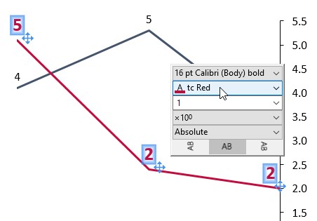
The font color of text in labels can be chosen and is not reset, even if the label background changes (see Font color).
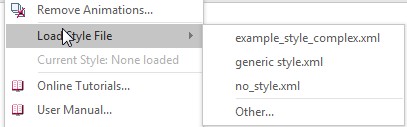
The Load Style File command makes it easy to load previously used and default style files. Initially, it contains all styles included with think-cell for easy selection.
The color scheme for new charts is always taken from the think-cell style. The most recently used color scheme is now irrelevant when inserting a new chart. You can use a style file to set your preferred color scheme as the default (see Brand compliance).
Chart decorations
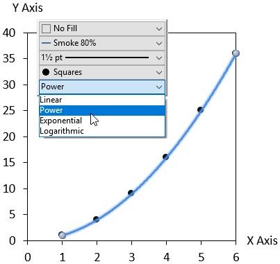
In the scatter chart, trendlines based on a power law, exponential or logarithmic relationship can be fitted to your data (see Trendlines).
You can represent the numerical scale of your chart with only gridlines instead of an axis line, instead of showing both (see Value axes).
JSON
Create slides with text content based on JSON input while using the full power and flexibility of smart text fields. The new named text fields serve as placeholders in your automation templates (see Advanced report automation).
think-cell's text boxes have been given a boost of intelligence. You can now use them to create complex slide layouts without manually moving or resizing any elements (learn more). Watch the video to see how it works.
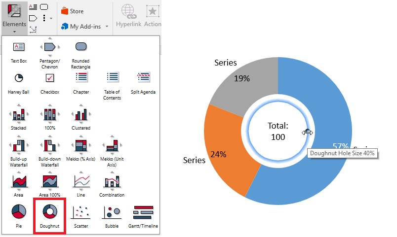
Doughnut charts
Make your pie charts stand out even more by converting them to our newest chart type, the doughnut chart. And yes, doughnut charts look just like they sound. They’re essentially pie charts with a hole in the middle. This new chart design helps to accentuate the data slices and provides a place to highlight additional information. Learn more.
Enhanced chart rendering
For better visual quality and faster editing, think-cell 9 uses PowerPoint's native chart component to render charts instead of the legacy MS Graph component. This also removes several other limits, e.g., scatter and line charts can now contain more than 4,000 data points. think-cell's user interface itself is not changed at all by the new rendering back-end. You will just notice the improved visual quality and better compatibility.
Automation with JSON
In addition to Excel, you can now use JSON data to automatically create and update periodic reports (learn more). This new enhancement allows you to:
Create presentations automatically by merging template charts with JSON data.
Build a web service that creates think-cell charts.
Export your business intelligence reports as PowerPoint slides.
More new charting features
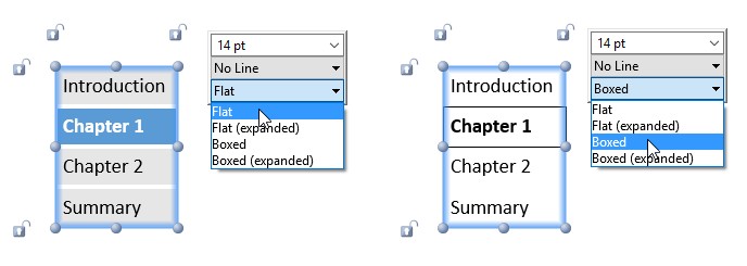
The new "Flat" agenda style uses background fills instead of rectangles. Learn more.
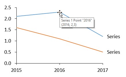
Tooltips now show labels and numeric values for individual datapoints.
Chart types can now be switched between absolute and percentage, even when there's no axis. Learn more.
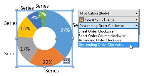
The sort order of slices can now be easily changed for pie and doughnut charts.
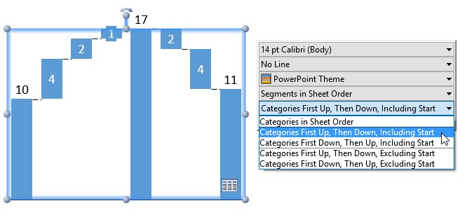
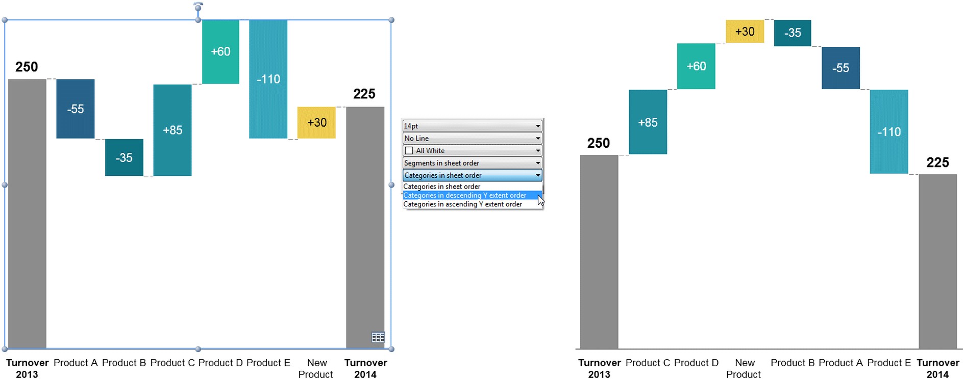
In waterfall charts, category sort options such as "Categories First Up, Then Down, Including Start" ensure that sum columns stay in their position.
The baseline weight can now be changed.
Changes to existing charting features
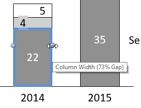
In previous versions you adjusted the column width by changing the gap width between columns. In think-cell 9, you instead adjust the column width directly by using the following handles: Learn more.
Label rotation was changed by dragging a handle in previous version, while other properties like font size and number format were set using the floating toolbar. In think-cell 9, you also set label rotation in the floating toolbar. Learn more.
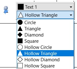
In previous versions, milestones where shaped as a triangle or diamond and you switched between them with a button in the milestone's context menu. In think-cell 9, additional shapes were added. Therefore, you choose the milestone shape with a control in the floating toolbar, which shows a list of choices. Learn more.
New tools to make you more productive
Quickly switch the decimal symbol (e.g., German to US format) for labels on all or selected slides. Learn more.
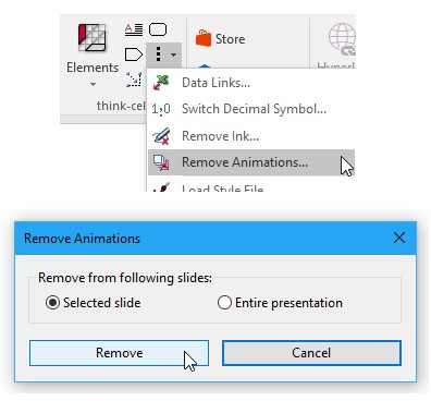
Remove animations from all or selected slides. Learn more.
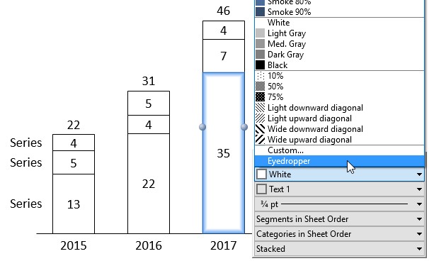
Quickly choose custom colors with the new eyedropper tool. Learn more.
New keyboard shortcuts:
Multi-select labels with Ctrl+Alt+Shift+←→↑↓.
Duplicate elements, e.g., in tables and process flows, with Ctrl+Alt+←→↑↓.
Additional customization options
Control agenda placement through a custom layout that can also contain more shapes for agenda slides. Learn more.
Define theme color shades as a base color plus brightness. Learn more.
Specify checkboxes with more options: non-square images, e.g., traffic lights, and all Unicode characters. Learn more.
For a color scheme, specify that it is not remembered as the default for subsequent charts. Learn more.
Improved Sharepoint support
think-cell fully supports the new user interface for conflict resolution in PowerPoint 2016 that is based on whole slides. Concurrent editing in SharePoint/PowerPoint 2013 is also improved.
think-cell 8
Process flow
think-cell 8 greatly expands the slide layout functionality of our software by introducing the pentagon/chevron and textbox as new think-cell elements. Show project steps with accompanying bullet points by creating the basic structure very quickly out of building blocks, and use flexible single-click duplication to add additional steps. The following video shows this in action.
The layout is continuously re-arranged and optimized automatically when the text in elements changes. Furthermore, the direction of the whole structure can be changed from left-to-right to top-to-bottom by dragging the unified rotation handle. Learn more.
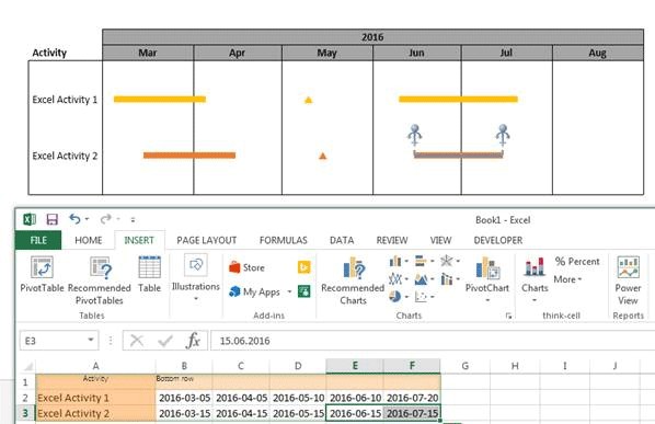
Excel link for Gantt chart
You like linking charts directly to Excel and having them update automatically? With think-cell 8, Excel links also work in Gantt charts. You can link activities and milestones to dates in Excel. When the dates change, the Gantt chart is updated as well. Learn more.
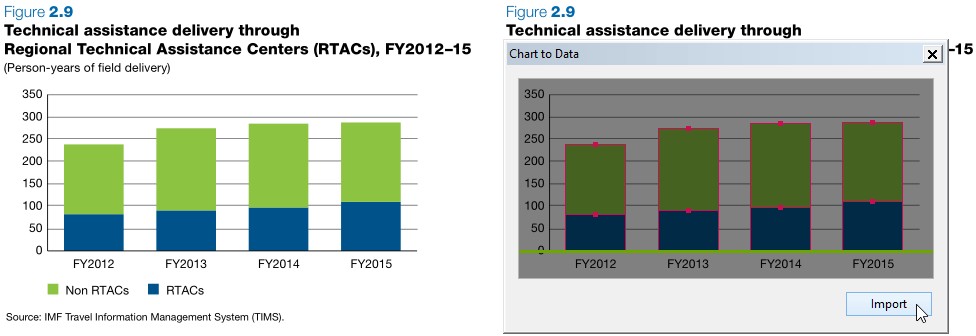
Chart to data
Sometimes source data is only available in a chart on a website or a PDF document. The new Chart Scanner tool in think-cell 8 lets you work with this data. Below on the left is a chart in a PDF document. On the right, the segments were automatically detected by think-cell and the numerical data is ready for import. Learn more.
Chart type conversion
Would you like to change chart types after the chart has already been created? In think-cell 8, you can easily convert chart types. For example, you can change stacked columns to clustered columns, segments to lines and many more combinations.
More new charting features
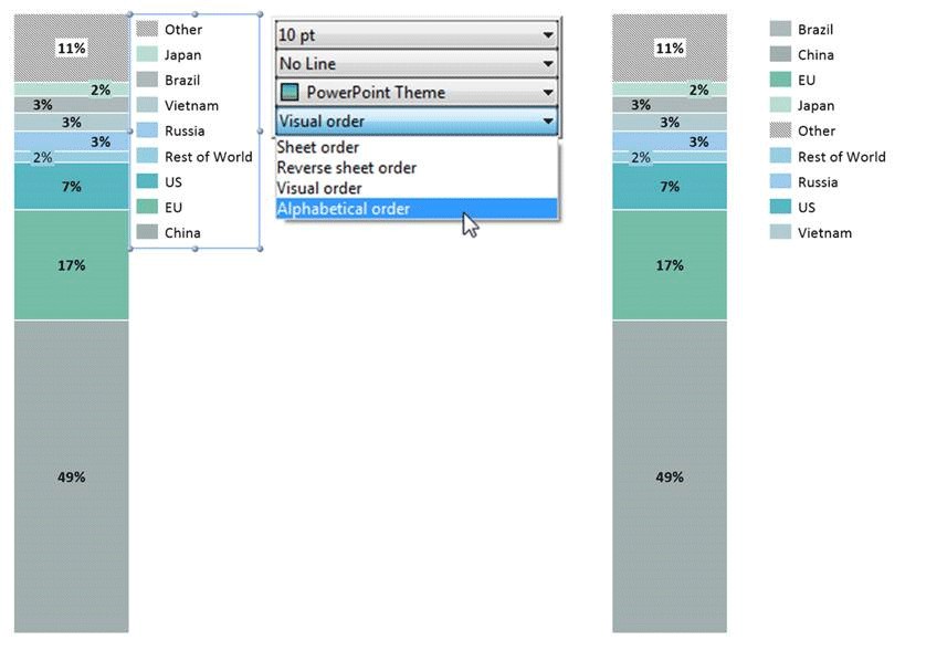
Do you want the series labels in a legend to appear in a different order than in the datasheet? With think-cell 8, you can also use the chart's visual order, which may be different due to sorting, or an alphabetical order.
Automated chart updates with think-cell's programming functions become even more automatic: The chart width remains fixed when the number of chart categories changes, minimizing necessary manual changes to the slide layout.
Set the numerical sign of labels independently for segments and totals.
Collaboration
Co-authoring in Microsoft Sharepoint is supported.
think-cell 7
Compatibility with Microsoft Office 2016
think-cell 7 is the first version of our software that is compatible with Microsoft Office 2016. Of course, it is compatible with all current Microsoft Windows and Office versions, including 32 and 64 bit versions. It is therefore recommended to install think-cell 7 regardless of which Windows or Office version is used.
Charting features
Aggregate data into a separate Other series from the segments' context menu in column, Mekko, area and combination charts. Add segments to or remove them from the Other series simply by dragging a handle. (More on this)
Sort categories by their total values directly from the chart's floating toolbar. (More on this)
Interactively resize data bubbles in bubble charts by dragging a bubble's handle. The other bubbles will be updated automatically, maintaining correct size ratios.
Adjust the reference size of the bubble size legend by dragging its handle.
Easily toggle the value axis between absolute and percent representations in stacked, 100% and area charts. (More on this)
To move all Gantt chart date items at once, press Ctrl+A while a bar, milestone or process is selected.
Formatting and style
Choose from the complete set of Microsoft Office design theme colors to style your think-cell charts. If needed, compatibility with Office 2003 and older versions can be ensured by a restricted color scheme offered in the chart's floating toolbar.
Customize your charts for a consistent visual identity with new options in the think-cell style file. In version 6, you could already change defaults for segment colors and color schemes. Now, in addition, you can define your own line colors and line styles, arrow bubble fills and outlines, Harvey balls and checkboxes, which may even include pictures instead of checkmark signs. (More on this)
Label content
Labels entered into the datasheet can now be up to 255 characters long without being truncated in the chart.
Create clean yet unambiguous charts by showing 4-digit year numbers on specific axis labels, while keeping 2-digit years for all others. (More on this)
In recognition of our growing Asian user community and its currency conventions, you can now find 104, 108 and 1012 in think-cell's magnitude dropdown box.
User interface improvements
Floating toolbars now open to the right of the mouse pointer, staying out of the way of selected elements.
Easily access cell formats from the datasheet toolbar with the new datasheet formatting button.