Gantt charts (timelines)
- Home
- Resources
- User manual
- think-cell Charts: Data visualization
- Gantt charts (timelines)

|
Icon in Elements menu: |
|

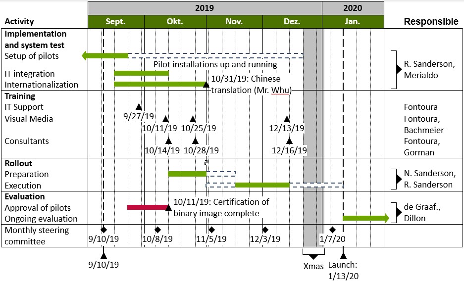
A project timeline (sometimes called Gantt chart) visualizes project activities. The scale of a project timeline is a calendar. The duration of activities is represented by bars or process arrows, whereas singular events are represented by milestones.
Calendar scale
Naturally, in a project timeline the scale is based on dates. With think-cell, you can quickly change the visible date range. The appearance of the scale is initially automatic, but can be manually modified if needed.
Modify the date range
When inserting a new project timeline, the calendar is initially scaled to show some time before and some time after the current date. There are two ways to change the date range that is shown.
You can open a calendar and select the dates you want:
- Double-click on a scale, e.g., the bar showing months, to open the calendar dialog.
- Alternatively click the

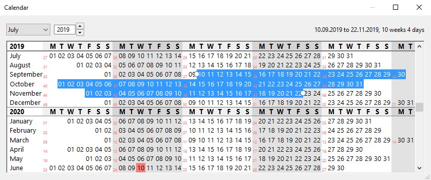
- Today’s date is marked red.
- Select the desired start date with a single click, and select the desired end date with another click while holding down Shift. You may also just hold down the mouse button and drag the mouse along to determine a range. In the upper right corner you will find additional information about the selected period.
- Alternatively, you can use the cursor keys ← → ↑ ↓ and PgUp PgDn to select a different date range. To expand the range, hold down Shift while moving.
- To edit a date range you can grab its beginning or end and drag it to the desired date.
- To scroll the calendar one line at a time, use your mouse’s scroll wheel, click the scroll bar arrows, or drag the scroll bar handle. To scroll the calendar one page at a time, click onto the scroll bar above or below the handle.
- To jump to an arbitrary date, select the desired month and year using the controls in the window’s toolbar. You can simply type in the desired year, if you do not want to use the control’s up/down buttons. The calendar immediately scrolls to the desired position.
- You can vertically resize the window to see more months at a time, and you can horizontally resize the window to adjust the font size. The width of the window does not have an impact on the calendar layout: One line always represents precisely one month.
Changes to the selected date range are immediately reflected in the chart. To close the calendar dialog, simply click the close button, or click into the main PowerPoint window.
Alternatively, you can simply change the date range by dragging the ends of a scale in the chart:
- Select a scale, e.g., the bar showing months.
- Click and drag the handle that appears on the selected scale. The current date is displayed as a tooltip while you drag.
- When you drop the handle, the chart is rearranged to accommodate the new date range.
While dragging the handles, they snap to integral units of the selected scale. You can quickly expand the chart to cover a large date range by dragging the handles of a scale with large units (e.g., years or months).

Note: When you modify the date range in such a way that a timeline item (see Timeline items) in the chart becomes invisible, any custom label text you have entered attached to that item will be discarded, and only the (start and/or end) date will be shown in its label when it later becomes visible again by enlarging the date range. This is to prevent accidentally storing sensitive information in currently invisible parts of the chart that can then be accessed by someone with whom only a narrower view was meant to be shared simply by enlarging the date range.
If you have accidentally narrowed the date range so that some label text was lost, you can simply Undo (Ctrl+Z) to restore it during the same PowerPoint session.
Scale display
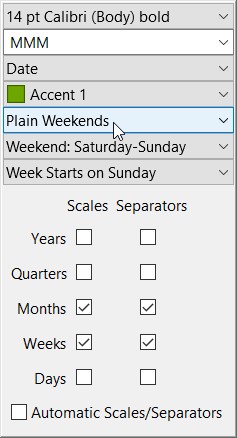
When changing the date range or the size of a chart, some scales as well as vertical separator lines may appear or disappear. Based on the range you select, together with the chart size and font size, think-cell suggests appropriate scales and separators to show. To make good use of this function, you should first select the desired date range before manually adding or removing scales or separators.
Altogether, there are five scales available in the project timeline chart: Years, quarters, months, weeks and days. In addition to showing or hiding scales, think-cell supports several options to change the look of the calendar. All of these settings are available on the mini toolbar of the Gantt chart or one of the currently visible scales:
- Using Scales, show or hide each of the five available scales (years, quarters, months, weeks, days). Depending on the chart’s current size and date range, some scales will automatically be disabled again because there is not enough room to show their units. Once you decide to show a scale it will not hide again automatically, even when the chart’s size or date range is changed, unless it cannot fit in the chart.
- Using Separators, show or hide vertical separator lines for each of the available scales (years, quarters, months, weeks, days). Separators may not be shown even if they are enabled if there is not enough space in the chart to display them.
- Enable or disable Automatic Scales/Separators. When enabled, think-cell shows appropriate scales and separators depending on the date range, chart size and font size. Once you explicitly show or hide a scale or a scale’s vertical separator lines, this option is disabled. When you enable it again, think-cell reverts to the scales and separator lines shown automatically.
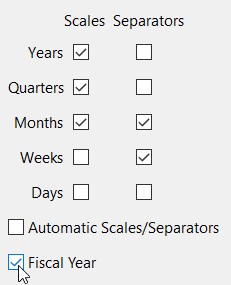
You can also configure a fiscal calendar for use in the scale of Gantt charts via think-cell's style file. If a fiscal calendar is configured in the loaded style file, an additional Fiscal Year option will be shown on the Scales menu. See Style files for information on style files generally, and Add fiscal calendar option to Gantt charts for how to configure the fiscal calendar specifically.
Each scale supports various ways to display date information, e.g., the months scale may show month names like “September” or numbers like “09.” You probably want to choose the appropriate format depending on the available space.
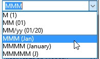
To do so, select the scale with the mouse and use the mini toolbar that appears to select the desired format. Since the dropdown menu is actually a date format control (see Date format control), you can also type in arbitrary date format strings.
Note: As with other labels, you can add arbitrary text to the scale labels, such as footnote markers or short comments.
The Gantt chart’s mini toolbar offers the following additional options:
- Choose between Plain Weekends, Shaded Weekends (weekends are shown in a different shade) and Hidden Weekends (weekends are not shown in the chart).
- Weekend: ...: Here you can choose the days that match the weekend in your country.
- Week Starts on ... lets you set the day that the think-cell calendar will use as the start of week.
If you have previously adjusted the visible date range and want to reset it, choosing 
Scale labels and separator lines
Each scale supports an optional label and optional separator lines. To use these features, open the context menu for the desired scale with a right-click.
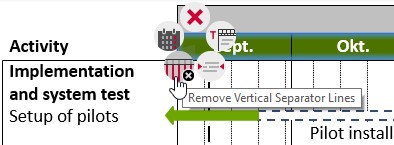
Note: Primary and secondary separator lines are automatically assigned different styles.
The scales’ context menu offers the following buttons:

Delete the selected scale. You can show the scale again using the Scales menu from the toolbar. When you deleted a scale it will not show again automatically, even when the chart size or date range is changed.
Open the calendar dialog (refer to Modify the date range).

Explicitly add or remove vertical separator lines for the selected scale. You can also remove separator lines by selecting them and pressing the Del key. The software automatically adds and removes these lines unless you are making an explicit choice.

Add descriptive text to the selected scale. The label contains language-dependent predefined text which can be replaced as needed.
An example for a typically used scale label is to write “Week of” to the left of the week scale if the first day of each week is shown in the scale labels:
- Enable the week scale on the Scales menu.
- Select one of the labels in the week scale and change the date format to include
dorddto show the first day of the week in the label. - Choose
- "Week of" is the default text of the week scale label.
Rows (activities)
A project timeline is made up of rows, each representing a certain activity that is named in the label to the left. The rows, in turn, contain timeline items such as bars, milestones and brackets.
You can explicitly select an entire row to change its look, add or remove labels, drag it to another location or use Shift+Alt and the cursor keys ↑ and ↓ to move it.
Note: There is a special row below the chart reserved for the most important milestones. You cannot add bars to this row, you cannot move it by drag-and-drop, and you cannot delete it. Otherwise, it is just an additional activity row which is always there.
Add and remove rows
To insert a new row, open the context menu by right-clicking an existing row, then select 
You can also duplicate a selected row using the keyboard shortcuts Ctrl+Alt+↑ and Ctrl+Alt+↓, creating a duplicate before or after the selected row, respectively. Using the keyboard shortcuts, you can add rows and keep typing without reaching for the mouse. Likewise, you can use Alt and the cursor keys ← → ↑ ↓ to move the cursor across labels.
To delete a row, open the context menu and select
Row features
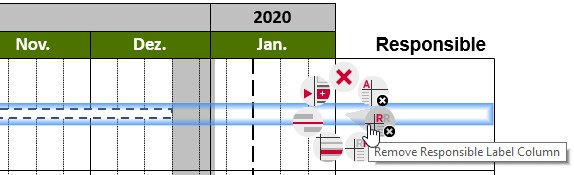
Each row can contain timeline items, such as bars, process arrows, milestones, brackets. Rows can also have up to three labels, a horizontal separator line, and row shading. The labels and decorations are added and removed using the think-cell context menu. To open the menu, move the mouse outside of the chart’s date range area and right-click on a row when it highlights.
Note: When you right-click a row inside the chart’s date range area, another menu opens that allows for insertion of new timeline items. Refer to Add items for more information.
The row’s context menu offers the following buttons. You can apply all of these buttons to one or multiple selected rows:
Delete the selected row.
Insert a new row after the selected row. You can also create a duplicate before or after the selected row using the keyboard shortcuts Ctrl+Alt+↑ and Ctrl+Alt+↓, respectively. If the selected row is the one below the chart’s bottom line, you can insert a new row using the keyboard shortcut Ctrl+Alt+↑.

Add or remove the activity label column. A headline for the column is added which you can overwrite or remove if necessary. With F2 you can edit the selected row’s activity label.

Add or remove the responsibility label column. A headline for the column is added which you can overwrite or remove if necessary.

Add or remove the remark label column. A headline for the column is added which you can overwrite or remove if necessary.

Add or remove shading. You can change the shading’s color and also add or remove the shading using the fill control on the think-cell mini toolbar. Shading works also well for multiple successive rows.

Add or remove a separator line above the selected row.
Row labels
Each row supports up to three labels, resulting in up to three text columns next to the actual timeline. The default headlines for the three columns are language dependent (see Language dependency), with “Activity,” “Responsible” and “Remark” used as the default English headlines. You are free to overwrite or remove them if necessary.
The labels to the left are intended for names of activities. These labels are shown by default and each label belongs to exactly one row. If you already have the text for the labels available in some other place where you can copy them to the clipboard, you can quickly paste an entire label column (see Paste text into multiple objects).
Note: Unfortunately, selecting multiple shapes in PowerPoint or labels in another Gantt chart does not work in this regard. Lines of text in a word processor, text editor or email or multiple cells in an Excel worksheet can be copied to the clipboard and pasted into activity labels as described above.
You can organize activity labels in a hierarchy using PowerPoint’s Decrease/Increase List Level buttons in the Paragraph ribbon group on the Home tab. Alternatively, hold down Shift+Alt and use the arrow keys ← and →. The vertical space between indented labels is reduced to show that they are grouped.
You can add up to two more columns if required. The labels for the headlines are automatically added when a column is created. The labels in the additional columns can refer to multiple rows (see Labels spanning multiple rows).
Initially, a newly created label column is empty except for its headline. Move the mouse over the label column to discover label placeholders, which you can select just as any other features in think-cell. Use the placeholder’s context menu to create either a text label, or a checkbox, or a Harvey ball. To quickly create a text label, you can simply select a placeholder and start typing. Similarly, you can recreate the headline labels, if you deleted them.
The row label’s context menu shows the following buttons:
Delete the selected label.

Use a checkbox instead of a text label (see Checkboxes). If the selected label already contains text, the text will be discarded.

Use a Harvey ball instead of a text label (see Checkboxes). If the selected label already contains text, the text will be discarded.

Use text for this label. Select and overwrite the placeholder text that is inserted when you click this button.

Add or remove the selected label’s bracket. Brackets are added automatically to labels that span more than one row (see Labels spanning multiple rows). This option only applies to responsibility and remark labels. Since activity labels always refer to precisely one row, these labels do not need brackets.
To remove a label, use its context menu or simply delete all text from the label—it will then disappear. To remove multiple labels at a time, it is often convenient to select all desired labels using the mouse together with Shift or Ctrl keys (see also Select multiple objects). Then, choose the delete option from the context menu, or press the Del key to remove all selected labels.
Labels spanning multiple rows
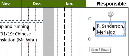
In both responsibility and remark columns, each label can refer to more than one activity. Drag the handles that appear next to the label when you select it, to determine the activities it refers to. You can only drag a label’s handles across rows that do not already have a label in the same column, and you cannot drag the handles across horizontal separators.
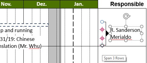
A bracket will automatically appear as soon as a label spans more than one row. In this case, you are free to remove the bracket by selecting it and pressing Del, or via the bracket’s or the label’s context menu.
Timeline items
There are several types of items used in a project timeline to visualize periods of time and events. The following items are supported by think-cell:
- Bars show the duration of some activity.
- Pentagons/Chevrons, also knows as process arrows, are similar to bars but contain text. They grow and shrink vertically with the amount of text they contain. To create an aesthetically pleasing layout, all process arrows of a Gantt chart are resized to the same height, if possible.
- Milestones mark singular events.
- Brackets are used to label periods of time which typically comprise multiple activity bars.
- Shades are used to visualize non-working times such as weekends or holidays. They are usually labeled by an additional bracket below the chart.
Add items
To add an item to the chart, move the mouse across the chart’s date range area. A crosshair helps you to track the row and date you are pointing at, and a tooltip provides precise date information.
The dates that can be selected depend on the chart’s date range and size, and on your current zoom level. If days are too small to be pointed at individually, the crosshair snaps to firsts of weeks and firsts of months. If even weeks are too small to be distinctively selected, the crosshair only snaps to the beginning of months.
Wherever the crosshair appears, it is possible to insert a new item. When you move the mouse over existing items, the crosshair disappears and the tooltip reflects that item’s date or date span.
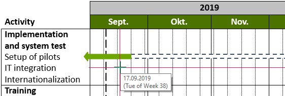
With the crosshair highlighting, click the right mouse button to open the context menu.
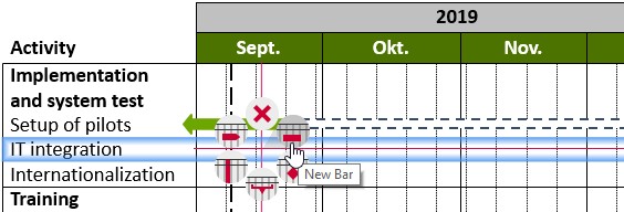
Note: If you want to open the row’s context menu to insert a new row or to add some row label or decoration, you must right-click on the row outside the chart’s date range area. Refer to Row features for more information.
The context menu for insertion shows the following buttons:
Delete the selected row, separator line, or milestone line.

Create a new activity bar beginning at the crosshair position.

Create a new milestone at the crosshair position.

Create a new bracket beginning at the crosshair position.

Create a new shade beginning at the crosshair position.

Create a new process arrow beginning at the crosshair position.
Note: You can also create new items by clicking and dragging existing items while holding down the Ctrl key. A copy of the original item is created at the new location.
Move items
There are several ways to move existing items to another date or row. Obviously, you can drag one or multiple selected (see Select multiple objects) items with the mouse. If exactly one item is selected, you can also drag its handle(s) to adjust the date, or anchor it to another item (see Anchor items).
You may double-click an item to open the calendar dialog for easy date selection. The current date of the selected item is pre-selected. For bars, process arrows, brackets and shades, select a date range as described above (Modify the date range). For milestones, simply click on the desired date; the calendar dialog will close immediately and the selected date will be applied.
Milestone position
Bars and process arrows are positioned to begin at 0:00h on the start date and to finish at 24:00h on the end date. The default position of milestones is 12:00h. Nevertheless, if the day scale and the vertical day separator lines are not visible, then milestones are displayed at 0:00h on the appropriate day for better alignment, even if their position is 12:00h.
The default positioning of milestones is usually correct but can be overridden, if required, by the use of anchors (Anchor items). Anchoring a milestone to the end of a bar, for example, will ensure that the milestone is always aligned with the end of the bar, regardless of the currently viewed data range or visible scales.
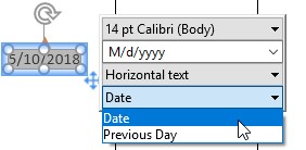
The milestone date label usually shows the Date the milestone is positioned at, but switches to the Previous Day when the milestone is aligned with the end of a bar. You can manually change this using the milestone's label content control.
Anchor items
Using the handles of bars, process arrows, milestones, brackets and shades, you can attach these items to other items. When you click a handle with the mouse, the available anchors highlight. Drag the handle within the current row to set the selected item’s date manually, or drag the handle onto an anchor of some other item to attach it to that item.
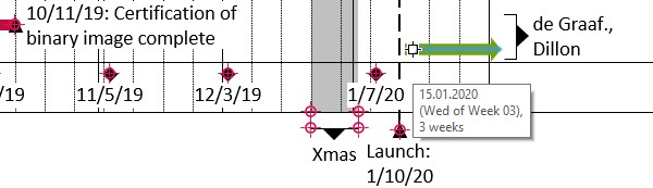
Items remain anchored while they are being edited. For instance, when you anchor the start of a bar to a milestone, this connection enforces that the start of that bar is always at the same date as the milestone. In particular, whenever you move the milestone afterwards, the start of the bar will be updated accordingly.
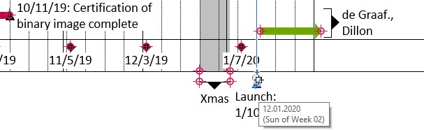
For another example, inserting a shade implicitly creates an additional bracket which is anchored to the shade. When you move the shade, the attached bracket moves along. Still, you can detach the bracket, move it to a different location, or delete it.
Note: Items can be anchored across different rows. When you drag an item’s handle, the date changes but the item remains in its row. To move an item to a different row, drag the item itself, not its handles.
Change a chart’s appearance
You can change the color of bars, process arrows, milestones and shades using the color control on the mini toolbar (see Fills). The background color of the chart can be changed by selecting the whole chart and choosing the desired color from the mini toolbar.
You can also control the outline of bars and process arrows, as well as the shape of milestones, from the mini toolbar. For bars and process arrows, you can also select from a predefined list of styles, i.e. of combinations of color and outline.
By way of the context menu, you can further configure the appearance of timeline items. The context menu for timeline items comprises the following buttons (depending on the type of the selected item):
Delete the selected item.
Open the calendar dialog for the selected item (refer to Move items).

Add or remove a label for the selected item. By pressing F2, you can edit the label’s item, or create it if it does not yet exist. By default, the label contains the item’s date which is updated when the item moves (see also Item labels).

Add a milestone line to the selected milestone.
Item labels
Bars, process arrows, milestones and brackets can have labels, while shades are usually labeled by means of an additional bracket below the shade. Use the think-cell context menu to add a label to one or more selected items. If exactly one item is selected, you can press F2 to add a label to this item or edit an existing label.
By default, an item label contains the item’s date or date span. This information is maintained in a text field (see Edit chart label text on the slide) and is updated whenever the item is moved. You can add text to the label or replace the default content with custom text.
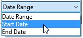
If you deleted the text field you can always re-insert it into the label. Select the label and choose the desired field from the label content control on the context-sensitive toolbar (refer to Label content).
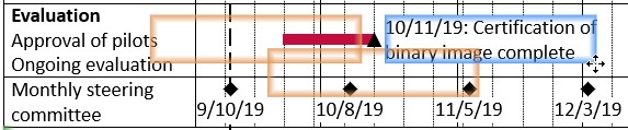
In particular, think-cell allows for large multi-line labels even in a relatively dense chart. All activities are automatically arranged to make the text fit. Moreover, most labels can be dragged to place themselves below or besides their respective item.
Datasheets
The Gantt chart can use dates stored in a datasheet. You can then anchor timelime items to those dates. If dates in the datasheet change, the anchored timeline items are updated accordingly.
This is similar to chart types which are based on numbers. In these chart types, the datasheet contains numerical values, and the chart is updated when numbers change. However, you also control the visualization of your data and add arrows and value lines in the chart, not in the datasheet.
Let’s say you want to create a Gantt chart with five activities that each have their result validated at a milestone a few weeks after completion. You want to store all dates in the datasheet to easily update them later in a single window.
You start by inserting a Gantt chart. Open the datasheet by clicking the 
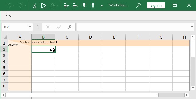
The first row in the datasheet corresponds to the milestone row below the Gantt chart. Into the second row, you enter the first activity description and three dates: the start of the task, the end and the validation milestone, respectively.
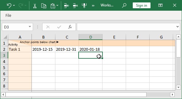
Note: You need to enter the dates in a way that Excel recognizes as dates. If the cell content is right-aligned, Excel has recognized a date. Otherwise, Excel has only recognized your input as text, and think-cell will not be able to use it. When specifying a date and not including a time, Excel will assume the time to be 12:00am, i.e., the beginning of that day. When such a date is used as the end of an activity, the activity therefore is displayed as ending on 12:00am of that day, i.e., not including the day itself. If you want to specify that an activity ends with January 15th and includes that day, either enter 2017-01-15 11:59pm or 2017-01-16.
You will notice two changes in the Gantt chart:
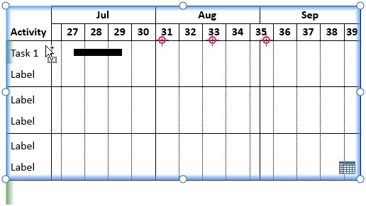
- Three anchor points are displayed at the top of the first row, corresponding to the dates you entered into the datasheet.
- A green line down the left of the first row indicates that this row is linked to the datasheet. The tooltip for the row contains the specific source: "Linked to sheet row 2."
Now it is time to anchor timeline items to the dates from the datasheet:
- Select the bar that remains from the default Gantt chart and anchor the beginning to the first anchor and the end to the second anchor.
- Insert a milestone and anchor it to the third anchor.
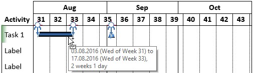
Note: If multiple timeline items are selected in different rows and a handle is dragged to an anchor from the datasheet, each item is appropriately anchored to the respective date from its own linked datasheet row.
Feel free to remove the other five standard rows that are not linked to the datasheet. Once you fill additional rows in the datasheet, corresponding activity rows will automatically be added to the Gantt chart as needed.
At this point, you finish entering activity titles and dates into the datasheet:
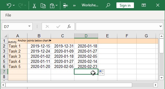
While you type in the additional tasks and dates in the datasheet, the Gantt chart is automatically updated:
- Once you start filling a new row in the datasheet, an activity row is added to the Gantt chart.
- As you add dates to the datasheet, new timeline items are added to the Gantt chart. The new items are modelled on the items in the existing row above the new row.
- New timeline items, i.e., the new activity bar and the new milestone, are automatically anchored in the same manner as those in the closest row—in this example, the row above. Of course, if the dates in the datasheet differ from row to row, the positions of the timeline items in the Gantt chart reflect this.
You have quickly created a complete Gantt chart with five rows and two items per row.
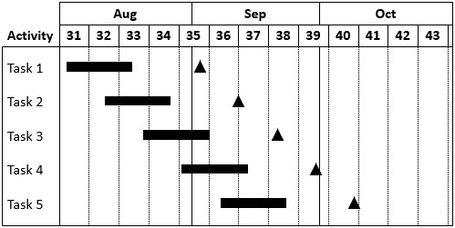
After you have defined the general structure in the first row, subsequent rows have automatically followed this structure without any more inserting and anchoring necessary.
Excel links
A Gantt chart can be linked to a range in an Excel file (see Create elements from Excel). Let’s assume that the dates from the example above reside in an Excel file you received:
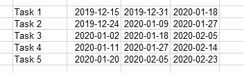
To create a linked Gantt chart, please
- Select all cells in Excel, including the activity titles and the dates.
- Include in your selection an additional row above the first activity title and dates. This additional row holds dates for the Gantt chart’s milestone row. Even if no such dates are present, this row needs to be included in your selection.
- From the Charts menu in Excel’s think-cell toolbar, select the chart type Gantt/Timeline.
- In PowerPoint, choose the appropriate slide and position for the new Gantt chart.
The range in Excel will be marked as linked:
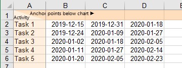
The new Gantt chart will show your activity titles and the anchors for the dates in Excel, but no timeline items yet:
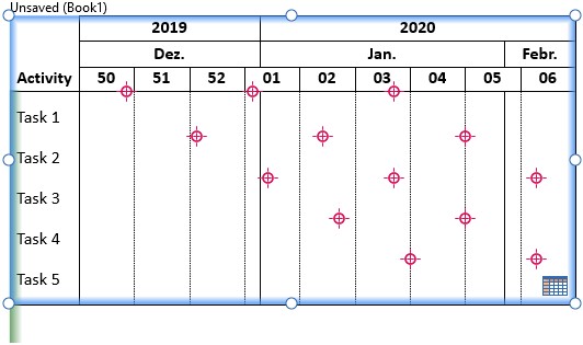
You can now insert timeline items like bars and milestones and link them to the anchors corresponding to dates in Excel.
To quickly populate the Gantt chart, please
- Insert and anchor items in the first activity row: one bar between the first two anchors and a milestone at the third anchor.
- Select all timeline items in the first row.
- Drag the items to the second row while holding down the Shift and Ctrl keys. In PowerPoint, a drag operation such as this would duplicate shapes while keeping them aligned. In think-cell, the result is the same: the timeline items are duplicated and aligned—anchored—to the respective anchors in the second row.
- Repeat for the other rows.
Using drag & drop while holding down Shift and Ctrl you can quickly fill the Gantt chart with timeline items. If the dates in Excel change, the Gantt chart is updated as described in Manage the data in linked elements.
Date format control
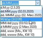
You can freely set the desired formatting for date values that appear throughout the labels of a project timeline. All item labels of a chart share the same date formatting, so when you change the formatting for one label, all others will change accordingly.
When you select a label that contains a date field, or select a date field within a label, the date format control appears on the mini toolbar. It works similarly to the number format control (see Number format).
The dropdown menu facilitates one-click selection of the most commonly used date formats. Its contents depend on the feature that is selected, e.g., each scale offers a different set of predefined date formats. Also, up to four of your most recently used custom formats are available in the dropdown box.
The edit box reflects the current setting and allows entering of custom date formats. Excel's format codes are supported, and some more codes were added for the particular purposes of the project timeline (see table in Date format codes).
Date format codes are case-insensitive.
Insert a line break with a pilcrow (¶) using the shortcut Alt+Enter (Windows) or Option+Return (Mac).
Mix format codes with custom text and characters to create your own labels. To use characters in custom labels that are part of format codes (d D w W m M q Q y Y \):
- Enclose text containing format-code characters in single or double quotation marks (
'...'or"..."). - Enter a backslash (
\) before a single format-code character.
To use a single quotation mark in custom labels, enter one quotation mark (') or two quotation marks consecutively ('').
Language dependency
The project timeline chart is language dependent: The display of full or abbreviated month names, as well as names for weekdays, the default headlines for the activity labels and the default text for scale labels, depend on the proofing language set in Microsoft Office. This setting’s value is used at the time when the elements are inserted.
The layout of the chart will also adapt to the reading direction of the language selected: When the proofing language is set to a right-to-left language, such as Arabic or Hebrew, the Activity column will be displayed on the right of the chart, the timeline will progress from right to left, and the Responsible and Remark columns will appear on the left of the chart.
You can alter the language used for language dependent elements as follows:
- Alter the setting to the desired language by
- clicking into a text box,
- choosing Review > Language > Set Proofing Language...,
- selecting the desired language in the dialog,
- clicking on Default... and confirming with Yes,
- closing the dialog with OK.
- Use the appropriate context menu to remove and then re-add the language dependent labels that you wish to update.
- Use the Scales menu to first hide and then re-show the scales that you wish to update.
Date format codes
|
Code |
Description |
Example |
|---|---|---|
|
|
day of month |
5 |
|
|
day of month (two-digit) |
05 |
|
|
day of week (abbreviated) |
Mon |
|
|
day of week (full) |
Monday |
|
|
day of week (single character) |
M |
|
|
week of year |
7 |
|
|
week of year (two-digit) |
07 |
|
|
"Week" + week of year |
Week 7 |
|
|
"Week" + week of year (two-digit) |
Week 07 |
|
|
month number |
9 |
|
|
month number (two-digit) |
09 |
|
|
month name (abbreviated) |
Sep |
|
|
month name (full) |
September |
|
|
month name (single character) |
S |
|
|
quarter (Arabic numeral) |
4 |
|
|
quarter (lowercase Roman numeral) |
iv |
|
|
quarter (uppercase Roman numeral) |
IV |
|
|
year (two-digit) |
04 |
|
|
year (four-digit) |
2024 |
|
backslash ( |
custom character, e.g., |
Q3 |
|
quotation marks ( |
custom text, e.g., |
Quarter IV |
|
one or two single quotation marks ( |
single quotation mark, e.g., |
Jul '24 |
|
pilcrow ( Alt+Enter (Windows) or Option+Return (Mac) |
line break, e.g., |
Mon |
To learn more about creating timelines in PowerPoint, read this blog article.