Säulen-, Linien- und Flächendiagramme
- Startseite
- Ressourcen
- Benutzerhandbuch
- think-cell Charts: Datenvisualisierung
- Quantitative Diagramme
- Säulen-, Linien- und Flächendiagramme

Säulen- und Balkendiagramme
Ein Säulendiagramm zeigt Kategorien entlang der horizontalen Achse und Werte entlang der vertikalen Achse an.
Ein Balkendiagramm zeigt Kategorien entlang der vertikalen Achse und Werte entlang der horizontalen Achse an. Bei Balkendiagrammen handelt es sich um gedrehte Säulendiagramme, die Sie genau wie Säulendiagramme verwenden können.
Sie können die folgenden Arten von Säulen- und Balkendiagrammen erstellen:
- Einfache gestapelte Säulen- und Balkendiagramme
- 100 % gestapelte Säulen- und Balkendiagramme
- Gruppierte Säulen- und Balkendiagramme
In gestapelten und zu 100 % gestapelten Säulen- und Balkendiagrammen können Sie Änderung der Segmentreihenfolge.
Einfache gestapelte Säulen- und Balkendiagramme
|
Symbol im Menü Elemente: |
|
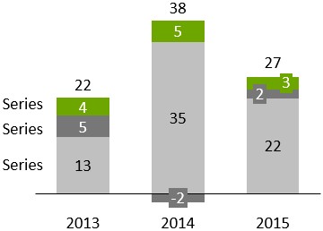
In think-cell wird zwischen einfachen Säulen- und Balkendiagrammen sowie gestapelten Säulendiagrammen und Balkendiagrammen nicht unterschieden. Um ein einfaches Säulen- oder Balkendiagramm zu erstellen, geben Sie nur eine Datenserie (Zeile) in das Datenblatt ein. Für einen schnellen Überblick über das Säulendiagramm siehe Einführung in Diagramme.
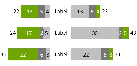
Sie können Schmetterlingsdiagramme erstellen, indem Sie zwei Balkendiagramme „Rücken an Rücken“ platzieren. Drehen Sie dazu eines der Diagramme um 180 Grad (siehe Elemente drehen und spiegeln) und wenden Sie auf beide Diagramme denselben Maßstab an (siehe Skalen verschiedener Achsen anpassen). Entfernen Sie dann die Kategoriebeschriftungen von einem der Diagramme.
Um ein gruppiertes Säulen- oder Balkendiagramm zu erstellen, siehe Gruppierte Säulen- und Balkendiagramme.
Um die Säulen- oder Balkenbreite zu ändern, markieren Sie ein Segment, und ziehen Sie einen der Ziehpunkte in der Mitte der Säule oder des Balkens. Der Tooltip zeigt während des Ziehens die resultierende Abstandsbreite an. Eine größere Breite resultiert in kleineren Abstandbreiten und umgekehrt, da die Diagrammbreite nicht geändert wird, wenn die Breiten geändert werden. Die Abstandsbreite wird als Prozentsatz der Spalten- oder Balkenbreite angezeigt, d. h. ein Wert von 50 % bedeutet, dass jeder Abstand halb so breit wie eine Spalte oder ein Balken ist.

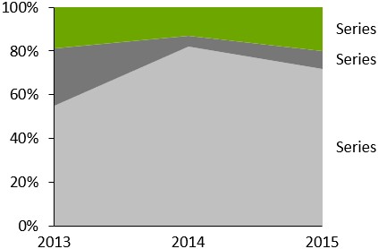
100 % gestapelte Säulen- und Balkendiagramme
|
Symbol im Menü Elemente: |
|
100 % gestapelte Säulen- und Balkendiagramme sind eine Variante von Säulen- und Balkendiagrammen, bei denen alle Säulen oder Balken typischerweise die gleiche Höhe haben (d. h. 100 %). Die Beschriftungen von 100 % gestapelten Diagrammen unterstützen das Beschriftungsinhalt-Steuerelement, sodass Sie wählen können, ob Prozent- und/oder Absolutwerte angezeigt werden sollen (Beschriftungsinhalt).
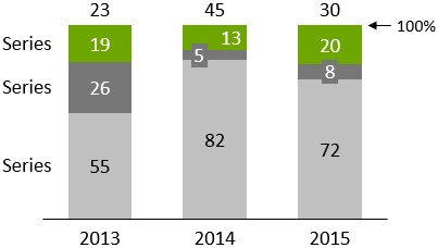
Mit think-cell können Sie 100 % gestapelte Diagramme erstellen, die nicht notwendigerweise 100 % ergeben. Wenn die Summe einer Spalte über oder unter 100 % liegt, wird die Spalte entsprechend dargestellt. Weitere Informationen zum Ausfüllen des Datenblattes finden Sie im Abschnitt Absolut- und Prozentwerte.
Änderung der Segmentreihenfolge
Sie können die Reihenfolge ändern, in der die Segmente in gestapelten und 100 % gestapelten Säulen- und Balkendiagrammen angezeigt werden. Gehen Sie dazu wie folgt vor:
Gruppierte Säulen- und Balkendiagramme
|
Symbol im Menü Elemente: |
|
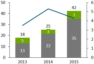
Gruppierte Säulen- und Balkendiagramme sind Variationen von gestapelten Säulen- und Balkendiagrammen, bei denen die Segmente nebeneinander angeordnet sind.
Ein gruppiertes Säulen- oder Balkendiagramm kann mit einem Liniendiagramm kombiniert werden, indem Sie ein Segment einer Serie markieren und Line aus dem Steuerelement „Diagrammtyp“ dieser Datenserie aufrufen.
Wenn Sie Stapel von Segmenten nebeneinander anordnen möchten, können Sie ein gestapeltes gruppiertes Säulendiagramm erstellen.
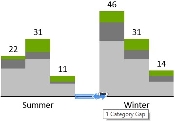
Führen Sie die folgenden Schritte aus, um ein gestapeltes gruppiertes Säulendiagramm zu erstellen:
- Fügen Sie ein gestapeltes Säulendiagramm ein.
- Wählen Sie ein Segment aus, und ziehen Sie den Säulenbreiten-Ziehpunkt zur halben Höhe der Säule, bis der Tooltip 0 % Abstand anzeigt.
- Klicken Sie auf der Basislinie an die Stelle, an der Sie einen Abstand zwischen zwei Gruppen einfügen möchten, und ziehen Sie den Pfeil so lange nach rechts, bis „1 Kategorie – Abstand“ angezeigt wird; wiederholen Sie diesen Schritt für alle Gruppen.
Bei einer geraden Anzahl von Stapeln in einer Gruppe kann die Beschriftung nicht für in der gesamten Gruppe zentriert werden. Nutzen Sie in diesem Fall ein PowerPoint-Textfeld als Beschriftung.
Linien- und Profildiagramme
|
Symbol im Menü Elemente: |
|
Dieser Abschnitt enthält die folgenden Themen:
Einführung in Linien- und Profildiagrammen
Das Liniendiagramm (auch Profildiagramm genannt, wenn es um 90° gedreht wird) verwendet Linien, um Datenpunkte zu verbinden, die zur gleichen Serie gehören. Sie können das Aussehen der Linie in der Mini-Symbolleiste ändern (siehe Linienschema, Linienstil und -stärke ändern und Markierungsstil). Die Beschriftungen der Datenpunkte werden standardmäßig nicht angezeigt, können jedoch mithilfe der Kontextmenü-Schaltfläche 
Falls die Kategoriewerte eines Liniendiagramms streng monoton steigende Zahlen oder Daten sind und gemäß des Zahlenformats der Beschriftung der X-Achse als solche interpretiert werden können, ändert sich die X-Achse automatisch in eine Wertachse (siehe Wertachsen). Falls Daten genutzt werden, kann die Datumsdarstellung verändert werden, indem mit der Mehrfachauswahl alle Kategoriebeschriftungen ausgewählt werden (siehe Mehrere Objekte auswählen) und die gewünschte Datumsdarstellung in das Steuerelement eingegeben wird (siehe Datumsformatcodes). Falls Sie mehr Beschriftungen anzeigen möchten, als nebeneinander passen, können Sie gedrehte Beschriftungen verwenden (siehe Beschriftungen drehen).
Die X-Achse kann nur vom Kategorie- zum Wertmodus wechseln, wenn die folgenden Bedingungen erfüllt sind:
- Alle Kategoriezellen im Datenblatt enthalten entweder Zahlen, wobei die Excel-Zellenformatierung auf General oder Number eingestellt ist, oder alle Kategoriezellen im Datenblatt enthalten Datumsangaben, wobei die Excel-Zellenformatierung auf Date eingestellt ist.
- Alle Zahlen oder Daten in den Kategorie-Zellen wachsen streng monoton von links nach rechts.
-
Die Y-Achse ist nicht auf Crosses Between Categories eingestellt (siehe Wertachsen positionieren). Wenn dies der einzige Grund ist, welcher das Umschalten zum Wertachsenmodus verhindert, können Sie

Wurde die X-Achse gelöscht, werden die Daten wie bei einer Kategorieachse angezeigt.
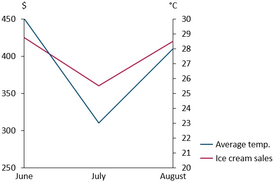
Das Liniendiagramm unterstützt auch die Anzeige einer zweiten vertikalen Y-Achse. Genauere Informationen hierzu finden Sie unter Zweite Achsen.
Ist Use Datasheet Fill on Top ausgewählt, (siehe Füllschema für Diagramme), wird die Füllfarbe der Zellformatierung in Excel folgendermaßen verwendet:
- Die Füllfarbe der Zelle mit dem Seriennamen gibt die Linienfarbe vor.
- Die Füllfarbe jeder Datenpunktzelle gibt die Markierungsfarbe dieses Datenpunkts vor.
Linienschema
Mithilfe des Linienschema-Steuerelements können Sie die Darstellung von Linien in Liniendiagrammen festlegen. Die unterstützten Linienschemata ermöglichen die Zuweisung konsistenter Linienstile und Farben für alle im Diagramm enthaltenen Linien. Sie können auch Linienschemata wählen, die die Datenpunkte entlang von Linien mit Markierungen hervorheben.
Nahtlose Linien
Wenn Sie eine glattere Darstellung der Linien im Liniendiagramm wünschen, können Sie diese Option aktivieren. Klicken Sie dazu mit der rechten Maustaste auf die gewünschte Linie und dann auf die Schaltfläche 
Interpolation
In Linien- und Flächendiagrammen werden fehlende Werte standardmäßig linear interpoliert. Die Schaltfläche 
In Liniendiagrammen können Sie die Interpolation für jede Serie getrennt an- und ausschalten. In Flächendiagrammen ist dies nur für das gesamte Diagramm möglich, da die Serien aufeinander aufbauen.
Markierungsstil
Mithilfe des Markierungsstil-Steuerelements können Markierungen für Datenpunkte in Liniendiagrammen hinzugefügt oder geändert werden.
Zweite Achsen
Diagramme mit Linien können eine zusätzliche zweite Y-Achse enthalten. Sie können eine zweite Y-Achse hinzufügen und dieser Achse eine Linie zuordnen, indem Sie die Linie markieren und auf die Schaltfläche 
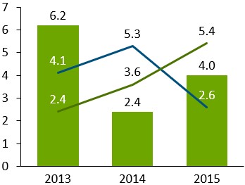
Fehlerbalken
Fehlerbalken können in Linien- und gestapelten Säulendiagrammen verwendet werden, um auf Abweichungen hinzuweisen. Sie können auch Fehlerbalken verwenden, um Fußballfeld-Diagramme zu erstellen.
Mithilfe der Fehlerbalken können Sie das folgende Diagramm erzeugen.
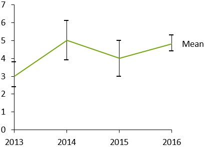
- Legen Sie ein Liniendiagramm mit drei Serien an. Die erste Serie reflektiert die obere Abweichung, die zweite Serie den Mittelwert und die dritte Serie die untere Abweichung.
- Klicken Sie mit der rechten Maustaste auf die Mittellinie, und wählen Sie

Wählen Sie einen der Fehlerindikatoren aus, um den Stil und die Farbe der Markierungen für die obere und untere Abweichung sowie den Linientyp des Indikators für alle Fehlerindikatoren festzulegen. Sie können auch eine einzelne Fehlerindikatormarkierung auswählen, um deren Eigenschaften separat festzulegen.
Nach der Auswahl eines Fehlerindikators erscheinen an beiden Enden Ziehpunkte. Sie können diese Ziehpunkte ziehen, um festzulegen, welche Linien die Fehlerindikatoren verbinden sollen. Anstelle der Abweichung von einem zentralen Wert können Sie auch Intervalle anzeigen, indem Sie die Fehlerindikatoren so einstellen, dass sie nur zwei benachbarte Linien verbinden.
Fußballfeld-Diagramme
Mit einem gedrehten Liniendiagramm und Fehlerbalken können Sie auch Football-Field-Diagramme erstellen. Sie können verwendet werden, um die niedrigen und hohen Werte eines Elements sowie die Differenz zwischen ihnen zu visualisieren.
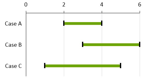
So erstellen Sie ein Football-Field-Diagramm:
- Erstellen Sie ein nach rechts gedrehtes Liniendiagramm (ein Profildiagramm)
- Niedrige und hohe Werte in das Datenblatt eingeben
- Wählen Sie beide Zeilen für niedrige und hohe Werte aus
- Klicken Sie mit der rechten Maustaste auf die Mittellinie, und wählen Sie Add Error Bars aus dem Kontextmenü von think-cell aus.
- Wählen Sie einen Fehlerbalken aus und formatieren Sie Balken und Datenpunkte wie gewünscht auf die niedrigen und hohen Werte. Üblicherweise würden Sie zu einem dicken Fehlerbalken wechseln, z. B. 6pt in Fußballfeld-Diagrammen.
- Klicken Sie dann mit der rechten Maustaste auf den Hintergrund des Diagramms, und wählen Sie Add Gridlines aus dem Kontextmenü. Um alle Gitterlinien zu formatieren, wählen Sie eine beliebige aus und drücken Sie Strg+A, um alle auszuwählen. Sie können dann verschiedene Formatoptionen, wie beispielsweise eine hellere Farbe, aus der Mini-Symbolleiste wählen.
Wenn Ihr erster Datenbereich auf der horizontalen Y-Achse platziert wird, können Sie entweder die Achsenausdehnung der vertikalen Achse ändern (siehe Wertachsen) oder die Y-Achse nach oben ziehen. Beachten Sie, dass die vertikale Achse im letzteren Fall in eine Kategorieachse konvertiert wird, was dazu führt, dass die Datenpunkte gleichmäßig vertikal verteilt sind und nicht auf den numerischen oder Datumswerten in der Kategoriezeile basieren.
Mit mehr als zwei Serien und durch Hinzufügen mehrerer Fehlerindikatoren zwischen Paaren können komplexere Football-Field-Diagramme erstellt werden. Sie können beispielsweise eine dritte Reihe mit einem Mittelwert hinzufügen und zwei Fehlerindikatoren mit unterschiedlichen Farben darüber und darunter hinzufügen.
Flächendiagramme
Fügen Sie gestapelte Flächen- und 100 % gestapelte Flächendiagramme zu Ihrer Folie hinzu.
Dieser Abschnitt enthält die folgenden Themen:
Gestapelte Flächendiagramme
|
Symbol im Menü Elemente: |
|
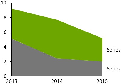
Ein gestapeltes Flächendiagramm ist eine Art gestapeltes Liniendiagramm, in dem die Datenpunkte anstatt individueller Werte die Summe der Kategorienwerte repräsentieren. Das Erscheinungsbild von gestapelten Flächendiagrammen wird über das Farbschema festgelegt. Die Beschriftungen der Datenpunkte werden standardmäßig nicht angezeigt, können jedoch mithilfe der Kontextmenü-Schaltfläche 


Wenn Use Datasheet Fill on Top ausgewählt ist (siehe Füllschema für Diagramme), bestimmt die Excel-Füllfarbe einer Zelle mit Serienbeschriftung die Füllfarbe des Bereichs dieser Serie.
100 % gestapelte Flächendiagramme
|
Symbol im Menü Elemente: |
|
Das 100 % gestapelte Flächendiagramm ist eine Variante des Flächendiagramms, in der die Summe aller Werte in einer Kategorie typischerweise 100 % repräsentiert. Wenn die Summe der Werte einer Kategorie 100 % über- oder unterschreitet, wird das Diagramm entsprechend angepasst. Weitere Details zur Dateneingabe finden Sie unter Absolut- und Prozentwerte. Die Beschriftungen von 100 % gestapelten Flächendiagrammen können Absolut- und/oder Prozentwerte darstellen (Beschriftungsinhalt). Die lineare Interpolation kann über die Schaltfläche
Flächenreihenfolge ändern
In einem Flächendiagramm stellt jede Fläche eine Serie dar. Sie können die Reihenfolge ändern, in der die Flächen in einem Diagramm erscheinen. Gehen Sie dazu wie folgt vor:
- Wählen Sie das Diagramm aus, um seine Mini-Symbolleiste zu öffnen.
- Wählen Sie im Menü Area Order die gewünschte Flächenreihenfolge aus.
- Areas in Sheet Order: Flächen erscheinen in der gleichen Reihenfolge wie die Serien im verknüpften Datenbereich, auch wenn das Diagramm gedreht wird (siehe Elemente drehen und spiegeln).
- Areas in Reverse Sheet Order: Flächen erscheinen in der gleichen Reihenfolge wie die Serien im verknüpften Datenbereich, auch wenn das Diagramm gedreht wird (siehe Elemente drehen und spiegeln).
Kombinationsdiagramme
|
Symbol im Menü Elemente: |
|
Beim Kombinationsdiagramm werden Linien- und Säulensegmente in einem Diagramm kombiniert. Detaillierte Informationen zur Nutzung von Linien- und Säulensegmenten in Diagrammen finden Sie unter Linien- und Profildiagramme und Einfache gestapelte Säulen- und Balkendiagramme.
Um eine Linie in eine Serie von Segmenten umzuwandeln, markieren Sie einfach die Linie, und wählen Sie Stacked Segments in der Diagrammtypsteuerung (siehe Diagrammtyp ändern). Um Segmente in eine Linie umzuwandeln, markieren Sie einfach ein Segment der Serie, und wählen Sie Line in der Diagrammtypsteuerung. Die Datenquellen von Liniendiagrammen, gestapelten Säulen- und Balken- sowie Kombinationsdiagrammen haben das gleiche Format.
Diese Funktion steht Ihnen in gestapelten und gruppierten Säulen- und Liniendiagrammen zur Verfügung.