File di stile
Questa pagina fornisce informazioni dettagliate su come personalizzare lo stile degli elementi think-cell. È possibile creare le impostazioni predefinite desiderate e assicurarsi che le presentazioni siano visivamente coerenti e sul marchio personalizzando i file di stile think-cell. La personalizzazione di un file di stile consente di:
- Personalizzare le opzioni di riempimento, linea e marker disponibili per gli elementi think-cell.
- Personalizzare i colori, gli stili e le combinazioni di colori predefiniti per i grafici, le forme, le etichette di testo e altre funzioni think-cell.
- Distribuire modelli di presentazione PowerPoint personalizzati o personalizzare gli stili predefiniti per la tua organizzazione.
Configurare i file di stile di think-cell
I file di stile di think-cell sono file XML che specificano gli stili applicati agli elementi e alle funzionalità di think-cell. Se per te il codice XML è una novità, puoi trovare utile visitare l'Assistenza Microsoft per ottenere una comprensione di base di come sono strutturati i file XML.
Aprire e modificare i file di stile
Puoi aprire e modificare i file di stile di think-cell utilizzando qualsiasi editor di testo. Consigliamo di utilizzare un editor di codice dedicato, ad esempio Visual Studio Code con l'estensione Red Hat XML, poiché insieme possono fornire suggerimenti di completamento automatico e convalidare automaticamente il codice utilizzando lo schema XML di think-cell.
Lo schema XML specifica le possibili opzioni di personalizzazione e la sintassi corretta per ciascun elemento e attributo. Puoi trovare gli schemi che specificano la sintassi del file di stile think-cell nella directory di installazione think-cell, nella cartella xml-schemas . Anche gli schemi sono file XML, ma non c'è motivo di visualizzarli: essi consentono semplicemente al tuo editor XML di eseguire controlli di sintassi adeguati, evidenziare errori e fornire suggerimenti per il completamento automatico. In un file di stile di think-cell, l'URL dello schema XML del file di stile in questione viene specificato nell'ultimo valore dell'attributo style dell'elemento xsi:schemaLocation.
Per modificare un file di stile, esegui la seguente procedura:
- Apri la directory di installazione think-cell. Per trovare la directory di installazione di think-cell, in PowerPoint, vai a Insert > think-cell > Tools

- Crea una copia della cartella
stylese inseriscila nella cartella Documents. La copia consente di apportare modifiche ai file presenti nella cartella senza bisogno di diritti di amministratore e garantisce la conservazione dei file originali. - Nella copia della cartella
styles, apri il file di stile che desideri modificare. - Nel file di stile, modifica gli attributi dell'elemento
style.- Modifica il nome nell'attributo
name. Quando think-cell utilizza un file di stile, il nome del file di stile compare nel menu Toolsname. - Il file di stile può fare riferimento a uno stile di base personalizzato con un attributo
basedOnsituato dopo l'attributoname. In tal caso, non eliminare o modificare il valore dell'attributobasedOnnella copia del file di stile.
- Modifica il nome nell'attributo
- Nell'elemento
style, personalizza gli stili come descritto in questo capitolo. - Prima di caricare il file di stile in una presentazione, rivedi e correggi eventuali avvisi o errori visualizzati dall'editor XML.
Le sezioni e gli elementi di questo capitolo sono ordinati in base alla sintassi dei file di stile di think-cell. Pertanto, quando aggiungi un elemento al file di stile, assicurati che si trovi dopo gli elementi che appaiono in precedenza nel capitolo e prima degli elementi che appaiono di seguito nel capitolo.
Se desideri creare il tuo file di stile, si consiglia di fare una copia del file di stile predefinito da utilizzare come punto di partenza per le tue personalizzazioni. Per creare un file di stile basato sul file di stile predefinito, segui le istruzioni riportate sopra e, nel terzo passaggio, apri la copia del file di stile predefinito.
Nota: per vedere qual è il file di stile predefinito per la tua versione di think-cell, in PowerPoint, vai a Insert > think-cell > Tools
La directory di installazione di think-cell comprende un file di stile di esempio che mostra una varietà di personalizzazioni complesse, con annotazioni che ti guidano attraverso il processo. Puoi trovare il file di stile di esempio nella cartella styles, sotto Customization Possibilities Showcase/Customization Possibilities Showcase.xml.
Le personalizzazioni dei file di stile descritte in questo capitolo presuppongono che tu stia utilizzando think-cell 14. Se la tua versione di think-cell è antecedente a quella di un file di stile, il caricamento di tale file di stile causerà un errore. Tuttavia, i file di stile più vecchi rimangono validi nelle versioni più recenti di think-cell. Se desideri aggiungere elementi di questo capitolo a un file di stile creato per una versione precedente di think-cell, procedi come segue:
- Nell'elemento
style, modifica i valori degli attributixmlnsexsi:schemaLocationin modo che corrispondano al numero di build nel file di stile predefinito della tua versione di think-cell. - Aggiorna il file di stile con tutti gli elementi mancanti richiesti in modo che la sintassi del file di stile sia valida nella versione più recente di think-cell.
Caricare un file di stile in una presentazione
Il file di stile di think-cell attivo in una presentazione dipende dall'installazione di think-celldell'organizzazione e dallo schema di diapositiva della presentazione. Per visualizzare il nome del file di stile caricato, vai a Insert > think-cell > Tools
- Sulla barra multifunzione, vai a Insert > think-cell > Tools
- Nel menu Change Style, seleziona il file di stile desiderato. Se il file di stile desiderato non compare nel menu, seleziona Other per aprire la finestra di dialogo Load Style File, quindi passa al percorso del file di stile e seleziona il file di stile stesso quindi Open. Puoi caricare un file di stile situato in qualsiasi percorso del computer o della rete.
Quando carichi un file di stile diverso, il nuovo stile si applica agli elementi di think-cell inseriti dopo l'esecuzione delle modifiche. Per abbinare lo stile di un elemento esistente al nuovo stile, modifica lo stile dell'elemento utilizzando la barra degli strumenti mini oppure inserisci nuovamente l'elemento.
Per aggiungere un file di stile a un modello di PowerPoint, consulta Distribuire un file di stile utilizzando un modello di PowerPoint.
Caricare, visualizzare e rimuovere i file di stile utilizzando le funzioni API
In Windows, puoi utilizzare le funzioni API di think-cell per caricare, visualizzare e rimuovere in modo programmatico i file di stile di think-cell. LoadStyle carica un file di stile in uno schema o un layout di diapositiva. LoadStyleForRegion carica un file di stile in modo che sia applicato solo a un'area specifica di un layout di diapositiva. GetStyleName restituisce il nome del file di stile in uno schema o layout di diapositiva. RemoveStyles rimuove tutti i file di stile da un layout di diapositiva.
Carica un file di stile: LoadStyle
Firma
VBA
tcPpAddIn.LoadStyle( _
    CustomLayoutOrMaster As Object, _
    FileName As String
)C#
void tcPpAddIn.LoadStyle(
    object CustomLayoutOrMaster,
    string FileName
);Descrizione
Questa funzione carica un file di stile in uno schema o un layout di diapositiva. Puoi passare PowerPoint.CustomLayout o PowerPoint.Master come parametro CustomLayoutOrMaster.
Se utilizzi la funzione LoadStyle per caricare un file di stile in uno schema di diapositiva, tale file di stile sovrascriverà altri file di stile nello schema o nei layout di diapositiva sotto tale schema di diapositiva. Allo stesso modo, se utilizzi LoadStyle per caricare un file di stile in un layout di diapositiva, esso sovrascriverà gli altri file di stile in quel layout.
Per evitare di sovrascrivere i file di stile, carica prima un file di stile che desideri sia nello schema di diapositiva, quindi carica tutti gli altri file di stile che desideri siano in specifici layout di diapositiva. Se desideri caricare un file di stile in un'area di un layout di diapositiva utilizzando la funzione LoadStyleForRegion, utilizza tale funzione dopo aver terminato l'utilizzo di LoadStyle (consulta Carica un file di stile in un'area del layout: LoadStyleForRegion).
VBA
Per utilizzare la funzione LoadStyle, aggiungi il seguente codice di esempio a un modulo in PowerPoint (vedere Visual Basic for Applications). Sostituisci quanto segue:
<INSTALLATION_PATH>: directory di installazione di think-cell:<FILE_NAME>: nome del file di stile
Option Explicit

Sub LoadStyle_Sample()

    ' Get the think-cell add-in object
    Dim tcPpAddIn As Object
    Set tcPpAddIn = Application.COMAddIns("thinkcell.addin").Object

    Dim master As Master
    Set master = Application.ActivePresentation.Designs(1).SlideMaster

    Dim style As String
    style = "C:\<INSTALLATION_PATH>\styles\<FILE_NAME>.xml"

    Call tcPpAddIn.LoadStyle(master, style)
End SubCarica un file di stile in un'area del layout: LoadStyleForRegion
Firma
VBA
tcPpAddIn.LoadStyleForRegion( _
    CustomLayout As PowerPoint.CustomLayout, _
    FileName As String, _
    Left as Single, _
    Top as Single, _
    Width as Single, _
    Height as Single _
)C#
void tcPpAddIn.LoadStyleForRegion(
    PowerPoint.CustomLayout CustomLayout,
    string FileName,
    float Left,
    float Top,
    float Width,
    float Height
);Descrizione
LoadStyleForRegion carica un file di stile nel layout di diapositiva CustomLayout e lo limita in modo che sia applicato solo a un'area di quel layout. Puoi specificare l'area riservata utilizzando i parametri Left, Top, Width e Height. Sul resto della diapositiva, think-cell utilizza il file di stile caricato nel layout o nello schema di diapositiva con la funzione LoadStyle.
Puoi specificare i parametri Left, Top, Width e Height come frazioni dell’altezza e della larghezza della diapositiva. Left e Top specificano rispettivamente la distanza dei bordi sinistro e superiore dell’area riservata dai bordi sinistro e superiore del layout di diapositiva. Si consiglia di specificare i parametri come frazioni dell’altezza e della larghezza della diapositiva. In alternativa, puoi specificare i parametri anche in punti di PowerPoint, dove 1 pt = 12.700 EMU (vedere Terminologia dei file di stile).
Ad esempio, per caricare un file di stile in un'area che copre i due terzi a destra del layout, utilizza il seguente codice:
Left = CustomLayout.Width / 3
Top = 0
Width = CustomLayout.Width * 2 / 3
Height = CustomLayout.HeightAggiungi immagini o forme a un’area specifica del layout di diapositiva
Con LoadStyleForRegion, puoi aggiungere immagini o forme univoche a un’area di un layout di diapositiva e caricare un file di stile da applicare solo a quell’area. Per fare ciò, aggiungi l’immagine o la forma a un layout di diapositiva; interroga l’immagine o le proprietà Left, Top, Width e Height della forma in modo programmatico; e utilizza i valori con LoadStyleForRegion per limitare il file di stile alla stessa area coperta dall’immagine o dalla forma.
think-cell supporta un massimo di due file di stile per layout:
- Un file di stile caricato con
LoadStyleForRegion, che si applica a una specifica area del layout - Un altro file di stile caricato con
LoadStyle, che si applica al resto del layout
VBA
Per utilizzare la funzione LoadStyleForRegion, aggiungi il seguente codice di esempio a un modulo in PowerPoint (vedere Visual Basic for Applications). Sostituisci quanto segue:
<INSTALLATION_PATH>: directory di installazione di think-cell:<FILE_NAME>: nome del file di stile
Option Explicit

Sub LoadStyleForRegion_Sample()

    ' Get the think-cell add-in object
    Dim tcPpAddIn As Object
    Set tcPpAddIn = Application.COMAddIns("thinkcell.addin").Object

    Dim layout As CustomLayout
    Set layout = Application.ActivePresentation.Designs(1).SlideMaster.CustomLayouts(2)

    ' Define a region covering the left half of the layout
    Dim left, top, width, height As Single
    left = 0
    top = 0
    width = layout.Width / 2
    height = layout.Height

    Dim style As String
    style = "C:\<INSTALLATION_PATH>\styles\<FILE_NAME>.xml"

    Call tcPpAddIn.LoadStyleForRegion(layout, style, left, top, width, height)
End SubVisualizza il nome del file di stile: GetStyleName
Firma
VBA
tcPpAddIn.GetStyleName( _
    CustomLayoutOrMaster As Object _
) As StringC#
string tcPpAddIn.GetStyleName(
    object CustomLayoutOrMaster
);Descrizione
GetStyleName restituisce il nome del file di stile in uno schema o un layout di diapositiva. Puoi specificare il layout o lo schema di diapositiva passando PowerPoint.Master o PowerPoint.CustomLayout come parametro CustomLayoutOrMaster. La funzione restituisce il nome specificato nell'attributo name dell'elemento style del file di stile (consulta Aprire e modificare i file di stile).
Nota che think-cell richiede un file di stile in tutti gli schemi di diapositive e carica automaticamente il file di stile predefinito in qualsiasi schema di diapositiva che non ne ha già uno.
Se hai caricato un file di stile in un layout di diapositiva utilizzando la funzione LoadStyleForRegion, la funzione GetStyleName non restituisce il nome di quel file di stile.
VBA
Per utilizzare la funzione GetStyleName, aggiungi il seguente codice di esempio a un modulo in PowerPoint. Per ulteriori informazioni, consulta Visual Basic for Applications.
Option Explicit

Sub GetStyleName_Sample()

    ' Get the think-cell add-in object
    Dim tcPpAddIn As Object
    Set tcPpAddIn = Application.COMAddIns("thinkcell.addin").Object

    ' Get the Master of the first slide of the current presentation
    Dim master As Master
    Set master = Application.ActivePresentation.Slides(1).Master

    ' Print the name of the style loaded to the debug console
    Dim name As String
    name = tcPpAddIn.GetStyleName(master)
    Debug.Print name
End SubRimuovi tutti i file di stile in un layout: RemoveStyles
Firma
VBA
tcPpAddIn.RemoveStyles( _
    CustomLayout As PowerPoint.CustomLayout _
)C#
void tcPpAddIn.RemoveStyles(
    PowerPoint.CustomLayout CustomLayout
);Descrizione
RemoveStyles rimuove il file di stile nel layout di diapositiva CustomLayout. Se il layout di diapositiva contiene due file di stile caricati utilizzando le funzioni LoadStyle e LoadStyleForRegion, RemoveStyles rimuove entrambi i file di stile. Successivamente, il file di stile nello schema di diapositiva sarà applicato al layout di diapositiva. Non puoi rimuovere i file di stile caricati in uno schema di diapositiva, poiché think-cell richiede che tutti gli schemi di diapositiva abbiano un file di stile.
VBA
Per utilizzare la funzione RemoveStyles, aggiungi il seguente codice di esempio a un modulo in PowerPoint. Per ulteriori informazioni, consulta Visual Basic for Applications.
Option Explicit

Sub RemoveStyles_Sample()

    ' Get the think-cell add-in object
    Dim tcPpAddIn As Object
    Set tcPpAddIn = Application.COMAddIns("thinkcell.addin").Object

    Dim layout As CustomLayout
    Set layout = Application.ActivePresentation.Designs(1).SlideMaster.CustomLayouts(2)

    Call tcPpAddIn.RemoveStyles(layout)
End SubTerminologia dei file di stile
Questa sezione spiega i termini relativi a think-cell chart e alla struttura XML che appaiono in questo capitolo. Di seguito puoi vedere una panoramica dei termini XML con esempi e descrizioni e un glossario dei termini usati per i grafici.
Panoramica dei termini XML
Per personalizzare gli stili di think-cell, in un file di stile puoi aggiungere o modificare elementi, elementi figlio, attributi e valori. Queste sono le principali unità strutturali che compongono un file XML. Per comprendere meglio il significato e l'uso di questi quattro termini, considera il seguente esempio XML e la tabella delle definizioni.
<solidFill name="Text 1">
  <schemeClr val="bg1"/>
</solidFill>|
Termine |
Definizione |
Nello snippet XML |
|
Elemento |
L’unità fondamentale che specifica uno stile nel file di stile. Gli elementi hanno tag di apertura e chiusura. |
|
|
Elemento figlio |
Un elemento situato tra i tag di apertura e chiusura di un altro elemento. Gli elementi figlio specificano le proprietà dei relativi elementi padre. |
|
|
Attributo |
Una stringa che si trova nel tag di apertura di un elemento per specificare le proprietà di quell’elemento. Un attributo è seguito da un segno uguale. |
|
|
Valore |
Una stringa o un numero che specifica le proprietà di un attributo. I valori vengono inseriti tra virgolette. |
|
Glossario sulla creazione di grafici
English Metric Unit (EMU): Unità metrica inglese. Un’unità di misura utilizzata principalmente nelle applicazioni Microsoft Office. Un millimetro equivale a 36.000 EMU. Un punto di font equivale a 12.700 EMU, quindi un font a 8 punti equivale a 101.600 EMU.
riempimento: Un colore solido, un motivo, una texture, un gradiente di colore o un’area trasparente che viene applicata all’interno di una forma.
etichetta: Testo che identifica o descrive segmenti o altre caratteristiche del grafico.
legenda: Una tabella che visualizza i riempimenti, i contrassegni o gli stili di linea che identificano le serie di grafici e le etichette delle serie corrispondenti.
indicatore: Una forma, ad esempio un cerchio, un triangolo o un rombo, che rappresenta i dati nei grafici a linea e a dispersione. La posizione di un indicatore indica il valore, mentre la sua forma indica una serie di dati.
schema: Un insieme predefinito di riempimenti, indicatori o stili di linea utilizzati per identificare le serie di dati in un grafico.
segmento: Una parte rettangolare di un grafico a colonna o a barre, un grafico Mekko o un grafico a cascata che rappresenta il valore di una cella nel foglio dati.
Personalizzare le opzioni di stile disponibili
Questa sezione illustra come personalizzare le opzioni di stile disponibili: gli stili di riga e carattere che think-cell utilizza per impostazione predefinita e gli elenchi di riferimento dei riempimenti, degli stili di riga, degli indicatori e delle forme disponibili.
Gli elenchi di riferimento sono inventari degli stili, vale a dire di riempimenti, stili di linea, indicatori e forme, che vengono specificati più avanti nel file di stile. Per specificare uno stile per un elemento di think-cell nel file di stile, devi prima aggiungere lo stile all’elenco di riferimento corrispondente.
Le opzioni di stile disponibili specificate determinano anche le opzioni che appaiono nella mini barra degli strumenti.
Attenzione: Per evitare errori durante il caricamento di un file di stile in PowerPoint, se rimuovi un elemento da un elenco, assicurati che non vi siano riferimenti a tale elemento in nessun altro punto del file di stile.
Sommario
- Personalizzare l’elenco dei riempimenti
- Personalizzare l’elenco degli stili di linea
- Personalizzare l’elenco degli indicatori
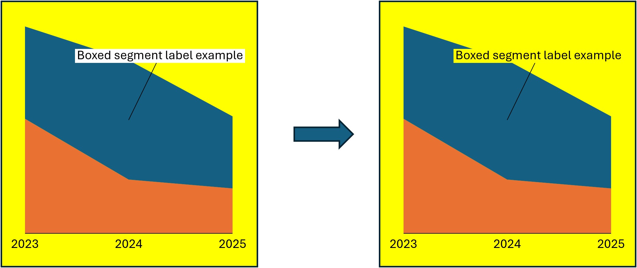
- Risolvere i problemi relativi ai riempimenti di sfondo per le interruzioni degli assi e le etichette dei segmenti racchiusi in riquadri
- Personalizzare lo stile di linea predefinito globale
- Personalizzare l’elenco delle etichette delle frecce e delle forme della linea temporale di Gantt
Personalizzare l’elenco dei riempimenti
Personalizza l’elenco dei riempimenti utilizzati da think-cell. Gli elementi che specificano i colori predefiniti, creano schemi di riempimento per i grafici e impostano i colori di varie linee e forme faranno riferimento all’elenco dei riempimenti. I riempimenti appaiono nella mini barra degli strumenti del menu Fill (vedere Riempimenti). Per personalizzare l’elenco dei riempimenti, esegui la seguente procedura:
- Trova l’elemento
fillLstnel file di stile. - Nell’elemento
fillLst, specifica i riempimenti aggiungendo o modificando elementi figlionoFill,solidFillepattFill. Per ulteriori informazioni su ciascun elemento figlio, fai riferimento all’elemento che segue. - Per aggiungere linee divisorie che separano set di riempimenti nel menu Fill , aggiungi l’elemento figlio
separatornell’elementofillLst.
Crea l’elenco di riempimenti: fillLst
Crea l’elenco dei riempimenti a cui possono fare riferimento altri elementi nel file di stile. L’elenco appare nella mini barra degli strumenti del menu Fill .
- Nell’elemento
fillLst, specifica i colori aggiungendo elementi figliosolidFille specifica i modelli aggiungendo elementi figliopattFill. - Nell’elemento
fillLst, specifica un’opzione di riempimento trasparente aggiungendo l’elemento figlionoFill. - Nell’elemento
fillLst, aggiungi linee divisorie che separano set di riempimenti nel menu Fill aggiungendo l’elemento figlioseparator. - In ciascun elemento figlio, imposta un nome univoco nell’attributo
name. Altri elementi fanno riferimento ai riempimenti utilizzando il valorenamedel riempimento.
|
Elemento figlio |
Descrizione |
Attributi |
|---|---|---|
|
|
|
Obbligatorio. Specifica un nome univoco per il riempimento. |
|
|
Obbligatorio. Specifica un nome univoco per il riempimento. |
|
|
|
|
Obbligatorio. Specifica un nome univoco per il riempimento. Facoltativo. Fa riferimento a un modello preimpostato. Se non presente, Valori possibili: Un valore descritto nell'elenco degli attributi dei valori predefiniti dei modelli di Office Open XML. |
|
|
|
Specifica un colore: solidFill
Specifica i colori di riempimento nell’elenco di riempimenti. Imposta i colori del tema di PowerPoint o specifici colori RGB.
- Nell’elemento
solidFill, specifica il colore aggiungendo uno dei seguenti elementi figlio.
|
Elemento figlio |
Descrizione |
Attributi |
|---|---|---|
|
|
|
Obbligatorio. Specifica il colore del tema incorporato Valori possibili:
|
|
|
Obbligatorio. Specifica l’intensità di rosso, verde e blu utilizzando i valori esadecimali. Valori possibili: Qualsiasi valore di colore esadecimale a sei cifre compreso tra |
|
|
|
Obbligatorio. Specifica rispettivamente l’intensità di rosso, verde e blu. Valori possibili: Qualsiasi numero compreso tra |
|
|
|
Obbligatorio. Specifica rispettivamente l’intensità di rosso, verde e blu come percentuale. Valori possibili: Qualsiasi percentuale compresa tra |
|
|
|
Obbligatorio. Specifica un colore di riempimento basato sulle predefinizioni XML. Valori possibili: Un valore descritto nell’elenco dei valori dei colori di riempimento predefiniti di Office Open XML. |
Schiarisci o scurisci un colore: lumMod e lumOff
Per personalizzare la luminanza, o luminosità, di qualsiasi colore di riempimento solido, aggiungi gli elementi figlio lumMod e lumOff in un elemento figlio schemeClr, srgbClr, sdrgbClr, scrgbClr o prstClr.
- Per rendere più scuro un colore di riempimento, aggiungi l’elemento figlio
lumMod. - Per rendere più chiaro il colore di riempimento, si consiglia di utilizzare
lumOffinsieme alumMod. Se utilizzati insieme, si consiglia di fare in modo che i valori combinativaldegli attributilumModelumOffdiano come somma il 100% - Ad esempio, per scurire un colore del 10%, aggiungi
lumMode imposta il suo attributovalsu90%. Per schiarire un colore del 10%, aggiungi entrambi gli elementi, quindi imposta l’attributovaldilumModsu90%e l’attributovaldilumOffsu10%. - Ecco alcuni esempi che mostrano come PowerPoint crea variazioni più chiare e più scure dello stesso colore di base nel menu Colori tema:
- Più chiaro 80%:
<lumMod val="20%"/><lumOff val="80%/> - Più chiaro 60%:
<lumMod val="40%"/><lumOff val="60%/> - Più chiaro 40%:
<lumMod val="60%"/><lumOff val="40%/> - Più scuro 25%:
<lumMod val="75%"/> - Più scuro 50%:
<lumMod val="50%"/>
- Più chiaro 80%:
Per vedere come le personalizzazioni lumMod e lumOff appaiono in un elenco di riempimenti, consulta le schermate di esempio nell’esempio Elenco riempimenti.
Nota: Queste descrizioni e questi esempi di elementi tengono conto degli usi più comuni per lumMod e lumOff. Per ulteriori informazioni su come personalizzare la luminosità, consulta Microsoft Learn.
|
Elemento figlio |
Descrizione |
Attributi |
|---|---|---|
|
|
|
Obbligatorio. Specifica la modulazione della luminanza di un colore come percentuale. Valori possibili: Qualsiasi percentuale compresa tra |
|
|
|
Obbligatorio. Specifica l’offset della luminanza di un colore come percentuale. Valori possibili: Qualsiasi percentuale compresa tra |
Specifica un motivo: pattFill
Specifica i motivi di riempimento nell’elenco di riempimenti.
- In ciascun elemento
pattFill, specifica il riempimento per primo piano e sfondo aggiungendo rispettivamente uno o entrambi gli elementi figliofgClrebgClr. - Se un elemento
pattFillha elementi figlio mancanti, utilizza il nero come colore di riempimento in primo piano e il bianco come colore di riempimento dello sfondo. - In ciascun elemento figlio
fgClrebgClr, specifica il colore di riempimento aggiungendo uno dischemeClr,srgbClr,sdrgbClr,scrgbClroprstClr.
|
Elemento figlio |
Descrizione |
Attributi |
|---|---|---|
|
|
|
Nessuno |
|
|
|
L’esempio che segue mostra uno snippet di codice XML che visualizza gli elementi figlio fillLst e come l’elenco di riempimenti specificato appare nella mini barra degli strumenti.
<fillLst>
 <noFill name="No Fill"/>
 <solidFill name="tx1">
   <schemeClr val="tx1"/>
 </solidFill>
 <solidFill name="bg1">
  <schemeClr val="bg1"/>
 </solidFill>
 <solidFill name="accent1">
  <schemeClr val="accent1"/>
 </solidFill>
 <solidFill name="accent2">
  <schemeClr val="accent2"/>
 </solidFill>
 <solidFill name="accent3">
  <schemeClr val="accent3"/>
 </solidFill>
 <solidFill name="Green">
  <sdrgbClr r="0" g="255" b="0"/>
 </solidFill>
 <solidFill name="Yellow">
  <scrgbClr r="100%" g="100%" b="0%"/>
 </solidFill>
 <solidFill name="Blue">
	<prstClr val="blue"/>
 </solidFill>
 <solidFill name="Red">
  <srgbClr val="CC0000"/>
 </solidFill>
 <separator/>
 <solidFill name="Accent 1, Lighter 20%">
  <schemeClr val="accent1">
   <lumMod val="80%"/>
   <lumOff val="20%"/>
  </schemeClr>
 </solidFill>
 <solidFill name="Accent 1, Darker 20%">
  <schemeClr val="accent1">
   <lumMod val="80%"/>
   </schemeClr>
 </solidFill>
 <separator/>
 <solidFill name="Gray">
  <prstClr val="silver"/>
 </solidFill>
 <solidFill name="Purple">
  <prstClr val="purple"/>
 </solidFill>
 <separator/>
 <pattFill name="10%" prst="pct10">
  <fgClr>
   <schemeClr val="tx1"/>
  </fgClr>
  <bgClr>
   <schemeClr val="bg1"/>
  </bgClr>
 </pattFill>
 <pattFill name="25%" prst="pct25">
  <fgClr>
   <schemeClr val="tx1"/>
  </fgClr>
  <bgClr>
   <schemeClr val="bg1"/>
  </bgClr>
  </pattFill>
 <pattFill name="50%" prst="pct50">
  <fgClr>
   <schemeClr val="tx1"/>
  </fgClr>
  <bgClr>
   <schemeClr val="bg1"/>
	</bgClr>
 </pattFill>
 <pattFill name="Light downward diagonal" prst="ltDnDiag">
  <fgClr>
   <schemeClr val="tx1"/>
  </fgClr>
  <bgClr>
   <schemeClr val="bg1"/>
  </bgClr>
 </pattFill>
 <pattFill name="Wide upward diagonal" prst="wdUpDiag">
  <fgClr>
   <schemeClr val="tx1"/>
  </fgClr>
  <bgClr>
   <schemeClr val="bg1"/>
  </bgClr>
 </pattFill>
</fillLst>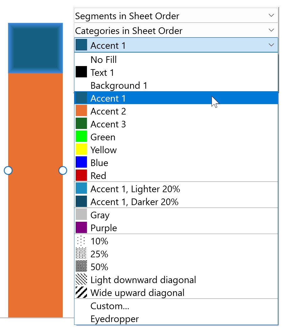
Personalizzare l’elenco degli stili di linea
Personalizza l’elenco degli stili di linea utilizzati da think-cell. Gli elementi che specificano linee personalizzate, creano schemi di linee e specificano stili di linee per varie caratteristiche del grafico faranno riferimento all’elenco di linee (vedere Modificare lo stile e il peso della linea). Gli stili delle linee appaiono nella mini barra degli strumenti del menu Line Style. Per personalizzare l’elenco di linee, esegui la seguente procedura:
- Trova l’elemento
lnLstnel file di stile. - Nell’elemento
lnLst, specifica le linee aggiungendo o modificando gli elementi figlioln. Per ulteriori informazioni sull’elemento figlioln, fai riferimento all’elemento che segue.
Crea l’elenco di linee: lnLst
Crea l’elenco di linee a cui altri elementi del file di stile possono fare riferimento. L’elenco appare nella mini barra degli strumenti del menu Line Style.
- Nell’elemento
lnLst, specifica gli stili di linea aggiungendo almeno un elemento figlioln. - In ciascun elemento
ln, specifica il peso della linea nell’attributowe imposta un nome univoco nell’attributoname. Altri elementi fanno riferimento alle linee che utilizzano il valore della lineaname.
|
Elemento figlio |
Descrizione |
Attributi |
|---|---|---|
|
|
|
Obbligatorio. Specifica un nome univoco per la linea. Obbligatorio. Specifica il peso della linea in EMU ( Valore massimo possibile: |
Specifica uno stile di linea: ln
Specifica i tipi di linea nell’elenco delle linee.
- In ciascun elemento
ln, aggiungi un elemento figlioprstDash. - In ogni elemento figlio
prstDash, specifica un tipo di linea solido o tratteggiato in base ai valori XML preimpostati.
|
Elemento figlio |
Descrizione |
Attributi |
|---|---|---|
|
|
|
Obbligatorio. Specifica il tipo di linea in base ai valori predefiniti del tipo di linea di Office Open XML. Valori possibili:
|
L’esempio che segue mostra uno snippet di codice XML che visualizza gli elementi figlio lnLst e come l’elenco di linee specificato appare nella mini barra degli strumenti.
<lnLst>
 <ln name="Solid 0.5 pt" w="6350">
  <prstDash val="solid"/>
 </ln>
 <ln name="Solid 1 pt" w="12700">
  <prstDash val="solid"/>
 </ln>
 <ln name="Solid 1.5 pt" w="19050">
  <prstDash val="solid"/>
 </ln>
 <ln name="Long Dash 0.5 pt" w="6350">
  <prstDash val="lgDash"/>
 </ln>
 <ln name="Long Dash 1 pt" w="12700">
  <prstDash val="lgDash"/>
 </ln>
 <ln name="Long Dash 1.5 pt" w="19050">
  <prstDash val="lgDash"/>
 </ln>
 <ln name="Dash 0.5 pt" w="6350">
  <prstDash val="dash"/>
 </ln>
 <ln name="Dash 1 pt" w="12700">
  <prstDash val="dash"/>
 </ln>
 <ln name="Dash 1.5 pt" w="19050">
  <prstDash val="dash"/>
 </ln>
 <ln name="Dot 0.5 pt" w="6350">
  <prstDash val="sysDot"/>
 </ln>
 <ln name="Dot 1 pt" w="12700">
  <prstDash val="sysDot"/>
 </ln>
 <ln name="Dot 1.5 pt" w="19050">
  <prstDash val="sysDot"/>
 </ln>
 <ln name="Long Dash Dot 1 pt" w="12700">
  <prstDash val="lgDashDot"/>
 </ln>
 <ln name="Dash Dot 1 pt" w="12700">
  <prstDash val="dashDot"/>
 </ln>
 <ln name="Long Dash Dot Dot 1 pt" w="12700">
  <prstDash val="lgDashDotDot"/>
 </ln>
 <ln name="Dash Dot Dot 1 pt" w="12700">
  <prstDash val="sysDashDotDot"/>
 </ln>
</lnLst>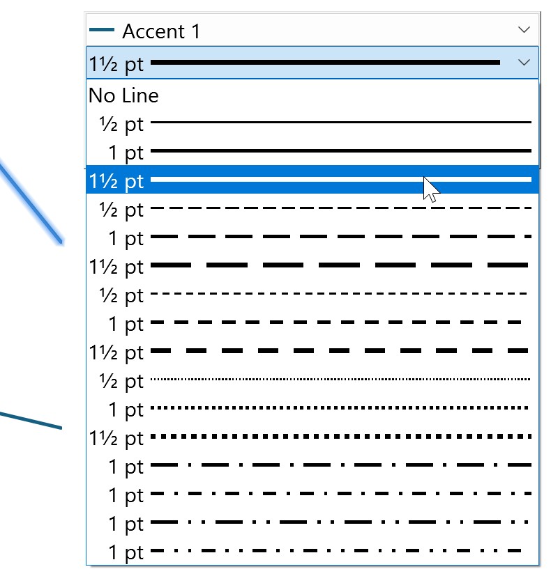
Personalizzare l’elenco degli indicatori
Personalizza l’elenco degli indicatori utilizzati da think-cell. Gli elementi utilizzati nel file di stile faranno riferimento all’elenco dei marcatori per specificare i marcatori predefiniti e creare schemi di marcatori per grafici a linee, a dispersione e di Gantt (vedere Forma indicatore). Gli indicatori appaiono nella mini barra degli strumenti del menu Marker Style. Per personalizzare l’elenco degli indicatori, esegui la seguente procedura:
- Trova l’elemento
markerLstnel file di stile. - Nell’elemento
markerLst, specifica gli indicatori aggiungendo o modificando gli elementi secondarimarker. Per ulteriori informazioni sull’elemento figliomarker, fai riferimento all’elemento che segue.
Crea l’elenco degli indicatori: markerLst
Crea l’elenco degli indicatori a cui possono fare riferimento altri elementi nel file di stile. L’elenco appare nella mini barra degli strumenti del menu Marker Style.
- Nell’elemento
markerLst, specifica gli indicatori aggiungendo almeno un elemento figliomarker. - In ciascun elemento figlio, imposta un nome univoco nell’attributo
name. Altri elementi fanno riferimento agli indicatori utilizzando il valore dell’indicatorename.
|
Elemento figlio |
Descrizione |
Attributi |
|---|---|---|
|
|
|
Obbligatorio. Specifica un nome univoco per l’indicatore. |
Specifica uno stile di indicatore: marker
Specifica gli stili degli indicatori nell’elenco degli indicatori.
- In ciascun elemento
marker, aggiungi un elemento figliosymbol. - In ciascun elemento figlio
symbol, specifica una forma di indicatore basata su valori XML preimpostati.
|
Elemento figlio |
Descrizione |
Attributi |
|---|---|---|
|
|
|
Obbligatorio. Specifica la forma dell’indicatore in base all’elenco dei valori predefiniti delle forme degli indicatori di Office Open XML. Valori possibili:
|
L’esempio che segue mostra uno snippet di codice XML che visualizza gli elementi figlio markerLst e come l’elenco di indicatori specificato appare nella mini barra degli strumenti.
<markerLst>
 <marker name="Marker1">
  <symbol val="circle"/>
 </marker>
 <marker name="Marker2">
  <symbol val="triangle"/>
 </marker>
 <marker name="Marker3">
  <symbol val="diamond"/>
 </marker>
 <marker name="Marker4">
  <symbol val="square"/>
 </marker>
 <marker name="HollowMarker1">
  <symbol val="hollowCircle"/>
 </marker>
 <marker name="HollowMarker2">
  <symbol val="hollowTriangle"/>
 </marker>
 <marker name="HollowMarker3">
  <symbol val="hollowDiamond"/>
 </marker>
 <marker name="HollowMarker4">
  <symbol val="hollowSquare"/>
 </marker>
 <marker name="Marker5">
  <symbol val="star"/>
 </marker>
 <marker name="Xmark">
  <symbol val="x"/>
 </marker>
 <marker name="Dash">
  <symbol val="dash"/>
 </marker>
 <marker name="PlusSign">
  <symbol val="plus"/>
 </marker>
</markerLst>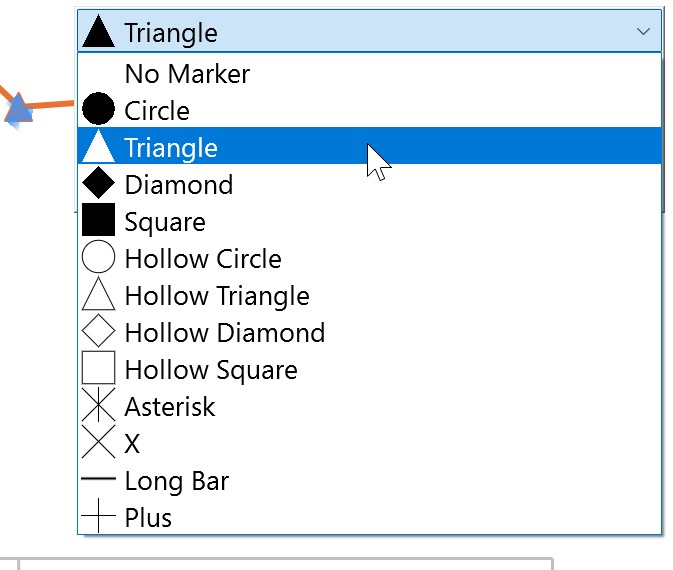
Risolvere i problemi relativi ai riempimenti di sfondo per le interruzioni degli assi e le etichette dei segmenti racchiusi in riquadri
Facoltativo
Per impostazione predefinita, think-cell regola automaticamente il riempimento dello sfondo delle interruzioni degli assi e alcune etichette di segmenti racchiusi in riquadri in modo che corrispondano al riempimento dello sfondo della diapositiva. Se le funzioni del grafico non corrispondono allo sfondo della diapositiva, si consiglia di modificare lo schema delle diapositive di PowerPoint per modificare il riempimento dello sfondo della diapositiva. Per modificare il riempimento dello sfondo della diapositiva utilizzando lo schema di diapositiva, seleziona Slide Master > Background > Background Styles > Format Background, quindi seleziona il riempimento desiderato e seleziona Apply to All. Per ulteriori informazioni sulla modifica del riempimento dello sfondo della diapositiva utilizzando lo schema di diapositiva, consulta KB0129.
Se non desideri modificare lo schema di diapositiva, puoi ignorare il rilevamento automatico dello sfondo di think-cell e specificare manualmente il riempimento dello sfondo della diapositiva. In genere questa pratica è utile nei seguenti casi:
- Il riempimento dello sfondo diapositiva non è configurato con l’opzione Format Background dello schema di diapositiva e/o non può essere modificato utilizzando lo schema di diapositiva. Di conseguenza, i riempimenti di sfondo delle interruzioni degli assi e alcune etichette dei segmenti in riquadri non corrispondono al resto della diapositiva.
- Il tuo progetto utilizza sfondi differenti in aree diverse della stessa diapositiva. In questo caso, puoi assegnare a ciascuna area il proprio file di stile utilizzando l’API think-cell (vedere Carica un file di stile in un'area del layout: LoadStyleForRegion).
Quando specifichi manualmente il riempimento personalizzato dello sfondo di una diapositiva, si consiglia di specificare anche i colori dei caratteri think-cell utilizzando l’elemento defRPr, per garantire che il testo della funzione grafico sia leggibile sullo sfondo personalizzato (vedere Personalizzare lo stile di testo predefinito ignorando i livelli di stile del testo nello schema di diapositiva). Per specificare manualmente il riempimento dello sfondo della diapositiva a cui think-cell abbinerà i riempimenti dello sfondo delle interruzioni degli assi e di alcune etichette di segmenti racchiusi in riquadri, esegui la seguente procedura:
- Trova o aggiungi l’elemento
solidfillRefBackgroundnel file di stile. - Nell’elemento
solidfillRefBackground, specifica il colore di riempimento desiderato utilizzando l’attributoname. Per ulteriori informazioni sull’elementosolidfillRefBackground, fai riferimento all’elemento che segue.
Specifica il riempimento dello sfondo per le interruzioni degli assi e le etichette dei segmenti racchiusi in riquadri: solidfillRefBackground
Specifica il colore di riempimento a cui think-cell abbinerà i riempimenti di sfondo delle interruzioni degli assi e a determinate etichette di segmenti racchiusi in riquadri.
- Trova o aggiungi l’elemento
solidfillRefBackgroundnel file di stile. - Nell’elemento
solidfillRefBackground, specifica il colore di riempimento utilizzando l’attributoname.
|
Elementi |
Descrizione |
Attributi |
|---|---|---|
|
|
|
Obbligatorio. Specifica un nome di colore di riempimento dall’elenco dei riempimenti in |
L’esempio che segue mostra uno snippet di codice XML che visualizza l’elemento solidfillRefBackground e in che modo il riempimento di sfondo specificato influisce sull’aspetto delle interruzioni degli assi e delle etichette dei segmenti.
<solidfillRefBackground name="Yellow" />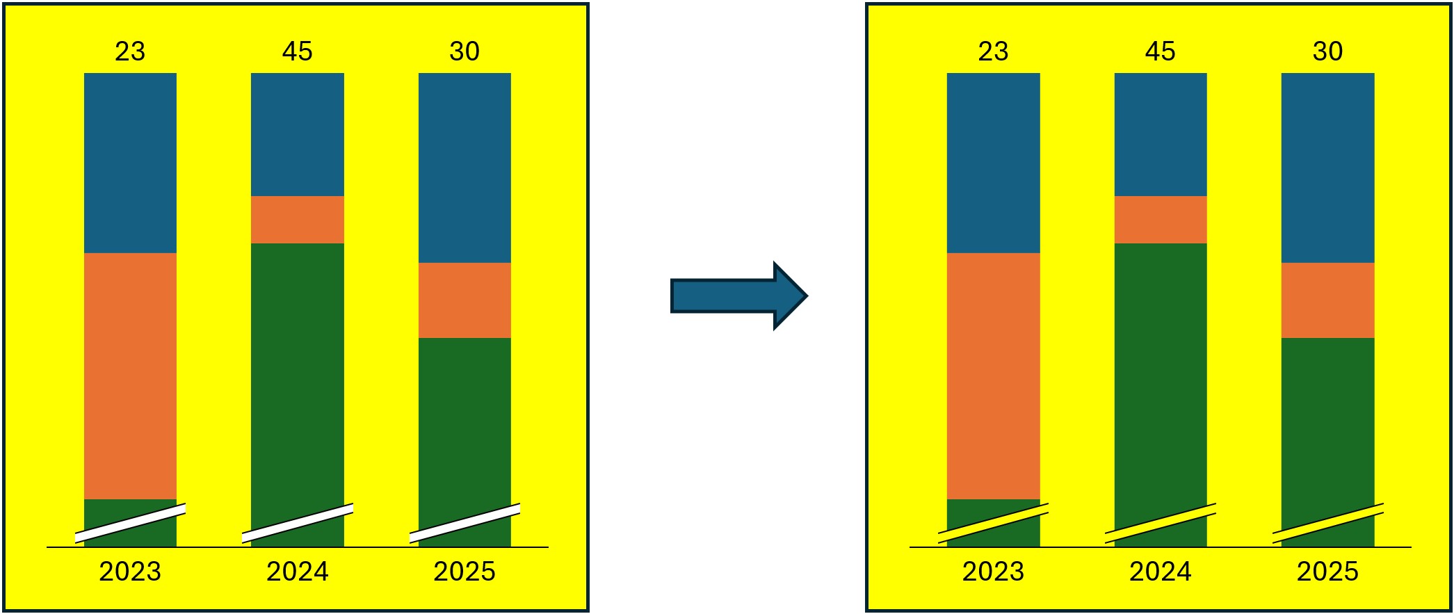
Personalizzare lo stile di linea predefinito globale
Specifica un tipo di linea e un colore che think-cell utilizza come impostazione predefinita globale. Se non specifichi uno stile di linea personalizzato per una funzione del grafico, think-cell utilizzerà lo stile di linea predefinito globale. Se aggiungi solo un elemento per specificare un tipo o un colore di linea personalizzato, think-cell utilizza il valore impostato nello stile di linea predefinito globale per l’elemento mancante. Per specificare lo stile di linea predefinito globale, esegui la seguente procedura:
- Trova l’elemento
lnfillDefaultnel file di stile. - Nell’elemento
lnfillDefault, specifica il tipo di linea e il colore predefiniti aggiungendo o modificando gli elementi figliolnRefesolidfillRef. Per ulteriori informazioni su ciascun elemento figlio, fai riferimento all’elemento che segue.
Specifica lo stile di linea predefinito globale: lnfillDefault
Specifica lo stile di linea predefinito utilizzato da think-cell.
- Nell’elemento
lnfillDefault, specifica il tipo di linea aggiungendo l’elemento figliolnRefe il colore della linea aggiungendo l’elemento figliosolidfillRefnell’ordine in cui appaiono nella tabella. - In tutto il file di stile, se non è presente un elemento facoltativo che specifica un tipo o un colore di linea personalizzato, think-cell specifica quel tipo o colore di linea utilizzando rispettivamente
lnRefosolidfillRefinlnfillDefault.
|
Elemento figlio |
Descrizione |
Attributi |
|---|---|---|
|
|
|
Obbligatorio. Specifica un nome dall’elenco di linee in |
|
|
|
Obbligatorio. Specifica un nome dall’elenco dei riempimenti in |
L’esempio che segue mostra uno snippet di codice XML che visualizza l’elemento lnfillDefault. Utilizzando questo esempio, se non specifichi uno stile di linea personalizzato per un elemento, oppure se specifichi solo un tipo o un colore di linea personalizzato, think-cell utilizzerà il tipo predefinito Solid 1 pt e il colore Text 1.
<lnfillDefault>
 <lnRef name="Solid 1 pt"/>
 <solidfillRef name="tx1"/>
</lnfillDefault>Specificare uno stile di riga personalizzato
In tutto il file di stile, molti elementi opzionali consentono di specificare uno stile di linea personalizzato per una funzione del grafico. Questi elementi offrono la possibilità di personalizzare specifici stili di linea, utilizzando gli elementi figlio lnRef e solidfillRef per specificare rispettivamente il tipo e il colore della linea. In alcuni casi, è anche possibile specificare una funzione del grafico senza linee. In questi casi, specifica gli elementi del grafico senza linee utilizzando l’elemento figlio noLine per sostituire gli elementi figlio lnRef e solidfillRef. Ogni elemento facoltativo che specifica uno stile di linea sostituisce lo stile di linea specificato un livello superiore a tale elemento, vale a dire lo stile di linea predefinito globale specificato in lnfillDefault, salvo ove diversamente indicato (vedere Personalizzare lo stile di linea predefinito globale).
Come regola generale, think-cell segue questa logica di stili di linee personalizzati che prevalgono su un altro stile di linea con tutti gli elementi opzionali. Se in un elemento facoltativo non è presente il tipo (lnRef) o il colore (solidfillRef) della linea, think-cell utilizza il tipo o il colore di linea specificato un livello sopra tale elemento, solitamente in lnfillDefault. Se ometti completamente un elemento di stile della linea, think-cell utilizza lo stile specificato un livello sopra tale elemento, solitamente in lnfillDefault. Pertanto, devi aggiungere elementi che specificano uno stile di linea personalizzato solo se desideri un tipo di linea o un colore differente dal rispettivo stile di linea predefinito.
Ad esempio, l’elemento facoltativo lnfillArrowCAGR specifica uno stile di linea personalizzato per le frecce CAGR. Se lnfillArrowCAGR non è presente, think-cell specifica le linee di freccia CAGR utilizzando l’elemento facoltativo lnfillArrow, il quale specifica lo stile di linea predefinito per tutte le frecce. A sua volta, se lnfillArrow non è presente, think-cell utilizza lo stile di linea predefinito globale specificato in lnfillDefault.
Specifica uno stile di riga personalizzato per una funzione del grafico: lnRef, solidfillRef e noLine
Per specificare uno stile di riga personalizzato per una funzione del grafico, aggiungi l’elemento facoltativo per tale funzione del grafico nel file di stile. Quando specifichi uno stile di linea personalizzato con un elemento facoltativo, tieni presente quanto segue:
- Per specificare un tipo di linea e un colore personalizzati, aggiungi l’elemento figlio
lnRefnell’elemento, seguito dall’elemento figliosolidfillRef. Per specificare solo il tipo di linea o il colore, aggiungi solo uno degli elementi figlio. - Puoi specificare alcune funzioni del grafico senza linee. Per specificare nessuna linea per tali caratteristiche del grafico, aggiungi l’elemento figlio
noLineanzichélnRefesolidfillRefnell’elemento.
|
Elemento figlio |
Descrizione |
Attributi |
|---|---|---|
|
|
|
|
|
|
|
|
|
|
|
Nessuno |
Gli esempi che seguono mostrano frammenti di codice XML che visualizzano personalizzazioni degli stili di linea a differenti livelli nel file di stile e in che modo ciascuna personalizzazione influisce sull’aspetto delle frecce CAGR.
Senza uno stile di linea personalizzato, la freccia CAGR utilizza lo stile di linea predefinito globale:
<lnfillDefault>
 <lnRef name="Solid 0.75 pt" />
 <solidfillRef name="tx1" />
</lnfillDefault>
Se specifichi uno stile di linea personalizzato per le frecce, le frecce CAGR utilizzeranno tale stile di linea:
<lnfillDefault>
 <lnRef name="Solid 0.75 pt" />
 <solidfillRef name="tx1" />
</lnfillDefault>
...
<lnfillArrow>
 <lnRef name="Solid 2.25 pt" />
 <solidfillRef name="Blue" />
</lnfillArrow>
Se specifichi un colore di linea personalizzato per le frecce CAGR, tale colore sovrascriverà il colore di linea specificato un livello sopra di esso in lnfillArrow, ma think-cell utilizzerà per le frecce CAGR il tipo di linea specificato in lnfillArrow:
<lnfillDefault>
 <lnRef name="Solid 0.75 pt" />
 <solidfillRef name="tx1" />
</lnfillDefault>
...
<lnfillArrow>
 <lnRef name="Solid 2.25 pt" />
 <solidfillRef name="Blue" />
</lnfillArrow>
<lnfillArrowCAGR>
 <solidfillRef name="Orange" />
</lnfillArrowCAGR>
Personalizzare lo stile della griglia predefinito
Facoltativo
Specifica uno stile di linea predefinito per le linee della griglia. Per personalizzare uno stile di griglia predefinito, esegui la seguente procedura:
- Trova o aggiungi l’elemento
lnfillGridlinenel file di stile. L’elementolnfillGridlinedeve essere posizionato immediatamente dopo l’elementolnfillDefault. - Nell’elemento
lnfillGridline, specifica il tipo di linea aggiungendo l’elemento figliolnRef, e/o il colore della linea aggiungendo l’elemento figliosolidfillRef. Per ulteriori informazioni su ciascun elemento figlio, fai riferimento all’elemento che segue.
Specifica uno stile di griglia predefinito: lnfillGridline
Specifica uno stile di linea personalizzato per le linee della griglia. Imposta un tipo di griglia predefinito, un colore o entrambi.
- Nell’elemento
lnfillGridline, specifica il tipo di linea aggiungendo l’elemento figliolnRef, e/o il colore della linea aggiungendo l’elemento figliosolidfillRefnell’ordine in cui appaiono nella tabella (vedere Specificare uno stile di riga personalizzato). - Se
lnRefosolidfillRefnon è presente, think-cell utilizza il valore inlnfillDefaultper l’elemento mancante.
|
Elemento figlio |
Descrizione |
Attributi |
|---|---|---|
|
|
|
Obbligatorio. Specifica un nome dall’elenco di linee in |
|
|
|
Obbligatorio. Specifica un nome dall’elenco dei riempimenti in |
L’esempio che segue mostra uno snippet di codice XML che visualizza l’elemento lnfillGridline e come questo personalizza l’aspetto predefinito delle linee di griglia dell’asse in un grafico.
<lnfillGridline>
 <lnRef name="Solid 0.5 pt" />
 <solidfillRef name="Red"/>
</lnfillGridline>
Personalizzare l’elenco delle etichette delle frecce e delle forme della linea temporale di Gantt
Personalizza l'elenco delle etichette delle frecce e delle forme della linea temporale di Gantt utilizzate da think-cell. Gli elementi utilizzati in tutto il file di stile faranno riferimento all'elenco di forme per specificare gli stili predefiniti per le etichette con le frecce CAGR e l'elenco delle forme della linea temporale del diagramma di Gantt (consulta Annotazioni del grafico e Elementi dell’indicatore cronologico). Gli indicatori appaiono nella mini barra degli strumenti del diagramma di Gantt nel menu Shape Style. Per personalizzare l'elenco degli stili di forma, segui questa procedura:
- Trova l’elemento
shapestyleLstnel file di stile. - Nell’elemento
shapestyleLst, specifica le forme aggiungendo o modificando gli elementi figlioshapestyle. Per ulteriori informazioni sull’elemento figlioshapestyle, fai riferimento all’elemento che segue.
Crea l’elenco delle forme: shapestyleLst
Crea l’elenco di forme a cui possono fare riferimento altri elementi nel file di stile. L’elenco appare nella mini barra degli strumenti del menu Shape Style.
- Nell’elemento
shapestyleLst, specifica le forme aggiungendo uno o più elementi figlioshapestyle. - In ciascun elemento figlio, imposta un nome univoco nell’attributo
name. Altri elementi fanno riferimento alle forme utilizzando il valore della formaname.
|
Elemento figlio |
Descrizione |
Attributi |
|---|---|---|
|
|
|
Obbligatorio. Specifica un nome univoco per lo stile di forma. |
Specifica uno stile di forma: shapestyle
Specifica gli stili di forma nell’elenco delle forme.
- In ogni elemento
shapestyle, aggiungi un elemento figliofillRefe un elemento figlio facoltativolnfill. - In ogni elemento figlio
fillRef, specifica il riempimento dello sfondo di una forma nell’attributoname. - In ogni elemento figlio
lnfill, specifica il contorno di una forma aggiungendo gli elementi figlio descritti nella tabella.
|
Elemento figlio |
Descrizione |
Attributi |
|---|---|---|
|
|
|
Obbligatorio. Specifica un nome dall’elenco dei riempimenti in |
|
|
|
Nessuno |
L’esempio che segue mostra uno snippet di codice XML che visualizza gli elementi figlio shapestyleLst e come l’elenco delle forme specificato appare nella mini barra degli strumenti.
<shapestyleLst>
 <shapestyle name="Completed">
  <fillRef name="Green" />
 </shapestyle>
 <shapestyle name="In Progress">
  <fillRef name="Blue" />
  <lnfill>
   <lnRef name="Dash 0.5 pt" />
  </lnfill>
 </shapestyle>
 <shapestyle name="Backlog">
  <fillRef name="Gray" />
  <lnfill>
   <lnRef name="Dash 0.5 pt" />
  </lnfill>
 </shapestyle>
</shapestyleLst>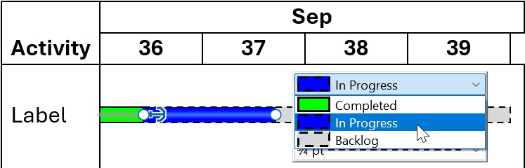
Personalizzare i grafici
Sommario
- Personalizzare gli elenchi di schemi di riempimento, linee e indicatori
- Personalizzare gli schemi dei grafici predefiniti
- Personalizzare lo stile di testo predefinito
- Creare layout preimpostati per il posizionamento dei grafici
- Personalizzare gli stili di etichetta predefiniti
- Personalizzare gli stili predefiniti di righe ed etichette per le annotazioni nei grafici
- Personalizzare gli stili di legenda predefiniti
Personalizzare gli elenchi di schemi di riempimento, linee e indicatori
Crea schemi di riempimento, linea e indicatore che think-cell utilizza per i grafici. Puoi creare un numero qualsiasi di schemi. Puoi fare riferimento solo a riempimenti, linee e indicatori elencati negli elementi fillLst, lnLst e markerLst negli schemi (vedere Personalizzare le opzioni di stile disponibili).
Personalizzare l’elenco degli schemi di riempimento
Personalizza l’elenco degli schemi di riempimento utilizzati da think-cell (vedere Schema di riempimento del grafico). Gli elementi in tutto il file di stile fanno riferimento a questo elenco per specificare schemi predefiniti per i think-cell chart. Gli schemi appaiono nella mini barra degli strumenti del menu Fill Scheme. Per informazioni su come specificare lo schema di riempimento predefinito per ciascun tipo di grafico applicabile, consulta Personalizzare gli schemi dei grafici predefiniti. Per personalizzare l’elenco degli schemi di riempimento, esegui la seguente procedura:
- Trova o aggiungi l’elemento
fillSchemeLstnel file di stile. - Nell’elemento
fillSchemeLst, crea schemi di riempimento mediante l’aggiunta di elementi figliofillScheme. - In ciascun elemento
fillScheme, aggiungi elementi figlio secondo necessità. Per ulteriori informazioni su ciascun elemento figlio, fai riferimento all’elemento che segue. - Per aggiungere linee divisorie che separano le serie di schemi nel menu Fill Scheme, aggiungi l’elemento figlio
fillSchemeLstnell’elementoseparator.
Crea l’elenco degli schemi di riempimento: fillSchemeLst
Crea l’elenco degli schemi di riempimento a cui possono fare riferimento altri elementi nel file di stile. L’elenco appare nella mini barra degli strumenti del menu Fill Scheme.
- Nell’elemento
fillSchemeLst, specifica gli schemi mediante l’aggiunta di elementi figliofillScheme. - Nell’elemento
fillSchemeLst, aggiungi linee divisorie che separano serie di schemi nel menu Fill Scheme mediante l’aggiunta dell’elemento figlioseparator. - In ciascun elemento figlio
fillScheme, imposta un nome univoco nell’attributoname. Altri elementi fanno riferimento agli schemi di riempimento utilizzando il valorenamedello schema.
|
Elemento figlio |
Descrizione |
Attributi |
|---|---|---|
|
|
|
Obbligatorio. Specifica un nome univoco per lo schema di riempimento. Obbligatorio. Specifica lo schema di riempimento utilizzato per Altre serie. Per ulteriori informazioni, consulta Serie Altro. Facoltativo. Specifica che cosa succede quando sono presenti più serie nel grafico che riempimenti nello schema di riempimento. Se non presente, la sequenza di riempimenti si ripeterà. Valori possibili:
|
|
|
|
Specifica uno schema di riempimento: fillScheme
Specifica gli schemi di riempimento nel relativo elenco. Aggiungi gli elementi figlio nell’ordine in cui appaiono nella tabella.
- Se desideri specificare gli stili di contorno per i segmenti del grafico, aggiungi gli elementi figlio
lnfillSegmentelnfillSegmentMekkonell’elementofillScheme. - Nell’elemento
fillScheme, specifica i riempimenti nello schema mediante l’aggiunta di elementi figliofillRef. - Se desideri specificare schemi di riempimento per grafici con un numero specifico di serie, aggiungi elementi figlio
seriesCountSpecificnell’elementofillScheme.
|
Elemento figlio |
Descrizione |
Attributi |
|---|---|---|
|
|
|
Nessuno |
|
|
|
Nessuno |
|
|
|
Obbligatorio. Specifica un nome dall’elenco dei riempimenti in |
|
|
|
Obbligatorio. Specifica il numero di serie che un grafico deve avere per l’applicazione di Valori possibili: Un numero, ad esempio Facoltativo. Specifica che cosa succede quando sono presenti più serie nel grafico che riempimenti nello schema di riempimento. Se non presente, la sequenza di riempimenti si ripeterà. Valori possibili:
|
L’esempio che segue mostra uno snippet di codice XML che visualizza gli elementi figlio fillSchemeLst e come appaiono gli schemi specificati nella mini barra degli strumenti.
<fillSchemeLst>
 <fillScheme name="PowerPoint Theme" fillRefOtherSeries="Gray">
  <lnfillSegment>
   <noLine />
  </lnfillSegment>
  <lnfillSegmentMekko>
   <lnRef name="Solid 1 pt" />
   <solidfillRef name="tx1" />
  </lnfillSegmentMekko>
   <fillRef name="accent1" />
   <fillRef name="accent2" />
   <fillRef name="accent3" />
 </fillScheme>
 <fillScheme name="Gray" fillRefOtherSeries="PowerPoint Theme">
   <fillRef name="Gray" />
 </fillScheme>
 <fillScheme name="Patterns" fillRefOtherSeries="50%">
  <lnfillSegmentMekko>
   <lnRef name="Solid 1.5 pt" />
  </lnfillSegmentMekko>
   <fillRef name="bg1" />
   <fillRef name="10%" />
   <fillRef name="Light downward diagonal" />
   <fillRef name="Wide upward diagonal" />
  <seriesCountSpecific seriesCount="1">
	 <fillRef name="25%" />
  </seriesCountSpecific>
 </fillScheme>
</fillSchemeLst>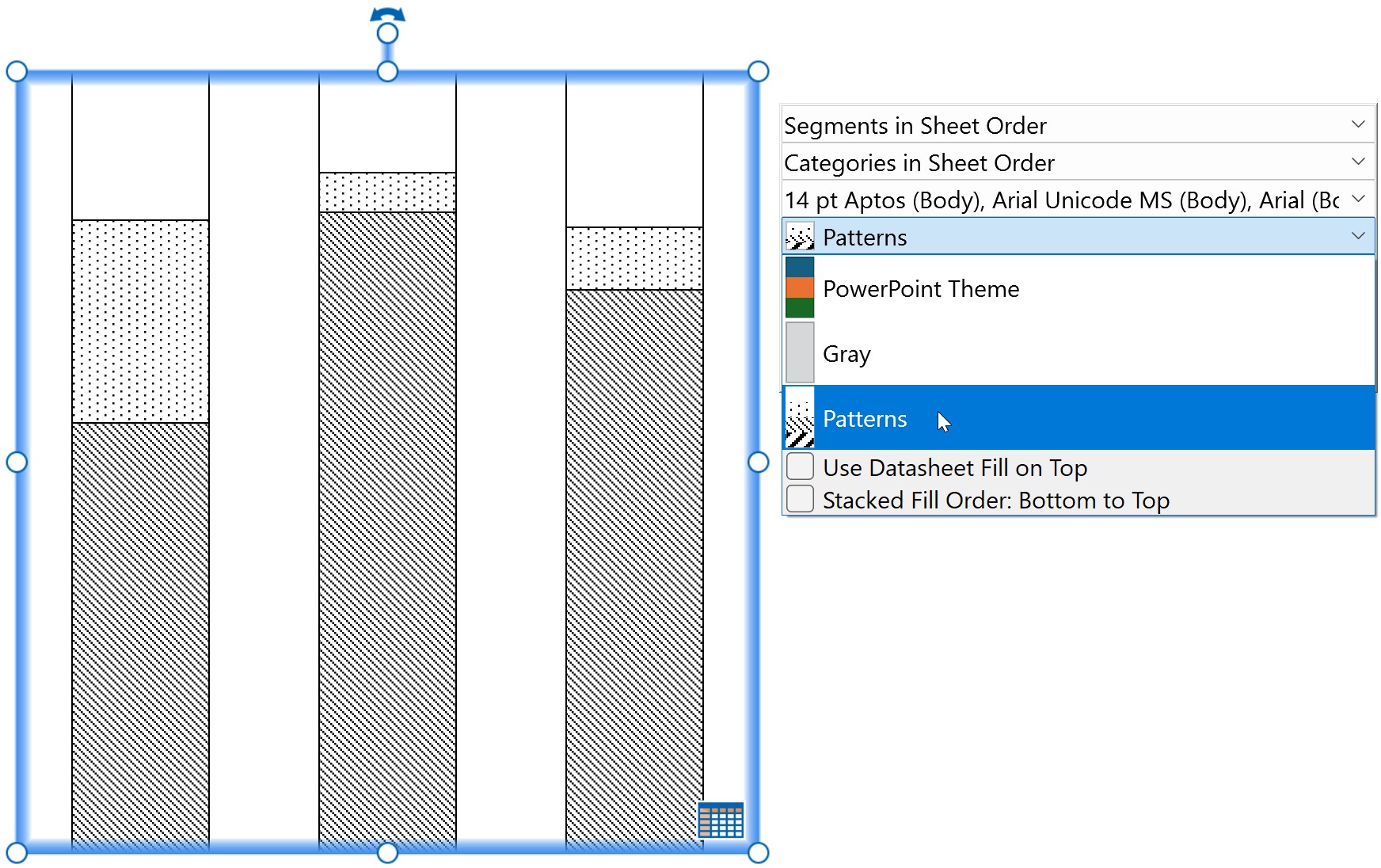
Personalizzare l’elenco degli schemi di linea
Personalizza l’elenco degli schemi di linea utilizzati da think-cell. Gli elementi in tutto il file di stile fanno riferimento a questo elenco per specificare schemi predefiniti per i think-cell line chart. Gli schemi appaiono nella mini barra degli strumenti del menu Line Scheme (vedere Combinazione linee). Per informazioni su come specificare schemi di linea predefiniti per i grafici a linee, consulta Personalizzare gli schemi dei grafici predefiniti. Per personalizzare l’elenco degli schemi di linea, esegui la seguente procedura:
- Trova o aggiungi l’elemento
lnfillmarkerSchemeLstnel file di stile. - Nell’elemento
lnfillmarkerSchemeLst, crea schemi di linea mediante l’aggiunta di elementi figliolnfillmarkerScheme. - In ciascun elemento
lnfillmarkerScheme, aggiungi elementi figlio secondo necessità. Per ulteriori informazioni su ciascun elemento figlio, fai riferimento all’elemento che segue. - Per aggiungere linee divisorie che separano le serie di schemi nel menu Line Scheme, aggiungi l’elemento figlio
lnfillmarkerSchemeLstnell’elementoseparator.
Crea l’elenco degli schemi di linea: lnfillmarkerSchemeLst
Crea l’elenco di schemi di linea a cui possono fare riferimento altri elementi nel file di stile. L’elenco appare nella mini barra degli strumenti del menu Line Scheme.
- Nell’elemento
lnfillmarkerSchemeLst, specifica gli schemi mediante l’aggiunta di elementi figliolnfillmarkerScheme. - Nell’elemento
fillSchemeLst, aggiungi linee divisorie che separano serie di schemi nel menu Line Scheme mediante l’aggiunta dell’elemento figlioseparator. - In ciascun elemento figlio
lnfillmarkerScheme, imposta un nome univoco nell’attributoname. Altri schemi di linea di riferimento di elementi che utilizzano il valorenamedello schema.
|
Elemento figlio |
Descrizione |
Attributi |
|---|---|---|
|
|
|
Obbligatorio. Specifica un nome univoco per lo schema di linea. |
|
|
|
Specifica uno schema di linea: lnfillmarkerScheme
Specifica gli schemi di linea nel relativo elenco. Aggiungi gli elementi figlio nell’ordine in cui appaiono nella tabella.
- Nell’elemento
lnfillmarkerScheme, specifica le linee nello schema mediante l’aggiunta di elementi figliolnfillmarker. - Se desideri specificare schemi di linea per grafici con un numero specifico di serie, aggiungi elementi figlio
seriesCountSpecificnell’elementolnfillmarkerScheme.
|
Elemento figlio |
Descrizione |
Attributi |
|---|---|---|
|
|
|
Nessuno |
|
|
|
Obbligatorio. Specifica il numero di serie che un grafico deve avere per l’applicazione di Valori possibili: Un numero, ad esempio Facoltativo. Specifica che cosa succede quando nel grafico sono presenti più serie che linee nello schema di linea. Se non presente, la sequenza di linee si ripeterà. Valori possibili:
|
Specifica stili di linea e indicatore personalizzati: lnfillmarker
Specifica gli stili di linea e indicatore in ogni schema di linea.
- In ciascun elemento
lnfillmarker, specifica uno stile di linea personalizzato aggiungendo uno qualsiasi dei seguenti elementi figlio nell’ordine in cui appaiono nella tabella. - Se non sono presenti elementi secondari,
lnfillmarkerutilizza lo stile di linea predefinito globale specificato inlnfillDefault(vedere Specificare uno stile di riga personalizzato).
|
Elemento figlio |
Descrizione |
Attributi |
|---|---|---|
|
|
|
Obbligatorio. Specifica un nome dall’elenco di linee in |
|
|
|
Obbligatorio. Specifica un nome di colore di riempimento dall’elenco dei riempimenti in |
|
|
|
Obbligatorio. Specifica un nome dall’elenco degli indicatori in |
L’esempio che segue mostra uno snippet di codice XML che visualizza gli elementi figlio lnfillmarkerSchemeLst e come appaiono gli schemi specificati nella mini barra degli strumenti.
<lnfillmarkerSchemeLst>
	<lnfillmarkerScheme name="Dash with Markers">
		<lnfillmarker>
			<lnRef name="Long Dash 1.5 pt"/>
			<solidfillRef name="tx1"/>
			<markerRef name="Square"/>
		</lnfillmarker>
		<lnfillmarker>
			<lnRef name="Dash 1.5 pt"/>
			<solidfillRef name="Blue"/>
			<markerRef name="Circle"/>
		</lnfillmarker>
		<lnfillmarker>
			<lnRef name="Long Dash 2.25 pt"/>
			<solidfillRef name="Red"/>
			<markerRef name="Triangle"/>
		</lnfillmarker>
	</lnfillmarkerScheme>
	<lnfillmarkerScheme name="Solid without Markers">
		<lnfillmarker>
			<lnRef name="Solid 1.5 pt" />
		</lnfillmarker>
		<lnfillmarker>
			<lnRef name="Solid 2.25 pt"/>
			<solidfillRef name="Gray"/>
		</lnfillmarker>
	</lnfillmarkerScheme>
</lnfillmarkerSchemeLst>
Personalizzare l’elenco degli schemi di indicatore
Personalizza l’elenco degli schemi di indicatore utilizzati dai grafici a dispersione. Gli schemi appaiono nella mini barra degli strumenti del menu Marker Scheme (vedere Combinazione marker). Per informazioni su come specificare lo schema di indicatore predefinito per i grafici a dispersione, consulta Personalizzare gli schemi dei grafici predefiniti. Per personalizzare l’elenco degli schemi di indicatore, esegui la seguente procedura:
- Trova o aggiungi l’elemento
fillmarkerSchemeLstnel file di stile. - Nell’elemento
fillmarkerSchemeLst, crea schemi di indicatore mediante l’aggiunta di elementi figliofillmarkerScheme. - In ciascun elemento
fillmarkerScheme, aggiungi elementi figlio secondo necessità. Per ulteriori informazioni su ciascun elemento figlio, fai riferimento all’elemento che segue. - Per aggiungere linee divisorie che separano le serie di schemi nel menu Marker Scheme, aggiungi l’elemento figlio
fillmarkerSchemeLstnell’elementoseparator.
Crea l’elenco degli schemi di indicatore: fillmarkerSchemeLst
Crea l’elenco degli schemi di indicatore utilizzati dai grafici a dispersione. L’elenco appare nella mini barra degli strumenti del menu Marker Scheme.
- Nell’elemento
fillmarkerSchemeLst, specifica gli schemi mediante l’aggiunta di elementi figliofillmarkerScheme. - Nell’elemento
fillmarkerSchemeLst, aggiungi linee divisorie che separano serie di schemi nel menu Marker Scheme mediante l’aggiunta dell’elemento figlioseparator. - In ciascun elemento figlio
fillmarkerScheme, imposta un nome univoco nell’attributoname. Altri elementi fanno riferimento a schemi di indicatore che utilizzano il valorenamedello schema.
|
Elemento figlio |
Descrizione |
Attributi |
|---|---|---|
|
|
|
Obbligatorio. Specifica un nome univoco per lo schema di indicatore. |
|
|
|
Specifica uno schema di indicatore: fillmarkerScheme
Specifica gli schemi di indicatore nel relativo elenco. Aggiungi gli elementi figlio nell’ordine in cui appaiono nella tabella.
- Se desideri che uno schema di indicatore utilizzi l’etichetta dei dati per indicare le posizioni dei valori senza un indicatore, aggiungi l’elemento figlio
noMarkernell’elementofillmarkerScheme. - Nell’elemento
fillmarkerScheme, specifica gli indicatori nello schema mediante l’aggiunta di elementi figliofillmarker. - Se desideri specificare schemi di indicatore per grafici con un numero specifico di serie, aggiungi elementi figlio
seriesCountSpecificnell’elementofillmarkerScheme.
|
Elemento figlio |
Descrizione |
Attributi |
|---|---|---|
|
|
|
Nessuno |
|
|
|
Nessuno |
|
|
|
Obbligatorio. Specifica il numero di serie che un grafico deve avere per l’applicazione di Valori possibili: Un numero, ad esempio |
Specifica gli stili di indicatore: fillmarker
Specifica gli stili di indicatore in ogni schema di indicatore.
- In ciascun elemento
fillmarker, specifica uno stile di indicatore personalizzato aggiungendo i seguenti elementi figlio nell’ordine in cui appaiono nella tabella.
|
Elementi figlio |
Descrizione |
Attributi |
|---|---|---|
|
|
|
Obbligatorio. Specifica un nome dall’elenco degli indicatori in |
|
|
|
Obbligatorio. Specifica un nome di colore di riempimento dall’elenco dei riempimenti in |
L’esempio che segue mostra uno snippet di codice XML che visualizza gli elementi figlio fillmarkerSchemeLst e come appaiono gli schemi specificati nella mini barra degli strumenti.
<fillmarkerSchemeLst>
 <fillmarkerScheme name="No Markers">
  <noMarker/>
 </fillmarkerScheme>
 <fillmarkerScheme name="Shapes">
  <fillmarker>
   <markerRef name="Square" />
   <solidfillRef name="Red" />
  </fillmarker>
  <fillmarker>
   <markerRef name="Circle" />
   <solidfillRef name="Green" />
  </fillmarker>
  <fillmarker>
   <markerRef name="Dash" />
   <solidfillRef name="Blue" />
  </fillmarker>
 </fillmarkerScheme>
</fillmarkerSchemeLst>
Personalizzare gli schemi dei grafici predefiniti
Personalizza gli schemi predefiniti di riempimenti, linee e indicatori utilizzati dai think-cell chart (vedere Introduzione alla creazione di grafici). Per personalizzare gli schemi grafici predefiniti, esegui la seguente procedura:
- Nel file di stile, specifica lo schema di riempimento predefinito per colonne e barre, combinazione, cascata, Mekko, area, torta, ciambella e grafici a bolle mediante l’aggiunta dell’elemento
fillSchemeRefDefault. - Se desideri specificare uno schema di riempimento predefinito per un tipo di grafico specifico singolarmente, aggiungi l’elemento pertinente per quel tipo di grafico dopo l’elemento
fillSchemeRefDefault. Per ulteriori informazioni sugli elementi che specificano schemi di riempimento predefiniti per tipi di grafici specifici, consulta il seguente riferimento all’elemento. - Dopo aver specificato i tuoi schemi di riempimento predefiniti, specifica gli schemi di linea e indicatori predefiniti aggiungendo gli elementi
lnfillmarkerSchemeRefDefaultefillmarkerSchemeRefDefault.
Specifica gli schemi di grafico predefiniti: fillSchemeRefDefault, lnfillmarkerSchemeRefDefault e fillmarkerSchemeRefDefault
Specifica gli schemi predefiniti di riempimenti, linee e indicatori utilizzati dai think-cell chart. Aggiungi gli elementi nell’ordine in cui appaiono nella tabella.
- Dopo l’elemento
fillmarkerSchemeLst, specifica lo schema di riempimento predefinito per colonne e barre, combinazione, cascata, Mekko, area, torta, ciambella e grafici a bolle aggiungendo l’elementofillSchemeRefDefault. - Per specificare lo schema di riempimento predefinito per un tipo di grafico singolarmente, aggiungi l’elemento pertinente per quel tipo di grafico dopo l’elemento
fillSchemeRefDefault. Consulta la tabella seguente per gli elementi che specificano uno schema di riempimento predefinito per un tipo di grafico specifico.- Se specifichi uno schema di riempimento predefinito per ciascun tipo di grafico singolarmente, puoi omettere l’elemento
fillSchemeRefDefault.
- Se specifichi uno schema di riempimento predefinito per ciascun tipo di grafico singolarmente, puoi omettere l’elemento
- Dopo aver specificato gli schemi di riempimento predefiniti, specifica gli schemi di linea e indicatori predefiniti aggiungendo gli elementi
lnfillmarkerSchemeRefDefaultefillmarkerSchemeRefDefault.
|
Elementi |
Descrizione |
Attributi |
|---|---|---|
|
|
|
Obbligatorio. Specifica un nome dall’elenco degli schemi di riempimento in |
|
|
|
|
|
|
|
|
|
|
|
|
|
|
|
|
|
|
|
|
|
|
|
|
|
|
|
|
|
|
|
Obbligatorio. Specifica un nome dall’elenco degli schemi di linea in |
|
|
|
|
|
|
|
Obbligatorio. Specifica un nome dall’elenco degli schemi di indicatore in |
L’esempio che segue mostra uno snippet di codice XML che visualizza varie personalizzazioni predefinite dello schema.
<fillSchemeRefDefault name="PowerPoint Theme" />
<fillSchemeRefDefaultPie name="Gray" />
<lnfillmarkerSchemeRefDefault name="Dash with Markers" />
<lnfillmarkerSchemeRefDefaultCombination name="Solid without Markers" />
<fillmarkerSchemeRefDefault name="Shapes" />Personalizzare lo stile di testo predefinito
Facoltativo
Per impostazione predefinita, think-cell seleziona uno dei tre livelli di stile di testo principali nello schema diapositiva della presentazione come stile di testo predefinito per gli elementi di think-cell. Quando selezioni lo stile di testo in questo modo, se la dimensione del carattere nel livello dello stile di testo è maggiore di 14 pt, think-cell utilizza la dimensione del carattere di 14 pt. Si consiglia di utilizzare la selezione predefinita dei caratteri di think-cell, poiché ciò assicura una maggiore flessibilità in caso di modifica del design dello schema di diapositiva, Se la selezione predefinita dei caratteri di think-cell non funziona per l’identità del tuo marchio, puoi specificare quale livello di stile del testo dello schema di diapositiva deve utilizzare think-cell aggiungendo l’elemento defPPr. Se specifichi il livello di stile di testo predefinito utilizzando l’elemento defPPr, la dimensione del carattere non ha restrizioni.
Per informazioni sugli schemi delle diapositive, consulta l’Assistenza Microsoft. Per specificare il livello di stile di testo predefinito, esegui la seguente procedura:
- Trova o aggiungi l’elemento
defPPrnel file di stile. - Nell’elemento
defPPr, specifica il livello di stile del testo desiderato mediante l’impiego dell’attributolvl. Per ulteriori informazioni sull’elementodefPPre sui valorilvlpossibili, consulta il seguente riferimento all’elemento.
Se desideri specificare uno stile di testo predefinito personalizzato che sovrascriva i livelli di stile di testo dello schema diapositiva, aggiungi l’elemento figlio facoltativo defRPr, quindi specifica le proprietà di testo personalizzate desiderate utilizzando gli attributi defRPr e gli elementi figlio. Per ulteriori informazioni, consulta Personalizzare lo stile di testo predefinito ignorando i livelli di stile del testo nello schema di diapositiva.
Specifica il livello di stile di testo predefinito: defPPr
Specifica quale livello di stile di testo dello schema di diapositiva utilizza think-cell come stile di testo predefinito per gli elementi di think-cell. Se l’elemento defPPr non è presente, think-cell seleziona automaticamente uno dei primi tre livelli di stile testo nello schema di diapositiva della presentazione come stile di testo predefinito.
- Nell’elemento
defPPr, specifica il livello di stile del testo dello schema di diapositiva utilizzato da think-cell nell’attributolvl.
|
Elementi |
Descrizione |
Attributi |
|---|---|---|
|
|
|
Obbligatorio. Specifica il livello di stile del testo. Valori possibili: Qualsiasi numero compreso tra |
L’esempio che segue mostra uno snippet di codice XML che visualizza l’elemento defPPr e il modo in cui lo stile di testo specificato viene visualizzato nello schema di diapositiva e nei grafici.
<defPPr lvl="1" />

Personalizzare lo stile di testo predefinito ignorando i livelli di stile del testo nello schema di diapositiva
Facoltativo
Se non desideri utilizzare lo schema di diapositiva di una presentazione per determinare lo stile del testo, puoi specificare manualmente le proprietà del testo per think-cell aggiungendo l’elemento figlio defRPr all’elemento defPPr. Per personalizzare le proprietà predefinite del testo ignorando lo schema di diapositiva, esegui la seguente procedura:
- Trova o aggiungi l’elemento
defPPrnel file di stile. - Nell’elemento
defPPr, specifica manualmente le proprietà predefinite del testo aggiungendo o modificando l’elemento figliodefRPre i relativi attributi. Per ulteriori informazioni sull’elementodefRPr, fai riferimento all’elemento che segue.
Specifica le proprietà predefinite del testo sovrascrivendo lo schema di diapositiva: defRPr
Personalizza manualmente le proprietà predefinite del testo ignorando lo schema di diapositiva. Se defRPr non è presente, think-cell specifica lo stile di testo utilizzando il livello di stile del testo dello schema di diapositiva impostato nell’attributo lvl dell’elemento defPPr. Se l’elemento defPPr non è presente, think-cell sceglie automaticamente lo stile di testo in base allo schema di diapositiva della presentazione.
- Nell’elemento
defPPr, aggiungi l’elemento figliodefRPr. - Nell’elemento figlio
defRPr, specifica la dimensione del carattere nell’attributo opzionalesz, quindi specifica rispettivamente il carattere grassetto e corsivo negli attributi facoltativibei. - Se non è presente un attributo
defRPr, think-cell utilizza lo stile del livello di stile del testo dello schema di diapositiva impostato nell’attributolvldell’elementodefPPral posto dell’attributo mancante.
|
Elemento figlio |
Descrizione |
Attributi |
|---|---|---|
|
|
|
Facoltativo. Specifica la dimensione del carattere. Valori possibili: Qualsiasi numero compreso tra Facoltativo. Abilita o disabilita i caratteri in grassetto. Se non presente, think-cell utilizza l’elemento Valori possibili:
Facoltativo. Abilita o disabilita lo stile del carattere in corsivo. Se non presente, think-cell utilizza l’elemento Valori possibili:
|
Specifica manualmente lo stile di testo: defRPr elementi figlio
Specifica un colore di testo personalizzato e un colore alternativo per gli sfondi più scuri. Imposta un carattere predefinito per i testi in caratteri latini, dell’Asia orientale e script complessi.
- Nell’elemento
defRPr, specifica il colore del testo, il colore alternativo e gli stili dei caratteri mediante l’aggiunta di uno dei seguenti elementi secondari nell’ordine in cui appaiono nella tabella. - Se non è presente un elemento figlio
defRPr, think-cell utilizza lo stile del livello di stile del testo dello schema di diapositiva impostato nell’attributolvldell’elementodefPPral posto dell’elemento figlio mancante.
|
Elemento figlio |
Descrizione |
Attributi |
|---|---|---|
|
|
|
Obbligatorio. Specifica un nome dall’elenco dei riempimenti in |
|
|
|
Obbligatorio. Specifica un nome dall’elenco dei riempimenti in |
|
|
|
Obbligatorio. Specifica un carattere. |
|
|
|
Obbligatorio. Specifica un carattere. |
|
|
|
Obbligatorio. Specifica un carattere. |
I seguenti esempi mostrano frammenti di codice XML che visualizzano gli elementi figlio defRPr e come appaiono gli stili di testo specificati nei grafici.
Livelli di stile testo dello schema di diapositiva
Come specificare un carattere personalizzato
<defPPr lvl="1">
 <defRPr b="true" i="false">
  <latin typeface="Times New Roman" />
 </defRPr>
</defPPr>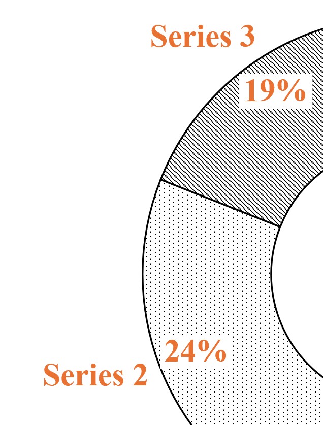
Come specificare i colori dei caratteri personalizzati
<defPPr lvl="1">
 <defRPr b="true" i="false">
  <solidfillRef name="Red" />
  <solidfillRefAlt name="Gray" />
  <latin typeface="Times New Roman" />
 </defRPr>
</defPPr>
Creare layout preimpostati per il posizionamento dei grafici
Facoltativo
Crea layout preimpostati che specificano il posizionamento dei grafici nelle diapositive (vedere Inserisci grafici). Con i layout preimpostati, quando selezioni un think-cell chart da inserire nella presentazione, in alto a sinistra del riquadro delle diapositive si apre lo strumento di posizionamento del grafico. Per creare layout preimpostati, esegui la seguente procedura:
- Trova o aggiungi l’elemento
fixedLayoutLstnel tuo file di stile. - Nell’elemento
fixedLayoutLst, aggiungi elementi figliofixedLayoutsecondo necessità. Per ulteriori informazioni su entrambi gli elementi, consulta il seguente riferimento all’elemento.
Crea l’elenco dei layout predefiniti per i think-cell chart: fixedLayoutLst
Crea layout preimpostati che specificano le posizioni dei grafici nelle diapositive.
- Trova o aggiungi l’elemento
fixedLayoutLstnel file di stile.
- Nell’elemento
fixedLayoutLst, specifica i layout mediante l’aggiunta di uno o più elementi figliofixedLayout. - In ciascun elemento figlio
fixedLayout, specifica a quali tipi di grafico si applica il layout utilizzando l’attributofor.- Nell’attributo
for, utilizza il valorepieper specificare i grafici a torta e a ciambella. Per specificare i diagrammi di Gantt, utilizza il valoregantt. Per specificare tutti gli altri grafici, utilizza il valorechart. - Puoi specificare più valori nell’attributo
for, separati da uno spazio. Ad esempio, aggiungi<fixedLayout for="gantt pie">per specificare i diagrammi di Gantt, torta e ciambella.
- Nell’attributo
|
Elemento figlio |
Descrizione |
Attributi |
|---|---|---|
|
|
|
Obbligatorio. Specifica a quale tipo di grafico si applica il layout. Puoi specificare più valori nell’attributo Valori possibili:
|
Specifica una posizione di layout: rect
Specifica le posizioni dei layout preimpostati nella diapositiva.
- In ciascun elemento
fixedlayout, aggiungi uno o più elementi figliorect. - In ciascun elemento figlio
rect, specifica il posizionamento del grafico per il layout mediante gli attributil,t,reb.- Come valore di ciascun attributo puoi specificare una posizione relativa come percentuale, una posizione assoluta in EMU o una combinazione di entrambi.
- Per specificare una combinazione di posizioni relative e assolute come valore, aggiungi una percentuale seguita da un segno più (
+) o un segno meno (-), quindi da un valore in EMU. Ad esempio,r="50%",t="2000000"eb="100%-1000000"sono tutte opzioni valide. - Ogni valore di attributo viene calcolato come posizione relativa all’angolo in alto a sinistra di una diapositiva.
|
Elemento figlio |
Descrizione |
Attributi |
|---|---|---|
|
|
|
Obbligatorio. Specifica i bordi sinistro, superiore, destro e inferiore della diapositiva, rispettivamente. I valori degli attributi vengono calcolati come posizione relativa all’angolo in alto a sinistra di una diapositiva. Valori possibili:
|
I seguenti esempi mostrano frammenti di codice XML che visualizzano vari elementi figlio fixedLayoutLst e come specificano lo strumento di posizionamento del grafico e i layout preimpostati per i grafici a torta e Gantt.
<fixedLayoutLst>
 <fixedLayout for="pie">
  <rect l="50%-2000000" t="66.67%-2000000" r="50%+2000000" b="66.67%+2000000"/>
</fixedLayoutLst>
<fixedLayoutLst>
 <fixedLayout for="pie">
  <rect l="50%-2000000" t="66.67%-2000000" r="50%+2000000" b="66.67%+2000000"/>
 </fixedLayout>
 <fixedLayout for="chart pie">
  <rect l="10%" t="30%" r="45%" b="90%"/>
  <rect l="55%" t="30%" r="90%" b="90%"/>
 </fixedLayout>
</fixedLayoutLst>
<fixedLayoutLst>
 <fixedLayout for="gantt">
	<rect l="1000000" t="2000000" r="100%-1000000" b="100%-1000000"/>
 </fixedLayout>
</fixedLayoutLst>
Personalizzare gli stili di etichetta predefiniti
Personalizza gli stili predefiniti utilizzati dalle etichette di think-cell. Puoi personalizzare gli stili di etichette di varie funzioni di think-cell chart, tra cui le linee guida, gli stili per le etichette CAGR e le posizioni delle etichette nei grafici. Per ulteriori informazioni sull’uso di think-cell, consulta Etichette del grafico. Per personalizzare le proprietà delle etichette, esegui la seguente procedura:
- Trova o aggiungi l’elemento
labelnel file di stile. - Nell’elemento
label, aggiungi elementi figlio secondo necessità. Per ulteriori informazioni su ciascun elemento figlio, fai riferimento all’elemento che segue.
Specifica gli stili di etichetta: label
Specifica gli stili di etichetta delle varie funzioni di think-cell chart, comprese le linee guida, gli stili per le etichette CAGR e le posizioni delle etichette nei grafici.
- Nell’elemento
label, aggiungi i seguenti elementi figlio nell’ordine in cui appaiono nella tabella.
|
Elemento figlio |
Descrizione |
Attributi |
|---|---|---|
|
|
|
Nessuno |
|
|
|
Obbligatorio. Specifica un nome dall’elenco degli stili di forma in |
|
|
|
Obbligatorio. Specifica la posizione delle etichette totali. Valori possibili:
|
|
|
|
Obbligatorio. Specifica la posizione dell’etichetta del segmento. Valori possibili:
|
Gli esempi che seguono mostrano frammenti di codice XML per ciascun elemento figlio label e come personalizzare l’aspetto predefinito delle etichette.
Linee guida
<label>
 ...
 <lnfillLeaderLine>
  <lnRef name="Solid 1 pt" />
  <solidfillRef name="Red" />
 </lnfillLeaderLine>
 ...
</label>
Forme decorative per i grafici
<label>
 ...
	<shapestyleRefBubble name="Red Bubble" />
 ...
</label>
Posizione delle etichette del grafico a cascata
<label>
 ...
  <sumLabelPosition val="awayFromBaseline" />
 ...
</label>
Posizione delle etichette dei segmenti
<label>
 ...
 <avoidSegmentLabelBoxing val="true" />
 ...
</label>
Personalizzare gli stili predefiniti di righe ed etichette per le annotazioni nei grafici
Personalizza gli stili predefiniti per varie linee nelle annotazioni dei think-cell chart, ad esempio gli assi dei grafici e le linee dei connettori (vedere Caratteristiche del grafico e Modificare lo stile e il peso della linea). Specifica quali etichette appaiono nei think-cell chart. Per personalizzare gli stili per le linee e le etichette di annotazione del grafico, esegui la seguente procedura:
- Trova o aggiungi l’elemento
chartnel file di stile.
- Nell’elemento
chart, aggiungi elementi figlio secondo necessità. Per ulteriori informazioni su ciascun elemento figlio, fai riferimento all’elemento che segue.
Specifica gli stili di linea per le annotazioni del grafico: chart
Specifica gli stili di linea di varie funzioni del think-cell chart, come assi del grafico, linee dei connettori e frecce CAGR.
- Nell’elemento
chart, aggiungi i seguenti elementi figlio nell’ordine in cui appaiono nella tabella.
|
Elemento figlio |
Descrizione |
Attributi |
|---|---|---|
|
|
|
Nessuno |
|
|
|
|
|
|
|
|
|
|
|
|
|
|
|
|
|
|
|
|
|
|
|
|
|
|
|
|
|
|
|
|
|
|
|
|
|
|
|
|
|
|
|
|
|
|
|
|
|
|
|
|
|
|
|
Obbligatorio. Specifica l’ordine degli schemi di riempimento. Valori possibili:
|
|
|
|
Obbligatorio. Specifica l’ordine degli schemi di riempimento. Valori possibili:
|
|
|
|
Nessuno |
Specifica le etichette predefinite del grafico: defaultLabels
Specifica quali etichette appaiono nei think-cell chart.
- Nell’elemento
defaultLabels, aggiungi i seguenti elementi figlio nell’ordine in cui appaiono nella tabella. Per ulteriori informazioni sulle etichette di think-cell chart, consulta Tipi di etichetta.
|
Elemento figlio |
Descrizione |
Attributi |
|---|---|---|
|
|
|
Obbligatorio. Specifica quali etichette appaiono nel grafico. Valori possibili:
|
|
|
|
Obbligatorio. Specifica dove le etichette appaiono nel grafico. Valori possibili:
|
|
|
|
Obbligatorio. Specifica dove le etichette appaiono nel grafico. Valori possibili:
|
|
|
|
Obbligatorio. Specifica dove le etichette appaiono nel grafico. Valori possibili:
|
L’esempio che segue mostra uno snippet di codice XML che visualizza vari stili di riga predefiniti e personalizzazioni delle etichette.
<chart>
 <lnfillAxis>
  <solidfillRef name="Gray" />
 </lnfillAxis>
 <lnfillArrow>
  <lnRef name="Solid 1.5 pt"/>
 </lnfillArrow>
 <lnfillArrowCAGR>
  <lnRef name="Solid 2.25 pt" />
  <solidfillRef name="Red" />
 </lnfillArrowCAGR>
 <lnfillArrowCategoryDifference>
  <lnRef name="Solid 1 pt"/>
  <solidfillRef name="Blue" />
 </lnfillArrowCategoryDifference>
 <lnfillExtensionLine>
  <lnRef name="Solid 0.5 pt"/>
  <solidfillRef name="Green" />
 </lnfillExtensionLine>
 <lnfillConnector>
  <lnRef name="Long Dash 0.25 pt"/>
 </lnfillConnector>
 <lnfillValueLine>
  <lnRef name="Long Dash 0.75 pt"/>
 </lnfillValueLine>
 <fillOrderStacked val="topToBottom"/>
 <defaultLabels>
  <segment val="totalAndSegment"/>
  <segmentWaterfallSummand val="totalAndSegmentSingleSegmentInside"/>
  <pieSlice val="outerAndInner"/>
 </defaultLabels>
</chart>
Personalizzare gli stili di legenda predefiniti
Facoltativo
Personalizza lo stile predefinito del testo e del contorno per le legende dei think-cell chart. Per ulteriori informazioni sulle legende dei think-cell chart, consulta Legende. Per personalizzare gli stili predefiniti per le legende, esegui la seguente procedura:
- Trova o aggiungi l’elemento
legendnel file di stile.
- Nell’elemento
legend, aggiungi elementi figlio secondo necessità. Per ulteriori informazioni su ciascun elemento figlio, fai riferimento all’elemento che segue.
Specifica gli stili di legenda predefiniti: legend
Specifica uno stile di contorno come predefinito per le legende dei think-cell chart e personalizza lo stile di testo della legenda.
- Nell’elemento
legend, aggiungi i seguenti elementi figlio nell’ordine in cui appaiono nella tabella.
|
Elemento figlio |
Descrizione |
Attributi |
|---|---|---|
|
|
|
Nessuno |
|
|
|
Facoltativo. Specifica il livello di stile del testo. Se non presente, think-cell utilizza il valore Valori possibili: Qualsiasi numero compreso tra |
L’esempio che segue mostra uno snippet di codice XML che visualizza gli elementi figlio legend e come personalizzano l’aspetto delle legende del grafico.
<legend>
 <lnfill>
  <lnRef name="Solid 1 pt" />
  <solidfillRef name="Red" />
 </lnfill>
 <pPr lvl="2">
  <defRPr b="false" i="true">
   <latin typeface="Times New Roman" />
  </defRPr>
 </pPr>
</legend>
Personalizza Harvey Ball e caselle di controllo
Specifica gli stili predefiniti per le Harvey Ball e le caselle di controllo di think-cell (vedere Harvey Ball e caselle di controllo).
Personalizza gli stili di Harvey Ball predefiniti
Per personalizzare gli stili predefiniti per le Harvey Ball, esegui la seguente procedura:
- Trova o aggiungi l’elemento
harveyballnel file di stile. - Specifica la dimensione predefinita della casella di controllo utilizzando l’attributo
szdell’elementoharveyball. - Nell’elemento
harveyball, aggiungi elementi figlio secondo necessità. Per ulteriori informazioni su ciascun elemento figlio, fai riferimento all’elemento che segue.
Personalizza le Harvey Ball: harveyball
Specifica gli stili predefiniti per le Harvey Ball.
- Trova o aggiungi l’elemento
harveyballnel file di stile. - Nell’elemento
harveyball, specifica la dimensione della Harvey Ball predefinita utilizzando l’attributosz.
|
Elemento |
Descrizione |
Attributi |
|---|---|---|
|
|
|
Obbligatorio. Specifica la dimensione predefinita della Harvey Ball a un centesimo di punto ( Valori possibili: Qualsiasi numero compreso tra |
Specifica gli stili di Harvey Ball predefiniti: fillRefCompleted, fillRefBackground e lnfill
Nell’elemento harveyball, aggiungi i seguenti elementi figlio nell’ordine in cui appaiono nella tabella.
- Per specificare i riempimenti per le sezioni di Harvey Ball riempite e vuote, aggiungi rispettivamente gli elementi figlio
fillRefCompletedefillRefBackground. - Per specificare uno stile di contorno per le Harvey Ball, aggiungi l’elemento figlio facoltativo
lnfill.
|
Elemento figlio |
Descrizione |
Attributi |
|---|---|---|
|
|
|
Obbligatorio. Specifica un nome dall’elenco dei riempimenti in |
|
|
|
Obbligatorio. Specifica un nome dall’elenco dei riempimenti in |
|
|
|
Nessuno |
L’esempio che segue mostra uno snippet di codice XML che visualizza gli elementi figlio harveyball e come questi personalizzano l’aspetto delle Harvey Ball.
<harveyball sz="3400">
 <fillRefCompleted name="Blue" />
 <fillRefBackground name="Gray" />
 <lnfill>
  <lnRef name="Solid 0.75 pt" />
  <solidfillRef name="tx1" />
 </lnfill>
</harveyball>
Personalizzare gli stili predefiniti delle caselle di controllo
Specifica gli stili predefiniti che si applicano alle caselle di controllo di think-cell. Per impostare uno stile predefinito per le caselle di controllo, esegui la seguente procedura:
- Trova o aggiungi l’elemento
checkboxnel file di stile. - Specifica la dimensione predefinita della casella di controllo utilizzando l’attributo
szdell’elementocheckbox. - Nell’elemento
checkbox, aggiungi elementi figlio secondo necessità. Per ulteriori informazioni su ciascun elemento figlio, fai riferimento all’elemento che segue.
Personalizzazione delle caselle di controllo: checkbox
Specifica gli stili predefiniti per le Harvey Ball.
- Trova o aggiungi l’elemento
checkboxnel file di stile. - Nell’elemento
checkbox, specifica la dimensione predefinita della casella di controllo utilizzando l’attributosz.
|
Elemento |
Descrizione |
Attributi |
|---|---|---|
|
|
|
Obbligatorio. Specifica la dimensione predefinita di una casella di controllo al centesimo di punto ( Valori possibili: Qualsiasi numero compreso tra |
Specifica gli stili di casella di controllo predefiniti: fillRef, lnfill e choices
Nell’elemento checkbox, aggiungi i seguenti elementi figlio nell’ordine in cui appaiono nella tabella.
- Per specificare il riempimento dello sfondo della casella di controllo, aggiungi l’elemento figlio
fillRef. - Per specificare uno stile di contorno per le caselle di controllo, aggiungi l’elemento figlio facoltativo
lnfill. - Per specificare gruppi di simboli per le caselle di controllo, aggiungi almeno un elemento figlio
choices.
|
Elemento figlio |
Descrizione |
Attributi |
|---|---|---|
|
|
|
Obbligatorio. Specifica un nome dall’elenco dei riempimenti in |
|
|
|
Nessuno |
|
|
|
Nessuno |
Specifica un gruppo di simboli per le caselle di controllo: choices
Specifica un gruppo di simboli, caratteri e immagini che possono apparire come simboli per le caselle di controllo. Puoi disporre di diversi gruppi di simboli di caselle di controllo che puoi scorrere specificando più elementi choices (vedere Caselle di controllo).
- In ciascun elemento
choices, specifica simboli o caratteri come simboli per le caselle di controllo aggiungendo elementi figlioglyphe specifica immagini come simboli per le caselle di controllo aggiungendo elementi figliopic. - Ogni elemento
choicesrichiede almeno un elemento figlioglyphopic.
|
Elemento figlio |
Descrizione |
Attributi |
|---|---|---|
|
|
|
Facoltativo. Specifica i tasti di scelta rapida che selezionano un simbolo per le caselle di controllo. Se non presente, puoi selezionare i simboli delle caselle di controllo utilizzando la mini barra degli strumenti nel menu Checkbox Symbol. Valori possibili: Obbligatorio. Specifica la dimensione predefinita del simbolo della casella di controllo a un centesimo di punto ( Valori possibili: Qualsiasi numero compreso tra |
|
|
|
Facoltativo. Specifica i tasti di scelta rapida che selezionano un simbolo per le caselle di controllo. Se non presente, puoi selezionare i simboli delle caselle di controllo utilizzando la mini barra degli strumenti nel menu Checkbox Symbol. Valori possibili: |
Specifica un simbolo o un carattere come simbolo per le caselle di controllo: glyph
In ogni elemento glyph, aggiungi i seguenti elementi figlio nell’ordine in cui appaiono nella tabella.
- Per specificare un colore di riempimento per il simbolo, aggiungi l’elemento figlio facoltativo
solidfillRef. - Per specificare uno stile di carattere per il simbolo, aggiungi l’elemento figlio facoltativo
font. - Per specificare il simbolo, aggiungi l’elemento figlio
te specifica il simbolo tra i tag di apertura e chiusura.- Puoi specificare il simbolo come carattere di testo normale o come riferimento numerico decimale o esadecimale a un carattere Unicode tra i tag di apertura e chiusura (vedere Wikipedia). Ad esempio, per specificare il simbolo ✗, aggiungi
<t>✗</t>o<t>✗</t>. Per specificare una casella di controllo vuota, aggiungi<t> </t>. - Ogni elemento figlio
tall’interno di un elementochoicesdeve avere un carattere univoco. Elementichoicesdifferenti possono avere elementi figlioglyphetduplicati.
- Puoi specificare il simbolo come carattere di testo normale o come riferimento numerico decimale o esadecimale a un carattere Unicode tra i tag di apertura e chiusura (vedere Wikipedia). Ad esempio, per specificare il simbolo ✗, aggiungi
|
Elemento figlio |
Descrizione |
Attributi |
|---|---|---|
|
|
|
Obbligatorio. Specifica un nome di colore di riempimento dall’elenco dei riempimenti in |
|
|
|
Obbligatorio. Specifica il nome di un carattere. |
|
|
|
Nessuno |
Specifica un’immagine come simbolo per le caselle di controllo: pic
In ogni elemento pic, specifica un file EMF come simbolo per le caselle di controllo aggiungendo l’elemento figlio Relationship.
- Specifica il percorso e il nome del file EMF nell’attributo
Targetdell’elemento figlioRelationship. Se il file EMF si trova nella stessa cartella del file di stile, ciò significa che puoi specificare il nome del file nell’attributoTarget. - Ogni elemento figlio
Relationshipall’interno di un elementochoicesdeve avere un valore di attributo univocoTarget. Elementichoicesdifferenti possono avere elementi figlioRelationshipduplicati. - Per garantire che il file di stile sia caricato senza errori sia su Windows che su Mac, utilizza la barra (/) quando specifichi il percorso del file. Si consiglia di conservare i file EMF nella stessa cartella del file di stile e di specificare semplicemente il nome del file.
|
Elemento figlio |
Descrizione |
Attributi |
|---|---|---|
|
|
|
Obbligatorio. Specifica il percorso e il nome del file EMF. Ogni attributo |
L’esempio che segue mostra uno snippet di codice XML che visualizza gli elementi figlio checkbox e come questi personalizzano l’aspetto dei simboli per le caselle di controllo.
<checkbox sz="3400">
<fillRef name="No Fill" />
<lnfill>
<lnRef name="Solid 1 pt" />
<solidfillRef name="tx1" />
</lnfill>
<choices>
<glyph hotkeys="Y1" sz="3200">
<solidfillRef name="Green"/>
<font typeface="Arial Unicode MS"/>
<t>✓</t>
</glyph>
<glyph hotkeys="X2" sz="3200">
<solidfillRef name="Red" />
<font typeface="Arial Unicode MS"/>
<t>✗</t>
</glyph>
<glyph hotkeys=" 3" sz="3200">
<t> </t>
</glyph>
</choices>
<choices>
<pic hotkeys="Q4">
<Relationship Target="traffic_light_green.emf"/>
</pic>
<pic hotkeys="Q5">
<Relationship Target="traffic_light_yellow.emf"/>
</pic>
<pic hotkeys="Q6">
<Relationship Target="traffic_light_red.emf"/>
</pic>
</choices>
</checkbox>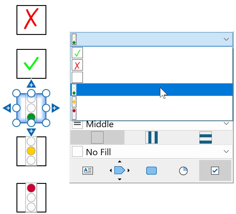
Personalizza diagrammi di Gantt
Personalizza l’aspetto e il formato dei diagrammi di Gantt di think-cell. Specifica gli stili predefiniti, ad esempio lo stile di linea di bordi e separatori, i riempimenti di sfondo e l’aspetto di barre e indicatori. Aggiungi un’opzione per abbinare la cronologia dei diagrammi di Gantt al calendario fiscale della tua organizzazione. Per ulteriori informazioni sui diagrammi di Gantt, consulta Diagrammi di Gantt (linea temporale).
Personalizzare gli stili predefiniti dei diagrammi di Gantt
Per personalizzare gli stili e la formattazione predefiniti per i diagrammi di Gantt, esegui la seguente procedura:
- Trova o aggiungi l’elemento
ganttnel file di stile. - Nell’elemento
gantt, aggiungi elementi figlio secondo necessità. Per ulteriori informazioni su ciascun elemento figlio, fai riferimento all’elemento in questione.
Specifica gli stili dei diagrammi di Gantt: gantt
Specifica l’aspetto e il formato predefiniti dei diagrammi di Gantt di think-cell. Per vedere come appaiono le personalizzazioni in un diagramma di Gantt, consulta le schermate di esempio nella sezione che segue.
- Nell’elemento
gantt, aggiungi i seguenti elementi figlio nell’ordine in cui appaiono nella tabella.
|
Elemento figlio |
Descrizione |
Attributi |
|---|---|---|
|
|
|
Nessuno |
|
|
|
Facoltativo. Specifica l’allineamento del testo per le etichette della scala calendario. Valori possibili:
Valori possibili:
|
|
|
|
Facoltativo. Specifica l’allineamento del testo per le etichette della scala calendario. Valori possibili:
Facoltativo. Abilita o disabilita le distanze sottolineate tra le etichette della scala calendario. Valori possibili:
|
|
|
|
Facoltativo. Specifica l’allineamento del testo per le etichette della scala calendario. Valori possibili:
|
|
|
|
Nessuno |
|
|
|
Nessuno |
|
|
|
Nessuno |
|
|
|
Nessuno |
|
|
|
Obbligatorio. Specifica un nome dall’elenco dei riempimenti in
|
|
|
|
Obbligatorio. Specifica un nome dall’elenco dei riempimenti in
|
|
|
|
Obbligatorio. Specifica un nome dall’elenco dei riempimenti in
|
|
|
|
Nessuno |
|
|
|
Nessuno |
|
|
|
Nessuno |
|
|
|
Nessuno |
|
|
|
Obbligatorio. Specifica il peso della barra in EMU ( |
|
|
|
Nessuno |
|
|
|
Obbligatorio. Specifica lo stile di parentesi.
|
|
|
|
Obbligatorio. Specifica la dimensione del cardine in EMU ( |
I seguenti esempi mostrano frammenti di codice XML per ciascun elemento figlio gantt e come personalizzare l’aspetto di un diagramma di Gantt.
Stili di intestazione del calendario
Specificare lo stile di intestazione della scala del calendario utilizzando uno di scaleFrame, scaleUnderline o scaleExtendSeparators.
<scaleFrame algn="ctr" includeLabelColumnHeaders="false">
 <lnfill>
  <solidfillRef name="Red" />
 </lnfill>
</scaleFrame>
<scaleFrame algn="ctr" includeLabelColumnHeaders="true">
 <lnfill>
  <solidfillRef name="Red" />
 </lnfill>
</scaleFrame>
<scaleUnderline algn="l" gap="false">
 <lnfill>
  <solidfillRef name="Red" />
 </lnfill>
</scaleUnderline>
<scaleUnderline algn="l" gap="true">
 <lnfill>
  <solidfillRef name="Red" />
 </lnfill>
</scaleUnderline>
<scaleExtendSeparators algn="ctr"/>
Stile di linea dei bordi
Specificare il tipo di linea e il colore dei bordi utilizzando lnfillBodyLeftRight, lnfillBodyTop, lnfillBodyBottom e lnfillFrameLeftRight.
<lnfillBodyLeftRight>
 <solidfillRef name="Blue" />
</lnfillBodyLeftRight>
<lnfillBodyTop>
 <solidfillRef name="Green" />
</lnfillBodyTop>
<lnfillBodyBottom>
 <solidfillRef name="Red" />
</lnfillBodyBottom>
<lnfillFrameLeftRight>
 <solidfillRef name="Orange" />
</lnfillFrameLeftRight>
Colore di sfondo delle colonne
Specificare il colore predefinito per il riempimento dello sfondo utilizzando fillRefDefaultBody. Consigliamo di impostare l'attributo name su No Fill o equivalente. L'esempio che segue è fornito solo a scopo illustrativo.
<fillRefDefaultBody name="Company Light Blue" />
Colore sfumatura
Specifica i colori per le sfumature verticali e orizzontali utilizzando fillRefHorzShading e fillRefVertShading.
<fillRefHorzShading name="Company Light Blue" />
<fillRefVertShading name="Company Medium Blue" />
Stili di separatori
Specifica il tipo di linea e il colore dei separatori delle sezioni del calendario utilizzando lnfillSeparatorVertPrimary e lnfillSeparatorVertSecondary.
<lnfillSeparatorVertPrimary>
 <lnRef name="Solid 1.5 pt" />
 <solidfillRef name="Blue" />
</lnfillSeparatorVertPrimary>
<lnfillSeparatorVertSecondary>
 <lnRef name="Dash 1 pt" />
 <solidfillRef name="Red" />
</lnfillSeparatorVertSecondary>
Stili di forma
Specifica l’elenco di forme per gli elementi della cronologia utilizzando shapestyleLstBar.
<shapestyleLstBar w="100000">
 <shapestyleRef name="Completed" />
 <shapestyleRef name="In Progress" />
 <shapestyleRef name="Backlog" />
</shapestyleLstBar>
Per specificare gli elementi della cronologia come linee anziché forme, utilizza invece lnfillLstBar.
<lnfillLstBar>
 <solidfillRef name="Blue" />
 <lnRef name="Solid 6 pt" />
 <lnRef name="Dash 6 pt" />
</lnfillLstBar>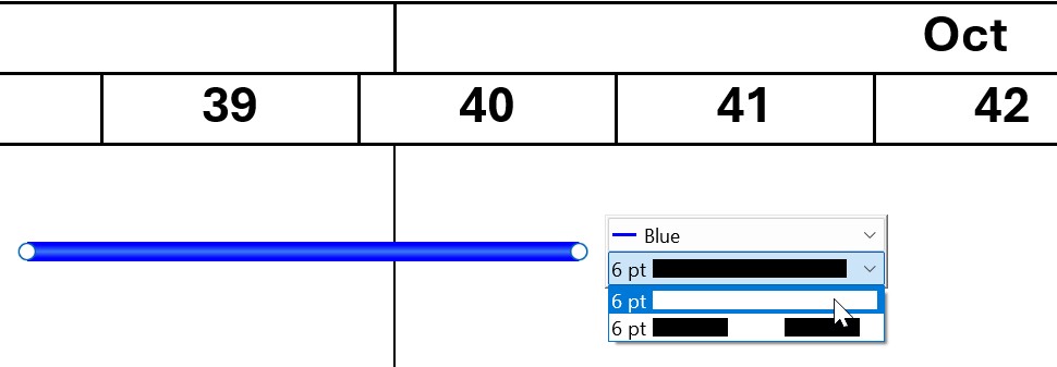
Aggiungi pentagoni e galloni all’elenco delle opzioni di forma della timeline utilizzando shapestyleLstPentagonAndChevron.
<shapestyleLstPentagonAndChevron>
 <shapestyleRef name="Solid Pentagon" />
 <shapestyleRef name="Dashed Pentagon" />
 <shapestyleRef name="Long Dashed Pentagon" />
</shapestyleLstPentagonAndChevron>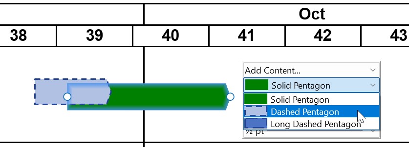
Stili di parentesi
Specifica lo stile della parentesi per gli elementi della cronologia del grafico impostando l’attributo style di bracket su uno di curly, line o triangle.
<bracket style="curly">
 <lnfill>
  <lnRef name="Solid 2 pt" />
  <solidfillRef name="Dark Blue" />
 </lnfill>
</bracket>
<bracket style="line">
 <lnfill>
  <lnRef name="Solid 2 pt" />
  <solidfillRef name="Dark Blue" />
 </lnfill>
</bracket>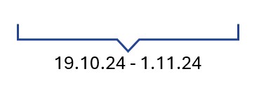
<bracket style="triangle">
 <lnfill>
  <lnRef name="Solid 2 pt" />
  <solidfillRef name="Dark Blue" />
 </lnfill>
</bracket>
Stili di cardine
Specifica gli stili predefiniti per gli indicatori delle fasi cardine e le linee delle fasi cardine utilizzando milestone.
<milestone w="119063">
 <markerRef name="Diamond" />
 <solidfillRef name="Dark Blue" />
 <lnfill>
  <lnRef name="Dash 1 pt" />
 </lnfill>
</milestone>
Aggiungere l’opzione calendario fiscale nei diagrammi di Gantt
Facoltativo
Aggiungi un’opzione per cambiare la cronologia del diagramma di Gantt in un formato calendario fiscale. L’opzione viene visualizzata come casella di controllo sulla mini barra degli strumenti del diagramma di Gantt.
Nel formato calendario fiscale, le sezioni anno, trimestre e settimana del grafico corrispondono alle specifiche dell’elemento fiscalYear. Selezionando l’opzione Fiscal Year nella mini barra degli strumenti di un diagramma di Gantt, all’intestazione della sezione anno nel grafico viene aggiunta l’abbreviazione “FY”.
Per aggiungere un’opzione calendario fiscale al diagramma di Gantt, esegui la seguente procedura:
- Nel file di stile, aggiungi un elemento
fiscalYeardopo l’elementogantt. - Nell’elemento
fiscalYear, aggiungi elementi figlio secondo necessità. Per ulteriori informazioni su ciascun elemento figlio, fai riferimento all’elemento in questione.
Se il calendario fiscale dell’organizzazione segue la convenzione di 52-53 settimane in cui l’anno fiscale termina in un determinato giorno della settimana, considera l’aggiunta dell’elemento figlio weekAlignment all’elemento fiscalYear e tieni presente quanto segue:
- L’anno fiscale terminerà il giorno feriale specificato nell’attributo
lastWeekday. - I trimestri comprendono 13 settimane. Il quarto trimestre di un anno bisestile è composto da 14 settimane.
- L’attributo
lastDayimposta la data del calendario in cui cade illastWeekdayspecificato. - Se l’attributo
weeksPerMonthè presente, i mesi terminano il giorno specificato nell’attributolastWeekday. La settimana bisestile viene sempre aggiunta all’ultimo mese del quarto trimestre.
Specificare un’opzione calendario fiscale per i diagrammi di Gantt: fiscalYear
Aggiungi un’opzione per cambiare la cronologia del diagramma di Gantt in un formato calendario fiscale. L’opzione viene visualizzata come casella di controllo sulla mini barra degli strumenti del diagramma di Gantt. Per vedere come appaiono le personalizzazioni nella timeline di un diagramma di Gantt, consulta l’esempio nella sezione che segue.
- Nell’elemento
fiscalYear, aggiungi i seguenti elementi figlio nell’ordine in cui appaiono nella tabella.
|
Elemento figlio |
Descrizione |
Attributi |
|---|---|---|
|
|
|
Obbligatorio. Specifica il mese di inizio o di fine dell’anno fiscale.
|
|
|
|
|
|
|
|
Obbligatorio. Specifica il giorno di fine della settimana fiscale.
Obbligatorio. Specifica quando termina l’anno fiscale in base al giorno di fine della settimana fiscale impostata nell’attributo Valori possibili:
Facoltativo. Specifica una struttura di calendario in cui l’anno è diviso in quattro trimestri di 13 settimane: due mesi di quattro settimane e un mese di cinque settimane. I mesi termineranno il giorno specificato in Valori possibili:
|
L’esempio che segue mostra uno snippet di codice XML degli elementi figlio fiscalYear e le intestazioni corrispondenti del diagramma di Gantt. Gli elementi personalizzano l’aspetto e il comportamento di un diagramma di Gantt con l’opzione anno fiscale selezionata come segue:
- Il primo trimestre inizia a giugno, come specificato nell’elemento
start. - Ogni settimana termina il venerdì, come specificato nell’attributo
lastWeekday. - L’anno fiscale termina il venerdì più vicino all’ultimo giorno di maggio, come specificato nell’attributo
lastDay: se il 31 maggio è un giovedì, l’anno fiscale termina il 1° giugno. Per terminare l’anno fiscale il 25 maggio, impostare invece l’attributolastDaysuinLastMonth. - Ogni trimestre è composto da 13 settimane che sono divise in tre mesi secondo la convenzione 4-5-4, come specificato nell’attributo
weeksPerMonth.
<fiscalYear>
 <start month="jun" />
 <weekAlignment lastWeekday="fri" lastDay="nearestToEndOfLastMonth" weeksPerMonth="454"/>
</fiscalYear>
Hai bisogno di risolvere un problema
Consulta la nostra Knowledge Base