Grafici Mekko

Un grafico Mekko (detto anche grafico marimekko) è un grafico a colonne in pila bidimensionale. Oltre all'altezza dei segmenti variabile di un normale grafico a colonne in pila, un grafico Mekko ha anche una larghezza delle colonne variabile.
La larghezza delle colonne viene scalata in modo che la larghezza totale corrisponda alla larghezza del grafico desiderata. Per conservare la relazione visuale tra le larghezze di diverse colonne, in un grafico Mekko non vi sono spazi tra le colonne.
In effetti, la linea di base di un grafico Mekko è un vero e proprio asse valore. È possibile selezionarlo con il mouse e utilizzare il relativo menu di scelta rapida per aggiungere segni di graduazione, etichette dei segni di graduazione e un titolo per l’asse (vedere Assi dei valori). Se sono stati abilitati i segni di graduazione per la linea di base, è possibile utilizzare la barra di trasformazione rapida dell’asse per alternare valori assoluti e valori percentuali.
Inoltre, a un grafico Mekko è possibile aggiungere elementi decorativi con alcune delle caratteristiche descritte in Assi e in Annotazioni del grafico. Le etichette del grafico Mekko supportano la proprietà del contenuto etichetta, il che consente di scegliere se visualizzare valori assoluti, percentuali o entrambi (Contenuto dell'etichetta).
Grafici Mekko con asse percentuale
|
Icona nel menu Elementi: |
|
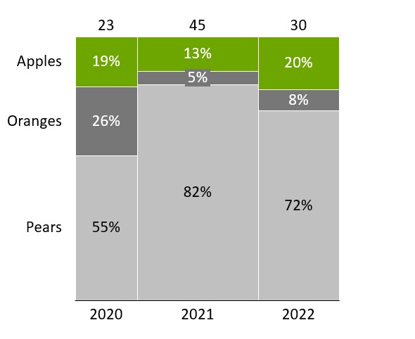
Un grafico Mekko con un asse percentuale (detto anche grafico marimekko o curva dei costi 100% ) è una variazione del grafico a colonne in pila 100% bidimensionale. Come nel grafico a colonne in pila 100%, l’asse del valore è basato su percentuali e le altezze delle colonne vengono visualizzate in relazione al 100%. Nel normale grafico a colonne in pila 100%, poiché le colonne sono scalate ad altezze relative, non vi è una rappresentazione visuale dei totali assoluti delle colonne.
Il grafico Mekko con asse percentuale utilizza larghezze di colonna variabili per rappresentare i totali delle colonne. Pertanto, l’area segmenti è proporzionale al valore assoluto dei segmenti. Per impostazione predefinita, i valori nel foglio dati sono rappresentati come valori assoluti; quando si calcolano le percentuali, think-cell presuppone che la somma di ciascuna colonna sia 100%. Ad esempio, l'esempio precedente di grafico Mekko che visualizza le percentuali utilizza il seguente foglio dati con valori assoluti.
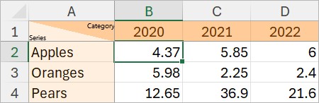
È inoltre possibile immettere i valori come percentuali nel foglio dati. Per fare in modo che think-cell calcoli i valori assoluti partendo dalle percentuali immesse, aggiungere la riga 100%= e immettere i valori assoluti che rappresentano il 100% nella riga 100%= (vedere Modifica layout foglio dati). Per ulteriori informazioni sui valori assoluti o relativi, vedere Valori assoluti e relativi.
Grafici Mekko con unità
|
Icona nel menu Elementi: |
|
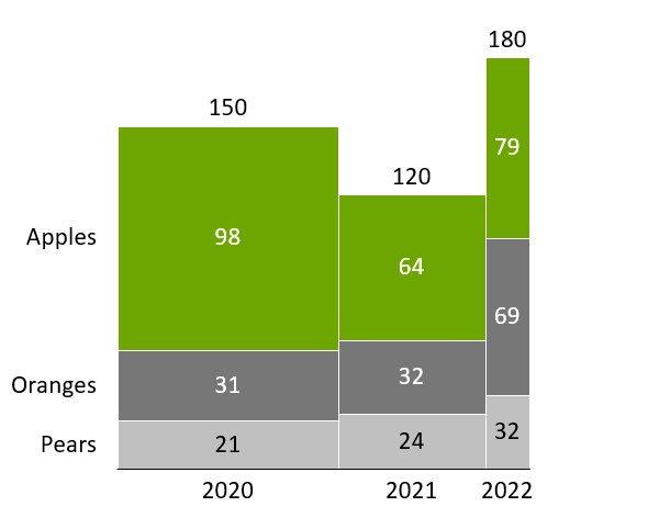
Un grafico Mekko con unità (detto anche grafico submarine o grafico olympic) è un grafico a colonne in pila bidimensionale. Come nel normale grafico a colonne in pila, l'asse del valore e il foglio dati di questo grafico sono basati su valori assoluti.
Larghezza e altezza vengono controllate in modo del tutto indipendente. Le larghezze delle colonne vengono immesse nella riga X extent nella parte superiore e le altezze dei singoli segmenti vengono immesse come in un normale grafico a colonne in pila.

Aggiungere o rimuovere profili
|
Nel menu: |
Grafico |
|
Voce di menu: |
|
È possibile evidenziare il contorno del grafico Mekko: Fare clic sul pulsante 
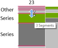
Serie Altro
Si consiglia di combinare diversi segmenti che rappresentano piccole porzioni di una categoria in un segmento "Altro''. In questo modo, una serie "Altro" viene aggiunta al grafico, in particolare quando tale segmento che raccoglie piccole serie è presente per ogni categoria.
Per creare una serie Altro, selezionare tutti i segmenti che devono essere inclusi, fare clic con il pulsante destro del mouse per richiamare il menu di scelta rapida e selezionare 
Una serie Altro può essere utilizzata anche nei grafici in pila e a colonne in pila 100% e nei grafici a barre.
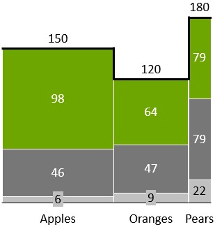
Modificare l'ordine del segmento
È possibile modificare l'ordine in cui i segmenti appaiono in un grafico Mekko. A tal fine, procedere nel seguente modo:
- Seleziona il grafico per aprire la sua mini barra degli strumenti.
- Nel menu Segment Order, scegliere l’ordine del segmento desiderato.
- Segments in Sheet Order: i segmenti vengono visualizzati nello stesso ordine dell’intervallo di dati collegato, anche se il grafico viene capovolto (vedere Ruotare e capovolgere gli elementi).
- Segments in Reverse Sheet Order: i segmenti vengono visualizzati nell’ordine inverso dell’intervallo di dati collegato, anche se il grafico viene capovolto (vedere Ruotare e capovolgere gli elementi).
- Segments in Descending Order: All’interno di ciascuna categoria, i segmenti appaiono dal più grande al più piccolo, con il valore più grande alla linea di base. I segmenti nella stessa serie di dati, con lo stesso colore, possono apparire in posizioni diverse tra le categorie.
- Segments in Ascending Order: All’interno di ogni categoria, i segmenti appaiono dal più piccolo al più grande, con il valore più piccolo alla linea di base. I segmenti nella stessa serie di dati, con lo stesso colore, possono apparire in posizioni diverse tra le categorie.
Hai bisogno di risolvere un problema
Consulta la nostra Knowledge Base