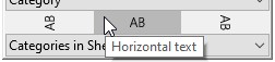
Chart labels

think-cell takes care of correct and readable labeling. Avoid using PowerPoint text boxes to label your charts as they will be ignored by think-cell’s automatic label placement. When you create labels from think-cell’s context menu, the default content is taken from the datasheet or calculated by the program (in the case of column totals, averages, and the like).
In addition, you can always enter additional text or replace the default text inside think-cell’s automatic labels. When a label is selected, you can start typing, overwriting the current text. If you want to keep the existing text, enter text editing mode by pressing F2 and use the cursor keys and Home/End keys to navigate within the label text. This section explains how think-cell’s labels work in detail.
Label types
Here is a list of labels that are supported for different types of charts, and the buttons in the context menu to add or remove them:
|
Label type |
Chart types |
Menu buttons |
|---|---|---|
|
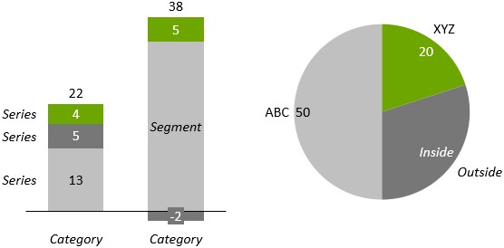
Category |
Column, line, area |
|
|
Series |
Column, line, area |
|
|
Segment |
Column |
|
|
Point |
Line, area, scatter |
|
|
Total |
Column, area |
|
|
Grand total |
Column, Mekko (percent axis), combination |
|
|
Inside |
Pie |
|
|
Outside |
Pie |
|
|
Activity |
Gantt |
|
|
Item |
Gantt |
|
|
Scale |
Gantt |
|
|
Percent indicator |
100% |
|


Note: Column includes stacked chart, clustered chart, 100% chart, Mekko chart, waterfall chart, and their rotated variations. Scatter includes bubble chart.
Additionally, some chart decorations also support labels:
|
Label type |
Chart decoration |
Menu button |
|---|---|---|
|
Tick |
Value axis |
|
|
Title |
Axis |
|
|
Value |
Value line |
|


Automatic label placement
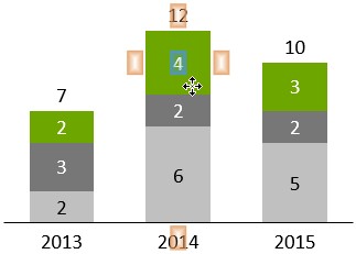
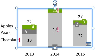
When using think-cell, labels are automatically placed at their appropriate positions. A number of built-in rules ensures that labels are always placed for easy readability and pleasant aesthetics. These rules are specific to the chart type and to the type of the label in question. Here are some examples.
For segment labels in column charts:
- If there is enough space, place all labels centered.
- If a label is larger than the segment it belongs to, put a colored rectangle underneath the label.
- If two labels are too close together, offset one to the left and the other to the right.
- If there is not enough space inside a segment, place the label outside the segment and add a line that points to the related segment.
For inside labels in pie charts:
- If there is enough space, place them as close to the segment’s outside border as possible.
- If a label is larger than the segment it belongs to, put a colored rectangle underneath the label.
- If two labels are too close together, offset one of them towards the center of the pie.
Manual label placement
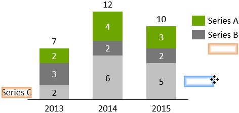
In general, think-cell automatically places all labels at appropriate positions. If a label can be placed at multiple positions, you can manually change think-cell’s placement decision:
- Select the label. If a drag icon appears at the lower right corner of the selection then this indicates that there are alternative locations for the label.
- Drag the selection frame or the drag icon with the mouse. While you are dragging, available locations highlight, and the blue selection frame jumps to these locations.
- Drop the label at the desired location.
Labels that do not show the drag icon when selected, do not offer alternative locations.
When manually placing a series label, alternative locations for the label will include any existing legend (Legends) for the chart.
Once you have manually placed a label at a specific position, think-cell will respect your decision and maintain the label’s position even when the chart layout changes.
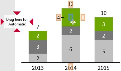
If you want a manually placed segment label to be put back into automatic mode, drag the mouse pointer onto the target Drag here for Automatic or click the 
Note: You can also drag multiple labels at the same time. To do so, use multi-selection (🛇sect_logicallasso) and move one of the selected labels as a representative.
Rotate labels
Many labels can be rotated by 90 degrees to the right or to the left. To rotate a label, select it and choose the desired rotation from the context toolbar.
Labels that do not show the rotation button in their context toolbar cannot be rotated.
Note: You can also rotate multiple labels at the same time. To do so, use multi-selection (🛇sect_logicallasso) and rotate one of the selected labels as a representative.
Edit chart label text on the slide
You can add arbitrary text to all labels that are created with think-cell. The numbers in the labels are updated whenever the datasheet changes, even when the label contains extra text. This is particularly convenient for annotations or footnote marks. To use this function, simply type into the text box as usual.
When you move the cursor or select text, you will notice that the numbers from the datasheet behave like a single character. This concept is called a text field. You can either overwrite the text field or add text before or after it, but you cannot change it. Any numbers that are based on the datasheet and are displayed in chart labels, are created as text fields. Each text field refers to a certain number created from the Excel data. This could be a single cell in the datasheet or a calculation involving multiple cells. Whenever the data source of the text field is changed, the numbers in the label are updated to reflect the change.
As long as you do not delete or overwrite a label’s text field, the numbers in the text box are kept consistent with the numbers in the datasheet. You may, however, choose to delete the field and replace it with some other text or numbers. In this case, the text in the label will no longer be updated.
It is not obvious when a numeric text field has been overwritten with some other number. To inform you that the label is no longer automatically updated, an exclamation mark 
To reset a label and (re-)insert text fields, use the label content control (Label content ) or simply click on the exclamation mark, if there is one.
Note: Alt+Enter can be used to add line breaks to text in the datasheet while F7 can be used to spell-check datasheet text.
Format chart labels
Font
For all chart labels, you can select font options such as size and style. To select font options, select a label to open its mini toolbar. Then, in Font, select the font option that you want.
To change the font options for all labels within a chart, select the chart to open its mini toolbar. Then, in Font, select the font option that you want. All labels that you later create within the chart will use the font option that you selected.
The options in Font reflect the fonts, font sizes, and styles in the slide master (see Microsoft Learn).
Font color
For all chart labels, you can select the font color. To do so, select a label to open its mini toolbar. Then, in Font Color, select the color that you want.
think-cell usually automatically selects a font color to maximize contrast with the label's background. When you choose a different font color, the label may become hard to read if the background has a similar color. To restore think-cell's automatic color selection, remove the label, then add it back in.
For more information on font color, see Fills.
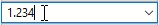
Number format
The number format control applies to text fields that display chart data. To use the number format control, enter an example number with the desired format. The actual number you enter is not important, it is only the number format that matters. The dropdown box provides quick access to the most common formats. Also, up to four of your most recently used custom formats are available in the dropdown box. Absolute and relative values can have different formats.
You can use the following punctuation characters for the grouping of thousands: comma, point, single prime and space. For the decimal point, you can use: point, comma and Arabic decimal separator. However, you cannot use the same character for the grouping of thousands and the decimal point.
For example:
- Type
1.000,00to display numbers with a comma for the decimal point, with two decimal places, and thousands separated by points. - Type
1000to display integer numbers with no grouping. - You can add arbitrary prefixes and suffixes, with or without spacing:
$1.2M - If you want all numbers to be signed, select a positive number and enter a leading or trailing plus:
+1,234 - Type
-USD 1,234to place the algebraic sign in front of the currency, typeEUR -1.234to place it in front of the value. - With a negative number selected, remove the minus sign and enclose everything including prefix and suffix in brackets, e.g.
(1,2M)to display bracketed negative values. If only a prefix or suffix is enclosed then the brackets are taken as literal characters, e.g.1,234 (metric tons). - Type –
1,234with a leading en dash to replace all minuses with en dashes.
think-cell can also use a number format that has been set in Excel. To use this, first choose the desired number format in Excel using the Format Cells... dialog and then select Use Excel Format from the bottom of think-cell’s number format control.
In the context of currency, some people use single prime as a symbol for million and double prime as a symbol for billion. If you want to use this convention with think-cell, start with entering millions into the datasheet or use the magnitude control to show the values in units of millions (see Magnitude). Then, enter the appropriate format string into the number format control. If you do not use the single prime in the format string, the numbers followed by a double prime always represent billions—even if there are no more numbers following the double prime.
Consider the number 3842.23 (or the number 3842230000 combined with a magnitude setting of ×106).
|
Number format control |
Output |
|---|---|
|
|
3”842’230 |
|
|
3”842’2 |
|
|
3”84 |
|
|
4” |
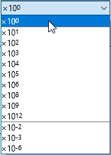
Magnitude
Values from data sources often have magnitudes that are not appropriate for data presentation. In think-cell, you can solve this problem by altering the magnitude of the labels without changing the data source.
Here is a simple example: Your Excel table is filled with seven-digit values (e.g. 3,600,000.00) but you would prefer to show values in units of millions. Simply select ×106 from the mini toolbar and the labels will show the appropriately scaled values.
Label content
Most labels can display various types of content. For example, the segment labels in the column chart can display absolute values, percentages, categories, series, percentages with absolute values or series, and series with absolute values. To view label content options, select the label to open the mini toolbar, then select the Label Content dropdown menu.

If you overwrite the content of a label, you can always restore the original label content. To restore the label content, select the label to open the mini toolbar, then on the Label Content dropdown menu, select the original label content option.
Date format codes
|
Code |
Description |
Example |
|---|---|---|
|
|
day of month |
5 |
|
|
day of month (two-digit) |
05 |
|
|
day of week (abbreviated) |
Mon |
|
|
day of week (full) |
Monday |
|
|
day of week (single character) |
M |
|
|
week of year |
7 |
|
|
week of year (two-digit) |
07 |
|
|
"Week" + week of year |
Week 7 |
|
|
"Week" + week of year (two-digit) |
Week 07 |
|
|
month number |
9 |
|
|
month number (two-digit) |
09 |
|
|
month name (abbreviated) |
Sep |
|
|
month name (full) |
September |
|
|
month name (single character) |
S |
|
|
quarter (Arabic numeral) |
4 |
|
|
quarter (lowercase Roman numeral) |
iv |
|
|
quarter (uppercase Roman numeral) |
IV |
|
|
year (two-digit) |
04 |
|
|
year (four-digit) |
2024 |
|
backslash ( |
custom character, e.g., |
Q3 |
|
quotation marks ( |
custom text, e.g., |
Quarter IV |
|
one or two single quotation marks ( |
single quotation mark, e.g., |
Jul '24 |
|
pilcrow ( Alt+Enter (Windows) or Option+Return (Mac) |
line break, e.g., |
Mon |
- Get started (WIP)
- think-cell Core: Presentation basics (TO DO)
- think-cell Charts: Data visualization
- think-cell Library: Presentation resources
- Deployment guide
- The think-cell API (WIP)