Chart annotations
- Home
- Resources
- User manual
- think-cell Charts: Data visualization
- Chart features (TO DO)
- Chart annotations

Difference arrows
|
In menu: |
Chart, segment in column and waterfall charts, point in line and area charts |
|
Menu items: |
|
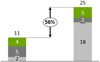
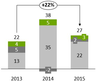
Difference arrows can be used in charts to visualize the difference between pairs of columns, segments or points. The difference is automatically calculated and updated whenever the underlying data changes. You can change the difference arrow label's font, number format, and label content (see Format chart labels).
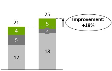
Two distinct styles of difference arrows are supported by think-cell: level difference arrows and total difference arrows. Level difference arrows are designed to show differences between pairs of segments or points in a chart; total difference arrows are designed to show differences between column totals.
Level difference arrows
Level difference arrows can be added by selecting the 

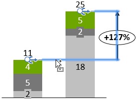
By default, a newly inserted difference arrow stretches from the selected segment or category to the top segment of the next category. You can also determine the desired start and end segment/category for the difference arrow immediately by selecting the start segment and the end segment at the same time. Then right-click on one of them and select
If the arrow is so small that the bubble would cover it up, the bubble is automatically placed next to the arrow. To manually optimize the layout, you can drag the arrow itself as well as its label to other locations (Automatic label placement). If you want to place the arrow between two columns, you might want to create an additional gap between the columns (Category gaps).
Total difference arrows
Total difference arrows can be added by selecting the 

Arrow modes
You can cycle through three arrow modes. The button in the context menu changes accordingly and the number in the label is recalculated:
|
|
Show an arrow pointing in one direction and calculate the relative difference. |
|
|
Show a double-ended arrow and calculate the absolute difference. |
|
|
Show an arrow pointing in the other direction and calculate the relative difference. |


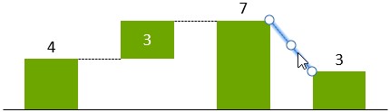
CAGR arrows
|
In menus: |
Chart, segment |
|
Menu item: |
|
This feature visualizes the compound annual growth rate. The range of dates on which the calculation is based is taken from the datasheet cells that are associated with category labels. The CAGR is automatically calculated and updated whenever the underlying data changes. For the calculation to work correctly, it is important that the respective datasheet cells contain the correct dates.
The CAGR from category A to B is calculated as
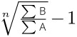
with n being the number of years in the date range. The 30/360 day count convention is followed to determine n when it is not a whole number.
The arrow's label automatically displays the CAGR. You can change the label's font and number format (see Format chart labels), and you can change the arrow's color (see Fills).

By default, only one CAGR is inserted that stretches from the selected category to the last category in the chart. You can use the handles that show up when the CAGR arrow is selected to specify its start and end categories.
You can also determine the desired start and end categories for the CAGR immediately: Select a segment in the start category and a segment in the end category. Then right-click on one of them and click 

Series CAGR
The CAGR arrow is always calculated based on the column totals. However, you might also like to visualize the compound annual growth rate of one of the series.
This can be shown in series labels. Simply select the label and choose the CAGR option from the label content control on the mini toolbar.
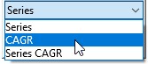
Now the CAGR is calculated series-wise.
To select all series labels in one action, click the first label, then Shift-click the last one (see Select multiple objects).
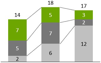
Value lines
|
In menu: |
Chart |
|
Menu item: |
|

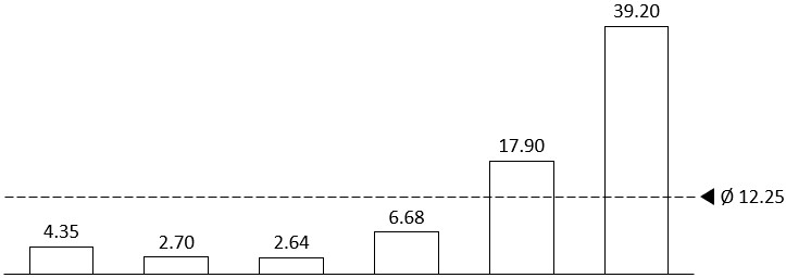
This feature displays a line parallel to the X-axis to visualize a certain value. You can create multiple value lines per chart, and you can choose to have the line’s label placed to the left or to the right of the chart.
Where appropriate, the value line is initialized with and snaps to the arithmetic mean (stacked chart, clustered chart) or the weighted mean (Mekko chart) of the column totals. If the line is snapped to such a value, this value is calculated and automatically updated when data changes.
You can drag the line as desired. If you need to increase the precision of the dragging operation, use PowerPoint controls to zoom in on the slide. You can also use the cursor keys ← → ↑ ↓ to nudge the line to a specific value. When using the cursor keys, the line moves in increments corresponding to the label’s number format.
As always, you can add custom text to the label or replace the predefined label with your own content. You can learn more about labels and text fields in Chart labels. You can also change the label’s font (see Font) and number format (see Number format).
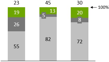
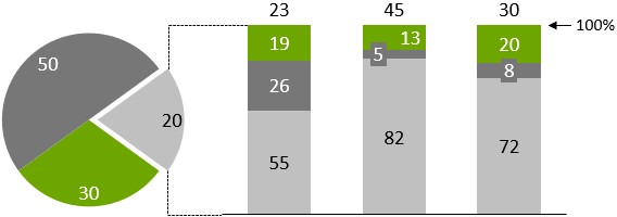
100% indicators
|
In menu: |
Chart |
|
Menu item: |
|

This feature shows a “100%” mark. It is on by default. You can choose to have the label placed to the left or to the right of the chart.
Series connectors
|
In menus: |
Chart, segment |
|
Menu item: |
|

You can add series connector lines to an entire chart or to a single segment. If you click the connector item of a segment’s menu, a connector line is created at the top right corner of that segment. If you want a connector as part of a waterfall calculation, you must use the specific waterfall connector (see Waterfall charts). Alternatively, universal connectors (see Universal connectors) can be used when the desired connections cannot be achieved using standard connectors.
Universal connectors
|
Icon in think-cell group: |
|

Universal connectors are different from the other decorations described in this chapter, because they do not belong to a specific element or feature. Therefore, they are not available in the think-cell context menu.
Instead, you can insert universal connectors from the think-cell tab. Double-click the universal selector button to insert multiple connectors. To leave insertion mode, click the button again or press the Esc key.
Each chart element can offer connectable points. The universal connector can connect any two connectable points that may or may not belong to the same element. Use the universal connector if you need an unusual connector that is not supported by the chart itself.
You can also use the universal connector to connect two different charts. The handles at the ends of the connector snap to connectable points while you move them. The handle in the middle of the connector can be dragged to change the straight connector to one with a right angle.
Note: The universal connector visually connects two objects, but it has no effect on the calculation of the waterfall chart. If you want a connector as part of a waterfall calculation, you must use the specific waterfall connector (see Waterfall charts). Standard connectors (see Series connectors) are also available for a number of chart types and should be used in preference to universal connectors when possible.
- Get started (WIP)
- think-cell Core: Presentation basics (TO DO)
- think-cell Charts: Data visualization
- think-cell Library: Presentation resources
- Deployment guide
- The think-cell API (WIP)