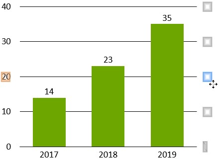
Use this feature to show a numerical scale for the values in your chart, represented either by an axis line with tick marks or by gridlines. Usually the Y-axis in a chart is a value axis.
Note: The X-axis of a Mekko chart is also a value axis. Similarly, scatter and bubble charts have two value axes that are always displayed. In addition, the X-axis of a line chart may be a value axis, rather than a category axis (see Line and profile charts). The X-axes of all other charts are standard category axes.
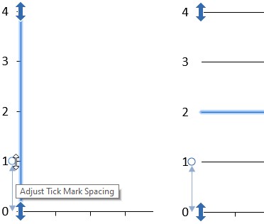
When selected, a value axis has three handles, shown below both for the axis line and the gridlines representation. When using gridlines, select one of the gridlines to show the axis handles.
Value axes are usually scaled by think-cell. You can, however, manually scale a value axis by dragging the handles at the end of the value axis. The values on the axis must always include the range between the lowest and largest value in the datasheet. If you do not want to show a specific value, either remove it from the datasheet or hide the respective datasheet row or column. Automatic value axis scaling can be restored by dragging the handles until the tooltip indicates Automatic or selecting Reset to Automatic Scale from the contextual menu of the axis or scaled chart element. Holding down Alt while dragging ensures that the value axis scale will not revert to automatic mode.
The tick mark spacing for value axes is usually calculated by think-cell. You can, however, manually adjust the tick mark spacing by dragging the middle handle. As you drag, the handle will jump to supported tick mark spacings, with a tooltip indicating the selected spacing. Releasing the handle will apply the indicated tick mark spacing to the axis. Automatic tick mark spacing can be restored by reducing the tick mark spacing until the tooltip indicates Automatic.
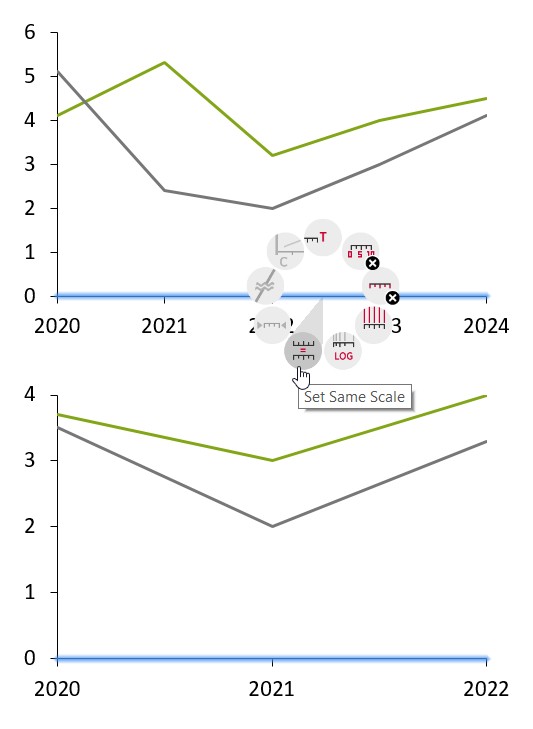
The Set Same Scale button can be used to apply the same scale to multiple charts. See Match the scales of different axes for further details.
Adjust the value axis type
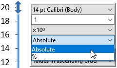
The position of segments, lines, and areas along an axis can be determined either based on their absolute values or on their relative (percentage) portion of the whole category. Respectively, in an axis's mini toolbar, on the Label Content menu, you can choose between Absolute and %.
In a stacked chart, switching to a percent axis will convert the chart to a 100% chart. A clustered chart will be converted to a stacked chart, because only then the relative portions are added up to a stack representing 100% of a category. Similarly, choosing a percent axis in a line chart will convert to an area chart.
Reverse the value axis
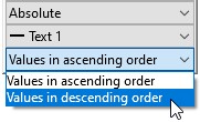
Scatter, bubble and line charts support reversing the axis direction by choosing Values in descending order from the axis direction dropdown in the axis’ contextual toolbar. In a line chart with two axes, you can set one to a reversed order to highlight negative correlations. Column, clustered and area charts flip the chart when reversing the axis.
Position value axes
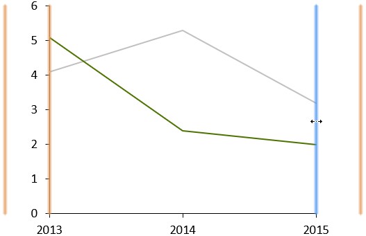
A value Y-axis can be moved by selecting and dragging the axis with the mouse. While dragging, available alternative locations for the axis will be highlighted. Dragging to the desired location and releasing will move the axis.
You will notice, when selecting and dragging the value Y-axis of a line chart, that two locations on either side of the chart are highlighted. Dragging to either of the locations will position the Y-axis on the appropriate side of the chart.
The location selected, however, also sets the crossing behavior for the chart. Two distinct styles of crossing behavior are supported for line charts:
Crosses At Categories The Y-axis crosses the X-axis at the center of a category. In this case the data points of the first category are placed directly on the Y-axis.
Crosses Between Categories The Y-axis crosses the X-axis between two categories. Consequently, the data points are offset from the border of the chart.
Regardless of the crossing behavior of the axis, the x-position of data points always corresponds to the center of the category.
Selecting either of the innermost highlighted locations will set the behavior to Crosses At Categories, while selecting either of the outermost highlighted locations will set the behavior to Crosses Between Categories.
The and buttons in the value axis context menu can also be used to alter the crossing behavior.
Position tick labels
Tick labels are usually shown to left of the axis line or gridlines. To move them to the right, select one of the tick labels and drag it to the alternative position:
Value axis context menu
Value axes have their own context menu. It shows the following buttons:
Add Title Add an axis title. You can drag the title to choose its placement. A title can also be added to the baseline of a chart, even though it may not be a value axis.
Add Tick Labels Add tick labels.
Add Tick Marks Add tick marks.
Add Gridlines Add gridlines.
Add Axis Line Add axis line. Only in the context menu of gridlines.
Set Logarithmic/Linear Scale Set the axis to a logarithmic or linear scale (see 🛇subsect_logscale).
Set Same Scale/Reset to Independent Scale Set the selected axes to the same scale or independent scales (see Match the scales of different axes).
Fit Scale To Data Revert the scale and tick mark spacing to automatic sizing if they have been modified either by the user.
Add Break Add a break at the current mouse pointer position (see Value axis breaks).
Set Crosses At/Between Categories Alter the crossing behavior for a line chart.
When appropriate, the buttons function as toggles for their respective function, i.e., if tick marks are already present, the same button position is used to remove them, as they cannot be added a second time.
Match the scales of different axes
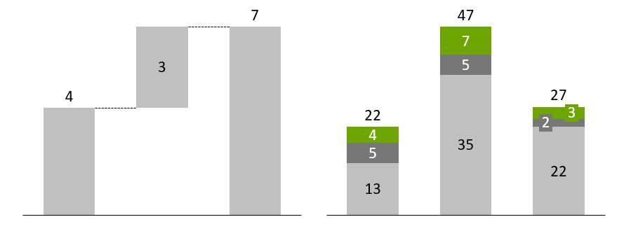
When there are multiple similar charts on the same slide, it is often desirable that all of them share the same scale. Only when two charts share the same scale, are the physical sizes of their segments comparable.
The following example shows two charts which have the same size, but not the same scale. Note that the column that represents 7 units in the waterfall chart is the same height as the column that represents 47 units in the column chart.
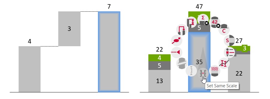
To make segments from different charts visually comparable, select segments from those charts together by holding Ctrl and clicking them, for example (see Select multiple objects). Then, open the think-cell context menu and click the Set Same Scale button to resize smaller scales to match the largest one.
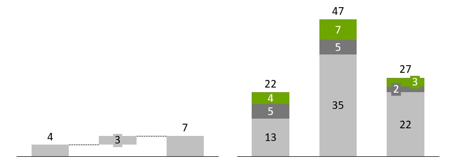
In the above example the resulting charts look like this:
When the data represented by a chart changes, it is possible that this chart rescales. The scales of all other charts set to the same scale are then adjusted as well, including when axis breaks are added or resized.
Instead of selecting multiple segments, you can also select multiple axes, gridlines or data points, one in each chart that should use the same scale. Afterwards, open the think-cell context menu and click the Set Same Scale button. You can also mix and match, i.e., for a line and a column chart, you would select a data point in the line chart and a segment in the column chart.
To revert to independent scaling, select a segment, axis, gridline or data point and choose Reset to Independent Scale from the contextual menu. If you are not sure which charts share the same scales, the easiest way is to revert the same scale for all charts, then to select appropriate parts in the requested charts and to activate same scale.
In charts with two value axes, e.g., line or scatter charts, a second Set Same Scale button is available for the X-axis. Each axis can be set to the same scale independently of the other. For example, you can set two line charts to the same scale on the X-axis to make sure they cover the same date range, while their Y-axis fits the data of each chart.
Logarithmic scales
You can switch to a logarithmic scale by using the Set Logarithmic Scale button from the value axis context menu. To revert to a linear scale choose Set Linear Scale .
Note: An axis with a logarithmic scale can only have tick marks at powers of 10, e.g. at 0.1, 1, 10. The axis must also begin and end at a power of 10.
Logarithmic scaling is not supported when it is mathematically not appropriate. Negative values are placed on the baseline and an exclamation mark is shown next to the label explaining that the value cannot be represented on a logarithmic scale. Also, an axis always uses a linear scale if multiple series that are added up to a total are associated with the axis.
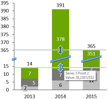
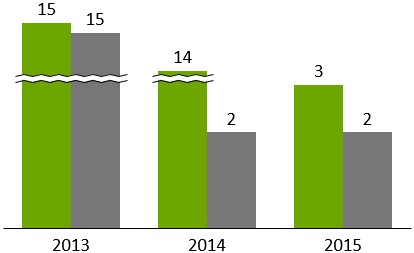
Value axis breaks
In menu:
Segment, axis, line, area
Menu item:
Use a value axis break to shrink a particularly large segment and enhance readability for the smaller segments. To add a value axis break, click the part of the segment or axis where you want the break to go and open the context menu. When adding a value axis break, the exact position where you right-click a segment or axis makes a difference.
Any break you insert applies to the value axis (if shown) and to all segments sharing the same range of the axis. For this reason, you can not add a break to the axis at any position where there is a segment border in any of the chart’s columns. A break can only be added if at the mouse pointer location there is some part of the value axis big enough to display at least the two lines that visualize the break. The break also applies to the axes and segments of any chart set to use the same scale (see Match the scales of different axes).
This is illustrated by the following example. No break can be added to the very top part of the second column, because the top of the third column is too close. However, within the range of the third column’s segment, there is enough space for the break. Since both columns share this range of the value axis, both segments are broken:
Adjust the break’s extent
You can adjust the size of a broken segment by dragging the lines that appear when you select the break. These lines mark the range of the scale that is compressed to save space. Drag the lines to determine the size of the compressed part of the scale. If you drag a line far enough for the compressed range of the scale to take as much space as was originally required, the break disappears. The default is to compress the selected part of the scale as much as possible while leaving enough room for the break lines to be rendered.
Available break styles
There are two types of break shapes supported by think-cell. The straight break as illustrated above is commonly used for standard column charts. The wiggle break as illustrated below is convenient to save space in charts with wide or adjacent columns. If enough space is available, you can toggle between the two shapes with Set Wiggle/Straight Shape in the break’s context menu.
Note: In line, area and Mekko charts only the wiggle style is supported.
Date axes
If the datasheet contains strictly increasing year numbers, the number format of the axis labels can be changed to one of the date formats, e.g., yy for two-digit years, yyyy for four-digit years and additional formats containing days and months (see Number format and 🛇[duplicated] sect_dateformatcodes).
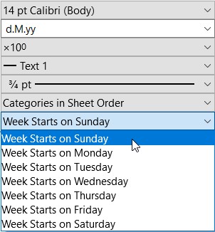
When the labels are formatted as dates, or when Excel’s cell format is set to Date for all category cells, you are using a date axis. When adjusting the scale of a date axis, years, months and weeks can be used for tick mark spacing.
When using a date axis, the mini toolbar of the axis displays an additional Week Starts On dropdown menu that allows you to select which weekday represents the start of a new week. When a tick mark spacing with a unit of weeks is chosen, either automatically or manually, think-cell will place dates with that weekday on the tick marks.
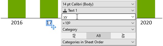
You can mix two- and four-digit year numbers on a date axis. For example, you might display the first and last category with four-digit years and all categories in between with two-digit years.
To choose the number of digits, you click the label you want to change and adjust the format. think-cell will automatically adjust other labels to ensure a consistent display. For example, if you only select the first label and use the two-digit date format yy, all labels switch to two digits as it is unusual to use two digits for the first label only. However, if you select one of the labels in the middle and use two digits, the first label will remain with four digits, but all other labels between the first and the last label will be switched to two digits:
On a category axis, you can choose the order in which the categories appear. Each chart type has its own sorting options. For example, in column, line, area, and Mekko charts, the following sorting options are available:
Categories in sheet order displays the categories in the same order that they appear in the datasheet (default).
Categories in reverse sheet order displays the categories in the reverse order that they appear the datasheet.
Categories in descending Y extent order displays the categories based on the sum of their values from highest to lowest.
Categories in ascending Y extent order displays the categories based on the sum of their values from lowest to highest.
You can change the category labels in your chart so that they display the categories' numerical rank on the axis. To display ordinal category labels, open the Label Content dropdown menu, and select Ordinal.
You can use ordinal labels with category sorting to rank categories in your chart based on the sum of their values. This is useful when the values in each category have a meaningful order but the intervals between them are not necessarily equal or relevant.
Category gaps
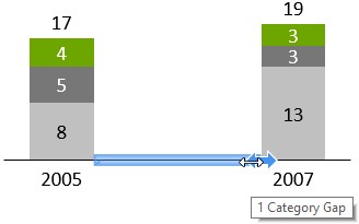
The basic spacing between columns in a chart is determined by the column width and the chart size. Extra spacing between individual pairs of columns may be added by inserting a category gap.
Category gaps can be introduced by clicking on the baseline and dragging the handle to the right. A category gap is as wide as one column width plus one gap width and the handle snaps to multiples of this category gap width.
Introducing category gaps preserves the width of the columns, resulting in an increase or decrease of the overall chart width.
You can ensure that the overall chart width is preserved by holding down the Ctrl key while dragging: the column widths will be increased or decreased to accommodate the category gap.
Note: In some cases, a break in the baseline (see Category axis breaks) may be a space-saving alternative to a category gap.
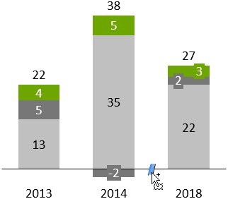
Category axis breaks
In menu:
Category axis column gap
Menu item:
A category axis break indicates a break in the continuity of the category axis scale. To insert the break, right-click on the category axis between two columns and select the respective menu item.