Element datasheets (TO DO)
- Home
- Resources
- User manual
- think-cell Charts: Data visualization
- Data entry in PowerPoint (TO DO)
- Element datasheets (TO DO)
[OPENING BLURB]
Introduction to element datasheets
[Update: Charts, text boxes, tables, Harvey balls, and checkboxes all have datasheets]
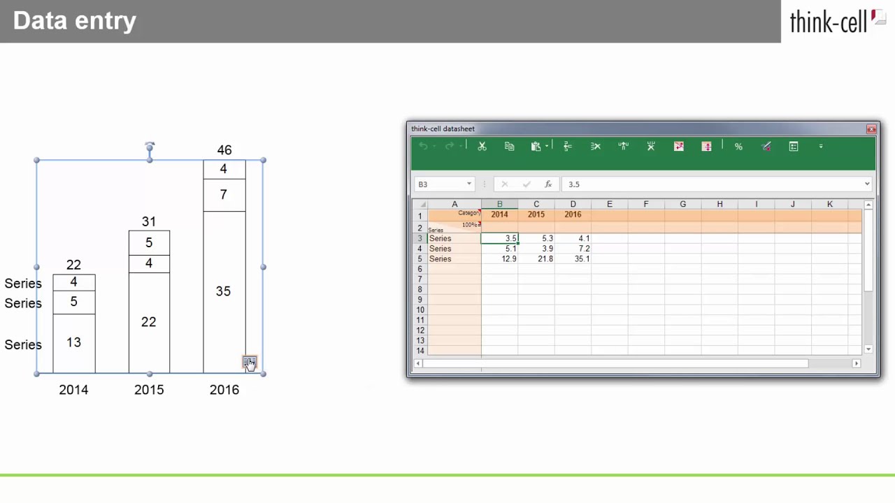
Every chart created with think-cell has an associated datasheet. The datasheet is opened by double-clicking the chart or by clicking the 
think-cell uses a customized Microsoft Excel sheet for data input, which you can use in the same way as regular Excel. You can use all the same shortcut keys, you can enter formulas instead of numbers, and so forth. But of course you can also use an Excel file as a data source (see Excel data links).
To insert or delete a row (or column) you can use the respective buttons in the toolbar of the datasheet. The standard buttons for undo and redo and cut, copy and paste are available as well.
Note: If you have Microsoft’s Chinese Conversion feature installed, you will find the options Simplified Chinese and Traditional Chinese in the datasheet’s toolbar.
Datasheet tools
[ADD INTRO BLURB AND TOC]
Absolute and relative values
You can enter absolute or relative values in a think-cell datasheet. To switch between absolute and relative values in a column, select the entire column or a cell in the column, then in the datasheet toolbar, select Add or Remove % Formatting

Keep in mind that for the display in the chart, it does not matter if you enter percentages or absolute values. If you enter absolute values but want to label the chart with percentages (or vice versa), think-cell performs the necessary conversion (see Label content ). A simple datasheet with only absolute values looks like this:

By default, when calculating datasheet values as percentages, think-cell assumes that the sum of each column represents 100% .
You can override the default think-cell calculation and enter specific values that represent 100% in the 100%= row. To enable the 100%= row, in the datasheet's toolbar, select Edit Data Layout


Alternatively, you can enter datasheet values as percentages. To calculate absolute values from the percentages you entered, in the 100%= row, enter the absolute values that represent 100%. The following datasheet uses percentages to specify the same data values as the previous datasheet example.

Transpose the datasheet
The layout of a think-cell datasheet depends on the chart type. In bar charts, for example, columns contain the data for a single series, while in column charts, rows contain the data for a single series. The following is a typical datasheet for a column chart.

To work with a datasheet where columns contain the data for a single series and rows represent categories, select Transpose Rows and Columns


Note that the columns have also been flipped to preserve the relationship between the visual order of data in the datasheet and the order of the data in the chart.
Reverse the datasheet order
The order of data in the datasheet always corresponds to the order of the data in the chart. This is also true for rotated charts (see 🛇3.5.2 Rotate and flip elements). To reverse the data order in the datasheet, in the datasheet’s toolbar, select Reverse Order of Data Rows


Edit datasheet layout
You can add or remove optional rows and columns that contain chart information in the datasheet. The chart type determines the available options for chart information that these rows and columns contain. Some optional rows and columns are enabled by default. For example, in a data range linked to a column chart, category labels appear in the first row and series labels appear in the first column.
To add or remove optional rows and columns, follow these steps:
- In the datasheet's toolbar, select Edit Data Layout

- Use the checkboxes to add or remove optional rows and columns.

- Get started (WIP)
- think-cell Core: Presentation basics (TO DO)
- think-cell Charts: Data visualization
- think-cell Library: Presentation resources
- Deployment guide
- The think-cell API (WIP)
