Format and style elements in think-cell Charts (TO DO)
- Home
- Resources
- User manual
- think-cell Charts: Data visualization
- Format and style elements in think-cell Charts (TO DO)
[ADD INTRO, e.g., these are extra ways to format elements in Suite. All the stuff from "Format and style elements" also applies to charts and tables]
Match element formatting to the datasheet (TO DO)
[See TECHDOC-247 New section: Match element formatting to datasheet]
Apply conditional formatting colors to elements
You can use conditional formatting in Excel to change the color of elements, giving you additional color control based on specific data trends. To apply conditional formatting colors in Excel to an element, follow these steps:
- Select a range of cells, a table, or an entire sheet in Excel. These cells may contain any values, formats, formulas, and references to other cells.
- Select Home > Styles > Conditional Formatting or think-cell > Styles > Conditional Formatting.
- Select one of the preset formatting rules. Enter your parameters in the dialog, then select OK.
- If you want to create custom formatting rules, select New Rule > Format only cells that contain > Cell Value. Enter your parameters in the dialog, then select OK.
- Select the linked element in PowerPoint to open the mini toolbar, then in the Color Scheme control dropdown menu, select Use Datasheet Fill on Top.
Using conditional formatting rules to affect chart colors has the following limitations:
- The Data Bars and Icon Sets conditional formatting presets don't affect chart colors.
- You can't use conditional formatting to change the number format of your charts. To change the number format of your charts using a linked Excel sheet, select the cells, then right-click and select Format Cells. To learn more, see Number format.
- think-cell can't automatically update chart colors after you create or change conditional formatting rules in a linked Excel sheet. To update the chart, change any data value on the linked sheet or save your progress and restart Excel.
To learn more, see Excel data links.
Chart color scheme
Apply a sequence of colors or patterns to a chart's series by picking a fill scheme. By default, think-cell elements use the PowerPoint Theme fill scheme. To change the fill scheme of a chart, select the chart to open the mini toolbar, select the Fill Scheme dropdown menu, then select a fill scheme. The fills update automatically when you add or remove series.
The fill scheme applies fills in sequence: by default, the first fill applies to the first series and the sixth fill applies to the sixth series. The fill sequence repeats after applying the last fill: by default, the seventh series will use the first fill of the scheme.
You can reverse the fill scheme sequence so that the first fill applies to the last series in the chart. To reverse the fill scheme order, select the chart to open the mini toolbar, select the Fill Scheme dropdown menu, then select Stacked Fill Order: Bottom to Top.
Note: Using think-cell style files, you can customize fill schemes. For example, you can change the default fill scheme; the list of available schemes in the Fill Scheme dropdown menu; and the number, order, and style of fills in a scheme. You can also specify what happens when there are more series in a chart than the number of fills in a scheme. To learn more, see Customize the list of fill schemes.

Use datasheet fill colors on your charts
You can use your datasheet to control the colors of your charts. To apply the cell fill colors of your Excel datasheet to your chart in PowerPoint, select your chart to open the mini toolbar, select the color scheme dropdown menu, then select Use Datasheet Fill on Top.
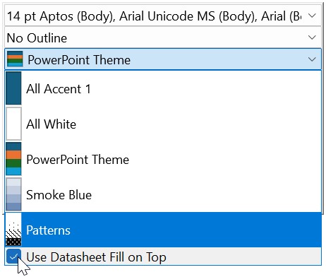
Use Datasheet Fill on Top is particularly convenient if you want to highlight patterns and trends in your data through the Excel datasheet. In most charts, selecting Use Datasheet Fill on Top applies the fill color of a cell containing a value to the corresponding feature in the chart—with two exceptions:
- In area charts, the fill color of a cell containing a series label determines the corresponding area's color in the chart.
- In line charts, the fill color of a cell containing a series label determines the corresponding line's color in the chart. The fill color of a cell containing a value determines the corresponding marker's color in the chart. To learn more, see Line scheme and Line and profile charts.
If you enable Use Datasheet Fill on Top and a feature in your chart corresponds to a cell without a fill color, think-cell applies the selected color scheme in PowerPoint to that feature.
Switch chart type
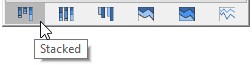
In a chart's mini toolbar, the chart type control switches to a different chart type that displays the same data. You can switch between the stacked, stacked 100%, clustered, area, area 100% and line chart.
When using only columns or bars on an absolute axis and lines, you can also switch individual series to a different type, creating a combination chart, by selecting a segment or data point belonging to that series and switching the chart type in the mini toolbar.
To switch to a 100% chart of the same basic type you can also set the Y-axis type to % (see Adjust the value axis type).
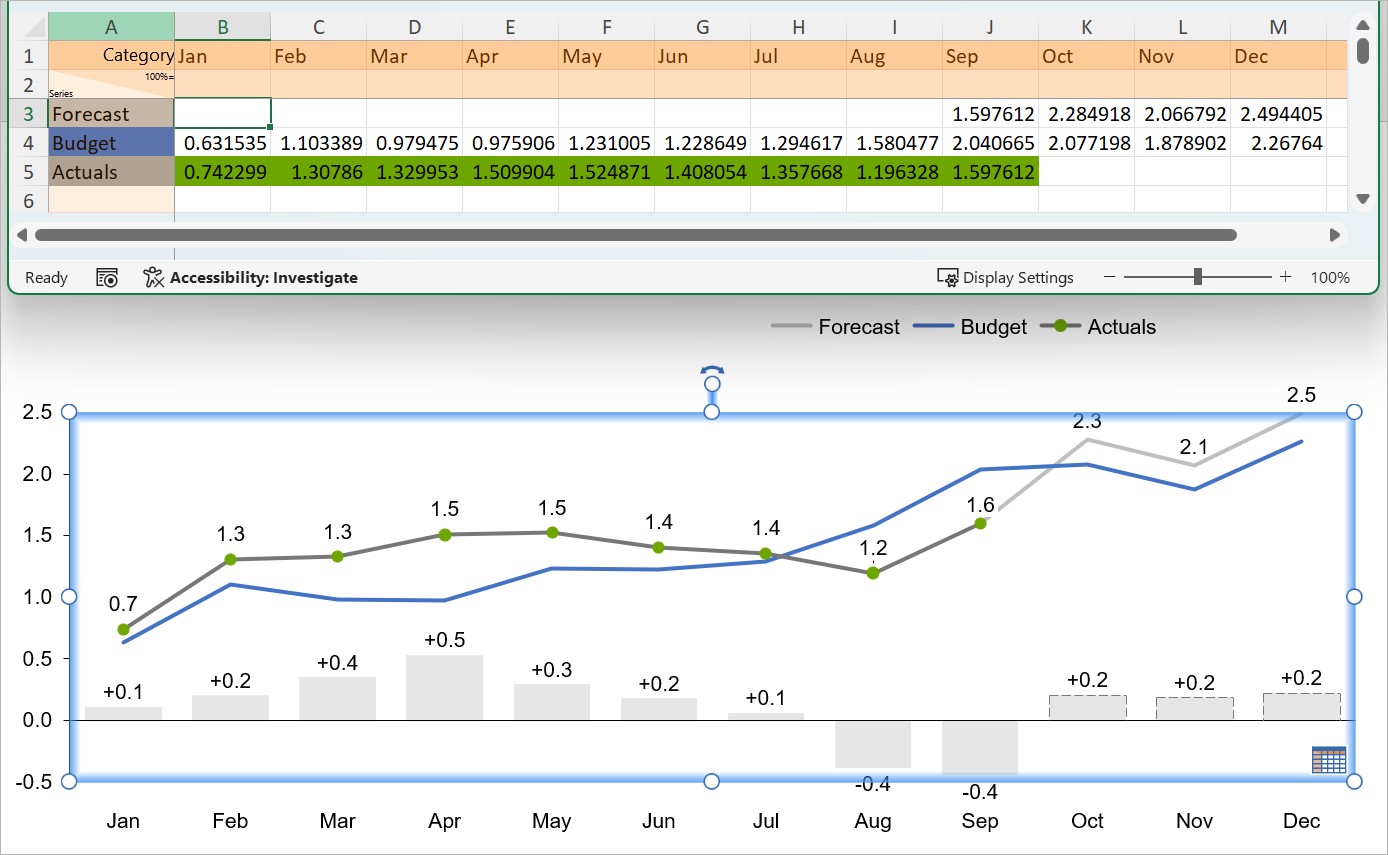
Net lines
Display a chart series as net lines. Net lines help compare expected and actual values, or highlight trends and deviations from the average. You can change any series to net lines in all column/bar charts and line charts.

To display a series as net lines, do the following:
1. Open the mini toolbar by selecting a series label, segment, or line.
2. On the mini toolbar, on the chart type controls, select  Net Line.
Like any other series, you can change the data values that net lines represent using the chart's datasheet (see Introduction to element datasheets).

By default, the appearance of net lines matches that of value lines (see Value lines). To change the appearance of a series of net lines, select a net line to open the mini toolbar, then use the Line Color and Line Style dropdown menus.
Add connectors to net lines
You can add connectors between net lines. To add connectors to net lines, open the context menu by right-clicking a net line, then select  Add connectors.
Create a step line
A step line connects the data points that net lines represent with horizontal and vertical lines that form a series of steps. You can add connectors to net lines at a right angle, thus creating a step line. To create step lines, add connectors between net lines, then extend the net lines by selecting a net line and dragging the handles until it forms a right-angle with the connector.

- Get started (WIP)
- think-cell Core: Presentation basics (TO DO)
- think-cell Charts: Data visualization
- think-cell Library: Presentation resources
- Deployment guide
- The think-cell API (WIP)