Create a bubble chart matrix
- Home
- Resources
- Content hub
- Create a bubble chart matrix
15 min read — Stephen Bench-Capon
A bubble chart matrix uses features of a bubble chart visualization to communicate multiple data dimensions in a clear, tabular layout.
This is the second article in our series that introduces you to some specialized charts you can use in your presentations when you need something a bit out of the ordinary. See also: Create a pareto chart, Create a box and whisker chart.
Here, we will walk you through the process of building a bubble chart matrix step by step, starting with how to set up the matrix and enter your data, to adding legends and aligning labels for a professional data visualization.
Contents
- Introduction
- Step 1: Insert bubble chart
- Step 2: Set up the matrix
- Step 3: Add your data
- Step 4: Choose your color palette
- Step 5: Add a legend to your bubble chart matrix
- Step 6: Fine-tune the chart axes
- Step 7: Move data to slide workbook
- Step 8: Add and align axis labels
- Step 9: Add bubble size legend
Introduction
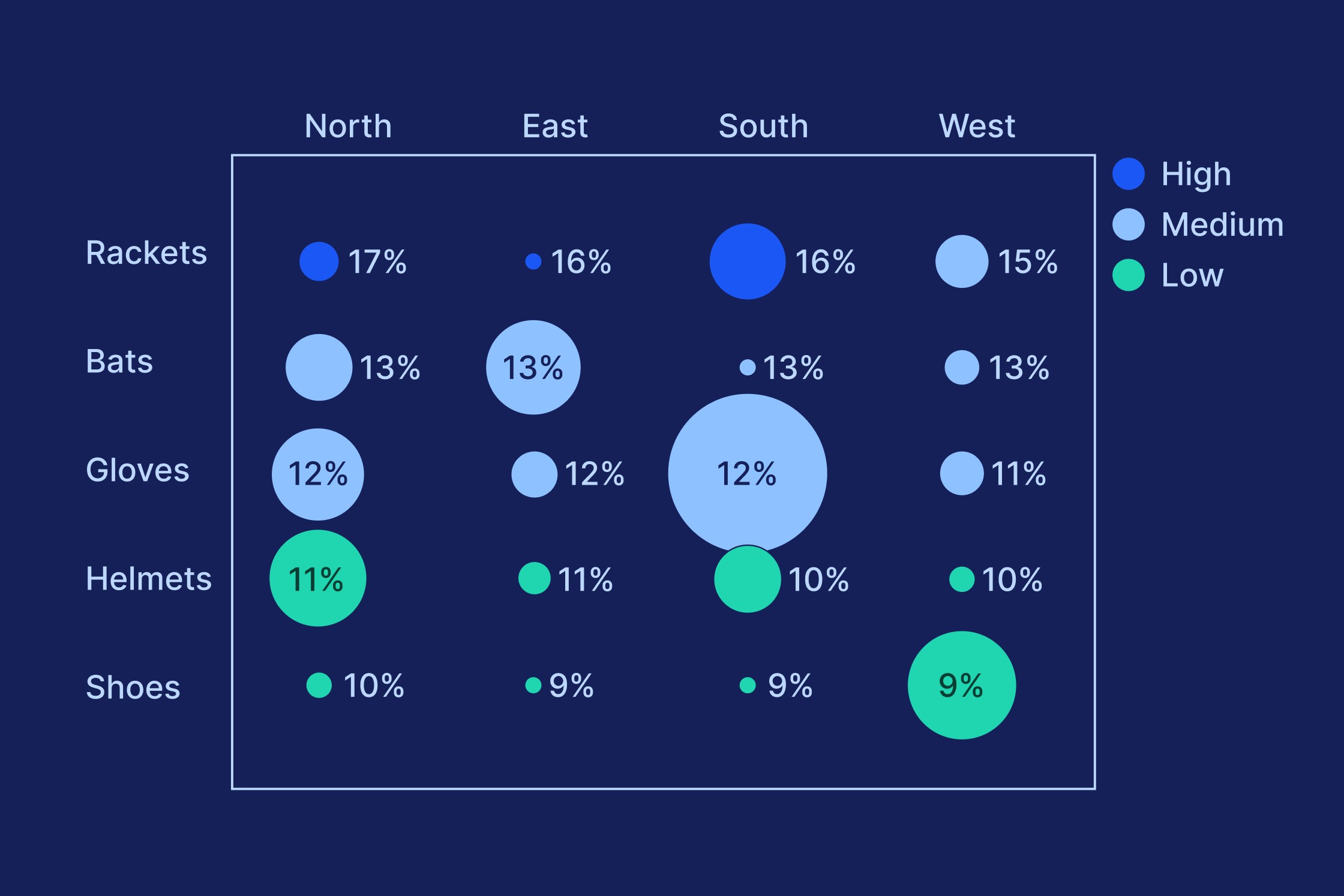
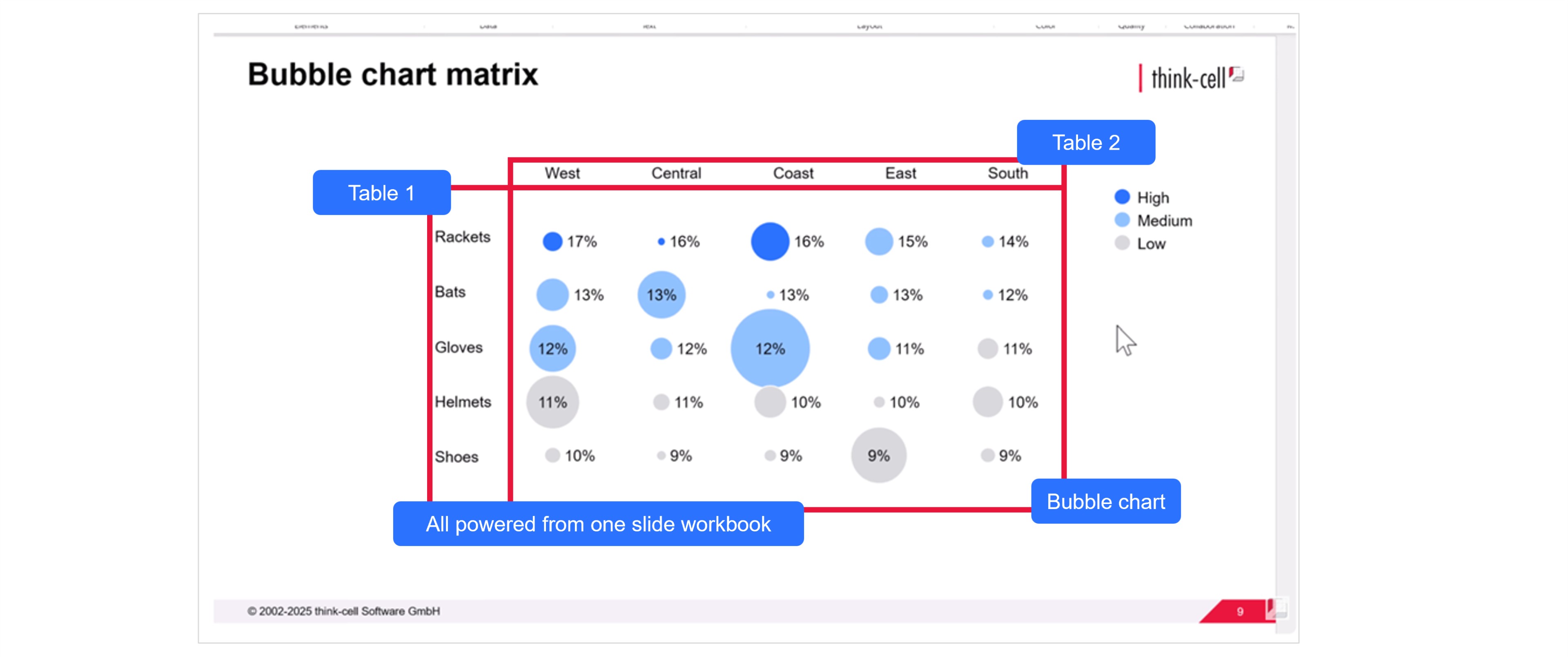
In this article we will create a bubble chart matrix showing sales data for sports equipment categories across five regions. The data is illustrative. Here’s what the bubble chart matrix will look like when we’re done.
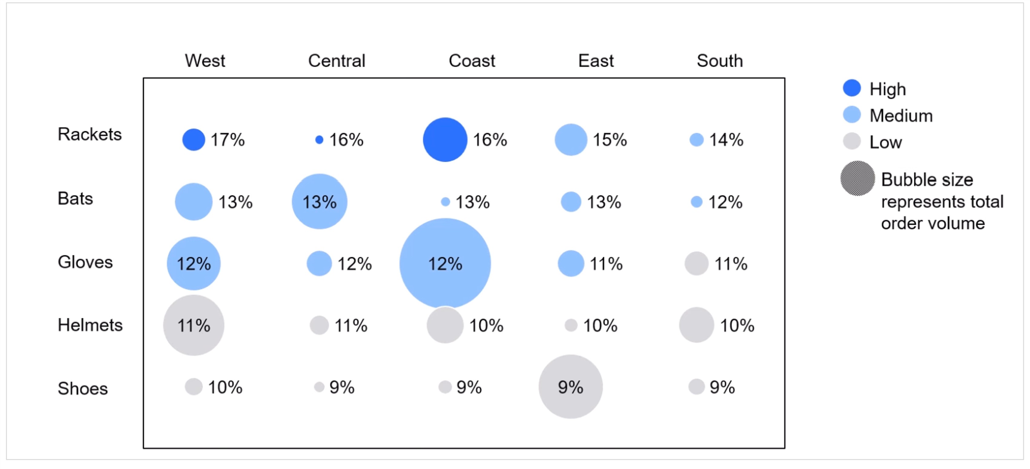
Bubble chart matrixes are useful when you want to show more than one datapoint for multiple category pairs.
A normal table with rows and columns can typically only show one value in each cell.
A bubble chart matrix can show three values for each category pair using:
- Bubble size
- Bubble label
- Bubble color
Sales data by category and region is a typical use case for a bubble chart matrix, but they can also be used to show categorical data over time by using one of the axes for the year.
Another common use for a bubble chart matrix is to show data over the course of a week by plotting the hour on the X-axis and the day on the Y-axis.
You can download the slide used in this article, which contains the final chart and the data in the accompanying slide workbook, in this PowerPoint file. The presentation also includes a more advanced example showing you how to generate a bubble chart matrix from raw data using a slide workbook.
You can also watch the whole process from start to finish in this video:

Step 1: Insert bubble chart
Start by inserting a bubble chart into your slide.
Simply select Bubble from the Charts menu and drag a box to place the chart.
Don’t worry about the data that appears in the chart by default. You’ll be turning it into a bubble chart matrix with your own data in the next steps.

Step 2: Set up the matrix
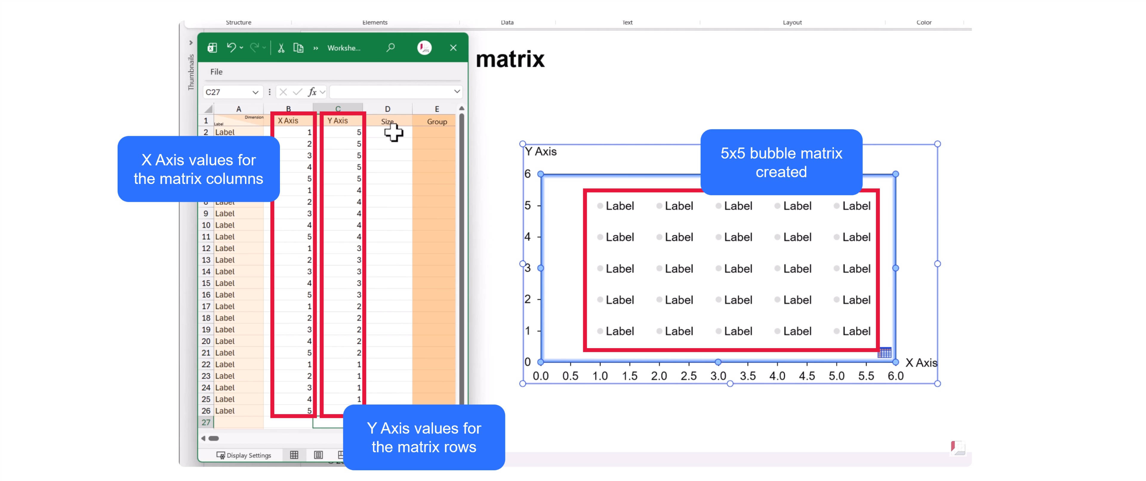
To create a bubble chart matrix, you need to set up a matrix within the framework of your bubble chart.
On a bubble chart, the position of each bubble is determined by its X and Y value, creating a coordinate.
To create a tabular matrix:
- Enter incrementally increasing values to the X Axis column in the datasheet. If your bubble chart matrix has 5 columns, you enter 1, 2, 3, 4, 5.
- Add the largest row number to the first rows or your Y axis column. In our case, we have five rows, so we enter 5. This creates the top row.
- Return to the chart and extend the Y-axis by dragging with the left mouse button so that the top row is inside the chart area.
- Extend the X-axis by dragging with the left mouse button so that the rightmost bubble is inside the chart area.
- Complete the X Axis column in the datasheet by repeating the values for each row of the matrix. In our case, we enter 1, 2, 3, 4, 5, 1, 2, 3, 4, 5 etc.
- Enter the values to the Y axis column to populate each row the bubble matrix chart. For the fourth row, we enter 4, 4, 4, 4, 4. For the third row, we enter 3, 3, 3, 3, 3, and so on.
With the tabular matrix set up, you have the bubbles you need and you are now ready to enter your data.
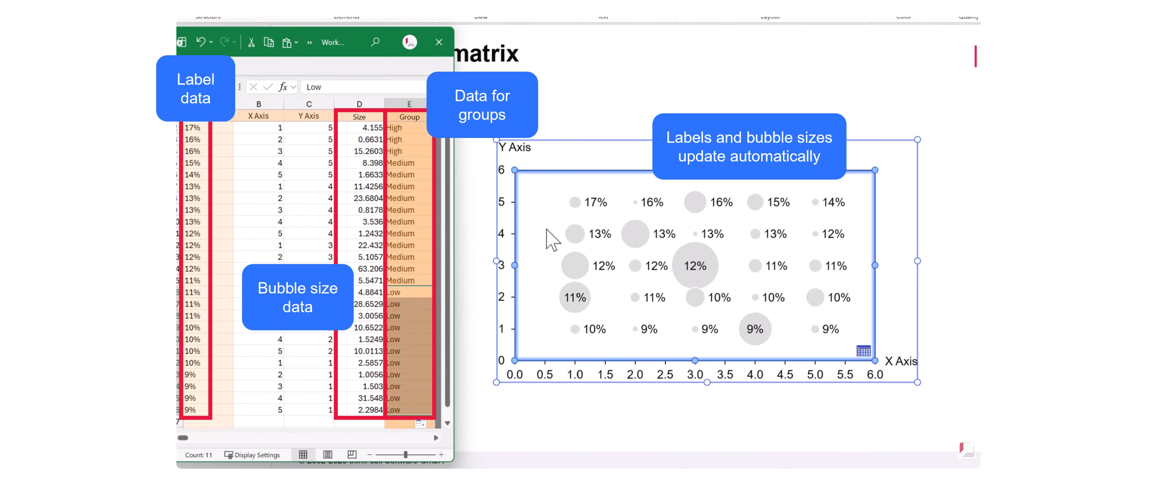
Step 3: Add your data
The bubble chart matrix allows for three columns of data that can add to your datasheet:
- Bubble size: By default, all bubbles are the same size. Copy your values to the Size column and the sizes will change in proportion. In our case, the bubble sizes represent total order volume.
- Bubble label: You can add values for the bubble labels to show another datapoint on your bubble matrix chart. Copy your values into column A of the datasheet. In our case, we use the bubble labels to represent supply chain cost as a proportion of revenue.
- Bubble color: By defining groups, you can give every bubble a color. Add the data to the Group column in the datasheet. In our case, we set groups for high, medium and low based on the same metric as is used for the label. Alternatively, you could define groups based on another metric, such as profitability, or use groups to highlight newly-released products.
When you first enter your data, the bubbles might not immediately change color. This will depend on which color palette is set for your charts. We will look at colors in the next step.
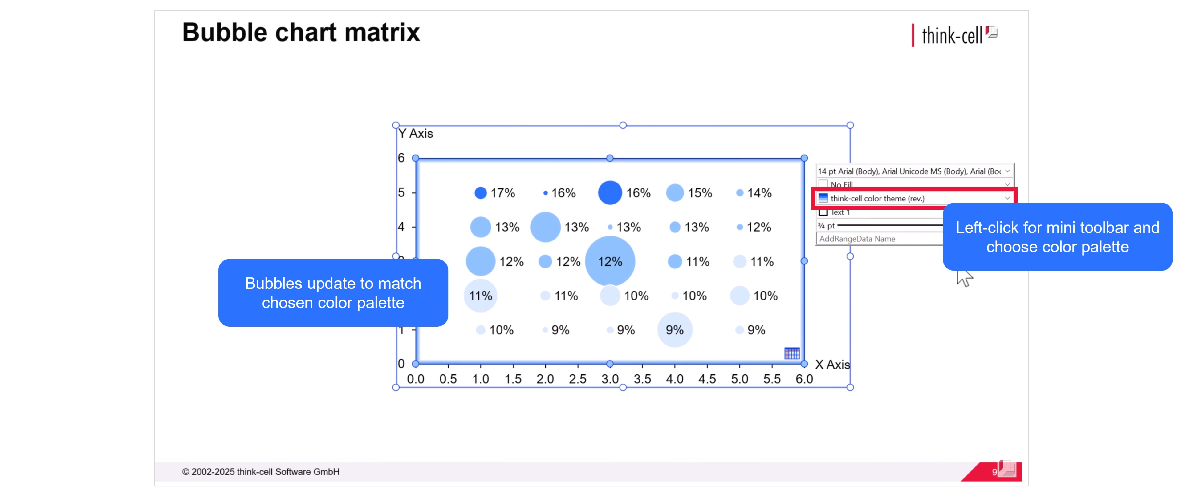
Step 4: Choose your color palette
Depending on how your PowerPoint file is set up, you may have a range of color palettes to choose from for your chart.
Left-click in the slide and choose your preferred color palette using the mini toolbar. The bubbles will change color based on the data you previously entered in the Group column.
If you want to change the color of one or more groups, you can do that in the next step.
Step 5: Add a legend to your bubble chart matrix
It’s important to add a legend to your bubble chart matrix so that your audience knows what the bubble colors represent.
When you right-click the chart area and select Add Legend from the menu, a legend will appear showing the names of all the groups you entered in your datasheet.
You can change the color of any group by clicking the circle in the legend and choosing a different color via the mini toolbar. In our case, we set the group ‘Low’ to gray to help the other groups stand out better.

Step 6: Fine-tune the chart axes
The bubbles of your bubble chart matrix are now complete with data, labels and formatting.
The next step is to fine-tune the chart axes. First, you can reduce the length of each axis with the mouse so that the bubbles occupy the center of the chart area.
Next, because the axis values of a bubble chart matrix are only used to create the layout, rather than being relevant datapoints, you can remove the axes. Right-click each axis and select Delete from the menu.
With your bubble chart matrix now perfectly proportioned, it’s also a good time to align your legend with the top of the chart.

Step 7: Move data to slide workbook
Slide workbooks let you control all the data-driven elements on your slide form a single source.
Open the datasheet and select Move Data to Slide Workbook from the datasheet toolbar.
Having your data in a slide workbook will make it easier to update your bubble chart matrix by including additional calculations, connecting your chart data to other tables, or automating your groups based on Excel formulas.

Learn more about slide workbooks in our blog post: Build data-heavy presentations more flexibly with slide workbooks
Step 8: Add and align axis labels
For the bubble chart matrix, we removed the value-based axis labels.
Instead, we want to add labels that represent the category pairs. In our case, this will be the product category on the Y-axis and the region on the X-axis.
Here’s how you add and align the axis labels for your bubble chart matrix:
- Copy or enter the category names for each axis somewhere on your slide workbook.
- Highlight the cells for your Y-axis labels and select Link to PowerPoint, then Table from the PowerPoint ribbon.
- In PowerPoint, drag the table to match the size of your bubble chart matrix.
- Left-click the table and select Middle for the vertical alignment of the cell text.
- Resize the table, if necessary, so that the category names line up with the rows of the bubble chart matrix.
- Follow the same process for the X-axis category labels, highlighting the cells in the datasheet and selecting Link to PowerPoint, then Table.
- To align the text for the X-axis labels, choose Center for the horizontal alignment.
You now have a bubble chart matrix with clear labels identifying the category pair for each bubble.
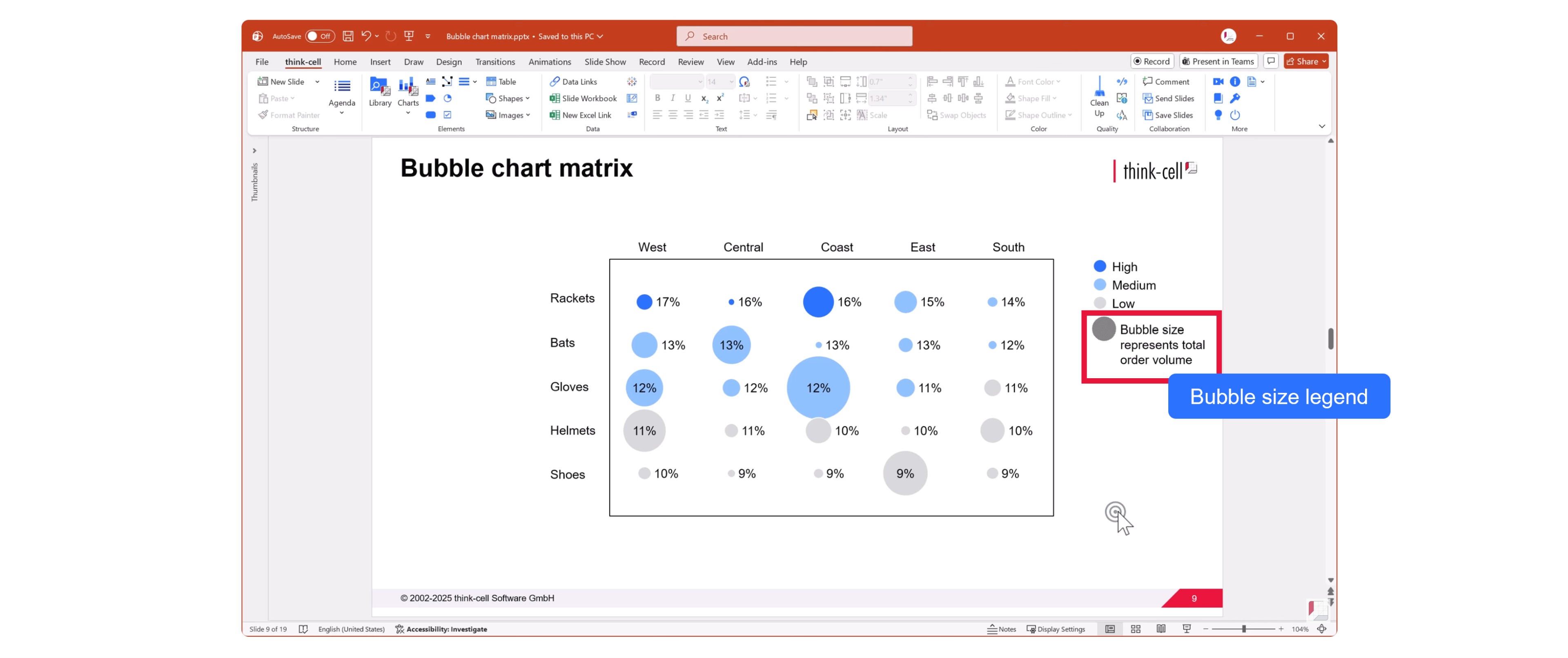
Step 9: Add bubble size legend
A bubble size legend will tell your audience what the size of the bubbles on your bubble chart matrix represents.
Right-click the chart and choose Add Bubble Size Legend from the menu.
You can change the color of the bubble size legend from the dropdown menu in the mini toolbar.
You can edit the label of the bubble size legend by left-clicking in the text field. Be as clear as possible. In our case, we write ‘Bubble size represents total order volume.’
Your bubble chart matrix is complete.
You can create your own bubble chart matrixes by downloading a free think-cell trial.
Explore this topic further with AI:
Read more
We walk you through the process of creating a Pareto chart, from structuring your data through to formatting and fine-tuning a professional data visualization.
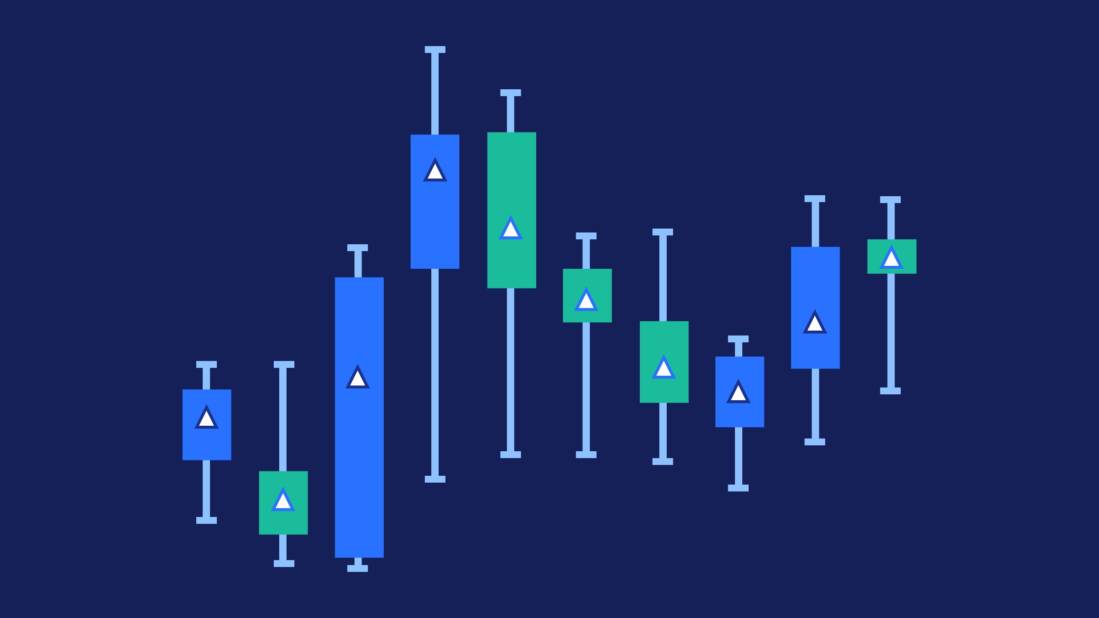
Learn the step-by-step process of building a box and whisker chart, from which chart type to use and how to adapt it to make a professional data visualization.
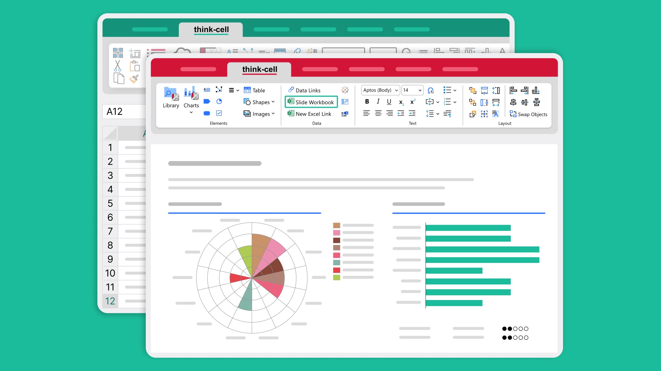
Learn how slide workbooks can change the way you build data-heavy presentations by combining the flexibility of ad-hoc datasheets with full Excel functionality.

Global survey of 1,200 professionals in 12 countries into how AI is used in presentation workflows.