Create a box and whisker chart
- Home
- Resources
- Content hub
- Create a box and whisker chart

13 min read — Stephen Bench-Capon
A box and whisker chart is a data visualization used to compare the internal distribution of different datasets by showing mean, quartile, maximum and minimum values in a clear, compact way.
This is the third article in our series that introduces you to specialized charts you can use in your presentations when you need something a bit out of the ordinary. See also: Create a Pareto chart and Create a bubble chart matrix.
The article will guide you step by step through the process of building a box and whisker chart, starting with which chart type to use and explaining how to adapt it to create the visualization you need for your data.
Contents
- Introduction
- Step 1: Insert line chart
- Step 2: Enter max and min values
- Step 3: Create the whiskers for the max and min
- Step 4: Distribute the whiskers across the chart area
- Step 5: Enter your upper and lower quartile data
- Step 6: Create the boxes for the interquartile range
- Step 7: Enter your median data
- Step 8: Create markers to represent the medians
Introduction
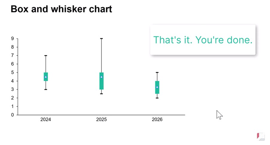
In this article we will create a box and whisker chart showing illustrative data for a three-year period, including one box plot for each of 2024, 2025 and 2026. Here’s what the box and whisker chart will look like when we’re done.
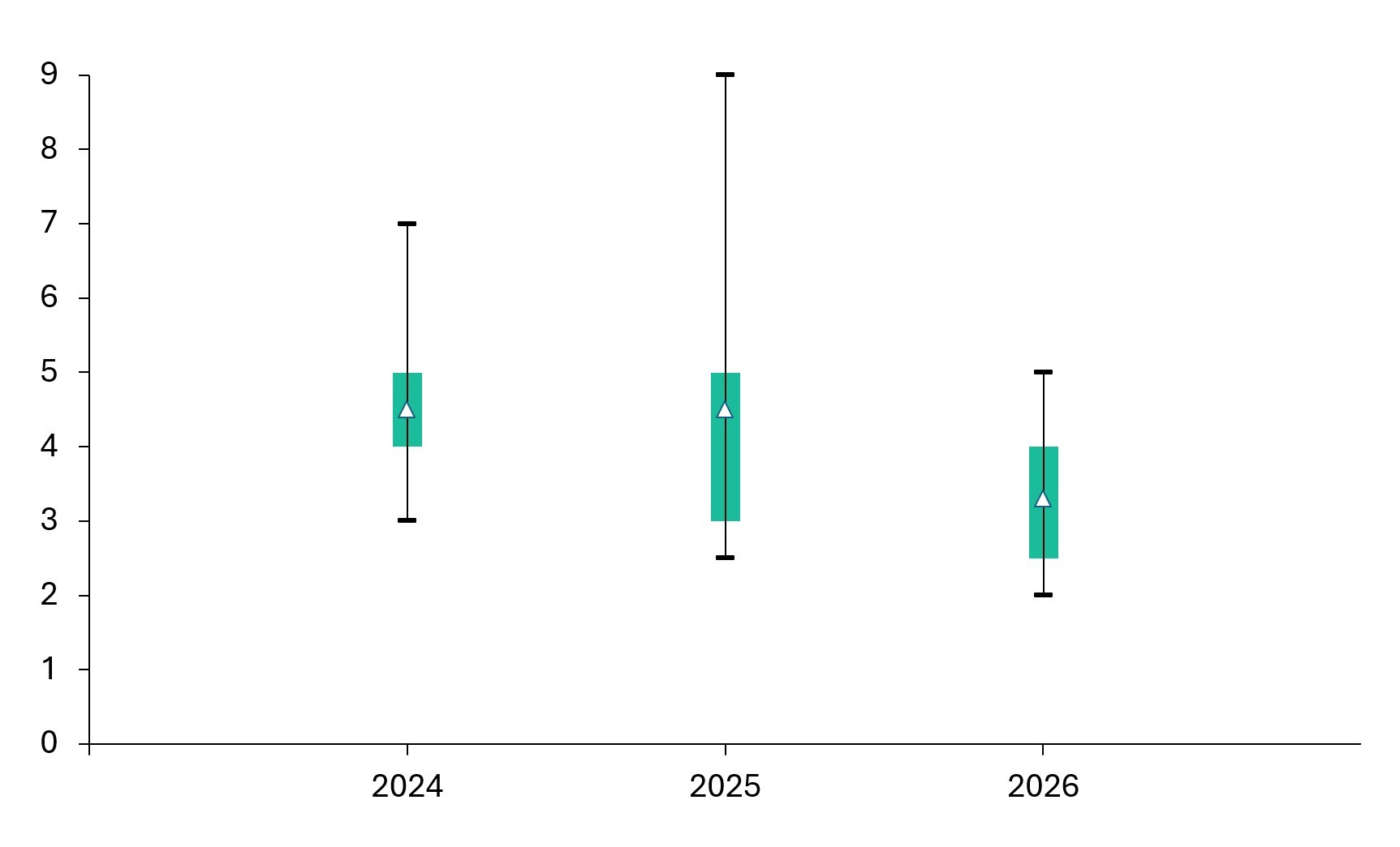
Box and whisker charts are useful when you want to visualize the distribution of values within different categories.
A box and whisker chart shows several datapoints for each category:
- Mean
- Upper quartile
- Lower quartile
- Maximum (excluding outliers)
- Minimum (excluding outliers)
For each category, a box covers the interquartile range, which extends from the lower quartile to the upper quartile. Lines, known as the whiskers, extend up to the maximum and down to the minimum.
Typical use cases for box and whisker charts include test scores, weather reports or payroll data, but they can also be used to visualize any dataset where there is value in showing the interquartile range and the underlying distribution, rather than just a mean or total.
You can download the slide used in this article in this PowerPoint file, which contains the final box and whisker chart, as well as the example data in the accompanying slide workbook. You can also watch the whole process from start to finish in this video:

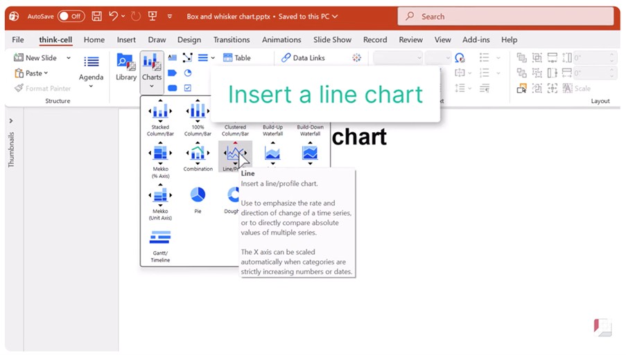
Step 1: Insert line chart
Start by inserting a line chart into your slide.
Simply select Line from the Charts menu and drag a box to place the chart.
The line chart won’t look anything like a box and whisker chart to start with, but that’s OK. We’ll make use of the line chart’s underlying structure to build our box and whisker chart.
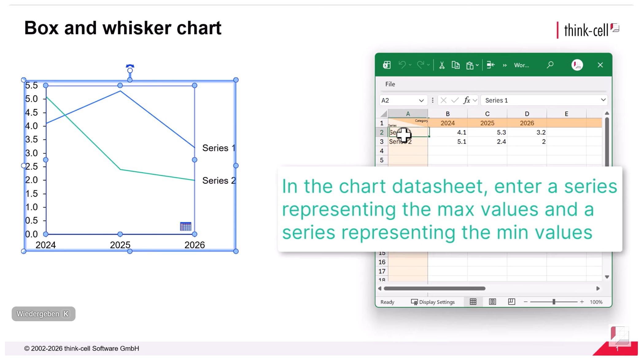
Step 2: Enter max and min values
The whiskers of a box and whisker chart represent the maximum and minimum values for each category.
Enter the values for two series, one for the max and one for the min values, into your chart datasheet or slide workbook.
The series names won’t be displayed on the chart but giving them clear names like ‘Max value’ and ‘Min value’ will make it easier to understand the chart data.
Remove any other default or dummy series from the chart data.
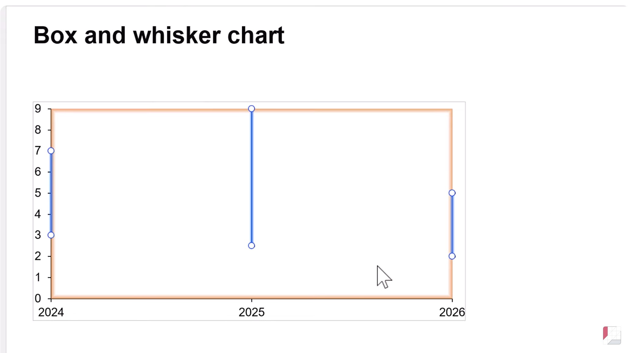
Step 3: Create the whiskers for the max and min
When the data is first entered, the max and min values will be represented as lines.
To turn the lines into whiskers for the box and whisker chart:
- Select one of the lines by left-clicking.
- Hold CTRL and select the other line.
- Right-click a line and select Add Error Bars from the context menu.
Your box and whisker chart will now have whiskers showing the range from minimum to maximum for each series.
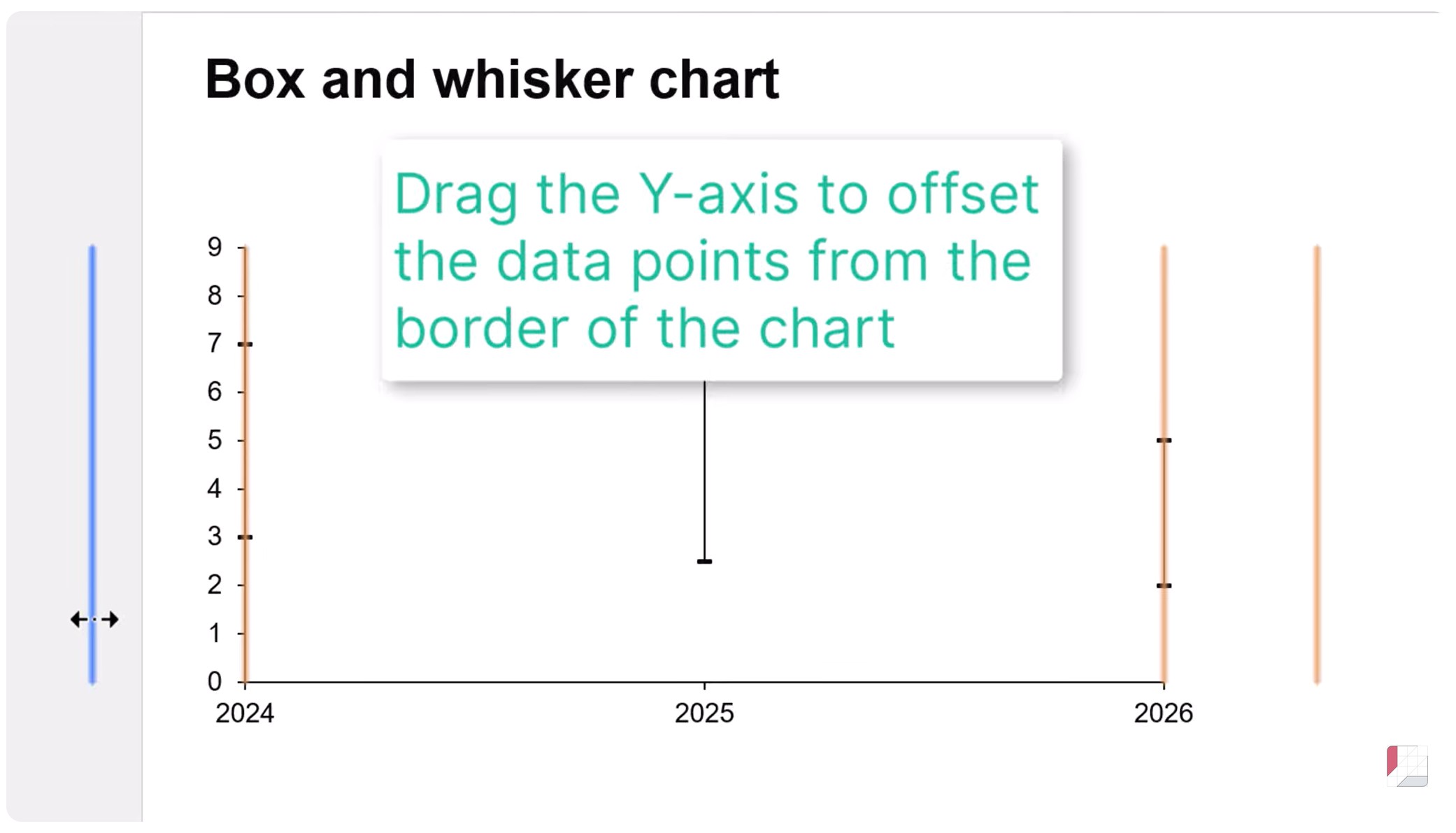
Step 4: Distribute the whiskers across the chart area
In a box and whisker chart, the categories should be distributed across the chart area, with a gap between the Y-axis and the first plotted category.
To position the categories correctly, simply drag the Y-axis to the left using the left mouse button.
The whiskers for all categories will now be clearly visible, evenly spaced across the horizontal chart area.
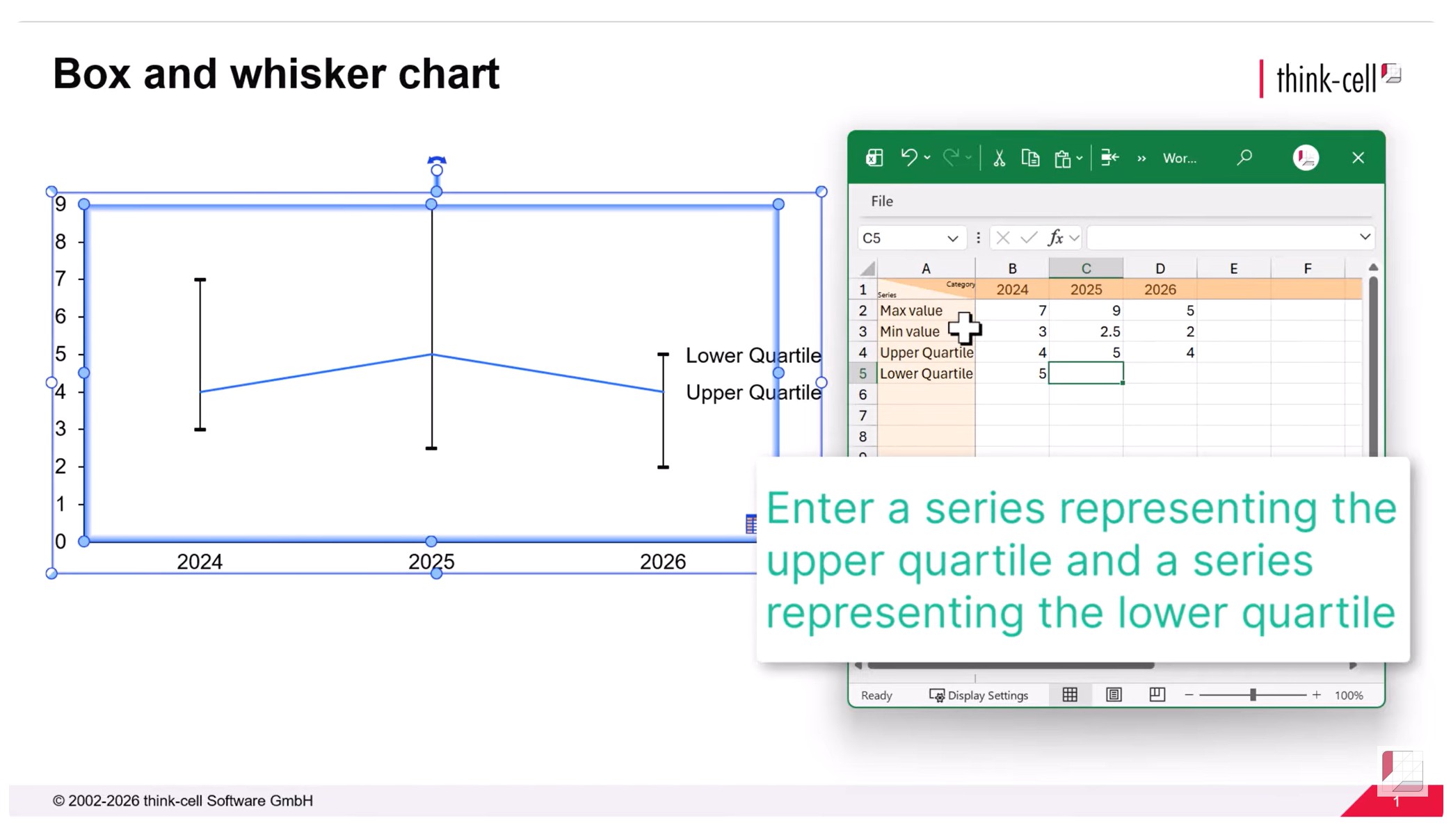
Step 5: Enter your upper and lower quartile data
The boxes of a box and whisker chart are bounded by the upper and lower quartiles of each category.
The upper quartile indicates the value at the 75th percentile of the category data.
The lower quartile indicates the value at the 25th percentile of the category data.
Enter a series containing values for each quartile in the chart datasheet or slide workbook.
As with the max and min series, the quartile series names will not be displayed on your final chart, but giving them meaningful names will help you understand and update the data.
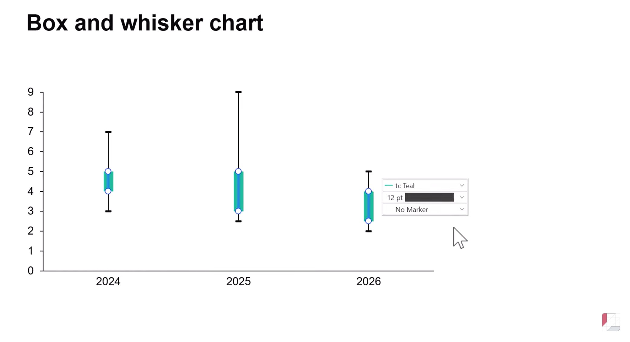
Step 6: Create the boxes for the interquartile range
The two quartile series are initially displayed as lines on the chart.
To turn the quartile series into the boxes required for the interquartile range of your box and whisker chart:
- Select one of the quartile lines by left-clicking.
- Hold CTRL and select the other line.
- Right-click either line and select Add Error Bars from the context menu.
This will create a line for each category in the same way as you did for the max and min value whiskers.
To turn the lines into boxes:
- Left-click to select interquartile lines and access the mini toolbar, where you can use dropdown menus to make changes to the style and formatting
- Adjust the line style by selecting 12pt to give the appearance of a box.
- Adjust the line color by choosing an appropriate highlight color from the dropdown menu.
- Remove the markers by selecting No Marker from the marker menu.
Your box and whisker chart will now have a box showing the interquartile range for each series.
Step 7: Enter your median data
The final datapoint to display on your box and whisker chart is the median.
Open the chart datasheet or slide workbook and add a series with the median values.
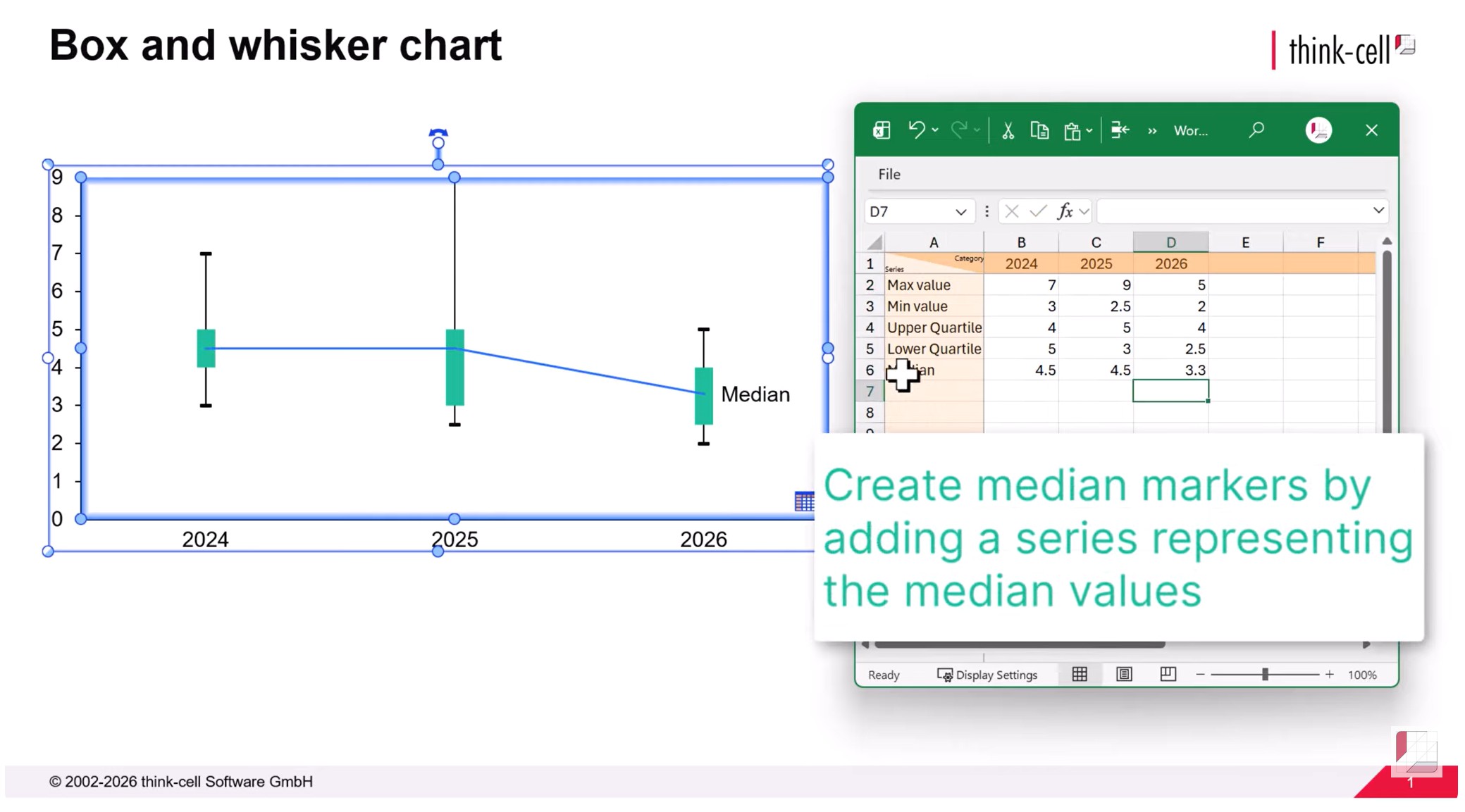
Step 8: Create markers to represent the medians
To begin with, the median series appears on the chart as a line.
It is customary to display the median on a box and whisker chart using a horizontal line or other clearly visible marker.
To convert the median to markers:
- Remove the median series label by selecting the label and using the Delete key or by right-clicking and selecting Delete from the context menu.
- Select the median line to access the mini toolbar.
- Adjust the marker style from the dropdown menu. Choose a marker such as Hollow Triangle that will stand out against the box.
- Remove the line by choosing No Line from the dropdown menu for line styles.
Your box and whisker chart is now complete.
Create your own charts
- Download a free think-cell trial.
- Gain full access to all functionalities of the software.
- Build your own box and whisker charts.
Explore this topic further with AI:
Read more

We walk you through the process of creating a Pareto chart, from structuring your data through to formatting and fine-tuning a professional data visualization.
Learn the process of building a bubble chart matrix step by step, from setting up the matrix and entering your data to formatting a professional visualization.
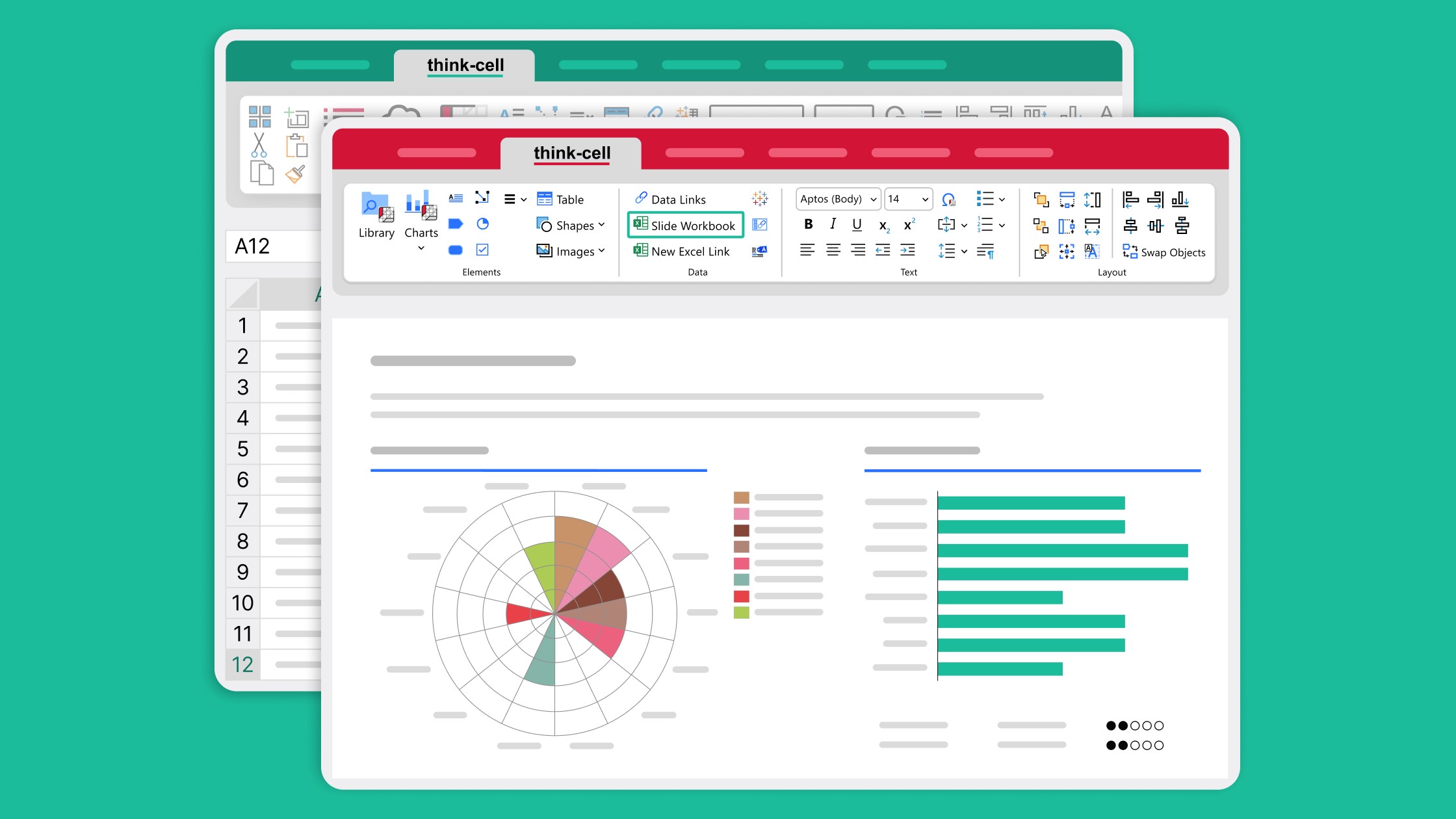
Learn how slide workbooks can change the way you build data-heavy presentations by combining the flexibility of ad-hoc datasheets with full Excel functionality.

Global survey of 1,200 professionals in 12 countries into how AI is used in presentation workflows.