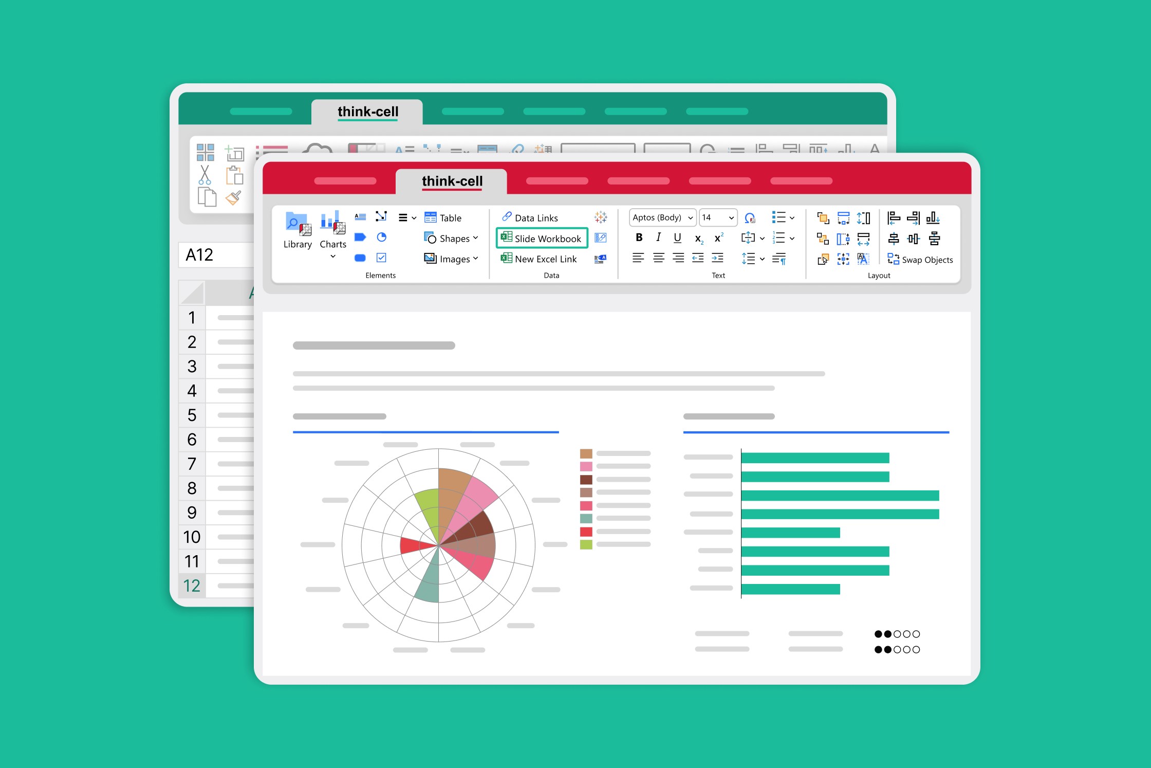
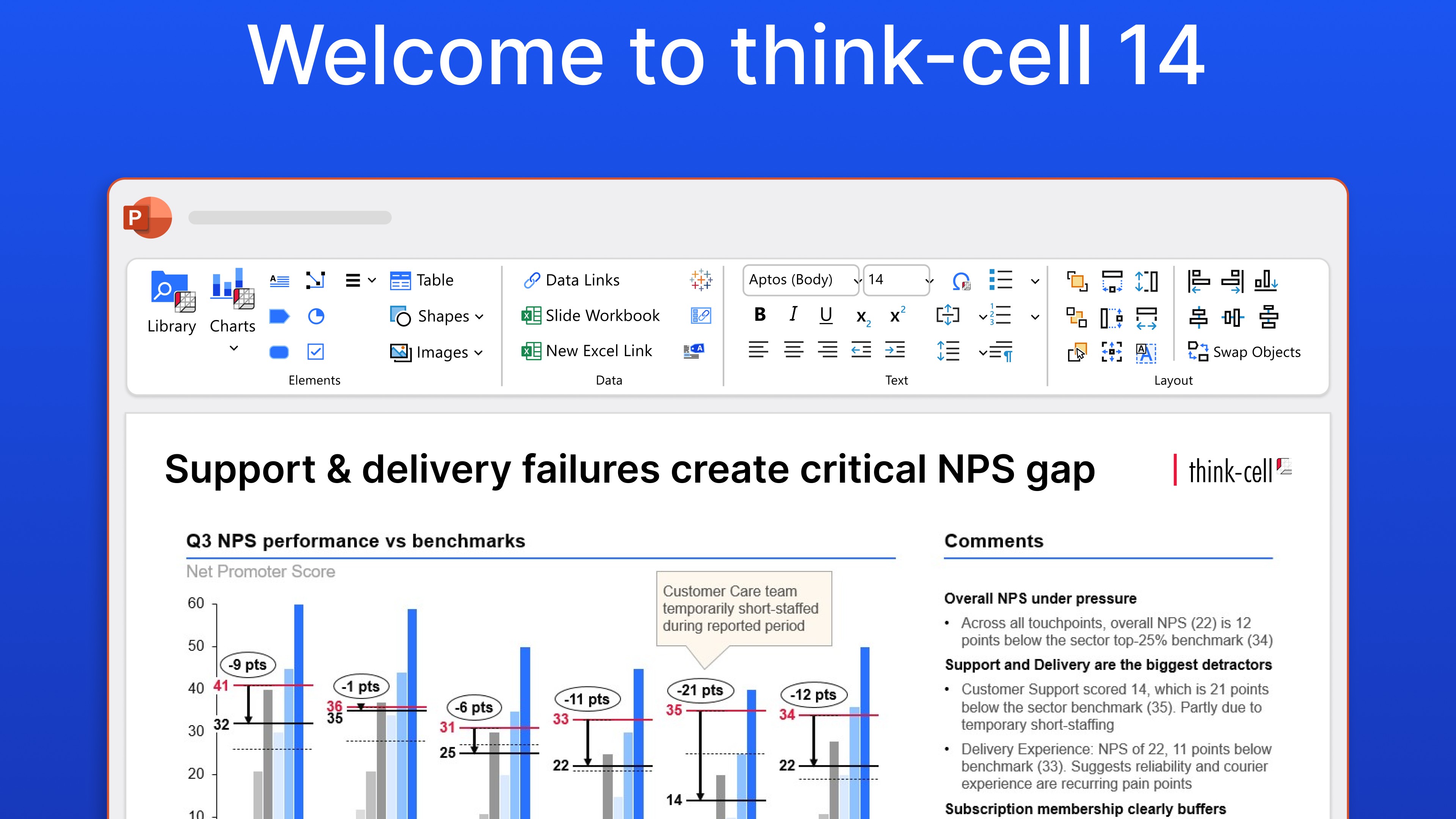
Build data-heavy presentations more flexibly with slide workbooks
- Home
- Resources
- Content hub
- Build data-heavy presentations more flexibly with slide workbooks
16 min read — Stephen Bench-Capon
Constructing data-heavy presentations can be a varied and at times rather fiddly process. You might have multiple Excel files to analyze before linking the data you need. Or you might take your favorite slide template and work inside PowerPoint, adding elements and populating their datasheets as you build your story.
Whatever your preferred approach, think-cell’s slide workbooks can help. Slide workbooks combine the flexibility of an ad-hoc datasheet in PowerPoint with the full functionality of an Excel workbook. To show this in action, we’ve prepared several examples that explore how slide workbooks can transform the way you build data-heavy presentations.
Slide workbooks are available in think-cell 14. Explore what this means for your data workflows in a free trial.
How slide workbooks can improve your workflows
You don’t have to change your existing workflows that rely on Excel links and slide datasheets. No one is taking these away from you. But there will be times when you want something a little out of the ordinary, and that’s where the versatility of slide workbooks comes into its own.
Here are just some of the things you can do with slide workbooks to work faster, more flexibly, and more efficiently across teams:
- Power multiple charts from the same dataset
- Give your collaborators the context they need
- Automate cross-departmental reports
- Create small multiples and choose which to show
- Tighten the connection between your charts and your data
- Share data-driven reports seamlessly
- Color your visualizations based on underlying data
- Build data integrations into slide templates
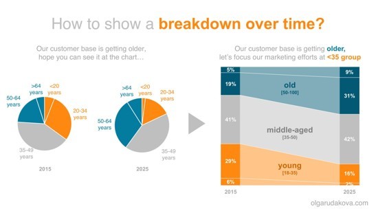
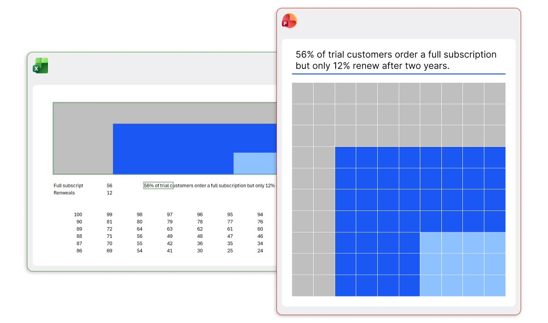
Power multiple charts from the same dataset
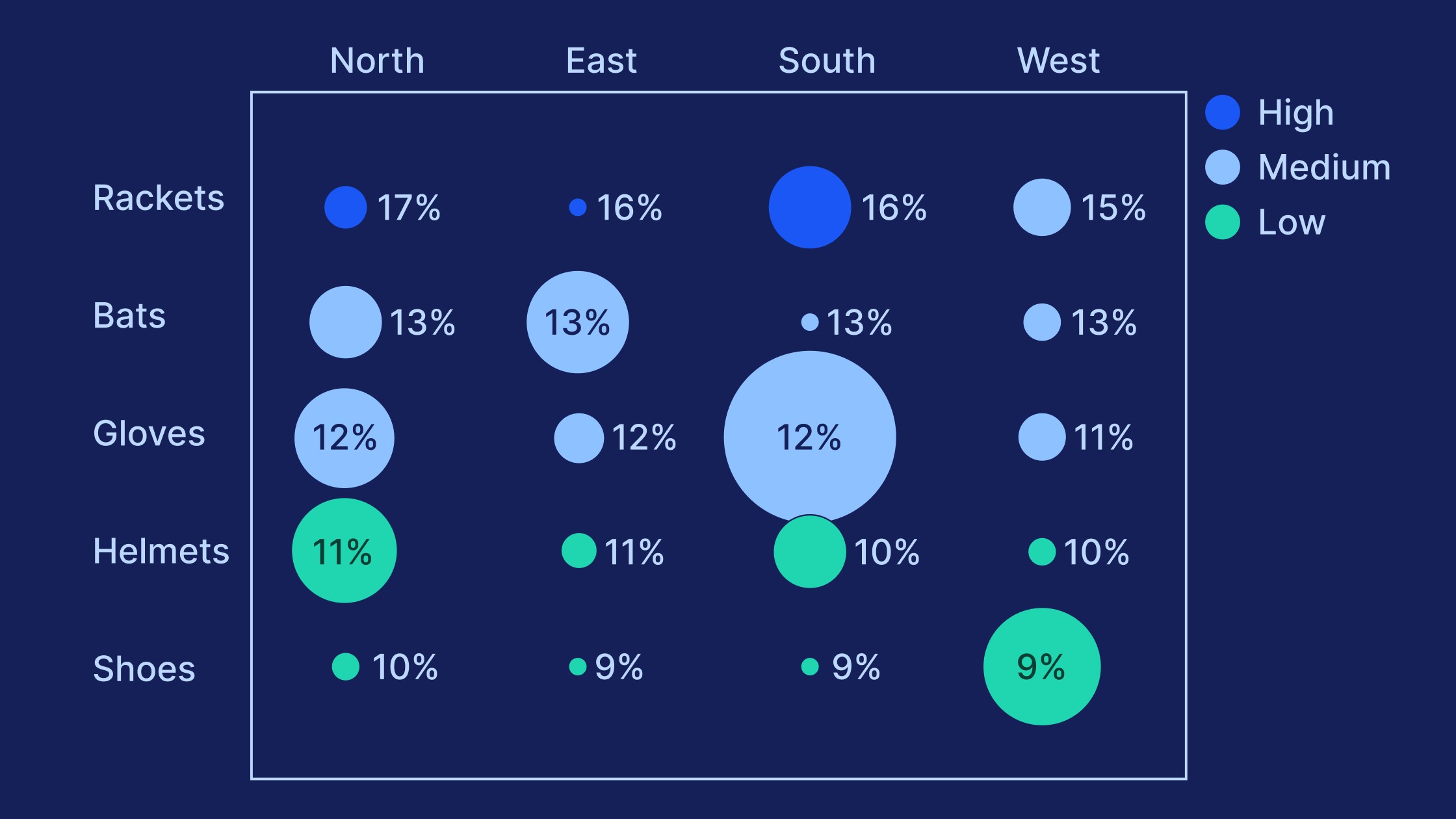
To tell a powerful data story, it’s often useful to build multiple charts that show different perspectives or focus the audience’s attention on the datapoints that matter most.
In this example, Olga Rudakova avoids more common pie or line charts in favor of two 100% stacked column charts that perfectly show the breakdown of age distribution over time.
While joining the column charts with an area chart is useful for emphasizing the shift from 2015 to 2025, it does mean making a third chart. Powering three charts from one dataset can triple your workload if the data changes. But not with slide workbooks. Put all your data in one table, and pull the data for each chart with simple formulas.
While joining the column charts with an area chart is useful for emphasizing the shift from 2015 to 2025, it does mean making a third chart. Powering three charts from one dataset can triple your workload if the data changes. But not with slide workbooks. Put all your data in one table, and pull the data for each chart with simple formulas.
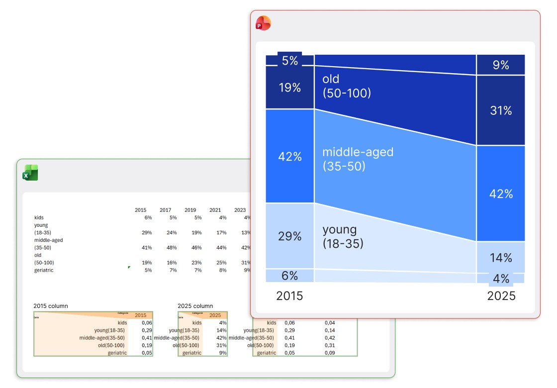
Any update to the data will change all the charts so they stay in sync, keeping you flexible to build custom visualizations that help you tell stories like an expert.
Give your collaborators the context they need
If your aim is to build the perfect slide, the structure of your datasheet is of secondary concern. When there’s a trade-off between tidy data and telling the story you want, you go with the story.
With slide workbooks, you don’t have to make trade-offs. You can have all the information you need in your workbook, and only show what you want to in your final slide. Teammates can also add comments directly to the slide workbook, enabling them to:
- Mention data sources, explaining where values are coming from.
- Draw attention to anomalies or explain why certain datapoints have been excluded.
- Type out formulas or clarify calculation methods for faster cross-checking.
This makes the slide workbook a living document for your team to work in without fear of disrupting the presentation.
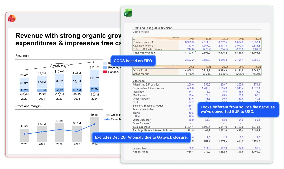
Collaboration benefits tremendously. Instead of asking where the data comes from or how it’s calculated, your team can access and follow all the steps of the analysis, from raw data to final tables, including explanatory notes, sources, look-up tables, references, and headings.
Finally, by having all this is a slide workbook rather than a separate Excel file, you’re in control and don’t have to worry about folder structures or filenames being exposed when sharing your presentation.
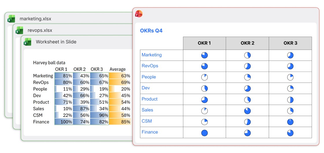
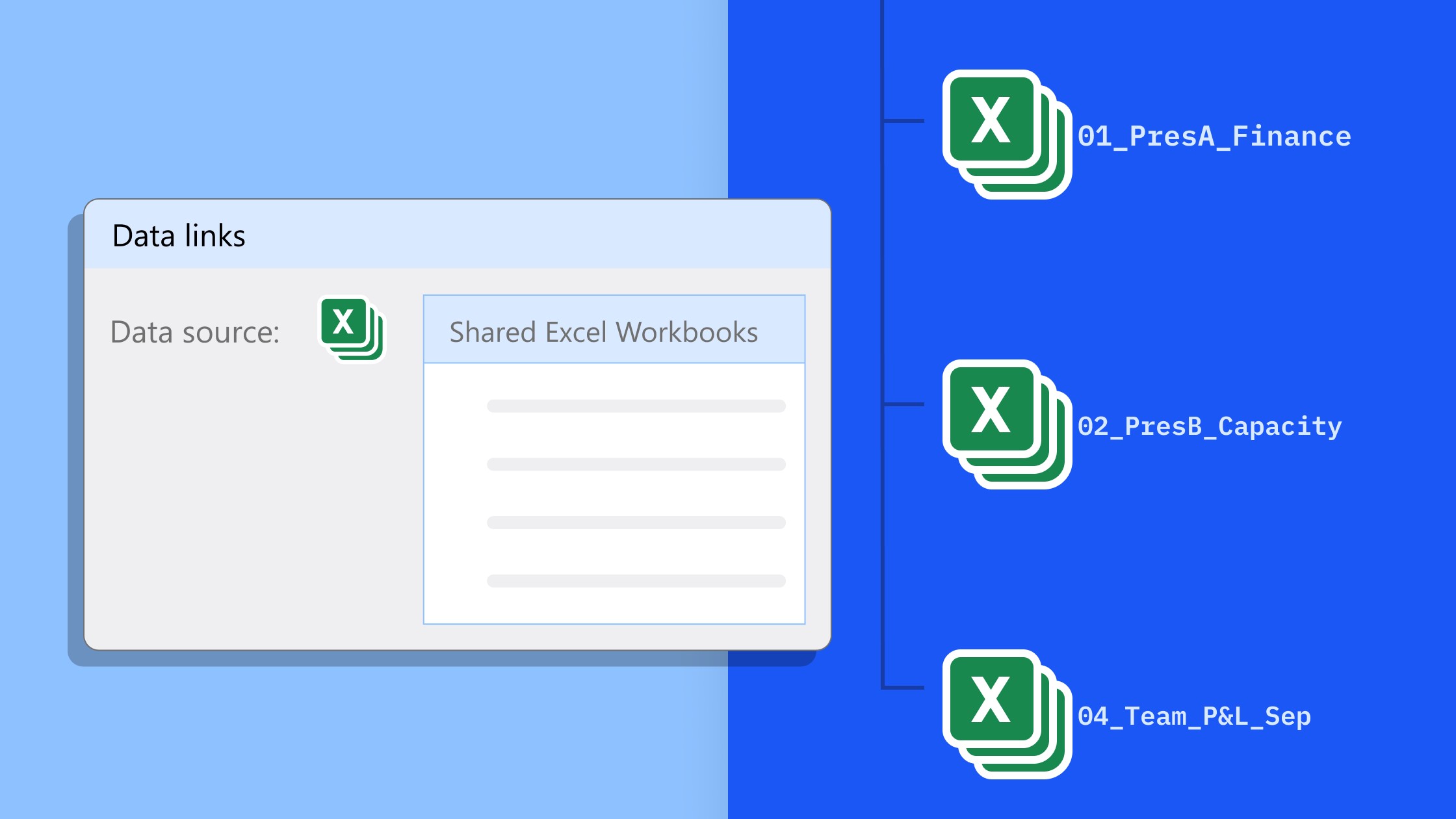
Automate cross-departmental reports
If multiple departments are contributing data for a report, then managing multiple Excel links can quickly become unsustainable. A common fallback option is to give up and enter data manually, which takes time, leads to errors, and means repeat work each reporting cycle.
A better way is to use a slide workbook. Formulas can retrieve data from other Excel files so each department’s data can be easily pulled into a dedicated sheet on the slide workbook. You can then use a summary sheet to generate the values needed for your slide visualization.
In this example, the report owner has even applied simple conditional formatting and added an average column so they can use the slide workbook for a quick analysis, as well as to power the Harvey balls in their presentation.
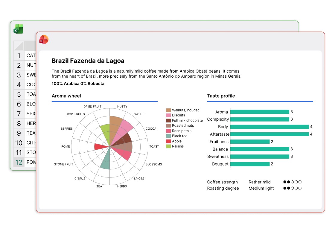
Create small multiples and choose which to show
Small multiples aren’t everyone’s favorite style of data visualization, but they can be useful in some situations, as this example of departmental salary expenses shows.
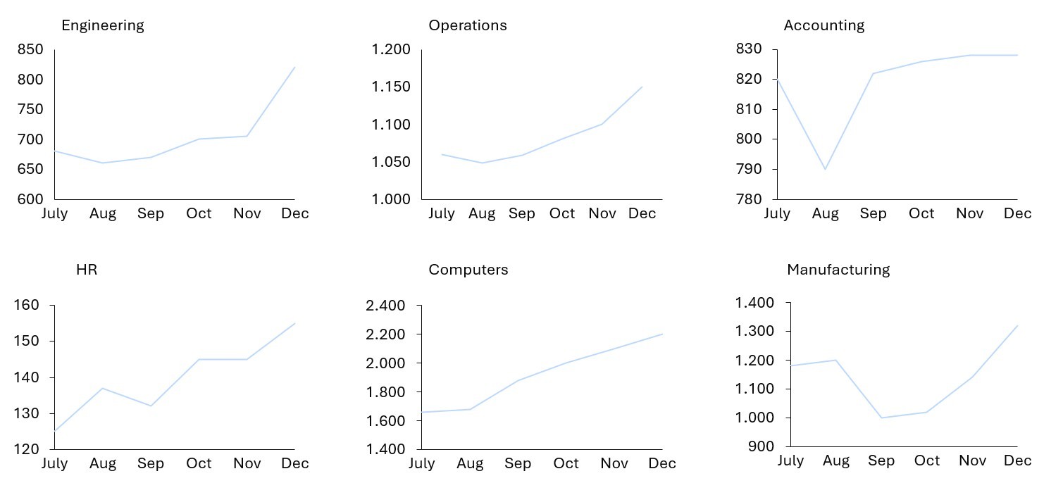
Using small multiples to split the data across six line charts lets you use a different Y-axis for each, and highlights the respective trend for each department. If all the lines are on one chart, trends for smaller volumes are less visible.
This is six charts that all come from one dataset, and all update on the same cadence. With a slide workbook, you can update the main table with the latest month’s data and your six charts all come together at once.
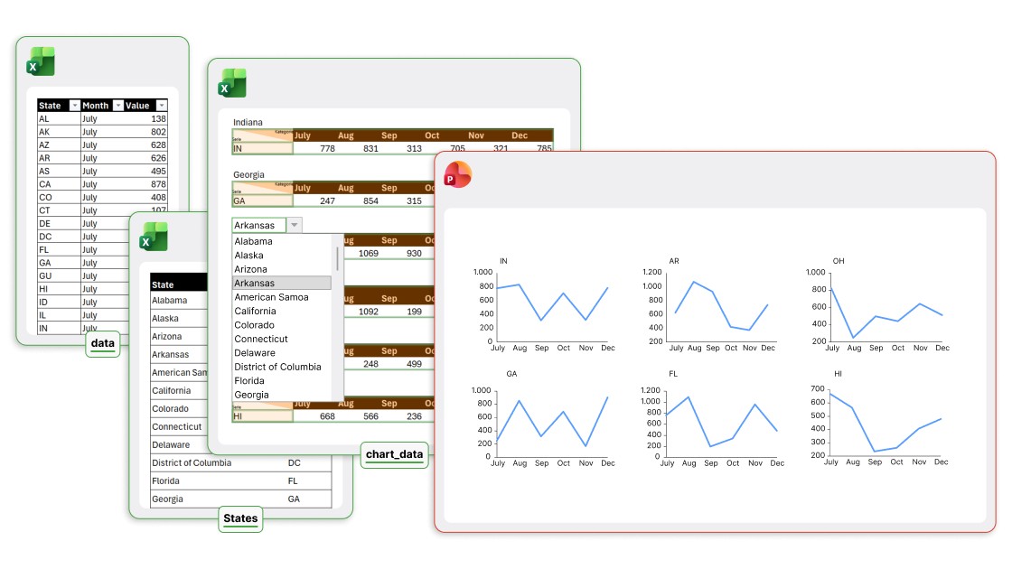
And it doesn’t end there. Imagine your dataset covers 50+ US states and territories instead of just six departments. Each month, you want the flexibility to choose which six to show on your slide when the latest data comes in.
With a slide workbook, you add data validation to make dropdowns, select the six states you need, and your slide adapts in real-time.
Tighten the connection between your charts and your data
You can easily add automated CAGR lines or difference arrows to any think-cell column chart, but often there are other calculations you need to display your data effectively.
Look at this bubble chart matrix.
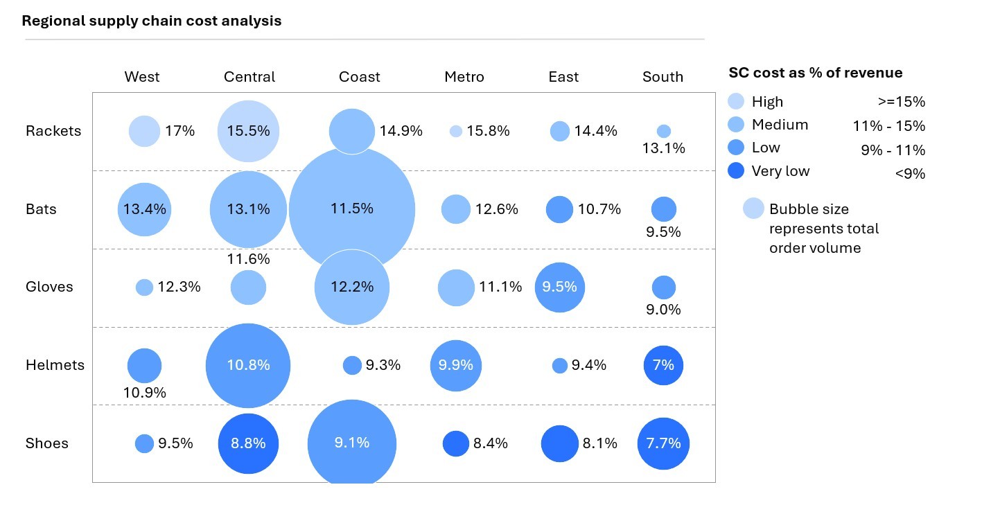
As well as the X and Y coordinates for the matrix, there are several more data points that need calculating to create the chart:
- Bubble sizes: Each bubble is sized relative to total revenue, which is calculated using filter formulas for region and product on the main data table.
- Labels: Shown for each bubble, the percentages for the labels are calculated using the revenue and another metric, supply chain cost, also filtered from the main data table.
- Colors: For the bubble colors, a formula is used to compare the revenues with a table of predefined thresholds, and the corresponding revenue band is assigned accordingly.
In the past, you might have done these calculations in a separate Excel file and copied over the values into your chart datasheet. This can work for a one-off chart but if anything changes, you have to do it all again.
With a slide workbook, you don’t need side calculations. You can link all relevant datapoints directly to your raw data table, ensuring 100% consistency across all your slide elements, even when you update, filter, or resort your data.
To learn more, read our blog article 'Create a bubble chart matrix', or visit our YouTube channel to see how to build a bubble chart matrix using think-cell.
Share data-driven reports seamlessly
With slide workbooks, you can share report templates without worrying about issues arising from different Excel files, broken links, or inaccessible save locations.
Each team member who downloads or receives the presentation gets a fully-functional report with all the data included. Wherever the slide goes, if it’s duplicated, copied into another presentation, or even sent by email, the slide workbook stays inside.

Color your visualizations based on underlying data
If you are building a less conventional data visualization to create a strong impact, you might want to use color to highlight your key messages. As soon as something becomes non-standard, it’s often tempting to build it from scratch and uncouple it from your dataset.
A slide workbook lets you overcome this temptation. You can use data validation, helper tables, conditional formatting and any other Excel functionality you need to keep your visualization tied to your underlying data, and enjoy seamless replication in your PowerPoint presentations.
Build data integrations into slide templates
Duplicating slides can be a huge time-saver for catalogue-style presentations that run through a list of products, campaigns or scenarios, and highlight the qualities of each. But if the slide you’re duplicating has a lot of data-heavy elements, you can spend a lot of time – and potentially make a lot of errors – updating datasheets or relinking different Excel files.
Slide workbooks solve this instantly. To create your presentation, you can build one slide with as many charts, tables, and other data-driven elements as you need to showcase the product’s features or the campaign metrics.
This slide serves as your template and, however complex it becomes, you simply duplicate the slide to duplicate the slide workbook along with it. Now, just swap in the specific data for your next product and you can build catalogue-style presentations at scale.
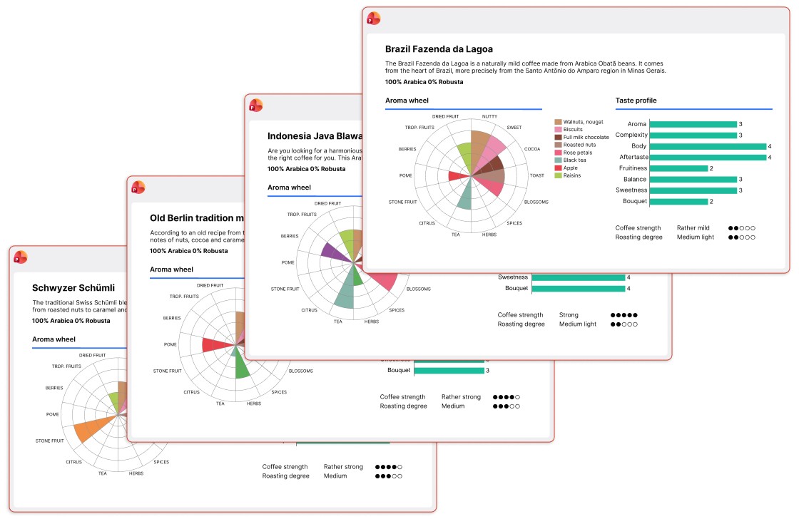
Thanks to Berliner Kaffeerösterei for the inspiration for these slides.
Explore the possibilities of slide workbooks
The best way to understand what having the full functionality of Excel inside a PowerPoint slide means is to try it out. Even our examples here have only scratched the surface. There are whole other opportunities like connecting your slide workbook to data pipelines that would need a dedicated article to explore properly.
To try slide workbooks for yourself, download your free think-cell trial today:
Explore this topic further with AI:
Read more

See five new think-cell 14 features that cut down time on formatting, layouts, and data prep so you can focus on your presentation's message.
Read about the launch of think-cell 14, a new version of our flagship PowerPoint productivity software, think-cell Suite, which introduces a set of powerful innovations to save users time and give them more versatility in their PowerPoint worfklows.
Learn the process of building a bubble chart matrix step by step, from setting up the matrix and entering your data to formatting a professional visualization.
Learn how our switch from passive link management to active link management gives you complete control over how you display and update Excel data in PowerPoint.

Global survey of 1,200 professionals in 12 countries into how AI is used in presentation workflows.