Create a Pareto chart
- Home
- Resources
- Content hub
- Create a Pareto chart
10 min read — Stephen Bench-Capon
A Pareto chart, or 80/20 chart, is a kind of combination chart that uses columns sorted in descending order for individual categories and a line series to show the cumulative total.
This article is the first of a series, in which we are going to introduce you to some specialized, but highly useful chart types you can use in your presentations.
In each article, we will walk you through the whole process step by step, starting with how to structure your data and create the basic chart, through to fine-tuning the formatting and adding the right annotations for a professional data visualization.
Contents
- Introduction
- Step 1: Prepare your data
- Step 2: Create chart from your data
- Step 3: Convert chart to Pareto chart
- Step 4: Remove gaps between columns
- Step 5: Format data labels
- Step 6: Reduce chart clutter
- Step 7: Highlight the 80/20 information
- Step 8: Add your own insights with annotations
Build better presentations faster
- Reduce your PowerPoint working time by up to 70%.
- Use AI where you work: inside PowerPoint integrated into your slide workflow.
- Trusted by all top 10 consulting firms and 88% of the Fortune 100.
Introduction
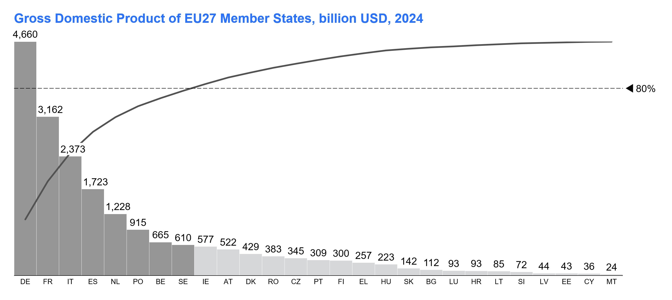
In this article we will create a Pareto chart showing the distribution of GDP across the Member States of the European Union. The data is taken from the World Bank's database, and is from 2024.
Pareto charts are designed to demonstrate the Pareto principle. This is also known as the 80/20 principle, because it suggests that 80% of the total volume comes from 20% of the categories, and can be used to show distributions such as:
- Sales data
- Online traffic data
- Inventory data
These are a few typical cases, but Pareto charts are used in many other spheres, too, and there is no strict requirement for the dataset to exactly fit the 80/20 distribution of the Pareto principle.
For this article, we have chosen the example of GDP as a nod to the origins of the Pareto principle, which was first applied to describe how wealth was distributed in a society.
You can download the dataset used in this article, and a PowerPoint slide containing the final chart, in this zip file.
Once we have created the Pareto chart, it will look like this:
Step 1: Prepare your data
Prepare your data by sorting the series by descending values.
Before you start, if there isn't an empty column to the right of your category names, add one, as this will make it easier to create your chart later.
There are several options for preparing your Pareto chart data in Excel, but this method is easy to update and avoids using complex formulas:
- Select the data range, and assign it a name by typing "my_data" into the Name Box to the left of the Formula Bar.
- When you have a named range, you can enter the simple formula "=SORT(my_data, 3, -1)" to get the sorted data. The 3 tells Excel the column to sort by and the -1 sets the sort order to descending.
- Now you want to calculate the data for the Pareto line, which shows the cumulative percentage of the total volume. To get the values for the Pareto line, you can enter a formula to the right of your sorted data. If your first value is in cell I3, your formula would be "=SUM($I$3:I3)/SUM(my_data)". Copy this formula down for the whole column.
- Check you have calculated the cumulative percentages correctly by verifying that the final value in the column is equal to 1.
- Select the sorted data, including the Pareto line column, and assign it a name, such as "my_sorted_data" using the Name Box.
- Finally, to get the data in the right orientation for your Pareto chart, enter "=TRANSPOSE(my_sorted_data)" somewhere on your spreadsheet.
To see how your data should look once prepared, you can refer to our sample data.

Step 2: Create chart from your data
To create your Pareto chart, highlight the transposed data and select Stacked from the Link to PowerPoint menu.
PowerPoint will open and you can simply click with the left mouse button to insert the chart.
Don't worry that you initially see a stacked column chart. You can turn it into a Pareto chart in the next steps.
Upon insertion, the chart will take the default color theme from your style file, which in our example is an all gray theme.

Step 3: Convert chart to Pareto chart
For a Pareto chart, you want a combination chart where the Pareto line series is a line, not a column:
- Left-click on the Pareto line series label and choose Line from the mini toolbar to convert this series to a line.
- Right-click on the new line series, which will be almost flat to the X-axis, and select Set to Right Axis from the context menu.
Now you have a combination chart with a column series and line series, but there's still some work to do to make your Pareto chart readable.

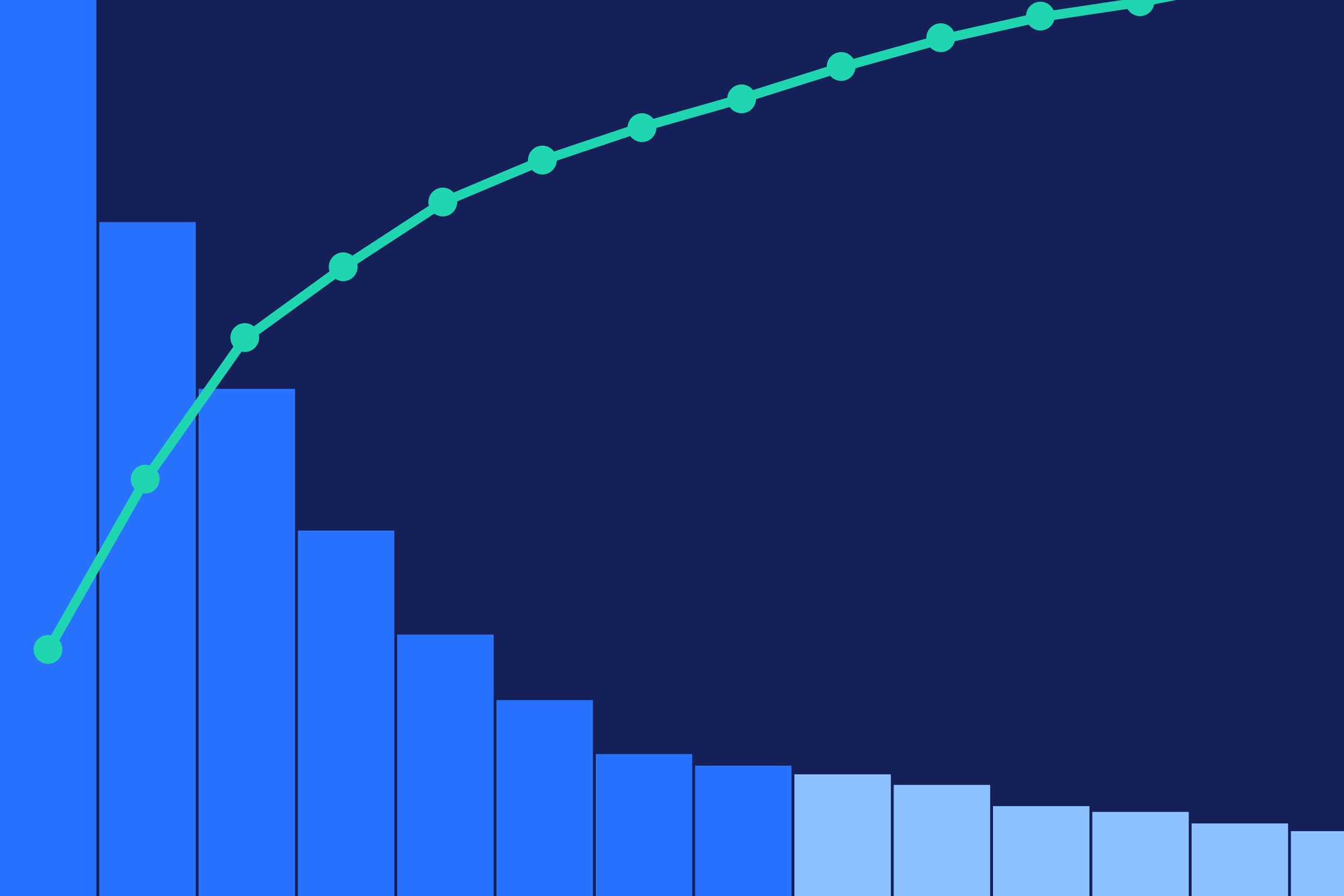
Step 4: Remove gaps between columns
As Pareto charts have one continuous line by design, they are usually more readable if the columns also appear visually continuous. You can create this impression by removing column gaps.
To set the column width to a 0% gap, left-click on any column in your chart. Then simply drag the anchor that appears in the middle of the column over to the adjacent column. This will remove the column gap.
Without gaps, the columns can be hard to distinguish. Set a thin border by left-clicking a column, pressing CTRL+A to select all, and choosing a 1/4pt outline from the mini toolbar. You can also choose an outline color from the same toolbar.

Step 5: Format data labels
Formatting your data labels will make your chart easier to read.
Choose an appropriate format for your column data labels by left-clicking one label and selecting a format from the mini toolbar.
In our example, we have values in the billions of dollars, so we choose x109.

Step 6: Reduce chart clutter
To make the chart cleaner, you should take some steps to reduce clutter that provides unimportant or redundant information:
- Remove tick labels from both Y-axes: Data labels are easier to read than axis tick labels. Left-click the left-hand Y-axis to select it. Hold Shift and left-click the right-hand Y-axis to also select that. Then right-click and select Remove Tick Labels from the context menu.
- Remove tick marks from both Y-axes: If you don't have tick labels, you don't need tick marks either. With both Y-axes still selected, open the context menu with the right mouse-button and select Remove Tick Marks.
- Hide the Y-axes: As the Y-axes aren't contributing information, you can make the chart cleaner by coloring them white from the mini toolbar accessible via the left mouse button.
- Delete the legend: The information in the legend can be included in the title and subtitle. Right-click the legend and select the X to delete it.
- Remove Pareto line markers: The markers on the Pareto line aren't needed unless you want to draw attention to a specific data point. Left-click the line and change Circle to No Marker in the mini toolbar.

Step 7: Highlight the 80/20 information
Pareto charts are normally used to highlight the contribution of the biggest categories.
This is usually referred to as the 80/20 principle, though the exact contribution of the top 20% of categories may not be exactly 80%.
There are two common ways of highlighting the 80/20 aspect of your data:
- Add a horizontal value line at the 80% mark:
- To add a value line, right-click somewhere in the right-hand half of the chart area and select Add Value Line from the context menu.
- By default, the value line won't always have the number format you want. You can change the format of the value line label to read as a percentage by left-clicking and using the mini toolbar in the same way as you can for data labels.
- Also, the value line won't be at 80%. To place the value line correctly, drag or use the up and down arrow keys to position the value line where you need it.
- Give the largest columns that make the biggest contribution a distinctive fill color:
- Multi-select the columns you want by holding Shift and left-clicking.
- Select an appropriate accent color from your brand palette via the mini toolbar.
Simple highlights are a powerful way of communicating the message you want to your audience and maximizing the impact of your Pareto chart.

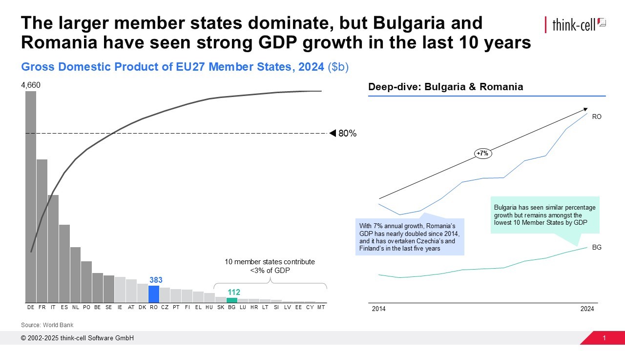
Step 8: Add your own insights with annotations
Once you have built your Pareto chart, you can make your data visualization more impactful by adding annotations.
The insights you add will depend on your analysis, and what you want to communicate to your audience, but you can consider the following ways of enhancing your Pareto chart:
- Add titles: Expressive action titles and descriptive subtitles should be used to tell your message and inform the audience.
- Include source information: Providing a footer showing where the data comes from increases your credibility.
- Group categories: Simple shapes and connectors can help give descriptive names to groups of categories.
- Show a hidden story: Coloring individual columns and/or highlighting specific column totals can draw the audience's attention to a point of interest.
- Use the space available: The large empty area on the right of the Pareto chart can be used to provide additional data, insights, or even charts.
Pareto charts are well suited to communicating the distribution of contributions, and can provide a strong foundation for a deeper data narrative.
Build professional charts in seconds
- Download your free trial for faster creation of 40+ chart types.
- Automate chart creation with AI tools purpose-built for your slide workflow.
- Work seamlessly with Excel data links for automated reporting.
Explore this topic further with AI:
Read more
Learn the process of building a bubble chart matrix step by step, from setting up the matrix and entering your data to formatting a professional visualization.

Learn the step-by-step process of building a box and whisker chart, from which chart type to use and how to adapt it to make a professional data visualization.

Understand the importance of data visualization for business decision-making and learn how to visualize business data to make your presentations more impactful.

Explore concrete examples that demonstrate how to make your business presentations stand out and learn common PowerPoint mistakes you should avoid.

Global survey of 1,200 professionals in 12 countries into how AI is used in presentation workflows.