What makes a business PowerPoint presentation stand out – with examples
- Home
- Resources
- Content hub
- What makes a business PowerPoint presentation stand out – with examples

25 min read — Stephen Bench-Capon
To make outstanding business presentations, you have to be more than just a skilled PowerPoint user. You have to understand what makes business presentations unique and how you can build slides that will appeal to a professional audience.
This article introduces five common mistakes that even advanced PowerPoint users can make when building business presentations, and provides five hands-on examples of how you can make your own business presentations stand out.
If you’re in a rush, you can jump to the section you’re most interested in:
- Why business presentations are different
- Examples of business presentation mistakes
- Example slides for outstanding business presentations
All the example templates shown in this article are available in the think-cell Suite, the world’s leading PowerPoint add-in for business presentations. Download your free trial to access all tools, templates and features.
Why business presentations are different
One of PowerPoint’s strengths is its flexibility. Grade school kids make animation-rich presentations about their favorite Pokémon, college students make citation-heavy presentations about the American Civil War, and wedding guests make photo slide shows of the bridegroom’s more uncomfortable life moments.
But business presentations are different. They’re not trying to look fun, convince a professor they’ve read sixty books, or embarrass one of their best friends. Business presentations aim to make an argument, convince an audience and drive effective decision-making.
That’s why business presentations are different.
Examples of business presentations range from quarterly reports to ad-hoc market analyses and executive-level pitches. While each of these has its own requirements, there are several factors that set business presentations apart from how PowerPoint is used outside of a professional environment:
- Investment: Business presentations don’t come cheap. As well as the time spent actually building slides in PowerPoint, there can be significant costs associated with the research, analysis and infrastructure that are needed to produce the content.
- Engagement: You don’t keep business audiences engaged with animations or entertaining visuals. You do it through clear communication, coherent narratives, and valuable insights.
- Outcomes: Business presentations are expected to produce meaningful results in order to justify the investment. They should lead to decisions being made and actions being taken that will move the business forward.
- Credibility: Accurate data, professional layouts and consistent branding are essential if a business presentation is going to instill confidence in the audience and influence a high-stakes decision.
- Consumption: Many business presentations are read outside of a meeting or pitch environment, meaning that the storyline and messaging on the slides has to be crystal clear, even without a talk track.
Being aware of these factors is the first step, but you still need to know how to avoid missteps and which concrete measures you can implement to build a successful business presentation.
Examples of business presentations mistakes
Even with the right goals, it’s not always easy to execute effectively. Here, we’ll look at a few examples of traps it’s easy to fall into when making a business presentation stand out, and show you how to avoid them.
Mistake 1: Cutting corners in the wrong place
Given the high costs involved in the production of complex business presentations, it might be tempting to try and make savings where you can. But this is a fallacy. Making your end product as polished as it can possibly be is how you maximize your company’s return on its investment into everything that has gone into the presentation.
As a simple example, you might find a licensed image online and wonder if it’s worth paying for it, or if you can just use the free watermarked version. Pay for it. Or use a license-free image. Don’t cut corners for the sake of a small saving that will tank the credibility of your presentation.
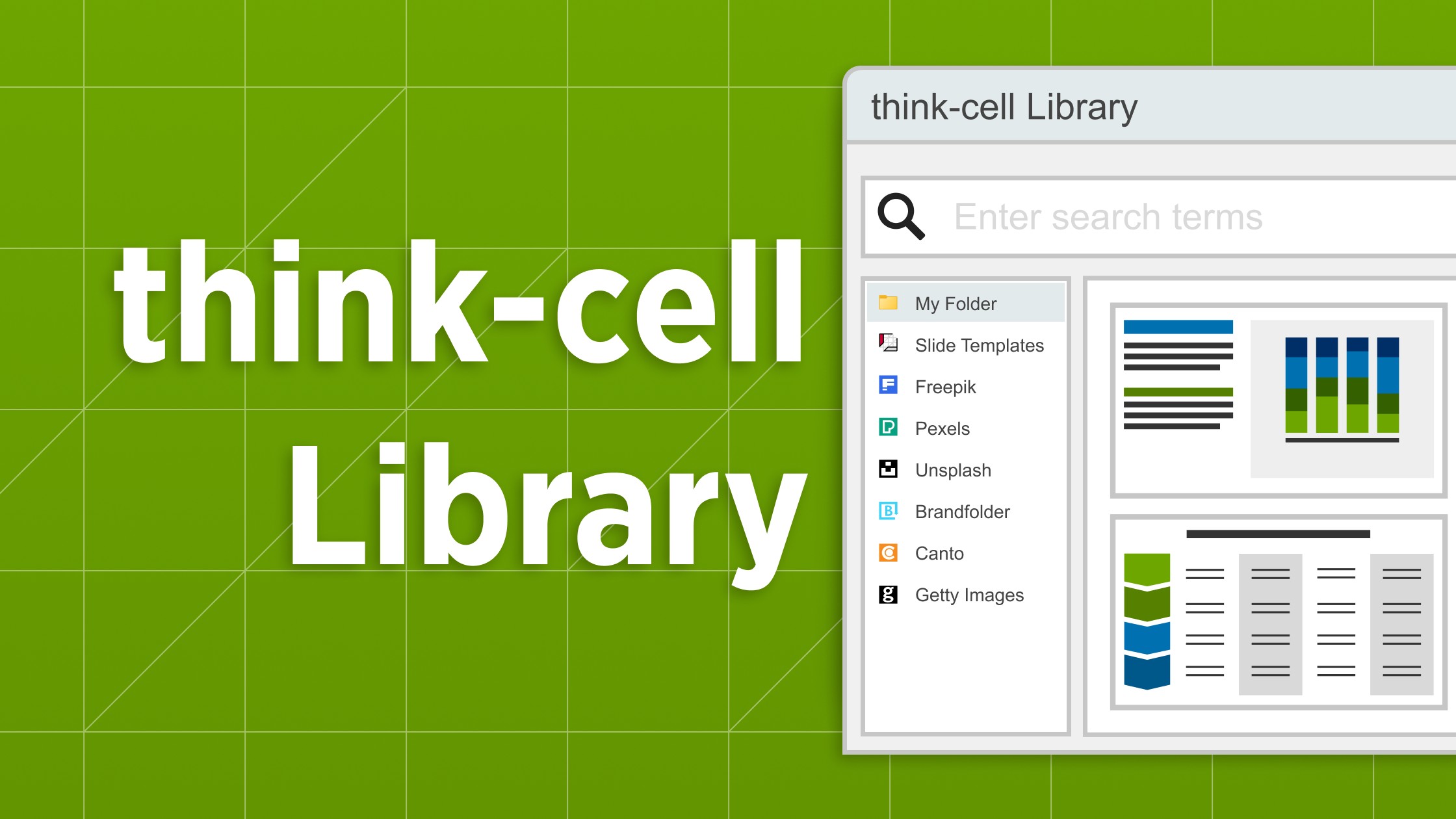
Tip: If you want to avoid rights issues from the outset, you can use the think-cell Library to access millions of professional icons and images that are free to use in your business presentations.
Mistake 2: Causing confusion with creativity
When building a business presentation you want to stand out, there is a danger of trying too hard to be innovative with your slides. This won't keep your audience engaged. Use templates and follow recommended best practices like the Pyramid Principle and MECE. They’re recommended for a reason.
Familiar visualizations are easier for your audiences to understand than something they’ve never seen before and have to get their heads around. So, don’t make the mistake of building radical slide layouts that will confuse your audience. If your slides are consistent and well-structured, they will subtly support your messages and help you tell an engaging story.
Tip: Creating new slide layouts also takes up valuable time. The think-cell Library lets you easily access your favorite slides, giving you the perfect foundation to start building your presentation.
Mistake 3: Misleading your audience to force a conclusion
You are under pressure for your business presentation to make an impact and drive decisions, so you want your story to be as clear as possible. But this doesn’t mean you should hide context or use data visualization tricks to mislead your audience.
As an example, a classic technique used to emphasize differences between values in a column chart is to start the y axis above zero. Excel even sometimes does this by default, which can create a false impression of the data.
Don’t do this. You can highlight what matters most but you shouldn’t hide anything just because it’s inconvenient. If your line of argument is solid, then transparent, confident communication is the best way to drive the decision you are aiming for.
Tip: If you want to highlight differences in a column chart without misleading your audience, you can do this in think-cell by using value axis breaks or by adding level difference arrows.
Mistake 4: Making late changes that introduce inconsistencies
Deadlines have a habit of spawning new ideas and data has a habit of changing just before it’s time for your presentation. Late changes are part of life, but if you’re updating any data, you need to allow enough time to check charts, tables, annotations, and any other slide elements that might be affected.
It’s painful, but if you don’t manually check all the charts and figures in your final presentation, then errors can easily slip through. Work with checklists, automation tools and any method you can find that will guarantee accuracy, strengthen your credibility and help your presentation succeed.
Tip: Set up your slides using think-cell’s Excel links to ensure everything is synced to your spreadsheet and can update automatically. This way, you’ll never present a slide with a number in the title that doesn’t match the data in the chart.
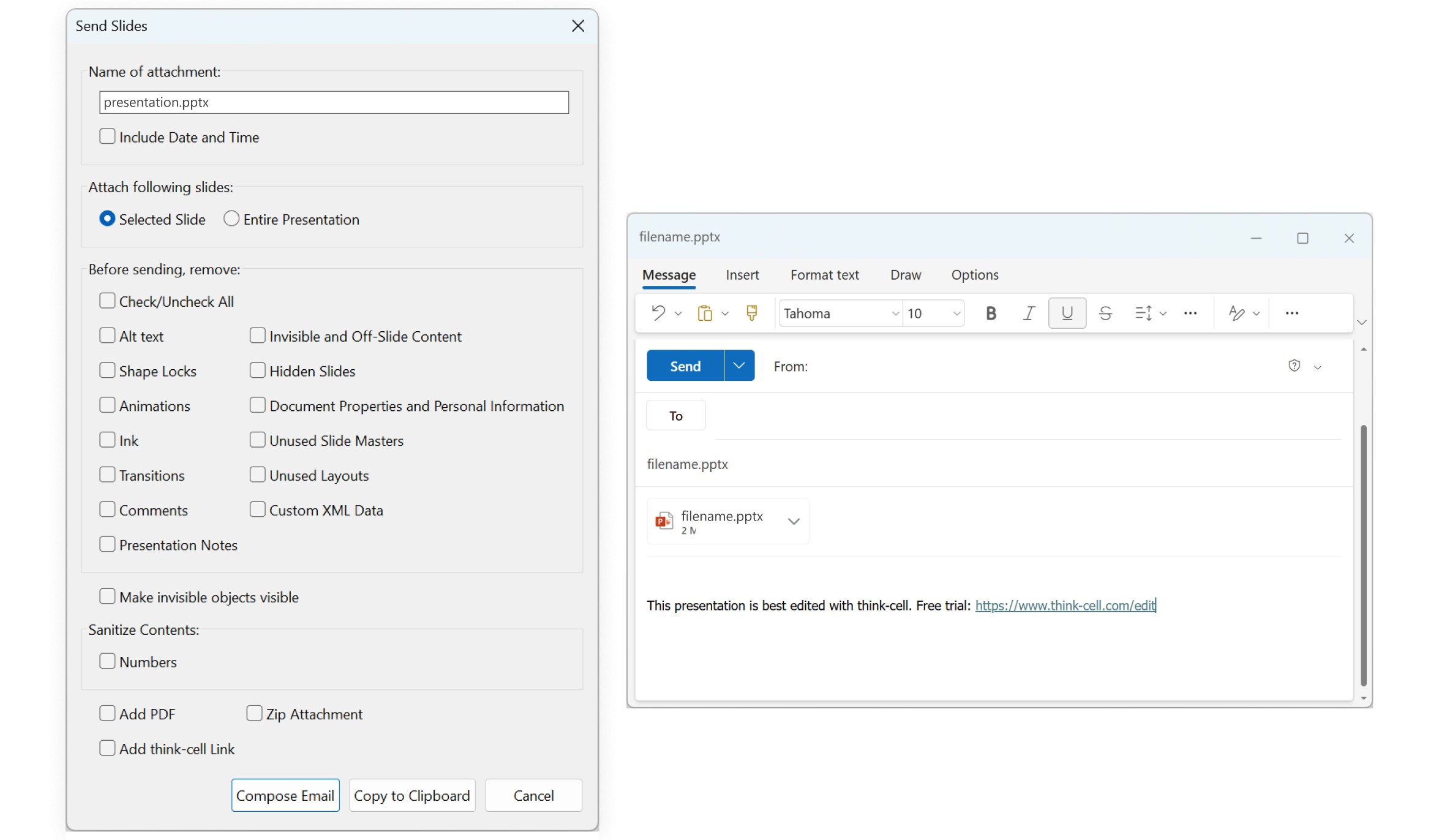
Mistake 5: Burying vital information in the presentation notes
If you have information that’s essential for the message you want to convey, then it needs to be on your slides and it needs to be visible. This is true even of business presentations that are shared for consumption on the screen, not in person.
You might think that your extensive presentation notes are helping your readers by providing explanations, but you can’t guarantee anyone will read them. Ultimately, if you need long supplementary texts to get your presentation’s message across, it’s a sign your slides don’t stand up on their own, and that’s where you should be investing your time.
Tip: Presentation notes can be a useful tool for reference during the creation of a presentation, but they shouldn’t be included in the end product. When you share a presentation using think-cell’s Send slides feature, you can instantly remove all notes, ink and comments, and make sure you’re submitting a polished version of your presentation.
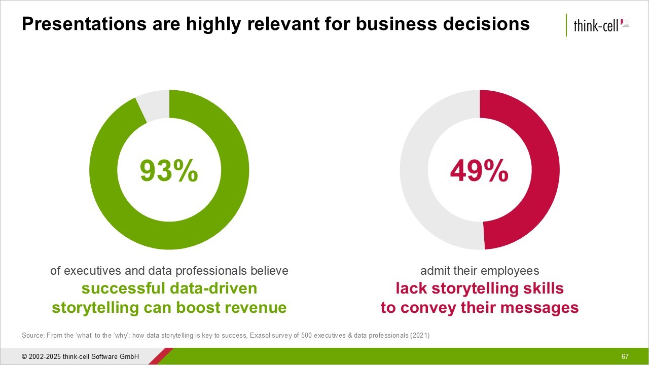
Data storytelling for business presentations
An outstanding business presentation needs more than a few outstanding slides. It needs a narrative arc that guides your audience through the presentation. Effective data storytelling doesn’t happen by chance, but it’s a skill that can be taught and one you can learn in our free webinars.
You can view the dates of our upcoming webinars here. Find a session that fits your schedule and join our expert, Chelsea Drucker, as she teaches you the art of data storytelling.
Example slides for outstanding business presentations
We’ve covered several things you can do wrong, so here we’ll look at concrete examples of what you can do right to make your business presentation slides stand out.
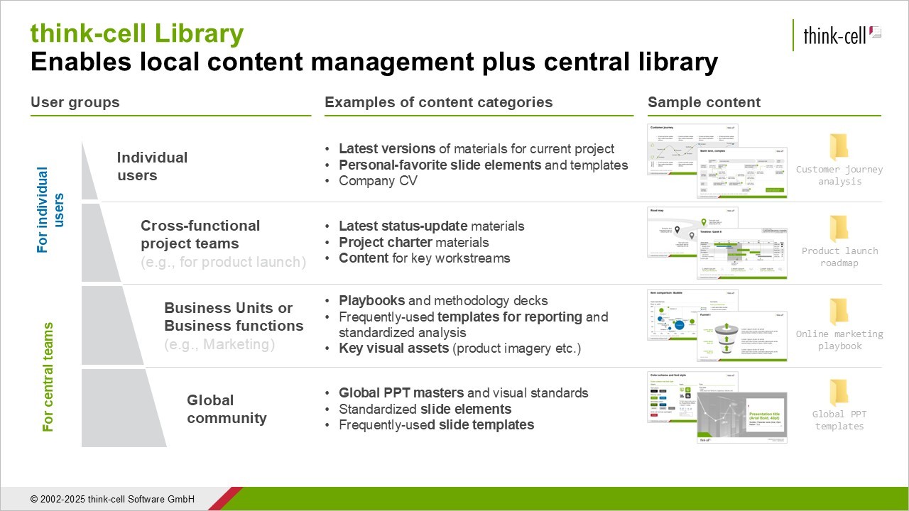
All of these example slides are based on templates from the think-cell Library, which comes with 250 slide templates, all professionally designed by our experts to meet the needs of business presentations.
You can access the examples shown here and all the other templates by signing up for a free trial.
Example 1: Identifying what to highlight and doubling down on it
A key part of presenting data effectively is guiding your audience’s attention. You don’t want to hide valuable information, but there are methods you can use to highlight what’s most important, make it clear why it matters, and provide additional insight.
The following example shows a stacked column chart with revenue for two regions, EMEA and North America, over a nine-year period. That’s eighteen datapoints that the audience have to deal with, but the slide includes several elements to make the data digestible and help the intended message stand out:
- Accent colors clearly show which two years are most relevant for comparison.
- Neutral gray tones reduce focus on less important years.
- Level difference arrow shows percentage growth of the key segment.
- Text annotation states clearly which region and timeframe the level difference arrow applies to.
- Action title provides a reason or recommendation related to the highlighted datapoint.
While the key message is clear, all other datapoints are labelled and column sums are also included. This gives the audience all the context they need to understand how this growth in North America fits into the overall revenue picture.
Example 2: Adding value without creating clutter
One challenge of adding sufficient detail and insights to a business presentation slide is doing so without your layout descending into chaos. Online PowerPoint advice, such as David JP Phillips' iconic TED talk, often recommends limiting the number of objects per slide to six.
This advice is valid, but it is primarily aimed at keynote presentations held in front of large audiences. Business presentations are different, particularly if they are designed for on-screen consumption.
Let’s look at an example. The following slide template has a five-layered pyramid, each with a heading, short text, and icon. The angle of the pyramid shape also provides space for an annotation in the top-left of the slide.
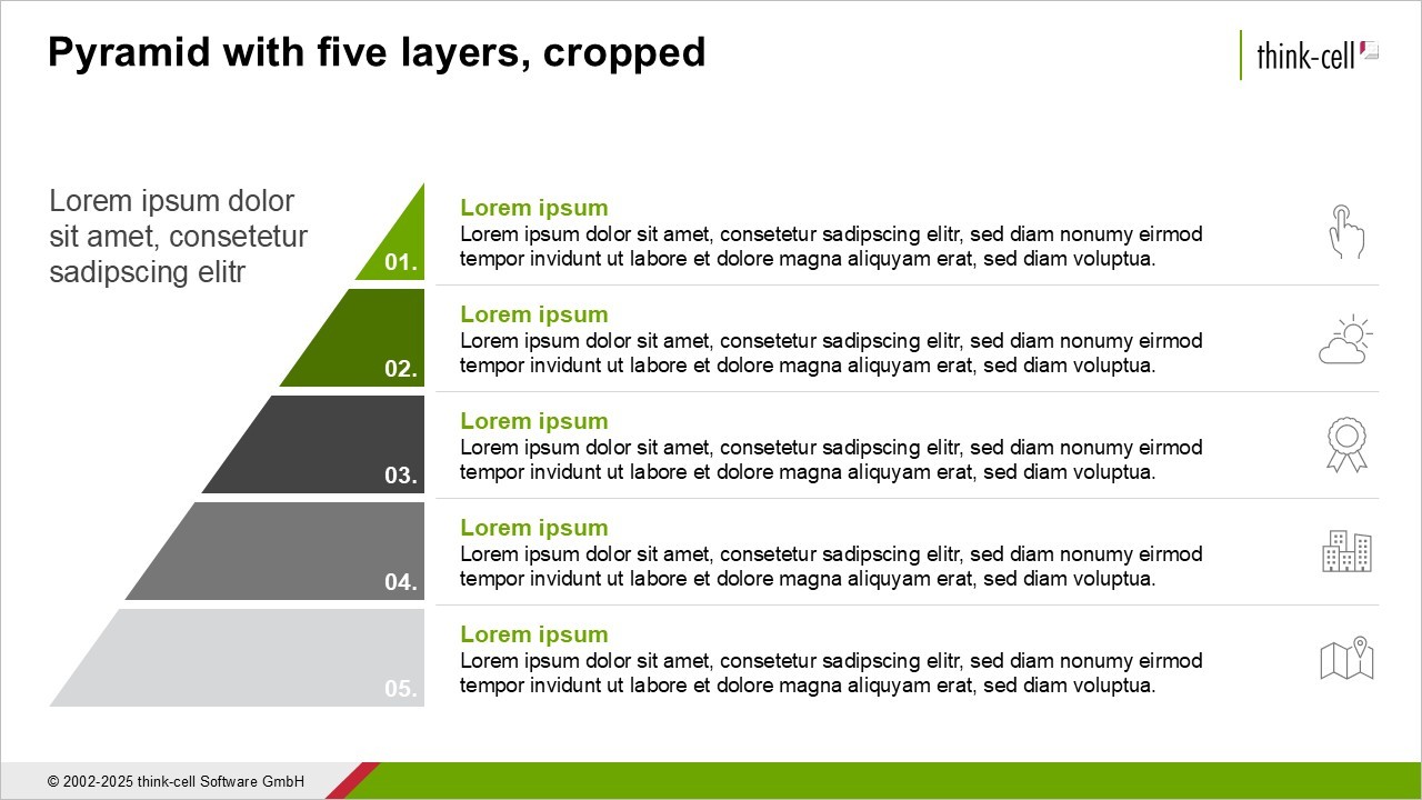
The slide has at least six objects but it still isn't in danger of being over-cluttered. The following example shows how we can adjust the slide layout and add more objects, including titles, example images, row headings, and more.
In spite of all this information, the slide remains easy to read thanks to a number of intelligent design choices:
- Illustration: The pyramid is reduced in size to create more space for elements, without sacrificing the visual effect.
- Text: Converting the paragraphs from full sentences to bulleted lists reduces the need for text without losing valuable content.
- Alignment: Despite adding elements, the strict tabular alignment in rows and columns is maintained to ensure readability.
- Headings: Succinct column titles help the reader easily parse the meaning of the additional content.
- Color: The green accent color has been removed from the text in the rows and the pyramid layers, eliminating possible distractions.
- Labels: The number labels on the pyramid layers have been deleted, as they do not contribute meaningfully to the slide’s message.
- Images: Although a total of eight images are included, the consistent positioning and alignment within the rows help maintain the continuity of the slide layout.
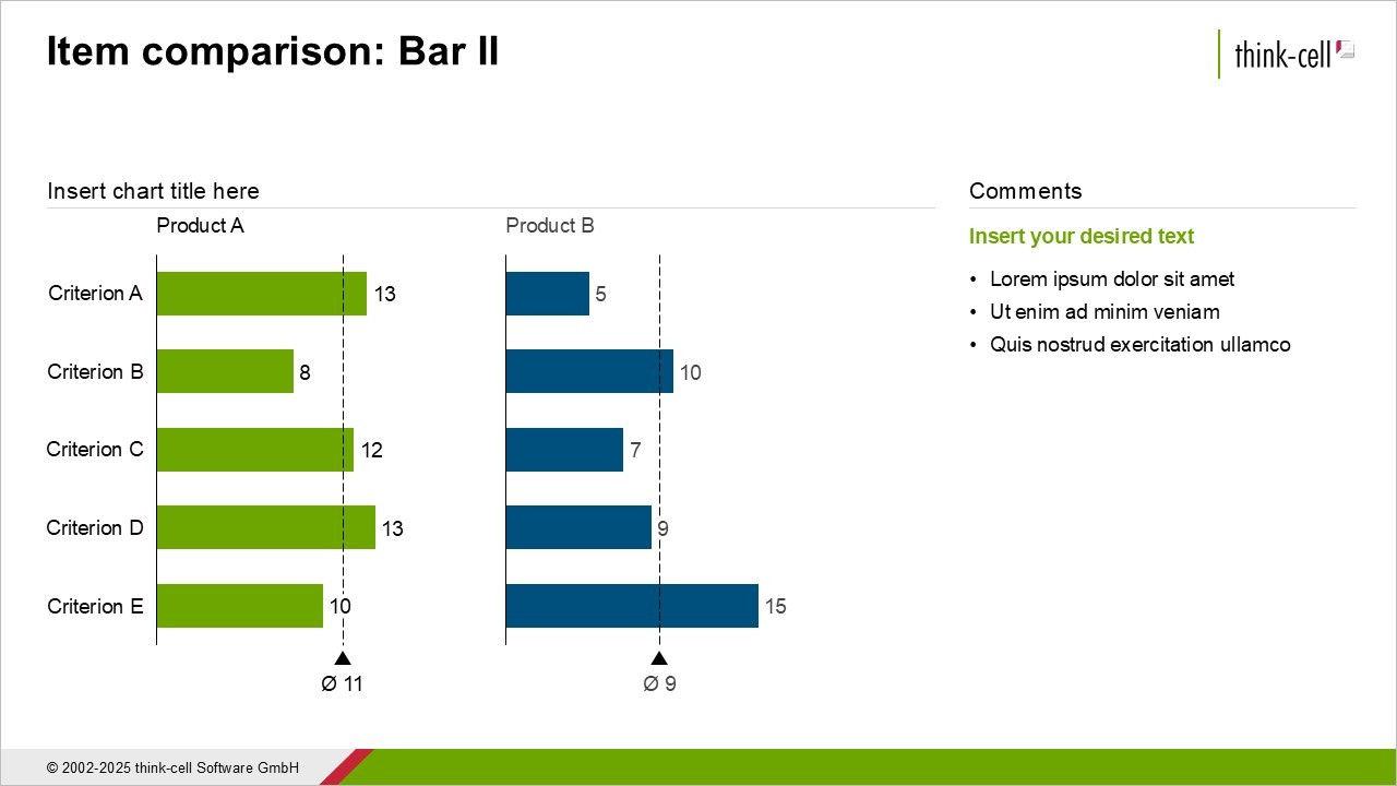
Example 3: Anticipating questions and answering them proactively
The next example looks at how you can compose individual slides to fit into your overall business presentation narrative. When you are designing a slide, you should always consider questions your audience might ask, and answer them preemptively.
There are a number of ways to do this, such as with annotations, text boxes, or an expressive action title. In some cases, you might want to create another chart that will provide an additional perspective or add more depth to the data.
In this example, we’ve added a bar chart that drills down into the data by showing how the total value for the PC category is divided between two subcategories.
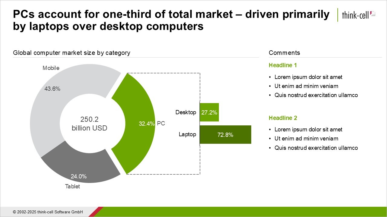
This example works well because the slide uses connectors and intuitive coloring to make it clear how the two charts relate to one another. Additional context could also be given via the comments section on the right, and as always, the action title.
By anticipating the audience’s questions, you demonstrate that you understand what matters to them, you help your presentation flow, and you provide value with every single slide.
Example 4: Following frameworks for balanced layouts
If your slide is presenting two statistics for direct comparison, or listing pros versus cons, then a 50:50 horizontal split across the slide makes sense, as in these examples.
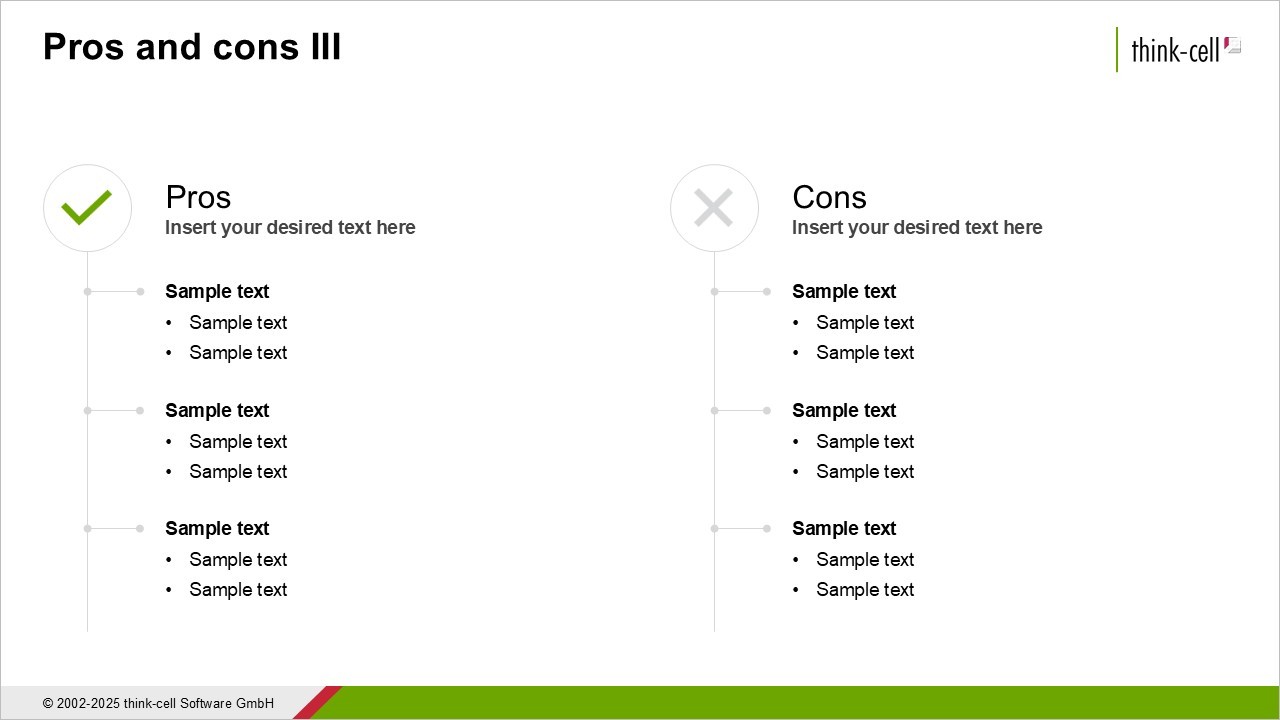
Dividing the slide evenly feels like a no-brainer to keep elements balanced. But 50:50 doesn’t always mean balance. If your two main elements aren’t equally important, you should consider giving more slide space to the one you want the audience to focus on.
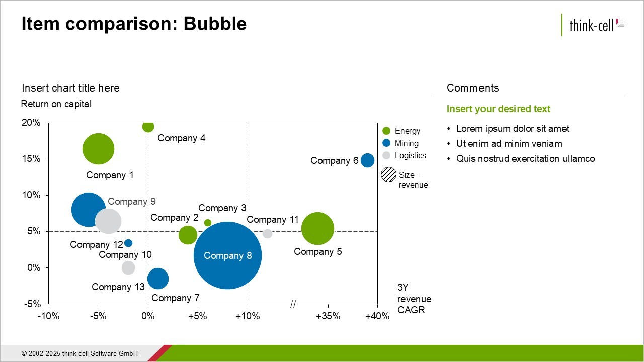
This doesn’t mean you can size, shape and arrange things however you like. It’s a good idea to organize your slide as a grid of rows and columns, even if some elements occupy more rows or columns than others. One framework, inspired by photography, is the rule of thirds. This means dividing your slide into three rows and three columns, creating nine equal sections. They’re not demarcated with visible gridlines, but they’re there.
To show how this works, the following example template dedicates two thirds of the slide to the chart on the left and one third to the comments on the right. Using this two-thirds/one-third balance has the following advantages:
- Readability: As the bubble chart is quite complex and contains several data labels, giving it two thirds of the slide space helps keep font sizes legible.
- Focus: Like in photography, the rule of thirds makes it easier to focus on the single-third element, with the chart canvas creating an implicit open space beside it.
- Guiding the story: When the left-hand element is larger and more colorful, these pre-attentive attributes will help give the reader a first visual impression of the chart before being confronted with more detail in the comments.
The rule of thirds won’t be suitable for every slide in every presentation. If you have a process with four steps of equal weight, give each step a quarter of the slide width. You don’t have to overthink it.
The recommended approach is to evaluate the content of each slide and choose a balanced layout accordingly. And stick to recognized best practices. Your slide might be beautiful and have unique insights, but it’s unlikely to be so special that it needs a brand new layout that’s never been seen before in a business presentation.
Example 5: Using color sparingly but consistently
An obvious rule when using color in your business presentations is to adhere to your company’s brand identity. If your company and/or department works with a corporate PowerPoint template, make sure you familiarize yourself with how to use the template and follow internal guidelines to keep your slides professional and on-brand.
But even within the limitations of a corporate template, you will normally have a certain amount of freedom to make color choices. And these choices can have a big impact on the appearance and readability of your slides. If you’re not sure how to use color in your charts, you can learn more with our free think-cell academy course: Becoming visual.
You can also use color to make your business presentation’s overall narrative more cohesive. Say you have several slides where Product A and Product B are mentioned. You can do your audience a big favor by using consistent coloring for each of A and B throughout your presentation, as the following example demonstrates.
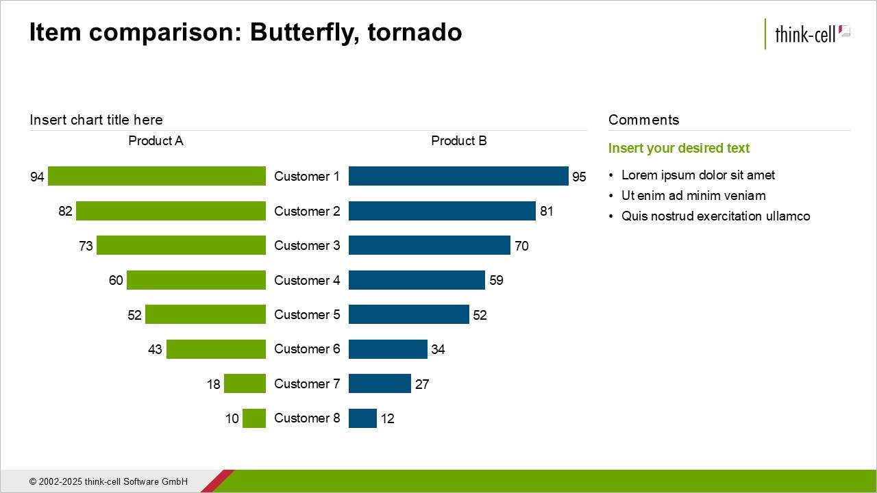
Imagine how confusing it would be if the colors were inverted across the two slides. By consistently using the same green for Product A and the same blue for Product B, you strengthen audience recall and help them buy into the story your presentation is designed to tell.
Conclusion: The best business presentations follow best-practice examples
Creating excellent business presentations isn’t about being a talented artist with a special talent. Anyone can study methodologies and example frameworks, and use them to build professional slide layouts and craft convincing narratives.
The main mistake you can make is thinking you need to be creative to stand out. You don’t. Study the fundamentals, apply them rigorously, and learn from best-practice examples. Finally, you need to equip yourself with the right templates and tools that will help put your theory into PowerPoint practice.
A great place to start is the think-cell Library, which comes packaged with more than 250 best-practice templates and lets you search all the slides in your PowerPoint repository. Start a free trial today to see how the think-cell Library can help you build outstanding business presentations faster.
Build better presentations faster
- Reduce your PowerPoint working time by up to 70%.
- Use AI where you work: inside PowerPoint integrated into your slide workflow.
- Trusted by all top 10 consulting firms and 88% of the Fortune 100.
Explore this topic further with AI:
Read more
Learn 7 steps for making an effective PowerPoint presentation, including how to structure your story, lay out your slides and create clearer, more impactful charts.
Explore the think-cell Library and see how you can save time, search effectively, and access a wealth of resources to ensure you never have to start your presentation from a blank slide again.

Five practical ways to turn cluttered data slides into clear, story-driven visuals that land with your audience.
Learn how to evaluate the most important features for choosing the best possible presentation library, including templates, images, and other visual assets.
Discover more than 70 PowerPoint slide templates that help you get started faster and cover all the most common business presentation scenarios.