7 steps for creating great PowerPoint presentations
- Home
- Resources
- Content hub
- 7 steps for creating great PowerPoint presentations

15 min read — Amos Wong
PowerPoint presentations don’t have a great reputation. You’ve probably sat through presentations that raised more questions than they answered and did more to confuse the audience than convince them. And there’s a simple reason for this: making great presentations isn’t easy. PowerPoint can be a powerful tool, but any presentation is only going to be as good as the skills and approach of the person who creates it.
With our seven-step framework, you can easily become someone who makes presentations people understand, are convinced by—and even enjoy watching. We’ve also included a few tips and tricks to help you build a presentation that achieves what you want it to. We’ve broken down the whole process step-by-step, but you can also dive straight into the aspect of creating presentations you’re most interested in:
For full access to a comprehensive set of tools for creating great presentations, you can try the think-cell Suite today by downloading your free trial:
Before you start: Determine the type of presentation you want to create
Before you can even begin making your PowerPoint presentation, you need to determine which type of presentation you’re giving. This isn’t a big task, but it’s an important one, as it helps ensure that the presentation you create is tailored towards achieving your overarching goal, which will influence the content, layout and structure of your slides.
Four common types of PowerPoint presentation
Most PowerPoint Presentations fall under one of the following four categories, which represent a continuum from light to heavy content:
- Key message presentations: This type of presentation is usually lighter in content and is designed to tell a persuasive story. Common examples would be a conference speech, TED talk or pitch deck.
- Recurring reports: Any presentation that is created on a regular cadence can be considered a recurring report. This includes monthly performance reports or presentations for regular team meetings where each team member contributes their slides. Presentations like this often include more detail to document results, trends or activities, and they often have a fixed layout with data that needs updating.
- Insights and research outcomes: Presentations such as survey data or market trend reports distill information from large datasets into high-level conclusions. Here, the aim is communicating the key takeaways from the research and presenting impactful conclusions to your audience.
- Documentation: This type of presentation provides detailed summaries of findings, typically with many charts and limited commentary. A documentation presentation is often made with the intent that the audience review it in detail on their own, rather than just absorb the information as presented.
It’s quite likely that the specific presentation you’re creating will include elements from multiple categories. It may be a recurring presentation that includes insights from the latest iteration of a regular survey. In this case, you can combine features of both presentation types.
Step 1: Build your presentation's story
All types of presentation should tell a story. This first step is most critical in key message presentations or when presenting insights and research outcomes, but it applies across the board.
There is extensive literature on the art of storytelling for business, and there is no shortage of courses on the subject available on online education platforms. Here, we’ll cover two aspects of storytelling that are most relevant for creating effective PowerPoint presentations.
Develop your top-level message
If the aim of your presentation is to convince your audience, you should first establish what your top-level message is. What is the single most important thing you want your audience to know after your presentation that they didn’t know beforehand? Examples of top-level messages might be:
- Information: Our division exceeded its quarterly growth targets by 20%
- Motivation: Our organization has the potential to be the market leader in our industry
- Conclusion: We recommend setting up a new subsidiary in the UK next year
Whatever your message, you should try to break it down into a single sentence. This will help you focus on the core idea of your presentation and ensure that every slide is contributing to your argument.
Use a structural framework
With your top-level message in place, you can then choose a framework to guide how you structure the rest of the presentation.
One popular option is the Pyramid Principle, a strategy for creating effective business communications ubiquitous in the consulting world. With the Pyramid Principle, you lead with your most important idea, followed by supporting ideas and facts. If your conclusion is that Acme Company should enter a new market, say it up front. Then go through each supporting argument in order of relative strength.
An important corollary to the above is the MECE Principle, which stands for mutually exclusive and collectively exhaustive.
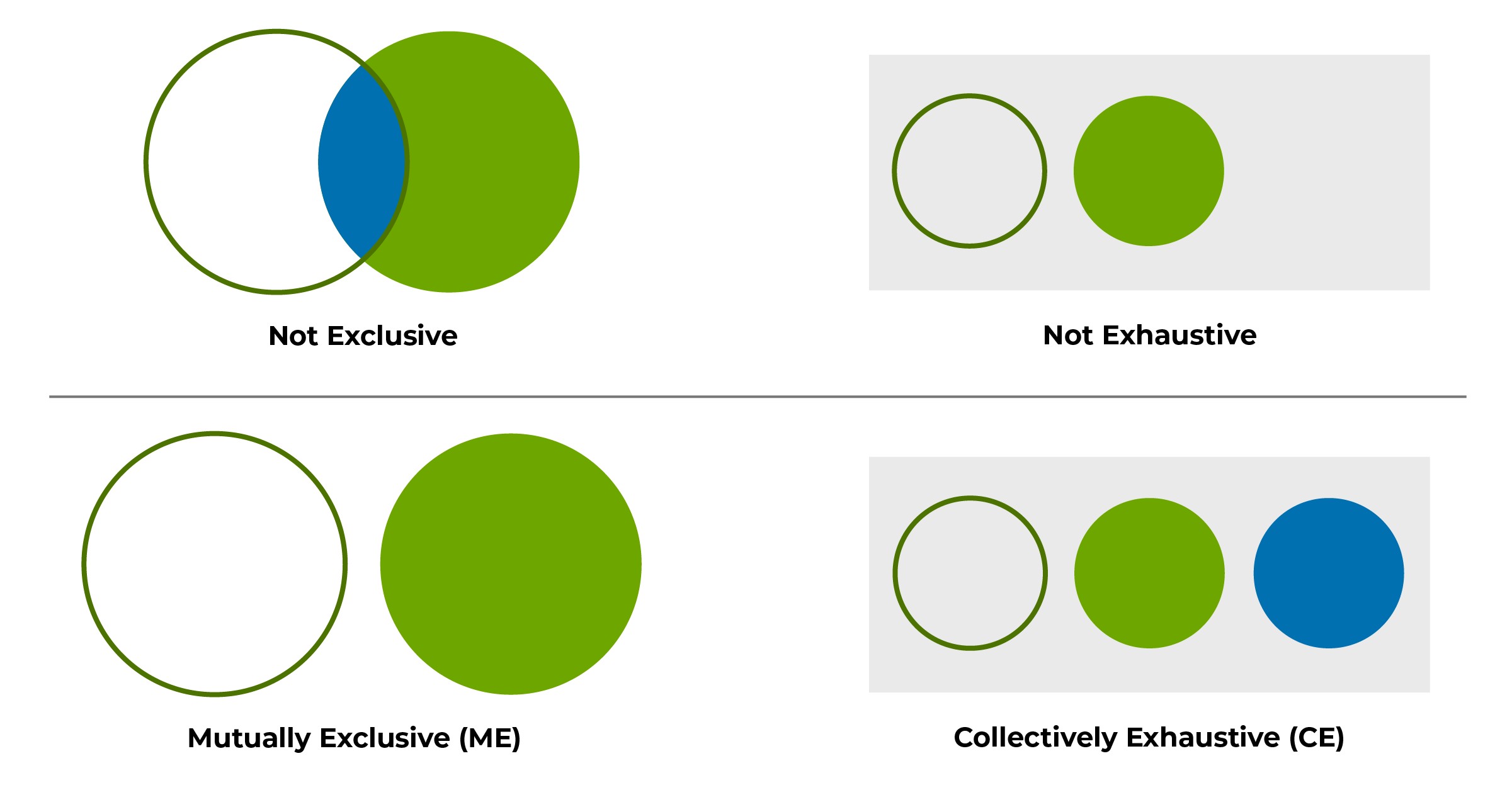
Compared with presenting a laundry list of ideas, MECE is a way to group them in a way that covers all relevant points without overlap. Using MECE to organize and group your ideas ensures a logically sound argument, while making the information easier for your audience to absorb.
You can also choose to use another structural framework if you prefer, but you should certainly choose something. Having a clear structure not only makes things easier creating your presentation, but it gives you a point of reference to help when reviewing, making alterations or updating an existing presentation.
Step 2: Write your action titles
Having decided on the story you want to tell and how you want to structure your PowerPoint presentation, you can get down to creating your slides.
An important thing to remember is that each slide should present exactly one idea, and that this idea should be summarized in a single action title. All information presented on the slide, including any charts or graphics, must support the action title.
It is also important to avoid including any visual or textual elements that may convey or imply a different or conflicting message. Just as each slide contributes to the presentation’s top-level message, each element on the slide should contribute to the action title.
A common strategy when creating presentations is to start by writing action titles for each slide to ensure they tell a complete story on their own. This is a similar approach to beginning with the chapter headings when writing an article or document. The action titles should be sufficient to verify that your presentation is consistent with your chosen structural framework. If it’s not clear, either something’s missing or the action titles aren’t expressive enough.
Once all your titles are in place, you’re then ready to go through and add the slide contents such as bullet points and charts.
Step 3: Use a clean layout and formatting
There are various PowerPoint rules that are often a combination of numbers like the 5-5-5 rule. Whatever the exact numbers, the idea behind all of these is that you shouldn’t overload your slides with too much content. There shouldn’t be too many different elements, there shouldn’t be too many sentences, and individual sentences shouldn’t be too long.
Whether you adhere to a strict rule or not, it is crucial when creating presentation slides to avoid overcrowding them with excessive information or elements that can create visual confusion. You can approach this by visualizing your slide as a table, laying out elements in columns and rows.
Best practices for presentation layouts
Commonly used slide layouts consist of either two, three or four sections, depending on the nature of the content and the desired visual representation. Other best practices for you to consider include:
- The rule of thirds: Placing elements at one-third or two-thirds from the edge of the slide, and particularly where these gridlines intersect, is a universal rule for building a visually appealing slide.
- White space: Resist the temptation to pack too much into your slides. Leaving sufficient white space is essential for readability and helping the audience take in each slide’s main point.
- Presentation type: Key message presentations will have less content on each slide, compared with documentation presentations that include more detail.
- Fonts: Use the same font color and size for titles and body text throughout your slide deck, ideally in a sans serif font like Arial, as this aids readability. Consistency is the main thing, but as a rule, titles should be 20 to 24 point size, with body text 12 to 18 point based on the amount of content on the slides.
Brand compliance
Particularly for business presentations created for an external audience, brand compliance is key. As the presenter, you are an ambassador for your company and your presentation needs to represent your employer in the best possible way.
On the one hand, this means building a slick, convincing presentation and delivering it professionally, but it also means ensuring that every slide is aligned with your brand’s corporate identity and visual style guidelines.
This starts off straightforward enough, provided you use your company’s PowerPoint template, but when you’ve made multiple edits and iterations, possibly combining slides from several different contributors, you should definitely allow time to check the final presentation and confirm that no elements are veering off-brand.
To learn more about how you can ensure brand compliance with think-cell, check out our user manual on setting up customized styles.
Step 4: Organize your bullet points
To avoid boring your audience, make sure you don’t have bullet points on every slide. One feature of great presentations is that they keep the audience’s attention by including some variety, which can apply as much to slide structure as to the specific messages of the content.
It’s very likely, of course, that your presentation will include bullet points on some slides, which is absolutely fine. If used well, bullet points are a concise, effective way of communicating key information. There is a good reason that they’re a core part of most PowerPoint presentations, good and bad.
Presentations are bad when they have overly long lists of bullet points—or lists with erratic levels of indentation—that can be confusing and hard for audiences to digest. Stick to three or five bullets. In some cases, you might stretch to a maximum of seven, but normally if you have that much to say, it’s better to break them up and use an additional slide. Do all seven bullet points really relate directly to the slide’s main message? As always, avoid packing in too much information in one slide, and ensure that all text supports the action title.
A final aspect is the structure and syntax of your bullet points. Consistency is key, so if one bullet is a complete sentence, they should all be complete sentences. The same applies if using sentence fragments or individual words. Each bullet should start with the same part of speech, be it a noun, verb or adjective. And if using multiple levels of bullet points, make sure you have a consistent, logical hierarchy throughout your list.
Step 5: Choose the right chart for your message
Never include a chart just for the sake of it. But your presentation will be more convincing if you can provide evidence to support your messages, and charts are often the best way of presenting data-based evidence.
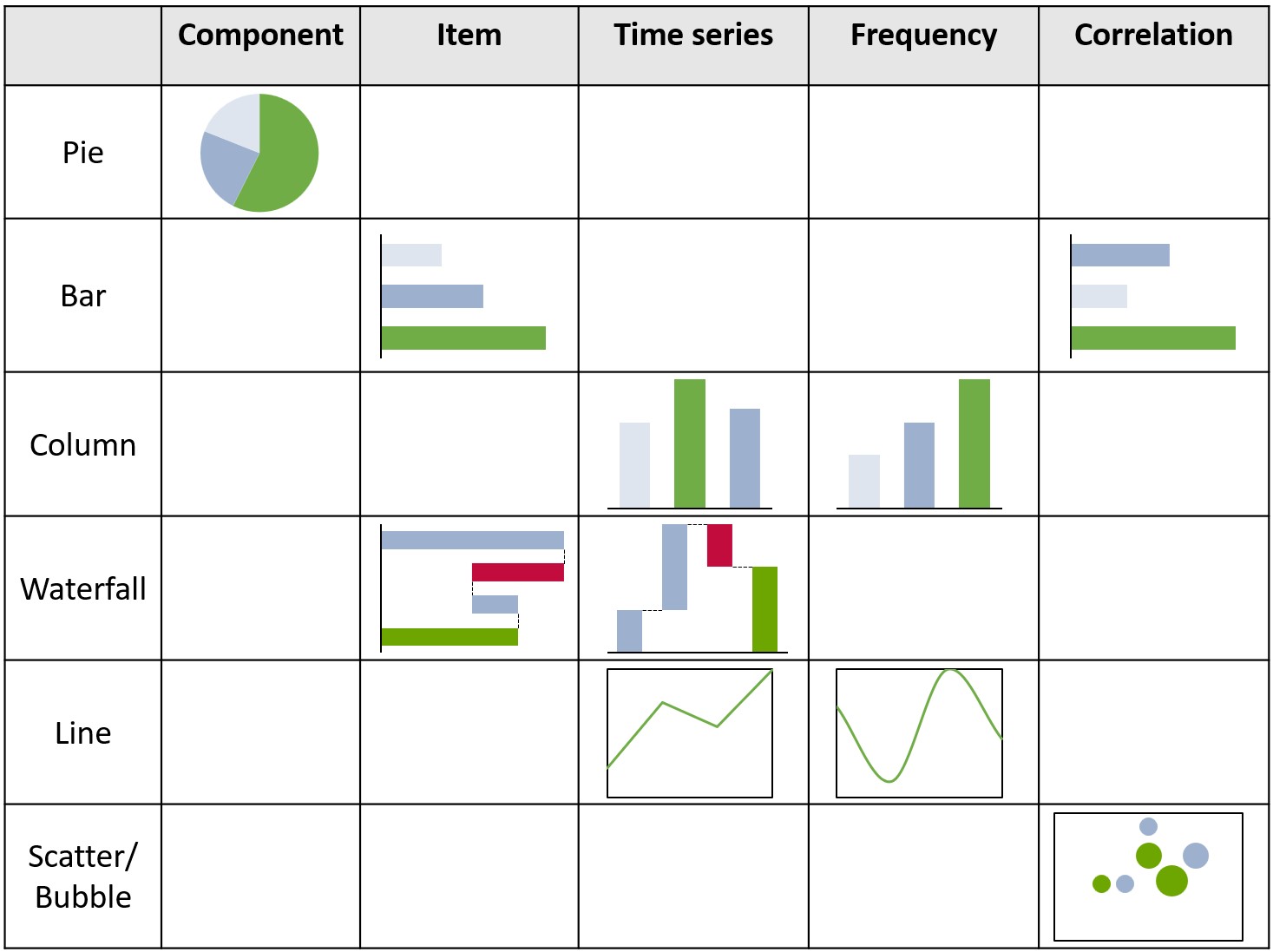
So, if you have data that is relevant to the slide’s action title, then do include a chart that is best suited to helping you highlight what you want to communicate. Say It with charts by Gene Zelazny offers a useful approach to choosing your chart in three steps:
- Identify which aspect of the data your chart will highlight
- Determine what you’re comparing, whether it’s components, change over time or correlation
- Select your chart according to the comparison you’re trying to make.
The mapping of some of the most commonly used chart types to data and comparisons is summarized in the following matrix. If you’re not familiar with all of these, you can find out more in the introduction to charting section of our user manual or our in-depth guides like how to create a waterfall diagram in PowerPoint.
Step 6: Format your charts for maximum impact
Choosing the best type of chart is one thing, but your chart’s effectiveness will depend heavily not just on the data, but on the design choices you make. For maximum impact, you’ll want to format and annotate each chart in a way that conveys your message and emphasizes what matters most, while avoiding confusion and—of course—ensuring that you adhere to your brand’s visual guidelines. This means:
- Including a chart title that summarizes the data and aligns with the slide’s action title.
- Labeling both the X-axis and the Y-axis with measurement units.
- Using color sparingly to highlight the chart’s conclusion, for example using muted tones except for one key vertical bar which you highlight in a bolder color.
- Adding trendlines and/or annotations to charts that can visually indicate patterns or trends in the data, for example, CAGRs.
- Displaying legends to help viewers understand the meaning of different colors, symbols, or patterns used in the chart.
Streamline your chart formatting with a PowerPoint add-in
Even with the best intentions, it isn’t always easy in PowerPoint to format a chart exactly how you want it. Sometimes you need to resort to messy workarounds and sometimes a feature simply doesn’t exist. That’s why many professionals use PowerPoint add-ins to help them create better slide decks and charts faster.
You can watch the video to see how easy it is to add chart decorations and annotations using think-cell:

Dynamic charts, process flows, annotations and text boxes all help organize complex information into visually sophisticated presentations, so you can spend less time struggling with formatting and more time crafting your story to communicate your message.
Looking for more inspiration? Visit our product page for a comprehensive list of all think-cell features.
Step 7: Check accuracy and consistency—and check again
If you’ve diligently gone through all the steps listed here and created a great PowerPoint presentation with a powerful main message, impactful structure, and convincing charts supporting your argument, then do make sure you don’t throw it all away by rushing right at the end.
Take the time to click through your completed presentation and pay particular attention to the following:
- Are action titles clearly written, error-free and unambiguous?
- Do core slide elements like titles, text boxes and charts jump around as you click from slide to slide, or is the positioning consistent?
- Are any placeholder elements still visible that should have been replaced or deleted?
- Do all figures mentioned in titles and annotations match the data displayed on charts?
- Are you using symbols and abbreviations (such as USD vs. $) consistently throughout the presentation?
Inconsistent formatting, contradictory data or confusing headlines are a sure-fire way of losing audience trust. Unfortunately, it’s easy for mistakes to slip in when you’re working to a deadline. That’s why productivity tools that automate alignment and proofing tasks are a great way to ensure a polished final product and give you peace of mind at the most critical stage of the presentation creation process.
Get unlimited access to all think-cell Tools and the full range of think-cell Suite features in your free trial:
A process that makes creating easier and presentations better
Building a PowerPoint presentation from scratch can seem like a tall order. By following our tips and breaking down the process step-by-step, however, you can make your life easier and be confident that you are producing high-quality outputs. With this approach, you have a method and the tools you need to consistently create presentations that leave your audience with a clear understanding of your message.
If you’ve read this article and you’re looking for even more guidance on how to create great presentations, check out our free eBook on PowerPoint best practices:
Build better presentations faster
- Reduce your PowerPoint working time by up to 70%.
- Use AI where you work: inside PowerPoint integrated into your slide workflow.
- Trusted by all top 10 consulting firms and 88% of the Fortune 100.
FAQ about creating PowerPoint presentations
Here is a summary of some of the most frequently asked questions around how to make a great PowerPoint presentation.
How do I begin making a PowerPoint presentation?
Like with any document, the best place to start when making a PowerPoint presentation is to understand why and for which audience you’re making it. That dictates the type of presentation you need to make, which helps you define the core message of your presentation. With that in place, you can proceed to build the presentation, ensuring that all slides and contents contribute towards communicating your main message.
How do you make a good PowerPoint presentation?
It’s much easier to make bad PowerPoint presentations than good ones, but anyone can learn to make high-quality PowerPoint presentations by paying attention to clear structure, keeping texts short and formatting clean, and focusing on a core message. Those are the most important points. It gets easier if you have some strong data and a great story to tell, and even easier if you work with sophisticated PowerPoint add-ins like think-cell.
How do you structure your PowerPoint presentation?
To structure a PowerPoint presentation effectively, you should draw on a framework such as the Pyramid Principle and/or the MECE Principle. These help you divide your messages or arguments into logical chunks that build on each other and feed into the main message of the presentation.
These aren’t the only options. For example, for a more narrative presentation like a keynote speech for a large audience, you may find a presentation built around a story arc more appropriate.
By working with a structural framework, you also have a way of checking your presentation to see if things are in the right order, something is missing, or if you have unnecessary information you can do without.
What is the 5-5-5 rule in PowerPoint?
The 5-5-5 rule in PowerPoint refers to the length of paragraphs (five lines), the length of sentences (five words) and the length in time of each slide (five minutes) that you should aim for. The purpose of a rule like the 5-5-5 rule is to encourage people to make PowerPoint presentations that are concise, meaningful, and to the point.
What is the 10/20/30 rule?
The 10/20/30 rule, coined by Guy Kawasaki, is a PowerPoint guideline for presentations that recommends limiting the number of slides to 10, keeping presentation time to 20 minutes or less, and not using any fonts smaller than 30 points. This is one of several popular rules for creating PowerPoint presentations that are geared towards keeping things short, low on text, and focused on the most important details.
What is the Kawasaki rule?
The Kawasaki rule is another name for the 10/20/30 rule. It refers to Guy Kawasaki, a venture capitalist who is credited with its invention.
What is death by PowerPoint?
The phrase ‘death by PowerPoint’ is a popular expression to describe the phenomenon of an audience being bored by a poorly created and delivered presentation. The implication is that many presentations in the corporate world are too long, confusing, and badly structured to communicate effectively and keep an audience engaged. The term is often used in advice pieces explaining ‘how to avoid death by PowerPoint’, such as David JP Phillips’ 2014 TEDx Talk.
Explore this topic further with AI:
Read more

Explore concrete examples that demonstrate how to make your business presentations stand out and learn common PowerPoint mistakes you should avoid.

Learn how to use Barbara Minto’s pyramid principle of communication to create better organized PowerPoint presentations that tell your story more effectively.

Learn about the MECE principle and examples of how to apply it, plus how to use it to create stronger PowerPoint presentations faster.

Understand the importance of data visualization for business decision-making and learn how to visualize business data to make your presentations more impactful.

Five practical ways to turn cluttered data slides into clear, story-driven visuals that land with your audience.

Discover more than 70 PowerPoint slide templates that help you get started faster and cover all the most common business presentation scenarios.