Expert guide to multiple series waterfall charts
- Home
- Resources
- Content hub
- Expert guide to multiple series waterfall charts
14 min read — Stephen Bench-Capon
Waterfall charts are often the best choice for showing how multiple factors contribute to a total, with the natural left-to-right flow of the waterfall chart providing the perfect scaffold for your data storytelling.
This article looks specifically at multiple series waterfall charts, which open up new options and let you add another layer of detail to your narrative.
Unlike native Excel or PowerPoint, think-cell supports multiple series for waterfall charts as standard, so we’ll mainly be using think-cell for the examples in this article.
- What is a multiple series waterfall chart?
- Multiple series waterfall charts in Excel
- Problems with workaround Excel waterfall charts
- Alternative to a multiple series waterfall chart
- Why stacked waterfall charts are the best solution for multiple series
- How to total multiple series in parallel in a waterfall chart
- Bonus: Creating a funnel with a multiple series waterfall chart
Build professional charts in seconds
- Download your free trial for faster creation of 40+ chart types.
- Automate chart creation with AI tools purpose-built for your slide workflow.
- Work seamlessly with Excel data links for automated reporting.
If you’re new to waterfall charts and not ready to explore multiple series just yet, you can get caught up by exploring our other waterfall chart resources:
- Ultimate guide to waterfall charts
- Instructions in the think-cell user manual: Waterfall charts
- Video tutorial: Waterfall charts with think-cell
What is a multiple series waterfall chart?
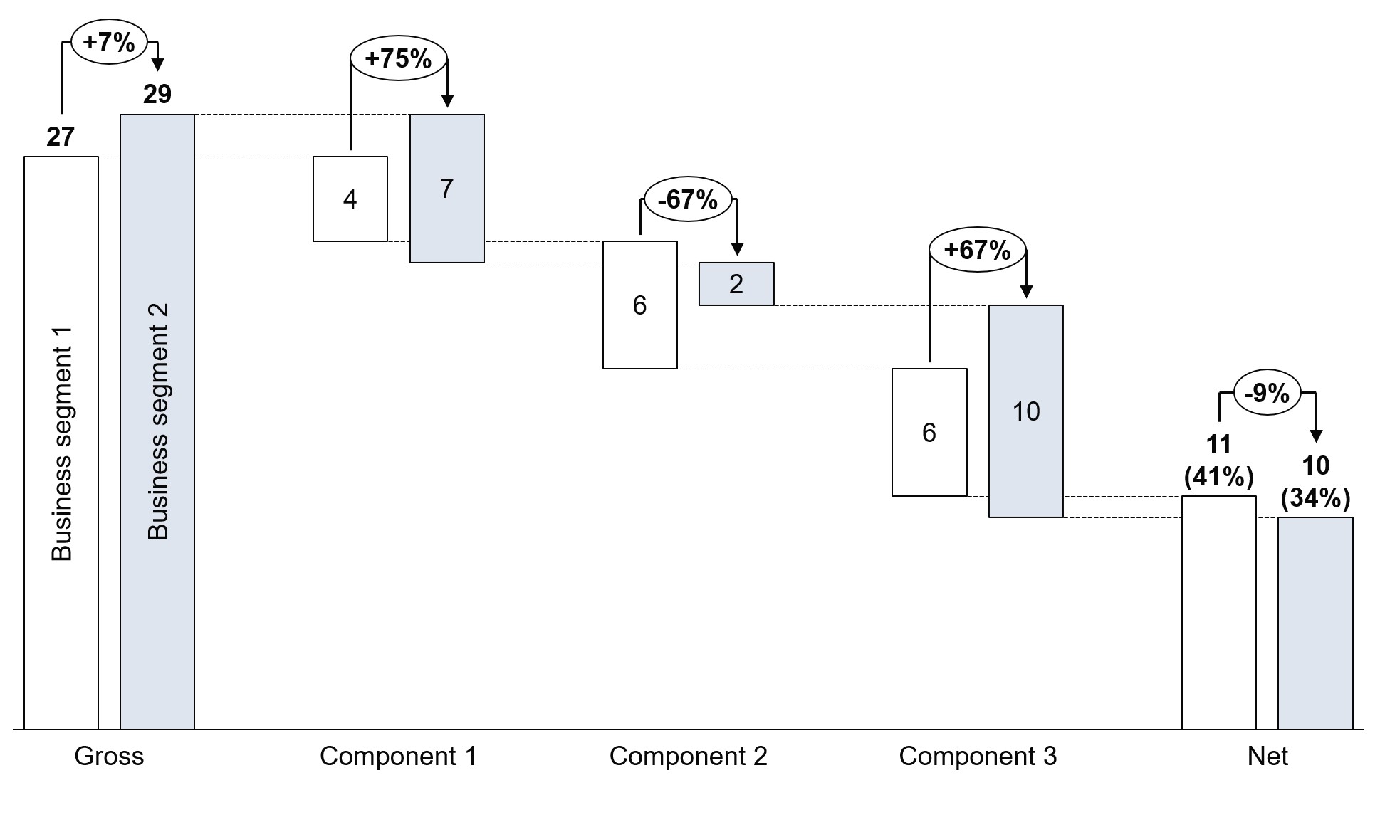
On a vertical waterfall chart, the columns represent categories, some of which may be totals or subtotals. In a single-series waterfall chart, there can only be one value for each category.
Multiple series waterfall charts make it possible to have more than one value for each category. This can be useful for breaking down financial metrics by department or region, or for displaying the value of individual components, while maintaining the flow and focusing on the totals for each category.
Multiple series waterfall charts in Excel
Excel does have built-in waterfall charts but they don’t support multiple series. If you try to add a second series to the data range of an Excel waterfall chart, it will simply be ignored.
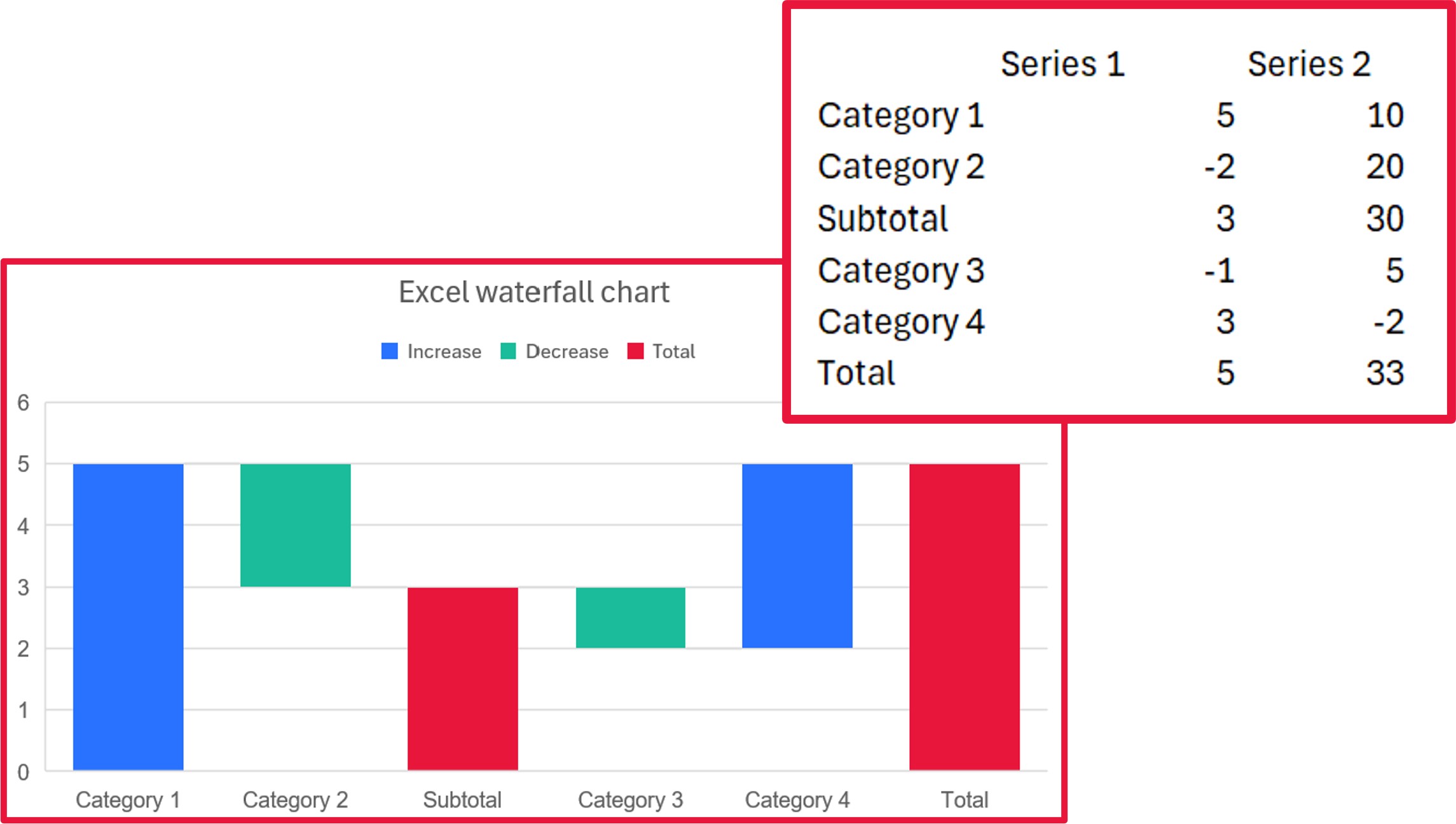
To make a multiple series waterfall chart in Excel or PowerPoint, you therefore have to use workarounds. These will usually start with a stacked column chart as a base, and rely on invisible columns and/or layering of multiple charts on top of one another.
Problems with workaround Excel waterfall charts
One fundamental problem with multiple series waterfall charts built in Excel is that a workaround that might do the trick for one dataset might break down with another.
Common challenges that can arise when building multiple series waterfall charts include:
- Handling columns that cross the X-axis.
- Combining negative and positive values for one category.
- Displaying series totals.
Waterfall charts built with think-cell have consistent, automated ways of calculating and displaying multiple series, which make them not only easier to build and easier to update, but easier to read, even when working with complex datasets.
Alternative to a multiple series waterfall chart
If you have two series and you are more interested in highlighting the comparison between them, rather than their sum total, then you can use a standard waterfall chart. Simple category gaps let you cluster the columns and color makes it easy for your audience to see the comparison.
This alternative to a multiple series waterfall chart only works well when you have exactly two series to compare. Once you add a third, or more, the chart can become cluttered and your audience will struggle to follow the flow. Also, this approach does not show the sum total for each category, which you only get with a multiple series waterfall chart.
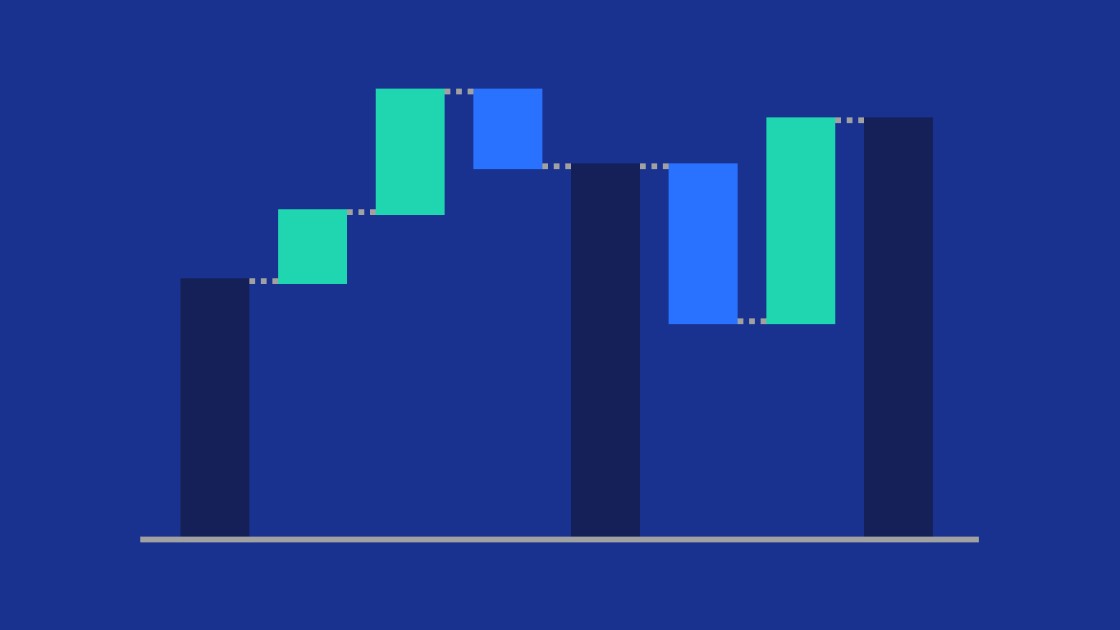
Why stacked waterfall charts are the best solution for multiple series
Stacking is the recommended way of displaying multiple series on a waterfall chart. There are other methods, such as a suggestion from Excel MVP John Peltier, which he calls a split bar waterfall.
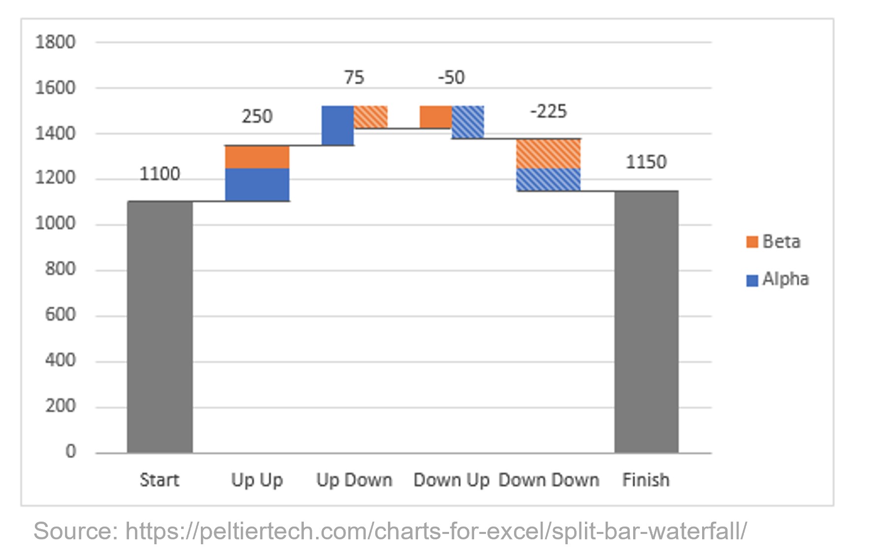
This approach is elegant in some ways, but it has at least three potential drawbacks:
- The width of the segments changes depending on whether the other segment in that category is rising or falling, rather than on the segment’s value. This creates a disconnect between the chart and the underlying data.
- The order of the series changes depending on which is rising and which is falling, making it hard for the audience to ingest the data.
- The chart loses its left-to-right flow, as factors that happen at the same time appear to be ordered consecutively. This can potentially mislead the reader when they are trying to understand the sequence.
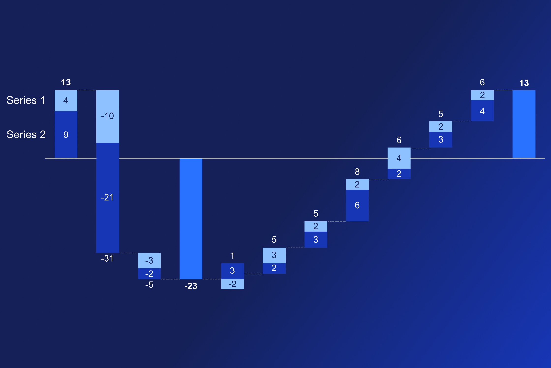
By contrast, the following image shows the same multiple series waterfall chart created with think-cell.
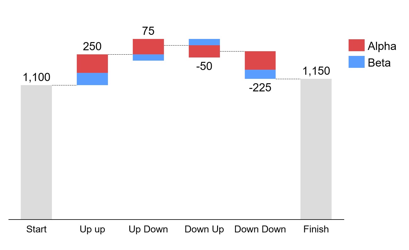
think-cell’s stacked segment approach to multiple series waterfall charts has the following advantages:
- Series segments are always a consistent width.
- The relative order of the series does not change.
- The chart flows naturally from left to right as concurrent events are always in the same column.
These benefits are why think-cell’s approach has become the industry standard. And because they’re the industry standard, think-cell charts are familiar and intuitive for your audience to understand.
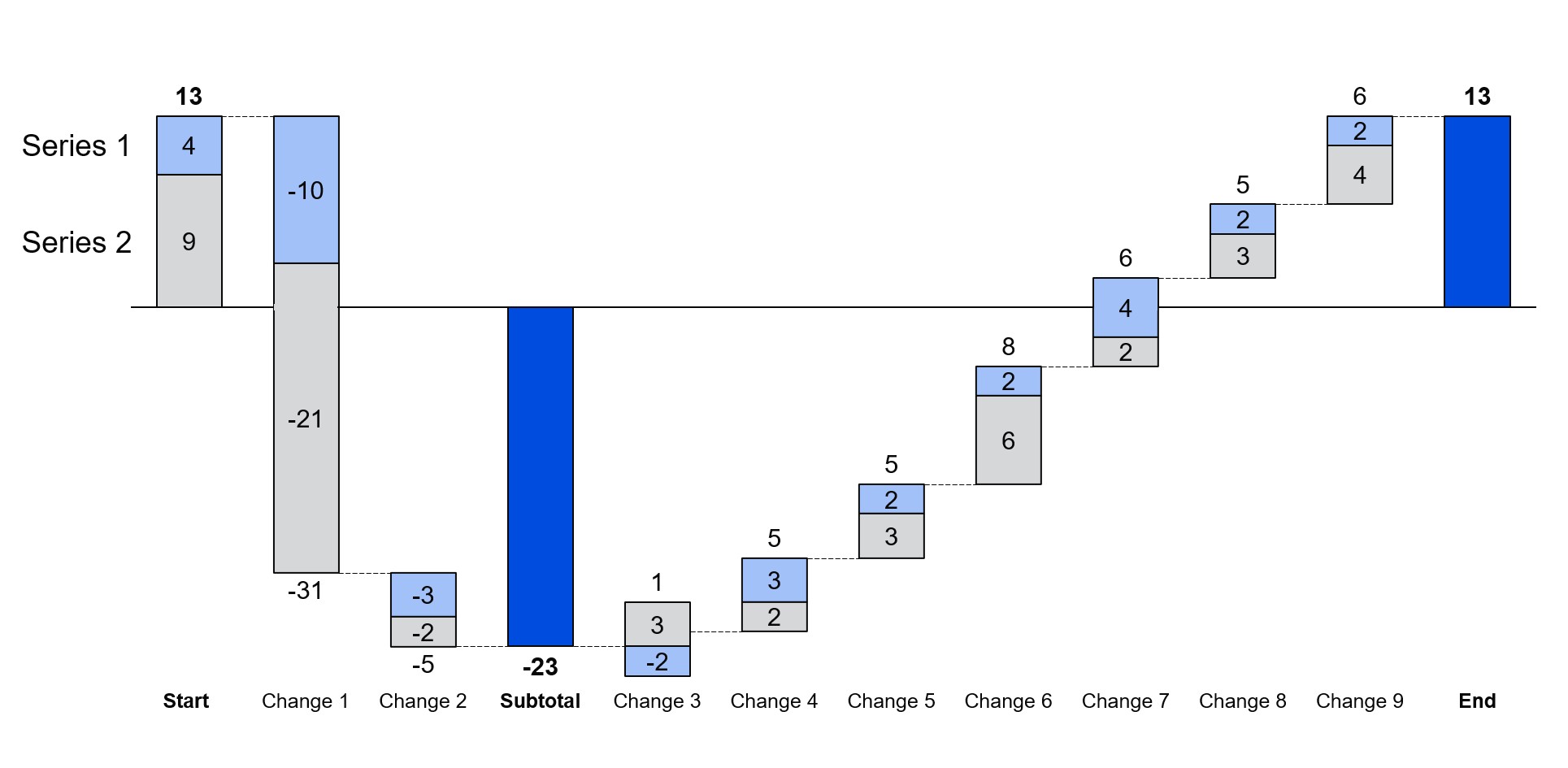
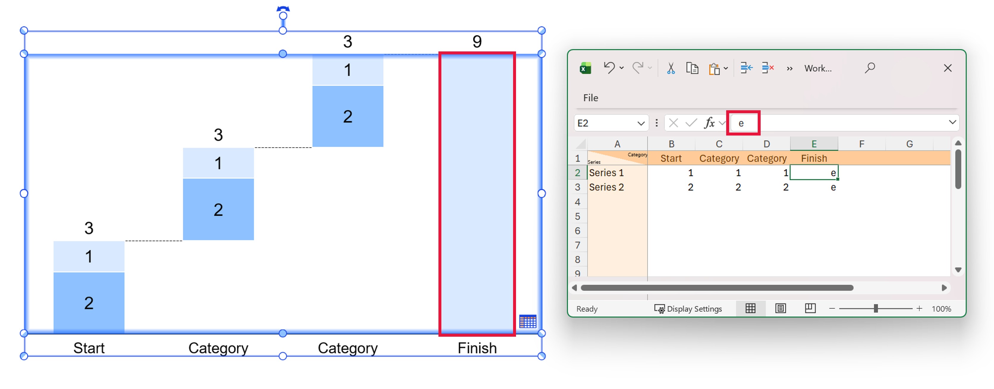
How to total multiple series in parallel in a waterfall chart
In think-cell, you can automatically calculate the total of a series in a waterfall chart by entering e in the chart datasheet. E stands for equals. If you have multiple series, then to calculate the totals per series in parallel, you start by entering e for the individual total of one series, as normal.
For any other series, it’s best to use Excel formulas. A simple SUM function is the easiest way to calculate an individual series total. This has two advantages:
- The total column stretches to the baseline. The e segment ensures the chart can identify the total column automatically and you don’t have to position any connectors manually.
- The total column accurately extends right to the baseline even if there are rounding errors or similar problems in other segments.
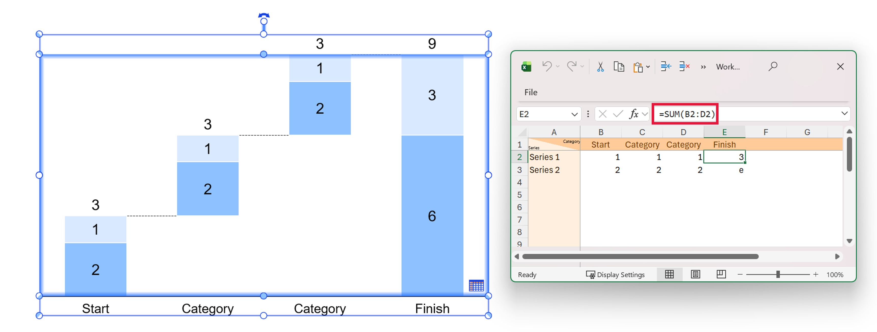
In think-cell's waterfall charts, the e segment automatically stretches between the values to which its ends are connected. If only one end of the e segment is connected to a specific value, it automatically extends to the chart baseline, which typically provides an automatic calculation of the total.
If you have stacked columns with multiple series in the waterfall chart, you can only have one auto-calculated e segment per stack. If you do try and use multiple e segments within a single stack, then all except one will collapse. Only do this if you want the total to be shown as one single segment without the breakdown by series.
Bonus: Creating a funnel with a multiple series waterfall chart
You can use a multiple series think-cell waterfall chart to visualize performance metrics along a funnel, as demonstrated in this think-cell Library template.
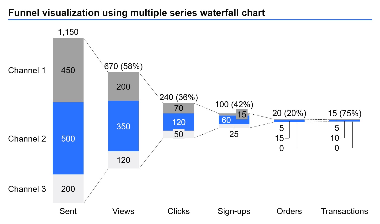
To create a funnel chart, insert a build-up waterfall chart from the think-cell tab and follow these steps:
- Add your multiple series data to the chart datasheet.
- Make sure that the bottom of the left-most segment is free floating.
- Add waterfall connectors linking the tops of all the bars.
- Add waterfall connectors linking the bottoms of all the bars.
- Delete the chart baseline.
As with any think-cell chart, you can edit the data in the chart datasheet or slide workbook, or link it to existing data you have in an Excel workbook.
Build professional charts in seconds
- Download your free trial for faster creation of 40+ chart types.
- Automate chart creation with AI tools purpose-built for your slide workflow.
- Work seamlessly with Excel data links for automated reporting.
Explore this topic further with AI:
Read more
Learn what waterfall charts are, why they are effective, and how to create them in Excel or PowerPoint to convince your audience and help your decision-making.
Learn the process of building a bubble chart matrix step by step, from setting up the matrix and entering your data to formatting a professional visualization.
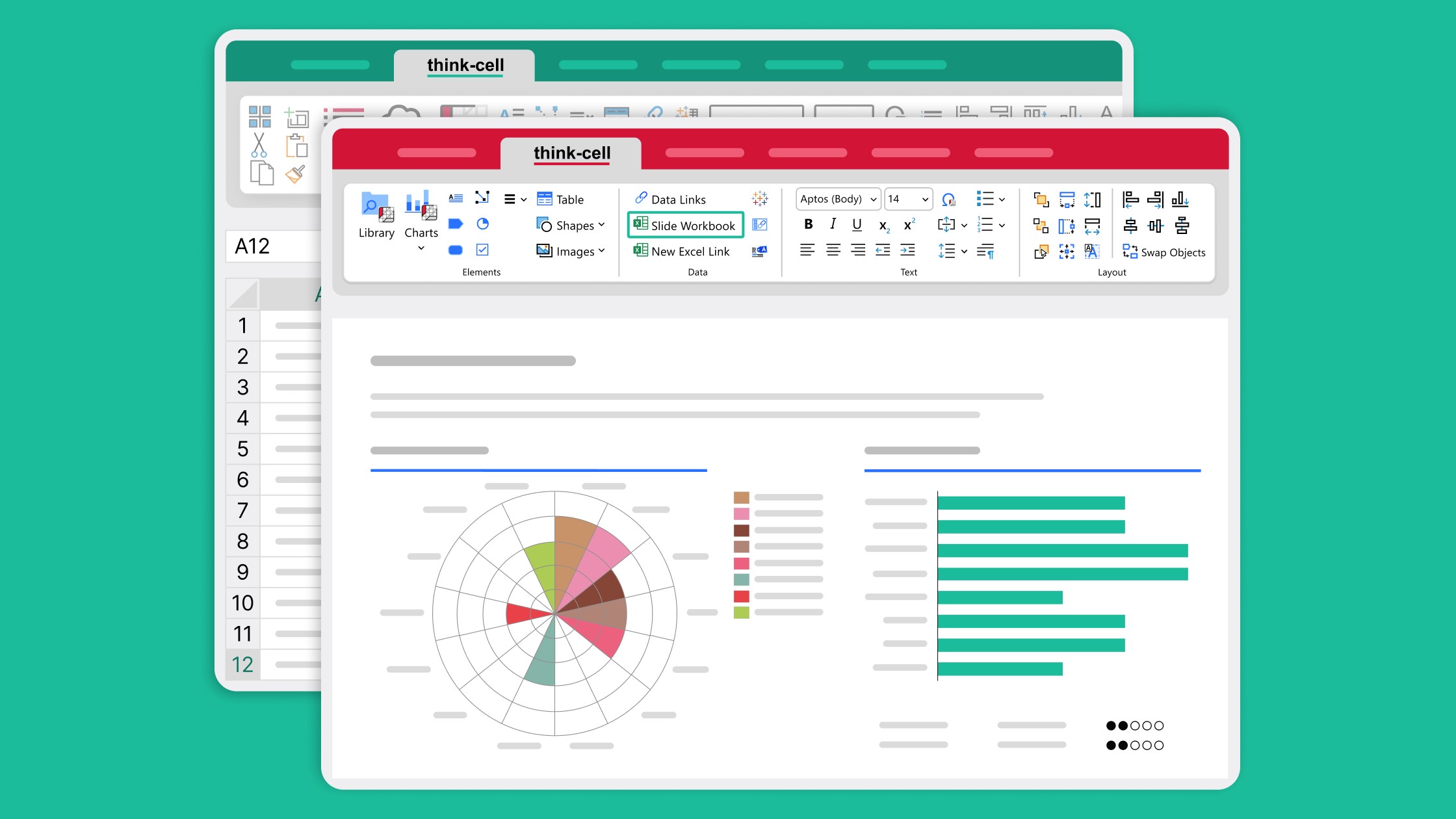
Learn how slide workbooks can change the way you build data-heavy presentations by combining the flexibility of ad-hoc datasheets with full Excel functionality.
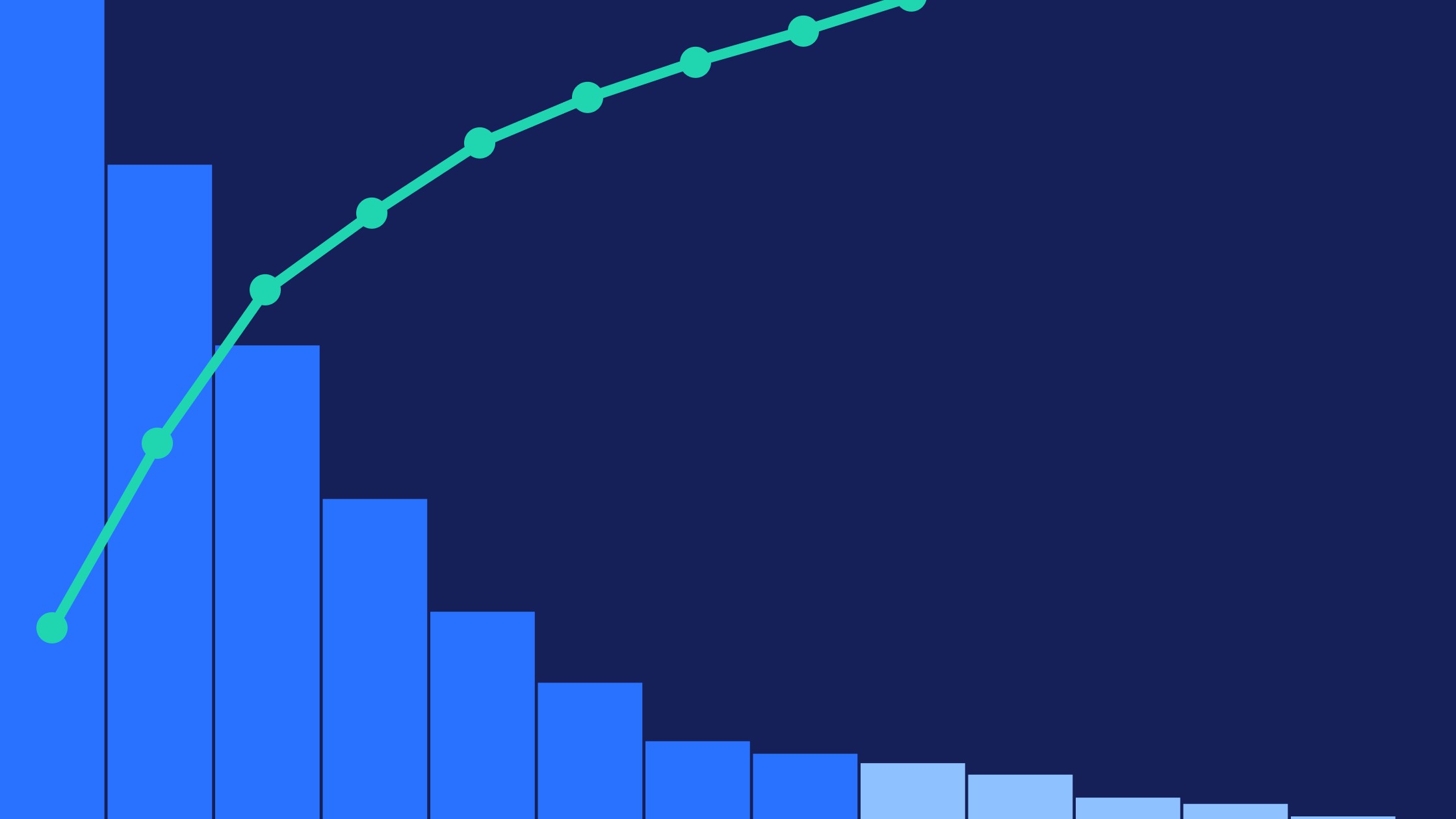
We walk you through the process of creating a Pareto chart, from structuring your data through to formatting and fine-tuning a professional data visualization.

Global survey of 1,200 professionals in 12 countries into how AI is used in presentation workflows.