How to tell a better data story one slide at a time
- Home
- Resources
- Content hub
- How to tell a better data story one slide at a time

15 min read — James Kashyap
Imagine presenting a complex slide full of data visualizations and your audience goes silent.
Are they collectively left speechless by the dramatic insights jumping off the slide? Or are they struggling to simultaneously listen to the speaker and figure out how what they’re hearing connects with what they’re looking at?
Realistically, it’s often the latter. Most data heavy slides don’t fail because they show the wrong data. They fail because they throw information at the viewer without telling a story.
With just a few changes, the delivery of many presentations could be significantly improved, leaving the audience with a shared understanding of the data and more importantly, a path to making an informed decision.
This guide will provide five practical improvements that you can apply to any data-supported slide:
Webinar: How to use data stories to craft more engaging narratives
Watch our pre-recorded webinar with Brent Dykes to learn how to tell data stories that keep your audience engaged.
What is data storytelling?
Data storytelling is a structured approach to communicating data insights using narrative elements and explanatory visuals.
As a data storyteller, the presenter can communicate insights that foster alignment and drive action. Instead of presenting all the available data in a cluttered dashboard and hoping your audience connects the dots, you present the data in a way that guides them to what’s important and to what you’ve identified as the key insights
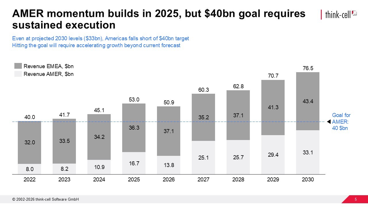
What makes a good headline for your slide
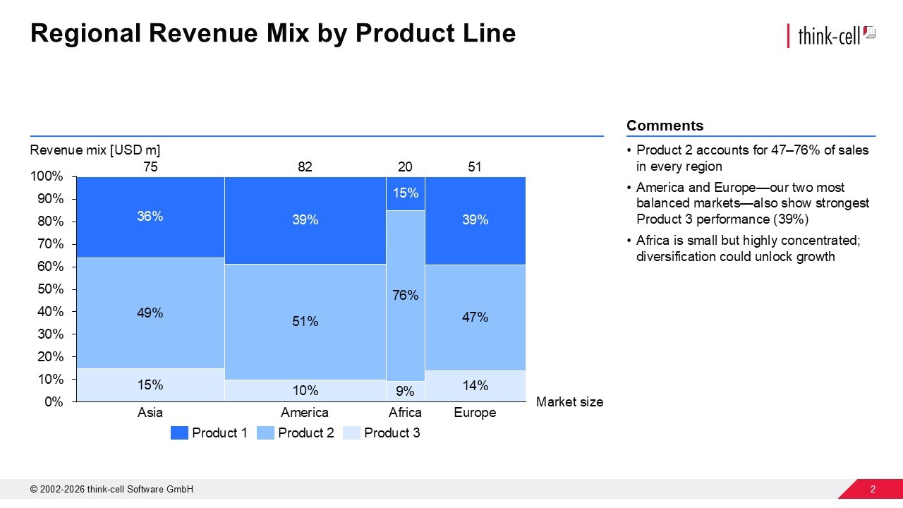
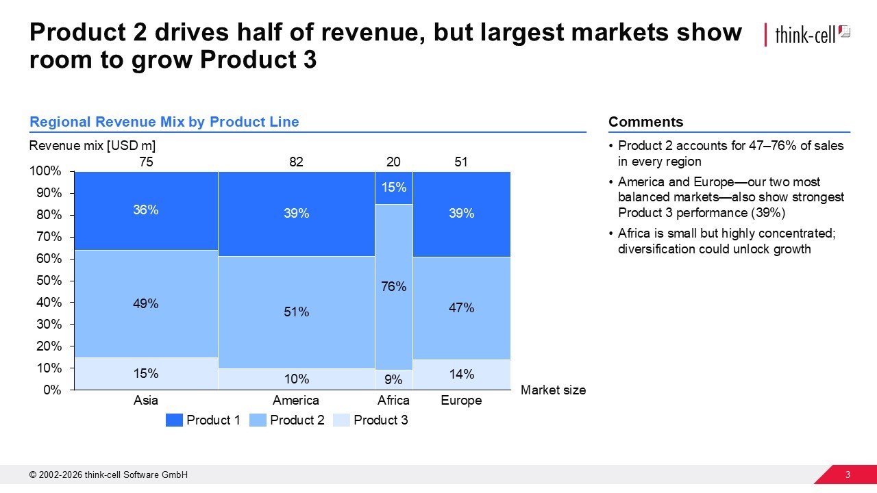
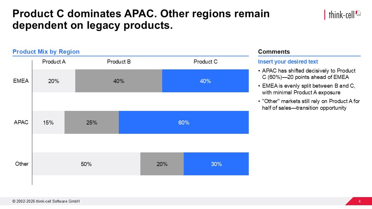
A good slide headline states the key takeaway, instead of merely describing the contents of the chart.
One incredibly common mistake with headlines is treating them like chart titles. So, you see slides titled: “Q4 Sales Results” or “Actual vs. Relative Value, USD.” This simply tells them what’s on your slide, not what’s important about the data you are displaying.
Instead, use an action title to immediately engage your audience with the slide’s key takeaway.
Write your next action title headline following these principles:
Find your slide’s core message.
- Use a strong verb.
- Tie it to the data your slide presents.
- Keep it concise.
- Ensure it flows with your deck’s narrative.
You can still have a chart title to identify the data you’re showing, but every slide needs an action title headline.
The state of AI in business presentation creation 2026
- Explore insights from 1,200 professionals in 12 countries.
- Understand current AI challenges and barriers to adoption.
- Inform decisions on how to integrate AI into your presentation workflows.

How to choose the right chart for the data you are presenting
Often a dataset can be visualized in many ways, so test different chart options until you find one that makes your main message clear for your audience.
Brent Dykes compares trying out different charts to arranging furniture. While you can plan in advance, you won’t know if you’ve made quite the right choice until you see the couch in your living room. The same applies to the chart you choose to visualize a dataset and highlight a certain insight. Experiment with different charts until the insight you want to communicate stands out clearly.

How to use color in your data visualization
Use color to highlight your main point, not to spice up your slide. A common mistake when creating charts is adding multiple colors for variety. While you may think more color means more clarity, it usually just creates noise that drowns out the message you’re trying to get across.
Take a more strategic approach. Add a single accent color to highlight the datapoints that supports your action title and leave everything else in more neutral tones.
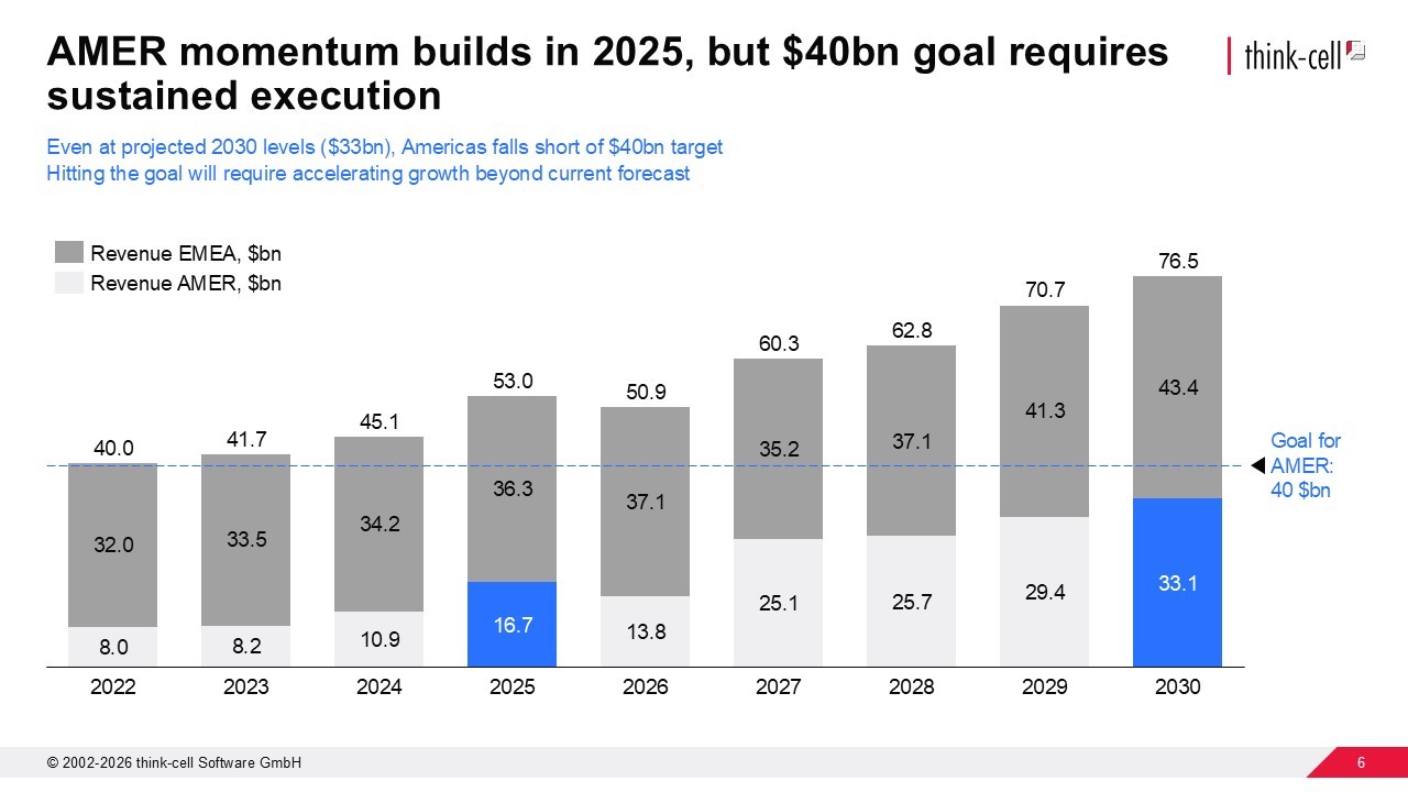
Color is one of your most powerful tools, so use it wisely for maximum storytelling impact.
Tell better data stories with think-cell
What graphical cues are and when to use them
Graphical cues are visual elements, such as arrows, circles, brackets, and boxes, that can be highly effective at directing your audience’s attention to a specific part of your slide.
For example, a well-placed arrow can call out an otherwise hard-to-spot anomalous datapoint that is key to the message you are trying to get across.
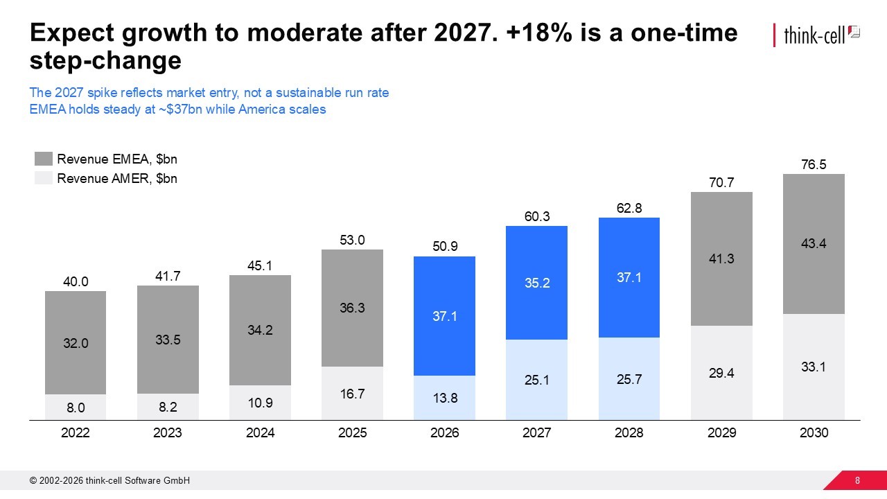
While impactful, use graphical cues sparingly. One or two well-placed cues will reinforce your message. Too many will make a mess of your slide and your audience won’t know where to look.
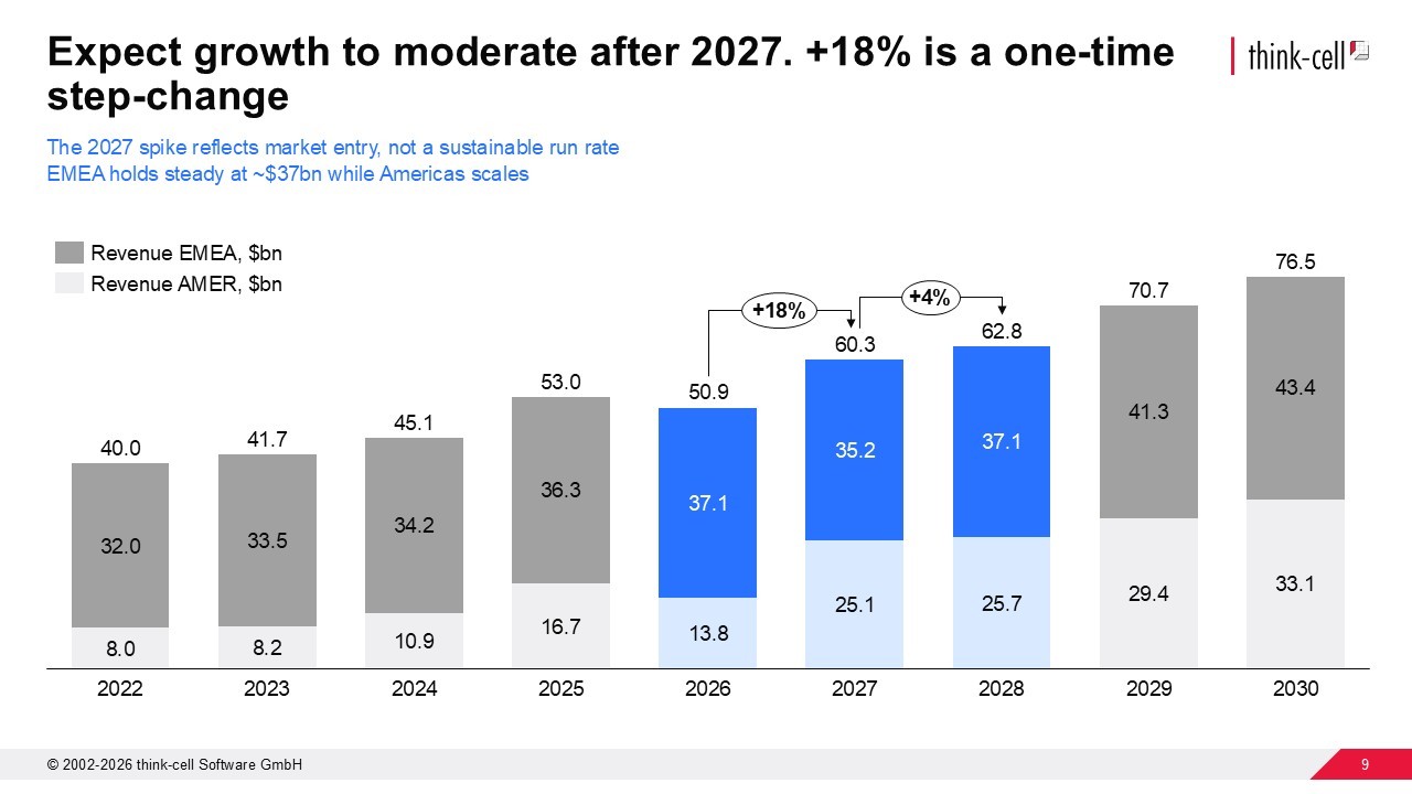
How to use annotations in your chart
While a difference arrow tells your audience where to look, an annotation adds an additional layer of insight that tells your audience what they’re seeing and why it matters.
In our Data Storytelling webinar, Brent Dykes identifies two kinds of annotations:
- Observational: States what a key datapoint shows. It gives your audience a what for the data.
- Additive: Provides context for the datapoint. It gives your audience a why for your data.
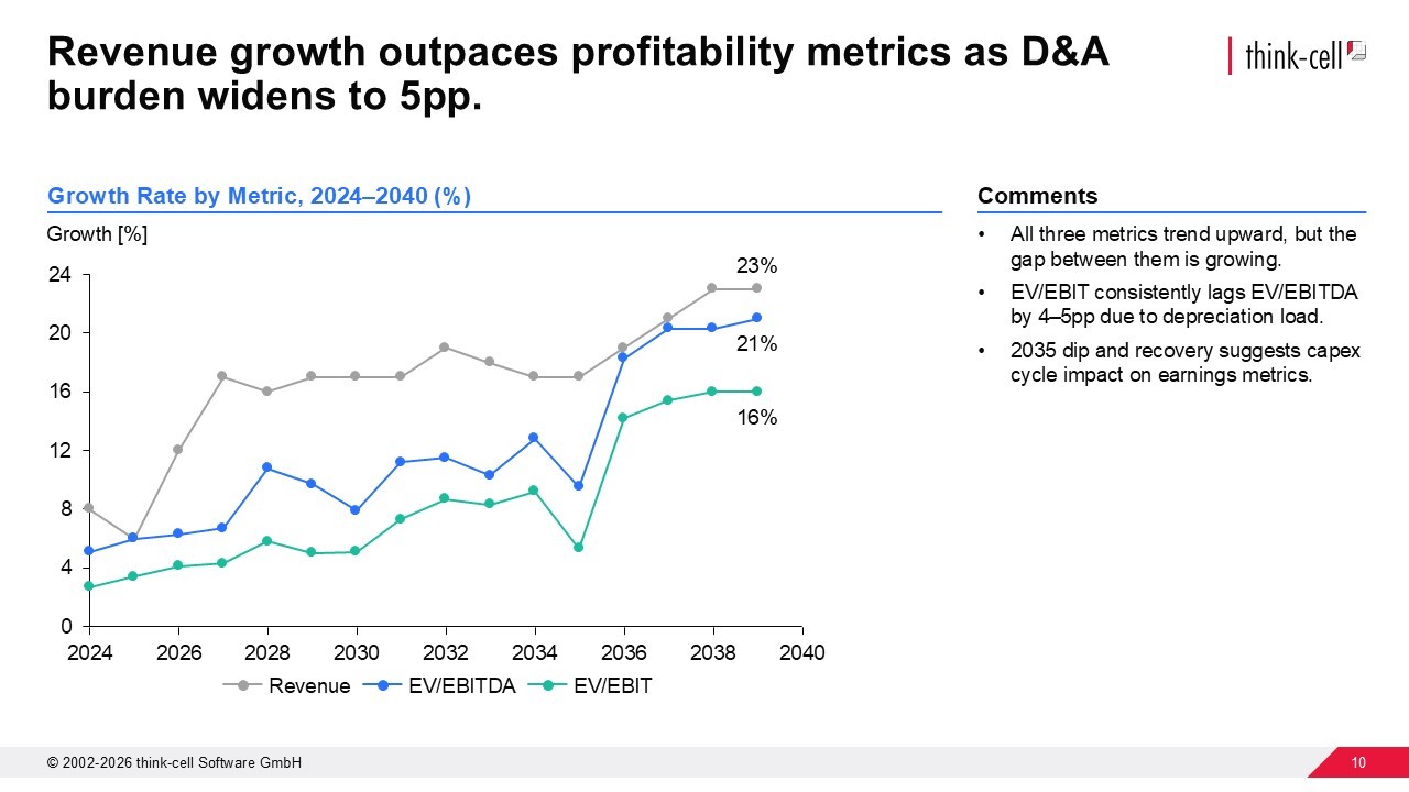
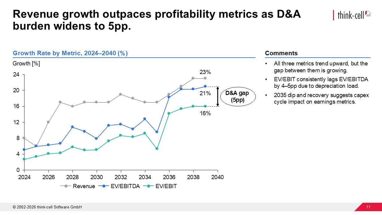
You won’t necessarily need both observational and additive annotations in your chart; this example works with an observational annotation. But, without any context for your data, your audience will be left to interpret or misinterpret the data.
Conclusion: Start your data story with one slide
To start telling data stories, pick one slide and apply Brent Dykes’ data storytelling elements:
- Headline: State the takeaway, not the topic.
- Chart: Test a few formats and pick the one that clicks fastest.
- Color: One highlight, everything else neutral.
- Graphical cues: One or two, maximum.
- Annotations: Explain what the data means.
Once you’ve got your first slide ready, you can continue slide by slide until you have a presentation that tells your audience a data story that will stick.
Tell better data stories with think-cell
- Create and test 40+ charts to find the right visualization.
- Add color with a tap to highlight your main message.
- Add CAGR and difference arrows that auto-calculate to tell your story.
Frequently asked questions about telling data stories with slides
What's the difference between a chart title and an action title?
A chart title labels the data ("Q4 Sales Results"). An action title states the insight ("Northern region underperformed after pricing change"). A chart title describes, while an action title tells the story.
Action titles use a strong verb, tie directly to the data, and are concise. They do the interpretive work, so your audience doesn't have to.
How do I know if I've picked the right chart?
You'll know you’ve picked the right chart because the insight you want to highlight is the one that stands out immediately. If someone has to study the chart to understand your point, or if their attention is drawn to a different conclusion, try a different chart type.
Brent Dykes compares choosing chart types to arranging furniture. You can have a floor plan, but you won't know if it works until you try it in the room. Same with charts. Test a few, live with each one for a moment, and you'll recognize the right fit.
Why is using too much color in charts a mistake?
Overusing color creates distraction because color is a signal, not decoration. When every bar is a different shade, you're telling your audience everything is equally important, which usually means nothing stands out.
The fix: highlight the one element that supports your headline. Make everything else neutral.
What's the difference between graphical cues and chart annotations?
Graphical cues, like arrows, circles and brackets, tell your audience where to look. Annotations add an additional layer of insight to the chart that tells them what they're seeing and why it matters.
Use cues sparingly, like one or two per slide, max. Use annotations to make sure your insight is both seen and understood.
What are the different types of chart annotations?
Brent Dykes identifies two kinds of chart annotation:
- Observational: States what a data point shows, such as Sales dropped 23% in March.
- Additive: Provides context from outside the data, such as Factory closed due to supply shortage.
You don't need both kinds of annotation on every chart. Just choose one to remove any room for misinterpretation.
Explore this topic further with AI:
Read more

Discover the best visualizations and charts for your slides that can tell a story and resonate with your audience.

Learn how to use Barbara Minto’s pyramid principle of communication to create better organized PowerPoint presentations that tell your story more effectively.

Learn about the MECE principle and examples of how to apply it, plus how to use it to create stronger PowerPoint presentations faster.

In this blog, we will explore the essential components, and the practical steps involved in creating compelling data-driven business stories.

Global survey of 1,200 professionals in 12 countries into how AI is used in presentation workflows.