In the world of data analysis and presentation, finding the perfect visualization to convey your message is key. It's not just about presenting numbers; it's about telling a story that resonates with your audience. Let's explore how you can find the right visualization, including charts, tables, and text, for your presentations.
Before diving into visualization options, it's crucial to understand the data you are working with. What are the key insights you want to communicate? Are there any patterns or trends you need to highlight? Let’s take a look at the table below, which showcases quarantine internet activities across different age groups during COVID.
Quarantine internet activities (%) across different age groups during COVID
Presenting a table with all the data in categories and series allows the audience to draw their own insights and conclusions. Rather than leaving it to the audience, the presenter should focus on conveying a key message and then use appropriate visualizations to support that message. For example, if the goal is to highlight that millennials spent the most time searching for COVID updates compared to other age groups, a column chart displaying this specific data point would be much more effective, as shown here.
Explore quantitative, qualitative, and text slides
Understanding the different types of slides and when to use them is essential for effective visualization. There are three main categories of slides: quantitative slides, qualitative slides, and text slides.
Quantitative slides primarily focus on presenting data using charts like bar charts, column charts, line charts, and others.
Qualitative slides, also known as conceptual slides or infographics, are used to present facts, build logical structures, and convey arguments. These slides include various chart types such as process cycles, organigrams, decision trees and Gantt charts, depending on the nature of the information being presented.
Text slides, which should be used sparingly, are reserved for presenting summaries or key points.
Understand attributes of quantitative charts
Knowing the attributes of common quantitative charts is crucial for presenting data effectively. The three most common charts for quantitative data are bar charts, column charts, and line charts.
Column charts are best suited for displaying development or growth over time, with years typically labeled on the X-axis.
Line charts excel in illustrating long-term trends and projections, making them popular for displaying, for example, stock data.
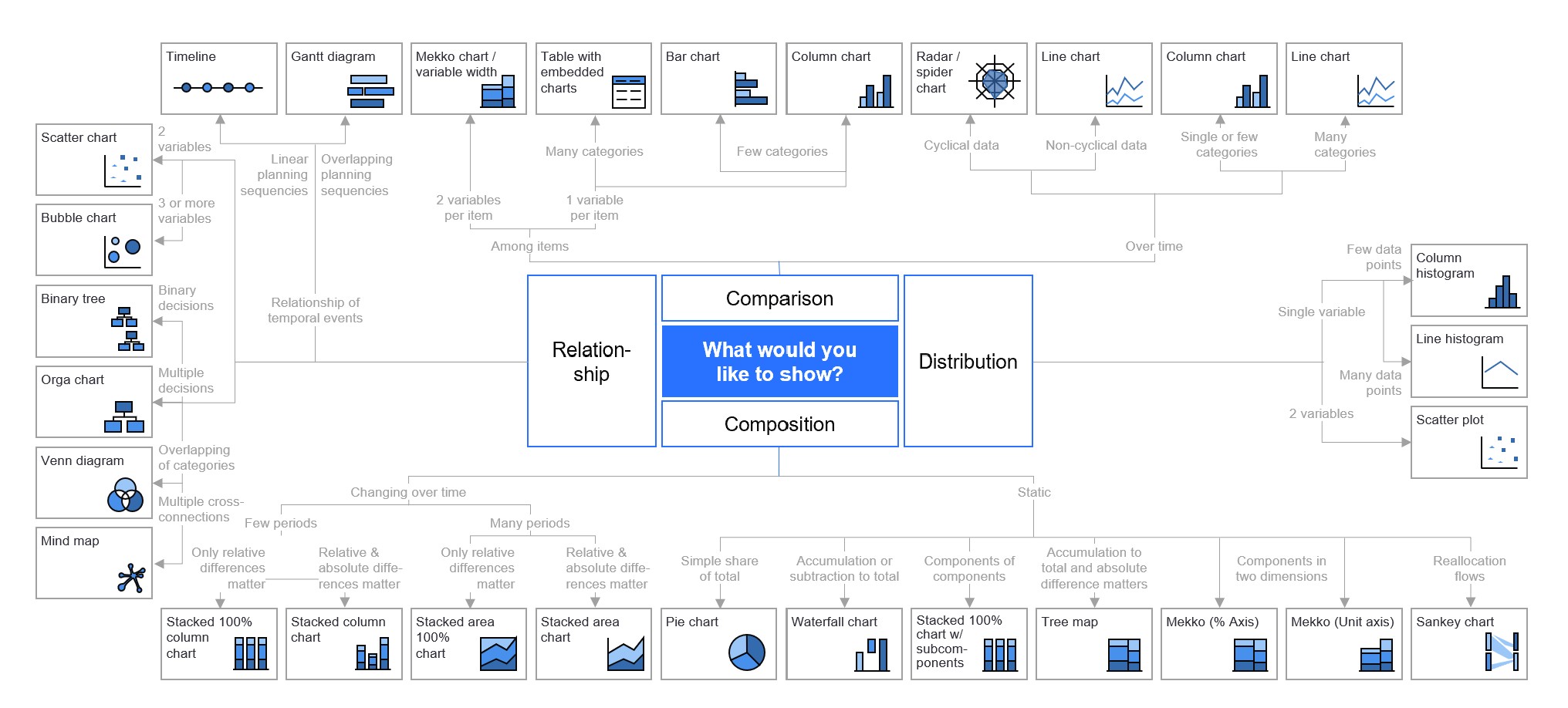
Ultimately, selecting the right chart type depends on the specific data being presented and the message the presenter wants to convey. Simple "chart chooser" tools available online can be helpful for individuals seeking guidance on selecting the appropriate chart type for their data. We highly recommend this tool from the Swiss Federal Statistical Office.
Chart choosers typically present a visual flowchart or provide a clickable decision tree that guides users through a series of questions about their data and intended message. By following the branches of the chart, users can narrow down their options and identify the most suitable chart type for their specific needs based on the chart’s attributes.
How AI helps you choose the right chart
Good data storytellers test their data with different chart types to fit their message to their audience's needs. In the age of AI, you do not have to do this alone. AI can help you interpret your data, test whether your narrative is strong, challenge your assumptions, and suggest whether your chosen chart is the best way to communicate the message.
For example, take a look at how thinkcell Assist, a set of AI tools designed to help make your best slides more effective, can help a user with chart-type-related questions.
With thinkcell Assist’s chat function integrated into PowerPoint, you can ask a prompt along the lines of “Is this the right chart type on the slide to show development or growth over time?”
In this example, thinkcell Assist notes that the stacked bar chart is not the ideal choice for showing development or growth over time. Instead, it recommends swapping the axes and using a separate series for each region or switching to a line chart. For each recommendation, thinkcell Assist explains why each chart is better.
Start building your best slides today with AI
Generate boardroom-ready charts from verified data sources or your own Excel.
Never leave your workflow: create, edit, analyze and translate from one interface in PowerPoint and Excel.
Try for free, no credit card required and no cancellation necessary.
thinkcell offers more than 40 professional chart types that can be added to PowerPoint slides. There are times when the chart you originally envisioned might not suit the data as well as you thought. If that happens, you can switch the chart type to another chart with these built-in conversion features.
How to switch between stacked, clustered, line, area and 100% charts
By selecting the chart and choosing the type from the mini toolbar, you can switch to and from the following chart types at the bottom of the toolbar:
Stacked column or bar
100% stacked column or bar
Clustered column or bar
Stacked area
100% stacked area
Line or profile
Net lines
This method only takes one click, so you can quickly experiment with all the different options and then revert to the one that best suits your data.
To rotate your chart, select the chart and drag the blue rotation handle. Red targets appear on each side showing the possible orientations you can drag the handle to.
How to switch between bar and column charts
Simply rotating your bar or column chart can make a big difference to the readability of your category labels.
To rotate your chart, select the chart and drag the blue rotation handle. Red targets appear on each side showing the possible orientations you can drag the handle to.
How to turn a series into a data table
Sometimes turning a series from your chart into a data table adds more detail while avoiding additional clutter. To do this, select Enable Data Tables for New Charts from the Tools menu in the thinkcell tab.
With the setting enabled, you can select data series to move from your chart to a table:
Insert a new chart, with a bar, column or line chart the most common options.
Right-click on the chart data that you want to display in a table.
Select Move to Table Row or Move to Table Column.
How to switch between scatter charts and bubble charts
You can convert a scatter chart into a bubble chart (and vice versa). Click on the chart to bring up the corresponding data sheet. Then, add or remove the values in the datasheet's "Size" column. Adding values to the size column converts the chart to a bubble chart. Removing the values turns it into a scatter chart.
How to switch between lines or columns in a combination chart
A combination chart uses lines and columns or bars in a single chart. You can change each series as needed. Select the series and then choose the type, whether stacked column, stacked bar, line, or profile.
Please refer to Combination charts in the user manual for more detailed instructions. Check this blog post to see how to create a Pareto chart, which is a specialized combination chart.
How to switch the value axis between absolute and percent
The position of segments, lines, and areas along an axis can be determined either based on their absolute values or on their relative (percentage) portion of the whole category. Clicking on an axis will bring up the mini toolbar.
On the Label Content menu, you can choose between Absolute and %. For additional details, refer to Adjust the value axis type in the user manual.
How to switch between a doughnut and pie chart
A doughnut chart is a variant of a pie chart, but just like the pastry it gets its name from, there’s a hole in the middle. The hole not only changes the aesthetic but can supply additional context by showing the total sum value.
To switch from a pie chart to a doughnut chart, click on the chart and drag the center handle inwards to create the hole. Drag it back to remove the hole and convert back to a pie chart. Read more about this process in our user manual.
Adjusting data to fit your chosen chart type
thinkcell Assist understands the layout of your data and recommends other chart types that might fit your data automatically.
In some cases, it might make sense to switch between chart types by creating the new chart next to the existing one and copy-pasting the data from the old datasheet to the new one.
Sometimes you may have to reinterpret the data. (e.g., in a bubble chart each data point has three dimensions (x, y, and size), while in a column chart it has only one dimension (y).)
If you want to explore multiple ways of displaying the same data, we suggest you use an Excel data link or a thinkcell slide workbook. You can create as many charts as you want, all linked to the same data range. This way, when data changes, all linked charts can be updated to reflect the change, and you can easily compare the results.
Depending on how you want to present the data, you may want to switch the series and axis. You can switch how thinkcell reads rows and columns from your Excel data, without changing the Excel file itself. You keep your spreadsheet structure as it is, while making the chart fit the story you want to tell.
To transpose a linked range, right-click the data link frame around the linked range, then select Transpose Link.
Transform text slides to qualitative slides
Text plays an important role in effective presentations, especially in summaries, but too much text can affect clarity. Transforming text into qualitative charts enhances the visual appeal of presentations. Take a look at the example of an overly text-heavy slide below.
Here’s the process for transforming a text slide to an effective qualitative slide.
Start by condensing the text to its essence, ensuring it is to the point.
Next, separate titles and text, arranging them like columns in a table, facilitating a structured layout. Applying the color scheme of the presentation adds coherence and reinforces branding.
Consult your slide library to select appropriate slide templates, which can then be customized to suit the content.
Highlight keywords to emphasize key concepts, aiding comprehension at a glance, especially for busy executives.
Enhance understanding with icons. A small disclaimer: Ensure you know your audience's preferences beforehand. Some people love icons, while others hate them. If you are unsure, it's better to avoid using icons in your first interaction with the audience.
Icons used on a slide
Choose the right visualization for engaging presentations
By following these steps, your slides can be transformed into engaging, informative visuals, ensuring effective communication of ideas and insights. By choosing the right chart, you’re able to tell an effective data story.
In conclusion, finding the right visualization for the information that you want to present requires careful consideration, experimentation, and iteration. By understanding your data, simplifying your message, enhancing it with color and icons, and tailoring it to your audience, you can create impactful visualizations that effectively communicate your message and insights.
Start a free trial and build polished presentations, faster
Create complex charts, like waterfalls and Gantt charts, in minutes.
Full access to 250+ slide templates, smart layouts tools, and automation.
Make your best slides more effective with AI tools build for slide work.
The importance of data visualization for business decision-making
Understand the importance of data visualization for business decision-making and learn how to visualize business data to make your presentations more impactful.
Choosing the right presentation library: From templates to icons
Learn how to evaluate the most important features for choosing the best possible presentation library, including templates, images, and other visual assets.