How to develop and automate financial planning & analysis dashboards
- Home
- Resources
- Content hub
- How to develop and automate financial planning & analysis dashboards
12 min read — Akash Choudhary
Dashboards are an essential financial planning and analysis (FP&A) reporting tool that managers use to review metrics and make decisions quickly. In the past, creating FP&A dashboards required specialist staff to build reports using custom spreadsheets or tools.
This has changed dramatically in recent years. With improved software, growing data literacy, and more accessible data, anyone can easily develop automated FP&A dashboards that can help drive business decisions.
In this article, we look at how to develop valuable FP&A dashboards, we explore the importance of automation for accurate financial reporting, and we show how think-cell can meet the FP&A needs of companies who aren’t yet ready to invest in a costly ERP software solution.
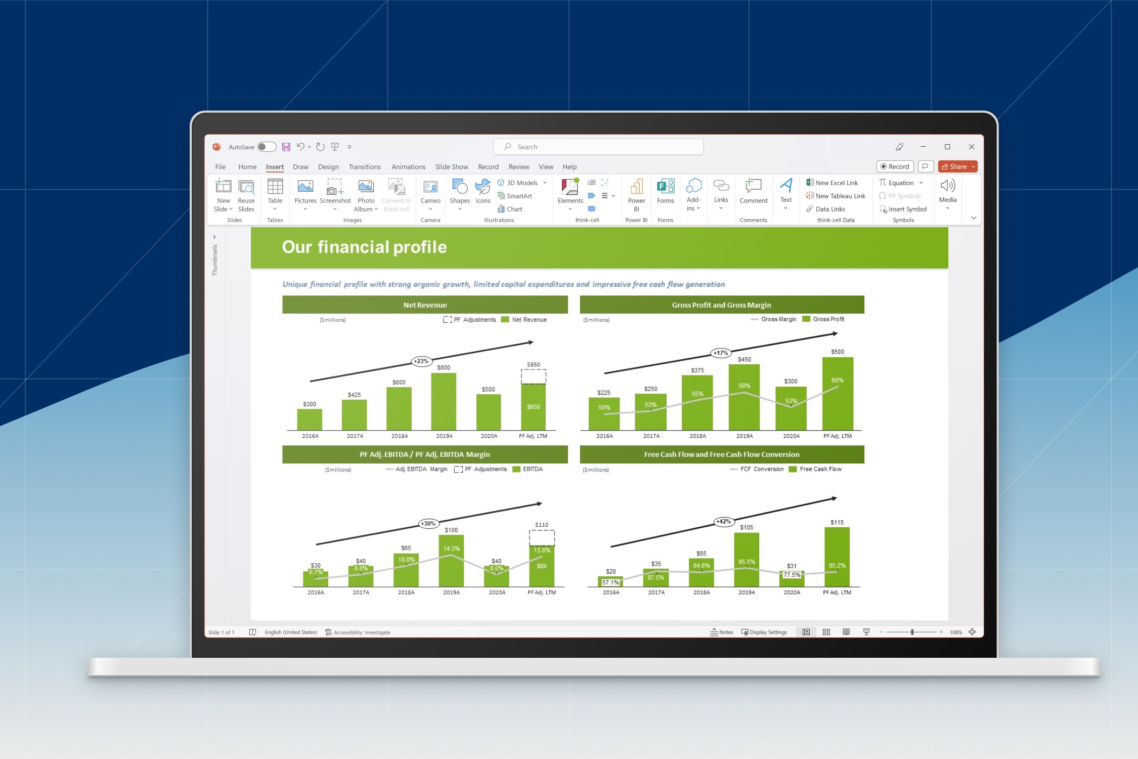
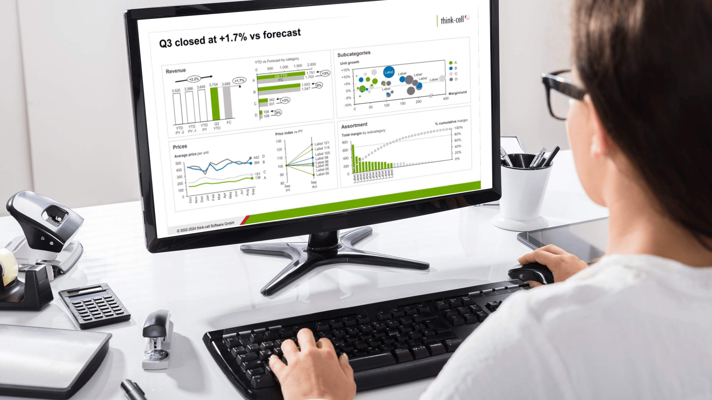
think-cell’s advanced Excel links and industry-leading charts make it easy to automate all kinds of financial reports and dashboards. Download a free trial to try it yourself:
What are FP&A dashboards?
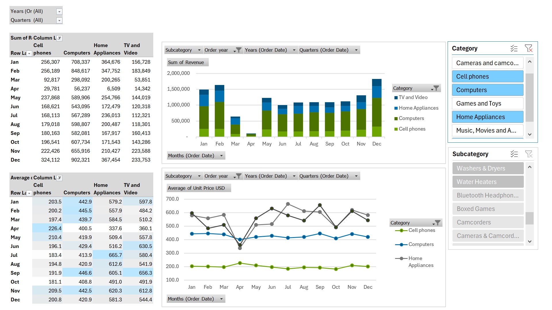
FP&A dashboards have evolved from a collection of Excel tables and graphs to advanced visualizations built with dedicated software. Another development in the use of FP&A dashboards concerns their scope. As the role of FP&A has grown within companies, reports have also expanded to include key performance indicators (KPIs) from other departments, as well as the core financial numbers.
To provide the context a decision-maker needs, FP&A dashboards might include KPIs related to pipelines, marketing campaigns, supply chain performances, and more. FP&A dashboards can play a key role in helping businesses understand the interconnectivity between different KPIs and functions.
Principles of good FP&A dashboard design
While FP&A dashboards have the specific aim of making financial planning and analysis insights accessible, they are still dashboards. As such, many of the principles of good data visualization—and specifically good dashboard design—also apply in an FP&A context.
One important work on dashboard design that is still referenced today is Stephen Few’s 2006 book, "Information dashboard design: the effective visual communication of data." Few’s definition of a dashboard includes the following criteria:
- It should be a visual display of the most important information needed to achieve objectives.
- It should be consolidated on a single screen.
- It should be monitored and understood at a glance.
In addition to these fundamentals of dashboard design, there are some more practical features of data visualizations that are needed to provide value in a business context, with FP&A again being no exception:
- Data accuracy: Any chart, report or dashboard that shows wrong data is useless at best, and harmful at worst.
- Automation: Dashboards are most helpful when they update automatically with their data source. Manual steps slow businesses down, and create the possibility of the dashboard being viewed with out-of-date information.
- Brand compliance: FP&A dashboards that are shared with decision-makers have enhanced credibility if they reflect the brand’s visual identity. Mismatched colors and fonts lower trust in the overall presentation and can create distractions that get in the way of making effective business decisions.
Adhering to the principles of good dashboard design requires a combination of understanding how to apply them and choosing the right software solution to make it possible. One of think-cell’s strengths when building dashboards is its powerful Excel links, which have several advantages over PowerPoint’s native solution.
Theoretical framework for developing FP&A dashboards
Thorough planning is vital for ensuring your FP&A dashboards fulfil their ultimate objectives and provide the business impact to justify their development. To aid planning and check that all relevant aspects are considered, it can be useful to follow a set framework, such as the following:
- Define the audience of your dashboard
- Identify the objectives of your FP&A dashboard
- Select the data to include in your FP&A dashboard
- Collaborate with other functions on dashboard design
1. Define the audience of your dashboard
The first step to creating an impactful FP&A dashboard is the same as for almost any report, data visualization or presentation: know your audience. It’s a cliché, but it’s crucial to begin by clearly identifying who you are building the dashboard for, and how your audience will interact with it.
Some dashboards are built primarily for exploration, which means giving your user access to filters and slicers. Others are built to be presented in a more static state that highlights the key findings of an analysis. How your audience is going to consume the information is of fundamental importance for dashboard design.
By answering these questions, you can refine the scope and content of your dashboard, ensuring that it provides relevant and valuable insights, without distracting from the key messages with unnecessary options or datapoints.
Let’s say that you aim to improve sales efficiency by creating a sales performance dashboard. Your audience could be made up of different people, each of whom is interested in the dashboard for their own reasons:
- Sales representatives need individual performance metrics and pipeline analysis.
- Regional managers require insights into regional performance and revenue.
- The sales director needs a high-level overview of overall sales performance.
Considering each audience's specific needs will help you provide relevant insights and support data-driven decisions to boost sales performance. However, you will only get this right if you plan for it from the outset. The complexity of FP&A dashboard design, particularly when combining multiple data sources, means that late changes to appease a particular stakeholder can be costly to implement and derail the project.
With the right planning, you have a better chance of spotting challenges early on before you have made any expensive decisions. For example, you might decide to create separate FP&A dashboards highlighting different aspects of performance, which is the kind of decision you want to make as early as possible in the process.
For more insight into the difference between exploratory dashboards and charts built for ad-hoc presentations, you can read our article on using Excel pivot tables in PowerPoint presentations.
2. Identify the objectives of your FP&A dashboard
Showing the information needed to achieve the dashboard’s objectives was the first of Stephen Few’s design criteria. So, before you can identify which information is most important, you need to define what your dashboard’s objectives actually are.
You can explore and define objectives by addressing the following issues:
- Timeframe: Is your dashboard reporting on short-term targets, such as the current month or quarter, or is it supposed to provide insights for the whole budget cycle?
- Forecasting and benchmarking: What is your dashboard tracking and is it supposed to forecast future performance? For example, a dashboard can track actual sales versus forecast, monitor sales quota achievements, compare company performance to industry benchmarks etc.
- Breadth and depth: Are you creating the dashboard to share operational KPIs with operational teams or are you providing enterprise-level metrics for the C-suite and board of directors? For example, regional management teams may require in-depth views of different markets, while the C-suite and the board of directors might be more interested in a dashboard showing daily revenue trends.
- Reproducibility: Is this dashboard a one-off or is it part of a series? If you are creating multiple dashboards, it may help to create a template of a dashboard that contains a similar, coordinated layout. This will speed up your development process and make it easier for users to compare metrics from different dashboards, should the need arise.
A good approach to defining objectives is to consult your audience and ask them to be as concrete as possible regarding the questions they have. If your FP&A dashboard can provide answers to your audience’s questions, there’s a very good chance it’s fulfilling its objectives.
3. Select the data to include in your FP&A dashboard
Based on your objectives, you should be well placed to define which data to include in your FP&A dashboard. You can divide dashboard data into two tiers of information:
- First-tier data should include KPIs that are critical to the business. For example, revenue trends, margins, pipeline, etc. These are KPIs that are not likely to change often.
- Second-tier data may be KPIs that can change as the business switches its focus. Dashboards can include data for various business drivers, for example, pricing, marketing investments, forecast accuracy, etc. Dashboards should be flexible enough to accommodate short-term initiatives, and such flexibility can only result from proper planning at the outset.
Many dashboards will include a combination of first and second-tier data, both of which can be FP&A metrics or KPIs related to other functions. In all cases, it’s crucial that the data you present is relevant to your audience and supports your dashboard’s objectives. Challenge the inclusion of any KPIs and confirm that they are helping to effectively measure progress, provide meaningful insights and support informed decision-making.
4. Collaborate with other functions to design the dashboard
FP&A mustn’t operate in a silo. To support different business functions in tracking their KPIs, FP&A professionals should work with other teams, including them as much as possible during the design phase. For example, in fast-moving consumer goods (FMCG) industries, the forecasting of production and inventory levels are heavily reliant on sales forecast by each product segment.
On the one hand, the forecasting of product sales will roll up and become the sales forecast. At the same time, the product sales numbers are needed by supply chain teams for production planning and inventory management. FP&A professionals need to understand how dashboards can provide each function with the data they need to support their specific activities.
Implementation of your FP&A dashboard
Once you have gathered all the information you need about your audience, objectives and data, and included input from all stakeholders, you are ready to build your FP&A dashboard. Here, we’ll run through things you can do to make your dashboard a success and provide real value to your business.
Ensure data integrity for consistent financial reporting
One common mistake is that teams may use different data sources for the same KPIs. For example, FP&A may use data from the accounting system to report marketing spend, while the marketing team may monitor campaign spending with another system, and aggregate this as their marketing spend.
When different teams use different data sources to report on the same KPI, the discrepancies can undermine people's confidence in your dashboard. This harms your personal credibility and negatively impacts usage of the dashboard. To ensure consistent financial reporting, it’s the FP&A team’s responsibility to provide clear definitions of KPIs and ensure that all teams use the same data source.
Add value by providing insights
Dashboards provide quantitative data. The FP&A team should analyze this data so they can provide commentary and identify actions that could be taken to double-down on successful initiatives or course-correct. FP&A professionals can provide added value by linking data points and advising management in their decision-making, or helping different functions coordinate their efforts to achieve broader company goals.
Educate your audience to encourage dashboard use
You’ve spent time and effort creating a dashboard, but you’re leaving this investment on the table if the dashboard isn’t used. The FP&A team should lead by example, using the dashboard to drive conversations and planning discussions. For example, it should form part of the regular reporting in presentations and forecast reviews.
If the FP&A dashboard isn’t getting as much traction as you hoped, you should aim to establish why. It’s possible that a quick training session is all it takes to help stakeholders understand the value they can extract from the dashboard, and start using it more often in their decision-making.
Exercise quality control to maintain trust
Maintain trust by ensuring that dashboards go through a quality control process before they are shared with others, even within the FP&A team. There should be a clearly defined quality control step, possibly with a series of mandatory quality checks, and including the person responsible. Your FP&A dashboards will likely evolve over time, so it’s vital that data integrity is maintained as visualizations are added or adjusted.
The importance of automation in your FP&A reporting
Every manual step involved in updating your FP&A dashboard is a potential source of errors that can damage your credibility and lead to incorrect conclusions. That’s why automation of data updates in your FP&A dashboards is so critical for ensuring consistent financial reporting.
If you are using PowerPoint to present a dashboard with financial reports, budget forecasts, performance metrics, and other KPIs, you need to be confident that what you are presenting is consistent with the underlying data. This is only possible with automation.
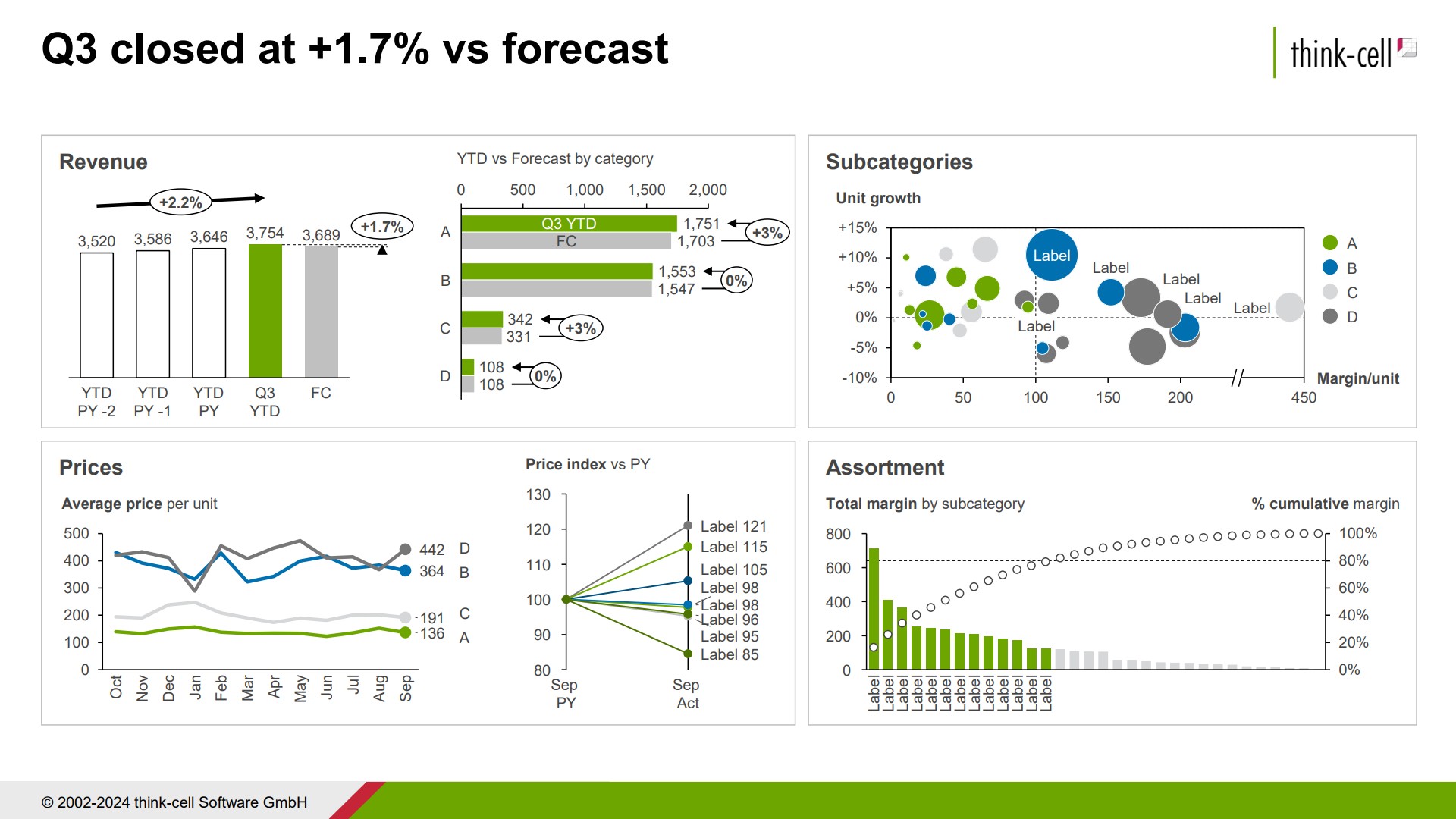
With think-cell, users can link their dashboard presentations, whether they contain charts, tables, CAGR lines, or text-based annotations, to the underlying data sources in Excel or Tableau. This enables automatic updates of the dashboard whenever new data is available. As a think-cell user, you save time and manual effort, and ensure that your entire dashboard always provides your audience with accurate and up-to-date visuals for financial analysis and reporting.
You can try think-cell for free by downloading a trial license, complete with a range of dashboard templates and all automation features:
Recent trends that are impacting the future of dashboards
Here, we’ll look at a few trends that are impacting how FP&A dashboards are developed and affecting how they are used.
Increased involvement of FP&A teams in integrated FP&A
As integrated planning becomes more common, more functions will build dashboards to provide the next level of data. FP&A professionals must understand how this data is issued and keep track of data integrity to avoid disparities. This objective can be accomplished by working with different functions and incorporating data through drilldowns of the KPIs that are presented in the higher-level dashboards.
Use of artificial intelligence (AI) to create dashboards
With the ongoing development and continued interest in ChatGPT and similar generative AI resources, creating dashboards using AI will become mainstream, as even non-experts feel they are able to easily and quickly build dashboards to showcase their data.
While AI can help in preparing dashboards, it’s important to remember the principles of good FP&A dashboard design discussed above, and follow the framework for good dashboard development. If the AI tool isn’t given sufficient information about your audience and your objectives, it might produce something pretty, but it won’t be able to build anything of real value.
Also be aware of the limitations of AI’s analysis capabilities. AI can calculate simple metrics out of context like forecast against budget or year-over-year-growth, but your FP&A experts can offer much more value. FP&A professionals can provide context to the narrative, explain how external factors impacted a particular market, or anticipate how upcoming events might affect sales performance.
As always, AI can help save time and eliminate errors in calculations, but your most valuable insights will likely come from your FP&A experts. And as always, it’s important to add a fact-checking process to any insights achieved via AI sources.
Increased availability of self-service dashboards
With tools such as PowerBI and Tableau, more functions are building dashboards. FP&A should work with any teams building dashboard to ensure that data sources are consistent and sandboxed. This will reduce the risks of data disparities across dashboards. FP&A should provide quality control and standardize the definition of KPIs and terms to ensure consistency and minimize miscommunication.
Using think-cell for automated FP&A dashboards
Many companies understand the value of consistent FP&A dashboards, but they don’t yet have the scale and resources to invest in an ERP solution. Even with skilled staff and the best intentions, cobbling together dashboards in Excel can be frustrating and error-prone, and often fails to result in a dashboard that is used regularly and impactfully.
With think-cell, companies can easily create FP&A dashboards that are automated, attractive and fully integrated into their financial reporting. You can see how easy it is to build dashboards with think-cell by downloading a free trial today:
Explore this topic further with AI:
Read more

In this blog, we will explore the essential components, and the practical steps involved in creating compelling data-driven business stories.
Learn to turn your Excel pivot table analysis into professional charts you can insert into PowerPoint for automated reports and insightful ad-hoc presentations.
Understand the importance of data visualization for business decision-making and learn how to visualize business data to make your presentations more impactful.

FP&A scenario management is an essential mindset that modern organizations should adopt to plan and make quick, informed decisions in an uncertain environment. This blog offers guidance on how to move to a more agile and adaptable scenario management.
Discover more than 70 PowerPoint slide templates that help you get started faster and cover all the most common business presentation scenarios.