Expert guide to trendlines in charts
- Home
- Resources
- Content hub
- Expert guide to trendlines in charts

20 min read — Anthony Karge
Trendlines in a chart help visualize the direction of data. A scatter chart (also known as a scatter plot) with hundreds of data points can be difficult to follow without a line making trends evident. Trendlines can identify patterns, make forecasts, and communicate data clearly. This is why they’re widely used not just in academic settings, but also in business.
Trendlines are only effective if you know which types are best for your datasets. Most people are familiar with a linear trendline that shows steady, consistent growth or decline. Exponential growth is also a straightforward concept, whether you have a math background or not. However, there are other trendlines best suited for specific situations.
Choosing the wrong trendline misleads more than it clarifies. When the right type of trendline is used, audiences quickly grasp whether the data shows a steady decline, rapid growth, or a more complex trend.
This article will show you the most common trendlines and also how to add them to Excel and PowerPoint with think-cell.
Advantages of trendlines
Trendlines show you the overall direction of data and not just the individual data points. These are especially beneficial when data is volatile or the trend isn’t immediately obvious when you are looking at a large number of individual datapoints.
Using trendlines correctly can:
- Reveal the underlying patterns in potentially noisy data.
- Highlight relationships between variables to see how one affects the other.
- Support accurate forecasting and projections.
- Identify outliers and deviations from the trend.
- Strengthen data storytelling and communication.
Build professional charts in seconds
- Download a free trial for faster creation of 40+ chart types.
- Auto-generate trendlines, annotations, and calculations. No formulas needed.
- Work seamlessly with Excel data links for automated reporting.
Types of trendlines in scatter charts
Trendlines are commonly used in scatter charts but can also be useful in bubble charts and line charts. Below are the most widely used trendlines in scatter charts with examples.
Linear trendlines
This is the simplest and most common trendline, showing a straight line through the data. It’s easy for an audience to interpret.
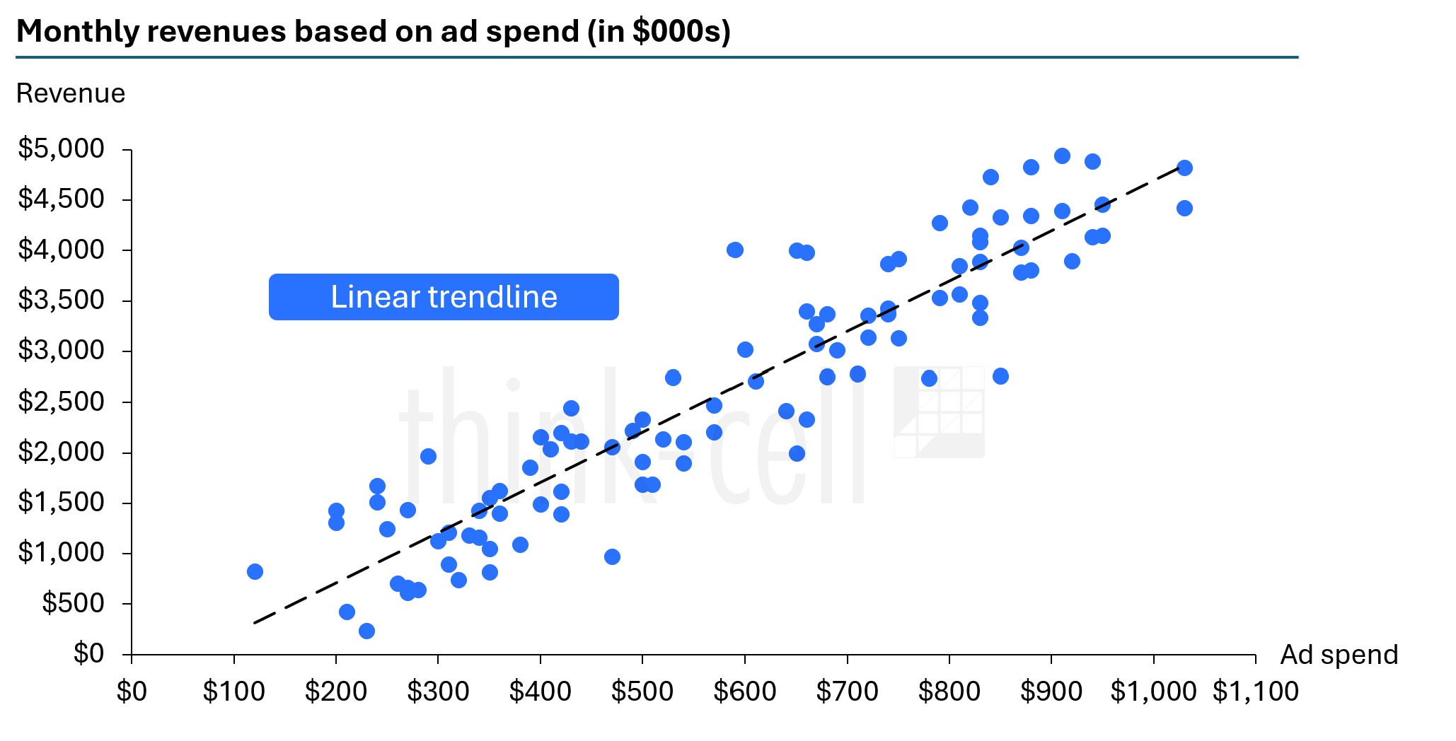
Linear trendlines work best for data that increase or decrease at a steady, consistent rate. Some real-life examples include:
- Linear (or straight-line) depreciation is used in accounting, where an item’s value is depreciated by the same amount each time period until reaching zero.
- Distance vs. time when an object is moving at a constant speed.
If the data is wildly divergent or levels off before or after rapid changes, then other trendlines are better suited.
Power trendlines
A power trendline is a curved line that shows a relationship in which one variable scales proportionally with another. Linear trendlines are either additive or subtractive, while power trendlines are multiplicative.
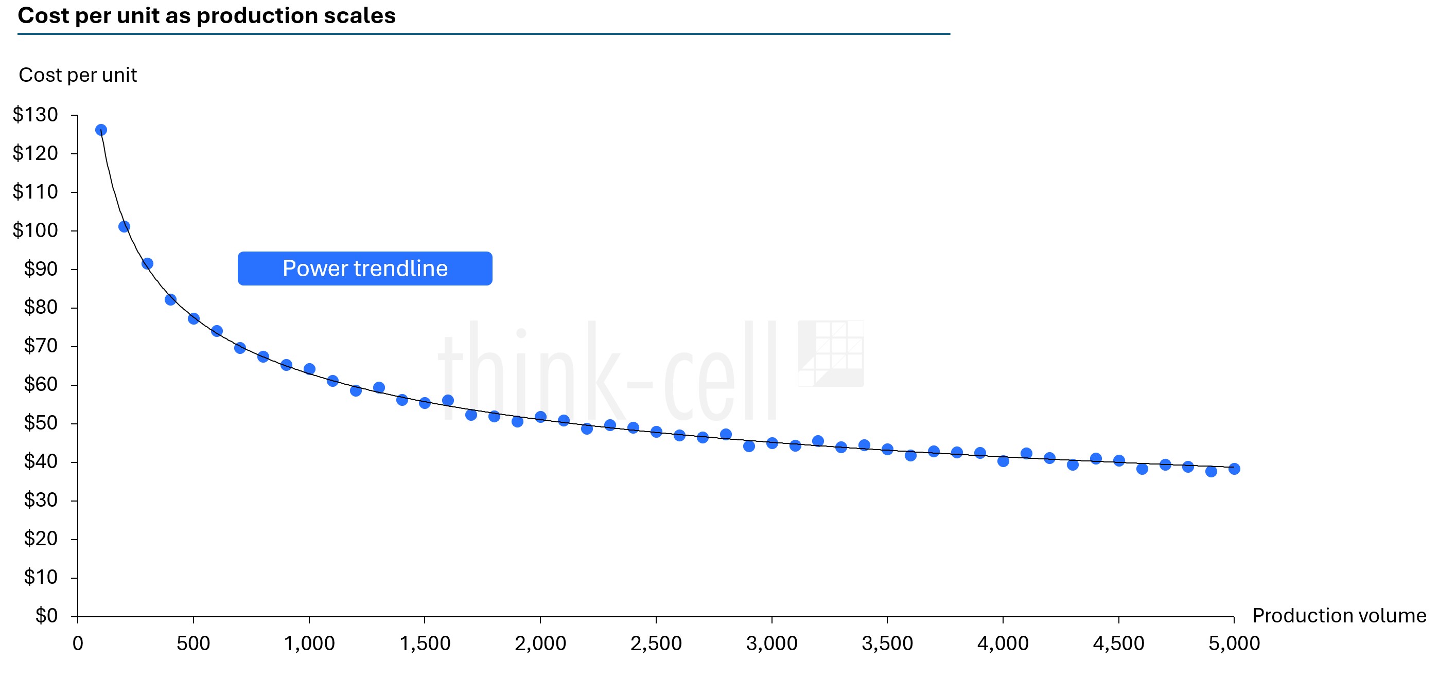
A power trendline could be used in business to show economies of scale (e.g., doubling production would cost only 1.5X more, rather than twice as much). However, if the growth rate is accelerating, an exponential trendline might be a better fit.
Exponential trendlines
An exponential trendline works best when data compounds proportionally to the previous value. The increases or decreases are at a constantly growing rate, leading to massive changes from the initial values.
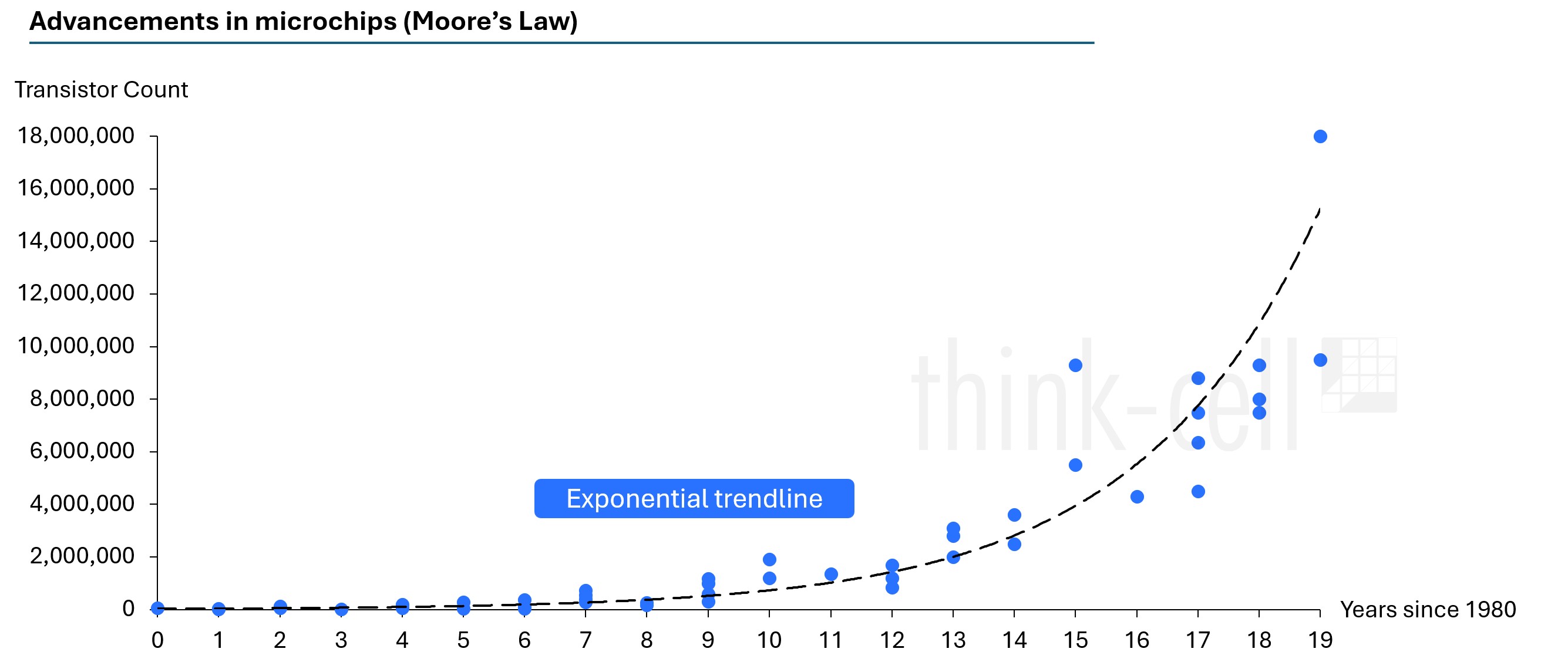
Think of compound interest, for example. The portfolio value grows exponentially over time when returns are reinvested. Looking at certain time frames in history, the human population grew exponentially. In science, bacteria can also grow exponentially.
Logarithmic trendlines
In a logarithmic trendline, growth is rapid and then slows down – a classic case of diminishing returns. It can also be the opposite, where the decline is fast and then slows over time. This trendline is best used when the biggest changes happen early and then the data plateaus.
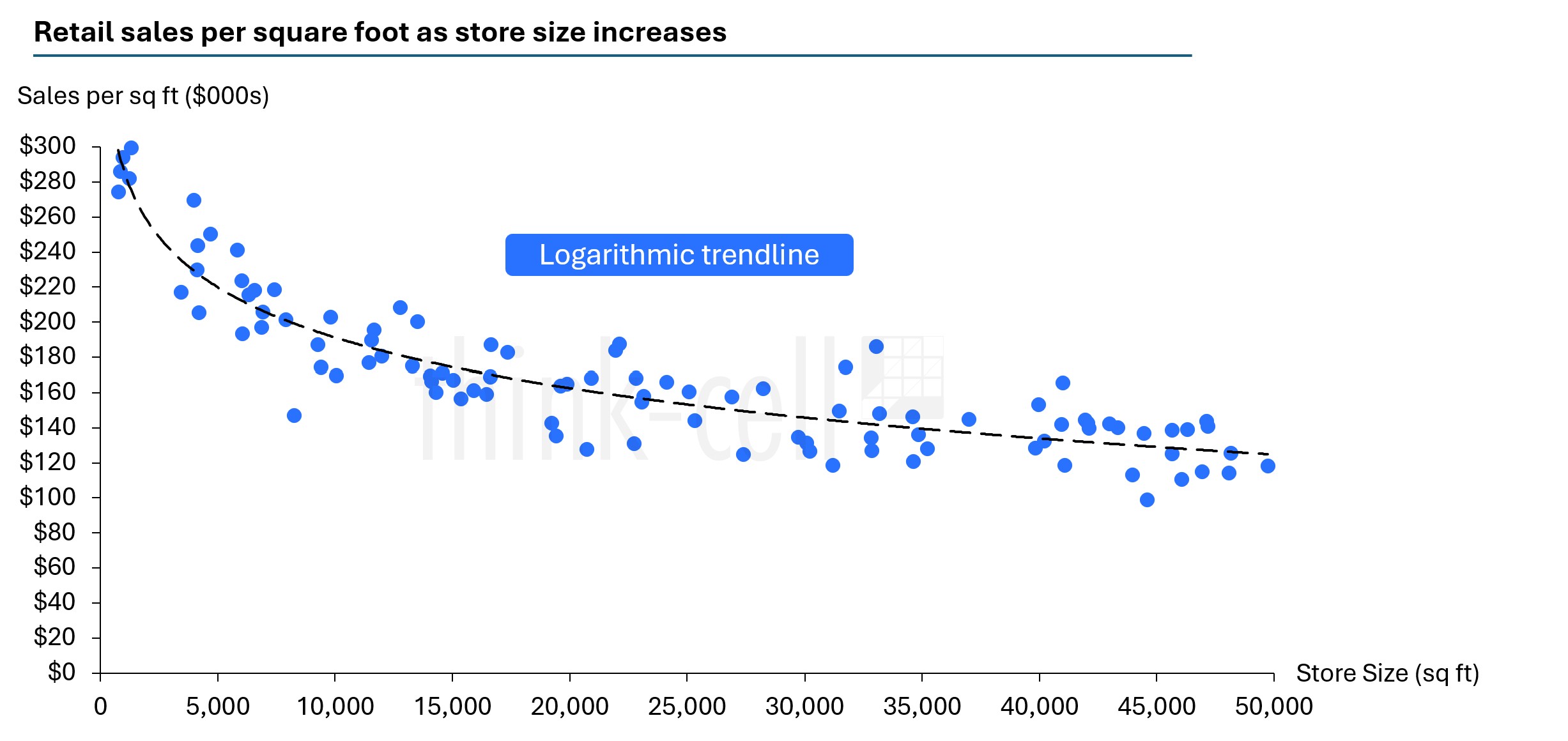
While the example above might look similar to a power trendline, logarithmic trendlines assume increases or decreases by a fixed amount. Power trendlines assume increases or decreases by a consistent percentage.
Logarithmic growth or decline never stops but slows over time. Think of a learning curve when it comes to gaining new skills. Gains are fast at first, but slow down over time. Sometimes in product adoption, the “low-hanging fruit” users can be converted, but it gets difficult to convert the more challenging prospects.
Quadratic trendlines
A quadratic trendline is a type of polynomial trendline. Polynomial trendlines are curved lines for non-linear data relationships and fit a polynomial equation (e.g., ax2+bx+c = 0).
You don’t need to know complex algebra to understand polynomial trendlines. A quadratic trendline shows a single curved arc in the data, either as a U-shape (the data falls and then rises) or an inverted U-shape (the data rises and then falls).
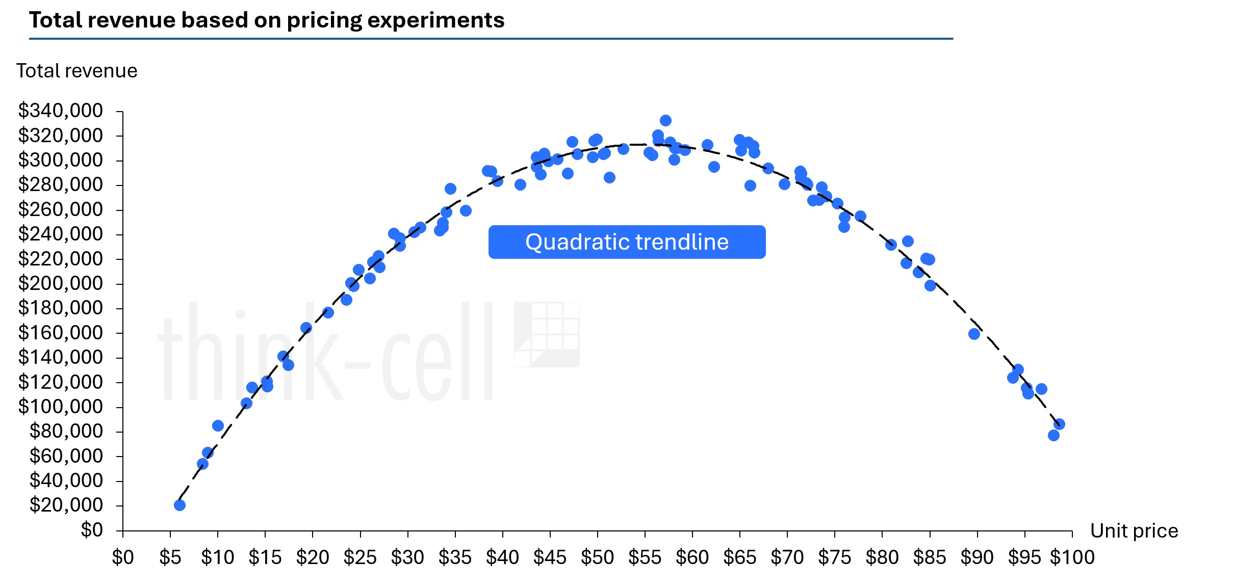
Quadratic trendlines are best used when the data has a turning point.
Cubic trendlines
A cubic trendline shows a bend or change of direction in the data.
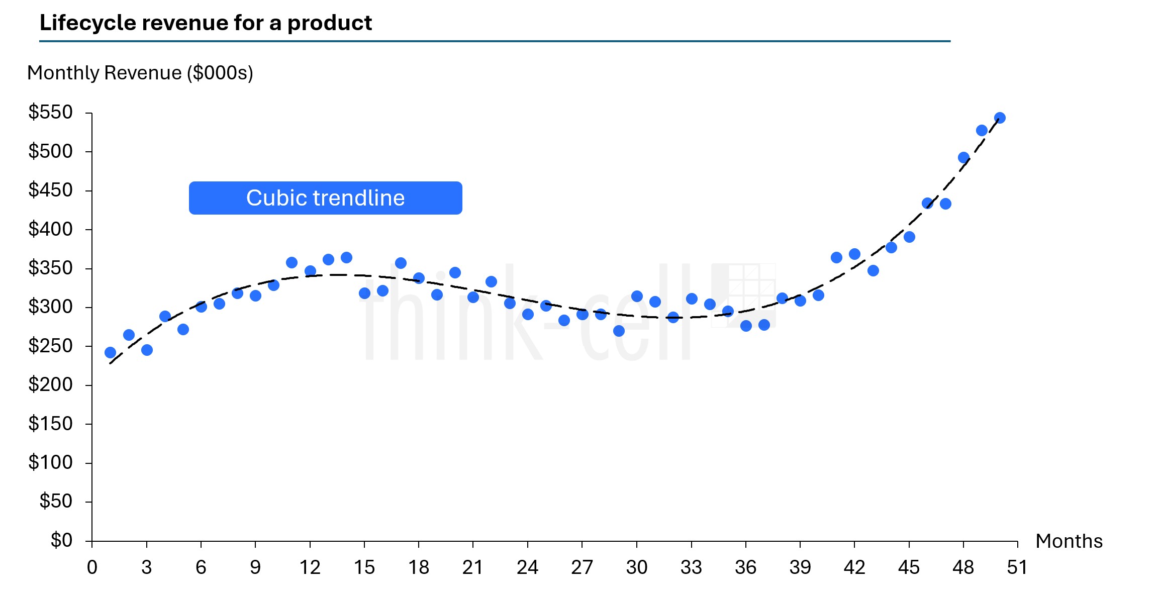
Cubic trendlines are best used when data rises, changes direction, and then shifts again. They can capture more complex patterns than a quadratic trendline.
Quartic trendlines
A quartic trendline shows up to three bends in the data. This type of polynomial trendline can follow very complex patterns.
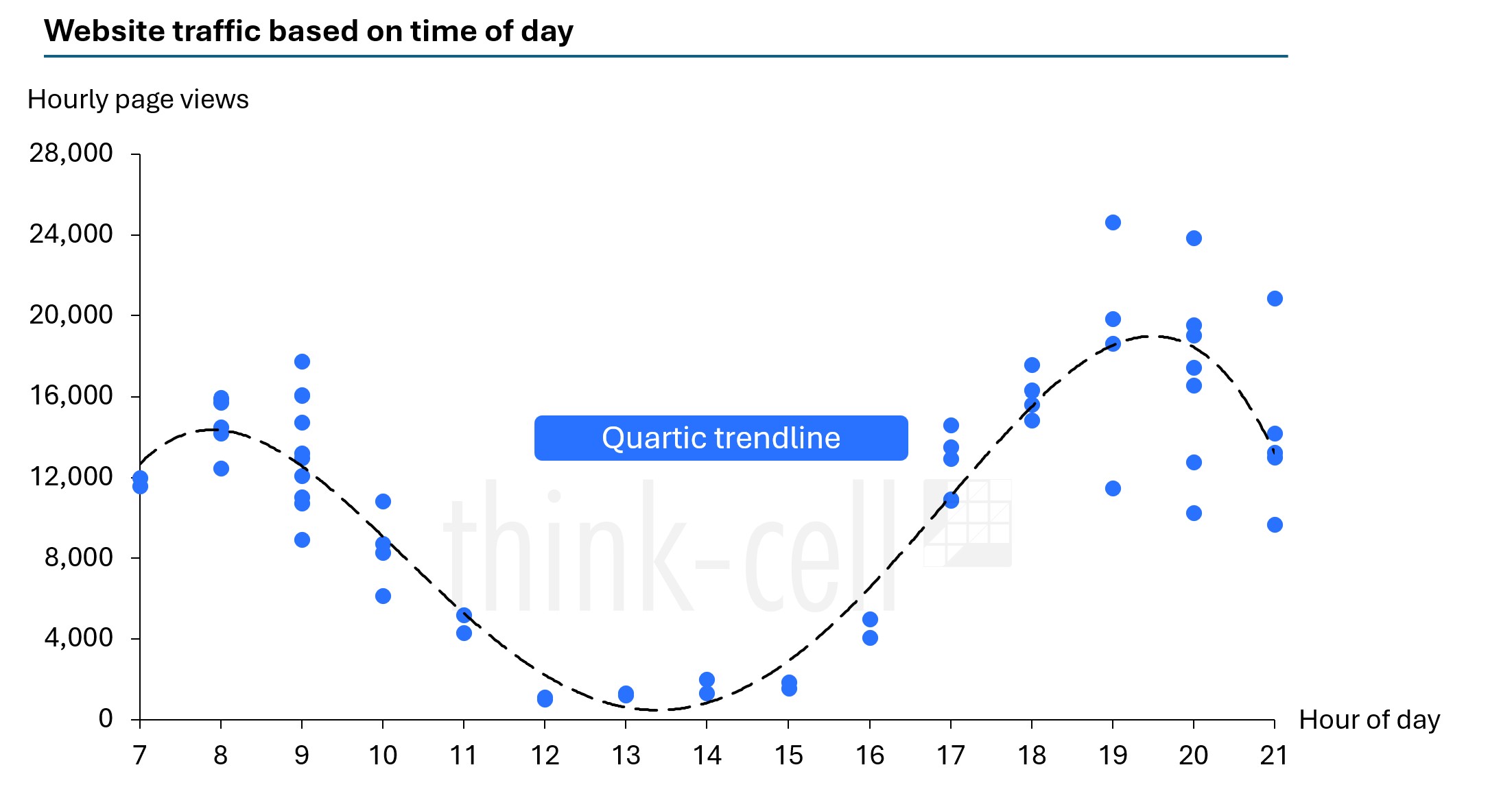
A quartic trendline is best used for complex datasets where a simpler trendline wouldn’t be able to tell the whole story.
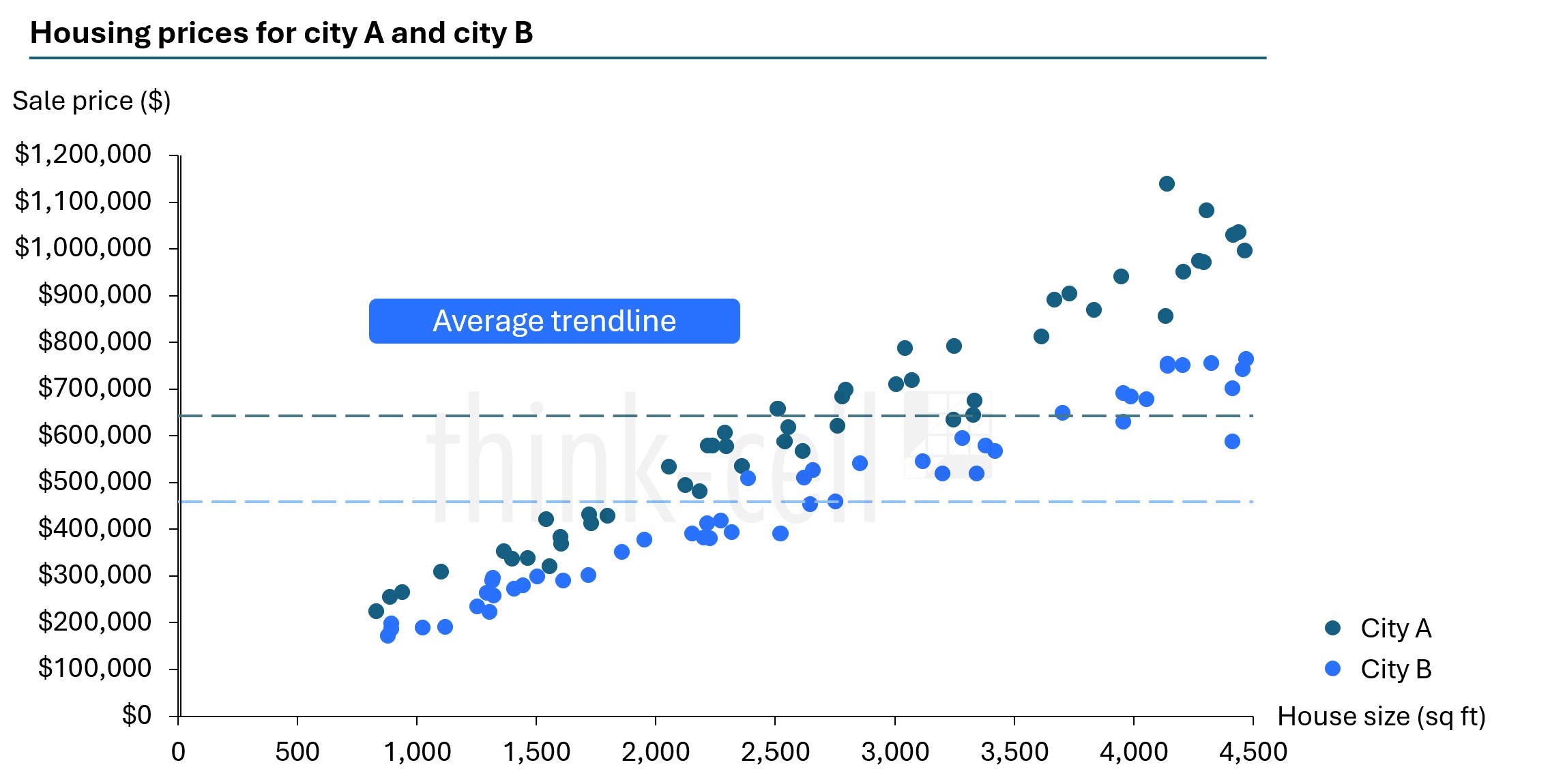
Average trendlines
An average of the X or Y values can highlight part of the data to provide additional context to whoever is reading the chart. It can be useful if you have two groups of data on the same chart that you want to compare.
A moving trendline, not pictured here, can be used to smooth out any changes in the data and make a pattern clearer.
How to add trendlines to Excel scatter charts
Adding a linear, exponential, and moving average trendline to a scatter chart in Excel is simple.
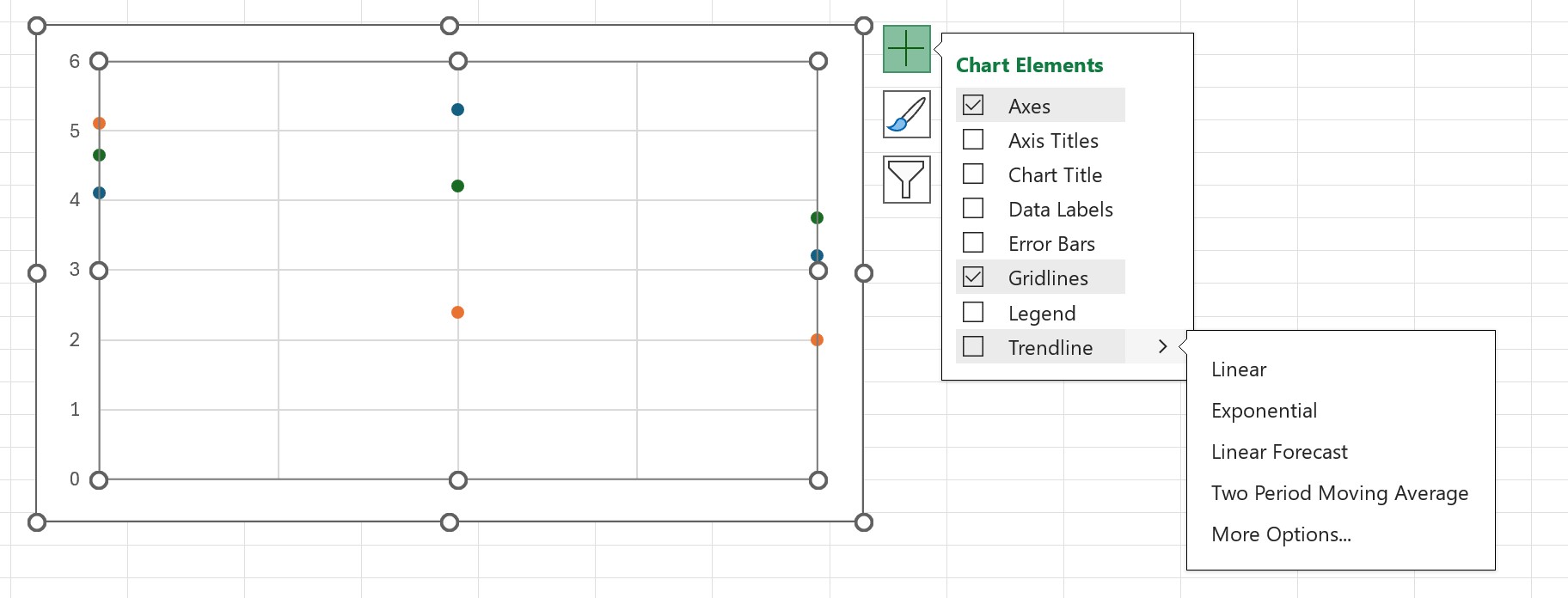
- After creating an Excel scatter chart based on your data set, click on the chart and select the chart elements menu.
- Select the trendline and choose one that suits your chart best.
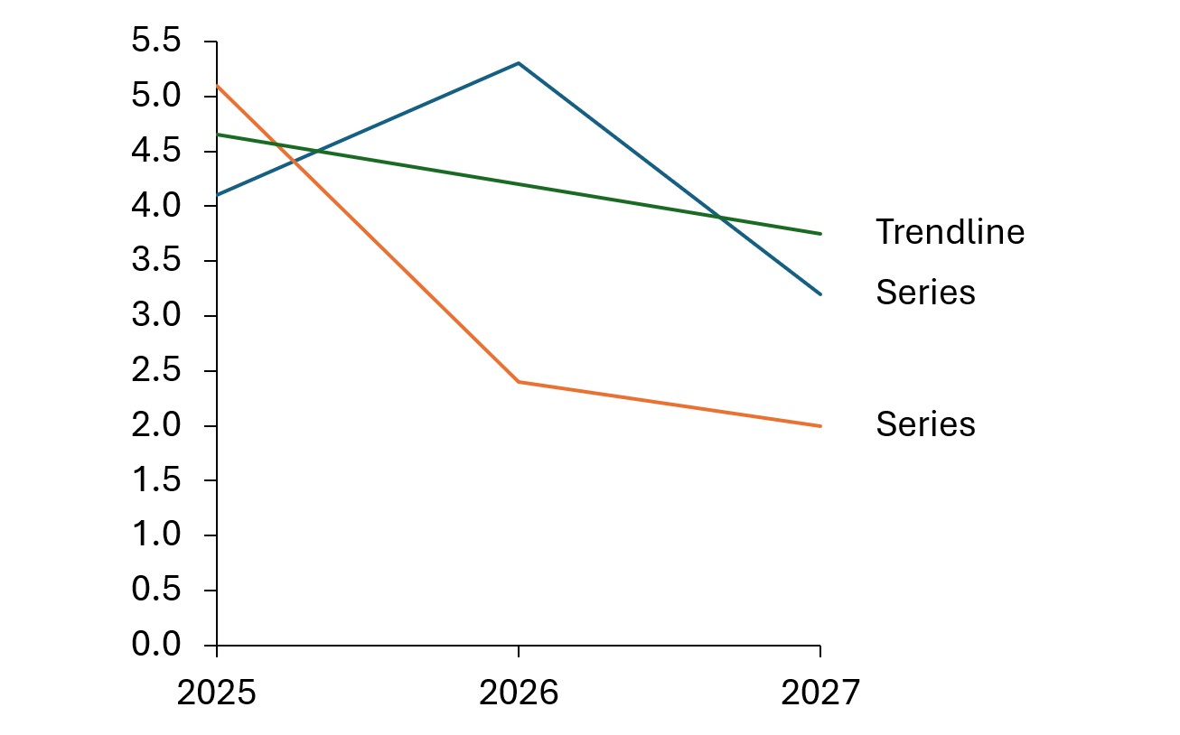
How to add a linear trendline to Excel line charts
While scatter charts are best suited for trendlines, they can work with other chart types.
To create a trendline on a line chart, you can use the same chart elements option detailed above. Alternatively, you can also use the trend function.
The trend function offers more flexibility and customization than the basic chart element option. It is, however, a more manual process.
To make a linear trendline:
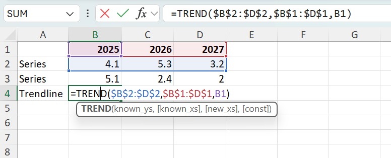
- Open the Excel document and add a new series, e.g., "Trendline".
- Calculate the first value of the trendline using the TREND function:
- Type "=TREND(" or use the Insert Function (fx) menu in Excel.
- Select all "known y" values and press F4 (e.g., "$B$2:$D$2").
Enter Excel's arguments separator, e.g., "," (comma).
(Note that the character expected by Excel as an arguments separator depends on your Windows regional settings. To see the correct character for your region, refer to the Excel tooltip appearing while you enter the formula. - Select all "known x" values and press F4 (e.g., "$B$1:$D$1"). Enter Excel's arguments separator.
- Select the first x value (e.g., "B1") and press ENTER.
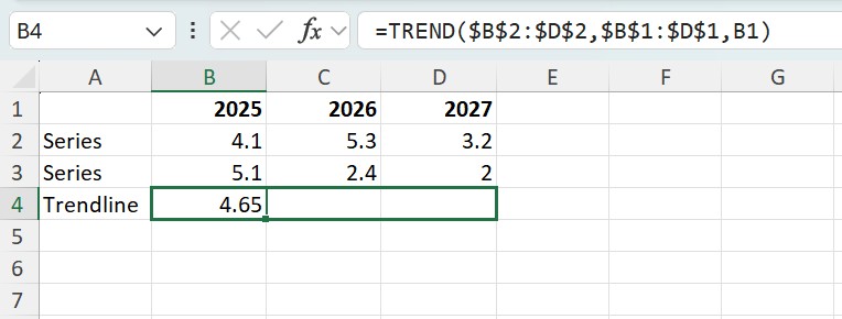
Note: By pressing F4, the cell reference type of the selected cells will change to absolute cell references. This way, the selection will stay the same when this formula is copied and will not be adjusted according to the new position.
- Select the first value of the new trendline and copy the function by using Excel's Auto Fill feature, dragging the fill handle in the cell's lower right corner to the right until the cell of the last value is selected as well.
Note: If you receive a #VALUE! error, check if the "known x" and/or "known y" values were auto-filled incorrectly - you may have used relative references when setting up the formula. In this case, change the cell reference type of the "known x" and "known y" values as described in step 2, using F4. Repeat step 3 afterwards.
- Highlight the series and trendline cells. Select Insert chart to create the graph with the trendline.
How to add a trendline to a think-cell chart in PowerPoint
With scatter or bubble charts made with think-cell, you can add a trendline for certain values in your chart. Trendlines are only available when both axes of the chart are set to a linear scale.
The trendline finds the straight line that best fits the data by minimizing the differences between each data point using linear regression. In a bubble chart, the bubble size is used to weigh each point’s contribution to the difference.
Watch this short video in the think-cell Academy or follow the directions below to add a trendline to PowerPoint.
There are two ways to add a trendline to a think-cell chart:
- On your chart, right-click a marker or bubble to open the context menu, then select Add Trendline/Partition.
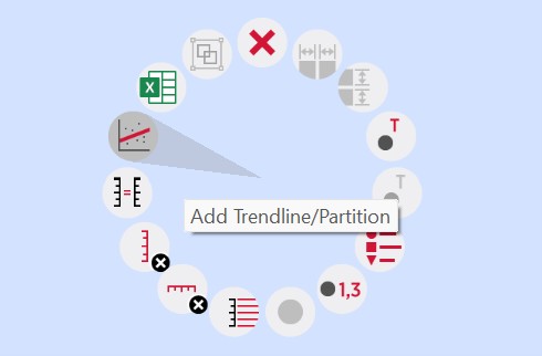
- Select a partition line (see Partitions in the think-cell user manual) to open the mini toolbar. On the Partition Type dropdown menu, select a data group or All groups. The partition line changes to a trendline based on the selected data.
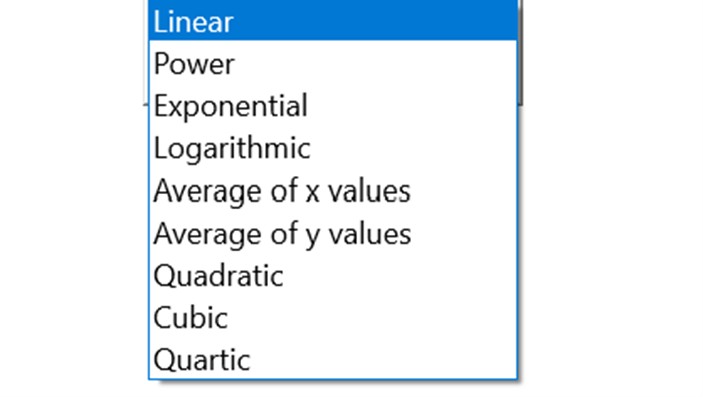
You can choose the trendline type on the Trendline Type dropdown menu on the mini toolbar. Linear trendline is the default type and is always available on the Trendline Type dropdown menu.
In scatter charts, for trendlines that are based on a specific data group, additional trendline types are available.
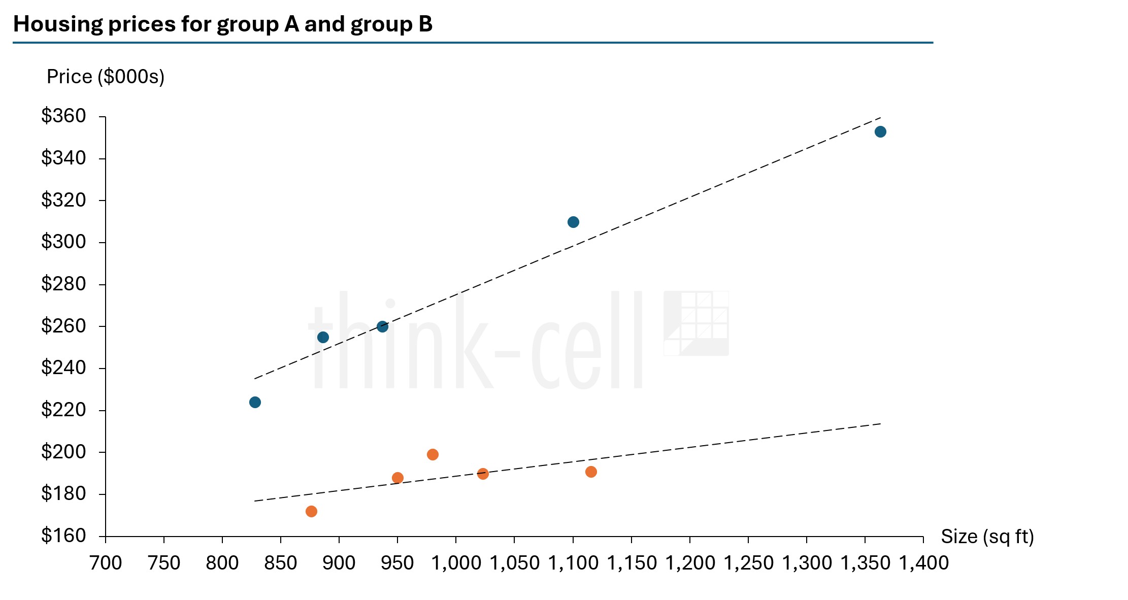
How to add multiple trendlines to a think-cell chart in PowerPoint
Do you have multiple groups and want to show trendlines for them?
The Group column in the datasheet can be used to organize individual data points into groups. In the scatter chart datasheet below, the first five data points belong to group A, while the remaining data points belong to group B.
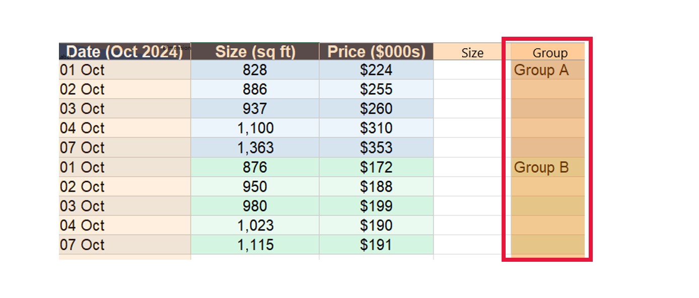
Multiple data points in the same group can be easily selected by clicking on a data point and then moving the mouse pointer while holding down the Shift key (see Select multiple objects in the think-cell user manual).

In PowerPoint, right-click on one of the groups and select the trendline of your choice. You can then do the same for the other group or select all groups for the trendline.
Add trendlines the easy way
- Download a free trial for faster creation of 40+ chart types.
- Auto-generate trendlines, annotations, and calculations. No formulas needed.
- Work seamlessly with Excel data links for automated reporting.
Explore this topic further with AI:
Read more
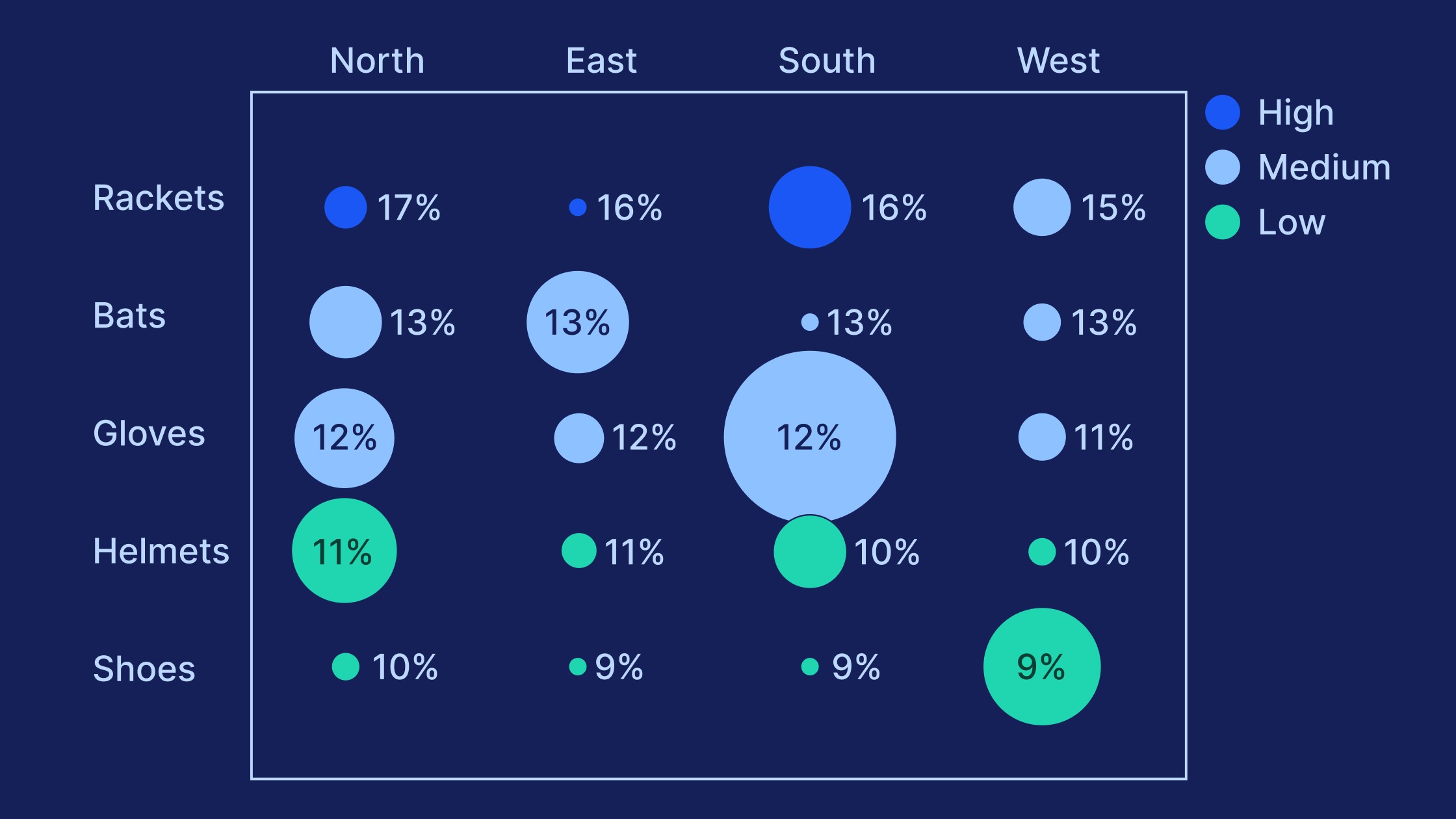
Learn the process of building a bubble chart matrix step by step, from setting up the matrix and entering your data to formatting a professional visualization.
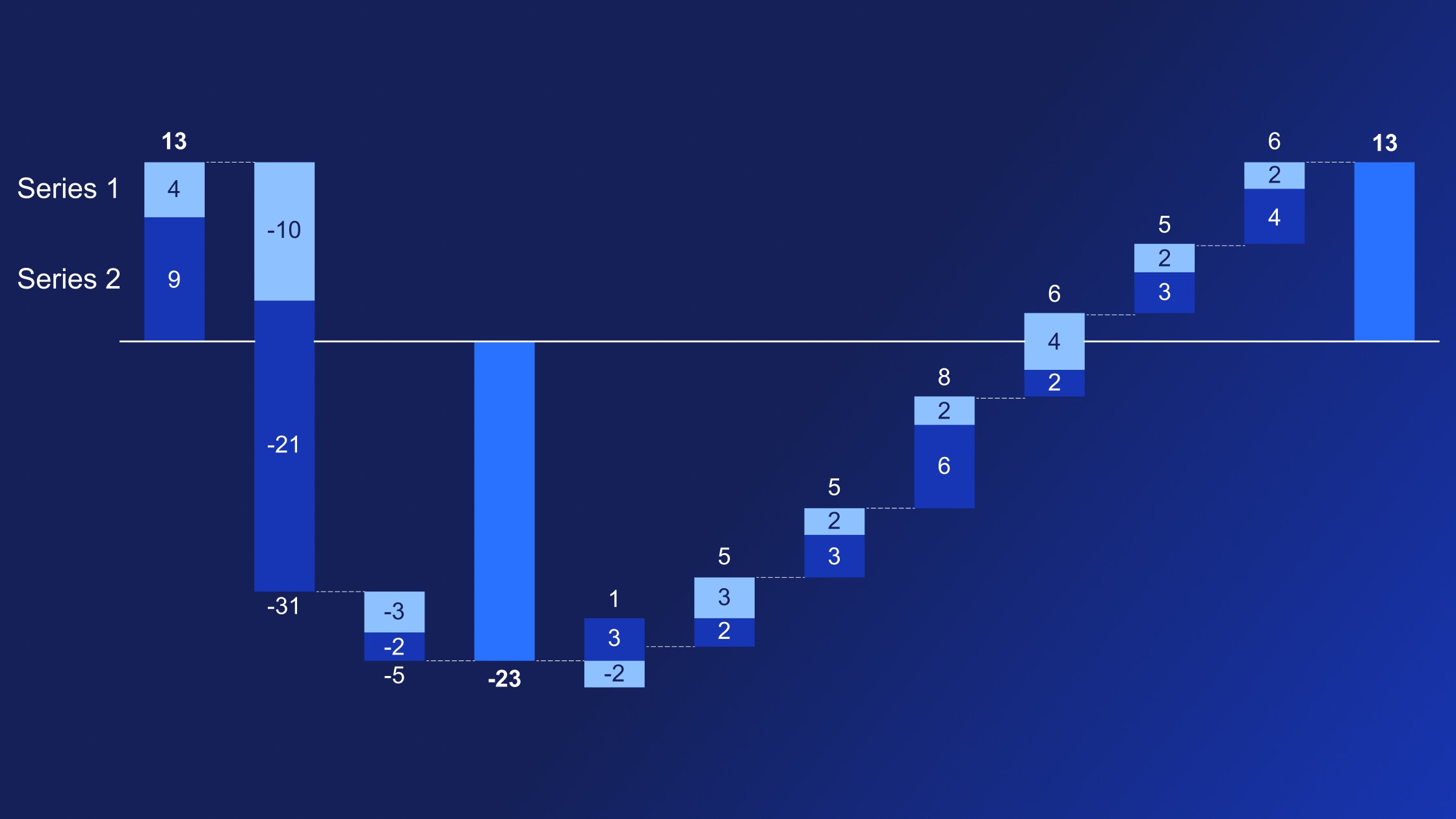
Learn how to use multiple series waterfall charts to tell a powerful, multi-layered story of how different factors contribute to an overall total.

Global survey of 1,200 professionals in 12 countries into how AI is used in presentation workflows.