KB0224: Google Slides does not properly display think-cell charts
- Home
- Resources
- Knowledge base
- KB0224
Problem
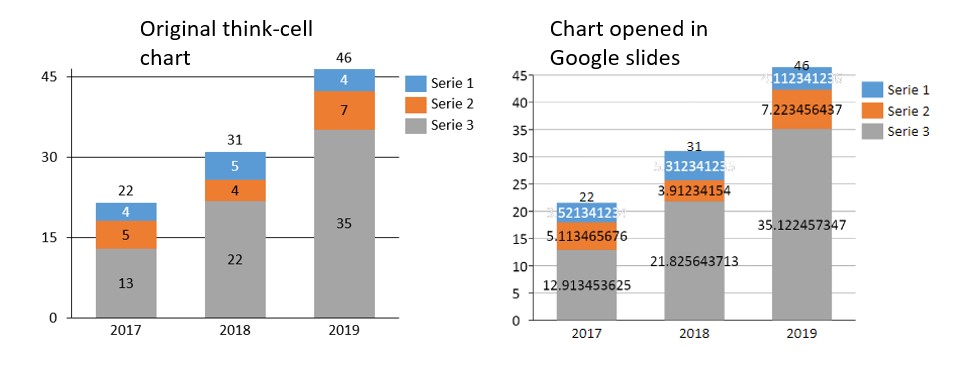
When a PowerPoint presentation containing PowerPoint charts is opened in Google Slides, charts may appear incorrect or ugly. Since think-cell charts are rendered using PowerPoint charts, this also affects think-cell charts. For instance:
- The full precision of the data in the datasheet is shown in labels
- Number formatting such as "%" signs may be thrown out
- Blurry and misplaced labels and lines
- Vertically compressed charts
- Additional horizontal gridlines
- Incorrect major/minor axis units
- Increased column width/decreased gap width between columns
Note: Additionally, hidden shapes are removed from the file. This also deletes some data relevant to think-cell. When reopening such a file in Microsoft PowerPoint afterwards, think-cell's functionality is lost and cannot be restored.
Explanation
Google converts all charts into images when importing into Google slides. Google explains this on their website under the Features not Supported section. This import does not always handle all chart features correctly. The issues occur both in opening files in Google directly, and in saving the file in the Google format.
The issues can be reproduced without think-cell, using a PowerPoint chart. Read more
Reproduction without think-cell
- Open PowerPoint
- Insert a PowerPoint Clustered Column Chart by going to Insert > Illustrations > Chart > Clustered Column > OK
- Right-click on the Y-axis and select Format Axis
- Set Maximum Bound to 9.5
- Set Minimum Bound to 0
- Set Major Unit to 2
- Right-click on a column and select Add Data Labels > Add Data Labels
- Right-click the data labels and select Format Data Labels... > Label Options > Number > Category > Number and set the Decimal places: to 0
- Save the PowerPoint presentation
- Upload the presentation to Google Drive / Google Slides and open it with Google Slides
Result: The custom major unit for the Y-axis is ignored, the Y-axis is extended to the next tick mark value, the chart is compressed vertically and the labels get misplaced. Lines and labels appear blurry, the chart title is removed and the column spacing is reduced to zero. In addition, number formatting is removed and the full precision is shown. 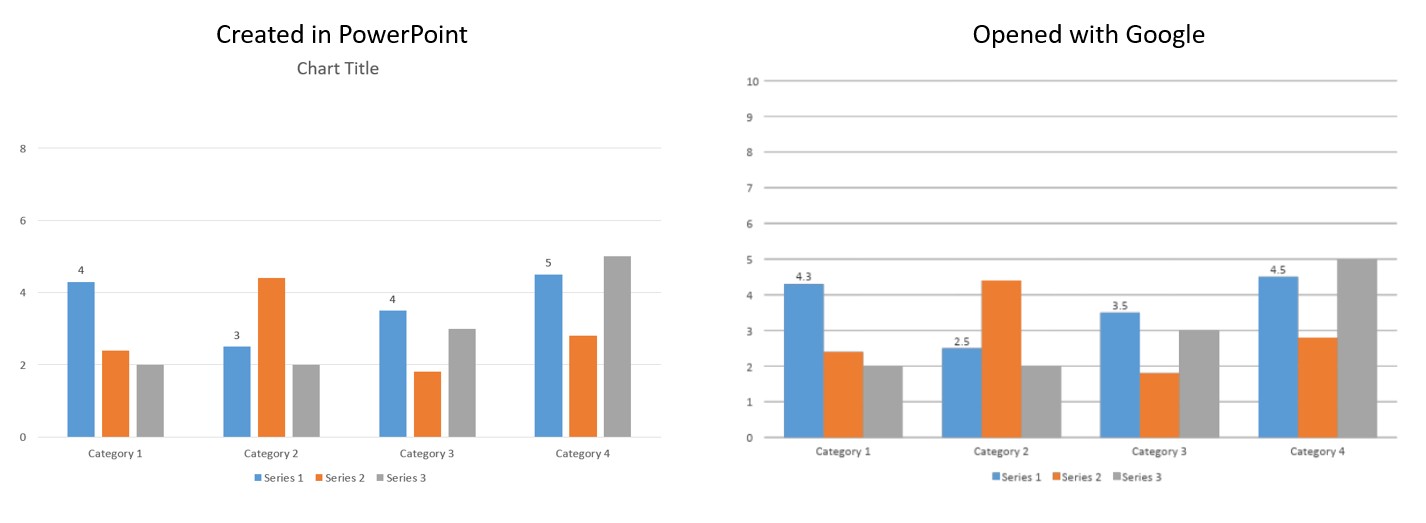
Solution
Before uploading your slides to Google, first change the charts to images. You can do this by taking a screenshot of each chart and pasting the screenshot in place of the chart.
We have reported this issue to Google, but no solution is forthcoming. If you have a Google Admin account and are experiencing this issue, please also report this to Google directly. You can find instructions on how to do this on Google's support page.