Waterfall charts in PowerPoint: Your step-by-step guide
- Home
- Resources
- Content hub
- Waterfall charts in PowerPoint: Your step-by-step guide

37 min read — Akash Choudhary
Waterfall charts are a powerful kind of data visualization that can support decision-making by highlighting how different values drive change. Waterfall charts are used in finance, consulting, and a range of other industries, yet building them in PowerPoint is not always straightforward.
This article will introduce you to the pros and cons of waterfall charts, describe best practices for building them, and examine when they are most effective. We’ll explain step-by-step how to create a waterfall chart in Excel or PowerPoint, and look at ways of building more impactful waterfall charts that go beyond PowerPoint’s native functionality.
The guide covers the following points:
- Key facts about waterfall charts
- What is a waterfall chart?
- How are waterfall charts used?
- Advantages of waterfall charts
- Disadvantages of waterfall charts
- Best practices for waterfall charts
- Different options for building waterfall charts
- Early stages: Using Excel to build waterfall charts
- Step-by-step: How to build a waterfall chart in PowerPoint
- Next level: Enhancing your waterfall charts with think-cell
- Waterfall chart FAQ
Key facts about waterfall charts
Before we dive in, we’ll start with a summary of the most important points covered in this article:
- Waterfall charts are a kind of data visualization that uses floating columns to show how positive and negative values contribute to a final result.
- Waterfall charts—also known as bridge charts—are used in a range of industries, most notably finance and consulting, but also by HR and leadership teams.
- Waterfall charts are an effective way of telling stories and supporting decision-making because they guide the audience from left to right, and help highlight the impact of specific metrics or contributing factors.
- To build a waterfall chart in PowerPoint, you can either build it directly in the presentation or you can create it in Excel and copy it over.
- Both PowerPoint and Excel have certain limitations when building waterfall charts, and they can be relatively time-consuming to work with.
Professional waterfall charts are best built with PowerPoint add-ins like think-cell, which allow users to quickly create industry-leading waterfall charts, including enhanced functionality like stacked columns. You can download a free trial to see how much easier building waterfall charts in PowerPoint can be:
What is a waterfall chart?
A waterfall chart (also referred to as a ‘cascade chart’, ‘bridge chart’, or ‘floating bar chart’) visualizes the positive and negative changes between a starting value and an ending value. The goal of a waterfall chart is to clearly illustrate what is driving the difference between two (or multiple) values, as well as the magnitude and composition of those drivers.
The name of the chart comes from the waterfall-style appearance, which is created by the columns cascading down the chart as you look from left to right. This is most evident in a waterfall chart that has a series of negative-value columns.
To create—or to read—waterfall charts, you need to understand how they are built. The two outer columns, on the far left and far right, are the starting value and the final total. Both are represented by full columns that start from the baseline, just like in a standard column chart.
These totals are visually distinguished from the intermediate columns, which float above the baseline and represent changes or incremental values between these totals. The reference point for each floating column is where the previous column ended. Whether this is the top or the bottom depends on whether the previous value was positive or negative. Dashed or dotted connecting lines between the columns are typically used to aid readability.
A special kind of waterfall: The bridge chart
The bridge chart is essentially the same as a waterfall chart, just with added intermediate columns representing subtotals. These, like the starting value and final total, are tied to the baseline and therefore show the total value up to that point, when reading from left to right.
The visual effect, particularly if more than one subtotal column is included, is to interrupt the waterfall-style cascade with arches that resemble a bridge. Hence the name ‘bridge chart’.
While the introduction of subtotals does have quite a significant impact on the visual appearance of a waterfall chart and how it is read, the terms ‘bridge chart’ and ‘waterfall chart’ are often used interchangeably. As ‘waterfall chart’ is the more catch-all term, that is what we will primarily use in this article.
How are waterfall charts used?
Waterfall charts are most frequently used to illustrate to what extent different values, such as income and costs, contribute to a total, such as a company's profit. The values reading from left to right show how each metric has driven change (or not).
While waterfall charts were brought into the mainstream by McKinsey & Company—a global management consulting firm—they are now heavily used across industries. Examples of how various teams use waterfall charts include:
- Commercial teams: To show how performance in relevant customer segments contributes to total sales volume.
- Sales teams: To look at how volume drops off along the stages of a sales funnel.
- Finance teams: To visualize the magnitude of line items in a profit and loss (P&L) statement.
- HR teams: To communicate net changes in headcount across offices.
- Leadership teams: To shed a spotlight on which business units have contributed most to hitting company targets.
All of these examples use the waterfall chart’s unique visualization to show how each driver of change contributes to a total. Another usage is as an alternative to a line chart, showing how a single metric has changed across different periods of time. For example, HR teams can use waterfall charts to show changes in headcount from quarter to quarter, resulting in the year-end total.
Similarly, bridge charts that include subtotal columns can also be based on a time series. In this case, the chart could show developments over several years, with subtotals showing the headcount at the end of each 12-month period.
Advantages of waterfall charts
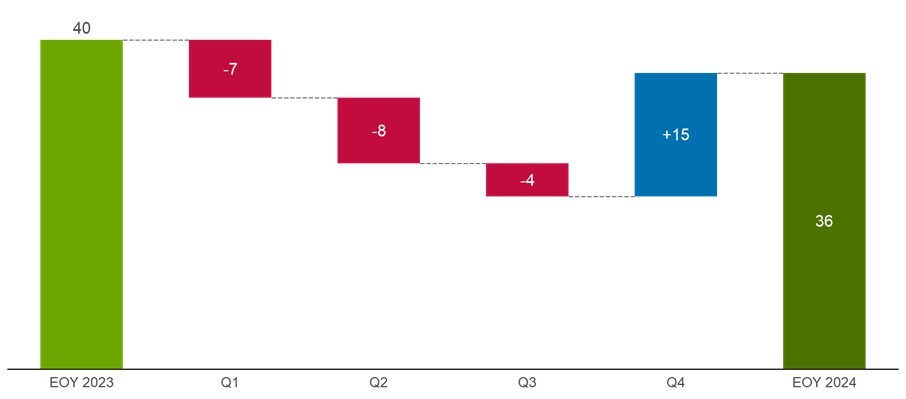
As waterfall charts are less familiar than some other chart types, it’s good to understand the motivation for using them that justifies any added complexity. A good way of looking at the advantages of waterfall charts is to consider two charts showing the same data of headcount changes over the course of a year.
On the left, we have the waterfall chart, which shows how headcount fell for the first three quarters, before rebounding in Q4 to a level around 90% of the initial total. On the right, we have the exact same data in a standard column chart.
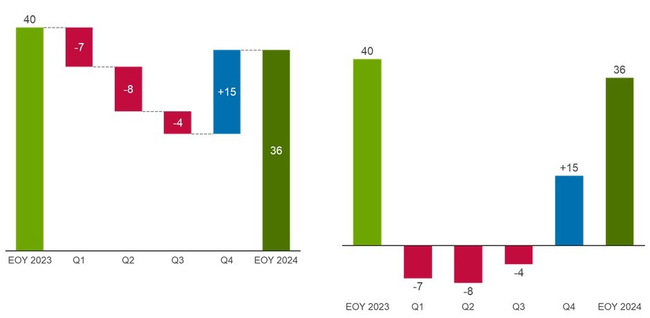
Even for a simple dataset like this, the waterfall chart displays several advantages over the column chart:
- Series labels are less disconnected from the columns
- Cumulative impact of changes is visualized, indicating the running headcount at the end of each quarter
- Intuitive flow lets the audience read the chart from left to right without jumping back and forth or up and down
- Clear differentiation helps distinguish between columns showing totals and those showing change
These factors—particularly the natural way the chart is read from left to right and the implicit running totals—make the waterfall chart more effective at telling the story and influencing positive business decisions. This can be even more pronounced for more complex datasets.
Additional advantages of waterfall charts compared with other chart types include:
- Versus line charts: Waterfall charts clearly emphasize what is interesting about each data point, which is either the total amount (for full columns) or the change (floating columns). Line charts need annotations to provide the same context.
- Versus stacked column charts: If you have a combination of positive and negative values contributing to a whole, stacked column charts become virtually unreadable, whereas waterfall charts clearly show each value’s contribution.
- Versus pie charts: Waterfall charts don’t only show how individual elements contribute to a whole—which can also be effectively displayed with a pie chart—they also clearly show the initial value. Also, pie charts are unsuited to negative values.
Given these benefits, you might wonder why waterfall charts aren’t more common. One reason is that creating them in PowerPoint or Excel can be hard to get right, which sees many people resort to an unsatisfactory column or line chart.
Waterfall charts don’t have to be awkward. If you want to see how easy it is to build them with think-cell is, you can jump to the section below—or you can download a free trial and have a go yourself:
Disadvantages of waterfall charts
No chart is suited to every scenario and every dataset. Here are a few examples of when waterfall charts might not be the best option:
- Running totals going above and below zero: If your starting value is positive but the data goes negative during the flow of the chart, it will cut through the x-axis. Depending on how far below zero the values go, this may impact the readability of your chart.
- Change values very small compared to starting value: If your initial value is a thousand times higher than your change values, then the floating columns will become very small and difficult to parse. There are possible solutions, such as leaving out the initial column and indicating the starting value another way, but you may also want to consider an alternative chart type.
- Too many contributing factors: If you have a very large number of categories, then labels can become compressed or even illegible. You can rotate your waterfall chart horizontally to aid readability, but you may still find that there is simply too much information on the chart. In such cases, you could try a different visualization or you may want to restructure your data so you can better highlight the most important points.
Understanding the pros and cons of different chart types is critical for telling convincing data stories. You can learn more about this topic in our blog article: Find the right visualizations for your presentation.
Best practices for waterfall charts
There are certain principles to be aware that will help you create great PowerPoint presentations. The following best practices build on these with specific recommendations for the construction of waterfall charts:
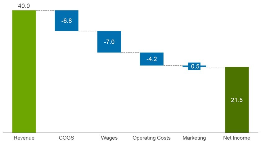
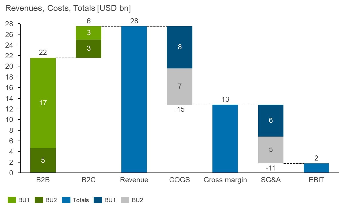
- Stack series that go together: You have to be a little careful with stacking because combining positive and negative values in a single column can be confusing. However, there are often good reasons to stack columns, such as showing equivalent metrics (e.g. revenue, COGS etc.) for multiple business units. Stacking these can help make the overall story clearer, without hiding the granularity of the data.
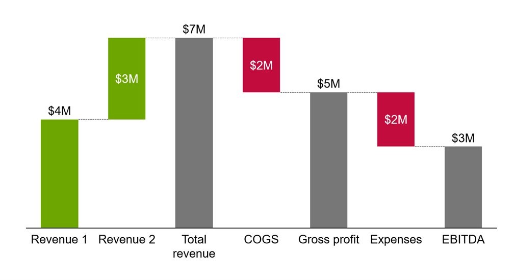
- Make use of subtotals: If you think about the story you want to tell with your waterfall chart, then you can view subtotals like chapters. Use subtotal columns to provide visual checkpoints and to break down the big picture into digestible components for your audience.
- Use data labels on columns: As the floating columns of a waterfall chart don’t start from a common baseline, it isn’t always easy to discern their size. Data labels for each column help your audience compare values across the chart.
- Tell your story with color: Don’t turn your waterfall chart into a rainbow, but it’s often useful to show negative and positive values with color, and to use a separate color for total columns.
- Calculate totals with formulas: Unlike most bar charts, the columns in a waterfall chart aren’t independent of one another. Make sure that the values in your total and any subtotal columns are linked with formulas to the category values. This will ensure that your chart stays correct if the data changes or you add a new category.
Different options for building waterfall charts
The most important thing when creating a waterfall chart is to use a feature that is designed for creating waterfall charts. You might be able to use invisible columns and dummy data series to make a column chart look like a waterfall chart, but it won’t be scalable and will likely be a messy, frustrating experience.
The three most suitable solutions for building waterfall charts are:
- Excel: Working with data can be most convenient in the place where data most commonly lives
- PowerPoint: Building your chart directly within the presentation environment helps reduce friction
- A PowerPoint add-in like think-cell: Leveraging a powerful software tool increases consistency and supports best practice chart creation
In the following sections, we’ll take a closer look at each of these three solutions in detail.

think-cell has been a game-changer for us. It allowed us to quickly create Gantt charts, tables and waterfall charts, which are critical for our project updates. The tool’s intuitive interface made it easy for our team to learn and use, significantly reducing the time we spent on presentation preparation.
Early stages: How to create a waterfall chart in Excel
Depending on your workflow and where your data is coming from, it may make most sense for you to create your waterfall chart directly in Excel. This will often be the case if you are still refining the concept for your chart and possibly still need to aggregate or structure your data before tackling the finer points of formatting your visualization.
Create a data table
In Excel, you need data before you can insert a chart. Excel should be able to parse your data if it’s ordered logically in rows or columns. One recommendation is to use an =SUM() formula for the total so that your final column always reflects any changes in the other values. Just be careful to exclude any subtotal columns from the SUM—otherwise they will contribute twice to the total.
Note that Excel doesn’t natively support the creation of stacked waterfall charts, so this will only work for a single series of data.
Insert the chart
Select your data range, go to the Insert ribbon tab and open the Charts menu, where you can find the Waterfall chart fairly near the bottom of the suggested chart types. When you first insert the chart, it probably won’t look quite as you’re expecting, but don’t worry. We’ll fix that in the next step.
Set your total columns
Excel does allow for totals columns in waterfall charts, but you need to set them manually. Clicking once on your total column will select the whole data series. Clicking a second time will focus the selection on the chosen column. From here, you can select ‘Series Options’ from the right-hand sidebar and check the ‘Set as total’ box. This should tie your chosen total column to the baseline. You can repeat this for any subtotals.
Format your chart
With your total columns set, you should have your functional waterfall chart set up. Formatting options in Excel are available via the Chart Design and Format ribbon tabs, or by right-clicking on the chart and selecting the Format option from the context menu.
Excel chart formatting is fairly limited, so the best use of the Excel chart is often as a dynamic preview to help you work with your data and make decisions like which categories to group together, which subtotals to include, and how to make the best use of color.
If you are building your waterfall chart as part of an Excel dashboard or report, then you can refine it as much as you like, but a common next step is to build a chart based on your Excel in PowerPoint, as this is likely where the chart will ultimately be presented.
Step-by-step: How to build a waterfall chart in PowerPoint
To build a waterfall chart in PowerPoint, you can either start by copying in what you have prepared in Excel, or you can use PowerPoint’s built-in functionality to create the chart from scratch within your presentation. In this step-by-step guide, we’ll start from a blank presentation. If you’re copying your chart in from Excel, you can just skip straight to the styling and formatting section.
When data comes from Excel—which it very often does—linking your spreadsheets to PowerPoint is standard practice. However, difficulties can often arise within teams when files are updated or moved, and presentations don’t reflect the latest data. Learn more about how we’ve addressed these issues with think-cell’s robust Excel data links.
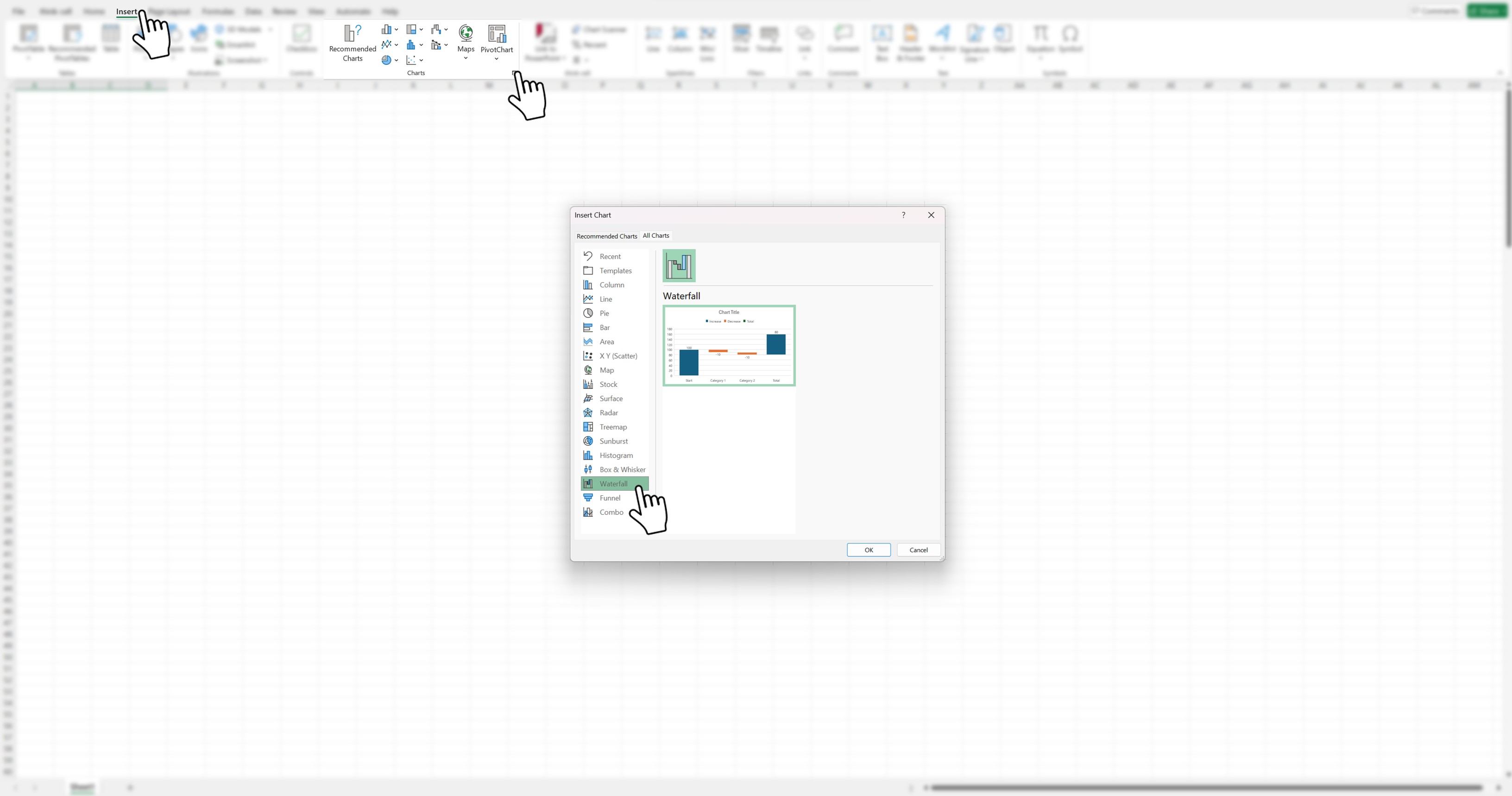
Step 1: Insert a waterfall chart in PowerPoint
The first step is to insert your waterfall chart. In PowerPoint, you can do this on an empty slide even before you have any data.
- Navigate to the Insert menu.
- Select ‘Chart’ under the ‘Illustrations’ group.
- Select ‘Waterfall’ from the list of chart options and click OK. This will populate your slide with a waterfall chart template, along with an Excel spreadsheet pop-up.
Step 2: Add data to your PowerPoint waterfall chart
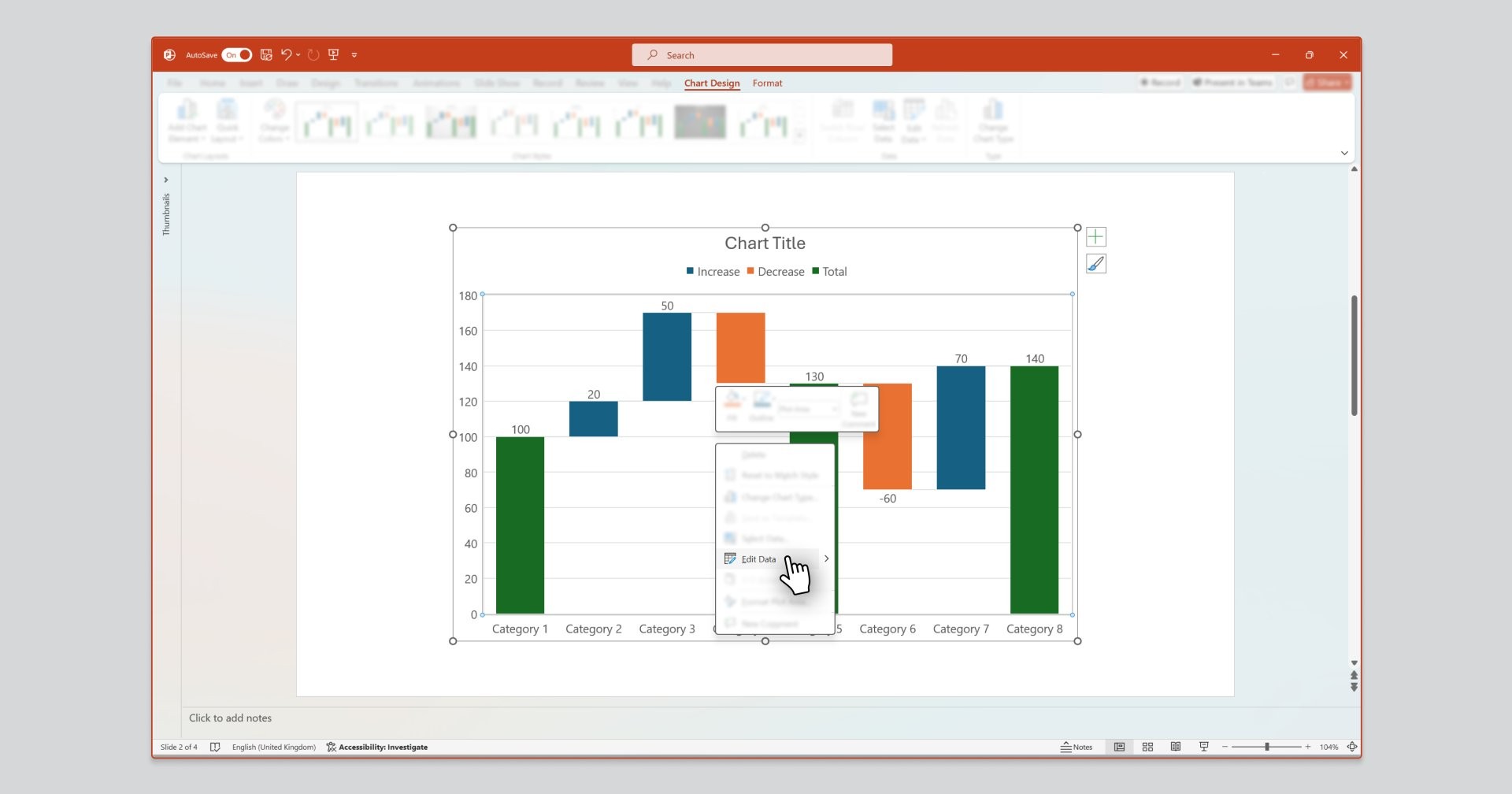
The default waterfall chart has some example data preloaded so that you can already see a few columns. You’ll want to replace the dummy value with your own data. You can add or edit x-axis labels and value your chart’s associated Excel window. Your chart’s Excel window can be accessed as follows:
- Automatically opens when you first insert your chart.
- Select ‘Edit Data’, accessible by right clicking on the chart or through the ‘Chart Design’ ribbon tab.
Note: Like Excel, PowerPoint functionality does not allow for stacked waterfall charts, so adding additional columns of data will not result in changes to your chart. If your presentation would benefit from a stacked waterfall chart, this is possible with an add-in like think-cell.
If you are only creating a single-series waterfall chart, you can stick with native PowerPoint and click on ‘Select Data’ to change the visible data in your chart.
Click on ‘Select Data’ to change the visible data in your chart
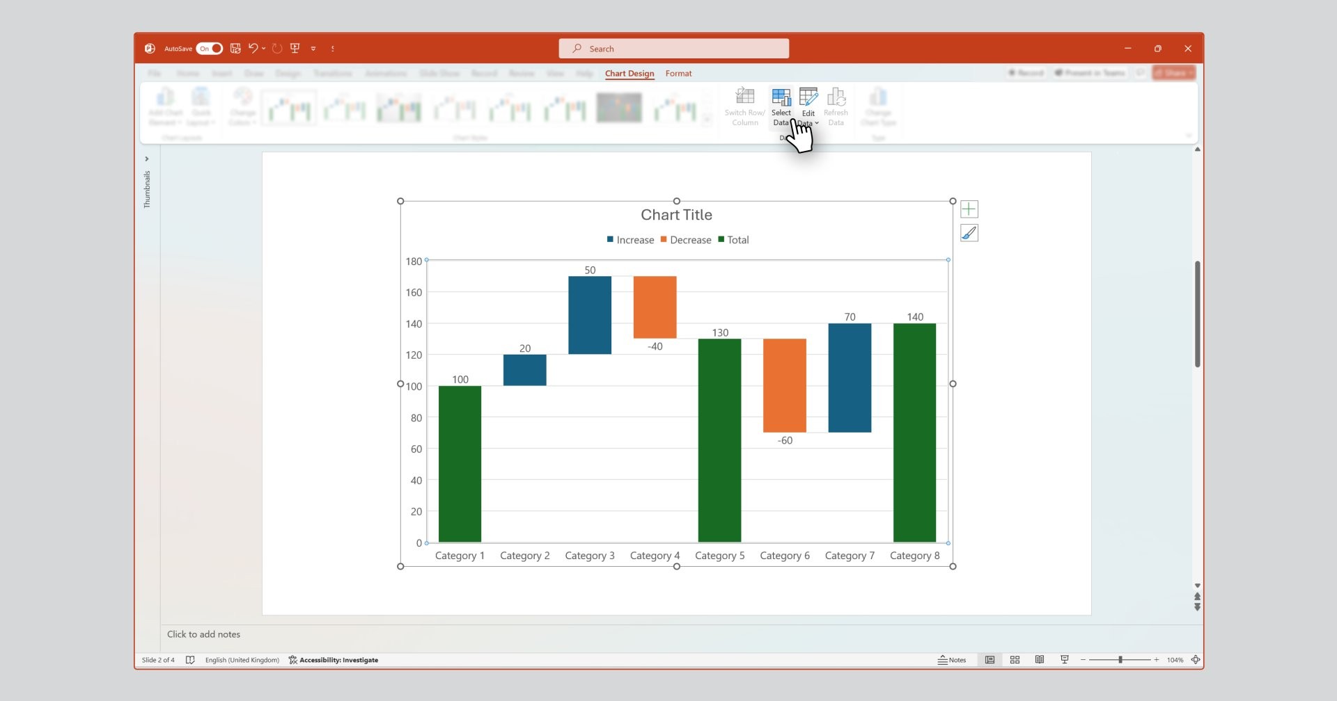
If you’re adding or removing rows of data to your chart, you’ll need to adjust the selected data PowerPoint is reading from. This can be done as follows:
- Click on the ‘Select Data’ command accessible within the ‘Chart Design’ ribbon tab. This will open the ‘Select Data Source’ window as well as your chart’s Excel window.
- Adjust your ‘Chart data range’, selecting the data in your chart’s Excel window you want to show.
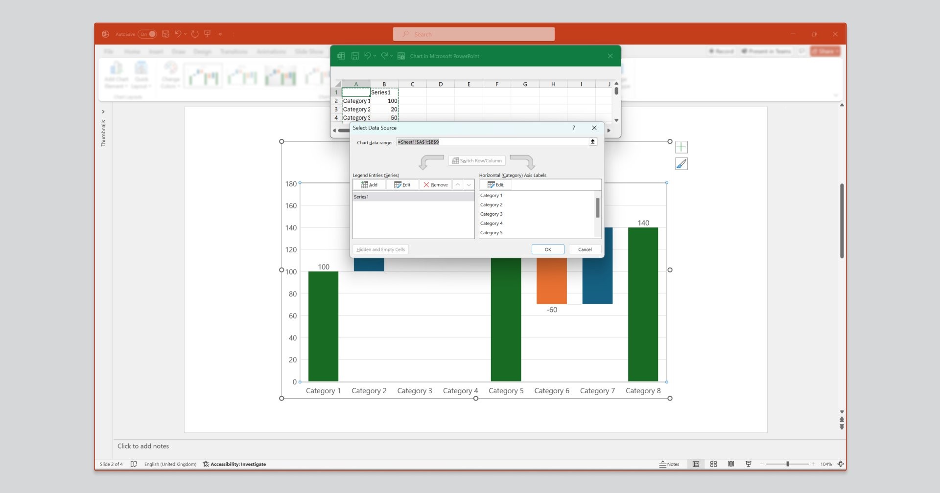
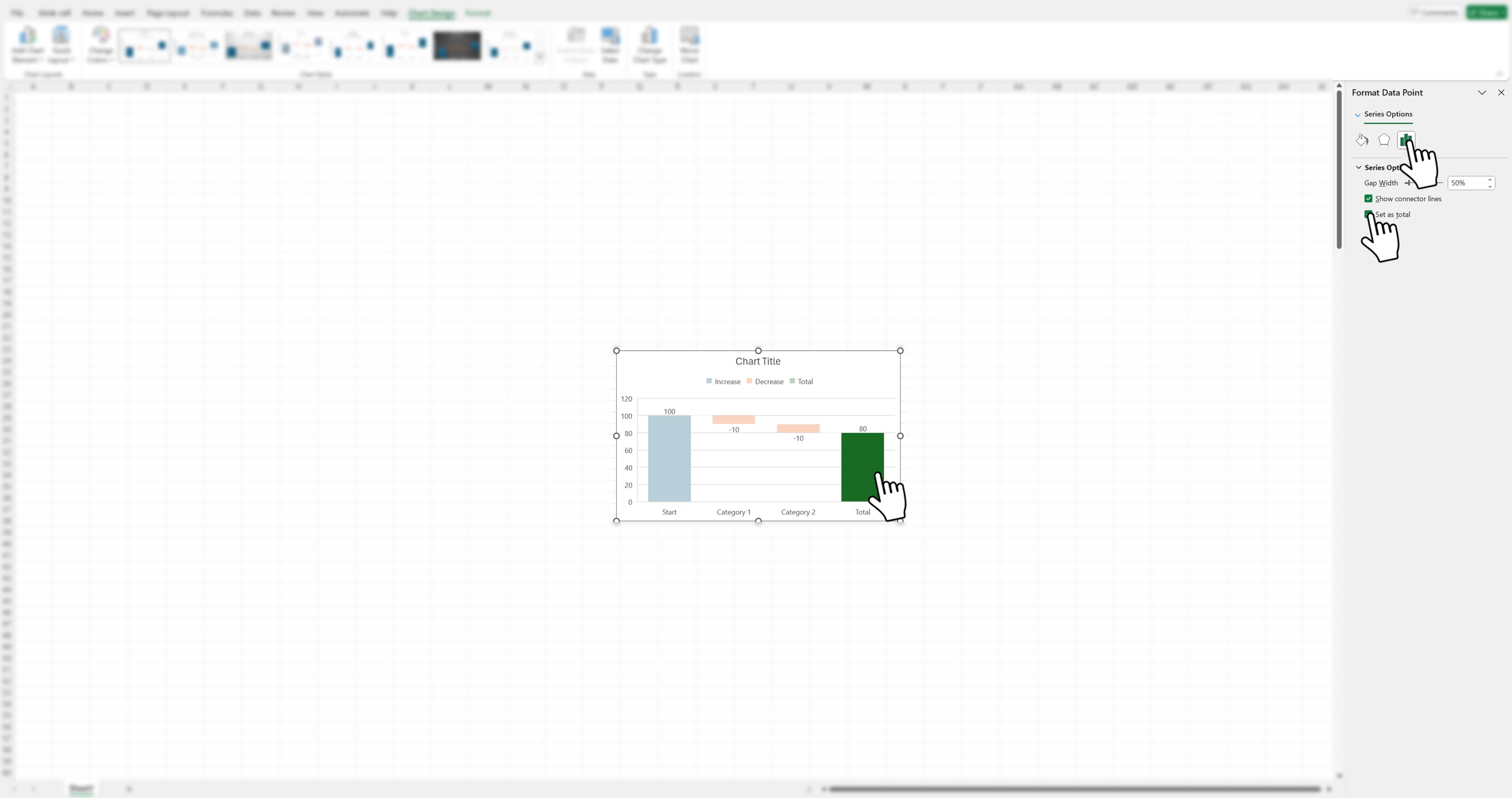
For any values that you want to define as totals or subtotals, you can use the ‘Set as total’ checkbox in the right-hand sidebar. This will be familiar to you if you have already built a waterfall chart in Excel.
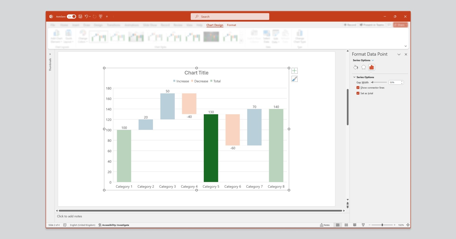
Data in your chart can either be:
- A total or subtotal, meaning the column is connected to the horizontal x-axis.
- A contributing value, meaning the column is seen as a floating box.
Tick or untick the ‘Set as total’ checkbox to toggle a datapoint between the two. To access this checkbox, click twice on the datapoint to open its ‘Format Data Point’ task pane. You will see the checkbox under ‘Series Options’.
Style and format your waterfall chart
With your data inserted, it’s time to style your waterfall chart. Styling and formatting can be applied to the entire chart or an individual chart element. Make your selection, and then use the ‘Chart Design’ and ‘Format’ ribbons, or the format task pane that appears on the right when a selection is made, to make your desired styling and formatting changes.
You can format ‘Increase’, ‘Decrease’, or ‘Total’ values as a group by selecting the respective legend element and formatting as desired. This is useful if, for example, you want to make all negative values red.
When formatting your waterfall chart in PowerPoint, it’s important to remember that your chart exists within the environment of the slide it’s on. While the chart will usually be the most prominent element on a slide, there are also titles, subtitles, banners, and possibly other shapes, text boxes, or other annotations to consider.
To keep your entire presentation professional and brand-compliant, ensure that the formatting and style of your waterfall chart—most notably fonts and color palettes—is consistent with all other elements.
Next level: Enhancing your waterfall charts with think-cell
Creating waterfall charts in PowerPoint or Excel comes with certain limitations, which is why many experts make use of a PowerPoint add-in. The number one add-in used for creating waterfall charts in PowerPoint is think-cell, which also offers a range of other available chart types and features.
This quick guide will show you how to easily create a waterfall chart in PowerPoint using think-cell. If you’re not a think-cell user yet, you can still follow the steps described here by downloading it for free. It’s a free trial that you can install to gain access to all the features of the software straight away:
Insert a waterfall chart in PowerPoint using think-cell
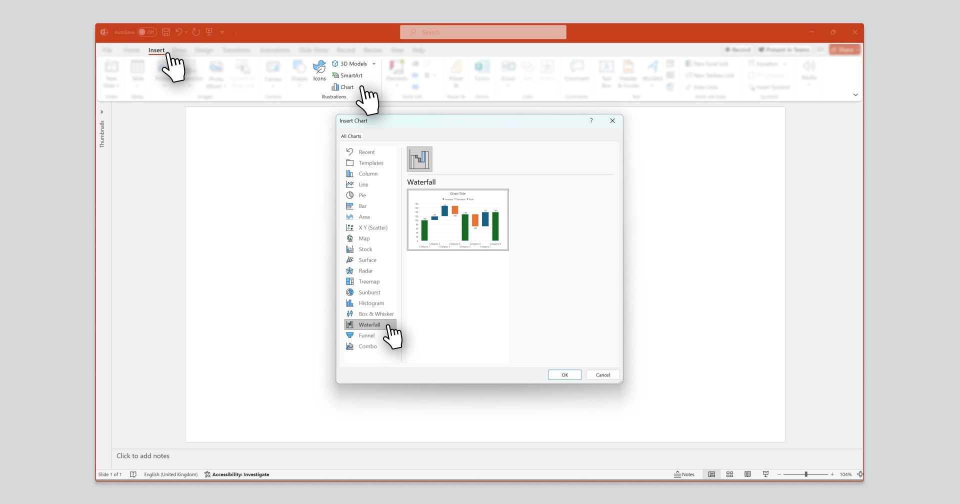
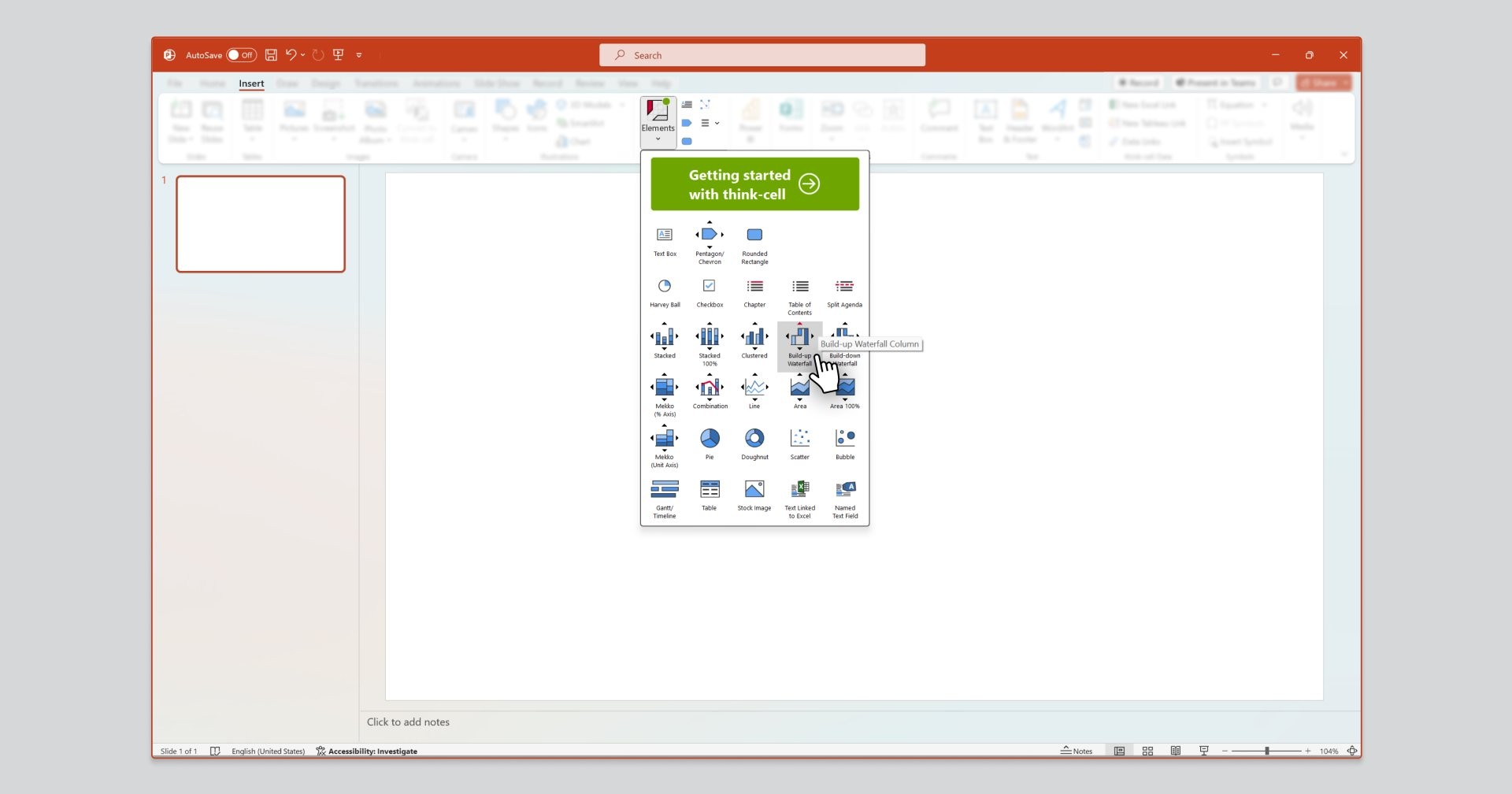
Once you have access to think-cell within PowerPoint, you can easily insert a waterfall chart as follows:
- Navigate to the Insert menu.
- Select ‘Elements’ under the ‘think-cell’ command group.
- Select ‘Build-up Waterfall’ and position your chart on your slide.
If you need help installing our software, you can read our simple installation guide. Once you have access to think-cell within PowerPoint, you can insert a waterfall chart in PowerPoint as follows:
Add data and information to your waterfall chart
The default think-cell chart comes prepopulated with some dummy data so that you already have a waterfall chart to start working on.
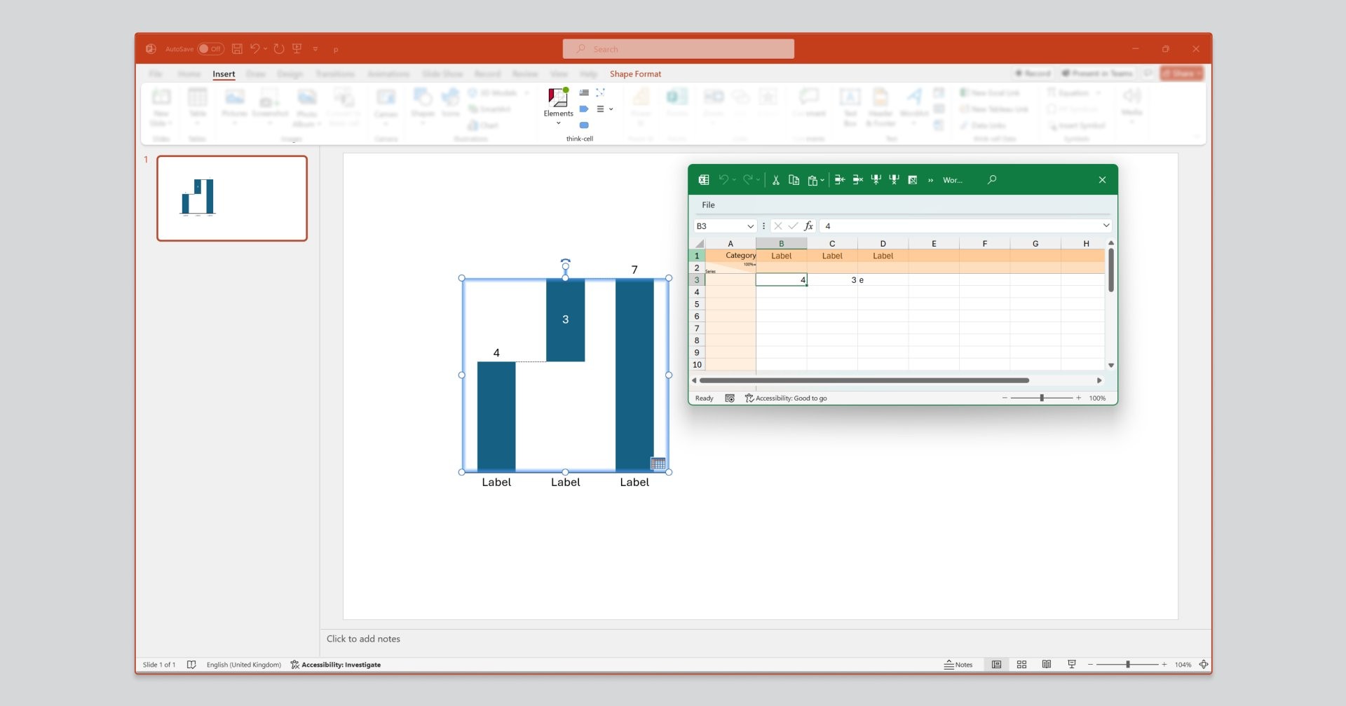
Adding your own data and information to your think-cell chart is quick and easy:
- Manage your data in the chart’s Excel-based datasheet: Like in native PowerPoint, think-cell charts have a datasheet behind them where the data is managed. This will automatically open when you insert your chart. Alternatively, you can access the datasheet at any time by double-clicking on your chart, or by clicking on the datasheet icon on the bottom-right corner of your chart.
- Add, remove, or edit column labels: The top row of the datasheet is where you can add column labels. You will see these update on the chart in real time as you enter them
- Add values to each column: You can type in the values for each category into the respective cells in the data row below.
- Add total or subtotal columns: With think-cell’s datasheet, you don’t have to worry about SUM formulas for totals or subtotals. You can type an ‘e’ (for equals) into any cell to automatically make the associated column a ‘total’ column.
Add additional rows for a stacked waterfall chart
Unlike PowerPoint and Excel, which don’t support stacked waterfall charts, think-cell does. You simply add an additional row of values to your datasheet and this will create a new segment for each column, letting you show, for example, how different business units contribute to a company’s revenue.
Adding data and information to your think-cell chart is quick and easy.
- Data is managed using your chart’s excel based datasheet. This will automatically open when you insert your chart. Alternatively, you can access the datasheet by double-clicking on your chart, or by clicking on the datasheet icon on the bottom-right corner of your chart.
- Add, remove, or edit column labels in the ‘Category’ row of the datasheet.
- Add values to each column by adding data to the respective cells in the data row below. Typing an ‘e’ in a cell will automatically make the associated column a ‘total’ column.
Style and format your waterfall chart
Styling and formatting can be applied to the whole chart or a single chart element. Select what you want to edit, then either left or right click to access formatting options.
- Right-click to add or remove chart features – for example, automatically calculated growth or total difference arrows, a legend, gridlines, a line break, labels, and more.
- Left-click to style your chart – for example, chart colors and font.
This short video gives you a quick summary of how easy it is to create a waterfall chart in PowerPoint using think-cell. For an in-depth guide covering more formatting and annotation options, you can refer to our user manual.

Build professional charts in seconds
- Download your free trial for faster creation of 40+ chart types.
- Auto-generate labels, annotations, and calculations. No formulas needed.
- Work seamlessly with Excel data links for automated reporting.
Frequently asked questions about PowerPoint waterfall charts
Here we summarize some of the most frequently asked questions about PowerPoint waterfall charts.
In a bar chart, all columns are totals connected to the horizontal x-axis. Bar charts are used to show a series of totals next to each other. In a waterfall chart, a mix of total columns and floating columns are used. Waterfall charts are used to clearly illustrate drivers of difference between total columns.
Waterfall charts are used to shine a spotlight on drivers of change, and the relative magnitude of these drivers. They are effective for visualizing areas of growth or decline (such as revenue or customer segments), or areas of over or underperformance (such as actuals vs targets).
A waterfall chart will typically start with a total column on the far left, followed by a series of floating columns which are read from left to right. Each floating column represents additions or deductions from the running total. On the far right of the waterfall chart, there is a second total column, which shows the cumulative effect of all the floating columns in the middle.
This sequence can be repeated more than once in a single chart, for which subtotal columns are used. Annotations, features, and styling can help readers interpret the chart better.
If using PowerPoint’s native charting functionality, select your PowerPoint waterfall chart, go to the ‘Chart Design’ tab at the top of the screen and open the ‘Change colors’ gallery. Here, you can select a color palette. You can set it up to display positive values in green and negative values in red, which is a common approach in reporting.
If you are looking to change the default labels of a native PowerPoint waterfall chart, this will not be possible. You can easily do this, however, if you build your waterfall chart using a PowerPoint add-in like think-cell.
If you want to change the position of the legend in a native PowerPoint waterfall chart, then go to ‘Chart Design’ tab at the top of the screen and locate the ‘Add Chart Element’ button under ‘Chart Layout’ group. Here you can set the visibility of the legend along with its position: top, bottom, left, right, top right. You can also choose whether the legend should overlap the chart area or not.
Unfortunately, neither PowerPoint nor Excel allows for stacked waterfall charts, which is a serious limitation for many presentations. There are workarounds using column charts with invisible columns, but the most efficient, scalable way to make a stacked waterfall chart is to use a PowerPoint add-in built for the purpose, such as think-cell.
You should use a waterfall chart when you want to present your data as a story, highlighting the impact different metrics have had on a total. Some typical usages of waterfall charts include:
- Tracking how net realizable value is achieved
- Displaying the difference between budget and actual costs
- Reporting on sales earnings for different segments
- Visualizing a sales pipeline
- Showing how P&L of a company has developed over time
- Interpreting financial statements
- Presenting factors that carry the greatest risk
- Creating OPEX and EBITDA reports
A waterfall chart is preferable to a bar chart if you have clear start and end values, and a number of other values that impact the final total. The waterfall chart’s floating columns help tell the story of how each value has contributed to change more effectively than bar charts where all columns are tied to the x-axis.
In everyday usage, there doesn’t have to be any difference between a bridge chart and a waterfall chart. Both use floating columns to show how different factors have contributed to a total. However, some people use the term ‘bridge chart’ to refer to a specific kind of waterfall chart that includes subtotals. The subtotal columns form visual arches, like a bridge across a river, rather than having a cascading flow like a traditional waterfall.
To create a waterfall chart in PowerPoint on macOS, follow these steps:
- Open the Excel spreadsheet that contains the data you want to turn into a waterfall chart.
- Select your data, then navigate to ‘Insert’, click on the waterfall chart icon, and select ‘Waterfall’.
- Use the Design and Format tabs to customize your chart’s appearance.
- To set a data point as a total, double-click on the data point to select it, then right-click and select ‘Set as Total’.
Explore this topic further with AI:
Read more
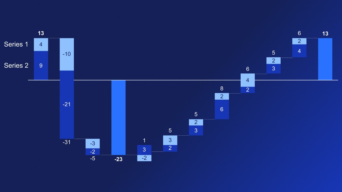
Learn how to use multiple series waterfall charts to tell a powerful, multi-layered story of how different factors contribute to an overall total.

Learn all about creating different types of PowerPoint timeline, including the best tools to use for making simple milestone charts and detailed project plans.

In the world of data analysis and presentation, finding the perfect visualization to convey your message is key. It's not just about presenting numbers; it's about telling a story that resonates with your audience. This blog explores how you can find the right visualization for your presentations.
Learn 7 steps for making an effective PowerPoint presentation, including how to structure your story, lay out your slides and create clearer, more impactful charts.
Discover more than 70 PowerPoint slide templates that help you get started faster and cover all the most common business presentation scenarios.