Create advanced PowerPoint charts in no time
- Professional PowerPoint visualizations with data-driven tables and over 40 other chart types.
- Automated annotations to share deeper insights with your audience.
- Seamless Excel-linking for 100% control and data consistency.
think-cell in numbers
end users worldwide
customers
Fortune 100 companies
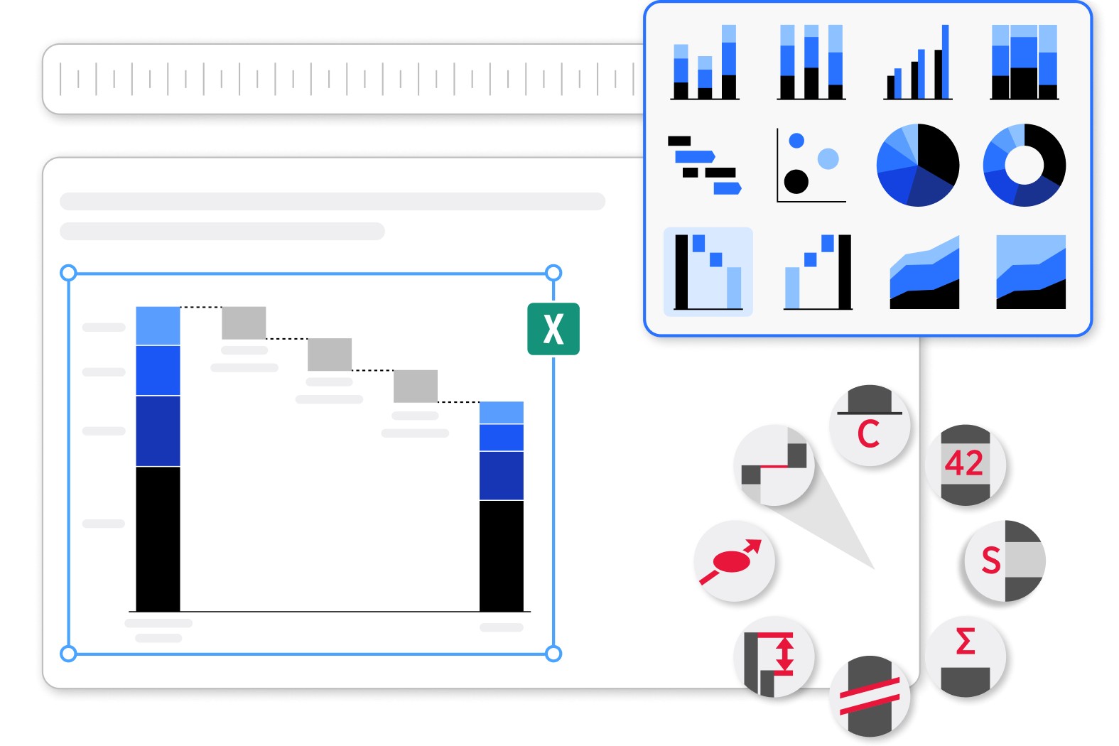
Transform any data into business insights
Turn your findings into a powerful narrative thanks to 40+ professional chart templates.
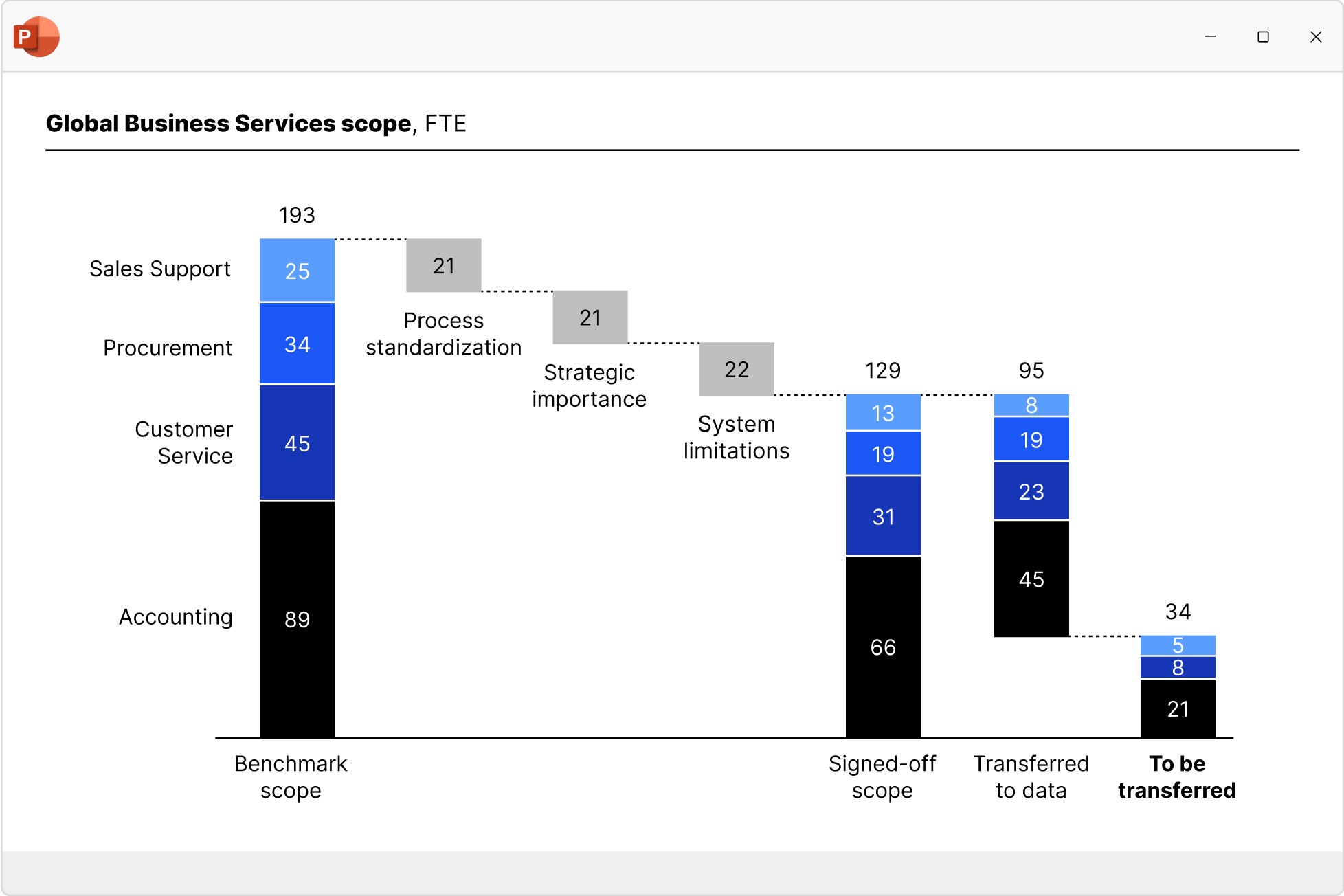
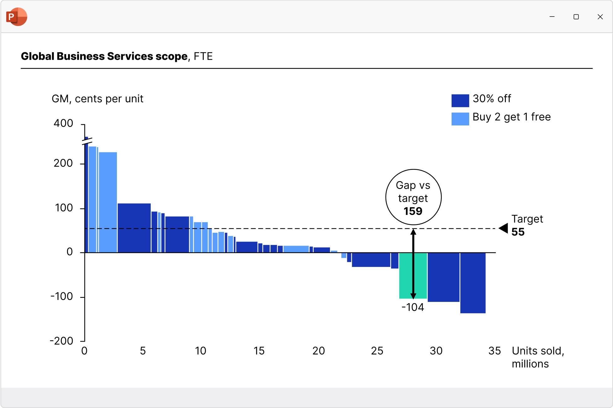
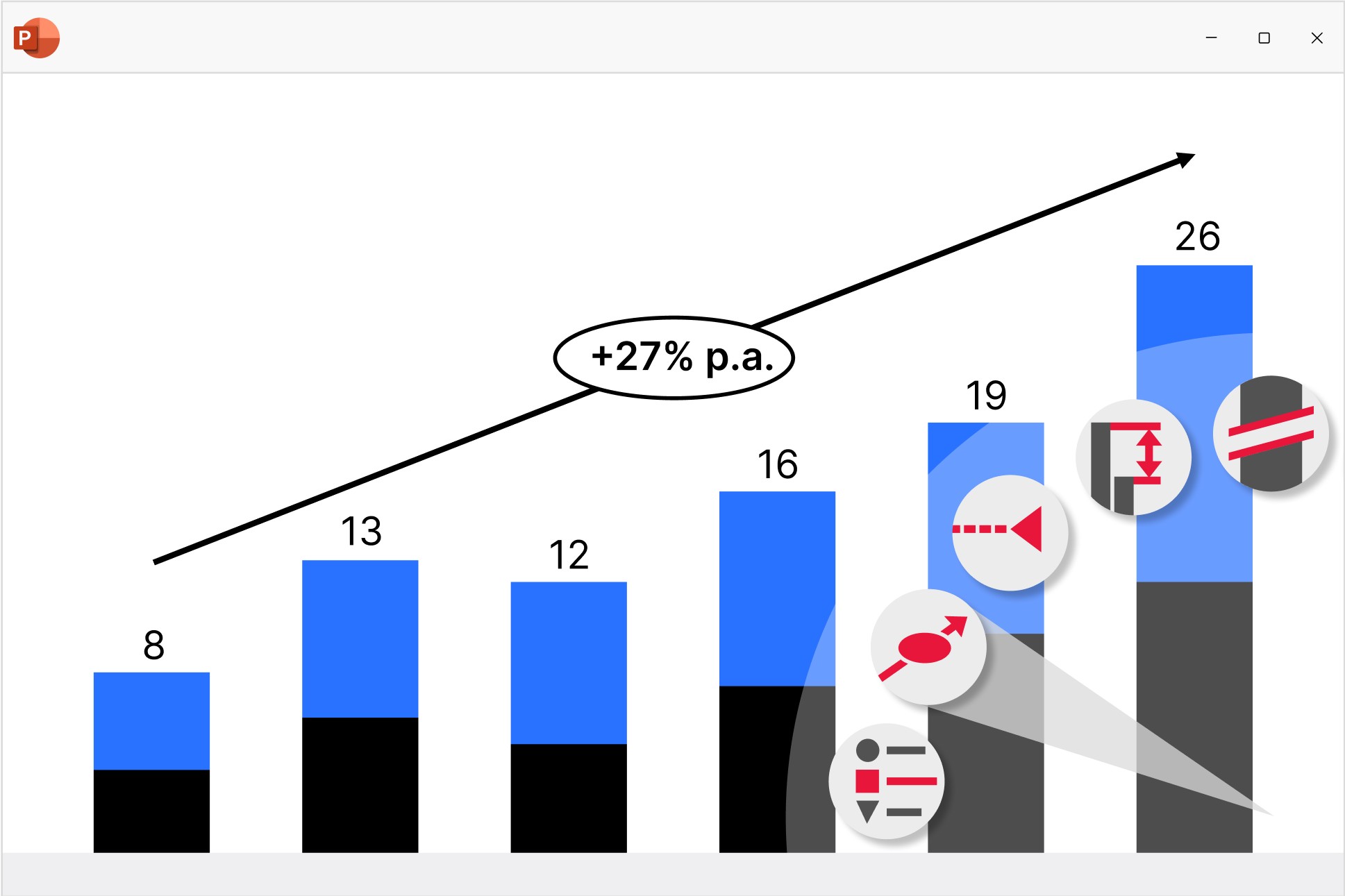
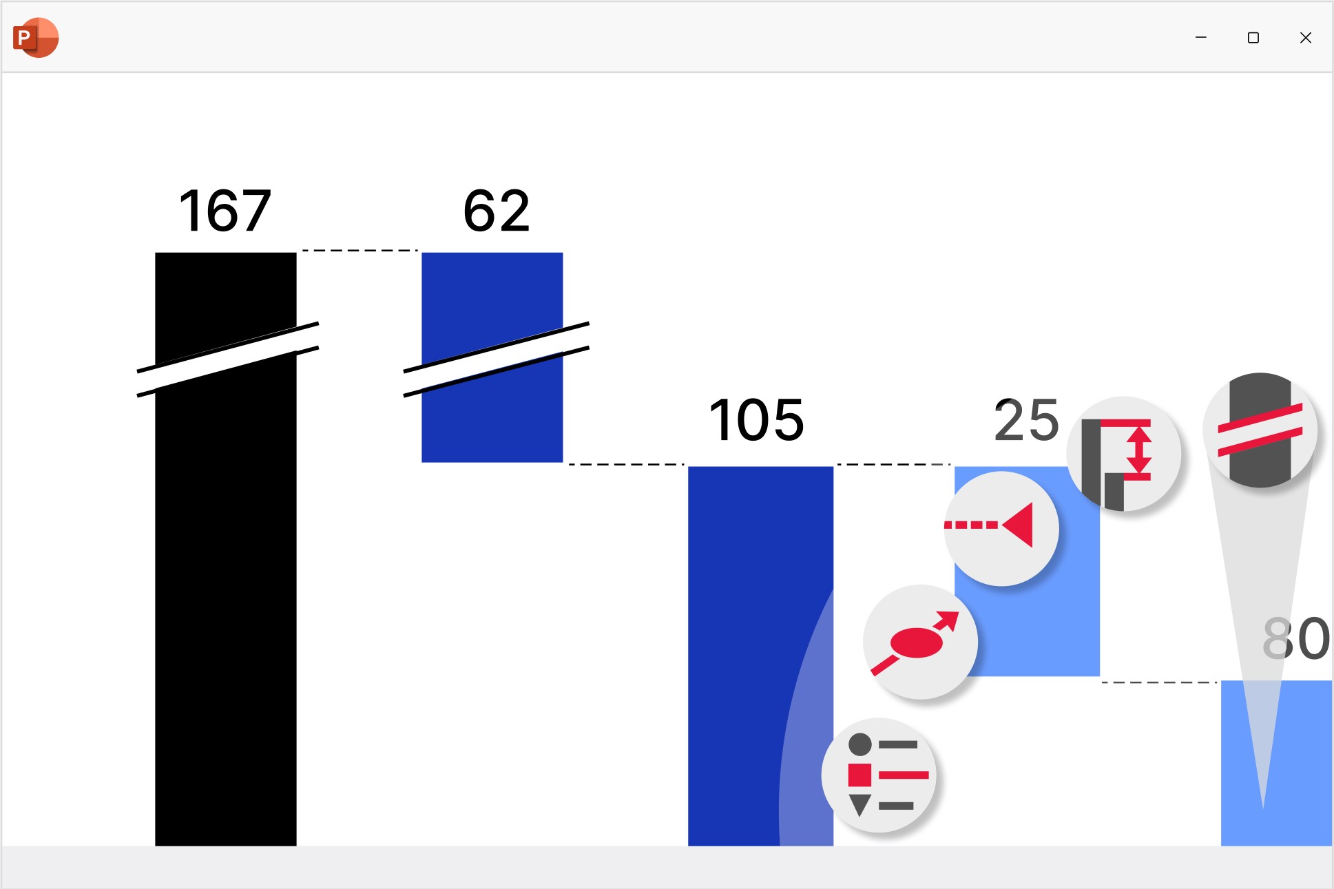
Waterfall charts
Create waterfall charts to show how different drivers contribute to an overall change. Industry standard for EBITDA bridge and P&L statements.
- Display multiple series with stacked segments.
- Include totals and subtotals that calculate automatically.
- Add segments that cross below the baseline.
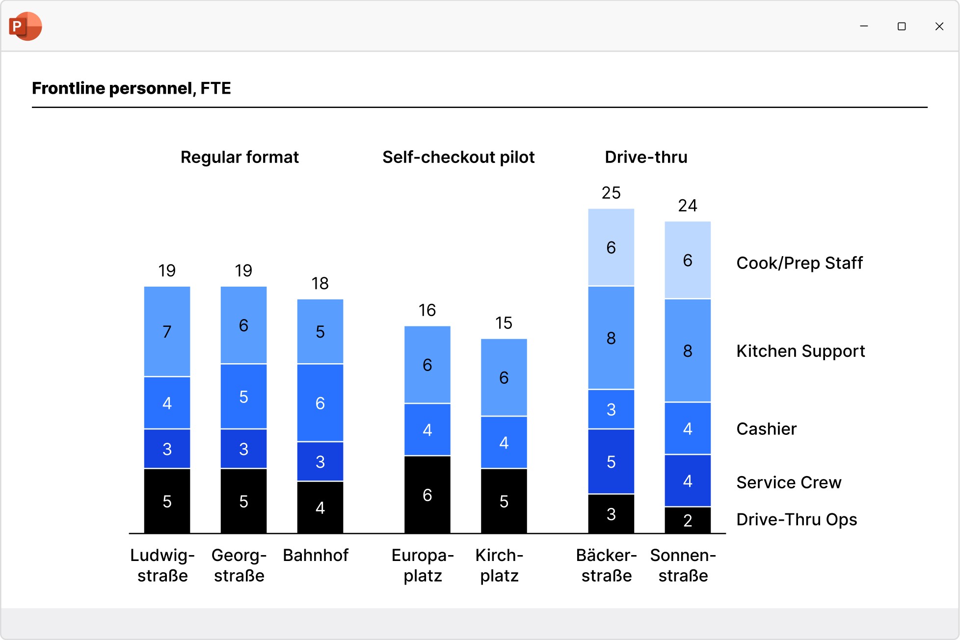
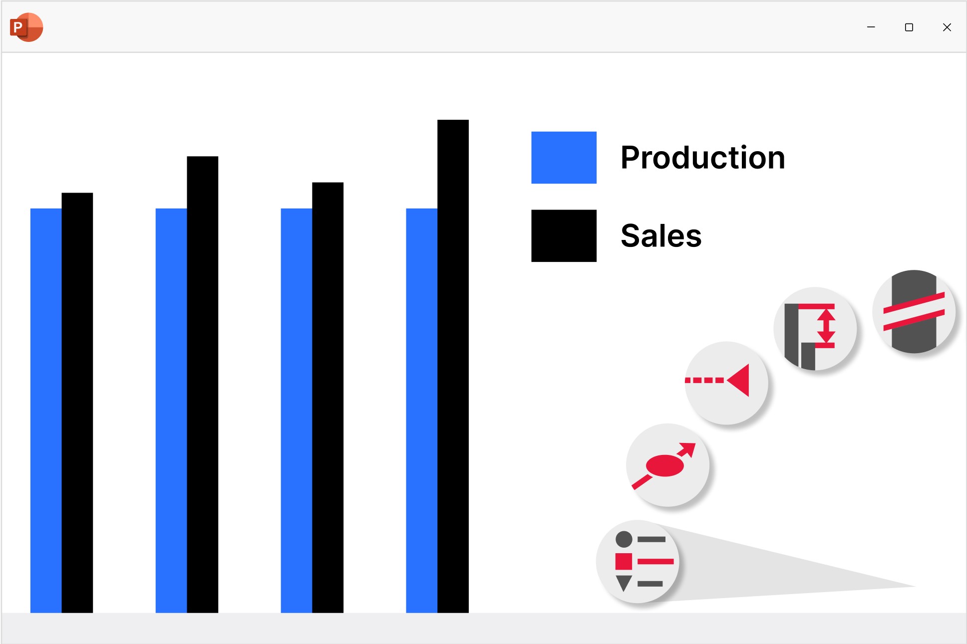
Column and bar charts
Use column and bar charts to present your data in a clear, digestible form anyone can recognize. Easily modified to create butterfly/tornado charts.
- Choose from stacked, clustered and 100% charts.
- Insert axis breaks to make best use of the slide space.
- Add category gaps to highlight distinct values like targets.
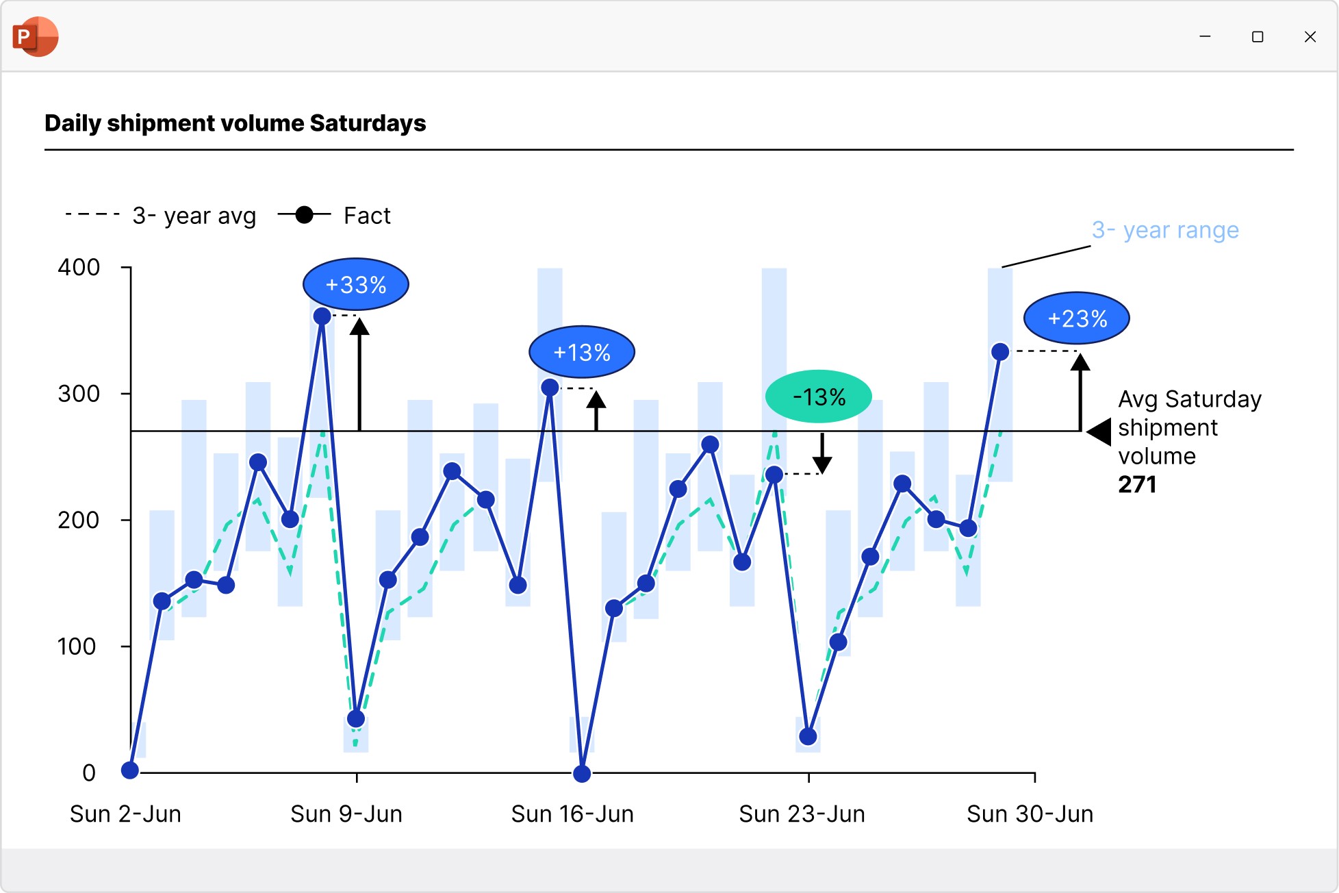
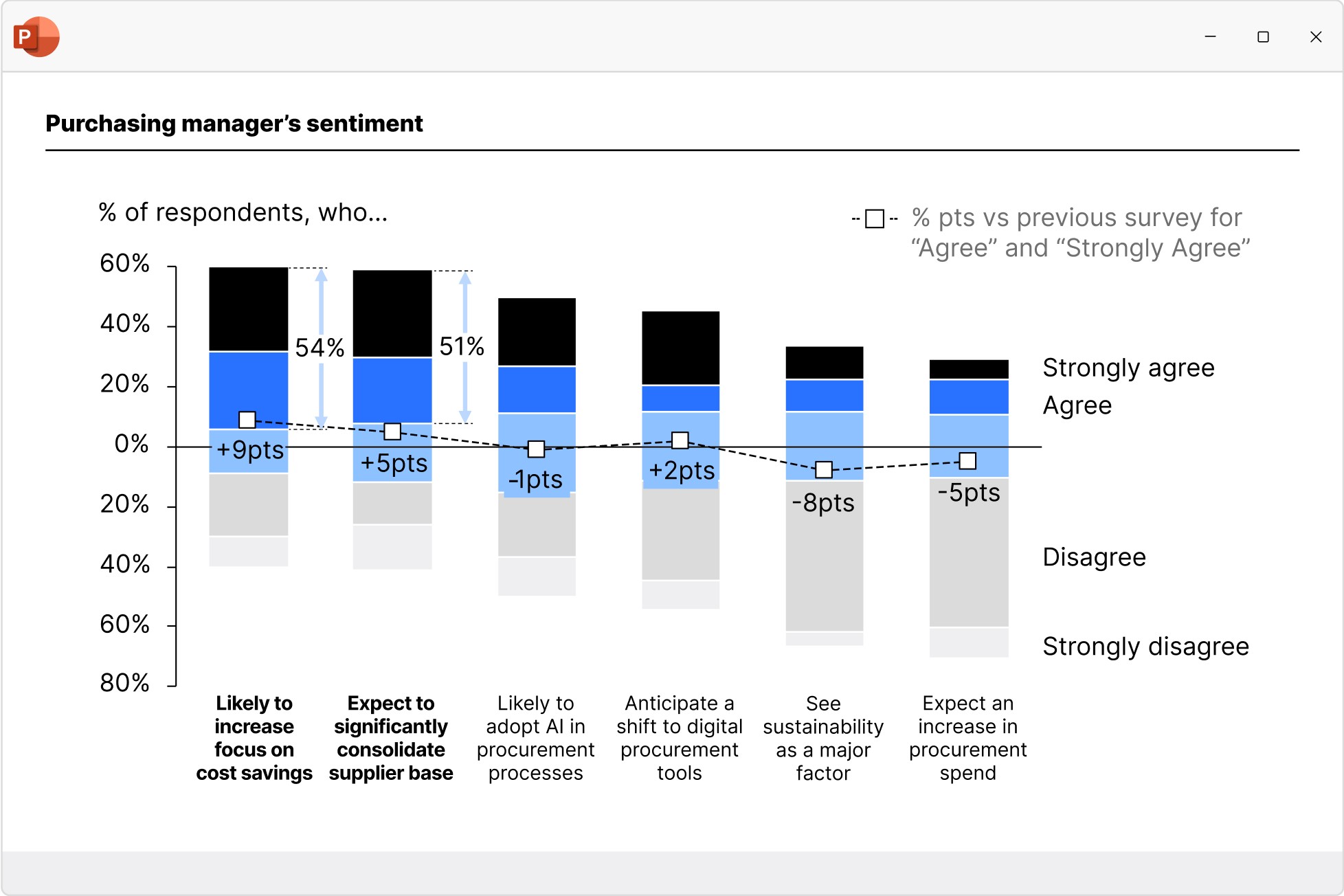
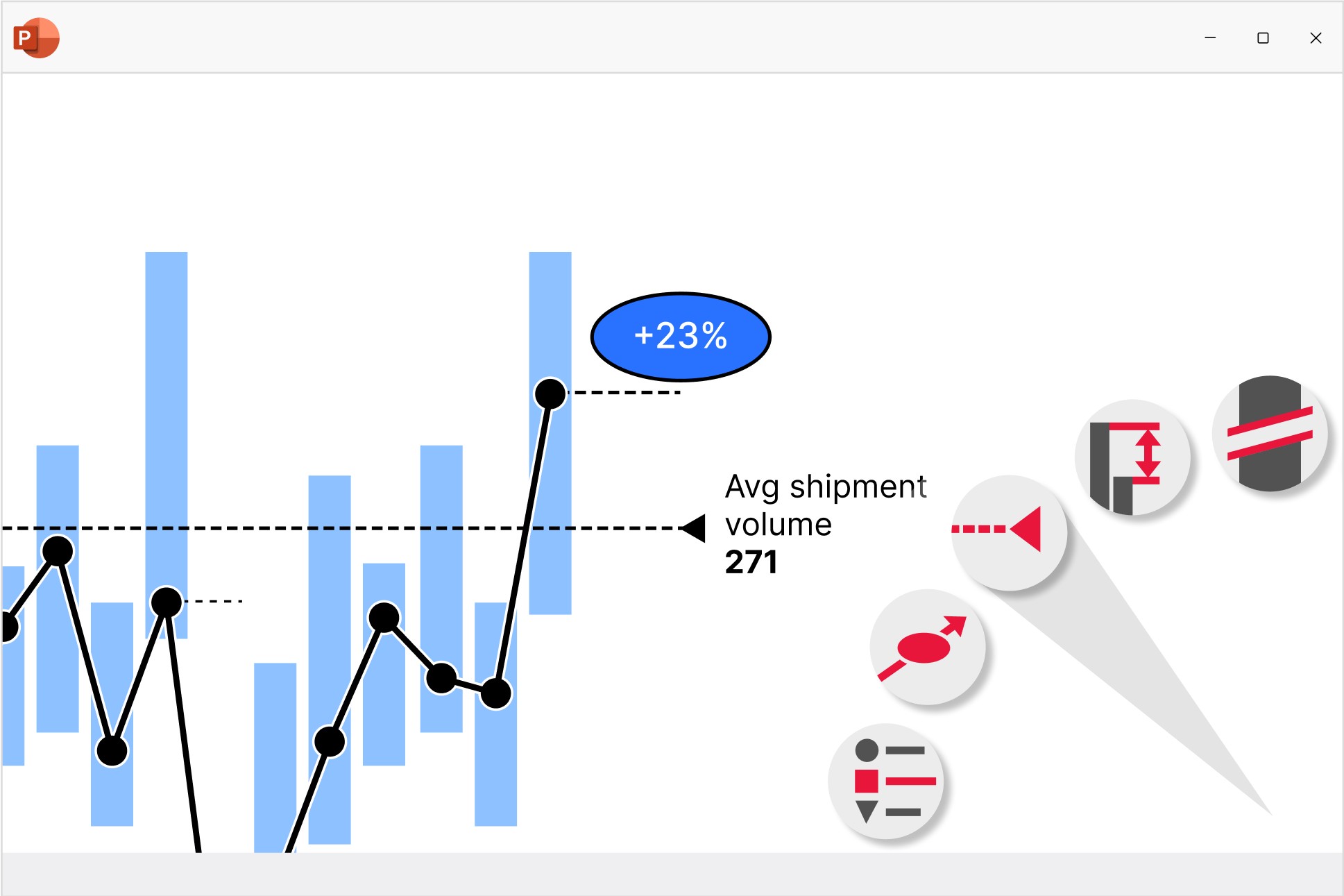
Line and area charts
Build line, area, and area 100% charts to communicate data trends over time. Versatile use as candlestick charts for stock prices or football field charts.
- Add a secondary value axis to better compare metrics.
- Add linear interpolation for any missing values.
- Use error bars to show confidence intervals.
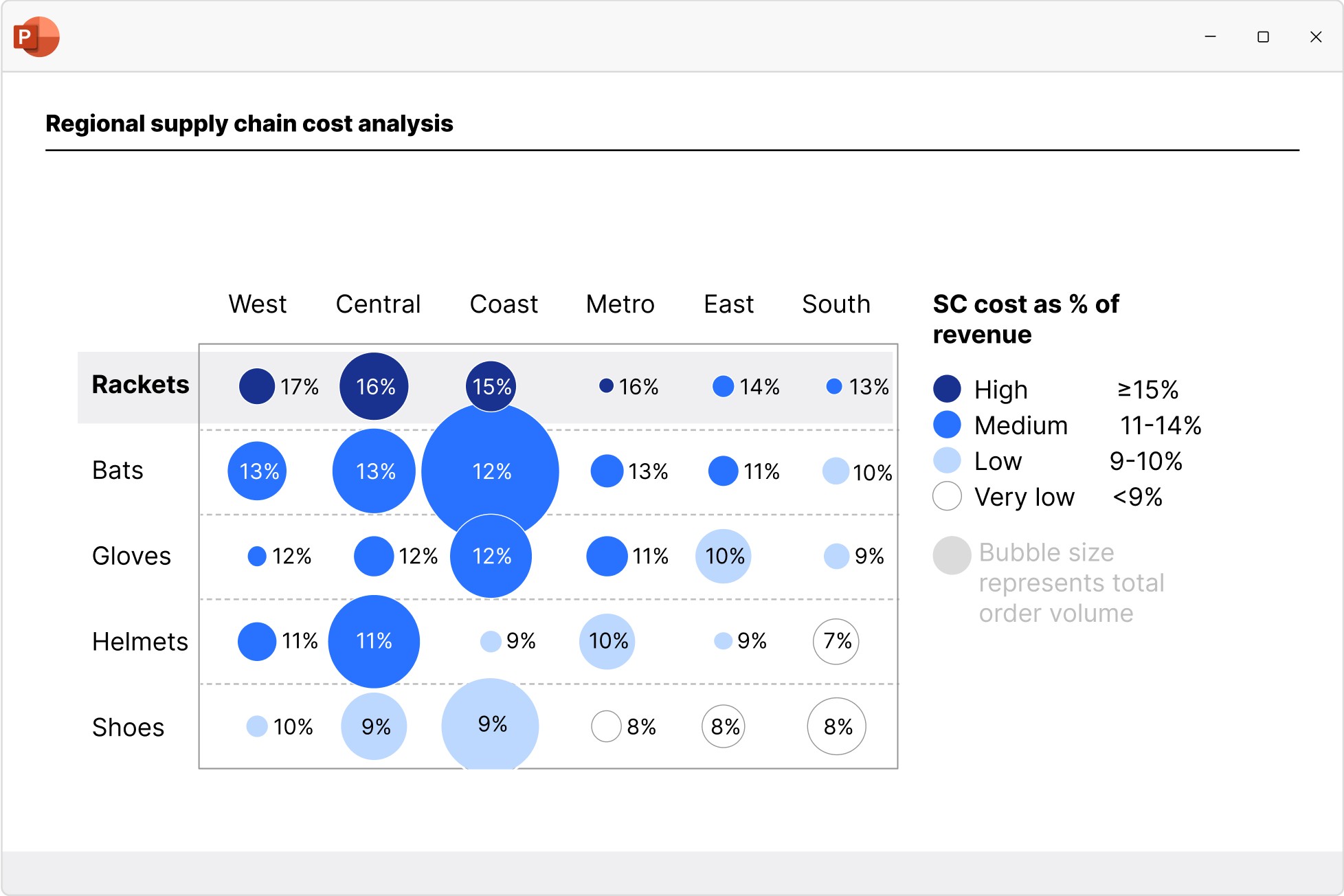
Scatter and bubble charts
Create scatter and bubble charts to show the relationship between two variables, reveal patterns in categorized data, and uncover outliers.
- Ensure maximum readability with automated point labels.
- Use bubble sizes and group colors to communicate more information.
- Shade or color partitions to highlight segments in scenarios, heat maps, etc.
Pie and doughnut charts
Use pie and doughnut charts to easily visualize the proportions of each category within a 100% total. Can be easily modified to create gauge charts.
- Break out individual slices to add emphasis
- Add connectors to create pie of pie charts or show segment growth.
- Use concentric doughnut charts for multi-series comparisons.
Mekko charts
Build Mekko charts to show data in two dimensions, using column width for total category sizes and height for proportions. Ideal for market shares.
- Choose from unit axis or percentage axis.
- Avoid manual workarounds as column widths are calculated automatically.
- Combine smaller segments to ‘Other’ to reduce noise.
Combination charts
Create combination charts to show trends and relationships between data series, bringing column/bar and line charts together in a single visualization.
- Set each series flexibly to be displayed as a column/bar or line.
- Use a secondary value axis to display data or series with different scales.
- Sort columns in descending order to create insightful Pareto charts.
Create professional Gantt charts directly in PowerPoint
Ensure maximum clarity in your project management reporting.
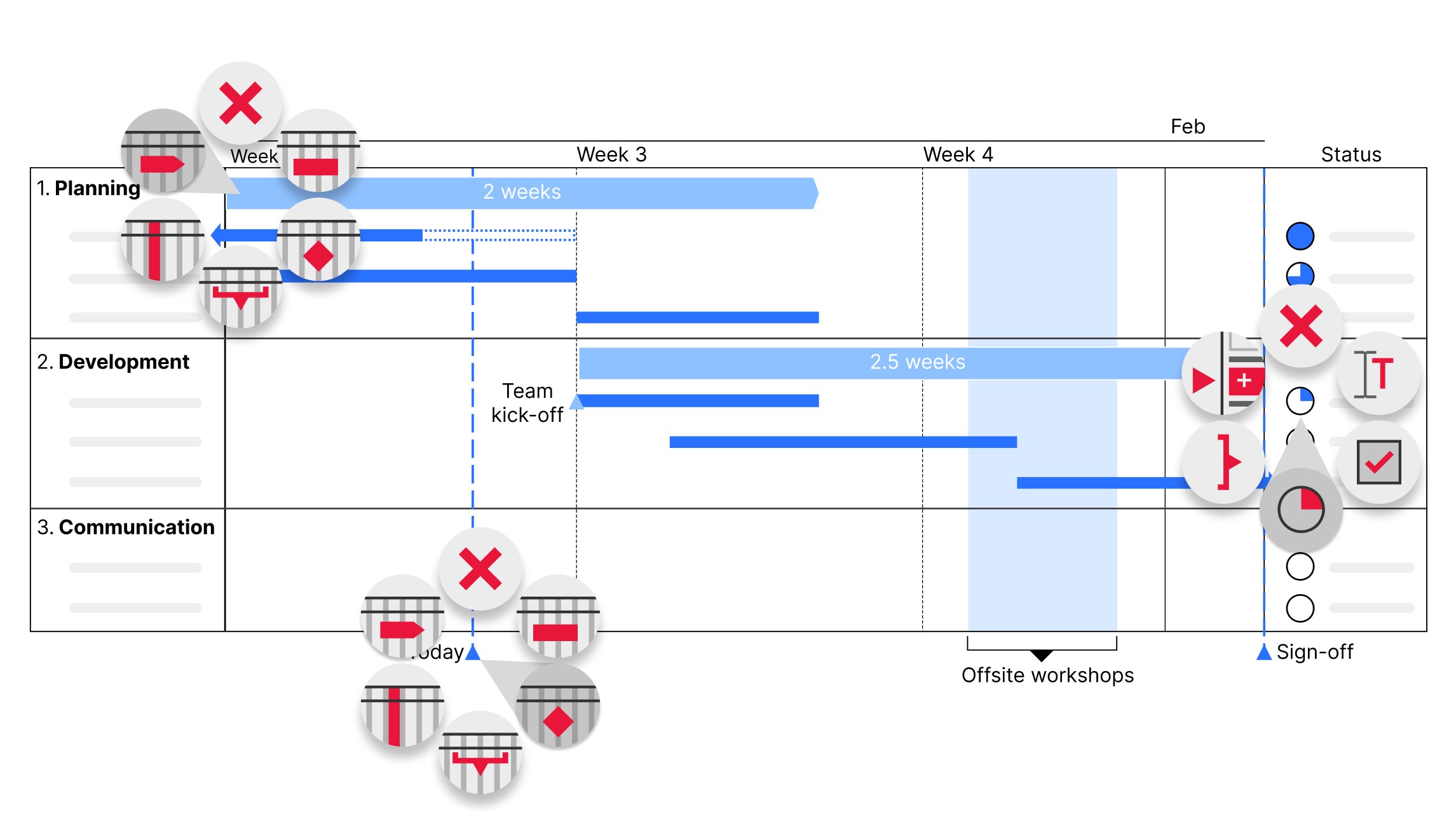
Add flexible columns containing data-driven elements like Harvey balls and checkboxes to show project status and completed initiatives.
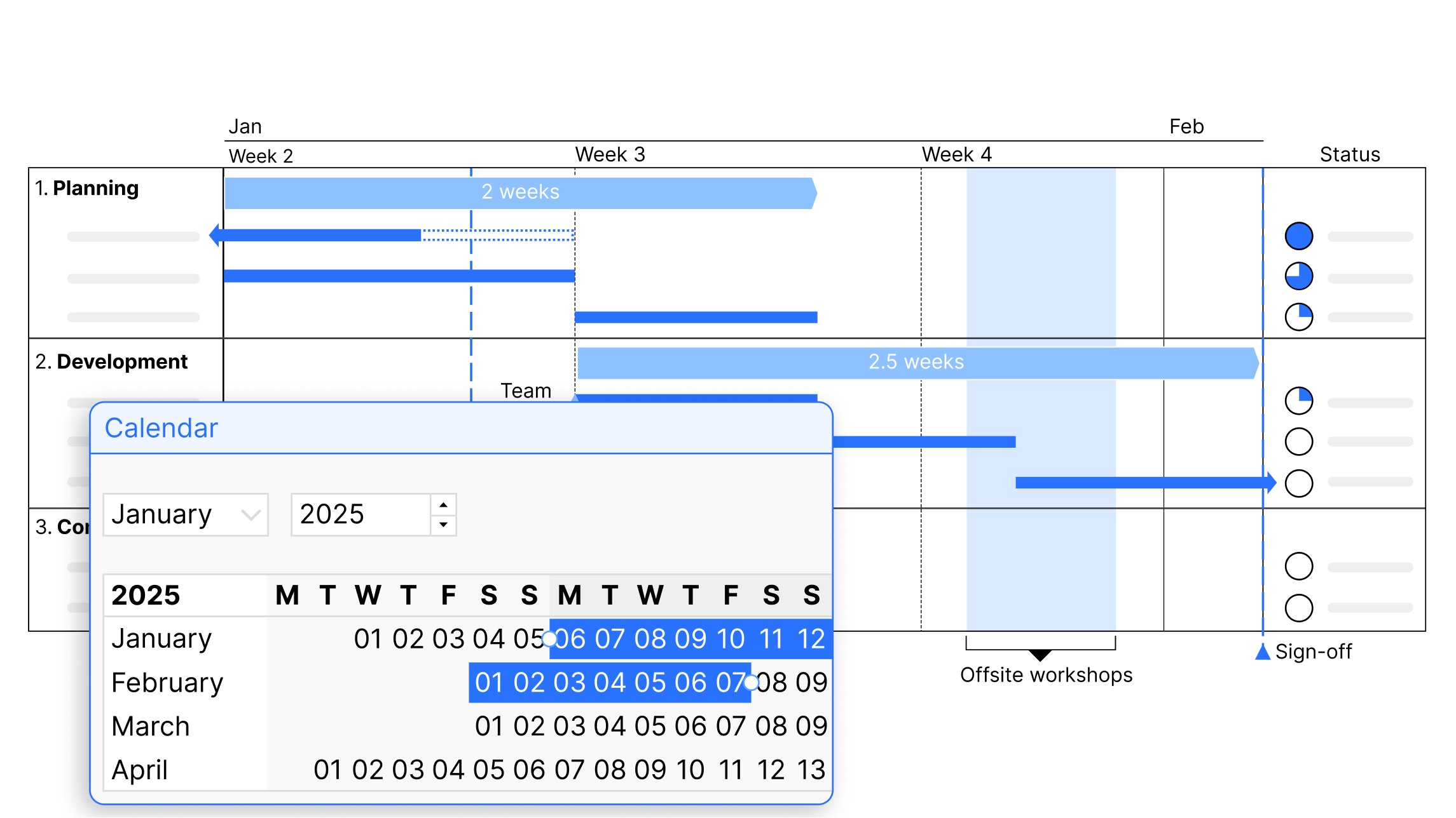
Choose your scale from day, week, month, quarter, or calendar and fiscal years, and add activity bars and milestones that connect directly to the calendar.
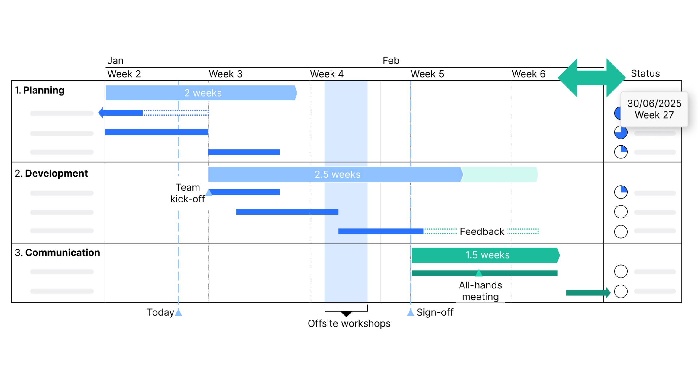
Edit your content, not your row heights and column widths. The Gantt chart adjusts automatically to maintain readability when you add or remove items.
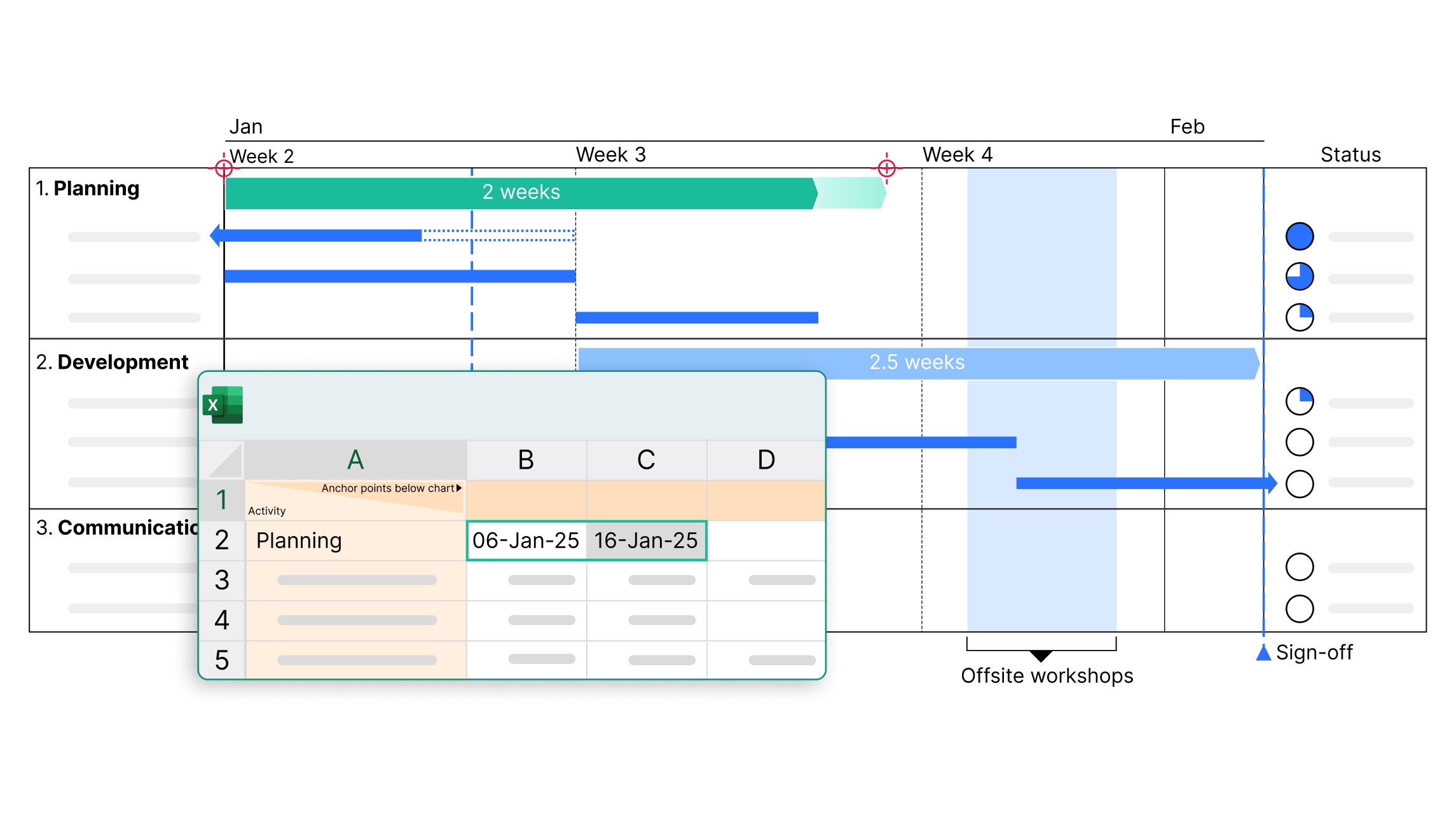
Connect Gantt charts with your Excel and enable automatic data updates. Ideal for large projects and frequent data changes.
Get started with think-cell
- Create professional charts and data-driven tables.
- Deliver impactful presentations faster.
- Try for free, no credit card required and no cancellation necessary.
Save up to 70% time working on slides
think-cell’s smart features boost productivity by eliminating manual formatting and cutting chart creation time to minutes.
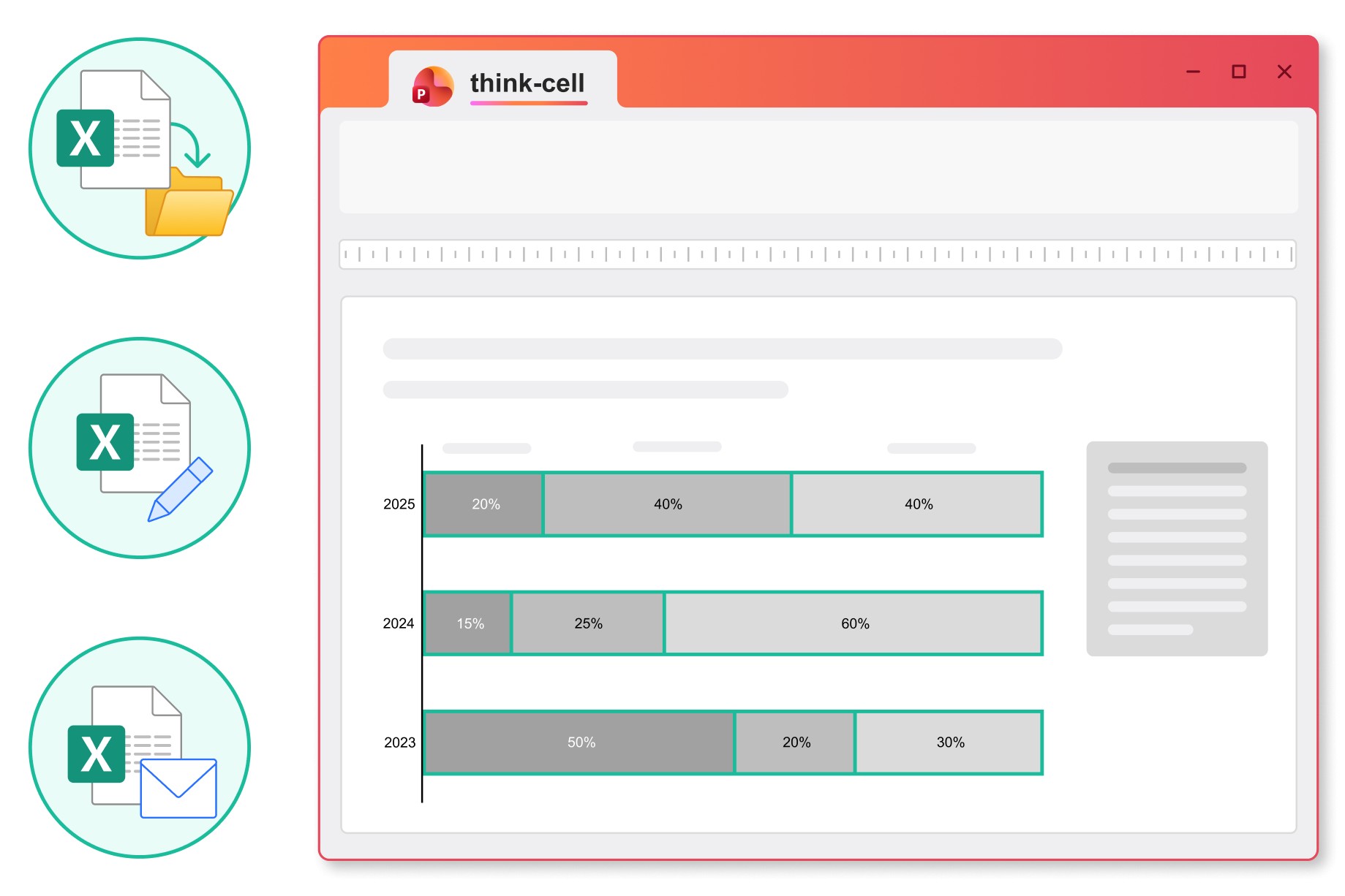
Data-driven tables
Include formula-powered data in your presentation without needing a separate Excel spreadsheet. No need to manually adjust values.
- Use familiar Excel formulas to automate calculations.
- Easily apply styles like row and column striping.
- Add Harvey balls and checkboxes that sync with your datasheet.
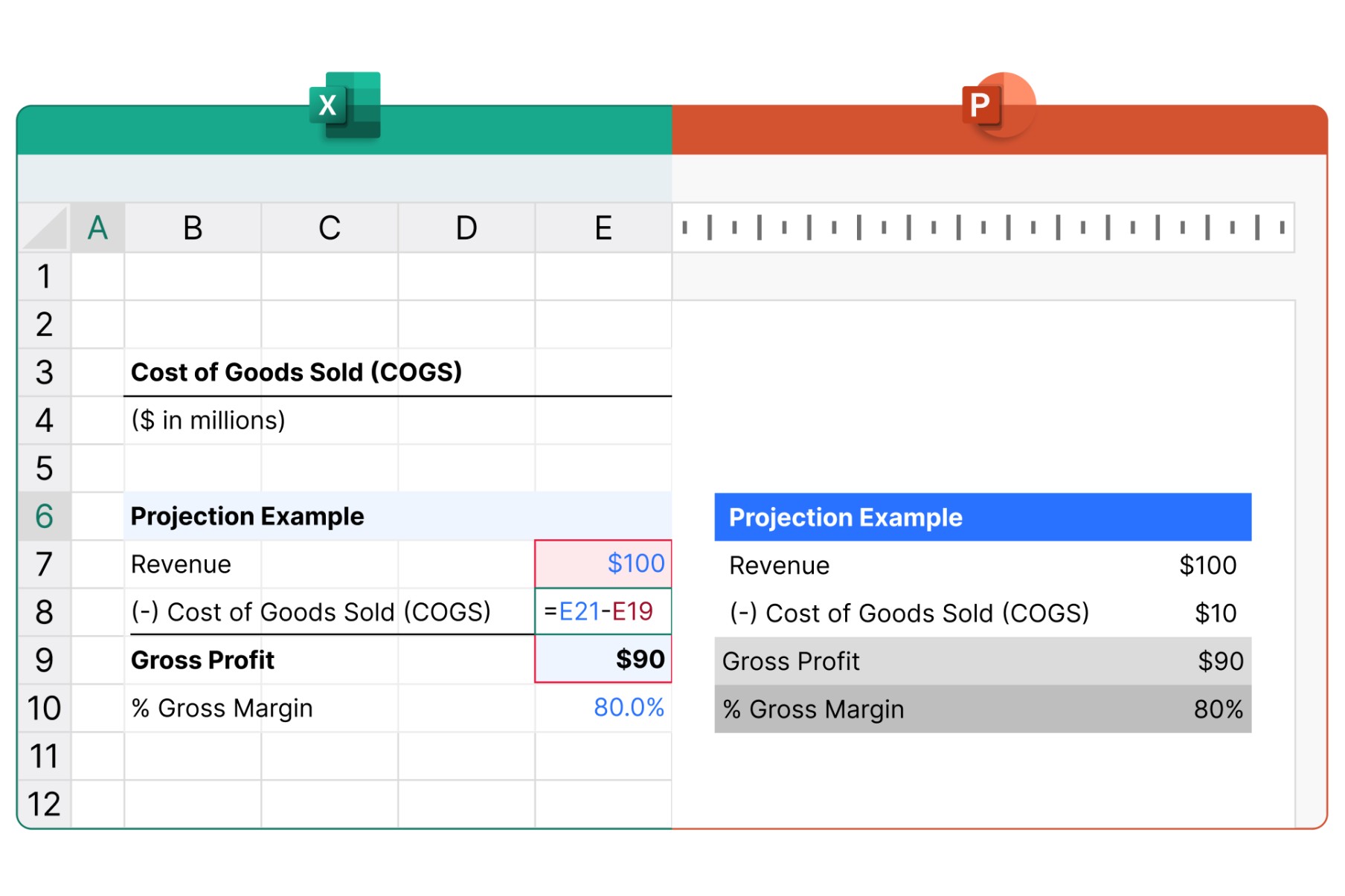
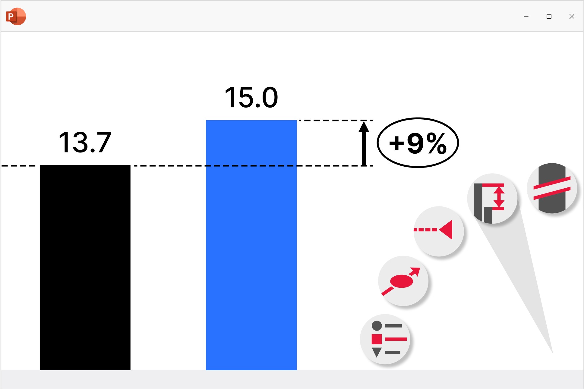
Chart annotations and decorations
Highlight key insights with a range of auto-calculated enhancements that are positioned perfectly for best practice chart layouts.
Excel links
Control how you manage updates to ensure your presentations maintain full data consistency.
Move, rename or email your Excel files and the links to your PowerPoint presentation will stay intact.
Link any content from a cell in your Excel spreadsheet to charts, tables, in-line text or any other object in your PowerPoint presentation.
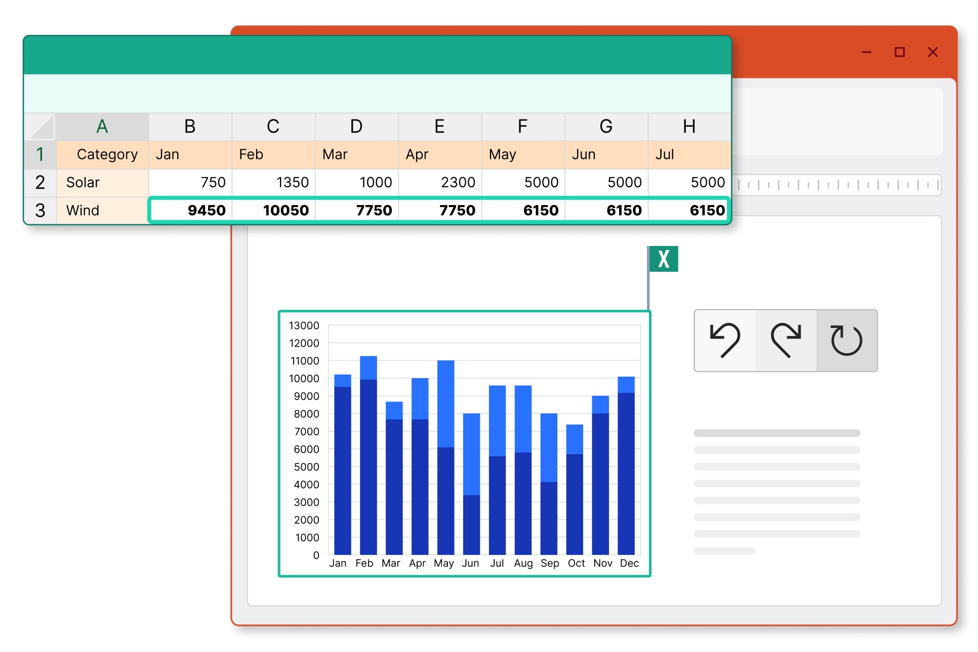
Choose between automatic and manual updates, and revert to previous versions to stay in control of the data you share.
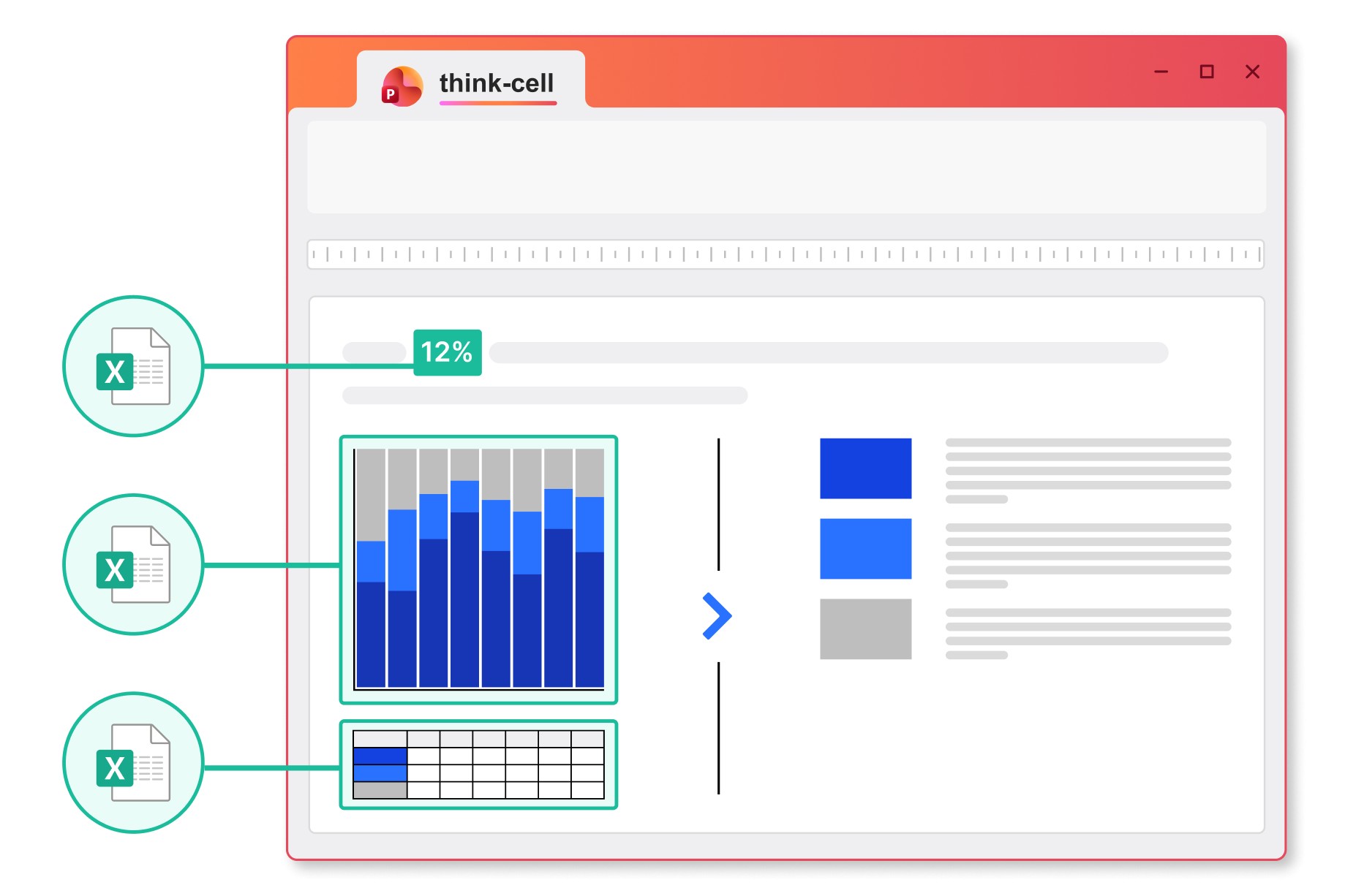
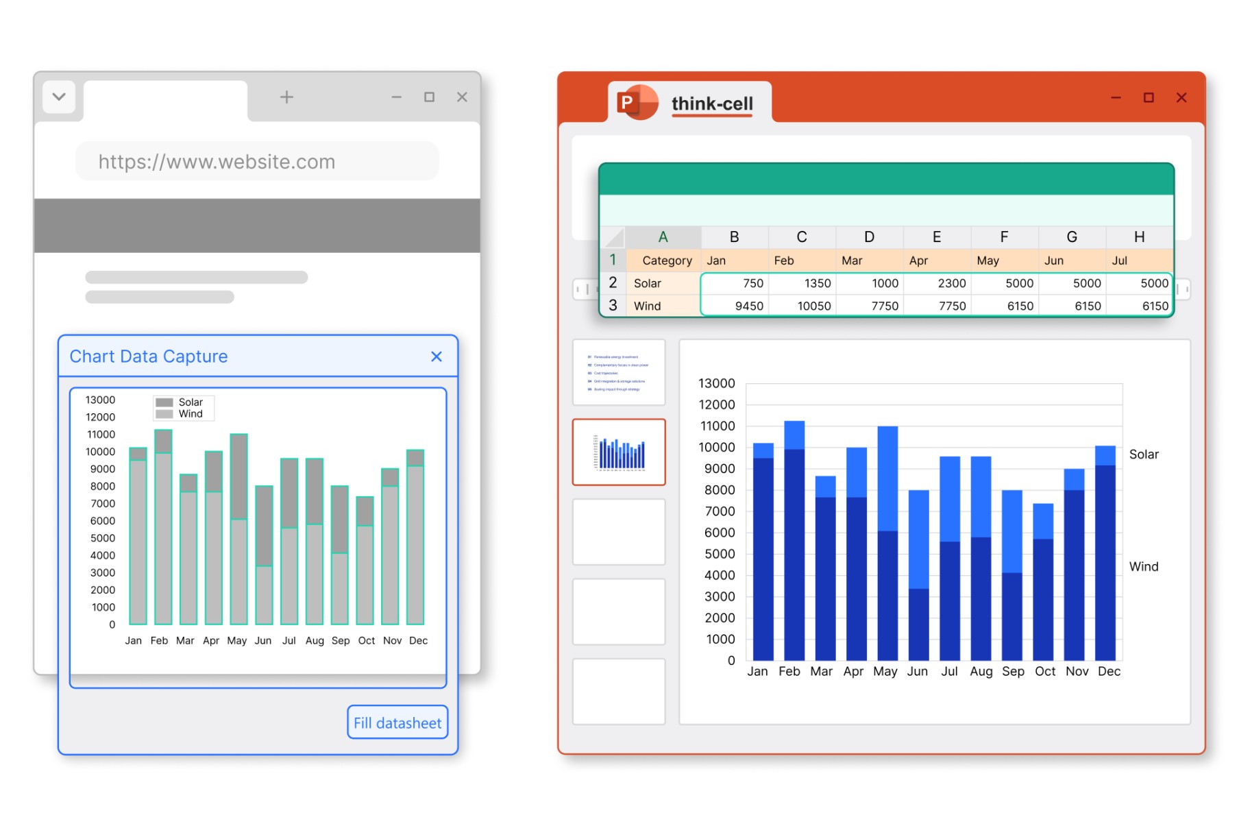
Chart scanner
Instantly create data-driven think-cell charts from images.
- Take a column or bar chart from any source and replicate it in your presentation.
- Capture all chart values and category labels.
- Edit, annotate, and adjust styling as you can with any other think-cell chart.
Link and manage data from any source
Advanced users can link to Tableau or use think-cell’s API to populate templates with charts, tables, text boxes, or in-line data fields.

Connect charts and tables to Tableau. Easily integrate data from your online dashboards.

Link individual elements or entire presentation templates via API. Works with any source that supports JSON exports.

Highlight all the data links on a slide. Set update scope to objects, slides or entire presentations.
Trusted by over 35,000 companies worldwide
People know exceptional software when they see it.

Automating chart creation and updates cuts the time spent on presentations by half, allowing the team to focus more on analysis and less on formatting.

The ability to create Gantt charts quickly to manage project timelines and align cross-functional teams is a game-changer.

We automate our reports by establishing links not just to chart data ranges, but to every single cell that contains a value. In this way, think-cell’s Excel links helps us generate our reports faster, while also guaranteeing 100% accuracy.

If I need 10 minutes to create a chart natively in PowerPoint, think-cell reduces this to just 3-5 minutes.