How to make smart use of pie charts in PowerPoint presentations
- Home
- Resources
- Content hub
- How to make smart use of pie charts in PowerPoint presentations

22 min read
If you’re a heavy user of PowerPoint and data visualization is a big part of your job, chances are that you either love pie charts or you hate them. At the very least, you have probably heard several strong opinions on the subject, and it’s likely not all of them have been positive. On the other hand, a more casual PowerPoint user who wants to choose the best way to visualize their data will often find pie charts mentioned among the best, most accessible charts to use.
So who’s right? Or could there be a possible middle ground to what seems like a polarizing debate on pie charts?
Quick answer: When should pie charts be used in PowerPoint?
Use pie charts in PowerPoint when you need to show how parts make up a whole, like budget breakdowns or market share, with 2-5 clear categories. Skip pie charts when comparing precise values, showing trends over time, or working with many similar-sized segments. For those cases, bar charts or line charts work better.
The reputation of pie charts may have taken a hit over the years, but when used strategically, they can still be an effective tool for data storytelling. In this blog article, we take an objective look at pie charts. We explore opinions on their pros and cons, look at why and how they’re used, and argue that in some cases, pie charts can be a solid choice to represent your data and convey your message effectively.
This article covers the following points:
- What is a pie chart used for?
- Why are pie charts so widely used?
- Arguments against pie charts
- Pie charts in PowerPoint: Quick decision guide
- Best practices when making pie charts
- 3 common pie charts mistakes in business presentations
- Why pie charts add value to PowerPoint presentations
- How to create pie charts in PowerPoint
- How to create pie charts with think-cell
- The case for pie charts
- Summary: When pie charts work in PowerPoint
If you’d like to explore using think-cell to create pie charts, you can start a free trial and have unlimited access to all features.
Who this guidance is for
If you're creating PowerPoint presentations for clients, executives, or stakeholders, and you want your data to be understood at a glance, this article will help you decide when pie charts work and when they don't.
What is a pie chart used for?
A pie chart is essentially a 100% chart that is presented as a circle instead of a column, and divided into slices, with each slice representing a portion of the whole.
Because pie charts are so familiar as one of the most universally understood forms of data visualization, a clean pie chart can be a good visual to introduce your audience to the big picture at the beginning of a presentation, before you go deeper into details. When your primary goal is to help your audience quickly grasp proportions, few visuals do it more intuitively than a well-designed pie chart.
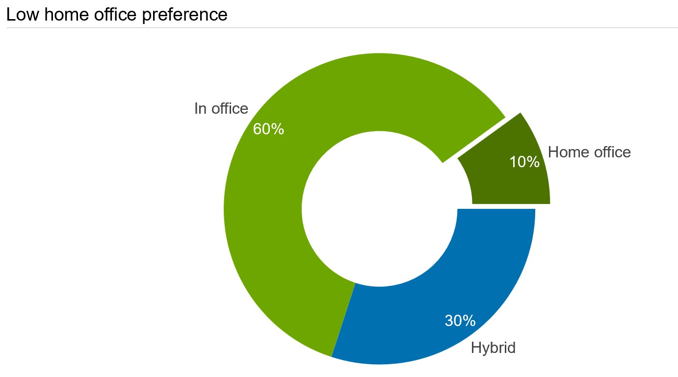
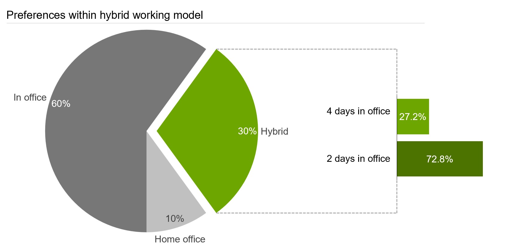
Consider the following example where the results of an internal employee survey on their working model preferences are represented in a 100% column chart alongside a pie chart.
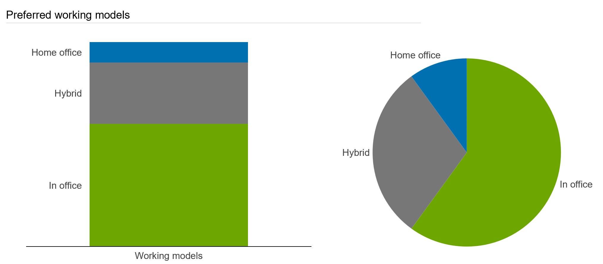
Even in this extremely simple pie chart, without any additional guidance or even data labels, the audience only needs an instant to understand several features of the data:
- In office is the most popular working model.
- Home office is the least preferred working model.
- More than half of employees prefer working in office.
- The hybrid model is preferred by just over a quarter of employees.
This simplicity is one reason many people still think fondly of pie charts and employ them in their presentation, even though others argue vehemently that pie charts are too often misused, greatly overused, and rarely the best choice for serious data visualization.
Why are pie charts so widely used?
The cry to abandon pie charts has grown louder over the years, but they remain widely used and are still a standard feature of data visualization tools. As a general rule, if the data you want to represent adds up to 100%, then pie charts are an option worth considering. Even if you want to label your chart with absolute numbers rather than percentages, pie charts can be used, provided the slices all combine to make a meaningful whole.
When are pie charts most useful?
Pie charts in journalism and academia
From academic work and political reporting to journalistic writing and research journals, pie charts are used in a wide range of contexts. It is evidence of their effectiveness that, even with the growing use of technological innovations, pie charts still find a place in election reporting and analysis in many countries.
In election reporting, pie charts or their variant, semi-circle pie charts are both used to represent the vote share of candidates or parties within a constituency, or to show the split of different voting methods.
In the following example, we take a look at a country that uses mixed methods to cast votes. Thanks to the pie chart, we see straight away that more than half of the votes were cast via paper ballot, while electronic voting is the least used method.
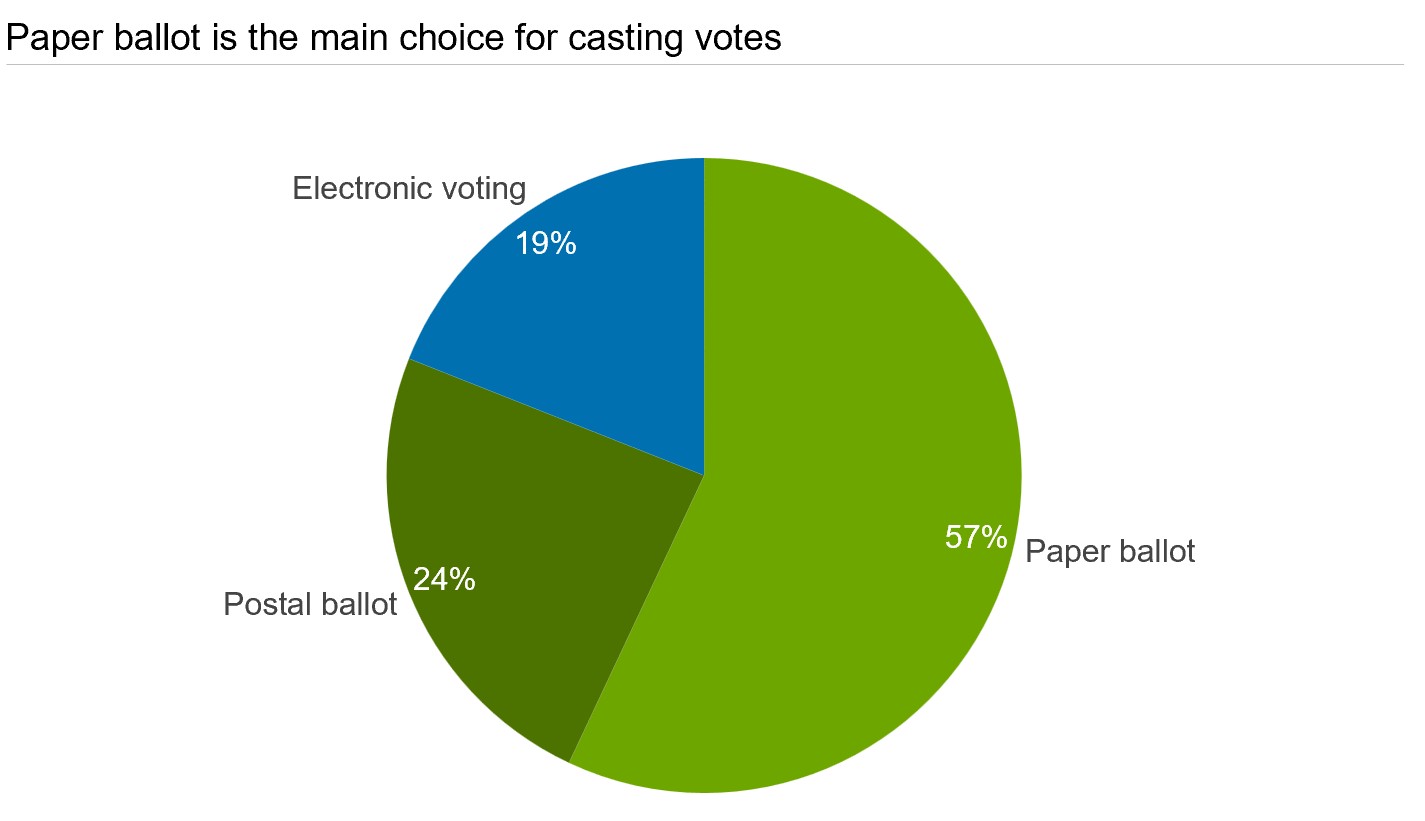
While the ability of pie charts to simplify complex data and make it accessible for non-expert audiences is what motivates their use in electoral reporting, they also hold significant value in the context of business presentations.
Pie charts in business presentations
Pie charts are a staple chart used to answer questions such as:
- What is our company’s market share vis-à-vis our competitors?
- What proportion of our marketing budget goes to paid channels?
- What is the revenue breakdown by product categories this quarter?
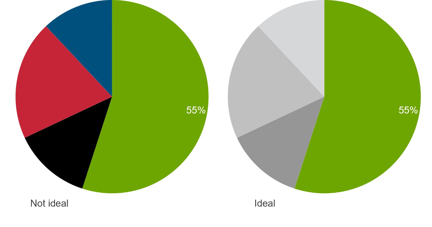
Let’s look at an example where Company A is the biggest player in the market selling organic produce, with the following pie chart illustrating their market share vis-à-vis their top competitor. Thanks to the way we recognize certain proportions, the pie chart makes it immediately clear that the competitor has captured over a quarter of the market. Depending on the context, this could be a wake-up call for Company A that its dominant position is under threat.
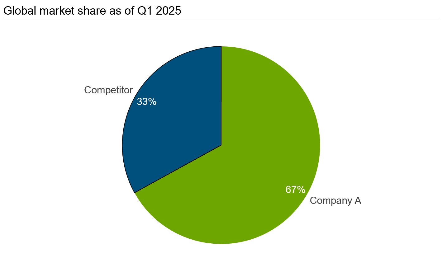
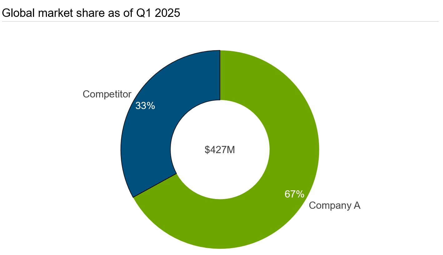
Tip: For market-share data, another common visualizing option is the donut chart, which is essentially a variant of a pie chart, just with a hole in the middle. The hole doesn’t just change the aesthetic. It can also be used to supply context to the visualization by showing the total sum value of the data set, in this case the overall market volume.
Learn more about how easy it is to switch between pie charts and donut charts in our user manual.
When should you avoid using pie charts?
Rule of thumb: If your audience needs to compare values precisely, track changes over time, or interpret many categories, a pie chart is usually not the best choice.
Arguments against pie charts
For all pie charts’ real-world uses, it’s hard to argue with the fact that some data is better represented with a bar chart or column chart, instead of a pie chart.
For example, pie charts work best for ad-hoc presentations where you already know that there is a dominant slice that you want to focus on. However, if you are dealing with a dataset that periodically changes, pie charts are the wrong choice. A pie chart’s suitability heavily depends on the data at hand. To show the breakdown of total sales across regions, for instance, a stacked 100% bar chart fairly depicts the dataset.
American mathematician and statistician John Wilder Tukey, who is best known for inventing the box plot, is even more unequivocal. He has been quoted as saying that there is no data that can be displayed in a pie chart that cannot be displayed better in some other type of chart.
Some of the common complaints people have against pie charts include:
- Pie charts are outdated.
- Colorful slices interfere with data comprehension.
- Pie charts are hard for people to read.
- Humans are categorically bad at comprehending proportion from angles.
- There are far better charts than pie charts.
Data visualization expert Nick Desbarates, on the other hand, who declares himself "an anti-pie-charter who switched camps," declares that all is not lost. When certain conditions are met, he says, pie charts continue to be an effective tool. Let’s briefly look at some of the conditions:
- There should be no overlapping categories.
- The categories should either be positive values or negative, not a mix.
- There should be fewer than six or seven categories.
Using these conditions, it’s easy to quickly establish whether or not a pie chart might be suitable for representing your dataset.
Pie charts in PowerPoint: Quick decision guide
Use pie charts when:
- You have 2-5 categories that add up to 100%.
- The differences between segments are visually obvious.
- Your audience needs a quick sense of proportion, not exact numbers.
- One segment is notably larger or smaller than the others.
Skip pie charts when:
- Values are similar in size (within 5-10% of each other).
- You need to compare across multiple data sets.
- You're showing change over time.
- Precision matters more than proportion.
The big picture
We’ve seen that there are valid scenarios for using pie charts, but that there are also justified criticisms. So, we’re not trying to white-wash pie charts and suggest you should abandon all other charting methods.
As with any kind of visualization, it’s important to maintain a semblance of balance and an objective perspective on the relative merits and demerits. Don’t be blind to the deficiencies of pie charts but also don’t let the positive aspects get buried in the dough.
Statements like "bar charts are better than pie charts" or "pie charts are useless" are unhelpful generalizations. We’d rather tread the line of reason and will use the following sections to talk about how you can get the most of out of your pie charts when you do have a suitable opportunity to use them in your presentations.
Best practices when making pie charts
In short, effective pie charts:
- Use few slices.
- Show clear size differences.
- Use readable labels.
- Avoid unnecessary decoration.
When it comes to creating pie charts, there are some obvious limitations that make them awkward to work with. As a rule, if you have to create a second chart to explain your point clearly, chances are that your pie chart is not the best. But we want to give pie charts a fair chance, so let’s look at how you can make your pie charts the best pie charts they can be.
It is important to note that many of the best practices elaborated here for pie charts also apply to other chart types, and to data visualization in general. These practices are still worth mentioning, however, as there is a danger of treating pie charts as something simplistic and not constructing them with the appropriate level of care and consideration.
How many slides is too many?
Keep slides to a minimum. Adding too many slices can not only get visually messy but also end up confusing your audience. This doesn’t exactly scream clear communication, so if you have a large number of slices, you’ll usually be better off avoiding pie charts.
If you’re looking for concrete advice, Microsoft recommends using pie charts only when you have less than seven categories, but the precise number will vary on who you ask. To play it safe, pie charts are best when you have three or even only two slices, and they can start to become unclear when you get to five or more slices.
Unfortunately, it’s not impossible for a clear, seemingly simple pie chart to become a cluttered mess. So, it is very much to the benefit of the presenter, and their audience, to keep the slices to a minimum. One approach is to combine smaller, less relevant slices into an "Other" slice. This won’t work well for all datasets, however, and if you do have a lot of categories, your best option may be to use a bar or column chart.
Does slide order matter?
Sorting the slices clockwise in descending order tends to be more intuitive and is a norm that is seldom broken.
Considering that pie charts are generally used to highlight the largest slice in the dataset, it helps if the slices are sorted in descending order.
By default, think-cell pie charts are displayed clockwise according to the order in the datasheet. You can change this with an easily accessible mini toolbar.
How to label charts clearly
Always remember to use category labels, so that viewers know exactly what each slice represents, and percentage or value labels. It is essential to take readability into account when adding labels to your pie charts. The placement, size, and legibility of the labels can make or break your pie charts.
In almost all cases, direct labelling at each slice makes a chart easier to read than using a legend at the bottom or side of the chart. And, if you are adhering to the practice of not overdoing the number of slices, you should have enough space to add clear labels that don’t conflict with each other.
If there is not enough space to place labels inside the slices without the pie chart looking cluttered, consider a tool like think-cell that lets you display the values alongside the category labels.
With a tool like think-cell that allows you to add automatic labels to your charts, you can place correct and readable labels to all your charts. Learn more about think-cell’s charting capabilities here.
When to choose a different chart type?
By design, the audience should be able to see a sizable difference between the slices just by looking at the pie chart. This way, it helps them easily compare two or more slices. The edge that pie charts offer in comparing slices is compromised when the slices are too similar in size. In such cases, choosing an alternate chart type would be smarter.
As a pie chart is a special case of a 100% chart with a single category of data that contains several series, you could consider using a single-column stacked 100% chart. However, these are usually not significantly better than pie charts for comparing category sizes. If you're concerned that the size difference between categories isn't clear, then the best option is a more standard column chart where you represent each series as its own category with its own column.
Another limitation of pie charts is that they can only reasonably show one metric. You do have the option of using concentric donut charts or a multi-level pie chart, but these will usually be hard to read, which defeats the objective of using a simple, clear pie chart in the first place. In most cases, a clustered bar or column chart will be easier to read for displaying multiple metrics, and you should accept that pie charts are not the way to go.
When to use pie charts vs. other chart types
|
Your goal |
Best chart type |
Why |
|
Show budget allocation across 3 departments |
Pie chart |
Clear part-to-whole, few categories |
|
Compare sales across 8 regions |
Bar chart |
Too many categories for pie chart |
|
Track quarterly revenue growth |
Line chart |
Shows trend over time |
|
Compare this year vs. last year budget |
Bar chart |
Comparing two data sets |
|
Show 60% market leader vs. competitors |
Pie chart |
One dominant segment is clear |
If you want to know more about choosing the right visualizations for your data, read our detailed article explaining what to consider in the process.
What colors and styles work best for pie charts?
In terms of the aesthetic integrity of pie charts, what should be completely avoided is colors or animations that get in the way of understanding the data. In general, charts should simplify the data and not make it harder to comprehend. Using too many jarring and contrasting colors or choosing 3D pie charts instead of two-dimensional ones can drastically impact the effectiveness of pie charts.
When choosing the color palette for your pie charts, keep in mind that the colors assigned to each slice need to be distinct. One way to do this is through hues and subsequently adjusting the lightness and saturation to attain additional variation.
Another way to make one slice stand out without using contrasting colors is to choose one dominant color for the main slice and use shades of a lighter color for the rest of the slices.
3 common pie chart mistakes in business presentations
- Using too many slices: More than 5-6 slices makes pie charts hard to read. If you have many categories, use a bar chart instead.
- Comparing multiple pie charts side by side: It's nearly impossible to compare slice sizes across different pies. Use grouped bar charts when you need to compare categories across data sets.
- Adding unnecessary 3D effects: 3D pie charts distort perspective and make it harder to judge relative sizes accurately. Stick with flat, 2D designs.
Why pie charts add value to PowerPoint presentations
For some seasoned data analysts, pie charts have almost become a sign of oversimplification or incorrectly represented data. But the reality is more nuanced. In the right context, pie charts are not only useful, they’re the best choice. Here, we’ll run through a few ways you can use pie charts to support your storytelling and make your business presentations clearer.
1. Pie charts simplify complex narratives
When used wisely, the modest pie chart can simplify a complex narrative and give the audience a point of visual interest. Pie charts are easy to understand and help the audience grasp the data faster than almost any other chart type, provided the data is suitable.
For every presentation you build, knowing your audience is a vital first step. And most often, when you’re presenting to a non-technical audience, simplicity can go a long way. If your boss hates pie charts, don’t use them. But in a world flooded with complex reporting dashboards and analyses, a pie chart can give your audience a little bit of breathing room, and help them get settled into your story before the complexity sets in.
2. Pie charts help set the stage
In business storytelling, especially at the beginning of a financial report or market analysis presentation, a pie chart can play an important role in setting the scene, introducing the audience to the context and helping them quickly understand the overall situation.
With a tool such as think-cell, you can easily explode one or more slices of your pie chart to make it more prominent. This is a simple but effective way of showing your audience which slice is most relevant, and a good setup for deeper analysis.
In the example below, the "Home office" slice stands out, even though it is the smallest proportion, implying that the presenter wants to look at "Home office" in more detail on subsequent slides.
Alternatively, you can add more context on the same slide, still using the exploded slice to guide the narrative. You can do this in think-cell by using universal connectors to easily connect an exploded slice to a stacked bar chart and create what is sometimes called a bar of pie chart.
If, in the above example, the presenter wanted to show more granular detail on the "Hybrid" slice, they could explode that slice and use a connected bar chart to add a further breakdown of the data.
If you are interested in trying out think-cell to build effective charts and professional slides, you can start a free trial and see for yourself how think-cell can add value to your business presentations.
3. Pie charts help communicate clearly to senior leadership
Pie charts can be particularly useful in executive-level presentations. Executives often don’t have time to comb through detailed bar graphs or tables. They need the information that is relevant for their decision, and they need it fast. Thanks to its simplicity, a pie chart can get a key message across at a glance, with other visualizations able to provide more depth where needed.
In any high-stakes presentation, what matters is clarity. A pie chart, even if labels, colors and slices comply with best practices, won’t usually be enough to get your entire message across. But a well-done pie chart can play a key role in supporting the takeaway you want your audience to leave the room with.
4. Pie charts excel for binary comparisons
Pie charts are unrivalled when you have a dataset that has two and only two slices for comparison. For example, when you want to show the results of a yes/no survey or you want to show the market share of two companies in a duopoly. This is a very specific case, but it is one where pie charts can be highly effective and easier to read than stacked column or stacked area charts.
5. Pie charts help emphasize one main slice
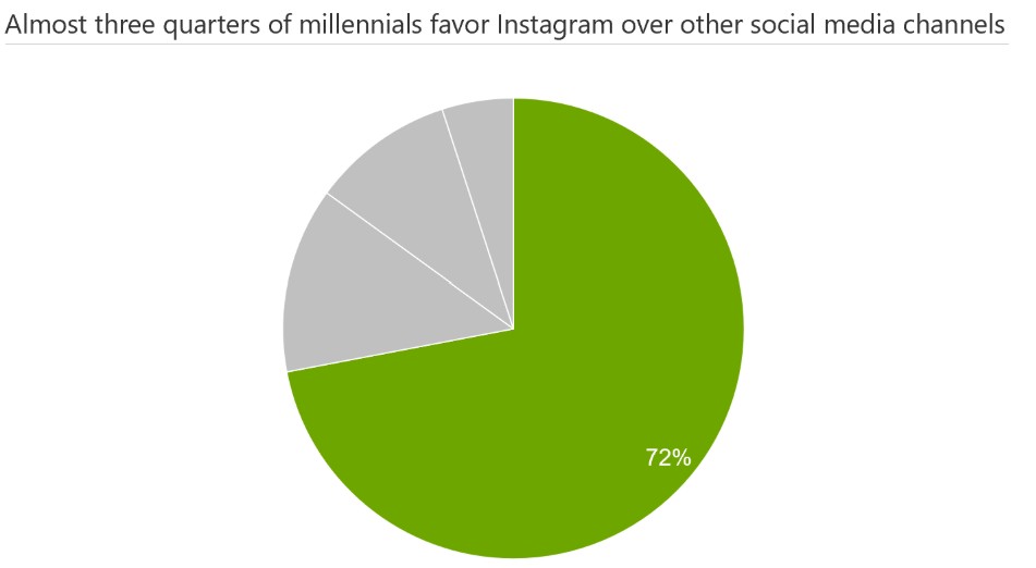
Another way in which pie charts add value to presentations is by drawing attention to the largest slice in the dataset. If one of the slices is well over half of the chart and the rest of the slices are significantly smaller, a pie chart can emphasize the largest slice, provided that the exact proportions of the smaller slices aren't important to the point being made.
For example, consider the following breakdown of time spent by millennials on different social media channels. Instagram accounts for the largest slice (72%), while the rest of the channels are insignificant in number. This is a good use case in which a pie chart can be used to emphasize one slice. You can even remove the inside and outside labels of the rest of the slices to place maximum focus on the largest slice.
How to create pie charts in PowerPoint
It’s fairly straightforward to add one of PowerPoint's built-in pie charts to your slide. On the ribbon, simply go to the Insert tab and select Chart. Then, in the All Charts pane, select Pie and choose one of the five variants that PowerPoint offers. Just be careful not to choose the 3D pie chart, of course.
While it’s quick to add a pie chart to your slide, it will lack the flexibility and professional layout that an add-in such as think-cell provides, and a lot of the standard settings need adjusting. By default, PowerPoint creates a legend at the bottom of the chart, rather than more readable slice labels, for example.
Editing any built-in PowerPoint chart also means navigating different ribbon tabs, menus, and sidebars, and having to carefully construct the best layout you can within PowerPoint’s limitations. think-cell helps you create better pie charts faster by automating label positioning and offering more flexible number formatting.
How to create pie charts with think-cell
Pie charts are one of the 40+ charting options that think-cell offers to help you convey your story better. You can create a think-cell pie chart in three simple steps:
- To start, on the PowerPoint ribbon, go to the think-cell tab. In Charts, select Pie.
- After you insert your chart on the slide, the datasheet will open. In the datasheet, in column A, enter the series labels. In column B, enter the percentages or values for each series.
- To choose the order in which to display your slices, click the chart area to open the mini toolbar and select the sorting option that you want.
With your pie chart on the slide, you can edit it and incorporate it into your overall slide layout. think-cell makes it easy to customize your pie chart to fit your corporate identity or that of your client.
You can learn more about think-cell pie charts, including detailed instructions on labelling, rotating, and exploding slices, in our user manual.
The case for pie charts
Pie charts might not be the most flexible form of data visualization and they might be one of the most overused, but when incorporated strategically into a presentation and built in line with best practices, they still have a role to play in business storytelling.
The mistake isn’t using pie charts, it’s using them in the wrong way. At their best and in the right situation, they have a unique ability to make data digestible and accelerate understanding that can support effective decision-making. For all their limitations, pie charts have earned their seat at the data visualization table, and they’re here to stay.
Summary: When pie charts work in PowerPoint
Pie charts are useful for showing simple proportions with 2-5 categories where visual differences are clear. They fail when you need precision, comparisons, or trend analysis. The key is matching your chart type to what your audience needs to understand, not just what looks familiar. For most business presentations, you'll use bar charts more often than pie charts, and that's completely fine.
If you haven’t tried using think-cell to create pie charts and more, you can start a free trial today and gain unlimited access to all features.
When are pie charts better than bar charts?
Pie charts work better when showing parts of a whole with few categories. Bar charts work better for comparing values across categories or showing multiple data sets.
How do you make pie charts clearer in PowerPoint?
Limit slices to 5 or fewer, use direct labels instead of legends, sort segments by size, and avoid 3D effects that distort perception.
Can you use pie charts for time series data?
No. Pie charts show composition at a single point in time. Use line charts or bar charts to show how values change over time.
Are pie charts bad for presentations
No. Pie charts are often misused, but when applied to simple part-to-whole comparisons, they can be effective and easy to understand.
What is the biggest mistake people make with pie charts?
Using too many slices or relying on them for precise comparisons.
Explore this topic further with AI:
Read more

Explore concrete examples that demonstrate how to make your business presentations stand out and learn common PowerPoint mistakes you should avoid.

In the world of data analysis and presentation, finding the perfect visualization to convey your message is key. It's not just about presenting numbers; it's about telling a story that resonates with your audience. This blog explores how you can find the right visualization for your presentations.
Discover more than 70 PowerPoint slide templates that help you get started faster and cover all the most common business presentation scenarios.