Efficiency case study
Understanding presentation creation in consulting firms
Consulting firms spend a large share of their resources on client communication. Most leading consulting firms employ specialists to translate their findings and recommendations into convincing presentations. These specialists have gained years of experience and developed a best practice building upon the industry standard Microsoft PowerPoint.
Still, our own personal experience in a consulting firm and anecdotal evidence from other consultants and graphics experts indicated a large potential for improving slide creation efficiency.
Starting from these indications, we spent half a year conducting interviews and observing work flows to thoroughly understand the problem. We then used test scenarios to quantify our qualitative impression. We focused heavily on software efficiency. We cooperated with a top-tier strategy consulting firm, and they allowed us to publish this data anonymously.
Identification of improvement potentials
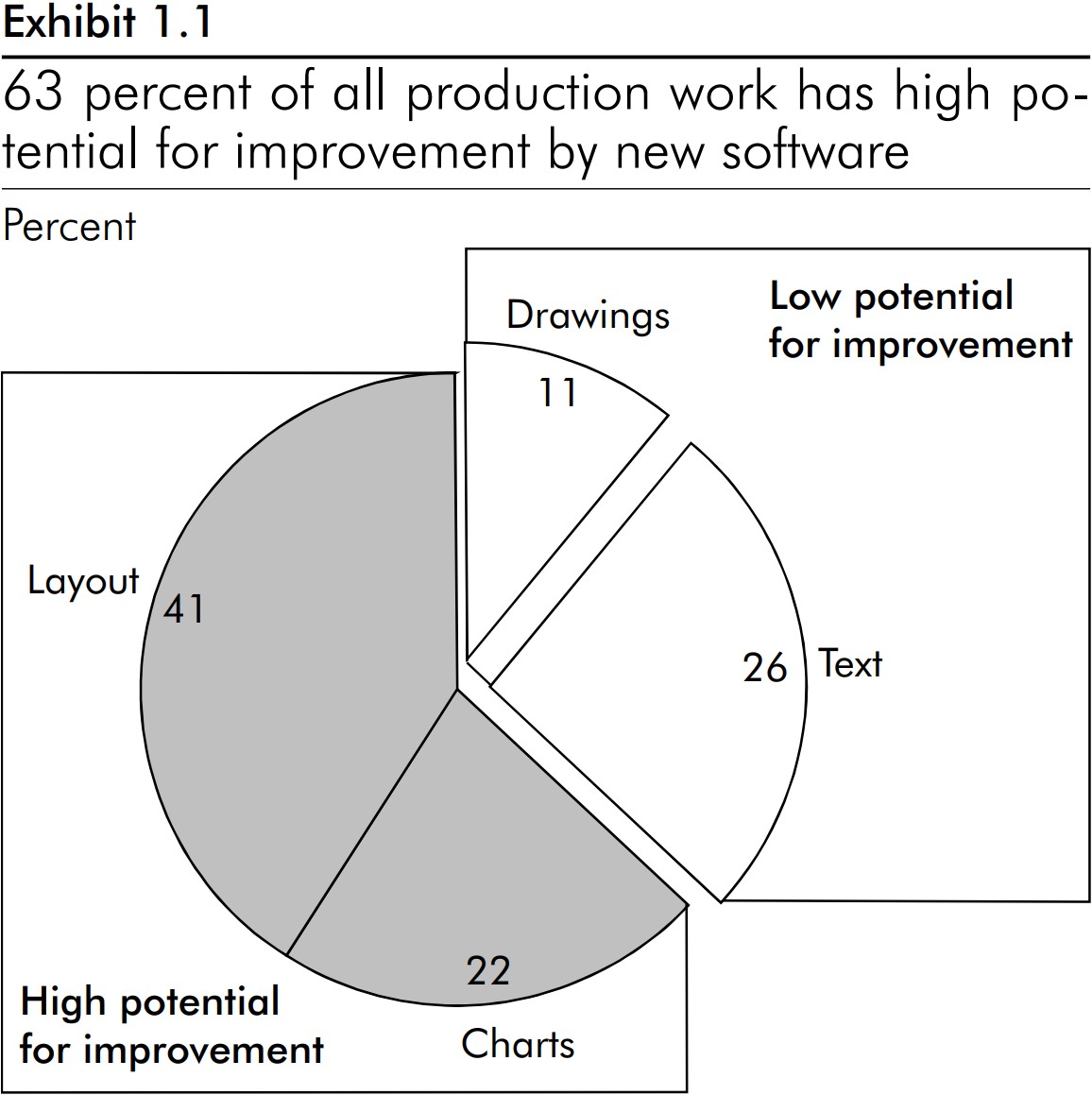
Exhibit 1.1 shows the distribution of time that graphics experts spent on presentations. 11% of their time was dedicated to slide-specific drawings. Another 26% was spent on typing text. Both fractions offered only limited potential for improvement. Typing speed is limited by the keyboard skills of the user, while creating drawings is difficult to standardize using intelligent software.
22% was spent on the production of business charts from numerical data. By far the largest fraction of time was spent on arranging text, drawings and charts to create the final slide layout (41%). Both chart and layout times exclude typing text. Including text-typing time, 30% of the work time was spent on charts and 59% on non-numerical standard slide components, not including drawings.
Both chart production and slide layout production had a high potential for improvement, since charts and slide layouts are usually standardized within a company and bound by common design rules, which can be formalized into a computer program.
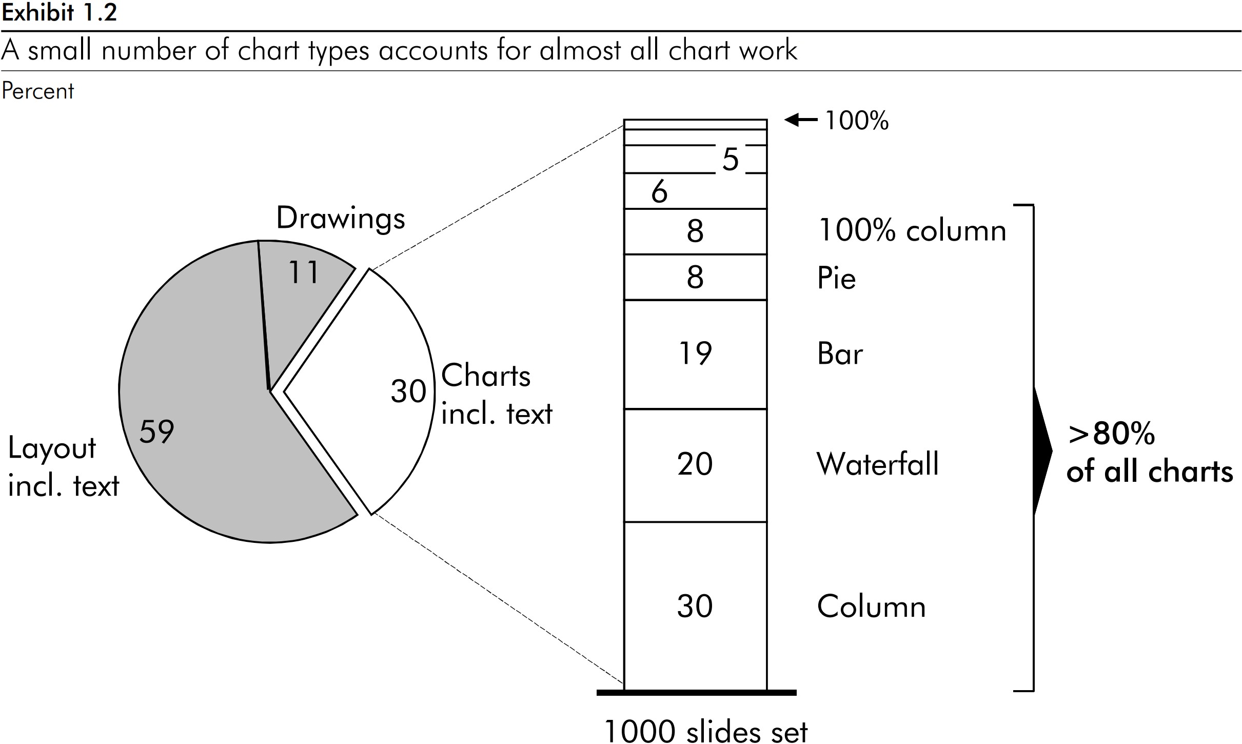
In the rest of this study, we focused on the impact of using think-cell, which was designed to exploit the described efficiency gain potential in chart production. As a first step, we took a closer look at the types of charts used by consulting firms.
Exhibit 1.2 shows that only a few chart types accounted for a large fraction of all used charts in the cooperating consulting firm. We compared this result with results obtained from other consulting firms and found it to hold true everywhere, with the dominating chart types varying slightly across different firms.
How to compare think-cell with PowerPoint
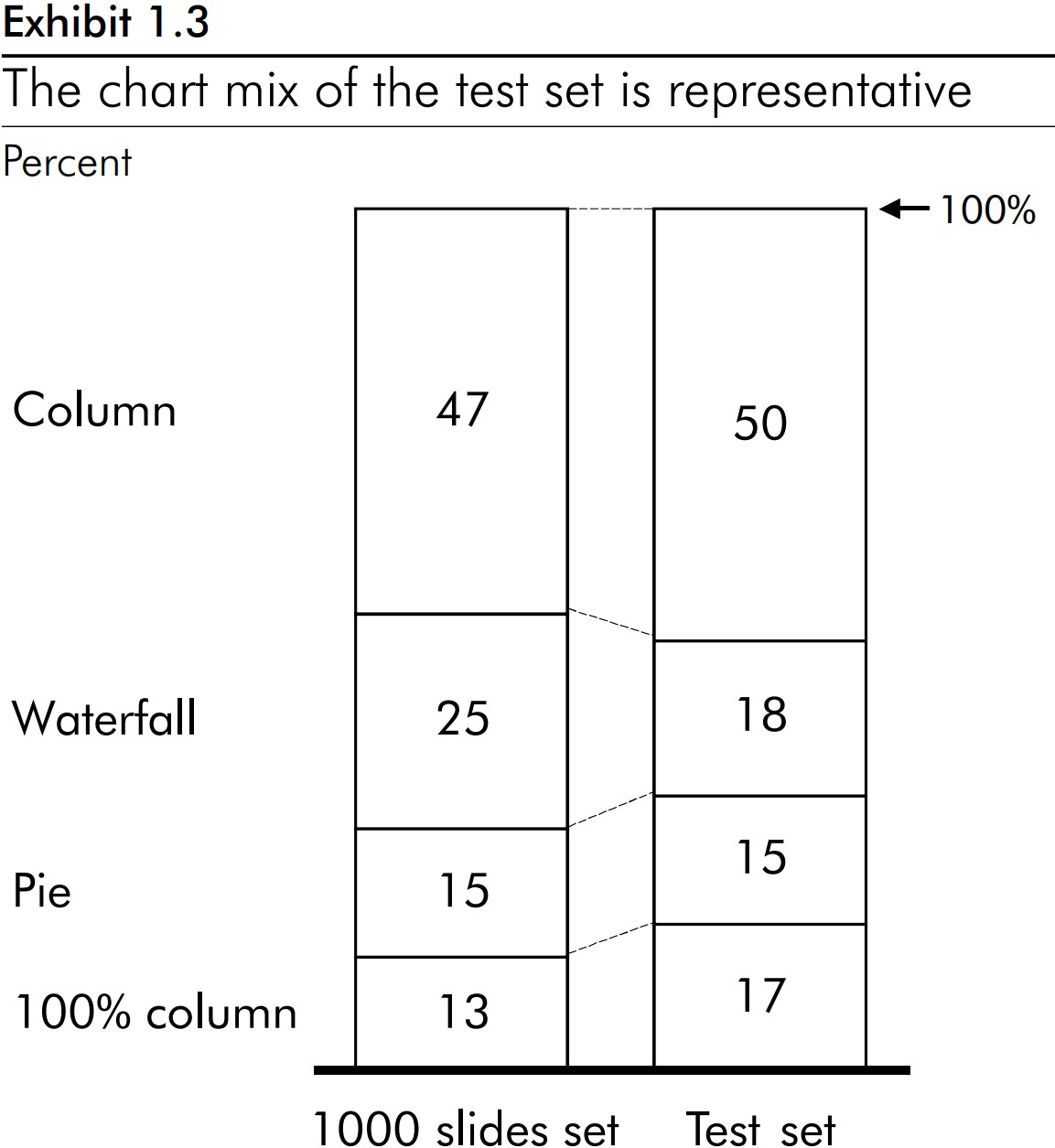
To quantify the impact of think-cell on the creation and alteration of charts, we selected a set of 48 typical charts out of a portfolio of archived slides. Exhibit 1.3 illustrates that the mixture of chart types in the test set resembled the mixture obtained by analyzing a much larger slide set. Our cooperation partner counted the number of different chart types in a set of 1000 slides picked at random from its portfolio. 468 of these slides had a chart.
We created two scenarios from the test set. The first scenario simulated the typical creation process: A chart is sketched by a consultant, faxed to the graphics expert and turned into PowerPoint. In our test, a highly experienced graphics expert from our cooperation partner turned the sketches into PowerPoint slides.
He was allowed to use the firm's regular set of templates for typical chart types and quantities (4-column, 5-column, ...) and also the macros already in use (for legends, units of measurement, etc.). We measured the time required to create the charts.
For the second scenario we printed the slides created in the first scenario, annotated them with typical changes a consultant would make, and handed them back to the graphics expert. We measured the time to incorporate the changes into the slides again.
The same two scenarios were used to evaluate the efficiency of think-cell.
Productivity gain with think-cell
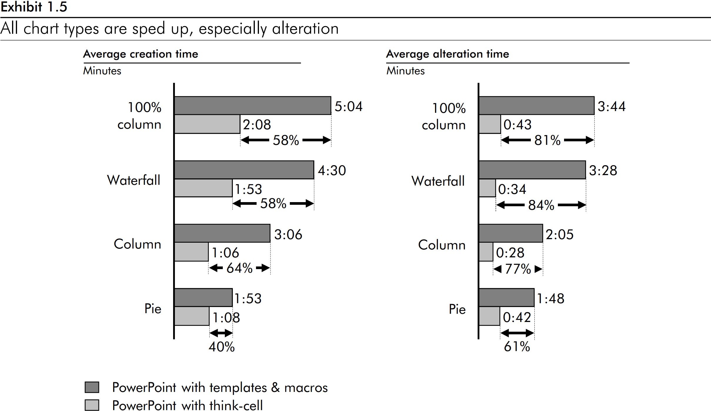
The main finding is illustrated by exhibit 1.4. It shows the cumulative time required for creating and changing the charts specified by our test set. In the case of our cooperation partner, alteration accounted for approximately 60% of chart production time. Hence, we scaled the time for chart alteration by two. This resembles the common assumption that one creation cycle leads to at least two cycles of alteration.
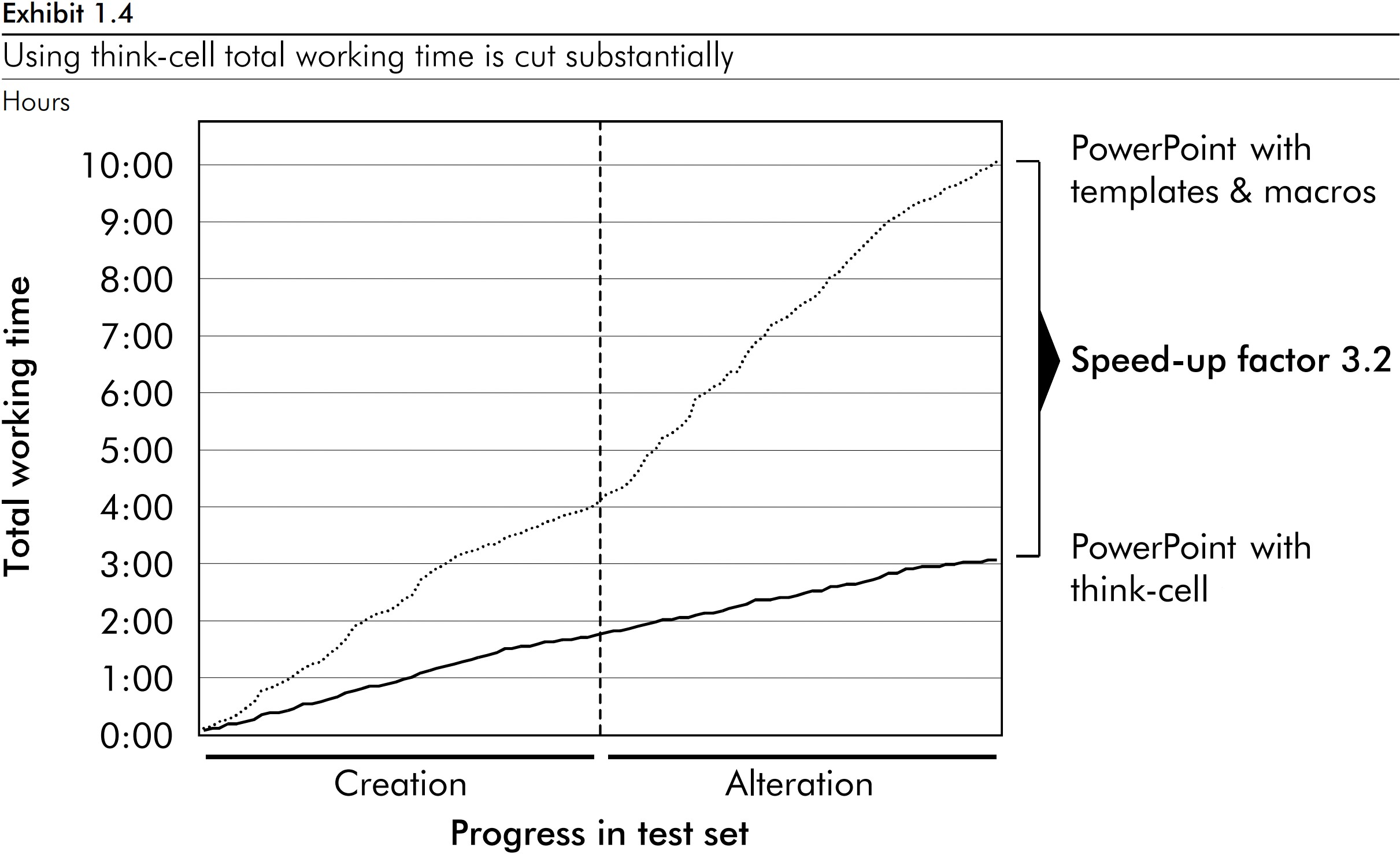
The total time required to finish the test set using PowerPoint together with templates and macros was over ten hours. The total time needed to finish the test set using PowerPoint with think-cell was approximately three hours. This implied an overall speed-up factor of 3.2.
Exhibit 1.5 breaks down this result to the four chart types that were included in our test. All chart types benefit quite evenly from using think-cell, especially in the alteration scenario.
Full study
This page features the shortened online version of a detailed case study conducted with one of our major customers.