Create a waterfall chart in just 2 minutes
Try think-cell — the PowerPoint add-in that
- saves you 70% working time
- fully integrates into PowerPoint
- is used by 10 of the top 10 consulting firms
Overcome PowerPoint's weaknesses with
think-cell's automatic waterfall charts
Creating waterfalls in PowerPoint is time-consuming and error-prone. You either push basic shapes around or use a hidden data row that supports floating segments. Hence, any data change implies many manual calculations and adjustments.
In think-cell, positive data values in waterfalls build up, negative values build down. This works automatically, even for stacked segments. Segments can cross the baseline and build upon segments in any category – not only the previous one.
- Column & bar waterfall chart
- Build-down & build-up
- Calculation-oriented data entry
- Excel link
- Column & bar totals
- Auto-placed segment labels
- Absolute values & percentages
- Any number of connectors
- Segments crossing the baseline
- Two types of column & bar breaks
- Baseline gaps & breaks
- Difference arrows
- Value lines
- Automatic category sorting
See how think-cell addresses your
other PowerPoint pain points
think-cell helps you create stunning charts in minutes, boosts your slide layout and automates your regular reports. And all this with a single PowerPoint add-in. Here are some of its most awe-inspiring features.
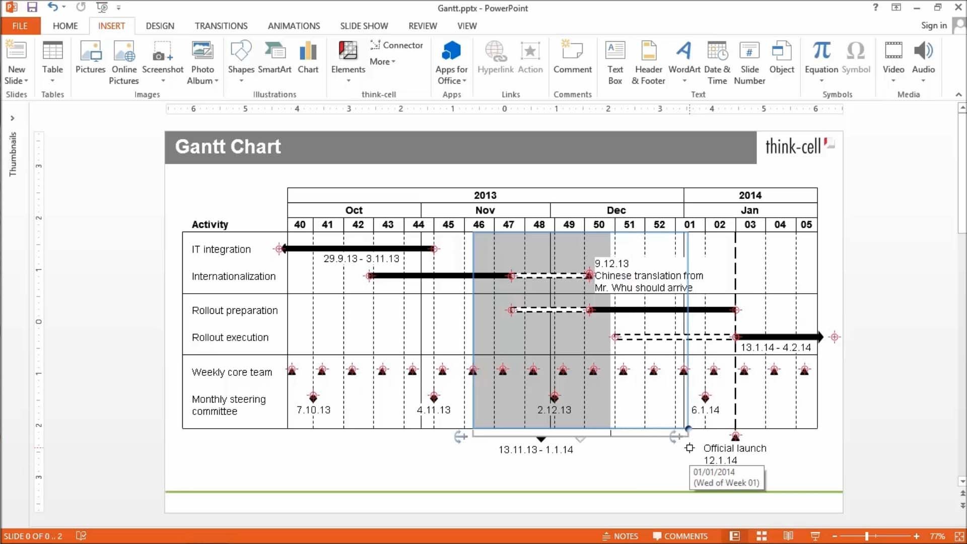
Gantt charts you can create in PowerPoint
Ensure maximum clarity in your project management reporting.
- Show project status with data-driven elements like Harvey balls and checkboxes.
- Choose your timescale and add activity bars and milestones that connect directly to the calendar.
- Add or remove items and the chart adapts automatically to maintain readability.
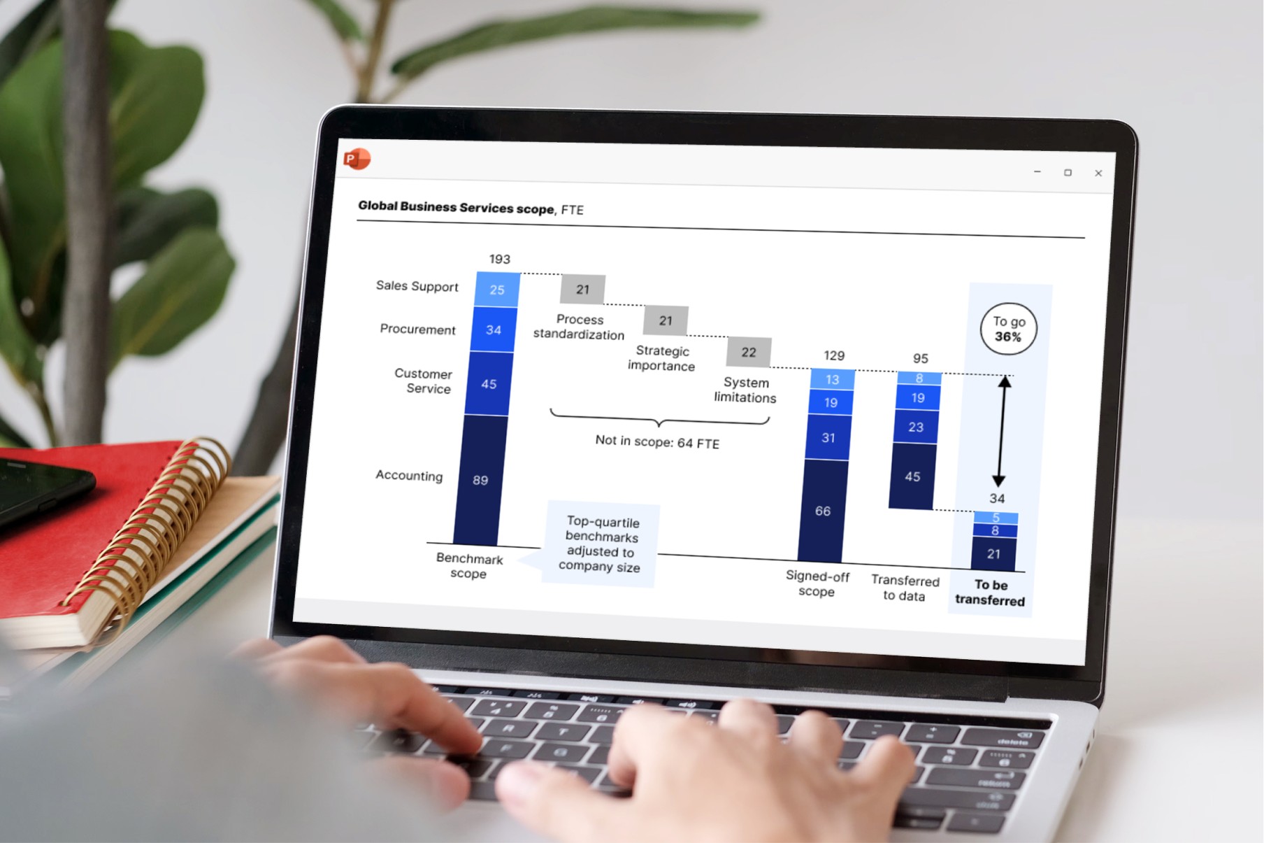
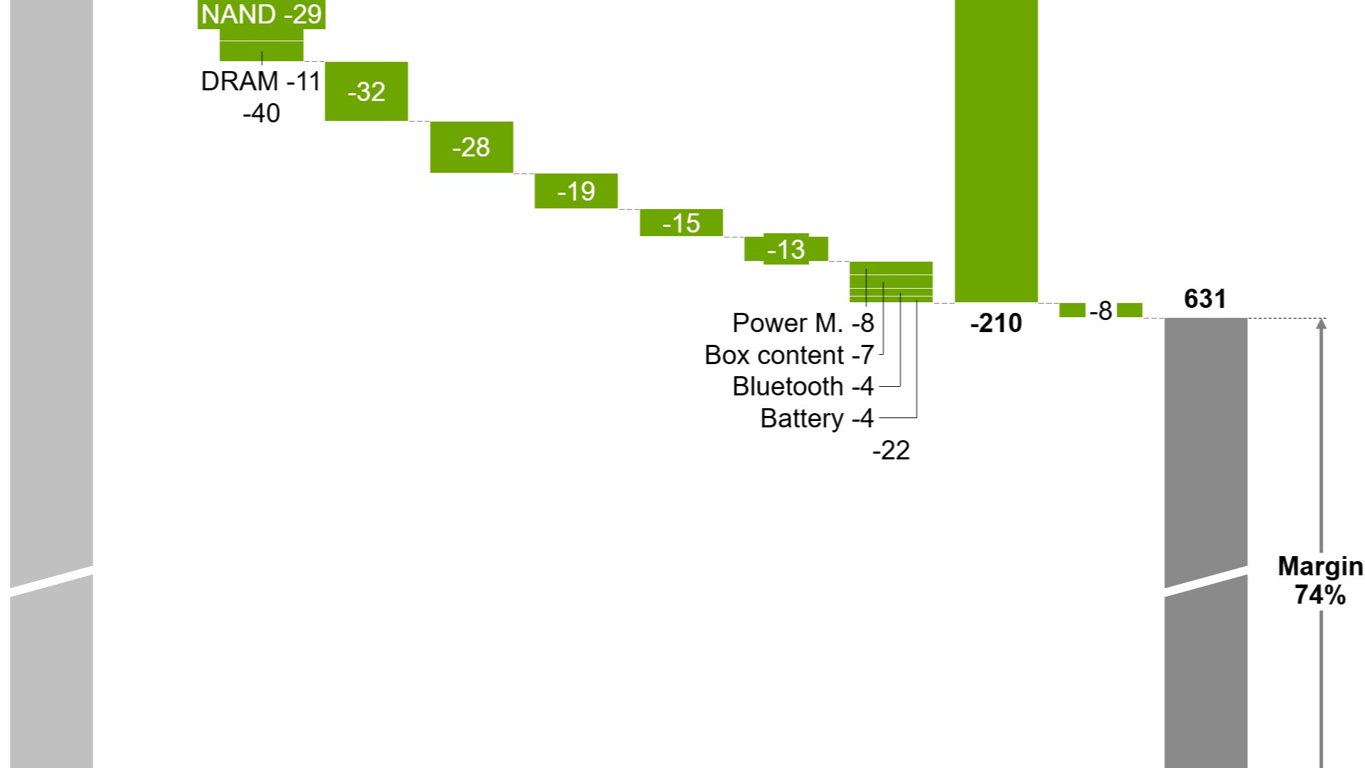
Waterfall charts without workarounds
Create waterfall charts to show how different drivers contribute to an overall change. Industry standard for EBITDA bridge and P&L statements.
- Display multiple series with stacked segments.
- Include totals and subtotals that calculate automatically.
- Add segments that cross below the baseline.
Chart annotations for data-driven stories
Highlight key insights with a range of auto-calculated enhancements that are positioned perfectly for best practice chart layouts.
- Use labels and legends for clearer data communication.
- Add CAGR arrows that automatically update when your chart changes.
- Show your audience what matters with value lines and difference arrows.
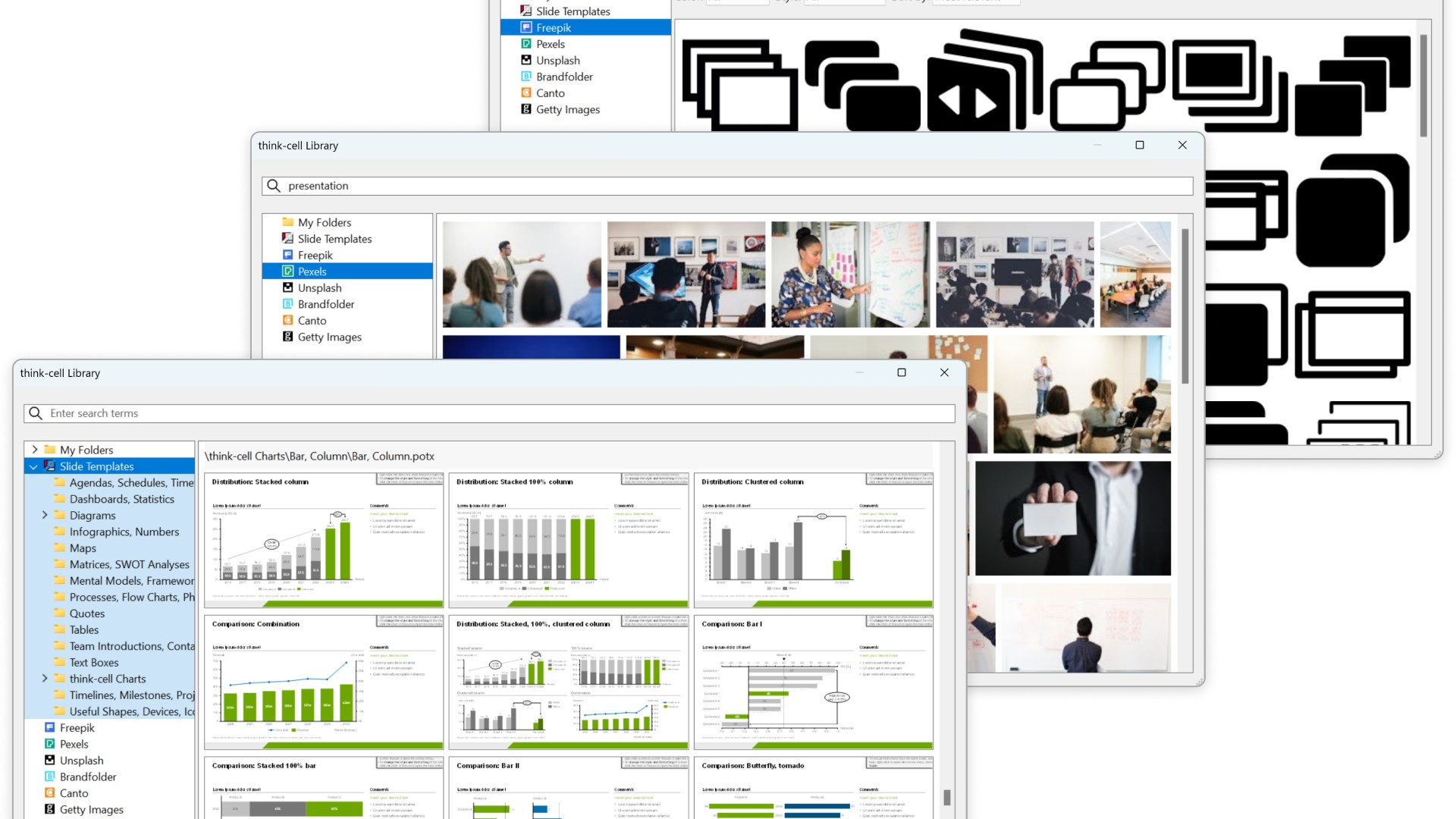
think-cell Library for the assets you need
Start building faster with the perfect foundation for your business presentations.
- Quickly access all your favorite slides, images and presentation resources.
- Draw on over 250 business templates so you never start from a blank slide.
- Find exactly what you need with slide-level search and powerful filters.
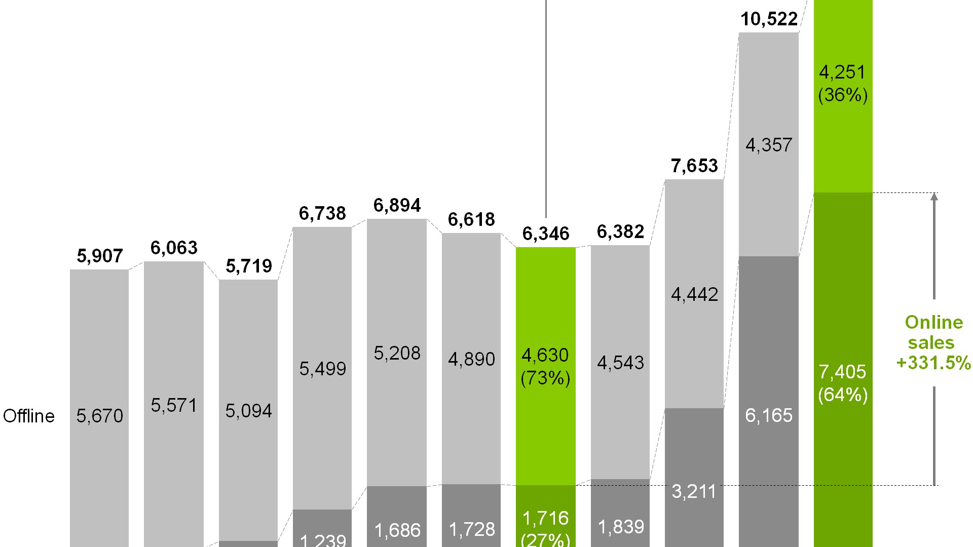
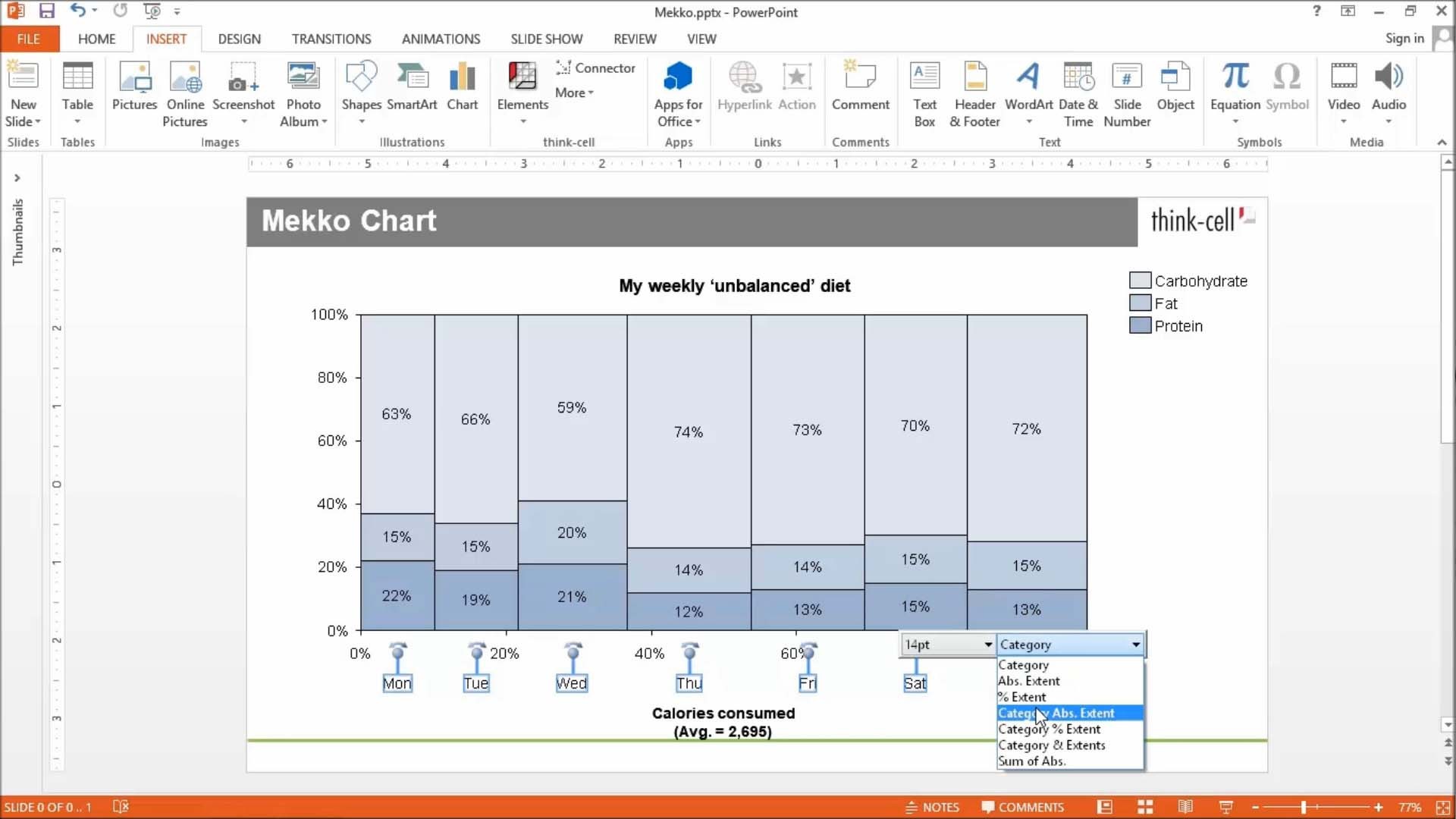
Automated Mekko charts
Build Mekko charts to show data in two dimensions, using column width for total category sizes and height for proportions.
- Choose from unit axis or percentage axis.
- Avoid manual workarounds as column widths are calculated automatically.
- Combine smaller segments to ‘Other’ to reduce noise.
Smart text boxes for professional layouts
Use smart text boxes that automatically form optimized layouts so you can stop worrying about the size and alignment of your slide elements.
- Focus on writing content rather than arranging objects.
- Combine smart text boxes to quickly create tabular structures.
- Make edits and add elements without breaking your slide.
Data automation that gives you full control
Link any content from a cell in Excel to charts or any other object in your PowerPoint presentation.
- Choose between automatic and on-demand updates to stay in control and maintain full data consistency.
- Move, rename or email your Excel files and the links to your presentation will stay intact.
- Integrate data from other sources like Tableau or populate templates with think-cell’s API.
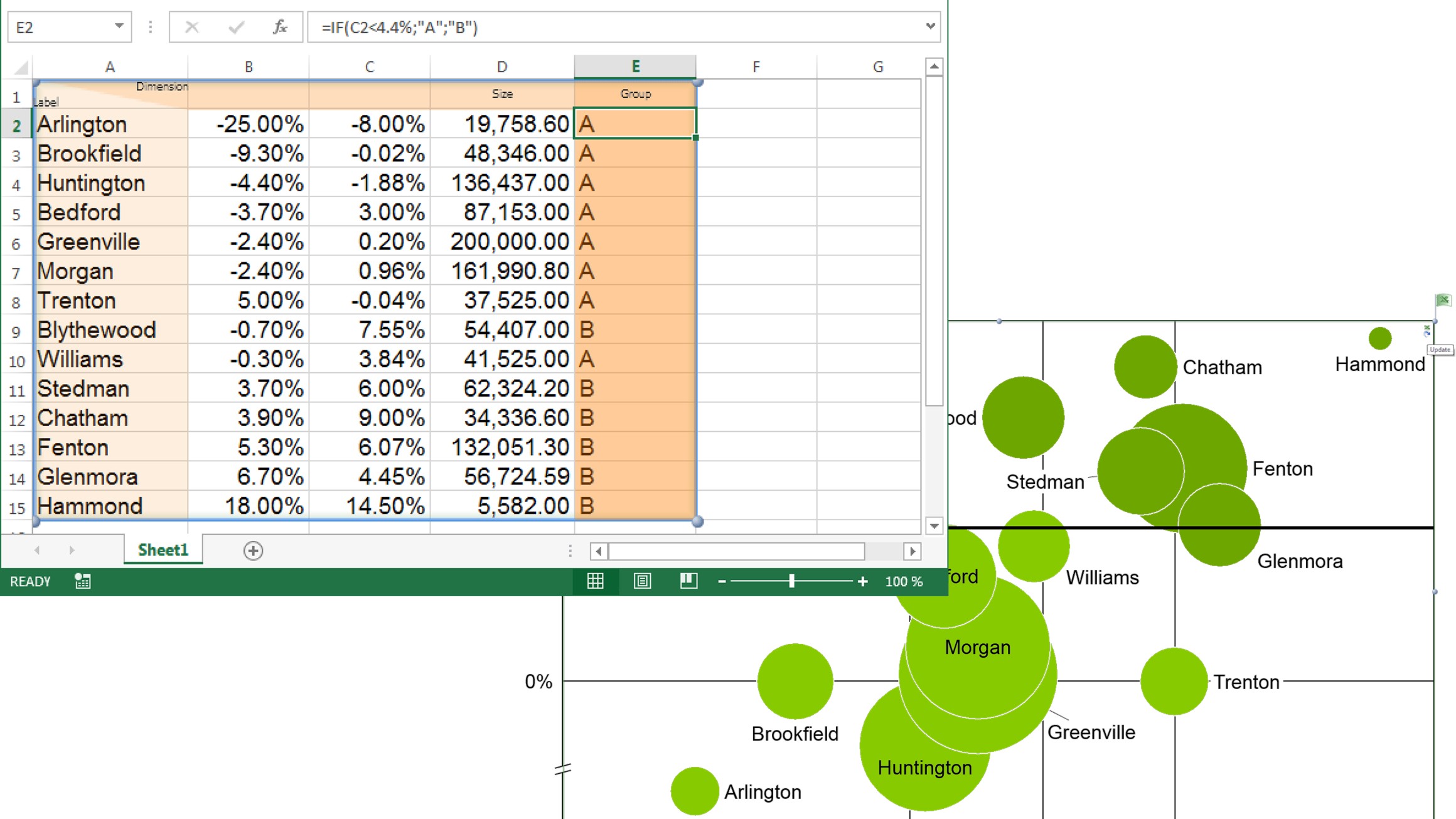
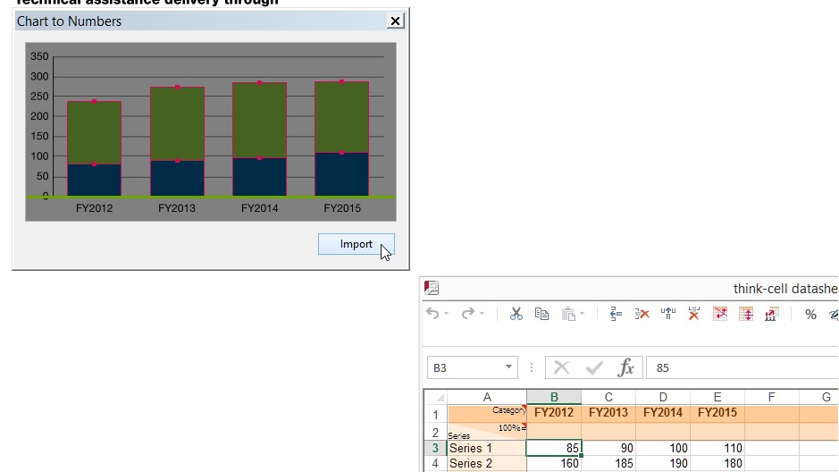
Chart scanner to pull data from images
Instantly convert flat images into fully-functional, data-driven think-cell charts.
- Take a column or bar chart from any source and replicate it in your presentation.
- Capture all chart values and category labels.
- Edit, annotate, and adjust styling as you can with any other think-cell chart.
Here are the four core benefits of using think-cell
- Create 40+ chart types in a few minutes
- Waterfalls, Gantts, Marimekkos and Agendas
- Dozens of data-driven visual annotations
- Access professional templates, images and icons on demand
- Connect and search across your entire PowerPoint repository
- Maintain control over permissions and keep content secure
- All functions available right at the PowerPoint objects
- No need to learn lots of dialogs, toolbars or property panes
- Become a pro user within a few hours
- Based on PowerPoint charts and shapes
- Charts shared with PowerPoint users remain data-driven
- Fully featured with Windows and macOS, including ARM processor
1,300,000 users at 35,000
rely on think-cell every day

10 of the top 10 consulting firms
According to vault.com
Seven of these firms provide our software to all their consultants.

88 of the top 100 US blue chip companies
According to Fortune 100

10 of the top 10 business schools
According to U.S. News & World Report
All of them provide our software to all their students and faculty members.
More information on waterfall charts
What is a waterfall chart?
A waterfall chart — sometimes also called a bridge chart or a flying bricks chart — is most frequently used to illustrate how different positive and/or negatives values, such as income and costs, contribute to a total, for example, a company's profit. Total and intermediate values are typically arranged in relation to value categories, and sometimes in relation to time.
A typical waterfall shows a calculation from left to right. It starts with an initial value, rendered as a column sitting on the chart's baseline. From there, positive values build up, negative values build down, both represented by floating columns to the right of the initial value and connected to their reference value by a dashed or dotted line. Total and intermediate values can be stacked if they belong to the same value category or time. Often, the final column represents the total sum of the preceding calculation and its column goes down back to the chart's baseline, forming a stair of columns. Learn more
Why are waterfall charts so useful?
Popularized by management consulting firms, such as McKinsey & Company, waterfall charts are frequently used in business presentations. They are extremely useful in financial analyses to focus the audience's attention on individual contributions of important value categories to an overall bigger picture, for example on how specific cost values contribute to a company's bottom line results derived from a top line revenue value.
A waterfall chart can be used in virtually any application scenario where something is quantifiable. This diagram type is helpful in planning the inventory of a sales company, and in managing human resources. In research-related contexts, waterfall graphs can, for example, track how the demographic of a society changes over a period of time or how the CO2 level in the atmosphere develops.
Why should I use think-cell for waterfall charts in PowerPoint?
Microsoft PowerPoint is by far the most frequently used program when it comes to creating presentation slides. Unfortunately, it is not that easy to generate compelling waterfall charts with PowerPoint. Creating charts in PowerPoint usually requires a lot of manual clicking and dragging.
This is why think-cell has developed a waterfall add-in for PowerPoint. This add-in allows users to automatically create waterfall charts in minutes from within their PowerPoint environment and insert them directly onto their presentation slides.
Waterfall charts are just one of more than 40 types of diagrams and graphs think-cell adds to PowerPoint. Every chart comes with a wide selection of features. Chart creation has never been easier and less time consuming!
Get started with think-cell
- Create professional charts and data-driven tables.
- Deliver impactful presentations faster.
- Try for free, no credit card required and no cancellation necessary.