Scatter and bubble charts
- Home
- Resources
- User manual
- think-cell Charts: Data visualization
- Quantitative charts
- Scatter and bubble charts

Introduction to scatter and bubble charts
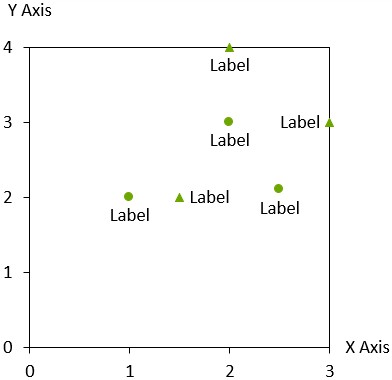
Scatter charts and bubble charts are similar in many aspects, both using an xy-plot to visualize datasheet contents. The charts differ, however, in the style of markers used for the individual data points.
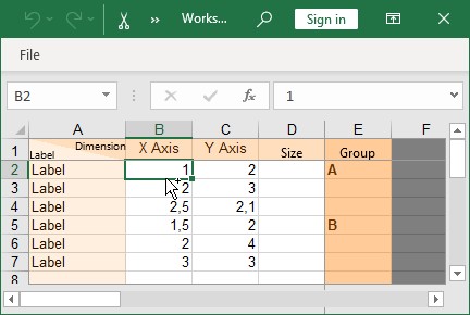
The datasheet for a scatter chart is organized as follows, with each row representing a single data point:
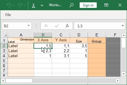
The datasheet for a bubble chart contains values in the Size column, but is otherwise organized identically:
The Group column in the datasheet can be used to organize individual data points into groups. In the above scatter chart datasheet, the first three data points belong to group A while the remaining data points belong to group B. Multiple data points belonging to the same group can be easily selected by clicking on a data point and then moving the mouse pointer while holding down the Shift key (see Select objects with your mouse).
The axes of scatter charts and bubble charts can also be adjusted. Please refer to Axes for details. You may also use dates for the X or Y values. When all cells in the datasheet for one axis contain dates and Excel’s cell format is set to Date, then the tick mark labels of this axis show dates and you can format them accordingly (see Date format control).
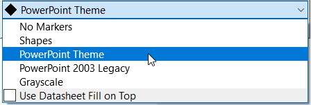
If Use Datasheet Fill on Top is selected (see Chart fill scheme), you can set the fill color from Excel’s cell formatting in any cell in a data point’s row to set the color for this data point’s marker.
Labels
In both chart types, up to two labels can be associated with each data point. Labels can be added using the 

The automatic labeler places labels as close to their data points as possible, using connecting lines if necessary (see Automatic label placement).
While the labeler is busy calculating the label placements, a rotating progress icon 
In rare circumstances the labeler may not find an optimal placement for all labels. When this happens, manually placing labels will help. Try to manually place one of the poorly placed labels and let the labeler automatically place the remaining labels. An acceptable placement for all labels can normally be achieved by manually placing only a few problematic labels.
Scatter charts
|
Icon in Elements menu: |
|
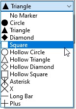
The scatter chart uses the marker scheme control to consistently mark data points belonging to the same group (see Marker scheme). The marker shape control can be used to set the marker shape for individual data points (see Marker shape).
If you choose No Markers in the marker scheme control, the markers for the data points are switched off. In this case the labels are centered on the position of the data points. However, the automatic label placement may offset the labels from this position to prevent overlap.
Marker shape
The marker shape control can be used to add or change markers for data points in line and scatter charts. Note that the marker scheme control should be used instead of marker shapes to add consistent markers to all the data points in a scatter chart.
Marker scheme
The marker scheme control applies consistent markers to data points in scatter charts. The markers are automatically updated when data points, groups and series are added or removed. The marker scheme control should be preferred over the marker shape control when adding consistent markers to an entire scatter chart.
Bubble charts
|
Icon in Elements menu: |
|
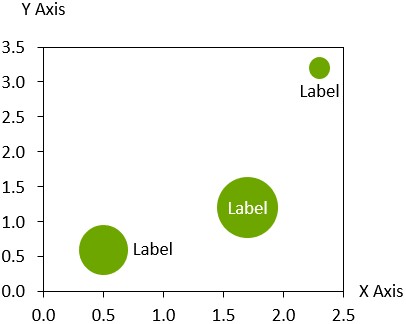
The bubble chart is a variant of the scatter chart, with data points marked by circles. The circle sizes are determined by the values in the Size column. By default, the Size value is proportional to the area of the circle. The 
To enable a legend of the bubble size, click 

When you select one of the bubbles inside the chart, a similar handle appears on the right boundary. Change the bubble size by dragging it. All other bubbles are scaled accordingly, as the ratio between bubbles is always determined by the numbers in the datasheet’s Size column.
When two bubbles overlap, the smaller bubble will be shown in front of the larger one. To change the order, choose 
Trendlines and partitions
|
In menu: |
Chart, data point |
|
Menu item: |
|
Trendlines
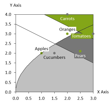
In scatter or bubble charts, you can add a trendline for certain values in your chart. A trendline is a graphical representation of trends in the data. You can use trendlines to study problems of prediction, also called regression analysis. Trendlines are only available when both axes of the chart are set to a linear scale.
The trendline finds the straight line that best fits the data by minimizing the differences between each data point using linear regression. In a bubble chart, the bubble size is used to weight each point’s contribution to the difference.

There are two ways to add a trendline to a chart:
- Right-click a marker or bubble to open the context menu, then select Add Trendline/Partition

- Select a partition line (see Partitions) to open the mini toolbar. On the Partition Type dropdown menu, select a data group or All groups. The partition line changes to a trendline based on the selected data.
You can choose the trendline type on the Trendline Type dropdown menu on the mini toolbar. Linear trendline is the default type and is always available on the Trendline Type dropdown menu. In scatter charts, for trendlines that are based on a specific data group, additional trendline types are available:
- Power
- Exponential
- Logarithmic
- Quadratic
- Cubic
- Quartic

The following example illustrates a Power trendline in a scatter chart where the Y-values are squares of the X-values:

You can change the background fill of a section of your chart that is bounded by a trendline. Hovering over the area above of below the trendline highlights the areas where you can apply a background fill. To apply background fill, select the highlighted area to open the mini toolbar, then in the Fill dropdown menu, select a background fill.

If you move a trendline, it becomes a partition line, as it is no longer based on the specific data points from the chart's datasheet. To learn more about moving partition lines, see Partitions.
Partitions
You can add a partition line to scatter or bubble charts to point up a partition of a set. To add a partition line, select
Partition lines are only available when both axes of the chart are set to a linear scale.
You can move the line by clicking on it and dragging it to the desired position. It is also possible to select the partition line and then drag the handles at the beginning or end of the partition line. While dragging, the end points will snap to specific values. The spacing of the snap points depends on your current zoom level. If you hold down the Shift key while dragging, the angle of the partition line is constrained to the current angle or to that of a vertical, horizontal or diagonal line.
To make a copy of a partition line, hold down the Ctrl key while dragging. This is an easy way to create parallel lines, e.g. to mark a range of values.
You can change the background fill of a section of your chart that is bounded by a partition line. Hovering over the area above of below the partition line highlights the areas where you can apply a background fill. To apply background fill, select the highlighted area to open the mini toolbar, then in the Fill dropdown menu, select a background fill.
If you want to calculate the position and angle of the line based on the values in the chart, see Trendlines.
To learn about creating a specialized bubble chart matrix, read this blog article.
Need to troubleshoot?
Check our knowledge base