Mekko charts

A Mekko chart (also called a marimekko chart) is a two-dimensional stacked column chart. In addition to the varying segment heights of a regular stacked column chart, a Mekko chart also has varying column widths.
Column widths are scaled such that the total width matches the chart width. To preserve the visual relationship between widths of different columns, there are no gaps between columns in a Mekko chart.
The baseline of a Mekko chart is a value axis. In think-cell, you can use the value axis's context menu to add tick marks, tick mark labels, and an axis title (see Value axes). If you have enabled tick marks for the baseline, you can use the mini toolbar of the axis to switch between absolute and percentage values.
You can also annotate a think-cell Mekko chart with some of the features described in Axes and Chart annotations. In Mekko chart labels, you can choose whether to display absolute values, percentages, or both (see Label content).
Mekko charts with a percent axis
|
Icon in Elements menu: |
|
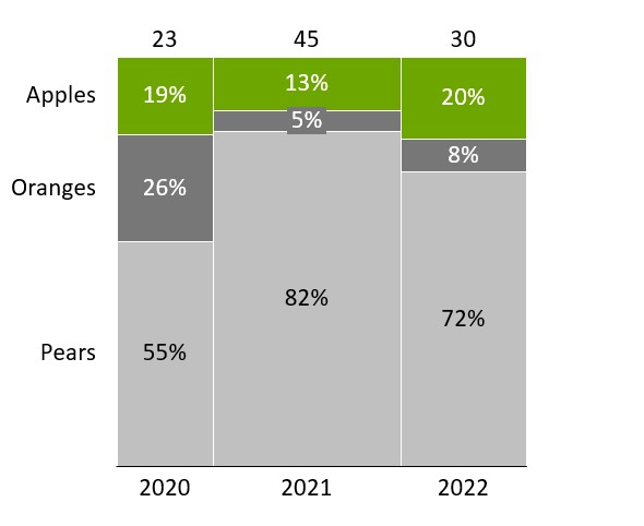
A Mekko chart with a percent axis (sometimes also called marimekko chart or 100% cost curve ) is a variation of the two-dimensional 100% stacked column chart. As in the 100% stacked column chart, the value axis is based on percentages and column heights are shown relative to 100%. In the regular 100% stacked column chart, since the columns are scaled to relative heights, there is no visual representation of absolute column totals.
The Mekko chart with a percent axis uses variable column widths to represent column totals. Thus, the segment area is proportional to the absolute value of the segments. By default, the values in the datasheet are represented as absolute values; when calculating percentages, think-cell assumes the sum of each column is 100%. For example, the earlier Mekko chart example that displays percentages uses the following datasheet with absolute values.
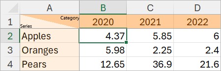
You can also enter your values as percentages in the datasheet. To have think-cell calculate absolute values from the percentages you enter, add the 100%= row and enter the absolute values that represent 100% in the 100%= row (see Edit datasheet layout). To learn more about absolute or relative values, see Absolute and relative values.
Mekko charts with units
|
Icon in Elements menu: |
|
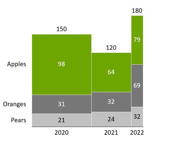
A Mekko chart with units (sometimes also called submarine chart or olympic chart) is a two-dimensional stacked column chart. As in the regular stacked column chart, the value axis and the datasheet of this chart are based on absolute values.
Width and height are controlled completely independently. Column widths are entered in the X extent row on top and individual segment heights are entered as in a regular stacked column chart.

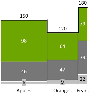
Add or remove ridges
|
In menu: |
Chart |
|
Menu item: |
|
You can highlight the outline of the Mekko chart: Click the 
Other series
You may want to combine several segments representing small portions of a category into one segment for “Other”. This way, an “Other” series is added to the chart, in particular when such a segment collecting smaller series is present for every category.
To create an Other Series, select all the segments that should be subsumed in it, right-click to invoke the context menu and choose 
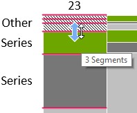
An Other Series can also be used in the stacked and 100% stacked column and bar charts.
Change the segment order
You can change the order in which segments appear in a Mekko chart. To do so, follow these steps:
- Select the chart to open its mini toolbar.
- On the Segment Order menu, choose the segment order that you want.
- Segments in Sheet Order: Segments appear in the same order as the linked data range, even if the chart is flipped (see Rotate and flip elements).
- Segments in Reverse Sheet Order: Segments appear in the reverse order of the linked data range, even if the chart is flipped (see Rotate and flip elements).
- Segments in Descending Order: Within each category, segments appear from largest to smallest, with the largest value at the baseline. Segments in the same data series, with the same color, may appear in different positions across categories.
- Segments in Ascending Order: Within each category, segments appear from smallest to largest, with the smallest value at the baseline. Segments in the same data series, with the same color, may appear in different positions across categories.
Need to troubleshoot?
Check our knowledge base