Waterfall charts
- Home
- Resources
- User manual
- think-cell Charts: Data visualization
- Quantitative charts
- Waterfall charts
Waterfall charts (sometimes called bridge charts) show how an initial value changes as you add or subtract a series of values. Add total and subtotal columns to show key intermediate and final values in the calculation.

Create waterfall charts
|
Icon in Elements menu: |
|
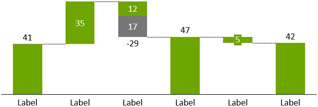
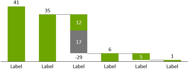
Positive values result in segments going upwards, negative values create segments going downwards. Subtotals—i.e., segments that go all the way down to the baseline of the chart—are easily created with an e (for “equals”). In fact, you can use e in any segment that you want to be stretched to fit the rest of the chart. All e segments are calculated by think-cell and automatically kept up-to-date when data changes.
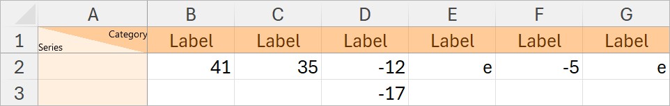
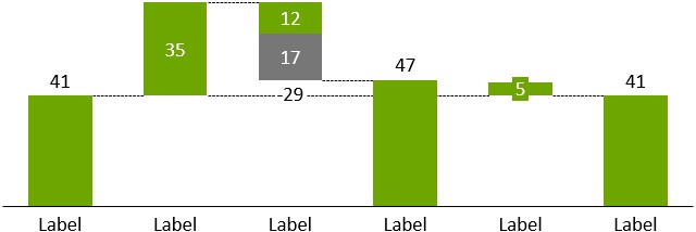
You can even begin the calculation with an e in the first column. In this case, think-cell starts from the right-most column and calculates backward to find the value for the e column. To get the same chart with an e in the first column, in the chart's datasheet, first delete the values, then enter the values in the following image.
You may enter two or more values into a single column. If you have a column made up from more than one segment, you can enter an e for at most one of them.
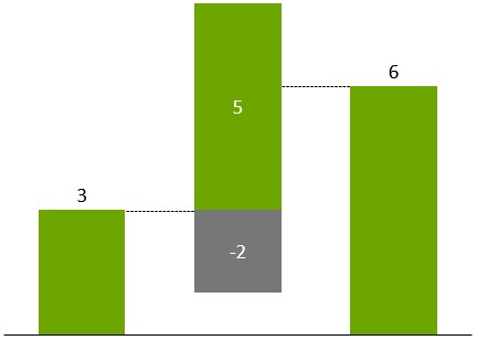
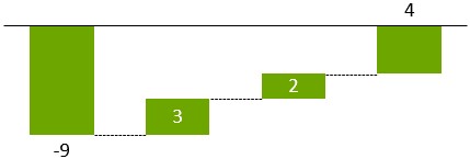
When both positive and negative values are used in a single column, the mathematical sum of all values will be used to continue the calculation, i.e., for two segments of values 5 and -2, the gap between the connectors on the sides of the column will be 3. At the same time, all individual segments are always displayed with the correct extent. To visualize the mathematical sum of the signed segments, the connector will use an anchor that may not correspond to the top or bottom of any individual segment:
Due to the complexity of the waterfall chart concept, only simple charts can be created by using the datasheet alone. If you notice that the chart does not build up the way you want it to, first finish typing in the data. It is easy to reconfigure the chart later with the mouse.
In a basic waterfall chart, every two columns are connected by precisely one horizontal connector. When selected, these connectors show two handles.
- Drag the connectors’ handles to change the way columns are connected in the waterfall.
- Remove a connector with Del in order to start a new summation. Add a connector by clicking

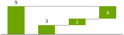
Based on the initial example, in the following chart the connector between the 1st and 2nd columns has been removed:
Whenever you drag a connector, the entire chart rearranges to accommodate the change and all “equals” columns are updated.
Also based on the previous example, in the following chart an equals column has been added and both ends of the highlighted connector have been moved:
If connectors are conflicting with each other, skew connectors will result. Remove some of the skew connectors to resolve the problem.
For example, to create a build-up waterfall with the total on the left, enter the following data into the sheet:
The resulting chart looks as follows:
Now drag the right handle of the highlighted connector to connect the “equals” column with the top of the last segment. This is the resulting chart:
![]() toolbar icon. The default datasheet is then filled with values appropriate for a build-down waterfall. Apart from this, there is no difference between a build-up and a build-down waterfall chart in think-cell.
toolbar icon. The default datasheet is then filled with values appropriate for a build-down waterfall. Apart from this, there is no difference between a build-up and a build-down waterfall chart in think-cell.
You can edit waterfall chart features and add annotations similarly to column charts (see Axes and Chart annotations).
By default, the segment labels in waterfall charts show the extent of the segment which is always a positive value. Negative values in the datasheet are represented visually by downward-going segments. However, you can select a positive number and enter a leading or trailing plus in the number format (see Number format) to show a sign for both positive and negative numbers or, you can select a negative number and enter a leading or trailing minus to only show a sign for negative numbers.
Note: If all segments are connected properly and the chart is still not grounded on the baseline the way you want it to, select the segment that should be grounded and force it to the baseline with the 

Difference arrow label: Percent of datasheet 100%=
In think-cell waterfall charts, labels for level difference arrows can display the difference between two values as a percentage of the first value's 100% value in the datasheet (see Level difference arrows).
In a waterfall chart's datasheet, each category has a 100% value. think-cell uses a category's 100% value to calculate percentages for each value in that category. By default, the 100% value is the sum of the values in a category. To change the 100% value, see Edit datasheet layout.
For example, in the following screenshot, the level difference arrow has the following parameters:
- The first value (start of the arrow) is 2.
- The second value (end of the arrow) is 4.
- The absolute value of the difference that the arrow represents is 2.
- The first value is in category A. Category A's 100% value is 3. Therefore, the first value's 100% value is 3.
The % of datasheet 100% label displays +67%, which is the difference of 2 as a percentage of category A's 100% value of 3.
To display the difference as a percentage of the 100% value, select the level difference arrow to open the mini toolbar. On the Label Content dropdown menu, select % of datasheet 100%.
Change the segment order
You can change the order in which segments appear in a waterfall chart.
- Select the chart to open its mini toolbar.
- On the Segment Order menu, choose the segment order that you want.
- Segments in Sheet Order: Segments appear in the same order as the linked data range, even if the chart is flipped (see Rotate and flip elements).
- Segments in Reverse Sheet Order: Segments appear in the reverse order of the linked data range, even if the chart is flipped (see Rotate and flip elements).
Need to troubleshoot?
Check our knowledge base