Deutsch English

7 Column chart, line chart and area chart

Previous [6 Text labels] Next [8 Waterfall chart]
7.1
Column chart and stacked column chart
7.2
Clustered chart
7.3
100% chart
7.4
Line chart
7.5
Area chart
7.6
Combination chart
7.7
Scales and axes
7.8
Arrows and values
7.9
Legend

7.1 Column chart and stacked column chart

Icon in Elements menu: image
Stacked column chart in think-cell

In think-cell, we do not distinguish between simple column charts and stacked column charts. If you want to create a simple column chart, enter only one series (row) of data in the data sheet. For a quick tour of the column chart, refer to the example in chapter Introduction to think-cell.

Bar charts in think-cell are simply rotated column charts, and can be used exactly as column charts. In addition, you can create butterfly charts by placing two bar charts “back-to-back”. To do so, apply the functions rotation (see Rotating and flipping charts) and same scale (see Same scale). Then remove the category labels for one of the charts.

think-cell sample butterfly chart

For the steps to create a stacked clustered chart, see Clustered chart.

7.2 Clustered chart

Icon in Elements menu: image
think-cell clustered chart

The clustered chart is a variant of the stacked column chart, with the segments arranged side-by-side. If you want to arrange stacks of segments side by side, you can create a stacked clustered chart.

think-cell stacked clustered chart

To create a stacked clustered chart, follow these steps:

1.
Insert a stacked chart.
2.
Click onto the baseline between the columns, drag the gap arrow to the left and set the gap width to “0”.
3.
Click onto the baseline where you want to insert a full category gap and drag the gap arrow to the right until the tooltip shows “1 Category Gap”; this has to be repeated for all clusters.

If there is an even number of stacks in a cluster, the label cannot be centered to the whole cluster. Use a PowerPoint text box as a label in this case.
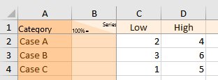
7.3 100% chart

Icon in Elements menu: image
The 100% chart is a variation of a stacked column chart with all columns typically adding up to the same height (i.e., 100%). The labels of the 100% chart support the label content property, which lets you choose if you want to display absolute values, percentages, or both (Label content). think-cell 100% chart

With think-cell, you can create 100% charts with columns that do not necessarily add up to 100%. If a column totals to more or less than 100%, it is rendered accordingly. For details about filling in the data sheet refer to Absolute and relative values.

7.4 Line chart

Icon in Elements menu: image
think-cell line chart

The line chart uses lines to connect data points belonging to the same series. The appearance of the line chart is controlled by the line scheme, marker scheme, line style and marker shape controls in the floating toolbar. See Formatting and style for details on these controls. Labels for the data points are not shown by default but may be displayed using the line chart image Add Point Label context menu button.

If the category values of a line chart are strictly increasing numbers or dates then the x-axis will automatically switch to a value axis (see Value axis). When dates are used the date format can be changed by multi-selecting all category labels (see Multi-selection) and typing a date format into the control (see Date format codes). If you want to show more labels than would fit next to each other horizontally you can use label rotation (see Label rotation).

The horizontal axis can only switch from category to value mode if the following conditions are met:

  • All category cells in the data sheet contain numbers and Excel’s cell format is also set to General or Number or all category cells in the data sheet contain dates and Excel’s cell format is also set to Date.
  • The numbers or dates in the category cells are strictly increasing from left to right.
  • The y-axis is not set to Crosses Between Categories (see Positioning the value axis). If only this requirement is preventing a switch to the value axis mode, you can use image Make Value Axis from the axis context menu to switch to Crosses At Categories and thereby switch to the value axis mode as well.

The line chart can also display a second vertical value axis. Please refer to Secondary Axis for further information.

7.4.1 Smoothed lines

If you prefer a smoother appearance of the lines in a line chart, you can turn on this setting. First right-click on the desired line, then use the image Set to Smooth Line button.

7.4.2 Error bars

Error bars can be used to indicate deviations. By means of the error bars the following chart can be created.

think-cell line chart with error bars
1.
Create a line chart with three series. The first series reflects the upper deviation, the second series reflects the mean and the third series reflects the lower deviation.
2.
Right-click the center line and choose image Add Error Bars from the context menu.
3.
Remove the series labels for the upper and lower series.

Select one of the error bars to change the marker shape and color for the upper and lower deviation and the line type of the bar for all error bars. You can also select an individual error bar marker to change the properties for this marker only.

A handle appears at each end when you select an error bar. You can drag these handles to select which lines the error bars should span. You can also visualize intervals instead of the deviation around a central value if you set the error bar to only span two adjacent lines.

7.4.3 Interpolation

In line, area and area 100% charts, the image Interpolate button can be used to display a chart with linear interpolation used for any missing data values in a series. In line charts, interpolation can be enabled and disabled for individual series in a chart. In area charts, it can only be applied to the whole chart, because the series stack on each other.

7.5 Area chart

7.5.1 Area chart

Icon in Elements menu: image
think-cell area chart

An area chart can be thought of as a stacked line chart, with the data points representing the sum of the values in the categories rather than the individual values. The appearance of area charts is set using the color scheme control. Labels for the data points are not shown by default but may be displayed using the area chart image Add Point Label context menu button. The area chart image Add Total context menu button can be used to display total labels. Linear interpolation can be enabled using the image Interpolate button (see Interpolation).

7.5.2 Area 100% chart

Icon in Elements menu: image
think-cell area 100% chart

The area 100% chart is a variant of the area chart with the sum of all the values in a category typically representing 100%. If the values in a category total more or less than 100%, then the chart will be rendered accordingly. See Absolute and relative values for more details about specifying data values. The labels of the area 100% chart can display absolute values, percentages, or both (Label content). Linear interpolation can be enabled using the image Interpolate button (see Interpolation).

7.6 Combination chart

Icon in Elements menu: image
think-cell combination chart (line, column and clustered column)

A combination chart combines line and column segments in a single chart. Line chart and Column chart and stacked column chart describe in detail the usage of lines and column segments in charts.

To convert a line to a series of segments, simply highlight the line and select the image Set to Segment Type button from the context menu. To convert segments to a line, simply highlight a segment of the series and select the image Set to Line Type button from the context menu. The data sources of line charts, stacked charts and combination charts have the same format.

think-cell segmented line and clustered column chart

This function can be used in stacked and clustered column charts as well as in line charts.

7.7 Scales and axes

7.7.1 Value axis

In menu: Chart
Menu item: image
Use this feature to display a value y-axis.

Note: The x-axis of a Mekko chart is also a value axis. Similarly, scatter and bubble charts have two value axes that are always displayed. In addition, the x-axis of a line chart may be a value axis, rather than a category axis (see Line chart). The x-axes of all other charts are standard category axes.

Adjusting the scale of a value axis

When selected, a value axis has three handles:

Adjusting the scale of a value axis in think-cell
  • Value axes are usually scaled by think-cell. You can, however, manually scale a value axis by dragging the handles at the end of the value axis. The values on the axis must always include the range between the lowest and largest value in the data sheet. If you do not want to show a specific value, either remove it from the data sheet or hide the respective data sheet row or column. Automatic value axis scaling can be restored by dragging the handles until the tooltip indicates Automatic. Holding down Alt while dragging ensures that the value axis scale will not revert to automatic mode.
  • The tickmark spacing for value axes is usually calculated by think-cell. You can, however, manually adjust the tickmark spacing by dragging the middle handle. As you drag, the handle will jump to supported tickmark spacings, with a tooltip indicating the selected spacing. Releasing the handle will apply the indicated tickmark spacing to the axis. Automatic tickmark spacing can be restored by reducing the tickmark spacing until the tooltip indicates Automatic.
  • The image Set Same Scale button can be used to apply the same scale to multiple charts. See Same scale for further details.

Positioning the value axis

A value y-axis can be moved by selecting and dragging the axis with the mouse. While dragging, available alternative locations for the axis will be highlighted. Dragging to the desired location and releasing will move the axis.

You will notice, when selecting and dragging the value y-axis of a line chart, that two locations on either side of the chart are highlighted. Dragging to either of the locations will position the y-axis on the appropriate side of the chart.

Positioning the value axis in think-cell

The location selected, however, also sets the crossing behavior for the chart. Two distinct styles of crossing behavior are supported for line charts:

  • Crosses At Categories The y-axis crosses the x-axis at the center of a category. In this case the data points of the first category are placed directly on the y-axis.
  • Crosses Between Categories The y-axis crosses the x-axis between two categories. Consequently, the data points are offset from the border of the chart.

Regardless of the crossing behavior of the axis, the x-position of data points always corresponds to the center of the category.

Selecting either of the innermost highlighted locations will set the behavior to Crosses At Categories, while selecting either of the outermost highlighted locations will set the behavior to Crosses Between Categories.

The image and image buttons in the value axis context menu can also be used to alter the crossing behavior.

Value axis context menu

Value axes have their own context menu. It shows the following buttons:

image Add Tick Marks
Add or remove tickmarks.
image Add Tick Labels
Add or remove tickmark labels.
image Add Grid Lines
Add or remove gridlines.
image Add Title
Add or remove axis title. You can drag the title to choose its placement.
image image Set Logarithmic/Linear Scale
Set the axis to a logarithmic or linear scale (see Logarithmic Scale).
image Add Second Y axis
Add a secondary axis (see Secondary Axis).
image Fit Scale To Data
Revert the scale and tickmark spacing to automatic sizing if they have been modified either by the user or by a same scale operation (see Same scale).
image Add Break
Add a break at the current mouse pointer position (see Value axis break).
image image Set Crosses At/Between Categories
Alter the crossing behavior for a line chart.

7.7.2 Value axis break

In menu: Segment, axis, line, area
Menu item: image image
Use a value axis break to shrink a particularly large segment and enhance readability for the smaller segments. To add a value axis break, click the part of the segment or axis where you want the break to go and open the context menu. When adding a value axis break, the exact position where you right-click a segment or axis makes a difference.

Any break you insert applies to the value axis (if shown) and to all segments sharing the same range of the axis. For this reason, you can not add a break to the axis at any position where there is a segment border in any of the chart’s columns. A break can only be added if at the mouse pointer location there is some part of the value axis big enough to display at least the two lines that visualize the break.

This is illustrated by the following example. No break can be added to the very top part of the second column, because the top of the third column is too close. However, within the range of the third column’s segment, there is enough space for the break. Since both columns share this range of the value axis, both segments are broken:

think-cell chart without value axis break think-cell chart with value axis break

Note: If you apply the same scale operation (see Same scale) to charts that have value axis breaks, the breaks are automatically removed. As long as breaks are present, it is impossible to make the selected charts visually comparable.

Adjusting the break’s extent

You can adjust the size of a broken segment by dragging the lines that appear when you select the break. These lines mark the range of the scale that is compressed to save space. Drag the lines to determine the size of the compressed part of the scale. If you drag a line far enough for the compressed range of the scale to take as much space as was originally required, the break disappears. The default is to compress the selected part of the scale as much as possible while leaving enough room for the break lines to be rendered.

Available break styles

There are two types of break shapes supported by think-cell. The straight break as illustrated above is commonly used for standard column charts. The wiggle break as illustrated below is convenient to save space in charts with wide or adjacent columns. If enough space is available, you can toggle between the two shapes with image Set Wiggle/Straight Shape in the break’s context menu.

Note: In line and area charts only the wiggle style is supported.

think-cell clustered column chart with wiggle break

7.7.3 Same scale

When there are multiple similar charts on the same slide, it is often desirable that all of them share the same scale. Only when two charts share the same scale, are the physical sizes of their bars or columns comparable.

The following example shows two charts which have the same size, but not the same scale. Note that the column that represents 7 units in the waterfall chart is the same height as the column that represents 47 units in the column chart.

Two think-cell charts with same size but not same scale

To make columns from different charts visually comparable, select all those charts together. Then, open the think-cell context menu of one of them and click the image Set Same Scale button to resize smaller scales to match the largest one. In the above example the resulting charts look like this:

Two think-cell charts with same size and same scale

When the data represented by a chart changes, it is possible that this chart rescales. If you still want to keep the same scale for multiple charts, you may have to reapply the same scale operation. The same applies if you manually changed the scale of one of the charts.

To revert the same scale, select one or multiple charts and click the image Fit Scale to Data button. If you are not sure which charts share the same scales, the easiest way is to revert the same scale for all charts, then to select the requested charts and to activate same scale.

Note: If you apply the same scale operation to charts that have value axis breaks, the breaks are automatically removed (see Value axis break). As long as breaks are present, it is impossible to make the selected charts visually comparable.

7.7.4 Logarithmic Scale

You can switch to a logarithmic scale by using the image Set Logarithmic Scale button from the value axis context menu. To revert to a linear scale choose image Set Linear Scale.

Note: Due to a limitation in Microsoft Graph an axis with a logarithmic scale can only have tickmarks at powers of 10, e.g. at 0.1, 1, 10. The axis must also begin and end at a power of 10.

Logarithmic scaling is not supported when it is mathematically not appropriate. Negative values are placed on the baseline and an exclamation mark image is shown next to the label explaining that the value cannot be represented on a logarithmic scale. Also, an axis always uses a linear scale if multiple series that are added up to a total are associated with the axis.

7.7.5 Secondary Axis

Charts containing lines may have an additional, secondary y-axis. You can add a secondary y-axis, and associate a line with this axis, by highlighting a line and selecting the image Set to Right/Left Axis button from the line context menu. If a chart has two y-axes, then you can use the same image Set to Right/Left Axis button to alter the y-axis association of individual lines in the chart. A secondary axis is a fully-fledged value axis (Value axis) and may be scaled independently.

think-cell chart secondary axis

7.7.6 Gap width and category gap

The basic spacing between columns in a chart is specified by the gap width. Extra spacing between individual pairs of columns may be added by inserting a category gap.

The gap width for all columns can be altered by clicking on the baseline and dragging the handle a small distance. The handle snaps to the default gap width. In order to achieve a consistent appearance for charts throughout your presentation, the default gap width should be used when possible.

think-cell gap width

Category gaps can be introduced by dragging the same handle further to the right until the category gap tooltip appears. The handle snaps to multiples of the column width.

think-cell category gap

Altering the gap width or introducing category gaps by simply dragging preserves the width of the columns, resulting in an increase or decrease of the overall chart width.

You can ensure that the overall chart width is preserved by holding down the Ctrl key while dragging: the column widths will be increased or decreased to accommodate the altered gaps.

Note: In some cases, a break in the baseline (see Category axis break) may be a space-saving alternative to a category gap.

7.7.7 Category axis break

In menu: Category axis column gap
Menu item: image
A category axis break indicates a break in the continuity of the category axis scale. To insert the break, right-click on the category axis between two columns and select the respective menu item. Category axis break in think-cell chart

7.8 Arrows and values

7.8.1 Difference arrows

In menu: Chart, segment1, point2
Menu items: image image image image
1column and waterfall charts
2line and area charts
Difference arrows can be used in charts to visualize the difference between pairs of columns, segments or points. The difference is automatically calculated and updated whenever the underlying data changes. The text label for the difference (chapter Text labels) supports font, number format and label content properties (Font, Number format, Label content).

Two distinct styles of difference arrows are supported by think-cell: segment (or point) difference arrows and category difference arrows. Segment difference arrows are designed to show differences between pairs of segments or points in a chart; category difference arrows are designed to show differences between column totals.

Segment difference arrow

Segment difference arrows can be added by selecting the image or image button in the context menu. You can use the handles that appear when the difference arrow is selected to set the two values that are to be compared. The ends of the difference arrow can be attached to column segments, data points or to a value line, if there is one (Value line).

think-cell chart difference arrow think-cell chart difference arrow with bubble label

By default, a newly inserted difference arrow stretches from the selected segment or category to the top segment of the next category. You can also determine the desired start and end segment/category for the difference arrow immediately: Select the start segment and the end segment at the same time. Then right-click on one of them and select image Add Segment Difference Arrow. To select multiple segments at a time, hold down Ctrl key while selecting (see Multi-selection). In case of a line or area chart, select the corresponding data points instead of segments.

If the arrow is so small that the bubble would cover it up, the bubble is automatically placed next to the arrow. To manually optimize the layout, you can drag the arrow itself as well as its label to other locations (Automatic label placement). If you want to place the arrow between two columns, you might want to create an additional gap between the columns (Gap width and category gap).

think-cell chart difference arrow with percentage differences

Category difference arrow

Category difference arrows can be added by selecting the image or image button in the context menu and connecting the ends of the difference arrow to the categories or columns that are to be compared.

think-cell chart category difference arrows

Arrow modes

You can cycle through three arrow modes. The button in the context menu changes accordingly and the number in the label is recalculated:

image Show an arrow pointing in one direction and calculate the relative difference.
image Show a double-ended arrow and calculate the absolute difference.
image Show an arrow pointing in the other direction and calculate the relative difference.

7.8.2 CAGR arrow

In menus: Chart, segment
Menu item: image
This feature visualizes the compound annual growth rate. The range of dates on which the calculation is based is taken from the data sheet cells that are associated with category labels. The CAGR is automatically calculated and updated whenever the underlying data changes. For the calculation to work correctly, it is important that the respective data sheet cells contain the correct dates.

The CAGR from category A to B is calculated as

CAGR formula

with n being the number of years in the date range. The 30/360 day count convention is followed to determine n when it is not a whole number.

The automatic display of the CAGR is based on a text label (chapter Text labels) and supports font and number format properties (Font, Number format). The arrow itself supports the color property (Color and fill).

think-cell automatic display of CAGR value

By default, only one CAGR is inserted that stretches from the selected category to the last category in the chart. You can use the handles that show up when the CAGR arrow is selected to specify its start and end categories.

You can also determine the desired start and end categories for the CAGR immediately: Select a segment in the start category and a segment in the end category. Then right-click on one of them and click image Add Compound Growth Arrow. If you select segments in more than two categories, you will get a CAGR for each pair of successive selected categories. To select multiple segments at a time, hold down Ctrl key while selecting (see Multi-selection). In case of a line or area chart, select the corresponding data points instead of segments.

think-cell start and end categories of CAGR

7.8.3 Series CAGR

The CAGR arrow is always calculated based on the column totals. However, you might also like to visualize the compound annual growth rate of one of the series.

image

This can be shown in series labels. Simply select the label and choose the CAGR option from the right-most menu on the floating toolbar.

Now the CAGR is calculated series-wise.

think-cell series CAGR

To select all series labels in one action, click the first label, then Shift-click the last one (see Multi-selection).

7.8.4 Value line

In menu: Chart
Menu item: image
This feature displays a line parallel to the x-axis to visualize a certain value. You can create multiple value lines per chart, and you can choose to have the line’s label placed to the left or to the right of the chart.

Where appropriate, the value line is initialized with and snaps to the arithmetic mean (stacked chart, clustered chart) or the weighted mean (Mekko chart) of the column totals. If the line is snapped to such a value, this value is calculated and automatically updated when data changes.

You can drag the line as desired. If you need to increase the precision of the dragging operation, use PowerPoint controls to zoom in on the slide. You can also use the cursor keys to nudge the line to a specific value. When using the cursor keys, the line moves in increments corresponding to the label’s number format.

As always, you can add custom text to the label or replace the predefined label with your own content. You can learn more about labels and text fields in chapter Text labels. You can also change the label’s font (see Font) and number format (see Number format).

Average value line in think-cell

7.8.5 100% indicator

In menu: Chart
Menu item: image
This feature shows a “100%” mark. It is on by default. You can choose to have the label placed to the left or to the right of the chart. think-cell column chart 100% indicator

7.8.6 Series connectors

In menus: Chart, segment
Menu item: image
You can add series connector lines to an entire chart or to a single segment. If you click the connector item of a segment’s menu, a connector line is created at the top right corner of that segment. If you want a connector as part of a waterfall calculation, you must use the specific waterfall connector (see Waterfall chart). Alternatively, universal connectors (see Universal connectors) can be used when the desired connections cannot be achieved using standard connectors. Series connectors in think-cell stacked column chart

7.8.7 Universal connectors

Icon in Elements menu: image
Universal connectors are different from the other decorations described in this chapter, because they do not belong to a specific smart-element or feature. Therefore, they are not available in the think-cell context menu.

Instead, you can insert universal connectors from the think-cell toolbar. Double-click the toolbar button to insert multiple connectors. To leave insertion mode, click the button again or press the Esc key.

Each smart-element can offer connectable points. The universal connector can connect any two connectable points that may or may not belong to the same smart-element. Use the universal connector if you need an unusual connector that is not supported by the chart itself.

think-cell universal connectors

You can also use the universal connector to connect two different charts. The handles at the ends of the connector snap to connectable points while you move them. The handle in the middle of the connector can be dragged to change the straight connector to one with a right angle.

Universal connectors between two different charts in think-cell

Note: The universal connector visually connects two objects, but it has no effect on the calculation of the waterfall chart. If you want a connector as part of a waterfall calculation, you must use the specific waterfall connector (see Waterfall chart). Standard connectors (see Series connectors) are also available for a number of chart types and should be used in preference to universal connectors when possible.

7.9 Legend

In menu: Chart
Menu item: image
A legend can be used to clearly identify the various data series or groups in a chart.

A floating toolbar containing a line style and a font control (Text label property controls) appears when the legend is selected, letting you specify a line style for the legend box and the size of the legend text. In addition, chart-specific property controls for the series and groups are available.

think-cell legend toolbar

If you change the size of the legend’s frame the legend text will be automatically reformatted to fit the new frame size. To create a horizontal legend for example pull the left or right border of the frame outwards.

Previous [6 Text labels] Next [8 Waterfall chart]